ADV @ UNDERCONSIDERATION Peek here for details
BROWSE
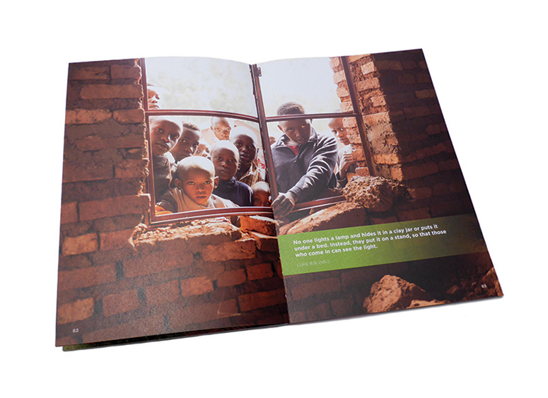
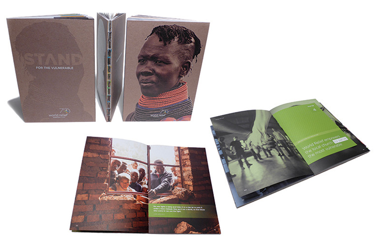
“STAND/For the Vulnerable” Book
Production Method
Offset
Design
StudioNorth
Art Director: Marilyn Frank
Designer: Natalia Bulsza-Gottschalk
Copywriter: Dan Gutknecht
Editor/Proofreader: Carol Badenhoop
Printing
The Fox Company, Inc.
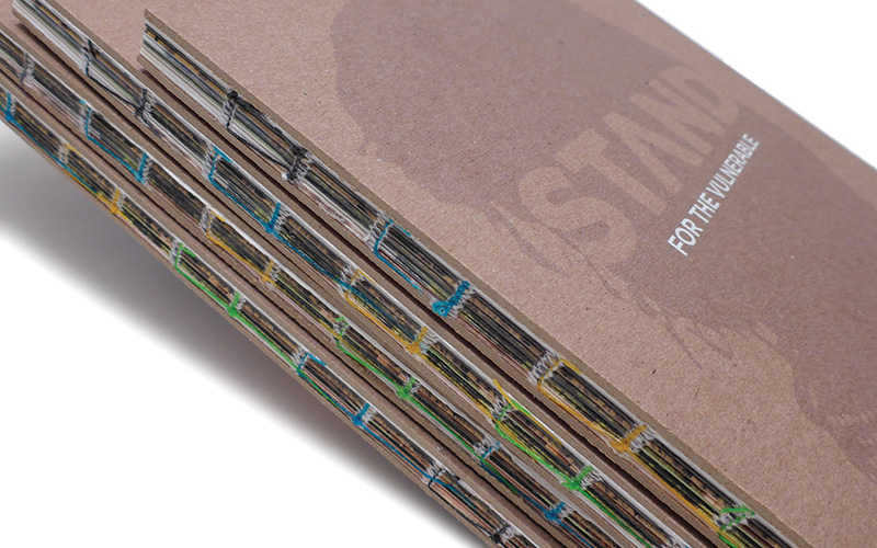
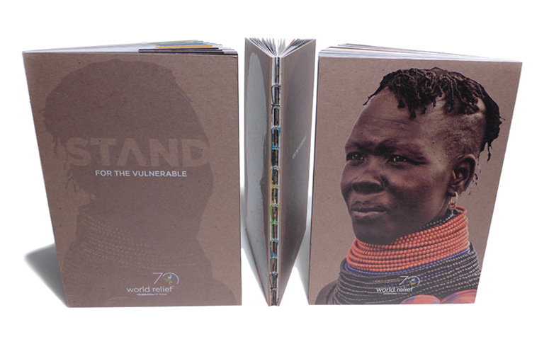
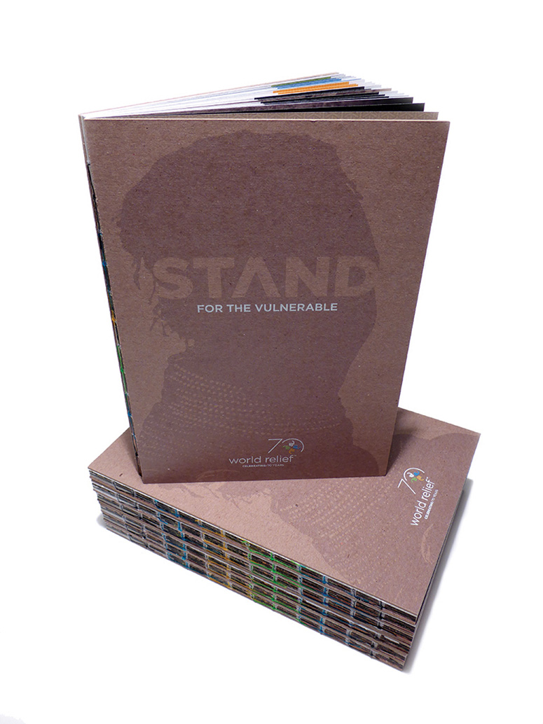
Serving over 4 million people a year, World Relief helps victims of poverty, war, disease and other vulnerable circumstances. This hardcover book of World Relief’s history was made to rebrand the organization for its 70-year anniversary. Bound with threads of the brand’s colors and digitally printed on chipboard covers to appear “varnished”, the book communicates a message of empowerment through both image and medium.
Dimensions (Width × Height × Depth)
7 × 10 × .5 in
Page Count
100
Paper Stock
Mohawk Options / Navajo Smooth / Brilliant White / 100T, 60T
Number of Colors
4
Varnishes
–
Binding
Smyth Sewn
Typography
Gotham
Linotype Notec Regular
Project Description
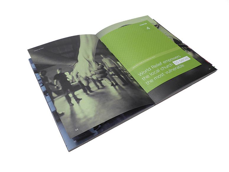
This book is a concise history of World Relief, and was created as part of a larger effort to rebrand the organization on the advent of its 70-year anniversary. Each chapter addresses a specific portion of their humanitarian and spiritually-informed mission statement. The reader is taken on a journey spanning seven decades of serving the most vulnerable populations all over the world.To tell the World Relief story, the book is highly visual, incorporating photos dating all the way back to its earliest days. Designed as a modern travel journal, and treated with brand colors strategically applied and revealed chapter-by-chapter, each page brings the story to life.
The cover image shows the silhouette of an individual ‘in the shadows,’ while the back cover reveals the individual in full color. The idea was to show how World Relief transforms lives and empowers individuals to thrive personally, and then continue the cycle of empowerment throughout their communities.
Construction: Smyth sewn bookbinding with colored threads based on World Relief’s brand colors. Hand-glued tip-in pages. Front and back covers digitally printed on chipboard.
Production Lesson(s)
Finding a way to create a ‘varnish’ effect on chipboard (for the back cover) was quite a challenge. Fox Printing did many tests to achieve just the right level of gloss. After several attempts, they pulled off exactly what StudioNorth was looking for by digitally printing multiple passes of the image, one on top of the next, so that the layers of ink naturally dried with a shiny finish.The book’s design employs the use of pattern overlays, which posed issues with printing consistency from section to section. Numerous color adjustments had to be made to ensure that these overlays didn’t disappear in one section and show up strongly in another. Placing them inside solid-colored shapes or over photos posed additional challenges because of the interplay between the colors and the patterns. Every inch of the book was scrutinized for color accuracy.

Post Author

Jessica Mullen
Writer for UnderConsideration LLC.
More: Online / On Twitter
Date Published
September 29, 2015
Filed Under
Books
Offset
Tagged with
book
hard cover
hardback
offset
sewn
smythe sewn


About
FPO (For Print Only), is a division of UnderConsideration, celebrating the reality that print is not dead by showcasing the most compelling printed projects.
FPO uses Fonts.com to render Siseriff and Avenir Next.
FPO is run with Six Apart’s MovableType
All comments, ideas and thoughts on FPO are property of their authors; reproduction without the author’s or FPO’s permission is strictly prohibited
Twitter @ucllc
Sign-up for Mailing List
Mailing list managed by MailChimp
Thanks to our advertisers
About UnderConsideration
UnderConsideration is a graphic design firm generating its own projects, initiatives, and content while taking on limited client work. Run by Bryony Gomez-Palacio and Armin Vit in Bloomington, IN. More…
blogs we publish
Brand New / Displaying opinions and focusing solely on corporate and brand identity work.
Art of the Menu / Cataloguing the underrated creativity of menus from around the world.
Quipsologies / Chronicling the most curious, creative, and notable projects, stories, and events of the graphic design industry on a daily basis.
products we sell
Flaunt: Designing effective, compelling and memorable portfolios of creative work.
Brand New Conference videos / Individual, downloadable videos of every presentation since 2010.
Prints / A variety of posters, the majority from our AIforGA series.
Other / Various one-off products.
events we organize
Brand New Conference / A two-day event on corporate and brand identity with some of today's most active and influential practitioners from around the world.
Brand Nieuwe Conference / Ditto but in Amsterdam.
Austin Initiative for Graphic Awesomeness / A speaker series in Austin, TX, featuring some of the graphic design industry's most awesome people.
also
Favorite Things we've Made / In our capacity as graphic designers.
Projects we've Concluded / Long- and short-lived efforts.
UCllc News / Updates on what's going at the corporate level of UnderConsideration.

Related entries
2017 Brand New Conference Program
Severe(d): A Creepy Poetry Collection by Holly Riordan
Um Caminho para Santiago CD Package and Diary
BOYCO Classpack® Book
Antes de Perder la Esperanza Book