ADV @ UNDERCONSIDERATION Peek here for details
BROWSE
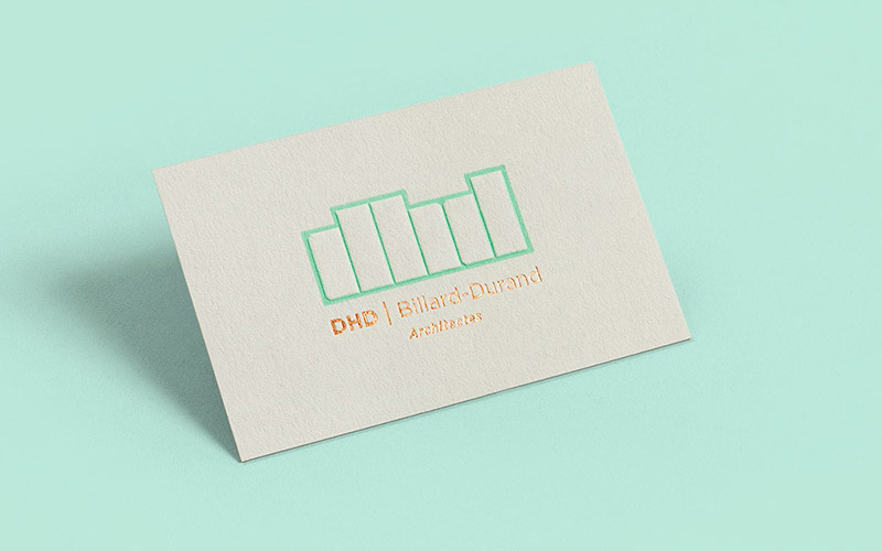
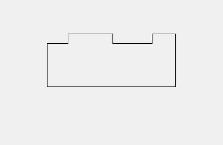
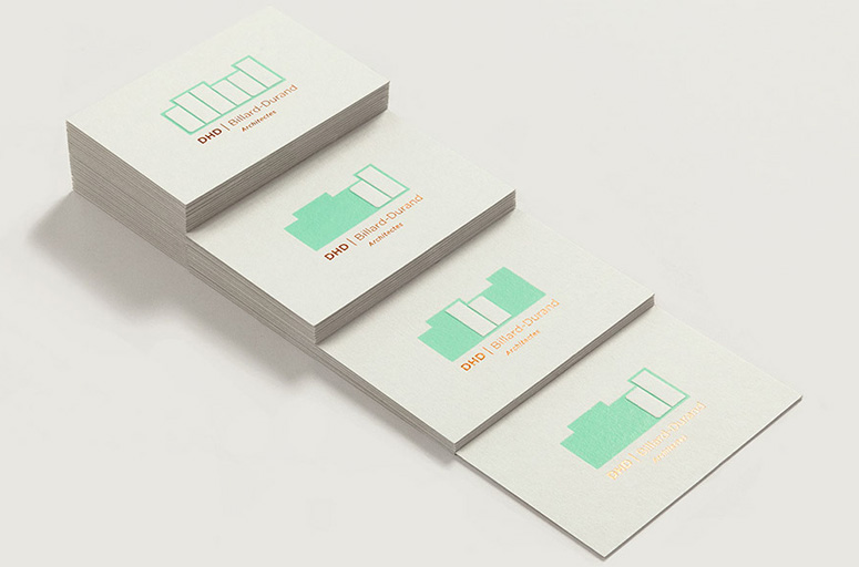
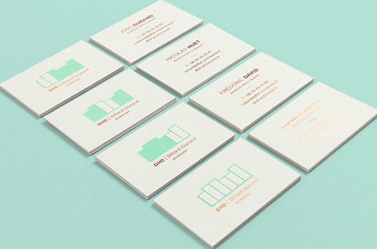
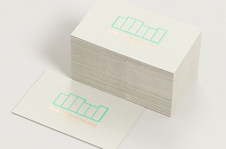
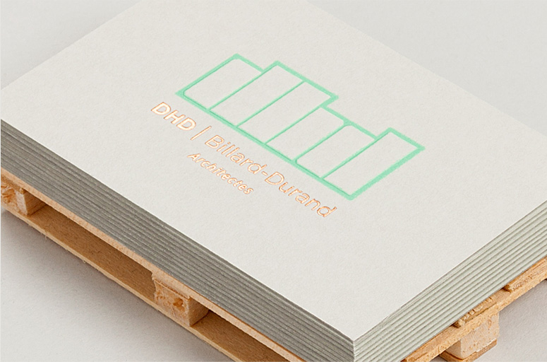
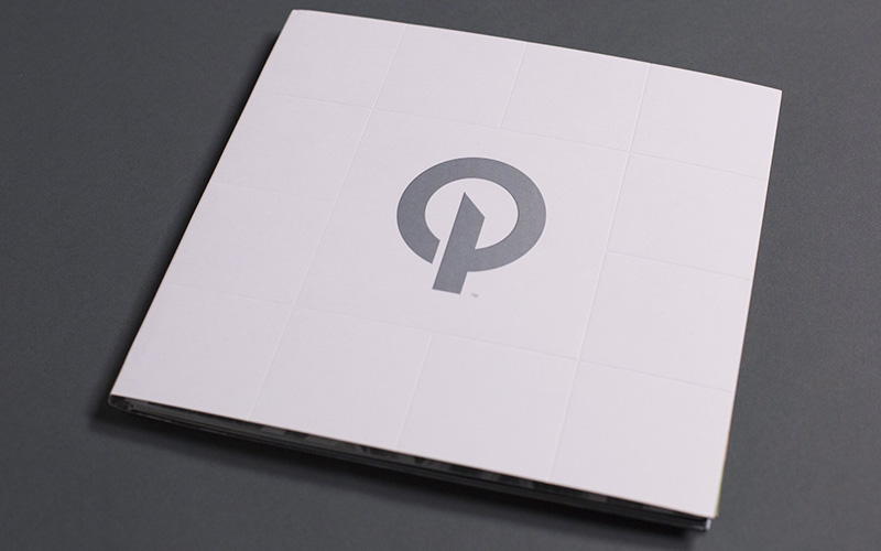
The encoded “D”, “H”, and “D” in the logo are used to great effect in this architecture firm’s business cards by debossing their outline and letting the letters stick out. While all employees got a business card that has the full DHD logo, the three partners only have their own letter raised while the other two are absent and only a field of the mint green color remains. Clever, catchy, and beautifully produced. The rest of the identity and materials are worth a look as well.
Dimensions (Width × Height × Depth)
3.5 × 2 in.
Page Count
–
Paper Stock
Colorplan / Pale Grey / 700g
Number of Colors
2 (Copper foil stamp, Green offset)
Varnishes
–
Binding
–
Typography
Gotham
Project Description
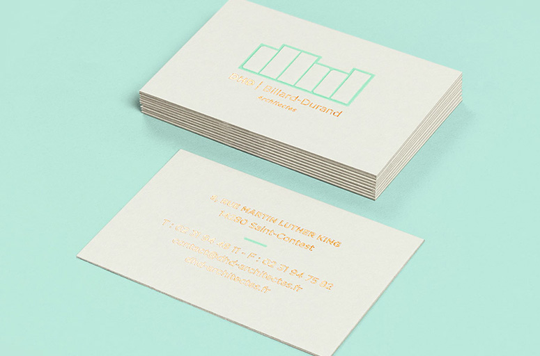
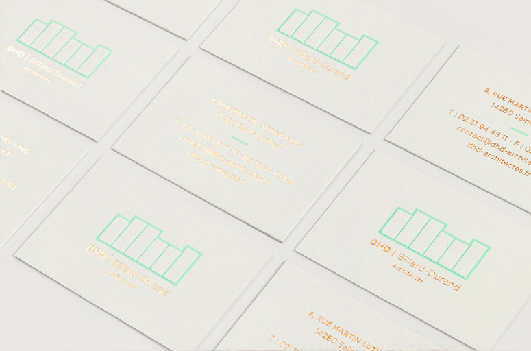
Supported by three architects who are driven by strong and singular characters, we came up with a logo using the first letter of all 3 associates’ names; forming the DHD acronym. We developed a logotype with powerful architectural and urban overtones, enabling us to bring into play those rhythmical notions that assert this new identity within its corporate identity and visual style. Deconstructing the logo enables you to reveal its potential and architectural connotations, whilst exploring its construction principle.[For the business card] we came up with four models: one model for the agency featuring the full logo, then one model per architect. We wanted to pay special attention to its pleasantness to handle, touch and resistance, essential factors for a communication medium which is subjected to wear and tear. On the front, we favoured embossing as the technique which would enable us to enhance the logo’s volume and feel. The overall composition is underlined by a copper hot foil which adds depth and elegance to the medium. On the back, information is entirely hot-foiled. Only a touch of colour, sea-green, adds lightness and complementarity to this composition.
Post Author

Armin Vit
Editor of FPO and co-founder of UnderConsideration LLC.
More: Online / On Twitter
Date Published
February 22, 2016
Filed Under
Business Cards
Foil stamp
Offset
Tagged with


About
FPO (For Print Only), is a division of UnderConsideration, celebrating the reality that print is not dead by showcasing the most compelling printed projects.
FPO uses Fonts.com to render Siseriff and Avenir Next.
FPO is run with Six Apart’s MovableType
All comments, ideas and thoughts on FPO are property of their authors; reproduction without the author’s or FPO’s permission is strictly prohibited
Twitter @ucllc
Sign-up for Mailing List
Mailing list managed by MailChimp
Thanks to our advertisers
About UnderConsideration
UnderConsideration is a graphic design firm generating its own projects, initiatives, and content while taking on limited client work. Run by Bryony Gomez-Palacio and Armin Vit in Bloomington, IN. More…
blogs we publish
Brand New / Displaying opinions and focusing solely on corporate and brand identity work.
Art of the Menu / Cataloguing the underrated creativity of menus from around the world.
Quipsologies / Chronicling the most curious, creative, and notable projects, stories, and events of the graphic design industry on a daily basis.
products we sell
Flaunt: Designing effective, compelling and memorable portfolios of creative work.
Brand New Conference videos / Individual, downloadable videos of every presentation since 2010.
Prints / A variety of posters, the majority from our AIforGA series.
Other / Various one-off products.
events we organize
Brand New Conference / A two-day event on corporate and brand identity with some of today's most active and influential practitioners from around the world.
Brand Nieuwe Conference / Ditto but in Amsterdam.
Austin Initiative for Graphic Awesomeness / A speaker series in Austin, TX, featuring some of the graphic design industry's most awesome people.
also
Favorite Things we've Made / In our capacity as graphic designers.
Projects we've Concluded / Long- and short-lived efforts.
UCllc News / Updates on what's going at the corporate level of UnderConsideration.

Related entries
KitchenAid Limited Edition Cards
BOYCO Classpack® Book
Herbst & Spungen Wedding Invitation Suite
Fracas Productions Business Cards
Gunnel Wåhlstrand Exhibit Book