ADV @ UNDERCONSIDERATION Peek here for details
BROWSE
Paragon Papers Wrapping Paper
Production Method
Offset
Design
Paragon Design Group
Designer: James Donaldson
Creative Director: Andrew Davies
Print Buyer: Susan Isaacs
Printing
Rapid Press
Lush dark blues and bright accents make this wrapping paper stand out, but when you touch it? Then it reaches a new dimension, one with depth and texture that is not often found in this product line.
Dimensions (Width × Height × Depth)
18.75 × 27 in.
Page Count
–
Paper Stock
80lb Satin
Number of Colors
Gatsby: PMS
Indigo Hyde: CMYK
Galileo: Glow-In-The-Dark Ink
Varnishes
Gatsby: Raised UV Gloss
Indigo Hyde: Soft Touch Film Lamination
Binding
–
Typography
–
Project Description
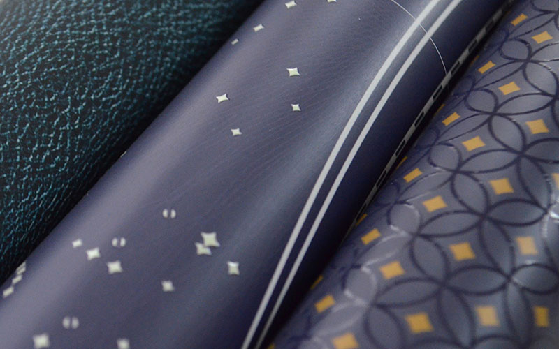
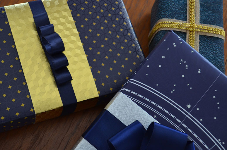
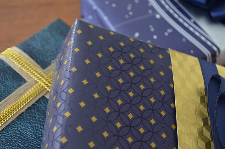
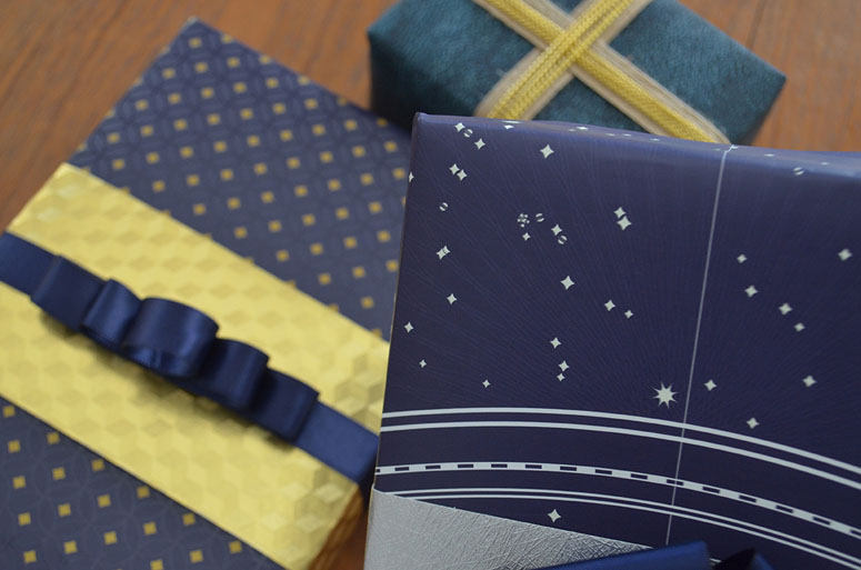
Experimenting with paper and ink combinations has been a longstanding passion here at Paragon. We work very closely with printers not just on color and quality, but also to push the boundaries of what's possible. After years of employing these techniques and our knowledge of press processes on commercial projects, we sat down one day with the idea to transfer this skill set into a product line. It's taken us a few years to actually do it, but in December of 2015 we finally launched Paragon Papers, a luxury wrapping paper line. Our first collection called Holiday Blues features 3 distinctive papers; Gatsby, Indigo Hyde and Galileo.Gatsby is the first of many art deco explorations. We love the style of the gilded era, with complex yet strikingly simple patterns that transport you to a time when gifts were chosen by hand, wrapped and delivered with flair and panache. Using only 2 PMS colors, we began with a deep blue backdrop to ensure our metallic gold would really pop, then added more depth and complexity using a clear UV gloss to create the lattice work and reinforce the metallic gold. During the production process the PMS inks had to printed first, before a second dry pass could be done to apply the UV gloss lattice. The completed finishes make the paper both interesting to see and touch. The perfect paper for fedoras, typewriters and green lights.
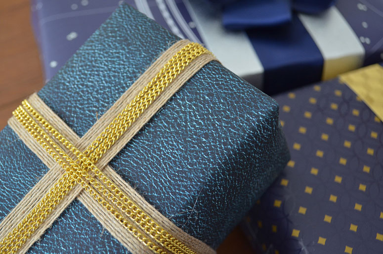
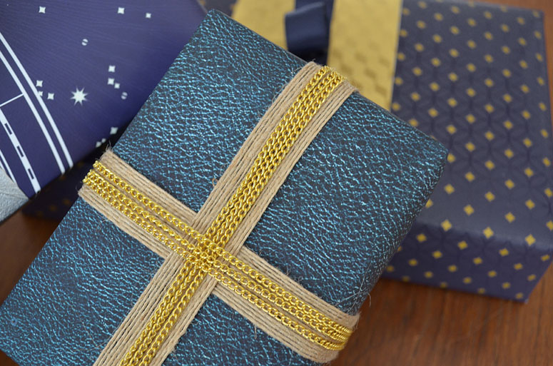
Indigo Hyde is a paper that allowed us to explore texture as well as the visual of supple leather. We wanted to really create a realistic texture, so we pulled in high res artwork and stitched together a seamless pattern. In production this was 2-step process. Step one was a full-color press run, and step two was dry pass in which a soft touch film was laminated over the entire sheet to create a buttery-soft feel. The soft-touch film was chosen because of a custom velvety finish that reinforces the blue leather concept. While the effect of the lamination is quite subtle and is not visibly noticeable, when compared to other papers it is surprisingly different and feels luxurious. Our goal is to explore even more papers that bring a tactile experience as well as beautiful designs.
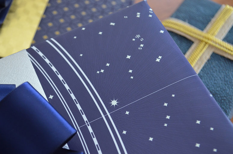
Galileo is another beautiful combination of design, high quality printing and unique custom inks. When starting the design, we pulled in antique star charts and really tried to create an authentic representation of the night sky. This was done with 1 PMS color for the night blue background. The stars were printed using a glow-in-the dark ink which was applied as a dry pass (separate from the print run) and done on a silk screen unit. A separate plate was necessary for the dry pass, so when setting up the file, we had to isolate the individual stars as a separate spot color. The glow-in-the-dark overlay makes this paper more than just an afterthought, it is an interactive experience.
For the paper itself we ultimately settled on Endurance Satin 80# text for all three because of its opacity and strength. The thickness of the paper was just enough to make it feel luxurious and remain wrinkle-free, but stopped shy of being so thick that wrapping a gift would be difficult.
Production Lesson(s)
Test everything. Working on a larger scale than we typically do meant using new equipment and procedures. For example, it's unusual to use a soft touch coating over this large of an area, so instead of our go-to aqueous we actually used a laminate film here. We also needed to extensively test the UV lattice coating and the Glow-In-The-Dark inks to make sure neither would not crack or flake.Partner with people you trust. We've been very fortunate to build a close working relationship with Rapid Press, a printer we've collaborated with on many projects over the years. They do fantastic work, are excellent at problem solving and don't run screaming every time we come to them with a new crazy idea. We even get to talk directly to their press technicians, which I have learned from experience is not very common. Rapid Press was actively engaged throughout this process; doing research, testing, advising and ultimately delivering a stellar product.
Also. Pallets of wrapping paper are unbelievably heavy!

Post Author

Bryony Gomez-Palacio
Editor of FPO and co-founder of UnderConsideration LLC.
More: Online / On Twitter
Date Published
April 12, 2016
Filed Under
Offset
Wrapping Paper
Tagged with
glow in the dark
metallic ink
offset
wrapping paper


About
FPO (For Print Only), is a division of UnderConsideration, celebrating the reality that print is not dead by showcasing the most compelling printed projects.
FPO uses Fonts.com to render Siseriff and Avenir Next.
FPO is run with Six Apart’s MovableType
All comments, ideas and thoughts on FPO are property of their authors; reproduction without the author’s or FPO’s permission is strictly prohibited
Twitter @ucllc
Sign-up for Mailing List
Mailing list managed by MailChimp
Thanks to our advertisers
About UnderConsideration
UnderConsideration is a graphic design firm generating its own projects, initiatives, and content while taking on limited client work. Run by Bryony Gomez-Palacio and Armin Vit in Bloomington, IN. More…
blogs we publish
Brand New / Displaying opinions and focusing solely on corporate and brand identity work.
Art of the Menu / Cataloguing the underrated creativity of menus from around the world.
Quipsologies / Chronicling the most curious, creative, and notable projects, stories, and events of the graphic design industry on a daily basis.
products we sell
Flaunt: Designing effective, compelling and memorable portfolios of creative work.
Brand New Conference videos / Individual, downloadable videos of every presentation since 2010.
Prints / A variety of posters, the majority from our AIforGA series.
Other / Various one-off products.
events we organize
Brand New Conference / A two-day event on corporate and brand identity with some of today's most active and influential practitioners from around the world.
Brand Nieuwe Conference / Ditto but in Amsterdam.
Austin Initiative for Graphic Awesomeness / A speaker series in Austin, TX, featuring some of the graphic design industry's most awesome people.
also
Favorite Things we've Made / In our capacity as graphic designers.
Projects we've Concluded / Long- and short-lived efforts.
UCllc News / Updates on what's going at the corporate level of UnderConsideration.

Related entries
2017 Brand New Conference Program
Severe(d): A Creepy Poetry Collection by Holly Riordan
Um Caminho para Santiago CD Package and Diary
BOYCO Classpack® Book
Antes de Perder la Esperanza Book