ADV @ UNDERCONSIDERATION Peek here for details
BROWSE
Call Family Distillers Packaging
Production Method
Offset
Design
Hired Guns Creative
Naming, Branding, Packaging Design and Typography by Hired Guns Creative
Product Photography by Sean Fenzl (www.seanfenzl.com)
Reference Photos supplied by Call Family Distillers
Rat Rod Photography by HotRod.com
Printing
Wright Global Graphics
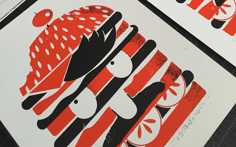
A package series full of character and charisma that can only be driven by a colorful history that informs and guides the design team every step of the way.
Dimensions (Width × Height × Depth)
–
Page Count
–
Paper Stock
–
Number of Colors
1 + 2 foils
Varnishes
–
Binding
–
Typography
Custom Typefaces created for this client:
- The Uncatchable Regular
- Willie Clay Call Regular
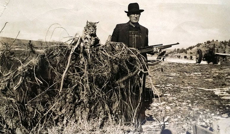
The Reverend Daniel Call, seen here with a wild cat in the late 1800s, taught Jack Daniels the art of distilling and sold him his first still.
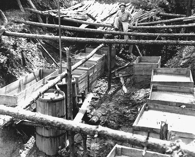
Large underground moonshine still operation. Located in Call Section, Wilkes County, North Carolina, circa 1950.
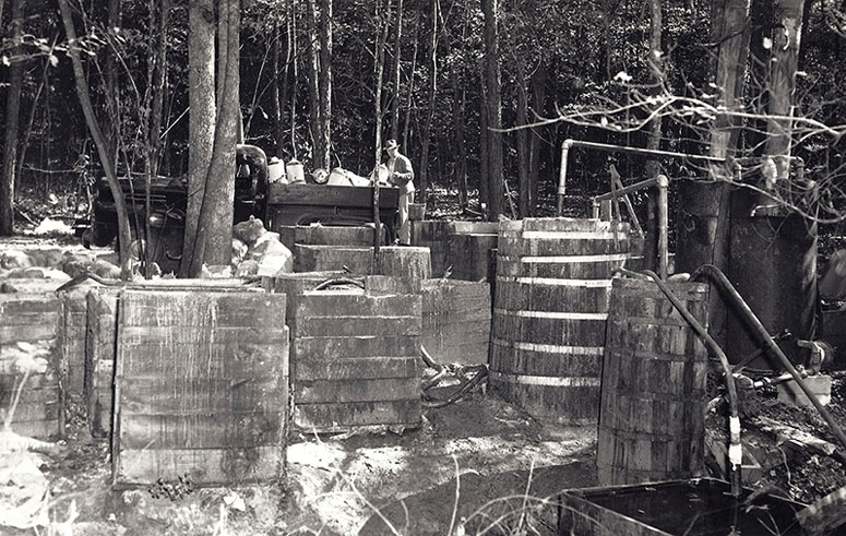
Large steam still operation located in Call’s Section, Wilkes County, North Carolina. Note the open wood fermentation boxes on left and the still, burners, thumper, and condenser on right. The Revenuer in the background looking on to his find.
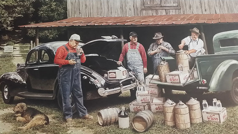
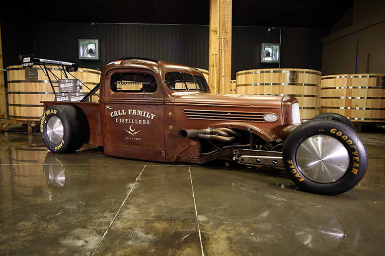
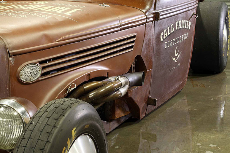
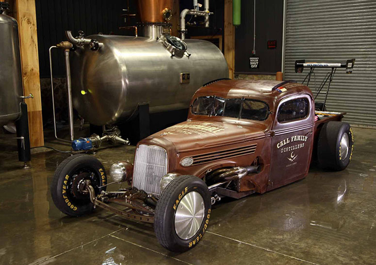
‘Shine & Cars
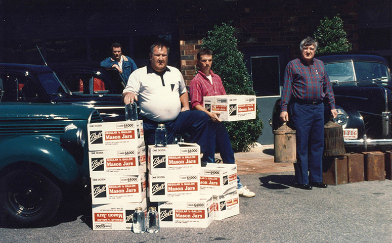
The Call Boys. Brian Call (current Head Distiller) pictured here holding a case of shine
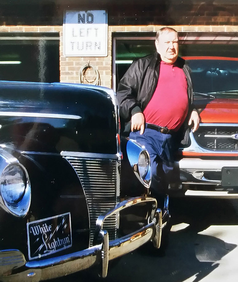
Willie Clay Call, with one of his “White Lightnin” 1940 Fords
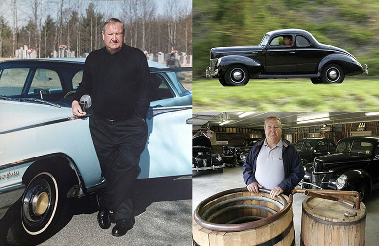
Willie Clay Call, “The Uncatchable”, with an authentic Wilkes County steamer still among his fleet of 1940 Fords in his garage down in Hell’s Half Acres.

Project Description
Call Family Distillers have been expertly distilling and illicitly distributing moonshine for 7 generations: since the 1860s. Their history begins with Reverend Daniel Call, who developed his own brand of whiskey behind the counter of his store and famously taught Jack Daniels the art of distillation. By the 1940s and 50s, the notorious Willie Clay Call was running hundreds of gallons a night in his legendary car without being caught. The Call Family name is well-known in the region and tales of their exploits abound â their domain of Wilkes County, North Carolina is rightly known as the Moonshine Capital of the World.Willie’s grandson, Brian Call, has most recently taken the wheel as the head distiller of Call Family Distilling. He decided to bring his family business into the modern era, finally making their sour mash moonshine available legally. When Brian and his nephew Brad came to us for branding and packaging, we were tasked with paying tribute to 150 years of family moonshining history.
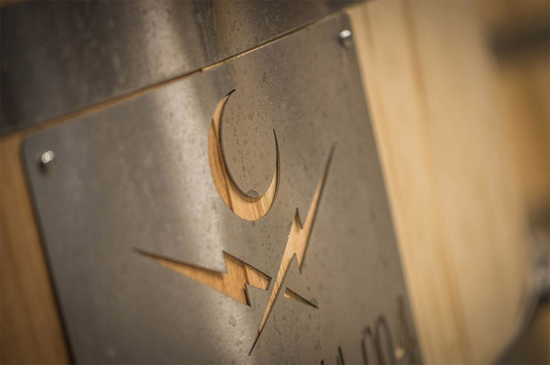
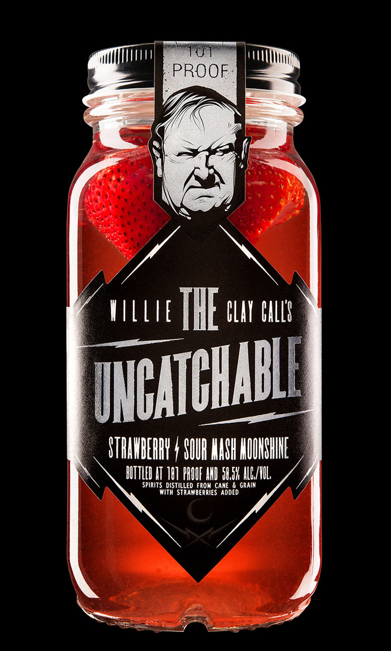
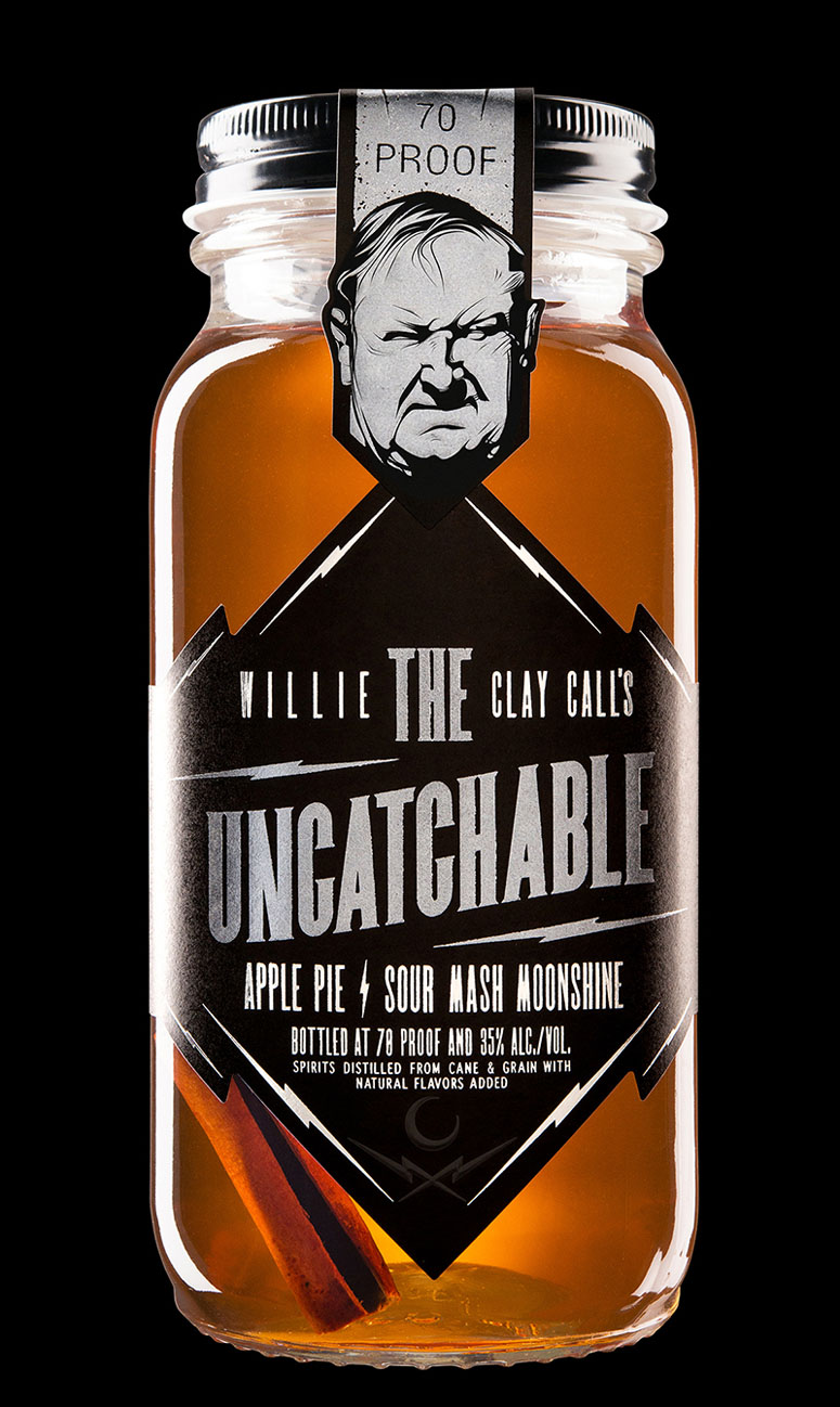
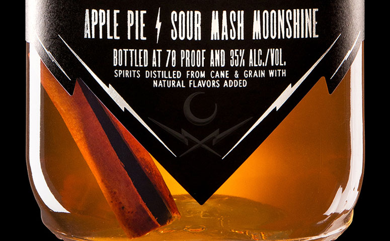
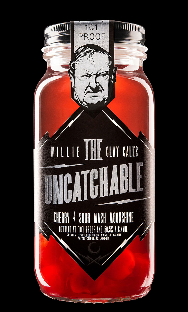
The Call Family brand is headed by a crescent moon, which serves both as a monogram for the Call name, and as a symbol of the family’s long years of running whiskey by moonlight. White bolts cross beneath the moon, an echo of Willie Clay Call’s thunderously loud car, whose vanity plate boasts “White Lightnin’.” The combined shapes of the lightning bolts under the crescent moon recall a skull and crossbones, evoking the illicit and dangerous nature of moonshining, as well as moonshine’s notoriety as a potential poison when not distilled by expert moonshiners.
For the brand personality, we decided to focus on the character of Willie Clay himself, starting with the lineup name: Federal ATF Agents, after countless high-speed chases, gave him the nickname, “Uncatchable.” It seemed fitting to pay tribute to Willie Clay’s trademark speed and stealth, with a nod to the race car culture he and other moonshiners inspired â NASCAR itself was born from these—moonshiner chases in the aftermath of Prohibition.
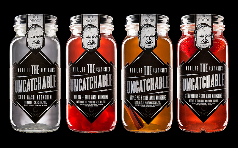
This further inspired us to develop a flexible name system, allowing the core product name to stand alone, while significantly extending on the label as a framing element, as in “Willie Clay Call’s The Uncatchable Apple Pie Sour Mash Moonshine.”
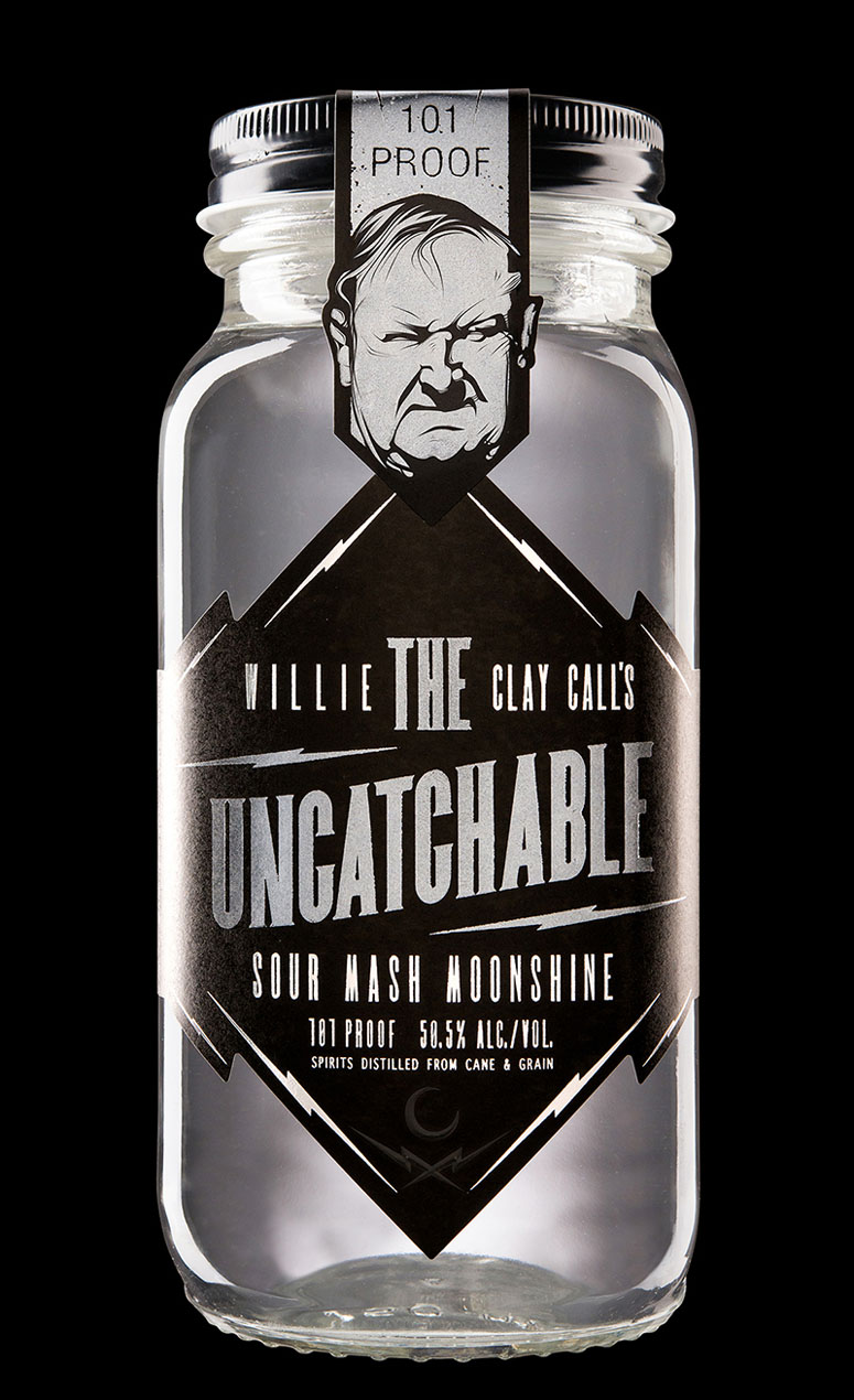
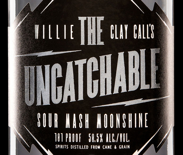
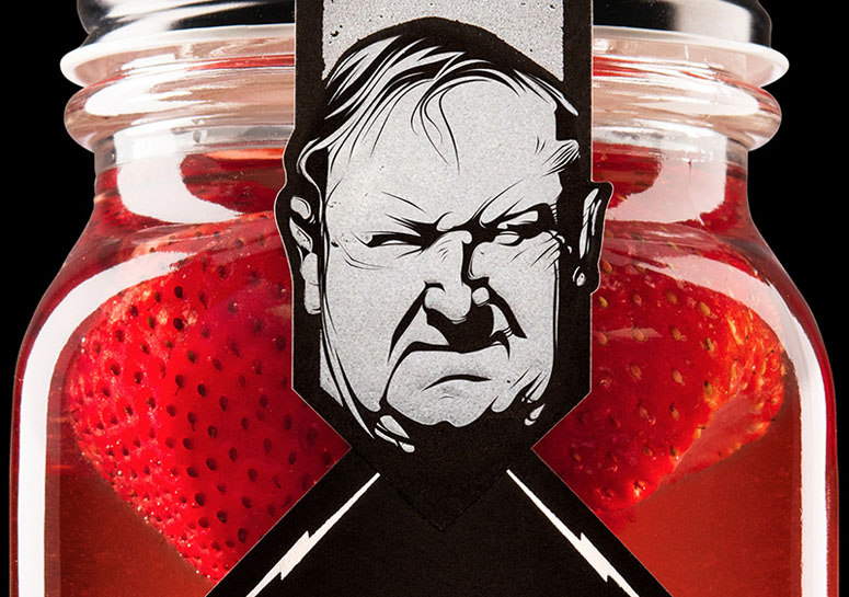
For the packaging, we set our type front-and-center in bright silver foil and pearl white, popping it off the matte black labels. Lightning bolts form the frame and lend their shape to the dieline. An illustrated portrait of Willie Clay Call crests the cap strap, putting the final seal on the mason jar â the same jar of moonshine handed down for 7 generations, now available during daylight hours.
With typography playing a central role in the Call Family brand world, we decided to create two custom fonts: a serif typeface with strong personality for display text, and a sans-serif type suitable for smaller copy. Both are narrow and upright, with strong verticals and tight curves—subtly reminiscent of an oval motor speedway. For “The Uncatchable Regular,” we designed serifs with sharp diagonals—to match the feel of the lightning bolts.
Production Lesson(s)
We pushed the printer's limits when it came to detailed foil work. In retrospect, we should have dialed that back a bit. The product photos required a bit of touching up in the detailed foil areas of the label.
Post Author

Bryony Gomez-Palacio
Editor of FPO and co-founder of UnderConsideration LLC.
More: Online / On Twitter
Date Published
May 12, 2016
Filed Under
Offset
Packaging
Tagged with
bottle
custom typefaces
foil
packaging


About
FPO (For Print Only), is a division of UnderConsideration, celebrating the reality that print is not dead by showcasing the most compelling printed projects.
FPO uses Fonts.com to render Siseriff and Avenir Next.
FPO is run with Six Apart’s MovableType
All comments, ideas and thoughts on FPO are property of their authors; reproduction without the author’s or FPO’s permission is strictly prohibited
Twitter @ucllc
Sign-up for Mailing List
Mailing list managed by MailChimp
Thanks to our advertisers
About UnderConsideration
UnderConsideration is a graphic design firm generating its own projects, initiatives, and content while taking on limited client work. Run by Bryony Gomez-Palacio and Armin Vit in Bloomington, IN. More…
blogs we publish
Brand New / Displaying opinions and focusing solely on corporate and brand identity work.
Art of the Menu / Cataloguing the underrated creativity of menus from around the world.
Quipsologies / Chronicling the most curious, creative, and notable projects, stories, and events of the graphic design industry on a daily basis.
products we sell
Flaunt: Designing effective, compelling and memorable portfolios of creative work.
Brand New Conference videos / Individual, downloadable videos of every presentation since 2010.
Prints / A variety of posters, the majority from our AIforGA series.
Other / Various one-off products.
events we organize
Brand New Conference / A two-day event on corporate and brand identity with some of today's most active and influential practitioners from around the world.
Brand Nieuwe Conference / Ditto but in Amsterdam.
Austin Initiative for Graphic Awesomeness / A speaker series in Austin, TX, featuring some of the graphic design industry's most awesome people.
also
Favorite Things we've Made / In our capacity as graphic designers.
Projects we've Concluded / Long- and short-lived efforts.
UCllc News / Updates on what's going at the corporate level of UnderConsideration.

Related entries
2017 Brand New Conference Program
Severe(d): A Creepy Poetry Collection by Holly Riordan
Um Caminho para Santiago CD Package and Diary
BOYCO Classpack® Book
Antes de Perder la Esperanza Book