ADV @ UNDERCONSIDERATION Peek here for details
BROWSE
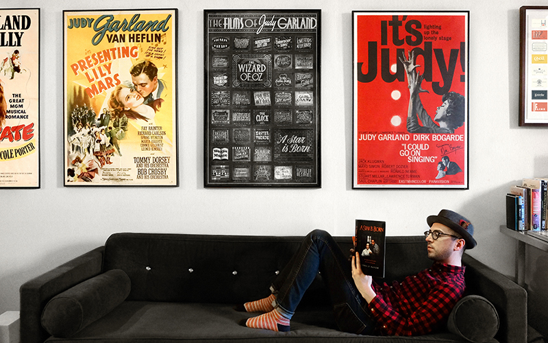
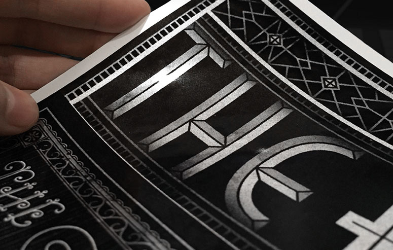
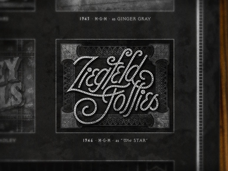
Raphael Geroni had a production goal with this poster and through it all he stuck with it. The result is totally worthwhile—the way the hand-lettering stands out from the metallic paper as a reference to older movies is quite striking.
Dimensions (Width × Height × Depth)
27 × 41 in.
Page Count
–
Paper Stock
Moab Slickrock Metallic Pearl Paper /
Number of Colors
–
Varnishes
–
Binding
–
Typography
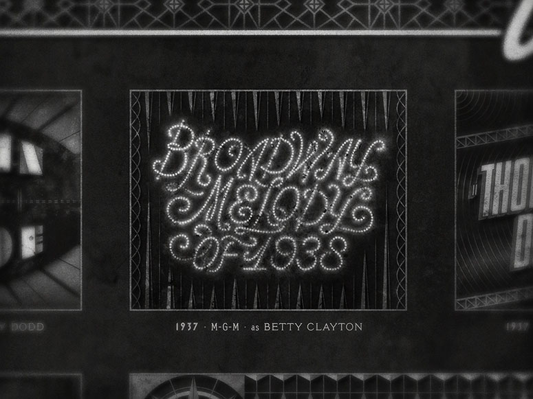
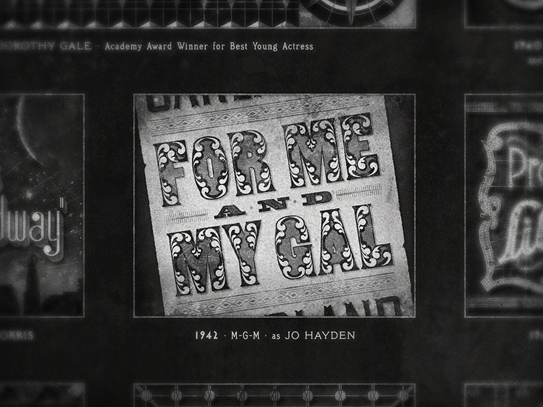
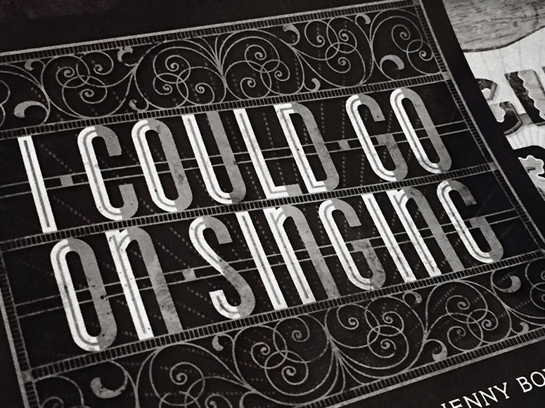
The typeface I used for the captions under each card is set in a font called Meyer Two (misspelling of Louis B. Mayer’s last name intentional) which was one of five fonts that Linotype cut to Mayer’s personal specifications to be used at MGM in their
Project Description
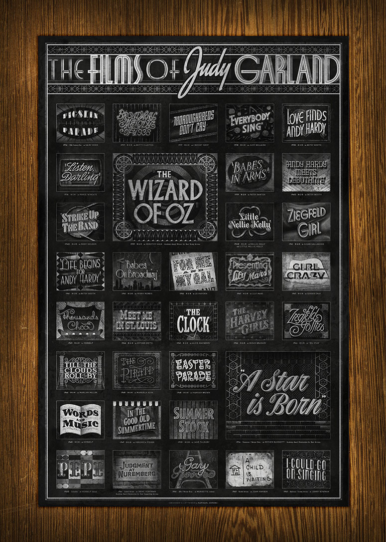
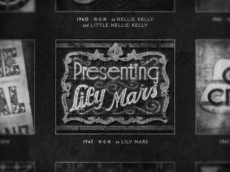
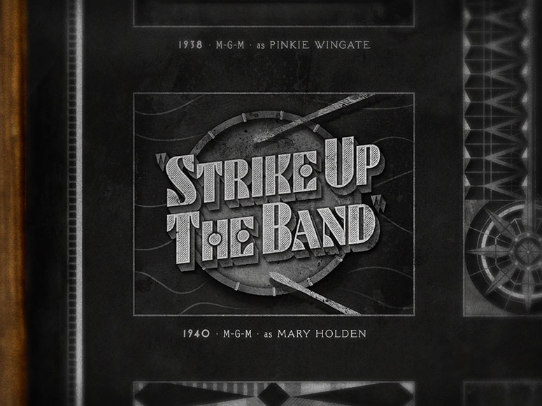
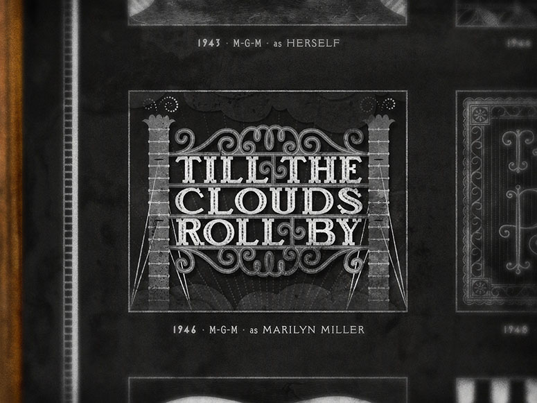
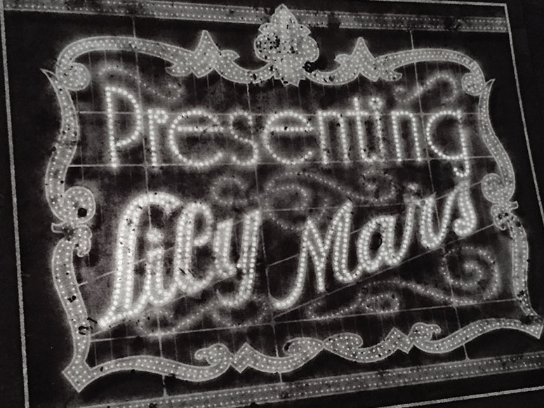
My love for classic films inspired me to design and letter a series of retro title cards for the films starring my favorite actress, Judy Garland, while drawing inspiration from their original titles and the promotional ephemera created for the films.Being a collector and a huge fan of classic movies, I found that the things I couldn’t collect in a tangible way were the artful titles created for some of the most memorable movies of all-time. I thought a great deal about how special title designs are to fans, and about their increased importance because they literally flash before your eyes. Before home video and the internet, the titles could only exist for fans in the form of their memories and revisiting long out-of-print films could be incredibly difficult.
My goal was to document, collect, and present an inspired, cohesive piece that represents a history of movie titles through one actress’s filmography while adding my own design language and take on each film. I wanted a specific history of typography and lettering to live together on a poster in a meaningful way.
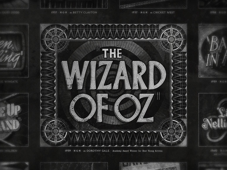
I would watch each film with a sketchbook in hand, decide on my reference, sketch a solid idea, and then jump on the computer and try to finish one title in one sitting. I would try to complete three titles per week so that I wouldn't fuss too much and so that getting 34 titles finished in a few months couldn't turn into a few years! The pieces I created were 4x3 just like the 4:3 aspect ratio of the majority of the films themselves.
I began the project with a series of titles from films that most movie fans would associate with Garland: The Wizard of Oz, Meet Me in St. Louis, and A Star is Born. After those films, I started from the very beginning of her film career in 1936 and continued chronologically until her final acting performance in a film she completed in 1963.
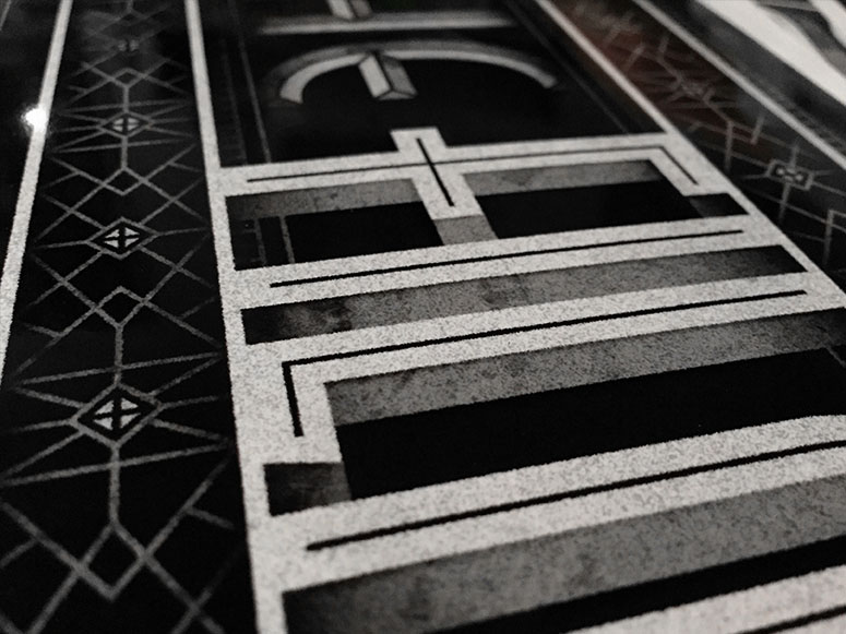
The poster is printed at the original one-sheet poster size (27" x 41") on a beautiful metallic stock that has a filmic quality and might remind you of a vintage silver gelatin portrait you might have received after writing to your favorite MGM star.
Production Lesson(s)
Printing large scale, digitally, on metallic paper paper is incredibly expensive and difficult to find a willing printer! It's easy to find large format printers but very few willing to take the time to do it right and use archival ink. I had wanted to print this piece more simply but when I found a fancy metallic paper all of that disappeared... I made the poster I wanted with the materials I believed could hold up the way I envisioned and it worked but I'm doing something in one spot color on uncoated paper next.
Post Author

Bryony Gomez-Palacio
Editor of FPO and co-founder of UnderConsideration LLC.
More: Online / On Twitter
Date Published
July 5, 2016
Filed Under
Digital
Posters
Tagged with
digital
hand-lettering
metallic paper
Meyer Two
moab
poster
self-promotion


About
FPO (For Print Only), is a division of UnderConsideration, celebrating the reality that print is not dead by showcasing the most compelling printed projects.
FPO uses Fonts.com to render Siseriff and Avenir Next.
FPO is run with Six Apart’s MovableType
All comments, ideas and thoughts on FPO are property of their authors; reproduction without the author’s or FPO’s permission is strictly prohibited
Twitter @ucllc
Sign-up for Mailing List
Mailing list managed by MailChimp
Thanks to our advertisers
About UnderConsideration
UnderConsideration is a graphic design firm generating its own projects, initiatives, and content while taking on limited client work. Run by Bryony Gomez-Palacio and Armin Vit in Bloomington, IN. More…
blogs we publish
Brand New / Displaying opinions and focusing solely on corporate and brand identity work.
Art of the Menu / Cataloguing the underrated creativity of menus from around the world.
Quipsologies / Chronicling the most curious, creative, and notable projects, stories, and events of the graphic design industry on a daily basis.
products we sell
Flaunt: Designing effective, compelling and memorable portfolios of creative work.
Brand New Conference videos / Individual, downloadable videos of every presentation since 2010.
Prints / A variety of posters, the majority from our AIforGA series.
Other / Various one-off products.
events we organize
Brand New Conference / A two-day event on corporate and brand identity with some of today's most active and influential practitioners from around the world.
Brand Nieuwe Conference / Ditto but in Amsterdam.
Austin Initiative for Graphic Awesomeness / A speaker series in Austin, TX, featuring some of the graphic design industry's most awesome people.
also
Favorite Things we've Made / In our capacity as graphic designers.
Projects we've Concluded / Long- and short-lived efforts.
UCllc News / Updates on what's going at the corporate level of UnderConsideration.

Related entries
Black Sheep Studio Business Cards and Promotional Items
E.A.S.E. Stationery Set
“A to Z Letters for Sale” Promo
End of Work iPad and Notebook Cases
CNN Digital New Hire Kit