ADV @ UNDERCONSIDERATION Peek here for details
BROWSE
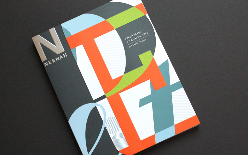
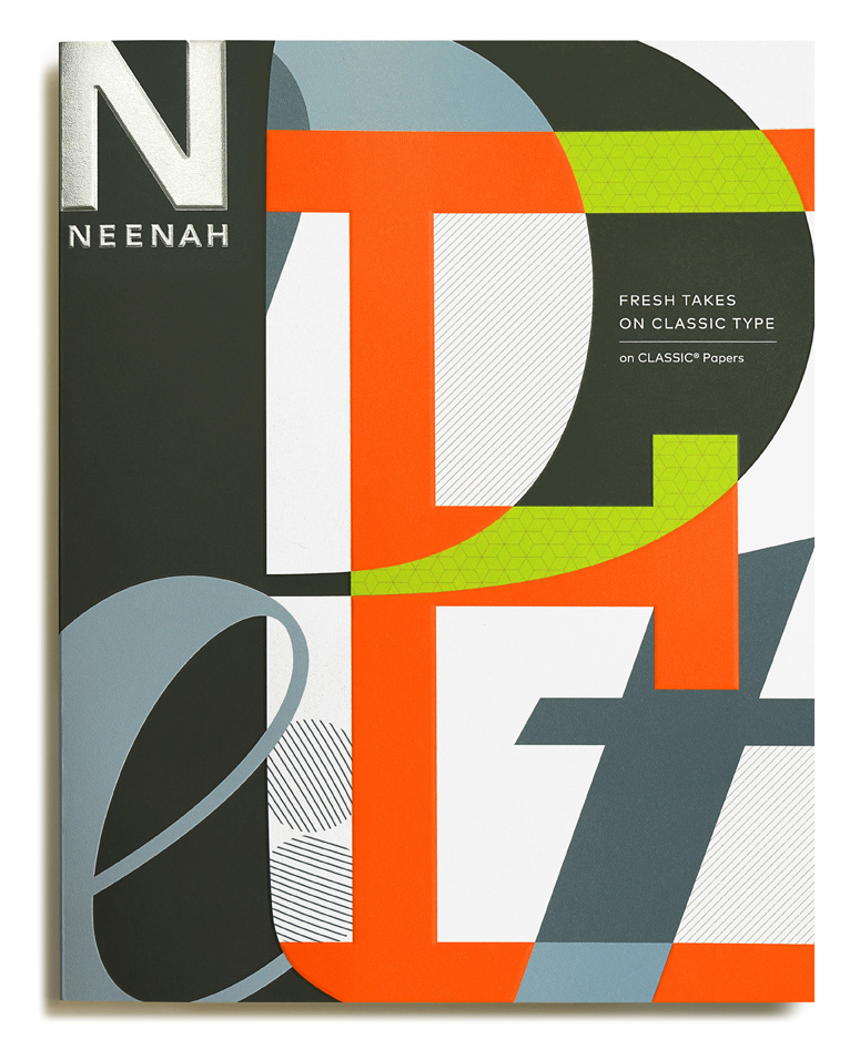
Neenah “Fresh Takes on Classic Type on CLASSIC® Papers” Promo
Production Method
Offset
Design
Willoughby Design
Printing
Independent Printing Company
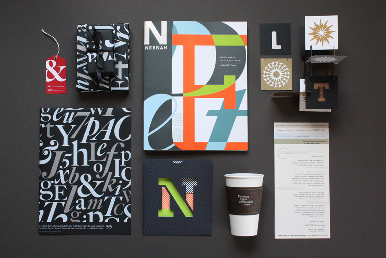
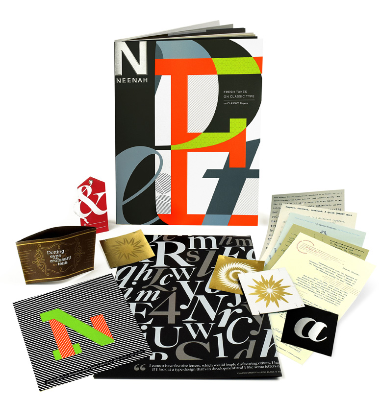
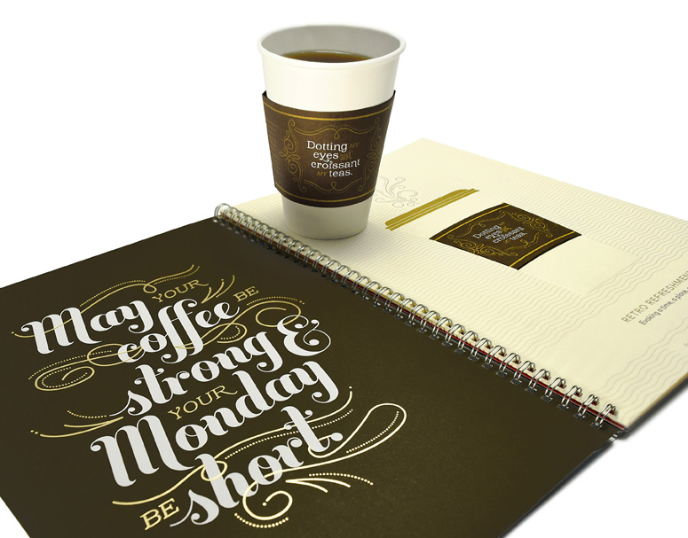
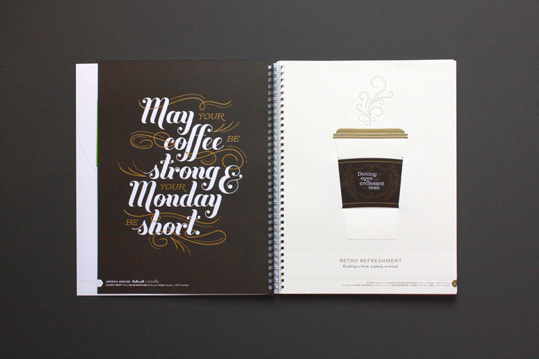
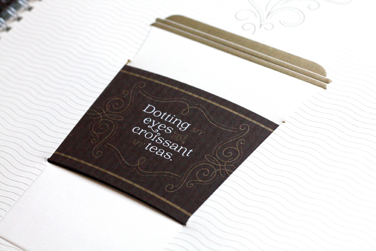
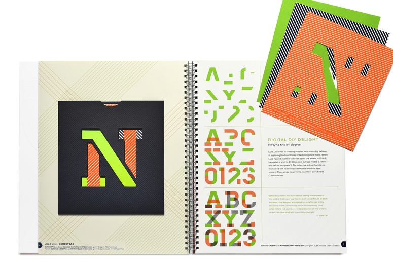
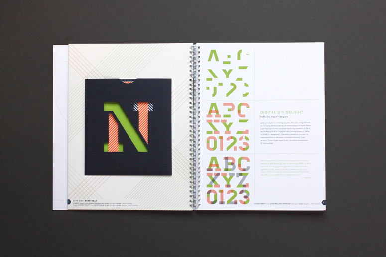
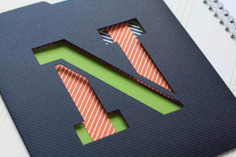
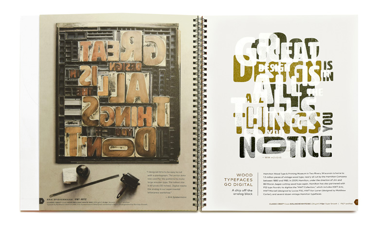
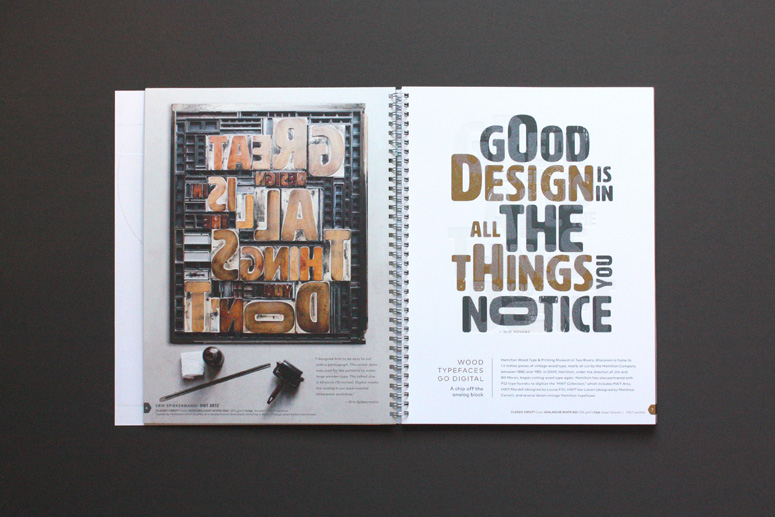
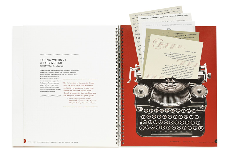
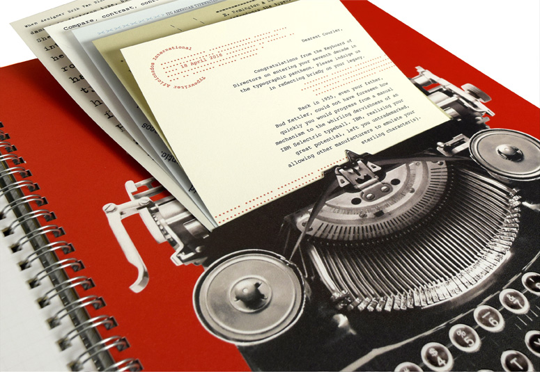
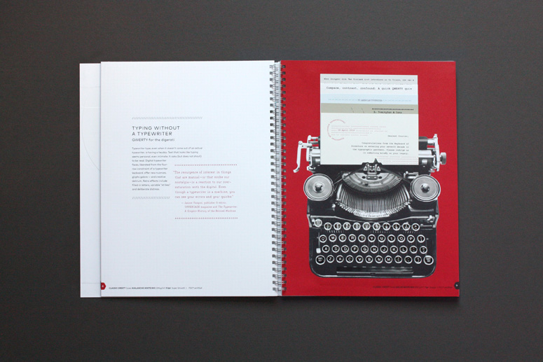
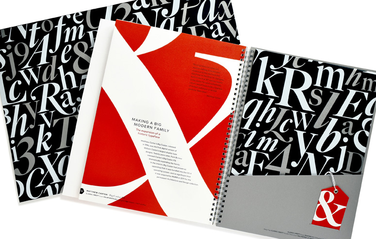
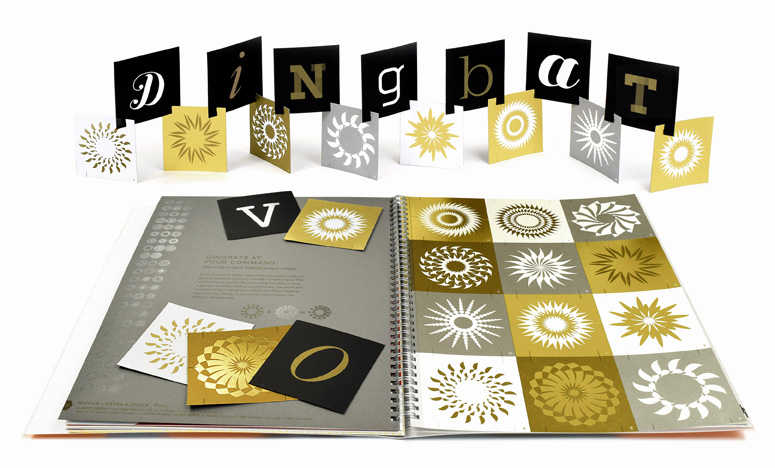
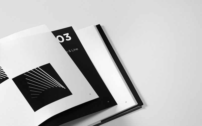
If you like your paper promos with small and big pieces that pull in and out or assemble and disassemble then this latest effort by Neenah will satisfy that craving six times over. To add the opposite of insult to the opposite of injury, the promo focuses on typography and six typefaces are highlighted and used to showcase the different papers with various cutouts and fancy printing techniques. The tactile and visual overload is a treat and, as any good paper promo, the printing processes and papers used are dutifully credited so that you can take these bits of inspiration and make them your own.
Dimensions (Width × Height × Depth)
9.5 in × 12 in
Page Count
16 + Cover
Paper Stock
Various colors and weights from CLASSIC CREST®, CLASSIC® Linen, CLASSIC® Laid, and CLASSIC COLUMNS®
Number of Colors
Tons
Varnishes
–
Binding
Wire-bound
Typography
Buttermilk + Brioche by Jessica Hische
Homestead by Luke Lisi
HWT Artz by Erik Spiekermann
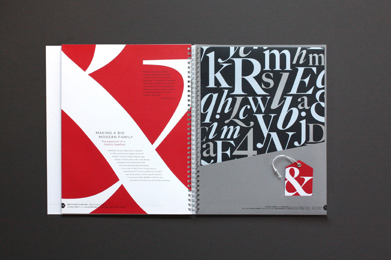
Big Caslon FB by Mathew Carter
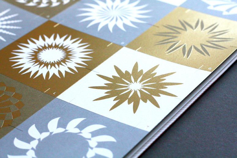
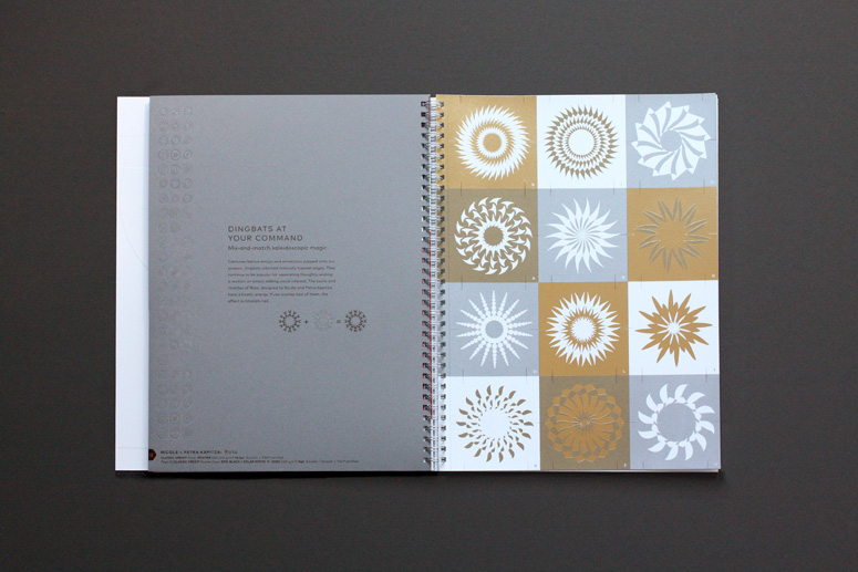
Roto One + Two by Nicole and Petra Katpitza
Project Description
Fresh Takes on Classic Type on CLASSIC® Papers by Neenah [#typelove] is a bold, interactive new promotion designed by Kansas City-based Willoughby Design. The book merges contemporary typefaces and design with the textures of legendary CLASSIC Papers.The 9.5" x 12" book features six French-fold spreads featuring an interactive story crafted specifically for each typeface. The visuals in each story are complemented with an added dimension of textural appeal with all four of the signature Neenah CLASSIC brands: CLASSIC CREST®, CLASSIC® Linen, CLASSIC® Laid, and CLASSIC COLUMNS® Papers.
Each spread contains a pull out, pop up, or put-it-together piece to help tell the story, and a quote from each typeface creator.
Production Lesson(s)
The project was a true collaboration between the Willoughby team, writer Alyson Kuhn, Neenah, the featured type designers and Independent Printing Co. Inc. In less than 20 years digital technology has transformed the way designers, typesetters and printers work, blurring the lines between digital and analog. This book celebrates the expanded possibilities for merging print and pixels.
Post Author

Armin Vit
Editor of FPO and co-founder of UnderConsideration LLC.
More: Online / On Twitter
Date Published
October 26, 2016
Filed Under
Brochures
Offset
Tagged with
neenah
neenah classic crest
paper promotion


About
FPO (For Print Only), is a division of UnderConsideration, celebrating the reality that print is not dead by showcasing the most compelling printed projects.
FPO uses Fonts.com to render Siseriff and Avenir Next.
FPO is run with Six Apart’s MovableType
All comments, ideas and thoughts on FPO are property of their authors; reproduction without the author’s or FPO’s permission is strictly prohibited
Twitter @ucllc
Sign-up for Mailing List
Mailing list managed by MailChimp
Thanks to our advertisers
About UnderConsideration
UnderConsideration is a graphic design firm generating its own projects, initiatives, and content while taking on limited client work. Run by Bryony Gomez-Palacio and Armin Vit in Bloomington, IN. More…
blogs we publish
Brand New / Displaying opinions and focusing solely on corporate and brand identity work.
Art of the Menu / Cataloguing the underrated creativity of menus from around the world.
Quipsologies / Chronicling the most curious, creative, and notable projects, stories, and events of the graphic design industry on a daily basis.
products we sell
Flaunt: Designing effective, compelling and memorable portfolios of creative work.
Brand New Conference videos / Individual, downloadable videos of every presentation since 2010.
Prints / A variety of posters, the majority from our AIforGA series.
Other / Various one-off products.
events we organize
Brand New Conference / A two-day event on corporate and brand identity with some of today's most active and influential practitioners from around the world.
Brand Nieuwe Conference / Ditto but in Amsterdam.
Austin Initiative for Graphic Awesomeness / A speaker series in Austin, TX, featuring some of the graphic design industry's most awesome people.
also
Favorite Things we've Made / In our capacity as graphic designers.
Projects we've Concluded / Long- and short-lived efforts.
UCllc News / Updates on what's going at the corporate level of UnderConsideration.

Related entries
2017 Brand New Conference Program
Severe(d): A Creepy Poetry Collection by Holly Riordan
Um Caminho para Santiago CD Package and Diary
BOYCO Classpack® Book
Antes de Perder la Esperanza Book