ADV @ UNDERCONSIDERATION Peek here for details
BROWSE
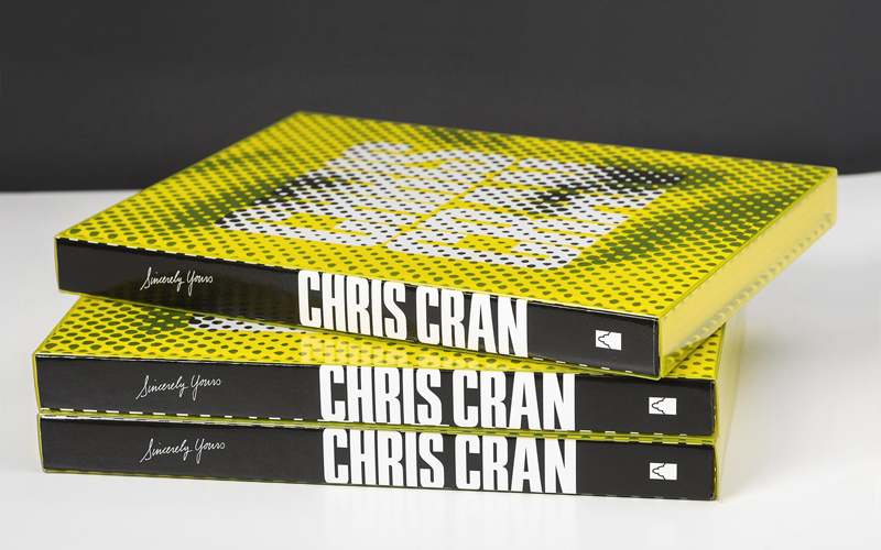
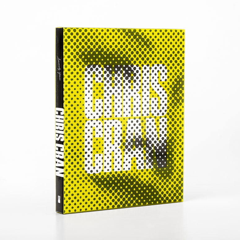
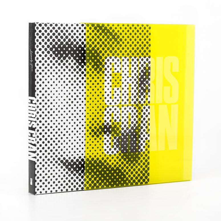
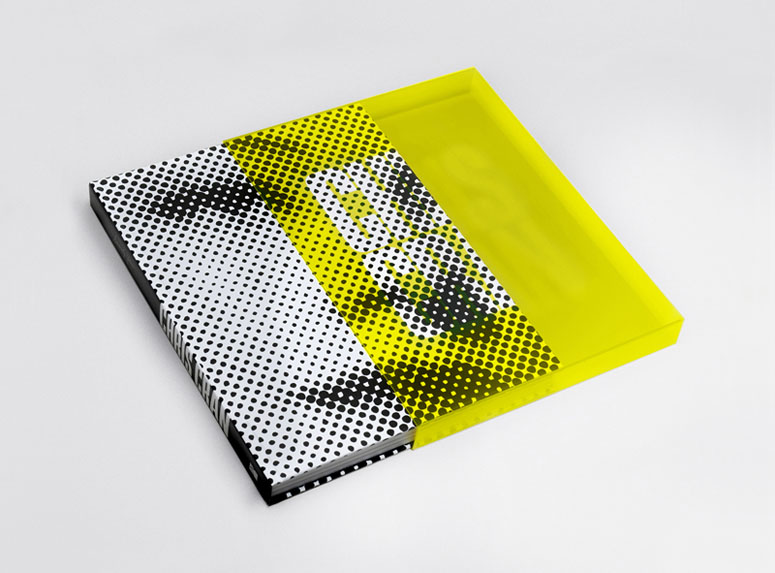
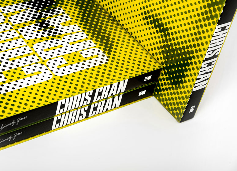
Chris Cran, Sincerely Yours Book
Production Method
Offset
Design
National Gallery of Canada
Designer: Stefan Canuel
Chief Publications and Copyright: Ivan Parisien
English Editor: Caroline Wetherilt
French Editor: Marie Christine Gilbert
Production Manager: Anne Tessier
Production Artist: Natalie Ann Garneau
Printing
Flash reproductions
Translating the work of an artist, and a show of his work, into a book is an art form in its self. The need to carefully balance the art itself with the artists vision, the visitors interpretation, and a level of interaction all come into play.
Client
National Gallery of Canada
Quantity Produced
1700
Production Cost
$35.00 each
Production Time
6 months
Dimensions (Width × Height × Depth)
–
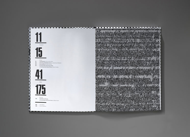
Page Count
204
Paper Stock
105 T Matte
Number of Colors
4 Color Process + Pantone Yellow for Sleeve
Varnishes
Thick Spot UV coating
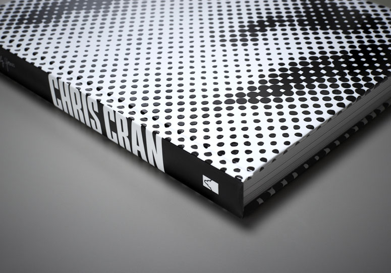
Binding
Casebound
Typography
Press Gothic
Sina
Project Description
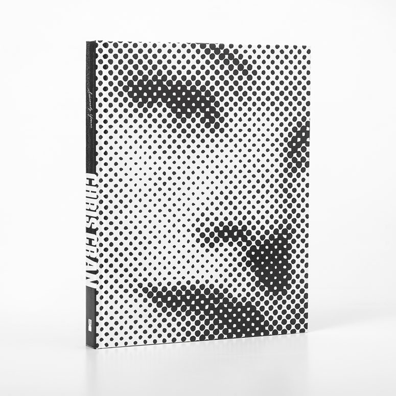
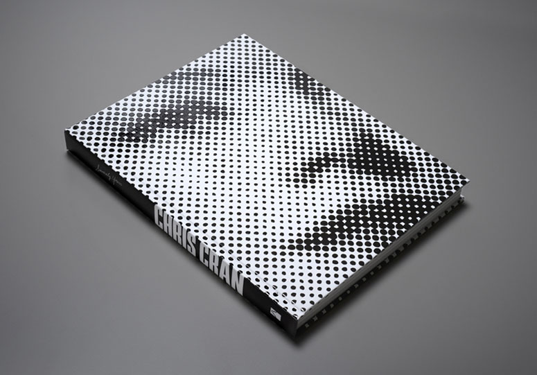
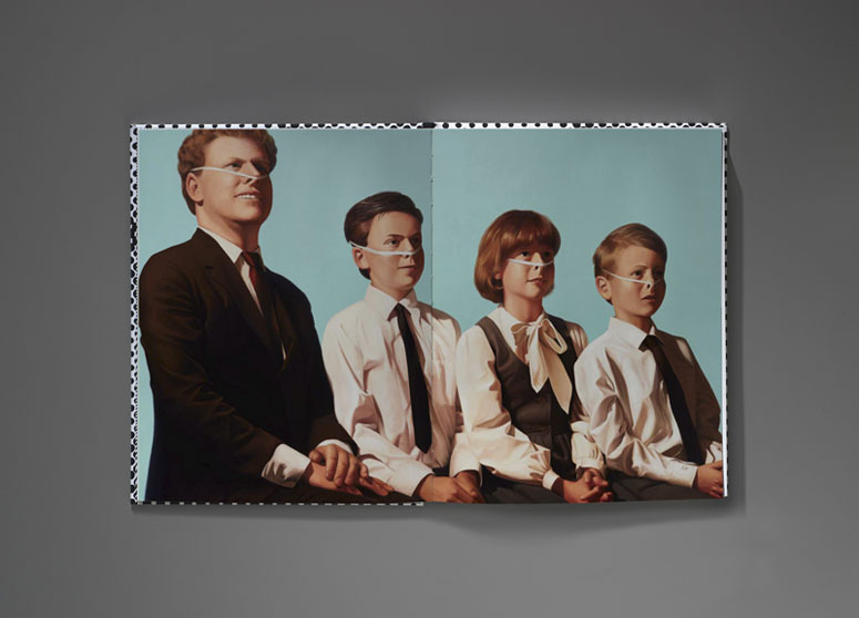
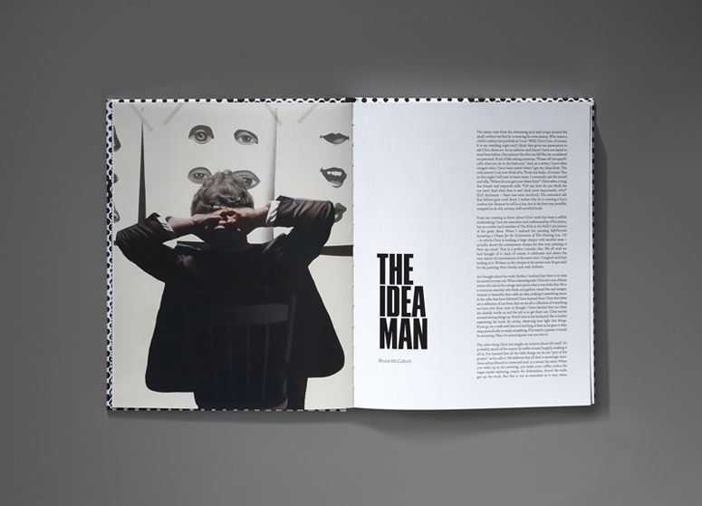
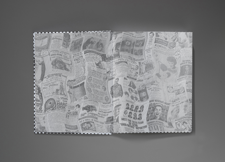
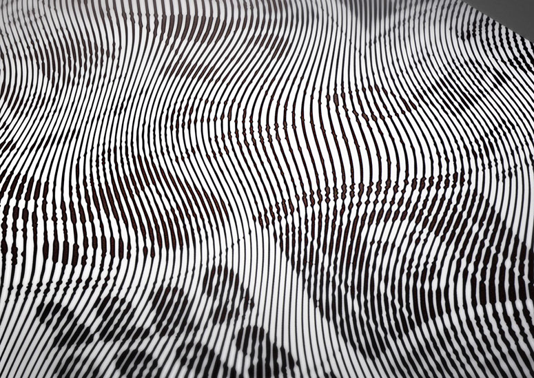
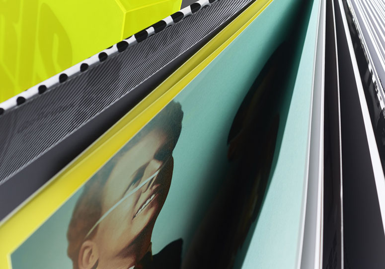
It was essential that the design of this book be sympathetic to the work of this contemporary artist. The halftone dot was chosen as an approach for the cover as this technique has been one constant in the artist’s multifaceted career. The yellow colour sleeve was incorporated as a way to reference the many layers in this artist’s practice, and the use of one of the Chorus faces on the cover was a humorous nod to the visitor experience. A selection of Chorus works were also used throughout the catalogue as dividers between sections. The endpapers was a great concept collaboration between the artist and I to create a unique piece, which brought a personal touch to the book. A spot-UV varnish was used on the cover to give the image a three-dimensional quality similar to his works.Production Lesson(s)
Working with an artist on a book can be a challenge. It is crucial that an artist’s work is respected, yet at the same time it is important to add another dimension to give depth and autonomy to the final product. Because the image on the front cover of this catalogue is an altered version of the original artwork, I had to assure the artist that this would be the best approach. It was important to relate to him the value in making a book that would be an object in its own right. Altering, cropping and overlapping text is always a potential issue when working on art publications.
Post Author

Bryony Gomez-Palacio
Editor of FPO and co-founder of UnderConsideration LLC.
More: Online / On Twitter
Date Published
July 18, 2017
Filed Under
Books
Offset
Tagged with
book
casebound
CMYK
offset
PMS
Press Gothic
Sina
Thick Spot UV coating


About
FPO (For Print Only), is a division of UnderConsideration, celebrating the reality that print is not dead by showcasing the most compelling printed projects.
FPO uses Fonts.com to render Siseriff and Avenir Next.
FPO is run with Six Apart’s MovableType
All comments, ideas and thoughts on FPO are property of their authors; reproduction without the author’s or FPO’s permission is strictly prohibited
Twitter @ucllc
Sign-up for Mailing List
Mailing list managed by MailChimp
Thanks to our advertisers
About UnderConsideration
UnderConsideration is a graphic design firm generating its own projects, initiatives, and content while taking on limited client work. Run by Bryony Gomez-Palacio and Armin Vit in Bloomington, IN. More…
blogs we publish
Brand New / Displaying opinions and focusing solely on corporate and brand identity work.
Art of the Menu / Cataloguing the underrated creativity of menus from around the world.
Quipsologies / Chronicling the most curious, creative, and notable projects, stories, and events of the graphic design industry on a daily basis.
products we sell
Flaunt: Designing effective, compelling and memorable portfolios of creative work.
Brand New Conference videos / Individual, downloadable videos of every presentation since 2010.
Prints / A variety of posters, the majority from our AIforGA series.
Other / Various one-off products.
events we organize
Brand New Conference / A two-day event on corporate and brand identity with some of today's most active and influential practitioners from around the world.
Brand Nieuwe Conference / Ditto but in Amsterdam.
Austin Initiative for Graphic Awesomeness / A speaker series in Austin, TX, featuring some of the graphic design industry's most awesome people.
also
Favorite Things we've Made / In our capacity as graphic designers.
Projects we've Concluded / Long- and short-lived efforts.
UCllc News / Updates on what's going at the corporate level of UnderConsideration.

Related entries
2017 Brand New Conference Program
Severe(d): A Creepy Poetry Collection by Holly Riordan
Um Caminho para Santiago CD Package and Diary
BOYCO Classpack® Book
Antes de Perder la Esperanza Book