Speak UpA Former Division of UnderConsideration
The Archives, August 2002 – April 2009
advertise @ underconsideration
---Click here for full archive list or browse below
  
Design’s Top 100

In the upcoming days I will move this whole post to a new, more roomy, page. Where everybody can frolic and submit more great design.

Film has the AFI’s Top 100 movies. The top 100 Novels are ranked by the Modern library. Who do we turn to to establish the one hundred best examples of Graphic Design? The AIGA? I wouldn’t trust them to come up with an unbiased list. HOW? Print? Eye? Not really. But I don’t think anybody has the guts to say “This is the best example of Design ever made” Since we have nothing to lose we will attempt to do so.

So I think we [designers] should come up with said list. This is going to be a rather ambicious project. The intention is to gather “nominations” of the best Graphic Design ever done. After we feel we have received enough entries we will, somehow, arrange them for you to vote on the top 25 or 50.

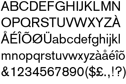
Nominations should be very focused. Every piece needs to achieve all the goals that Graphic Design strives for. Form. Content. Solution. Concept. Transcendence.

All images should be placed in the comments window. Look at the first comment for info on how to post images. Please read this for a few considerations on submitting images.

Note: This NOT a design contest. No awards or prizes will be given to anybody.

Maintained through our ADV @ UnderConsideration Program
ENTRY DETAILS
ARCHIVE ID 1313 FILED UNDER Critique
PUBLISHED ON Dec.01.2002 BY Armin
WITH COMMENTS
Comments
Armin’s comment is:

Please use the code below to display images, simply copy and paste it in the comments window, then replace the URL with an absolute path to an image.

<img src="http://www.yoursite.com/image.gif">

If you see an image on the web, click and hold your mouse over it, until a menu pops up, select Open image in new window. This will provide you with an absolute path for that image.

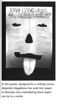
Please try to provide an image source, it will make it more simple for us to track the submissions. Try to find images from the web preferrably. If not take a screenshot, scan a book or a magazine. Worst case scenario, describe the piece and we will try to find it.

On Dec.01.2002 at 03:49 PM
Armin’s comment is:

I will start this of with one of my favorite posters of all time.

On Dec.01.2002 at 04:50 PM
Jon’s comment is:

Well, the Nutrition Facts Food Label isn't the prettiest thing ever designed, but in pure functionality it's a great piece of information design. We take it all for granted, but after living in Europe for 6 months a few years ago and realizing how hard it was to know what was in something, I definitely appreciated it.

(Sorry, couldn't find a pure image link, so I linked to the label's web page guidelines.)

On Dec.01.2002 at 10:40 PM
KM’s comment is:

I feel this is the best CD package design of all time. Skeleton Key "Fantastic Spikes Through Balloon" designed by Sagmeister Inc. I am sure you have seen it.

On Dec.01.2002 at 10:50 PM
Darrel’s comment is:

Isn't this sort of like determining the best 100 'writings' of all time?

'Graphic Design' is such a broad term that I'm not sure if anyone could narrow it down to 100 pieces without some sort of tangible sub-categorization (100 best posters, 100 best CD covers, etc.).

On Dec.02.2002 at 09:41 AM
Armin’s comment is:

>Isn't this sort of like determining the best 100 'writings' of all time?

Darrel, look at it like a Best of Show at a Dog contest. You have terriers competing against poodles, but it all works out. So just submit something ; )

On Dec.02.2002 at 10:37 AM
Tom’s comment is:

The first printed piece of design from western civilization that still drives the proportional composition for page layout today. The Guttenburg Bible

On Dec.02.2002 at 10:53 AM
Armin’s comment is:

It doesn't get any more influential than this:

Milton Glaser's I (heart) NY

This Paula Scher poster is not one of my favorites, but it's quite emblematic and memorable.

On Dec.02.2002 at 12:14 PM
Tom’s comment is:

A breakthrough in poster design. In 1905, Lucian Bernhard at the age of 18 establishes the approach of using simple images and text.

On Dec.02.2002 at 12:47 PM
KM’s comment is:

This is the state's anti-litter campaign. Bet you didn't know that. It's been used very much the same way as the I (heart) NY, for the Lone Star State.

On Dec.02.2002 at 01:59 PM
Jon’s comment is:

Those Paula Scher/Public theater posters really impacted the way Broadway theater presented itself. They were very typographically-driven and relied on wood-type forms instead of classical serif faces. As is the standard when something new is introduced, the design style was quickly accepted and 'borrowed' for other plays and musicals, so much so, that after a few years she actually flipped the concept to image-driven posters with serif type.

I imagine myself looking back on old CA design annuals and still loving these posters 20 years from now.

On Dec.02.2002 at 03:07 PM
Armin’s comment is:

On Dec.02.2002 at 03:39 PM
Armin’s comment is:

Whether you hate him or not, Carson probably deserves a spot.

On Dec.02.2002 at 03:47 PM
Jon’s comment is:

Are we nominating people or actual specific designs? RayGun magazine, with Carson as designer, definitely deserves a nom. I'm not sure he's done much since that's truly affected the profession, though.

On Dec.02.2002 at 04:57 PM
Armin’s comment is:

>Are we nominating people or actual specific designs?

Preferably designs. But sometimes it's hard to find the actual piece. If you can't find the piece you want just say the name and describe the piece.

At this point let's just bring in as much names/designs as possible.

For example, I want to put something by Ed Fella, but I can't find any good images of some of his best work.

On Dec.02.2002 at 04:59 PM
GW’s comment is:

On Dec.03.2002 at 12:01 AM
Armin’s comment is:

Nest magazine has pushed the conventions of editorial design since issue #1.

But my favorite of all is this one

On Dec.03.2002 at 09:36 AM
Matt’s comment is:

Otto Storch/McCall's:

On Dec.03.2002 at 10:28 AM
Thomas Shebest’s comment is:

This Poster designed by Armin Hoffman is one of my favorites.

On Dec.03.2002 at 10:32 AM
Thomas Shebest’s comment is:

I don't know if typefaces are within the scope of this list but here are two that I think deserve mention.

Univers

Berthold Akzidenz-Grotesk

On Dec.03.2002 at 10:52 AM
Tom’s comment is:

> I don't know if typefaces are within the scope of this list but here are two that I think deserve mention.

On Dec.03.2002 at 10:58 AM
Tom’s comment is:

Herbert Matter's Swiss Tourism posters 1934

On Dec.03.2002 at 11:43 AM
Armin’s comment is:

Tom, great posters yo!

And yes, a few typefaces should be included.

>This Poster designed by Armin Hoffman is one of my favorites.

One of my all-time favorites too. I was exposed to Hoffman's work very early, mainly because we share the same, odd, name.

On Dec.03.2002 at 11:50 AM
Jose Luis’s comment is:

Tom's post made me think of this

paula scher, swatch poster, 1985

On Dec.03.2002 at 11:51 AM
Darrel’s comment is:

Yea...I'd have to agree that a complete set of Univers is pretty much all a designer needs. Good nomination.

On Dec.03.2002 at 01:52 PM
Armin’s comment is:

>Tom's post made me think of this

wow... rip-off or tribute?

On Dec.03.2002 at 02:06 PM
Jose Luis’s comment is:

quoted from an article on plagiarism on gunnarswanson.com

"There was quite a bit of complaint about Paula Scher’s Swatch ads, based on Herbert Matter’s 1930s Swiss tourism posters, as examples of plagiarism. The claim was that confusion was created over authorship. My assumption has always been that Scher assumed that either people would recognize Matter in the ads, know that that work was from before Scher’s time, and know that Matter had died before the ads were produced, or they were outside the world that cared to make judgments about authorship and thus it wasn’t important. While some considered the Matter + Scher attribution deception, I saw it as an homage combined with a joke. (The fact that Sher had permission from Mercedes Matter, Herbert Matter’s widow, and paid a royalty for the use of the form removes any “property rights” arguments from this discussion.)"

I tend to agree with the view

On Dec.03.2002 at 02:17 PM
GW’s comment is:

Susan Kare's user interface graphic

{Form. Content. Solution. Concept. Transcendence.}

On Dec.03.2002 at 02:24 PM
Tom’s comment is:

So many of the over 500 album covers Reid Miles designed for Blue Note could be in this category, but this is a classic.

Also, I have always loved this logo.

On Dec.03.2002 at 03:01 PM
Thomas Shebest’s comment is:

Armin, I almost didn't notice your post of Paul Rand's alternate IBM logo. Great choice. I so wish IBM had chosen that logo.

On Dec.03.2002 at 03:23 PM
pnk’s comment is:

Don't forget Saul Bass and his incredible work in movie titles! There are tons of great ones (North By Northwest, Anatomy of a Murder, The Man with the Golden Arm, and Casino, to name but a few!), but my personal favorite has always been the opening sequence in Psycho.

On Dec.03.2002 at 03:28 PM
Jose Luis’s comment is:

Maybe for pure sentimental reasons but this would definetly

be on my top 10

by Lance Wyman

On Dec.03.2002 at 04:33 PM
Armin’s comment is:

>Paul Rand's alternate IBM logo. Great choice.

So simple, isn't it? And I've been trying to find all day long a version Rick Valicenti did of that same logo but it's all in 3D, it is quite something too.

>Maybe for pure sentimental reasons

Maybe? c'mon! seriously, it's a bad-ass logo WWFT could only dream of doing something like this. I mention WWFT, 'cause some of their logos try to be retro like that.

The blue note logo is great! it's what the blues are about.

>Susan Kare's user interface graphic

Excellent selection. I would add to that all the original Mac icons.

On Dec.03.2002 at 04:40 PM
Armin’s comment is:

Thanks to everybody who has submitted so far. This is going great. Let's keep it rolling. Need some motivation?

Here is a note from Bill Cahan regarding this Top 100 thing:

"hey armin--

i like what you're doing--

you should probably produce a book if the work gets interesting enough--(i'm sure that is what you intend to do)

good luck on this venture--maybe princeton architectural press would be interested in helping you on it--although if you end up designing the book, would be nice to keep the work as the main event--

best,

bill"

I'm serious when I say this: Everything that is going on in this small window will become bigger, better and tastier. It won's stay here forever. I have big plans for it, and that email just got me pumped. So let's keep the great design coming.

'Tis only the beginning.

On Dec.03.2002 at 04:47 PM
Armin’s comment is:

Two pieces by Shockmeister:

And I'm debating whether the beheaded chicken deserves a spot or not.

On Dec.03.2002 at 05:44 PM
Armin’s comment is:

Too bold to overlook

On Dec.03.2002 at 06:04 PM
Tom’s comment is:

Lester Beall

On Dec.03.2002 at 09:13 PM
Grant Hutchinson’s comment is:

This series of ads has always made me smile and then wonder how this amount of marketing chutzpah got out the door in the first place. More here.

On Dec.04.2002 at 10:07 AM
Grant Hutchinson’s comment is:

So simple, isn't it? And I've been trying to find all day long a version Rick Valicenti did of that same logo but it's all in 3D, it is quite something too.

Armin, I didn't have any luck locating that particular version of the IBM logo either, but I did find this historical archive of IBM logos in case you're interested.

On Dec.04.2002 at 10:32 AM
Kiran Max Weber’s comment is:

Along with GW's excellent recommendation of Susan Kare's user interface graphic, I think Apple's 1977 logo by Rob Janoff should probably be included.

Read about it at Steven Weyhrich's informative website.

On Dec.04.2002 at 11:17 AM
KM’s comment is:

Tokyo Salamander by Vaughan Oliver and Shinro Ohtake

On Dec.04.2002 at 11:28 AM
KM’s comment is:

I can't believe I didn't post this earlier and that no one has either.

Mr. Kalman's Colors:

On Dec.04.2002 at 11:33 AM
Armin’s comment is:

>I can't believe I didn't post this earlier and that no one has either. Mr. Kalman's Colors:

Damn it! you beat me to it. I was gonna post that today, but I had to do some actual work rather than post comments.

> historical archive of IBM logos

Great page. That first logo, at the top, is awesome.

On Dec.04.2002 at 11:41 AM
Kiran Max Weber’s comment is:

Ditto for Colors.

James Montgomery Flagg's 1917 poster is probably the most famous American poster.

In my opinion, along with Lester Beall's posters, Jean Carlu's 1942 poster for the Division of Information for the Office for Emergency Management is one of the most striking posters that was ever produced.

On Dec.04.2002 at 11:45 AM
Tom’s comment is:

> James Montgomery Flagg's 1917 poster is probably the most famous American poster.

On Dec.04.2002 at 12:38 PM
Kevin’s comment is:

There seems to be a definitive American/British slant to this collection, what about the amazing work from eastern Europe and the Russian Avant-Garde. Rodchenko, for example

On Dec.04.2002 at 12:51 PM
Kevin’s comment is:

Otto Neurath's development of Isotype:

On Dec.04.2002 at 12:58 PM
Kevin’s comment is:

And Quentin Fiore's work which I found on the same page. To me the work Fiore did for Marshall Mcluhan and Buckminster Fuller is a radical example of breaking the often sterile boundaries of academia, and a stellar integration of form and content.

On Dec.04.2002 at 01:06 PM
Kiran Max Weber’s comment is:

Right on Tom. Great poster Kevin.

"Probably the best statistical graphic ever drawn, this map by Charles Joseph Minard portrays the losses suffered by Napoleon's army in the Russian campaign of 1812. Beginning at the Polish-Russian border, the thick band shows the size of the army at each position. The path of Napoleon's retreat from Moscow in the bitterly cold winter is depicted by the dark lower band, which is tied to temperature and time scales."

Edward Tufte

On Dec.04.2002 at 03:03 PM
Armin’s comment is:

I think some people are fed up about everybody raving about this, but there's a reason for that. Kyle Cooper's "Se7en" titles.

On Dec.04.2002 at 03:46 PM
Jon Parker’s comment is:

Iconic. Effective. Evocative. And cheap!

(Although it is now equally evocative of capitalism run rampant as it is of sporting equipment.)

On Dec.04.2002 at 05:05 PM
Jon’s comment is:

I was trying to find more, but this'll do for Wolfgang Weingart.

On Dec.04.2002 at 10:36 PM
Matt Wright’s comment is:

Amazing.

On Dec.04.2002 at 11:58 PM
GW’s comment is:

On Dec.05.2002 at 12:33 AM
Tom’s comment is:

I think these 2 influenced the graphic design community for years

- and still do.

Designed by Peter Blake

Designed by Richard Hamilton

Each of the original copies were individually numbered

in the lower right corner.

On Dec.05.2002 at 08:30 AM
Armin’s comment is:

Jon Parker's Nike submission made me think. Yes, Corporate (read: capitalist) America, sucks, but there is something to be said for large corporations' brands. They need to be recognizable world-wide and must widthstand through the thousands of applications that they are used for. So, here are a few marks I consider to be effective and memorable.

Tom, those CD covers are excellent examples. Specially the "White" Beatles CD. And well, how many times has Sgt. Pepper been parodied?

On Dec.05.2002 at 09:10 AM
Jon’s comment is:

how many times has Sgt. Pepper been parodied?

How many times has that AT&T logo been (unironically) parodied? There's such a lack of imagination in corporate land sometimes.

On Dec.05.2002 at 10:37 AM
Darrel’s comment is:

I always see the AT&T logo as the Death Star.

Maybe that's just me.

On Dec.05.2002 at 11:23 AM
KM’s comment is:

I always see the AT&T logo as the Death Star.

I can see that... : )

On Dec.05.2002 at 03:53 PM
Jon’s comment is:

I always see the AT&T logo as the Death Star.

I believe they actually call it that internally. GE calls their logo the GE Meatball.

On Dec.05.2002 at 04:19 PM
Armin’s comment is:

This collaboration between Rick Valicenti with John Maeda produced one of the best paper promotions ever. For Gilbert Papers:

On Dec.06.2002 at 09:04 AM
dawn’s comment is:

the stenberg brothers are tops on my list. they can't be missed!

On Dec.06.2002 at 01:06 PM
Grant Hutchinson’s comment is:

Not that the use of translucent plastics in consumer devices was anything new when the original iMac was launched, but Apple still managed to smack an entire industry upside the head.

On Dec.06.2002 at 01:44 PM
GW’s comment is:

The iMac fits as an icon of innovative industrial/product design, but I don't see it in the element of graphic design. On the otherhand, Chiat Day's "Think Different" campaign that fueled the marketing of the iMac had some serious mojo.

On Dec.07.2002 at 12:53 AM
Kippy’s comment is:

Enduring outdoor advertising!

On Dec.07.2002 at 02:47 PM
Sam’s comment is:

This is a set of contest rules on the back of a Hershey bar wrapper from around 1994. I've saved it because it's a nearly perfect piece of typesetting. It's about 6 on 7 pt. Condensed or Ultracondensed Helvetica and it's a perfectly colored block of type. Not bad for the inside of the wrapper. I would guess that this represents a lot of work (and that's not even counting the hours spent battling the legal department over changes), which means somebody really cared about what they were doing.

I was going to ramble on about vernacular design but oh lord, was that pedantic. Let's hear it for the jobbers and the unsung craftsmen!

On Dec.08.2002 at 09:27 PM
Tom’s comment is:

Has any other design firm over the last ten years produced the breadth of "quality" graphic design and influenced so many others than Charles S. Anderson Design Co.?

These swatch books and other earlier French promotions by CSA opened my eyes to the possibilities of design. I was headed down the lucrative career path of hot shot ad agency creative executive, and instead chose the underappreciated, underpaid, never good enough, never on-time world of graphic design(or did it choose me?)

Thanks Chuck!

On Dec.12.2002 at 10:03 AM
Armin’s comment is:

Speaking of French Paper, I think this promotion by Laurie DeMartino is beautiful.

Twelve Identities

On Dec.12.2002 at 10:15 AM
Tom’s comment is:

From "The Father of Industrial Design", Raymond Loewy, some well known graphic icons and packaging:

On Dec.12.2002 at 10:57 AM
Armin’s comment is:

Not a famous poster, but right on the money.

On Dec.13.2002 at 03:30 PM
arturo’s comment is:

Wow! Armin you just post the poster I was looking for... Alejandro�s work is really awesome.

saludos de la esquina norte

a.

On Dec.14.2002 at 04:38 PM
kippy’s comment is:

Since you're still 29 shy of 100. Here's one of my most favorite spots.

On Dec.23.2002 at 09:54 PM
Armin’s comment is:

Sorry Kippy, no advertising.

BTW, I know I promised a new page for this topic, and I will do it, probably in the first days of january.

On Dec.27.2002 at 11:20 AM
Nikola CEKIC’s comment is:

Dear Sirs / Madams,

I would like to ask you, to send me by mail the following material, intended for the work with the students of the newly formed FACULTY OF ARTS - UNIVERSITY OF NIS, Applied Graphics Division:

1. CD-DVD ROM DESIGN TOP 100 PRESENTATIONS FULL DESIGN 2004., with the documentation, comprising the curriculum and the educational examples from the teaching process - THEORY of FORMS, so that wel could use a part of your affirmative material in the classes in the 2004 / 2005 school year.

2. Literature, magasines et similar in the field of GRAPHIC DESIGN - Visual Communications (PDF Format).

3. Information on the most popular Art Fairs and other manifestations in the field of graphic design and visual communications.

4. Your Newsletter.

Yours sincerely

Prof. Sci. D. Nikola CEKIC, grad. arch. eng.

Faculty of Civil Engineering and Architecture

Faculty of Arts - Applied Arts Division

Address:

Home address:

SCG - 18000 NIS - 1, Dobrile Trajkovic st.

SERBIA&MONTENEGRO ( YUGOSLAVIA )

E - mail: ncekic@yahoo.com

(http://www.junis.ni.ac.yu)

Tel. ( +381 18 ) 523 - 143; Mob: 063 / 483-681

CURRICULUM VITAE

He was born on 6th December 1949 in Nis. He completed with excellent marks his primary school and Gymnasium (natural and mathematical sciences division), all in Nis.

On 1st November 1973, he graduated at the Faculty of Architecture, Belgrade.

On 13th June 1980, he defended his Specialist work at the Faculty of Architecture, Belgrade.

On 13th January 1984, he defended his MA at the Faculty of Architecture, Belgrade.

On 30th June he defended his Ph D dealing with the collective residing, at the Faculty of Civil Engineering in Nis.

He improved himself professionally at the faculties of architecture in Moscow and Leningrad ( 1973 ), Prague ( 1987 ), Ljubljana ( 1989 ) and Sofia ( 1997 ).

He is the author of the large number of the urbarchitectonic projects in areas of residence structures construction, social and industrial objects, scientific works and papers delivered at Yugoslav and international meetings, articles in daily press as well as the works in the area of visual communication - graphic design.

He has published the study textbook THE LIBRARIES ( 1994 ), the monograph THE STUDENTS RESIDENCES IN SERBIA ( 1996 ) the monograph THE DEVELOPMENT OF THE RESIDENT UNIT IN STUDENTS’ RESIDENCES ( 2000 ).

He is active in the social organizations in Nis and Serbia. He is a member of the Union of Engineers and Technicians of Serbia, the Union of the Architects of Serbia , the Association of the Town Planners of Serbia, The Association of the Artists, Applied Artists and Designers of Serbia, and the World Association for Ecology, “Ecoforum for peace”.

From 1st to 24th August 1995 he stayed in Moscow - Russia, in the Designing bureau of the company ROADS CYPRUS LIMITED - OFFICE MOSCOW, for the purpose of making the designing and architecture documentation for the large number of the social community objects.

He works at the Faculty of Civil Engineering and Architecture in Nis, at the Section of Town Planning, Design and Structures in Building Construction, as a full professor of the following courses: Public Facilities Design and the Fundamentals of Structural design, and at the Faculty of Technical Sciences in Kosovska Mitrovica of the Architectonic drawing course. At the University of Banja Luka, the Faculty of Architecture and Civil Engineering, he is engaged at the course Design of the Public Buildings, while at the Faculty of Occupational Safety in Nis, he is teaching in the post-graduate studies, the course on Ecology.

In the schoolyear 1999 / 2000 he become the Associate Professor at the Faculty of the Applied Arts, The Arts University of Belgrade, Nis Department, of the course of the Design of Forms.

22nd May 2000 he got a Diploma - International Academy of Architecture for the participation in the book exhibition of the 9th World Trienale of Architecture in Sofia - INTERARH 2000, with the central theme:“The values of the 20th century architecture”, for the two monographs about the students’ residing.

In the period between 4th - 16th July 2000. and 10 - 22 July 2001, he worked as a lecturer and a mentor in IX and X International Summer School of Architecture in Ohrid and St. Ioakim Osogovski monastery - Kriva Palanka in Macedonia.

By the decree of the Teaching and Scientific council of the Faculty of Civil Engineering and Architecture, University of Nis, of 7th November 2000, ( document no: 209, of 8th November 2000 ) he was chosen to perform of the function of the Dean.

By the decree of the Teaching and Scientific council of the University of Nis, since 9th of July 2001 he was appointed a Head of the Civil Engineering and Architecture Division of the Scientific Research Center of the Serbian Academy of Sciences and Arts and the University of Nis.

On the basis of the positive opinion of the Design section of the Art council, the Board of Directors the ULUPUDS from Belgrade, he was promoted on 18th October 2001 into the status of Extraordinary Artist of ULUPUDS (ref. no. 64/2 of 7th November 2001).

He has been the chairmen of the Board of Directors of the Agency for Construction of the city of Nis since March 2002.

On 20th of May 2003, by the decree of the Temporary council of the Faculty of Arts from the University of Nis, no 417 / 6-01, he was given the status of the full professor for the area of the expert subjects of graphic design ( Design of forms ).

On Jun.22.2004 at 05:52 AM