Speak UpA Former Division of UnderConsideration
The Archives, August 2002 – April 2009
advertise @ underconsideration
---Click here for full archive list or browse below
  
Repurposed Logo

This goes back to December when I was back home in Mexico City. My dad subscribes to a bunch of design magazines, as a consequence he gets all the calls for entries for every competition. We are sitting there and I’m going through the Art Directors Club’s entry form and my mom says “Why is Albrecht Dürer’s signature on that thing?” What? “Yeah, that’s his signature” No way “Way.”

This obviously shows how far my attention span reached during Art History 101. So I do some research. The current ADC’s logo comes courtesy of Design Machine and is deemed as the “Millenial logo.” I also find out that they have been using Dürer’s signature as their logo since 1920. Perplexed I kindly emailed the ADC to get more information. Here is some feedback I got:

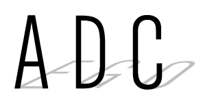
- “Albrecht Dürer and Art Director have the same initials.” That, I was able to figure out on my own.

- “Albrecht Durer was considered an appropriate model because he was, in their view, the first commercial artist, that is, he sold his prints on the street directly to the public, rather than working on commission.” Right… but… well… ok.

- “It is a good design.” It is a lovely signature.

- “There is an expectation to return to the familiar AD logo in the near future.” I see.

Let’s recap: an organization that’s devoted to promoting, encouraging and recognizing creativity snags an artist’s signature for their own identity? I’m not sure how I feel about that. Yes, it’s a great tribute to a great artist, but what about originality? Not very original I’d say.

Maintained through our ADV @ UnderConsideration Program
ENTRY DETAILS
ARCHIVE ID 1344 FILED UNDER Branding and Identity
PUBLISHED ON Jan.23.2003 BY Armin
WITH COMMENTS
Comments
benfRank’s comment is:

well, that's a load of crap...they try and put theirselves off as the be all end all of design annuals. even their cutrrent call to entries the box that the book is in uses crumpled up entry forms to CA and print and others for it's packing material. very pretentious. for them to rip off one great artists signature to make their logo is unacceptable. i am sure there are plenty of other things they could have done with and 'A' and a 'D'.

On Jan.23.2003 at 10:44 AM
Kiran Max Weber’s comment is:

I think it's cool when people rip other people off. Right on!

On Jan.23.2003 at 11:03 AM
Sam’s comment is:

Perhaps the ADC should become the Association for Stealing Stuff...

Lame, just lame. But no surprise.

It raises the question, though, of stealing versus copying versus imitating versus homage etc. This came up in the Design 100 with Paula Scher's Swatch poster referring to an earler Herbert Bayer design.

Copying is pretty clear but what is stealing? I mean the good kind of stealing. For an obvious example, various name-brand designers (Chip Kidd, Paula Scher) "stole" Sagmeister's idea of printing an image on the page-edges. (This is the cover; couldn't find the printed edges, but y'all probably seen it plenty.) Sagmeister, more cleverly, stole the idea from the Renaissance. He even copied his own idea for his own book (again, no images of the page-edges). I heard somewhere that Sagmeister used some special software, which was probably not available to the Italian monks.

On Jan.23.2003 at 11:08 AM
Darrel’s comment is:

Art Directors are about creativity?

;o) ;o) ;o)

Anyhoo...I thought they were about good design solutions? Creativity and originality are parts of good design solutions, but are not necessarily integral to a good solution. Quite often, originality doesn't fit in with a particular design solution.

Just throwing out some ramdom thoughts.

It raises the question, though, of stealing versus copying versus imitating versus homage

Yep. That's all a very muddy, grey-area, soup.

I think that sagmeister would be one of the first to say that good ideas are often 'borrowed' ideas.

Besides, they publish the design annual, which is, after all, the place we all go to when we need to borrow some ideas for an upcoming project. ;o)

Good post, though, Armin. Interesting.

On Jan.23.2003 at 12:37 PM
Armin’s comment is:

>Good post, though, Armin. Interesting.

Hey, thank my mom, I would have never known.

>Sagmeister used some special software, which was probably not available to the Italian monks.

Which do you think they would have preferred? Laptops or Desktops?

Now to a more serious note, I think there actually exists something like "the good kind of stealing." It's using, or borrowing or whatever you want to call it, ideas or techniques that have been done before and applying them correctly to your own project. The important thing is to make it your own, give it a little unexpected spin. If you are borrowing something and at the same time make an improvement on it, it's a big plus for the designer. It just raises the bar a little bit.

>the box that the book is in uses crumpled up entry forms to CA and print

I thought that was kind of funny. In an egomania kind of way.

On Jan.23.2003 at 12:50 PM
Sam’s comment is:

Oh I DEFINITELY think there's a good kind of stealing. Sagmeister, Victore, Louise Fili are all masters at it, and my hero Tibor Kalman, stole everything he did, practically (he was very smart about what he stole). That is not in any way a bad thing. Originality and so-called creativity are largely myths. And trying to figure out who originally did something sounds tedious (it was tedious finding that gilt-edge page) and pedantic.

BUT, stealing vs. copying is a different matter. Maybe it's sementics, but maybe not. Is it better to steal an idea or a technique? Is copying source code out of a web page stealing, assuming your going to re-purpose it somehow?

Who do YOU steal from? Other designers, or artists, or someone else entirely?

And the monks are all about the laptop, man. Come sit here little boy...

On Jan.23.2003 at 01:28 PM
Darrel’s comment is:

BTW...what's up with the new box logo for them?

On Jan.23.2003 at 01:40 PM
d’s comment is:

So is a 'good kind of stealing' just influence?

or is that too indirect?

On Jan.23.2003 at 01:44 PM
pedro’s comment is:

I think there's an interesting book delving on the subject and by, who else?? Mr. Steven Heller.

Borrowed Design: Use and Abuse of Historial Form

by Steven Heller (Author), Julie Lasky (Author)

I remember reading it (or was it browsing it?)and finding some interesting comments and examples. Just checked in Amazon Borrowed design and unfortunately it seems to be out of print.

(Being in Mexico I cant offer to lend it to anybody - sorry).

On Jan.23.2003 at 02:10 PM
g’s comment is:

paula scher, though. and stephen heller.

On Jan.23.2003 at 04:37 PM
Armin’s comment is:

huh?

On Jan.23.2003 at 05:13 PM
Sam’s comment is:

and yet, tomato. and stephen heller.

On Jan.23.2003 at 06:25 PM
Armin’s comment is:

it is quite late in the UK. At those wee hours of the morning one becomes incoherent.

On Jan.23.2003 at 06:28 PM
felix’s comment is:

the thing i find most interesting is the ADC is going back to its old logo. that, itself, is enough to make a grown art director cry.

what are some thoughts on the new vs the old logo? i think the new one is better than the old "AD", but neither are great OR original. the new "box" is ripped off as well. which is odd coming from Gelman's original hand (perhaps he himself isnt aware of it).

"Amatuers borrow, Genius steal"

— Oscar Wilde

With ADC, we have an exception.

I propose we design a new, original ADC logo. Are they worth it? Sure. Who is with me?

On Jan.23.2003 at 07:38 PM
Armin’s comment is:

>what's up with the new box logo for them?

I thinks it's far too simple of a logo. But I have a thing against cube logos. Just not very original.

>I think there's an interesting book delving on the subject and by, who else?? Mr. Steven Heller.

I do remember reading that at home and it had some pretty sordid examples of this matter. There is also a cool column in Print magazine called "Separated at Birth" where they compare two designs that are very similar.

>So is a 'good kind of stealing' just influence?

I'd say no. Influence takes form in unexpected ways, I think it's a more subjective thing. You might be influenced by somebody's work or style that is then translated into something else. But it's a close call, though.

>I propose we design a new, original ADC logo. Are they worth it? Sure. Who is with me?

A communal design eh? it's every art director's dream come true. So... I'm in.

On Jan.23.2003 at 08:29 PM
d’s comment is:

>I propose we design a new, original ADC logo. Are they worth it? Sure. Who is with me?

> A communal design eh? it's every art director's dream come true. So... I'm in.

Count me in - we could even rip off someone else's... no I'm kidding - though we could deliver a final identity with our thought on the brand strategy and everything... (perhaps getting too ahead of myself).

I think its an excellent idea - let me know how I can help.

On Jan.23.2003 at 09:50 PM
Sam’s comment is:

Perhaps one committee should design the "A," another for the "D," and a third for the misplaced "C."

Oh, and another committee for the swoosh, of course.

I'm happy to help, as long as I can be corny.

On Jan.23.2003 at 11:06 PM
Armin’s comment is:

I do think it should be a "slap in the face" logo. See what you started Felix?

Or we could be serious about it. Although that wouldn't be as much fun. Opionions are welcome.

On Jan.24.2003 at 08:39 AM
Darrel’s comment is:

No designer likes unsolicited advice.

"Hey...your logo sucks, so we made you a better one."

I don't see that going over very well. ;o)

On Jan.24.2003 at 09:27 AM
Armin’s comment is:

>No designer likes unsolicited advice.

Specially New York art directors.

On Jan.24.2003 at 09:52 AM
Arturo’s comment is:

Nice idea Armin. How about starting with a brief of the communal "client" or even better, can we describe the logo we have in mind without images just words?

Or like this game: you draw something and pass it to the next one, and he adds his 2cts. and goes on to the next one... Sorry I don�t remember the name in english...

a.

On Jan.24.2003 at 11:32 AM
Armin’s comment is:

I think this is something that should stay internal and let's just have some fun at the expense of the ADC. We can post pictures of how it's doing. And yes, I like the "logo tag" idea. Let's do this...

1) I'll start.

2) I'll place a screenshot of what I did here

3) I'll e-mail the logo to the next person

4) He/She can make any changes

5) He/She will post a screenshot of the changes and pass it on.

Can everybody read .eps files? Be it in Illustrator or Freehand?

When you email the logo, send two versions in the same file: one with fonts untouched and the other with outlined fonts.

Any suggestions?

On Jan.24.2003 at 11:40 AM
d’s comment is:

Since this goes completely against my approach to helping companies build their brand - but don't want to halt momentum, is there any way to agree on a few kinds of things before we randomly begin 'sketching'.

For instance - I know little of the ADC other than what is on their site - does anyone want to help prepare a short intorduction to them and what we're trying to create - besides a great looking logo.

Or maybe each designer - also includes 50 words or so on what their direction is? Even if it is vastly different from someone else's - it might have some common ground.

Just some thoughts.

On Jan.24.2003 at 12:45 PM
g’s comment is:

sorry, armin-yes, a bit incoherent last night. brilliant site, btw. in terms of the logo thing, i've just found the chrome effect in photoshop, so i might be of some use.

On Jan.24.2003 at 12:45 PM
Armin’s comment is:

Ok. Let's settle this, are we going to be serious or is it more of a joke kind of thing?

On Jan.24.2003 at 12:47 PM
Armin’s comment is:

I ask 'cause I already had a lil' somethin' somethin'. It's silly though, so it doesn't really matter if I have to throw it away.

On Jan.24.2003 at 12:53 PM
Darrel’s comment is:

Well, I say you've summed it up perfectly Armin! Sometimes the first solution IS the most appropriate. ;o)

On Jan.24.2003 at 05:16 PM
Jon’s comment is:

That's the funniest thing I've ever seen!

On Jan.24.2003 at 05:43 PM
natasha’s comment is:

What's wrong with re-contextualizing Durer's signature by making it into a logo? Jeff Koons put 3 Hoovers in a glass box and sales it for millions of dollars. Isn't it original?

On Jan.25.2003 at 11:48 PM
Sam’s comment is:

I don't have a logo design, but I would like to propose some mottoes that might possibly be incorporated into the ADC logo:

(All in Latin, preferably to be read with a James Earl Jones voice)

Clientis Stipulor, Clientis Approbo

(=Client Demands, Client Approves)

Signum Rubefactum

(=Make the Logo Red)

Signum Grandis

(=Make the Logo Bigger) with apologies to Paula Scher

On Jan.26.2003 at 01:29 AM
felix’s comment is:

armin heres a smattering of sudden starts and stops. nothing terribly great, but i think you can pull a few out- work on top of em if you want and post what you like best. everyone else- feel free to throw tomatoes too....

On Jan.29.2003 at 04:12 PM
plain*clothes’s comment is:

if someone has already commented to this effect forgive me, I can't find the time to keep up with this lively site (as I post some two months late).

the most surprising element of this thread is that a number of designers did not recognize the mark. am I to understand that designers are not studying art history, or at least not giving it much attention? are we, as a profession, just looking to the official "design" history for the development of inspiration and theories? I really don't intend to criticise the individuals who missed the connection, I'm just surprised that one of the most important _designers_ in all recorded history has been, to some extent, forgotten.

getting back to the orginal concern, I've come to enjoy the AD ripoff. when I first saw the logo, I was irritated that they didn't at least customize it -- I felt this great work would be disconnected from association with the engraver over time and become a symbol of design commercialism. but now, the shock having worn off, I'm reminded of a truely great artist and the grand beginnings of our craft -- probably what it was intended to accomplish. I suppose appropriation is not always detrimental to the original use.

On Mar.31.2003 at 11:55 AM
Armin’s comment is:

A new logo (see bottom of image) for the Art Directors Club, now officially going by ADC. Courtesy of Paula Scher.

Sigh. It's kinda boring. The dangling C appears as a visual afterthought. It's so� architectural and that's not a compliment. Sorry Paula.

I still don't understand why the ADC is so hesitant to do a unique, creative, intrinsic mark. Shit, even Gelman's cube seems daring.

On Dec.18.2003 at 02:12 PM
Mark’s comment is:

How's this for original?

It's A,D,and C overlayed on top of one another in red,blue,and yellow which are the primary colors in art.

Heres the variations of the logo

all this I made myself in Powerpoint.

On Nov.08.2005 at 03:26 PM