Speak UpA Former Division of UnderConsideration
The Archives, August 2002 – April 2009
advertise @ underconsideration
---Click here for full archive list or browse below
  
Logo Sins

It’s shame and tell day.

So we’ve had the Logo Smackdown, Part One and Two. Many posted their proudest logos, and we joined each other in high-fives, festering in our unbridled joys of accomplishments.

Enough of that.

Now let’s see the shame, the “skeletons in the closets” as someone put it — the logos (and other design uglies) that you were forced to create, designed while stoned, or just somehow let slip out of your grasp before it was done.

Confess, and you shall be absolved of your sins! It will also make for a good laugh.

+ also see Low Points

Maintained through our ADV @ UnderConsideration Program
ENTRY DETAILS
ARCHIVE ID 1602 FILED UNDER Show and Tell
PUBLISHED ON Sep.19.2003 BY Tan
WITH COMMENTS
Comments
Tan’s comment is:

I'm digging for some that weren't burned yet....

On Sep.19.2003 at 11:04 AM
Tan’s comment is:

Ok. This is shameful, but not entirely my fault.

I work w/ a nonprofit foundation -- very nice people -- who asked me to refine and clean up their logo. They admitted that it was ugly, but that many in management loved it. I tried everything to convince them to scrap it entirely, but to no avail. At the end, I just cleaned up the illustration a bit, and tried to kern some of the type. It's on everything that we produce for them.

And yes, their corporate font is MS's Cronos. *sigh*

On Sep.19.2003 at 11:28 AM
Sam Sherwood’s comment is:

I'll have to put something together tomorrow... We all know the Logoworks minion has some nasty compositions to show (by no fault of his own!).

On Sep.19.2003 at 12:07 PM
marian’s comment is:

I'm sure I've done worse than this, but digital copies are nowhere to be found.

But this really is right up there with the worst. It's also really awful because they LOVE it. I designed this about 6 years ago, and last year we were kinda thinking maybe we could get them to change it, but no fuckin' way. The part they love most is the "v". Ugh. And at one of our last meetings someone said she loved the way it was like a big Check mark, like "Yes. Check!" I'd never seen that before but it made me hate it worse than ever. We had to work with this logo every day for 6 years, and man o man. It doesn't centre, it doesn't flush right or left, it has no alignment whatsoever, and it goes with nothing. I hate hate hate it, and it's all my fault.

They wanted something with "West coast imagery" -- the kiss of death. This is another one with alignment difficulties, though not as bad as the VCC. But this is too delicate and tends to break up at small sizes. It's not an abomination, but it's more the history of the thing that taints it in my eye. After several tries, I was desperate over the West coast thing. Then I noticed one of their own brochures with a "ripped paper" graphic motif (Yes! In the mid 90s!) and "ripped" the mountains from that.

On Sep.19.2003 at 12:54 PM
Tan’s comment is:

the V is truly horrible Marian. Same problem w/ my NPower logo -- the fucker doesn't align with anything, and it's a puss-y zit on the face of everything it goes on.

Ok, not a logo, but a website for Beef Jerky. "Meat Snacks" is the official food category. This is still a comp -- the actual is even worse.

Come 'on folks, Fork it over. Let's see some truly horrible stuff. (where is everyone today?)

On Sep.19.2003 at 01:23 PM
Armin’s comment is:

I wish I could play with you Tan, but everything I do is perfect.

I have some terrible, horrible stuff, but it's at home. Will post on the weekend.

>where is everyone today?

Yeah, what the hell? It's been a quiet week overall.

On Sep.19.2003 at 02:43 PM
Rick Moore’s comment is:

I have lots...will post later.

Don't give up on this thread!

I love the fact that you guys are all human!!!

On Sep.19.2003 at 03:19 PM
Hack jobber’s comment is:

Yeah yeah yeah... keep this thread alive. I have plenty of crap to show and tell.

I don't keep it with me, though... so I'll have to post from home.

-H&Js

On Sep.19.2003 at 03:24 PM
Armin’s comment is:

> Ok, not a logo, but a website for Beef Jerky.

Hahaha, that's awful. Check this out, I can't completely take the credit (or blame) for this one, I worked with another designer (and Tom Cox was the Art Director!) at marchFIRST. Dig the bubbles. I didn't go to the photoshoot, but all who went said the model (on top) was HOT!

Guess you could have done without that last bit of information.

On Sep.19.2003 at 03:24 PM
KM’s comment is:

Finally something I can particpate in... : )

Nothing so far is as bad as this: Logo for the band The Used

On Sep.19.2003 at 03:34 PM
pk’s comment is:

*sigh*

stupidest client ever.

it could have been good. and yes, they directed the fuck out of the typographic forms. one of those things where the cloient has no visual sensibilities whatsoever and asks for sixteen million alts and you end up ready to either give up or punch them until they die.

On Sep.19.2003 at 03:44 PM
Marshall’s comment is:

Shit Marian, I always hated that VCC logo but I was afraid to say so....I was sparing your feelings. I had no idea.

On Sep.19.2003 at 05:40 PM
marian’s comment is:

This is a gas. LOVE that beef jerky site. Speaking of awful sites, does anyone remember about 5-7 years ago someone did what I think was a parody: a site that used every single fucking colour, background pattern, huge, flashing type, animated clip art in existence? It was a mindblowing work of art and I've always wished I could see it again.

No need to spare my feelings, Marshall. I can always tell when you hate my work anyway.

On Sep.19.2003 at 05:49 PM
Tan’s comment is:

> but all who went said the model (on top) was HOT!

pssh...like you had a chance. She is purdy though -- in a Helen Hunt kind of way.

On Sep.19.2003 at 06:29 PM
sena’s comment is:

Some logos you take pride in. Others you just get paid for. Here's a sample of the latter, for an aircraft navigational system:

(I don't want to know how many "Hail Marys" it's gonna take to atone for this one...)

Hideous.

On Sep.19.2003 at 08:03 PM
Bradley’s comment is:

This is fucking hysterical. I need to gather digital files of crap I've done, if I can find it--I went searching for old web sites and that sort of thing but, believe it or not, they've all been changed for the worse. Good topic.

On Sep.19.2003 at 08:37 PM
Brent’s comment is:

I've done a lot of crap for money (graphically speaking) and this is by far the worst. It was for somebody's friend who was starting a mini golf business and needed someone to produce a logo based on an idea they had sketched out. I was so removed from the client I didn't know their name but I got the money upfront. Later I found out the idea for the logo came from a high school babysitter.

On Sep.19.2003 at 11:09 PM
Unworthy’s comment is:

This utterly awful piece of crap I did in exchange for a full cut/style/spa day, which I gave as a holiday present. Does that make me bad? Or just a hack?

On Sep.20.2003 at 12:35 AM
Rick Moore’s comment is:

OK, here we go.

This was done for a printer that I do a lot of work with. He and I both liked the one that was much more up-to-date (their previous logo looked like it was designed in the 70s), but this one was the one that everyone else at the shop liked. I learned to never show the client the design that I absolutely hate.

Second:

I hate when a client gives you a detailed drawing and says, "this is exactly what I want." I also hate how every small business in Utah feels the need to put everthing they do in a 2" by 2" space. Ugh.

On Sep.20.2003 at 01:08 AM
JLee’s comment is:

Brent - Later I found out the idea for the logo came from a high school babysitter.

Hahahha. Now that is funny!!!

On Sep.20.2003 at 01:30 AM
Jeff’s comment is:

Great Fun! SHeaR SeaTTLe causes me actual physical pain.

Here's some more pain:

This is for an extreme sports shop, mostly powerkite & kitesurfing stuff. The funny thing is, they are one of my favourite clients, and I've done a lot of really delicious stuff for them. But this was the first project before they trusted me. I gave them a ton of great ideas, but no, it had to say turbulence with a whirlwind splitting it in two. They love it. They especially love the way the whirlwind looks like a smoking spliff when it's by itself. I'm wearing the t-shirt right now.

On Sep.20.2003 at 04:31 AM
darrel’s comment is:

Hi! I'm Turbu Lence. Your local weed dealer. ;o)

On Sep.20.2003 at 08:16 AM
Tan’s comment is:

(big brother just cleaned up a few errant postings...)

....

sena, that logo isn't bad. It's nothing awesome, but it doesn't belong in the hall of shame either. I like plane icons I guess.

But there are some truly hideous stuff here -- Brent's giant golf ball, Jeff's crane (hahaha.."Butch"), Jeff's tornado. I know...why do clients always want the 3-D crap, like it's busting out of shit at ya (sorry..sneeze coming on...ah..AH-UPS-CHOO!!)?

I have clients show me sketches all the time -- that just means that they've never worked with a designer before, so they're not quite sure how to contribute. I usually take the sketch w/ a smile, and totally ignore it.

More uglies!

On Sep.20.2003 at 10:11 AM
Armin’s comment is:

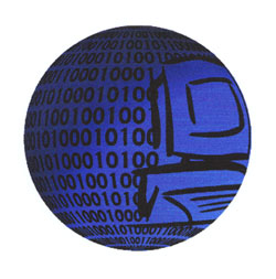
I am so ready to put all you whiners to shame. This is the absolute worse a graphic designer can do and actually get paid for it. I have put this up before, but it is so unbelievably ugly that it deserves to be shown over and over. This was done right before I finished college. It was a logo for a pilot show called PC on TV, so I assumed they were selling PC stuff on TV (hence the name) I never got much direction as you can see. Anyway, here it is:

It's a globe. It has a frickin' PC on it. Some binary code. It's bitchin'! I think I used Adobe Dimensions and felt like the most tech-savvy dude in Mexico —�pushing the boundaries!

On Sep.20.2003 at 10:20 AM
Tan’s comment is:

wow Armin. I count 5 grievous violations to the international code of design. In the Netherlands, you would've had to face a tribunal for that logo.

But college work doesn't count. I committed many equally horrible crimes in my youth. I'll try to hunt them down. But I think most of that crap is forever entombed in a Syquest disk somewhere in my basement.

On Sep.20.2003 at 10:52 AM
Armin’s comment is:

It wasn't a college project. It was a freelance gig around the time I finished. Some crackhead was actually going to slap this on a stupid TV show. Luckily, for me, the pilot show got cancelled. I got paid $200. And the dude kept one of my treasured ZIP disks. Bum.

On Sep.20.2003 at 11:16 AM
Rick G’s comment is:

Oh my god, Armin. You just won.

-R

On Sep.20.2003 at 01:14 PM
Keith Tam’s comment is:

So Marian, you are the one who designed the bloody Vancouver Chamber Choir logo... ;-) It's a great choir though!

I'm working on an identity refinement and implementation at the moment...

Everything from the naming of the organization, the typographic arrangement, the swishes (they are supposedly ripples) and even the URL (www.go2hr.ca) is problematic and not to mention cliché. Originally they even didn't want it refined. I proposed that they should redo it, to no avail. Apparently they already hired two companies to do this before me, but they didn't like what they got. Then they came to me. I had to keep the colour scheme and the overall idea, just because the first firm did a lot of 'research' and had focus groups to test the design. Typical design by committee situation. This is another one of those logo that wouldn't align to anything. So I made a careful lock-up grid with my version with clear alignment lines:

I cleaned up the swishes (yes, those again! I can't stand them!), changed to a stronger, more contemporary font (Corpid by LucasFonts), and chaged the 2 to an old-style one. Much better, I think. And they like it. I still hate it, but that's the best I could do to it. I don't claim any credit of the design, so I couldn't care less. I'm my job to apply it the best ways I can.

They now use Corpid as their corporate font, instead of the stinking Helvetica Neue (extended, actually!). They love it.

By the way, the client insists on using "go2" in prose with no capitalization of the G, to be 'consistent' with the logo. I think this is horrible, what do you guys think?

On Sep.20.2003 at 01:20 PM
corey’s comment is:

Hi all, I haven't posted in a while so I figured I may as well jump in with both feet and trip.

This was the first corporate logo I ever designed - my guess is that it was about 6 - 8 months out of college. It has the dreaded swoosh on it, but I'm not certain that the swoosh was as ubiquitous at the time (this is towards the beginning of the internet craze). Regardless, the idea was not to be a swoosh, but rather a musical tie thereby slurring the distinction between the future, and the step you just took towards it. As I said earlier, I was just out of school.

As you can see, it was a real family shamer.

On Sep.20.2003 at 07:25 PM
Mark’s comment is:

Keith, my opinion is that a logo or mark is part of the visual identity for a company, not the company. The business name is a proper noun and should be treated as such. And for evidence: I have a great article on logo v. copy editing.

But of course, the client money is always right!™

On Sep.20.2003 at 11:35 PM
Colin’s comment is:

Nice article, Mike. I'm going to pass this on to my journalist friends.

On Sep.21.2003 at 07:19 PM
Colin’s comment is:

I said Mike. I meant Mark. Sorry. It's been a rough day. To quote Ghostbusters, "I feel like the floor of a taxi cab."

On Sep.21.2003 at 07:20 PM
Christopher Simmons’s comment is:

This is a mistake

For those of you who are designers, participating in this thread does you a disservice. Every project is a collaborative effort, and often the results are less than we feel we could have achieved if left to our own devices. Posting such failures publicly with comments like, "stupidest client ever" or "this is the worst a designer can do and get paid for it" is precisely what leads to designers being viewed as whining artist types and not thinkers, business partners and problem solvers.

The fact of the matter is that design is a service industry, not an artistic autocracy. Our clients are an essential part of the equation, and bad-mouthing them discredits design as a profession. I've done my share of less than stellar work too, of course, but those projects are quietly filed away and discussion then turns not to how our clients failed to let us create "great design" but how we can better communicate with our clients, and enable them to empower us to do our best work —for them.

On Sep.22.2003 at 01:19 AM
Jeff’s comment is:

This is a mistake...

...because no other profession in the world goes down to the pub in the evening for a gripe and a laugh about work.

...because our sole reason for existence is empowering clients.

...because one of our clients could be reading this RIGHT NOW!

...because in every class there is someone who has to spoil eveyone else's fun. And dang it! Why is it always the freakin' straight A student?! (Very pretty portfolio, Chirstopher.)

All right. I'm going to go have my morning cup of tea, lose the sarcasm and start empowering clients.

On Sep.22.2003 at 04:10 AM
Darrel’s comment is:

You learn from mistakes. It's good to share.

On Sep.22.2003 at 09:09 AM
Tan’s comment is:

No, no folks...I understand Christopher's points here. I do hope that this doesn't turn into a client bitching thread. We've had enough of those.

But I humbly disagree that this is a total mistake. It's human to fail at things -- and also human to find fault. Although I agree that 99% of my mediocre work is no one's fault but my own (...well, maybe 90%). And at the end of the day, none of my work would exist without the input, support, and involvement of my clients in the first place.

But I would ask this: if it's not ok to find humor and ownership in our bad logos, then how is it better to proudly celebrate ownership of our good ones?

There's a slight hypocrisy here.

On Sep.22.2003 at 10:09 AM
Christopher Simmons’s comment is:

You learn from mistakes. It's good to share

Agreed. So why not share the cause of our failures and not effects?

I guess what I'm saying is that if you respect your clients chances are better that they will respect you. If they don't, your best option is to politely part ways, not bad mouth them on the internet.

Not every client is right for every designer, and certainly not the reverse. For instance, we had a notoriously conservative client for many years who let us do good work, but not our best work. Because of the length of our relationship we (and they) felt like we understood them pretty well—their tastes, their tolerances, etc. Then, one day, after not hearing from them for a while, we suddenly happened upon their new brochure. It was beautiful, contemporary, different, edgy. In short it was everything we had always wanted to do for them but were afraid to show.

The lesson here is not to take your clients for granted, but to constantly work at developing a relationship with them, regardless of whether or not you are working on a project for them at that instant. Grow with them. If you can, become a catalyst for growth. Become a valuable part of their business. Good design—the best design—is an act of rigorous inquiry, not a matter of aesthetics.

If you listen well enough, your clients will hear.

On Sep.22.2003 at 10:09 AM
Tan’s comment is:

> So why not share the cause of our failures and not effects?

Agreed, but how 'bout we show both. Just as in our Smackdown threads, where it was good to share supporting project info to why the project did work -- let's continue, and share why you think the logo didn't work.

Cool?

On Sep.22.2003 at 11:39 AM
Darrel’s comment is:

I guess what I'm saying is that if you respect your clients chances are better that they will respect you. If they don't, your best option is to politely part ways, not bad mouth them on the internet.

Oh...agreed. That doesn't mean you can't show bad logos, though.

Good design—the best design—is an act of rigorous inquiry, not a matter of aesthetics.

Nicely put. An 'ugly' logo may very well still be a good logo, just as a really good looking logo may be completely bad for the needs of the client. It all depends on the what the client needs.

On Sep.22.2003 at 11:50 AM
Christopher Simmons’s comment is:

Fair enough.

I was at this lecture once by a certain well known designer who actually gave out his client's phone number and invited the audience of designers to call and take the account — he dispised his client that much. Shit like that just drags us all down. It's not even funny.

So, that's the attitude I want us to steer clear of. Some of the better comments in this thread are those like Tan's, in which we take responsibility for our work.

On Sep.22.2003 at 01:41 PM
amy’s comment is:

Well, that little sphere thing with the computer is pretty bad, but I think mine may eclipse it.

It's definitely second worst.

And no, I had no input on this at all. It was one of those "client has a total sketch already" ideas. They wanted a graphic executionist, not a designer. Made me want to be a graphic executioner instead!

I actually rather like a couple of these so-called hall of shamers. I like Wilderness Falls (it's a freaking mini-golf after all, what are you gonna do? it looks nice). I like the Triple C backhoe claw. I think there's nothing wrong with Varsity Printers.

Those two work. They're cute. They communicate. Maybe they're not as artsy as you want, but they do the job and look good doing it (and presumably made the clients happy)... and isn't that what's important?

Mine's just barfy though.

On Sep.22.2003 at 03:05 PM
amy’s comment is:

I really can count. I meant "those three." I swear.

On Sep.22.2003 at 03:08 PM
Sam Sherwood’s comment is:

Better late than never!

I call this "Expensive to Print #1"... This composition was made for a company that created custom garages, including storage. Client wanted to have a Nascar feel (including colors), but also appeal to the upper-crust consumer. Thus, the Benz in the garage -- I know, I'm so clever.

Next up, a swirly. Client was a start-up marketing firm, and specifically requested something created with "swirls." Naturally...

Enjoy!

On Sep.22.2003 at 06:41 PM
Tan’s comment is:

Oh man, I think Garage Mahal just beat Armin's globe.

It's a bad logo, followed by a truly awful pun for a name. Nascar and the Taj Mahal -- yup, makes sense to me.

Please pass the curry corn dogs...

On Sep.22.2003 at 06:54 PM
Armin’s comment is:

> Oh man, I think Garage Mahal just beat Armin's globe.

Oh my God! I bow out gracefully. I thought "food for run" was bad, but this... boy!

On Sep.22.2003 at 07:08 PM
Sam Sherwood’s comment is:

What can I say... I desperately wanted to please the client. Here's a somewhat subdued second composition, submitted at the same time. The tilted text was requested, naturally.

I guess I'm what you'd call a "bad logo contest ringer". The cold, harsh truth to only getting one creative brief and no one-on-one contact.

But come on -- are you telling me those colors won't transcend time?

On Sep.22.2003 at 08:27 PM
jonsel’s comment is:

I think I want a t-shirt with the Garage Mahal logo on it.

On Sep.22.2003 at 10:23 PM
Armin’s comment is:

> The tilted text was requested, naturally.

Whoah! Reverse (fake) italics. Now that is good graphics designs.

> I think I want a t-shirt with the Garage Mahal logo on it.

Maybe Patrick can morph it in somehow with his t-shirt

On Sep.23.2003 at 08:41 AM
Darrel’s comment is:

This is maybe more corny than bad. This was done way back at school at one of my first real design jobs. never met the client and was just given a rough pencil layout of what they wanted. Yes, it's a pack of werewolves. Yes, it is an internet service provider. No, I do not get the connection. That said, it was a fun illustration to do.

The client never paid. So this was one of my first lessons on the importance of contracts ;o)

On Sep.23.2003 at 11:14 AM
Ginny ’s comment is:

I love this! All of it!

However, I love Garage Mahal the most!!!

If you get tshirts made I will wear one with pride!

I have to admit, Armin's globe is definitely the worst. Mostly because it was a no brainer solution. I cannot say the same for GarageMahal. I even love the name.

On Sep.23.2003 at 12:32 PM
Sam Sherwood’s comment is:

It just so happens that said Mahal didn't choose either composition, so I still own the rights to both images. Maybe not the name, but let's face it, this guy isn't getting big anytime soon!

The real question: Which one is the most gaudy? I've always wanted to be a Sedan Sultan.

There's a certain irony in the association between the SU shirt and the Mahal... UPS is the official delivery company of Nascar.

On Sep.23.2003 at 01:08 PM
Krystal Hosmer’s comment is:

I hate this logo! Centered on top in black and red boxes. I did it for my former employer. It was just one of many type samples I showed her on a page and the owners decided it was "finished" and just LOVE it. Then they got the bright idea to pair it with this whole natural, recycled look. Of course they didn't tell me that was what they wanted when I was designing the stupid thing. So delighted to not have to look at that every day anymore.

On Sep.23.2003 at 01:50 PM
sena’s comment is:

"Garage Mahal" is memorable. It made me chuckle, and I can think of probably a dozen people I'd point it out to.

But hey, that's just me. I can't resist a bad pun.

On Sep.23.2003 at 02:21 PM
Darrel’s comment is:

If the name were spelled Garaj Mahal, I think it would have been perfect.

On Sep.23.2003 at 02:32 PM
Ginny ’s comment is:

I agree with darrel. laugh out loud goodness!

On Sep.23.2003 at 03:19 PM
Armin’s comment is:

> I have to admit, Armin's globe is definitely the worst. Mostly because it was a no brainer solution.

Hey! I still have feelings, you know? I [like to think I] put a lot of thought behind it and it is very conceptual — ya'll just don't get it.

No. It sucks.

On Sep.23.2003 at 03:27 PM
amy’s comment is:

I've got another good one that I actually forgot about. I have no idea how. The top one is my initial comp based on the client's 'brief' (laughable). The second is what was left after the client finished making changes and declared "I LOVE IT!"

Then 48 hours later he went MPD on me and called it "kindergarten crap," demanded a refund, called the person I was subcontracting for a "little faggot" when he refused to give the refund.

Last I checked my friend still has his domain name since the crazy client never paid up for the hosting. Heh. Heh.

On Sep.23.2003 at 04:02 PM
Krystal Hosmer’s comment is:

amy... I'm sorry. YOU WIN! Dripping ice? Ohhhhh... you poor thing!

GarajMahal! Yes...trancendant!

On Sep.23.2003 at 04:13 PM
amy’s comment is:

Krystal, hehe. Yeah, not only dripping ice, but FLAMES and gradients!

I agree. Garage Mahal is zen. If you put it on a t-shirt, I WILL buy it... but only the first one! The second one comes way too close to passable. ;)

Worse than ALL of these, though, is the Verizon logo. I feel physically ill whenever I see one of their commercials, and it's not because I hate their stinking monopoly guts. I can't be alone in that! If they're gonna be a monopoly, they might as well at least be stylish about it...

On Sep.23.2003 at 04:21 PM
jonsel’s comment is:

Worse than ALL of these, though, is the Verizon logo

If we're talking just plain-old "the big boys should know better" bad logos, let's talk about the new Palm identity. First, they spin off the software company, then rename themselves and get a dreadful logo. I hope TurnerDuckworth wasn't behind this, because I have a lot of respect for their design acumen.

On Sep.23.2003 at 05:05 PM
amy’s comment is:

Jonsel, I hadn't even noticed that. Aww look, how clever, the l in palm was chosen for its likeness to a 1! "PalmOne"... makes me wanna, you know, palm one. Five-finger discount. Mmm.

On Sep.23.2003 at 06:49 PM
Sam Sherwood’s comment is:

There's an abomination on its way from Abbey National. Click on the "Click here to find out more" link to launch a flash pop-up, and witness the atrocity.

On Sep.24.2003 at 08:22 AM
Brent’s comment is:

>Abbey National

Banking's one of those things I have a hard time separating image from reputaion. Even if that place was a good bank I don't think I could put my money there.

Bright fuchsia doesn't say "safe and secure" to me.

On Sep.24.2003 at 10:01 AM
jonsel’s comment is:

Was that the new Abbey logo with the fading in/out type?? Or was that supposed to be a metaphor for the slow unveiling of the new identity?

On Sep.24.2003 at 10:12 AM
Sam Sherwood’s comment is:

This picture explains all:

On Sep.24.2003 at 10:20 AM
Tan’s comment is:

hahaha...everytime I hear the name "abbey" I still think of that scene from Young Frankenstein.

"Where did you get this brain?"

"It was Abbey-something?"

"Abbey-something?"

"Yes, yes..I believe it was Abbey-Normal?"

"Abbey Normal...as in abnormal??!!"

I love that movie.

On Sep.24.2003 at 10:33 AM
Sam Sherwood’s comment is:

Heh!

Frau Bluecher!

::Neeeeigh!::

On Sep.24.2003 at 10:38 AM
Laura’s comment is:

I love the Garage Mahal logo, that's just my kind of humour.

P.S. Dibs on a shirt...

On Sep.25.2003 at 02:39 PM
Brent’s comment is:

Tan-

Hold onto that beef jerky client!

25-30% growth a year ... who knew?

On Oct.14.2003 at 02:59 PM
Armin’s comment is:

“Jerky has just boomed“

Next year's Speak Up T-shirt.

On Oct.14.2003 at 03:56 PM