Speak UpA Former Division of UnderConsideration
The Archives, August 2002 – April 2009
advertise @ underconsideration
---Click here for full archive list or browse below
  
A License Plate for Every Taste

Not owning a car currently, and having owned one but not exactly cared about it a few years ago, I am rather oblivious to anything related to a car. But there is one thing that is impossible not to notice: License plates. And I’m not referring to vanity plates, but to the incredible amount and variety of license plates across the country, not to mention across the world.

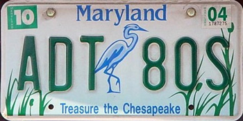
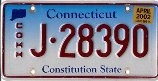
Within one city you can see dozens of different license plates on cars from the overly simple to the overly decorated with whatever the state animal, flower, fruit or landmark is. Georgia has peaches, California has palm trees and suns, Colorado sports the Rocky Mountains and Louisiana has a… pelican? (I’m sure this is some part of Louisiana culture that I’m missing out on).

With State and Government departments in the US being so controlling you’d think there might be a very strict standard for license plates. Some guidelines to control which typeface is optimal for display in all sorts of weather conditions and all times of day and night, maybe even a set size or shape, heck, even a background color (white?) would be helpful. Yet, there is none, it’s a freely-willy situation, every state is left to their own taste and own interpretation of what makes a license plate useful.

Obviously, these looseness gives way to some cool-looking license plates and is a nice way of knowing that you are in another city, driving in a different highway and also makes for some excellent online galleries, like this one. But, when design decisions are left to state officials you know things can get ugly. And I’m not arguing for nicely kerned license plates, just some common decency of what is readable on the road.

Granted, nobody might care about what their license plate looks like (although products like this prove otherwise) or whether the x-height of the typeface used is the optimal, but maybe a bit of consistency could be helpful? Just a tiny bit? Maybe? No?

Thanks to Jim Lasser for the topic.

Maintained through our ADV @ UnderConsideration Program
ENTRY DETAILS
ARCHIVE ID 1785 FILED UNDER Miscellaneous
PUBLISHED ON Jan.26.2004 BY Armin
WITH COMMENTS
Comments
brook’s comment is:

this is one of the new ones in minnesota, pretty cool. i'm just happy when i see something interesting, or at least not terribly ugly. standards? it might be a good idea, but I think most states are competent enough on their own.

On Jan.26.2004 at 09:53 AM
Rebecca C.’s comment is:

I'm from Florida--a state blessed with 78 options for individualizing one's lightweight 4-wheel automotive. Most are ugly. However, the vast majority of people I have spoken to regard such options as away to express themselves. Since most people are not designers, they have limited options for such "custom" expression of their personal taste, preferences, opinions, alma mater, etc. I just don't care enough to bother with my car or tag in that way; I feel comfortable expressing myself in other, less general/broadcast ways.

I'd love to see a "Native" tag for every state, like Texas, if for no other reason than to identify those who cannot drive with any sense and warn others of their presence. As for a nationally-issued tag, I'm not sure the current format would allow the high number of permutations required for all the vehicles in the country. Besides, they would probably end up looking like the new currency...

Perhaps if we-the design community- could have a strong hand in the process, a national tag would be something pretty decent. Otherwise, I'm afraid it would would follow neither form nor function.

On Jan.26.2004 at 09:54 AM
Rebecca C.’s comment is:

Stink! I was so sure I would be the first post...

On Jan.26.2004 at 09:55 AM
surts’s comment is:

I've always liked the old North West Territories and Nunavut License Plates

On Jan.26.2004 at 10:08 AM
Scott d’s comment is:

Living in the Cincinnati area, I frequently see Kentucky license plates. I don't know if the rest of you have seen the new Kentucky plates, but they're awful. Let's put it this way, it's got a cartoon sun with a smiley face and the tag line is "Kentucky It's that friendly."

On Jan.26.2004 at 10:25 AM
Greg’s comment is:

eeesh. reminds me of something you'd see on a video game in the 80's.

On Jan.26.2004 at 10:27 AM
Brent’s comment is:

I kind of like it. It beats Illiniois' blue Abe Lincoln head.

And I must say I'm terribly diasppointed to see Georgia has gotten rid of their pretty peach plates. The new one looks like a poster for "The peach that ate Georgia."

Since states have discovered the gradient and it's ablility to ruin the nice and simple, it seems to be popping up everywhere. I didn't know that there weren't guidelines for plates. Now I'm not surprised.

On Jan.26.2004 at 10:46 AM
ps’s comment is:

this is one of the new ones in minnesota, pretty cool

ugly as a duck. wow, that's terrible

On Jan.26.2004 at 10:55 AM
brook’s comment is:

i kind of like the kentucky one. it's funny. like teletubbies or something.

so, PS, any good ones out there?

On Jan.26.2004 at 11:04 AM
ps’s comment is:

so, PS, any good ones out there?

i guess i would go for good type/numbers and good typography of all information on the plate, more than some illustration. i can't tell you which plates i like, i'll have to look. i remember that i used to like an old california type, but have to see which one. i do like the swiss and german plates but they don't deal with 50 states...

anyway, its monday morning -- and busy as hell, i'll have to try to give you a better answer later.

On Jan.26.2004 at 11:19 AM
Zoelle’s comment is:

To me, I guess I don't really care how ugly they make license plates. If you don't like them, don't buy them. However, I do have a concern regarding the aesthetics of the plates vs their function.

I'm from Wisconsin. The normal state issued plate is clean and functions well as a vehicle identification tag.

The optional Sesquicentennial plate fails miserably in its function. I can't see how anyone could gather the information from this plate in an emergency. It looks as though you need 3D glasses to see it properly. Do they even test these things for readability?

On Jan.26.2004 at 11:23 AM
Emily’s comment is:

I've always liked Oregon's basic license plate. Clean, simple, celebrates what the state has to offer.

On Jan.26.2004 at 11:34 AM
Patrick’s comment is:

>And I must say I'm terribly diasppointed to see Georgia has gotten rid of their pretty peach plates. The new one looks like a poster for "The peach that ate Georgia."

As a former Georgian, I agree that the new one is ugly. What's with putting the web address on the plate, anyway? What is this, an advertisement?

On Jan.26.2004 at 11:47 AM
ryin’s comment is:

louisiana IS the pelican state after all...

i've always had an affinity for washington states plate...the ghosted baby blue of mt rainer with bold red type.

On Jan.26.2004 at 11:53 AM
Armin’s comment is:

Besides the obvious ugliness and tackiness of most license plates I am surprised that nobody has taken it upon themselves to making them better. Improving legibility so that cops hiding behind billboards can quickly jot down your license plates.

I am also surprised that no type designer has taken on that challenge either. For example, James Montalbano did some excellent work on a type system for interstate signage. I'm sure some of the same principles could be applied to license plates. People don't pay or need to pay the same attention to plates as they have to to signs, I know.

Also, while I was doing some research on this, the background graphics (like ugly ducklings) don't interfere with those cameras mounted on tollways and such that take snapshots of your plates as you go by. Something to do with 3M and weird rays.

And speaking of fonts, Emigre's Platelet is based on California's license plates.

On Jan.26.2004 at 11:56 AM
Armin’s comment is:

Thanks Ryin, I knew there was an obvious explanation, never thought of Louisiana as being pelican-heavy… Alligator-heavy maybe… I'll shut up now.

On Jan.26.2004 at 11:58 AM
Sam P.’s comment is:

Sigh, so much for the old Sam P.

On Jan.26.2004 at 12:22 PM
brook’s comment is:

they are working on making them easier to read. as armin said, it's focused on technological improvements. the loon plate i linked and the other full color special plates look dull as jpgs. in person they are very reflective, almost glowing. the process is the same as is used in newer street signs where they are incredibly reflective and designed to stay that way even when dirty or covered in precip. 3M is responsible for both. i'm sure there could be some more effort put into the typographic aspects, though.

On Jan.26.2004 at 01:00 PM
Zoelle’s comment is:

More than I needed to know about plates:

Plate Index

On Jan.26.2004 at 01:13 PM
ryin’s comment is:

armin... the only reason i know it's the pelican state is from a 4th grade oral presentation...that and it's a line from fletch. okay that's two reasons. i'll shut up too.

On Jan.26.2004 at 01:19 PM
marian’s comment is:

OK, I'm going to weigh in as a heavy fascist on this one.

There oughta be a law! That Minnesota place is an abomination. License plates are there so that your vehicle can be identified under any number of circumstances, and not just by the cops. They are not to express your pathetic pseudo-"personality" and they're not to advertise websites, states or anything else. This is basic information design and if I were the king of this continent, plates would have a regulated font for both the numbers and the state/province and be simply solid colours with a rules regarding the required contrast between background and letters.

Shapes however, would be allowed: I've always loved the NWT polar bear. Note that it doesn't interfere with the readability of the plate.

On Jan.26.2004 at 01:22 PM
Alan’s comment is:

Here's one that I was told I was going to get to 'design', but it turned out they just wanted the logos on it.

Still, it looks awfully nice on my car.

On Jan.26.2004 at 01:52 PM
Sam’s comment is:

Alan, it's a thing of beauty. I image the "RS" is for ARod and Curt Schilling? So close!

Go Sox! (Yeah, you heard me, JonSel.)

On Jan.26.2004 at 02:11 PM
KM’s comment is:

License plates are there so that your vehicle can be identified under any number of circumstances,...

I will have to agree with Marian. You have the choice of vehicle that suits your personality, budget, tastes, etc. The purpose of the plates are to identify your vehicle - that's it.

Now if we could come up with a law that regulates what you can adorn your vehicle (Yosemite Sam, Taz, Calvin pissing, etc.) Okay, that would be too much...

On Jan.26.2004 at 02:16 PM
Jim Lasser’s comment is:

I have a problem with a state making design choices (horrendous ones at that) for you. Plates should be simple and functional. I am from Illinois. I long for the days of the "Land of Lincoln" plates as featured in "Risky Business" and "Blues Brothers." Now Illinois has too many colors, a script font more fitting for Mississippi, a shadowy Lincon, and (the worst of it) a color gradient. Now I live in Wisconsin. The plates are a step up from Illinois, but not much better. I remember when Wisconsin was classic cheese yellow.

I am waiting for the retro craze to hit the DMV. Please give me my "Throwback Plates."

On Jan.26.2004 at 02:20 PM
mrTIM’s comment is:

When I was young I remember this plate which is an old version of the Colorado plate. I remember it so well, because when I got hit by a car it was the last thing I saw before blacking out.... Either way it's been engrained in my mind, and I've always wanted one. It's simple and looks good in the dark. (white on black) It'd look great on my car.

Personally I like plates that contrast the car's color, and I hate when I see some soccor mom trying to run me off the road with a "Princess" frame around the plate. In fact most plate frames just drive me nuts... "what? your witty and a bad driver? wow how cool..."

The Washington plates are nice. Not ugly and very easy to read (too easy sometimes), plus it has an active volcano on it. I like volcanos.

On Jan.26.2004 at 02:23 PM
Jeff Croft’s comment is:

Wow...

I was never too fond of the Kansas one, but in comparison, I think it looks pretty damn good. :)

On Jan.26.2004 at 03:09 PM
brook’s comment is:

i agree that these things shouldn't be overdesigned. there is definitely something to say for having the special variations. many people donate extra money to things like wildlife conservation funds or aids research. the regular minnesota plate is very simple.

On Jan.26.2004 at 03:18 PM
Adrian’s comment is:

I love South Carolina's flag, which also makes a nice license plate. I saw this one (third one down, "In God We Trust") the other day and could not believe it. How did they get that one to pass with all the PC police out there? I don't mind it at all, I think it's funny since SC is a rather defiant state.

On Jan.26.2004 at 03:55 PM
Lisa’s comment is:

I've loved Maryland's "Treasure the Chesapeake" plates ever since they first came out. The blue-green heron design has a really nice soft, peaceful quality about it, but doesn't interfere at all with the readability of the numbers.

The brand new 2004 redesign is much bolder, but isn't nearly so pretty:

On Jan.26.2004 at 05:01 PM
Aaron’s comment is:

I wonder how the state decides who to contract for the work? As a kid I was always told that license plates were made by prisoners, but maybe that was just a California thing.

Even though I'm in WA now, I'd still have to say these are my favorite plates. Simple and black, how cool is that?

On Jan.26.2004 at 07:12 PM
Patrick’s comment is:

>I wonder how the state decides who to contract for the work?

Judging by the ones shown, having a first name of Sam goes a long way. Mr. Potts, I see a new niche for you.

On Jan.26.2004 at 10:18 PM
Sam’s comment is:

It's kind of like all the Abercromie & Fitch designers putting their brthdays in the nonsense numbers on the sweatshirts and stuff (true story).

I was blacklisted after trying to do everything in Osprey. I kept telling them there was a concept behind it.

On Jan.27.2004 at 11:18 AM
Rebecca C.’s comment is:

Florida posted a "contest" to design a new license plate when I was in college, the proceeds of which would go to support Fine Arts funding at the state level. Cool, huh? Yeah right. The resulting design: State of the Arts looks like it belongs hanging in my dentist's office...

Hooray for Wisconsin: black on white, keeping the graphics interesting, but out of the way.

The project specs were, well, specific, but the submissions were to use the same size and font as all tags. I'd love to see new font submissions for a national car tag--anyone? Anyone? Bueller?

On Jan.27.2004 at 11:28 AM
Smackfu’s comment is:

Connecticut used to have nice simple ones. Solid dark blue with white type. No way to add decoration though, and not reflective. So they switched to a light blue to white gradient with dark blue letters, as seen here.

Then someone realized they needed something contrasting for commercial vehicles, and decided to keep the same baby blue and white background, but use RED lettering, out of all the available choices. Liks so. What an abomination.

On Jan.27.2004 at 01:26 PM
Lee’s comment is:

While I was living in Providence, this plate was introduced. It was designed by a fairly well-known graphic designer whose name, unbelievably, escapes me at the moment.

Thankfully, the vintage (read: old) car that I bought here in SF came with its original blue plates, not the hideously bastardized "Art Deco-ish" sunset design.


Now, speaking of commemorative plates...this is a scary idea!

On Jan.27.2004 at 01:29 PM
Steven’s comment is:

I'm with ps and Aaron. I really like the old California black and yellow plates... And what they were attached to as well:

(My old ride, BTW)

On Jan.27.2004 at 05:10 PM
Greg’s comment is:

You gotta love plate design that you can do something with:

Disclaimer: Those with heightened sensitivities need not look too hard. I mean long. I mean....dammit!

On Jan.28.2004 at 12:13 PM
Armin’s comment is:

I wonder if the article �When Bad Plates Happen to Good States by author Laurel Harper in the latest issue of STEP was inspired by this thread?

It doesn't keep me up at night, but I do wonder…

On May.03.2004 at 08:44 AM
Nicole’s comment is:

kentucky's license- plate design the one with the smily face. NOT THE BEST! i really dont like it! what about you

On Nov.08.2004 at 04:40 PM
madison’s comment is:

I agree with nicole she is rite

they really need to get something cooler

than a smiley face!!

On Nov.08.2004 at 04:50 PM
Taylor’s comment is:

why do licensis plates hove to be so detailed why can't they have just like a bird on it or a flower or something that is not so detailed.

On Feb.06.2006 at 11:55 PM
Taylor’s comment is:

why do licensis plates hove to be so detailed why can't they have just like a bird on it or a flower or something that is not so detailed.

On Feb.06.2006 at 11:55 PM
Paulie’s comment is:

As a Sample License Plate collector for nearly
17 years, I was able to amass over 10,000 sample/prototype license plates.They date back to the early 1920`s to present and beyond.I must agree that a majority of today`s States license plates are difficult to read on the roads, and that so many States are going `Flat` or already have gone to the newest FLAT plate technology, makes it even more difficult to decipher.I must admit, that taking photos of my sample plates, and posting them to my web site, looks better, than the actual plates on a vehicle, because they aren`t in motion.Oh, you should see all the graphic plates Australia issues...the designs are georgeous on some of them.If anyone reading this is interested in license plates, and would like to get into this wonderful Hobby, let me know.Visit my website, and contact me if interested.
www.geocities.com/milk11364/index.html

On Apr.08.2008 at 12:37 AM