Speak UpA Former Division of UnderConsideration
The Archives, August 2002 – April 2009
advertise @ underconsideration
---Click here for full archive list or browse below
  
My Name is Font. Ultra Pixel Font.

In the past two, three, even four years we have seen a preponderance of pixel (or bitmap) fonts on the web — not to mention on PDAs, cell phones and all sorts of electronic gadgets and widgets. It is no surprise (based on Speak Up’s pixelness) that I am somewhat a closet-fan of pixel fonts. And now, there is a new genre of screen typography: Ultra Pixel Fonts.

Basically — as I understand it — Ultra Pixel Fonts employ gray pixels as well as black pixels to create a font; contrary to the black-pixel-only nature of bitmap fonts. This brings together the smoothness and ease of readability of anti-aliasing with the crispness and sharpness of bitmap fonts — getting the best of both worlds.

The technology — called Gray Cell Technology� — that makes this possible comes courtesy of Truth in Design who handcraft digital luxuries. They have also launched Ultrafonts to spread the grayscale-enabled goodwill of Ultra Pixel Fonts. Among their collection you can find the usual pixel-styles (small, very small, really very small) yet it does bring an expansive collection of better-developed serif fonts. Worthy of mention is Hrant’s Mana, that went through a six-year development and truly takes advantage of the grayscale capabilities of this new technology. Mana has an overwhelming 1,500 kerning pairs and great attention to detail.

In all, this is a great new collection for any pixel-maniac looking to bring added readability to their web projects.

Maintained through our ADV @ UnderConsideration Program
ENTRY DETAILS
ARCHIVE ID 1823 FILED UNDER Typography
PUBLISHED ON Feb.12.2004 BY Armin
WITH COMMENTS
Comments
Christopher Johnston’s comment is:

Fun. Thanks Armin.

On Feb.12.2004 at 09:28 AM
brook’s comment is:

i think i need a better explanation of this. why is it better? why should i want to use it? i guess i like pixel fonts (especially the serif ones), but never use them... so enlighten me.

On Feb.12.2004 at 10:18 AM
Armin’s comment is:

Not sure if there is lot of enlightening to do Brook... but if there is one reason why these are better is because they are a little easier on the eyes. So if you are concerned for the vision of your readers, you would be interested in using them.

On Feb.12.2004 at 10:52 AM
aj’s comment is:

I think pixel fonts are great. Mushy-looking type on websites does not look good. If only the designer thought about using pixel fonts .....

I'm sure someone can explain this to Brook far better than I can, but pixel fonts are optimised for on-screen viewing. They are designed to fit into the pixel matrix of computer screens, and the results are clearer and more legible.

When using fonts which are optimised for print, at a small point size, you will notice that they just don't look good at all. They will appear messy and indistinct. That's when you need pixel fonts.

Pixel/bitmap fonts look so much better on screen, and there are even some good freeware fonts out there, too. There are some free fonts at the Ultrafont site, if you register, you can download them, and try them out.

I must say, the fonts at the Ultrafont site are very good. I particularly like Atlantis and Bellefield, as they have an elegance and style which is distinctive.

On Feb.12.2004 at 11:21 AM
Su’s comment is:

Do the grey pixels only get applied at teeny sizes? I'm zooming in to take a look at the construction, and I'm seeing nothing but black. Am I missing something?

On Feb.12.2004 at 11:28 AM
Hrant’s comment is:

(Armin, thanks for the coverage.)

The correct gray pattern only kicks in at the right point size, which is standardized at 8pt (at 72 dpi) no matter the actual vertical span of the design; this for a number of reasons, including convenience. It's the same with "regular" (1-bit/b&w) pixelfonts, actually.

The reason you're only seeing black when you zoom in is that these are actually outline fonts* (just like regular 1-bit pixelfonts). If you look carefully, you'll see that the outlines are kind of funky (unlike 1-bit pixelfonts), and this is because they're "tricking" the software renderers (like in Photoshop and Flash, which actually behave differently) into rendering a certain shade of gray at a given pixel position.

* The reason for this is that there's simply no robust way to deliver "true" bitmap fonts (especially not grayscale ones) in all the platform/app configurations. Outline fonts are very well-supported.

Pixelfonts are really a necessity - I can't understand all the small blurry outline fonts I see used for screen work - sometimes it seems like using a certain favorite (or maybe dictated) font is more important that the horrible way it comes out in lo-fi setting...

The problem with 1-bit pixelfonts is simple: they don't use all the potential of the hardware - gray pixels allow for a much better balance between fidelity and readability.

BTW, Brook, if you like serif pixelfonts, stay tuned!

hhp

On Feb.12.2004 at 12:06 PM
Christopher May’s comment is:

Ultrafonts! Greyscale pixel fonts! Grrrrrrrrr, come to daddy.

On Feb.12.2004 at 01:10 PM
brook’s comment is:

The problem with 1-bit pixelfonts is simple: they don't use all the potential of the hardware - gray pixels allow for a much better balance between fidelity and readability.

this was the part i didn't get. i do now...i'll have to play with it.

On Feb.12.2004 at 01:17 PM
Jason’s comment is:

With Safari and OSX, we're slowly seeing the disappearance of coarse screen type. We're recallig other times, maybe better times, when the web was fresh and exciting and full of possibilities. Frankly, I've always appreciated pixelized anything. Coming out of the Mac Plus, where I would paint and draw pixel by pixel by pixel, I love the "sum of the parts" appearance in pixel type.

Your article in How Magazine on the Mac OS icon designer was just as enjoyable as this post, Armin. Ah... pixels. How I love to fondle thee.

On Feb.12.2004 at 01:42 PM
Hrant’s comment is:

> With Safari and OSX, we're slowly seeing

> the disappearance of coarse screen type.

But only at a cost to crispness, hence readability. Panther OS text is much better than Jaguar was, but it's still way too blurry.

To me the increasing devaluation of bitmap fonts on MacOS is highly unnerving - a waste of great heritage.

hhp

On Feb.12.2004 at 01:51 PM
aizan’s comment is:

Yay! Best thing since miniml.

One thing I don't like: I don't get to make fonts like this on my own! It all has to go through them to make a font out of it. Darn it!

On Feb.12.2004 at 01:53 PM
Mr. Kahn’s comment is:

OS X And Anti-Aliasing

If your type is too muddy or blurry in OS X check the Anti-Aliasing levels. It is under Preferences > Appearance > Font Smoothing.

On LCD's it works very well since the system adjusts the Red, Green, Blue transistors to smooth and sharpen more precisely than on a CRT.

Why Anti-Aliasing Can Improve Readability

A well anti-aliased typeface will be more readable than one which is not. This additional information is in essence increasing the resolution of the typeface.

A decade ago I had an art director at a video game company who wished he had a "half-pixel." Well he did, it was using an intermediary color between the foreground and background color. Back then we hand anti-aliased everything, including the typefaces.

So this Gray Cell Technology is not a new idea, however the technical implementation itself maybe new.

On Feb.12.2004 at 02:16 PM
Hrant’s comment is:

> check the Anti-Aliasing levels

Tweaks certainly help, but unless somebody invents a much better algorithm for rendering outline fonts at smaller sizes onscreen, you won't get the quality of hand-made grayscale bitmaps. Check out all the haze around even the simplest letterform feaures such as horizontal bars, like in the "T" and "H".

No currently available automatic-from-outlines rendering algorithm can produce something like Mana-16 (unless you spend months superhinting the outlines specifically for grayscale rendering, which is essentially the same thing as making bitmaps anyway).

> Gray Cell Technology is not a new idea

You're right that Truth in Design didn't invent grayscale bitmap fonts (I myself was doing them in '98), but the "technology" actually refers to the way outlines are built to produce the desired bitmaps, not the idea that gray pixels help - and that is indeed a novelty as far as I know.

hhp

On Feb.12.2004 at 03:05 PM
dave’s comment is:

I am starting to get this, thanks for all the explaining.

Can ultra pixel fonts be used at larger sizes with the same great results? I remember using minml fonts, but they had to be used at specific sizes. When they were incorrectly used or not on the whole pixel (in Flash) they looked fuzzy and small.

On Feb.12.2004 at 05:44 PM
marian’s comment is:

Not only are these pixellitious, but the site itself is really nice as well. Not lovely, but slick and functional. I think it's fabulous.

On Feb.12.2004 at 06:11 PM
Hrant’s comment is:

Grayscale pixelfonts generally look worse than 1-bit pixelfonts when used really large... unless you like grungy type. :->

One reason is technical: Apparently, to accurately reproduce the exact shades that you want in all the various apps (Photoshop and Flash calculate shades totally differently) you have to resort to these really strange, particular blocky patterns.

Another reason is cost-effectiveness: Truth in Design has actually created a utility that takes a plain image template with all the glyphs painted into slots and within minutes creates a TT font of it! When you consider the time it would take to change your mind about a shade in a glyph, nevermind if you decided for example that you wanted a given gray slightly lighter throughout the font, you realize what a huge benefit that is in terms of production, which is an especially iterative process for something so cutting-edge. So the automation that [in part] causes the grunginess makes the results more affordable.

Theoretically you could make grayscale pixelfonts that strike some kind of balance between somewhat inconstant but nearly-optimal grayscale rendering in various apps and that look good large, but honestly it's much easier to just design a companion outline font that you'd use for the large text, or just use an outline font that's visually compatible; in the case of Mana for example, Berthold Imago or Rotis Semi-Sans work well as titling equivalents.

Basically you're hitting the WYSIWYG fallacy here - something designed to look really good for the screen can't look really good and look like the same font in print. If you compare the bitmap and outline versions of Chicago for example, you'll see they're not totally be the same - in fact various sizes of plain 1-bit bitmap fonts (like check out Georgia) have distinct looks! The only way to have onscreen rendering with high fidelity to print is to embrace "full fuzziness". Yuk.

hhp

On Feb.12.2004 at 06:35 PM
Stephen Coles’s comment is:

The UltraFonts are no smother than a standard bitmap on my PowerBook 15inch LCD. I sincerely hope this is not a case of the emperor's new clothes.

On Feb.13.2004 at 02:13 AM
Hrant’s comment is:

If your gamma is really flat (low) your display will be brighter = most of the grays will wash out, making most of the fonts look a lot like 1-bit. Macs have flatter gammas than Windows, although it varies. But it's good to remember that although the creators of graphic content are mostly on Mac, the "users" are almost all on Windows, so you have to tolerate a bit of "flatness" to get optimal overall quality*. It's the same thing with images (except for specially-equipped PNGs) where they'll look darker on Windows, and you have to account for that.

* What you can also do -if you're anal like me- is use Photoshop's Levels to nudge the grays in one direction or another.

I did a lot of "field testing" for Mana to figure out what's a good balance of grays between the two platforms. This included visits to the local Apple store, hopping from one computer to the next, bringing up some test pages on my website, until I started getting annoyed glares from the salespeople... :-)

The result is that Mana will look a hair too dark on Windows and slightly too light on Mac. Note however that this applies to max-contrast black-on-white rendering; the less color contast between the text and the background the gentler the difference - some people like to use Mana in a really dark gray on a light tint background.

hhp

On Feb.13.2004 at 10:00 AM
Stephen Coles’s comment is:
But it's good to remember that although the creators of graphic content are mostly on Mac, the "users" are almost all on Windows.

You know what? You're very right. And, like a lot of web designers, I forget that.

On Feb.14.2004 at 10:39 AM
Steven’s comment is:

Anti-aliased body copy is one of my pet peeves, and it's so prevelant. For me, it's one of the indications of a designer that doesn't get the difference between designing for the screen and for print, just like Web pages from which the only escape is the Back Arrow.

Hey, do these greyscale enabled fonts only work in Mac OS X? I'm still using 9. (I know, I know.) My miniml fonts work just fine.

Hrant, I'll be using Brutaal and Domination on my dancingcorpse.com site, whenever I figure out what I'm going to do with it. But those fonts are perfect.

On Feb.16.2004 at 02:35 AM
Steven’s comment is:

Oh, and while I like a lot of the fonts shown on both of these sites, I wonder why there aren't any italic fonts, when they would most benefit from it (i.e. an angled line benefits more from grey pixels than straight lines).

On Feb.16.2004 at 11:30 PM
Hrant’s comment is:

> I'm still using 9

In which case you need a "Mac-native" TT font, since unlike in OSX you can't just use Windows-format TT fonts. The reason these are not [yet] available through the site is -as you might guess- demand, since people who would pay for bitmap fonts tend to have up-to-date systems. But there's no reason Ultrafonts couldn't provide OS9 conversions of whichever UPFs you're interested in - just give them a buzz.

> I wonder why there aren't any italic fonts

You're right that onscreen italics need the most help. But my preliminary efforts seem to show that they simply need too much help! The balance between crispness and fidelity is really precarious in italics, to the point that it might actually be worth it to have a 1-bit (non-gray) italics companion to a grayscale Roman font! For one thing, italics need to stand out in a body of Roman*, and this is especially difficult to ensure onscreen. I personally favor semi weights for emphasis (even in print, actually) - in fact you'll notice that Mana-16's Bold works very comfortably as emphasis in a body of Regular.

* Which is why the italics of -the otherwise wonderful- Unibody is sadly nothing short of dysfunctional.

But I haven't totally given up yet! As much as it's a form of liberation not being forced to make italics, it's still an obligation of sorts, and for my upcoming 14-pixel serif face I will try very hard to make it work. Wish me luck - I'll need it...

--

BTW, nice to hear praise for the Daam Entity. Let me know when you're ready and I'll throw in Cristaal for a small surplus. They kind of all go together: the weights and widths for all the glyphs of a given character match.

hhp

On Feb.17.2004 at 02:58 PM
Dave ’s comment is:

"It's too small" - The comment I have gotten from every single client I have presented bitmap fonts to. Don't get me wrong...I love a pixel font but I know that many of you have had the same response from your client's when you try to implement them into a design. I believe they can be a great design element for items like navigation, buttons, captions, etc...But how many times have you tried to read a large block of copy or an entire set in sevent or mini and come away with a splitting headache. BTW, This generally happens on design sites!

On Feb.17.2004 at 04:24 PM
Steven’s comment is:

Hey Dave, click on my name and launch my site. Then go into one of the theory links. The body copy is from Miniml and it is quite a reasonable and legible size. So not all 1-bit fonts are too small. And on the Ultrafonts site, atlantis, Bellefield, and others are pretty legible. One the other hand, Bossa, Jetson, and even Lucy could understandably be considered to be too small for a number of people. So, I guess it's really how and what you use that makes the difference. B'sides, anti-aliased text that small is also illegible. So...

However, I would agree that designers can be abusive with the size of their text. But hell, the print world has forever been torturing people with tiny text. ;-)

Hrant, thanks for the info. I thought it might have to do with OS9. (Argh. Sigh.) I'll keep in mind your suggestion about asking Ultrafonts for OS9 versions. But, I have a bunch of Miniml fonts that work fine, in the meantime. And thanks for the type offer! Now I just need some VC funding and some technical know-how, and I'll be all set to launch my goth/industrial/metal Internet radio station. ;->

On Feb.17.2004 at 05:39 PM
Hrant’s comment is:

> "It's too small"

This is right on.

Designers put too much value on dainty, supposedly elegant small text with too much whitespace. It's an affectation, and anti-user.

It's easy to smugly dismiss a client who seems to prefer "horsey type" - it's much harder to be a good craftsman and have the humility to accomodate what the client really needs.

> I have a bunch of Miniml fonts that work fine

But they don't use the full capacity of the medium. I guess it's a matter of sensitivity: most people think fully anti-aliased (read: fully blurry) text is "fine" too...

The functional scope of a font (especially a text face) goes way beyond consciousness - that's why things like "focus groups" can be so way off sometimes - what people express is not at all what they actually feel.

hhp

On Feb.17.2004 at 05:51 PM
Hrant’s comment is:

Dave, as Steven says bitmap fonts don't have to be small. It might seem like large bitmap fonts are superfluous because outline fonts become decent at larger sizes - but in practice the threshold is about 20 pixels. So yes, above 20 it's difficult to justify bitmap fonts, unless it's something highly decorative - but below 20 they'll keep making sense as long as automatic-from-outlines rendering algorithms remain as dumb as they are now. Computers are simply not as clever as humans.

Steven, I just went to one of your theory articles, and I have to say that the readability* is indeed low. For one thing, the interletter space is too tight - which is why for example Verdana is much more readable than Tahoma, its tighter twin. Fonts with one-pixel stems need two pixels of spacing for the word-shapes (what we read) to become comfortable to decipher for extended reading. With one pixel of spacing the internal counters overpower the relationship between the letterform bodies and the space between them.

* Not the same thing as mere legibility of individual letterforms.

But your navigation I'm in love with!

hhp

On Feb.17.2004 at 06:20 PM
Dave ’s comment is:

"click on my name and launch my site. Then go into one of the theory links. The body copy is from Miniml and it is quite a reasonable and legible size."

Steve, I would argue that the text is not easy on the eyes. If you tested your site on 100 average users, that every one of them would move closer to the screen and squint. I hate to say it as a designer...it's too small.

On Feb.17.2004 at 06:44 PM
Steven’s comment is:

Really? The body copy on the scrolling theory pages, with the little UI in the upper left corner? Hmmmm...

It's not any bigger than the body copy on SU.

I guess I'd have to see what you consider to be a comfortable size, in order to have an informed opinion. Maybe it's the setting of your monitor compared to mine.

Now, I will admit that the copy in my portfolio area is pretty small. But I thought that I was being fairly responsible with the other text. No one has complained about it, yet. And, there are loads of other designer sites that have much smaller text than mine.

Hmmm...

Actually, I just went to your nice site and my text size is just slightly smaller than what you show on your home page. Maybe my text seems more difficult because it's reversing out of a dark background and might vibrate a bit. And well, I'm not a big fan of Jakob Nielson's "aesthetic sensibilities" with design, necessarily.

Hmmm... I wonder what others think?

Well, okay, in any event, there are text sizes in 1-bit fonts that are bigger too. I guess the whole point, for me, is that anti-aliased body text in Flash, etc. is even worse than "smallish" 1-bit text.

On Feb.17.2004 at 08:03 PM
Hrant’s comment is:

> Maybe it's the setting of your monitor

My own effective dpi is actually pretty low - people with 15" screens set to 1600x1280 (yes, there are some - I know two) would need one of those magnifying thingies in that movie Brazil... :-)

I can't stand Nielsen either, but the user is king, and readability is bread. The font you're using isn't just too small, it has some problems at the letterform level, like the "a": a binocular form helps readability a lot.

> anti-aliased body text in Flash, etc. is even worse

Agreed.

But grayscale pixelfonts (at any size) are better than either! :-)

--

Don't be afraid of going bigger - the sneers you'll get from some primadonna designers will be more than offset by "normal" people actually appreciating all your great content.

hhp

On Feb.17.2004 at 08:16 PM
Steven’s comment is:

Good Lord! 1600x1280 is painfully small! With my 44 year-old eyeballs, I'd soon go blind if I had to look at that all day long. My (2) 17" monitors are set at 1024x768, which seems like a much more reasonable standard, IMHO. (No offense!)

User is king? I thought content was king. Well anyway, I hear ya about legibility. Like I said before, I thought I was being reasonable. But I guess maybe I'm just reasonable--with a dash of snottiness. ;-)

However I would agree that, with the font I'm using, the l/c "a" does start to look like an "o."

Don't be afraid of going bigger - the sneers you'll get from some primadonna designers will be more than offset by "normal" people actually appreciating all your great content.

Yeah, that probably good advice, in the big picture. I'm slowly warming up to the idea. I just can't get too goofy, though.

I think the text size of SU or Dave's site is good size. N'est-ce pas?

On Feb.17.2004 at 10:14 PM
Hrant’s comment is:

> My (2) 17" monitors are set at 1024x768

That's actually almost as low as 15"/1600x1280 is high.

I'd target something in between those two extremes.

hhp

On Feb.17.2004 at 11:08 PM
Armin’s comment is:

> I think the text size of SU or Dave's site is good size. N'est-ce pas?

An advantage to HTML text, contrary to bitmap fonts in Flash, is that the King (read user) can make it bigger as they so desire. The first time I ever saw somebody enlarge their text size and completely mess up my beatifully developed web site I almost fainted as the text overtook everything just like Godzilla would take over Tokyo. Noawadays with web Kings, I tend to say Fuck it, enlarge the font if that's what makes you happy. Not to open up an unnecessary can of worms, but that is why I love print over web: the user gets what we design the way it was originally intended by us, primadonna designers ; )

On Feb.17.2004 at 11:27 PM
Hrant’s comment is:

This can has more worms than it might seem...

I actually think there has to be a balance between what the user [thinks he] wants and what WE think is "good for them" - for one thing otherwise nobody would need web designers (at least not good ones).

Text size is a great issue to talk about. There's actually empirical evidence than the sizes people think are most legible are somewhat larger than what's actually optimal in terms of readability - and this is due to the difference between legibility and readability, between conscious appreciation and the subconscious "firmware" that allows us to read [almost] like we breathe.

When you're designing for print although you don't have absolute control, you still know that humans have arms of a certain ballpark length, retinas of a certain acuity*, etc. and you can choose your point size pretty well. On the screen there's a much bigger variance in effective dpi, but unfortunately the purists who claim that we can leave size totally up to the user are wrong - not least because software comes with defaults (which are independent of the given monitor size/res) and most users never change them.

* For people with very poor [corrected] vision there are special books, so there can/should be special web pages too.

There is such a thing as giving too much control to users, since they don't need -and really don't want- to know how the engine works, they just want to get to their destination. So for example I think there shouldn't be a font size button on the topmost toolbar of a browser - instead it should take a nominal effort to reach it, just to give the designer a chance to apply his expertise. Unfortunately the other side of the coin is that the [sensitive] designer still needs to know what effective dpi the given user has - and there's no mechanism for this now. If there were, a web page could figure out what point size to use (as a basis, with conscious mods by the user still allowed, if discouraged) to get something a decent size.

So when I say "primadonna" I don't mean people who think they're useful as designers - just the subset among them who think they're great "artistes" who simply can't be encumbered by what the user needs.

So the user is king, but a smart king listens to his advisors.

hhp

On Feb.18.2004 at 05:25 PM
Steven’s comment is:

I use my non-designer wife as my font-size barometer. When she gives me the "Steven, that type's too damn small" statement, I know I've probably crossed over the line of legibility. Granted, this isn't exactly the most scientific or universally accessable method, but it has worked well so far.

Hrant, ya know I had to smile at your recommendation to increase my font size, but lower my screen resolution, cuz wouldn't that, in effect, be the same as keeping things the same? :-)

BTW, the reason that I keep my monitor setting at its current size is that it is closest to the standard screen resolution that most people use. So I'm shooting for a commonality. Also, when I'm fussing about with pixel-level details, it's a lot easier to see this at the larger, more standard resolution.

Armin, I got a laugh out of your statement because right now I'm designing a site for a good client of mine and I swear she has the font size on her browser set to something like 14 pt. Yuck! Fortunately, her employee that's also helping me with the project has "normal" eyesight, so I'm not being forced into the Land of the Grotesque. Actually, I'm trying to build the layout in tables that will expand as the font size increases, so that the layout is flexible. It kind of an interesting and challenging learning experience in Web site design for me, as a mostly print guy.

On Feb.19.2004 at 05:02 PM
Hrant’s comment is:

> wouldn't that, in effect, be the same as keeping things the same?

1) Sure - I'm not saying the type on your display is too small - as a sensitive designer you've probably set it at an effective dpi that you like.

2) The settings a designer needs to have aren't the same as those a user will typically have.

> I'm shooting for a commonality.

Very good tactic. But then use a 15" screen.

Or switch to 1280 resolution - that'll yield about the same effective dpi.

Most of all though: choose your fonts very carefully.

hhp

On Feb.19.2004 at 06:08 PM
Armin’s comment is:

> just the subset among them who think they're great "artistes" who simply can't be encumbered by what the user needs.

Yup, you are right Hrant. And I don't like those artistes either.

> I use my non-designer wife as my font-size barometer.

We use our 40+ years non-designer Sales and Marketing Director. It works well too.

I am surprised at how informative this thread has been.

On Feb.19.2004 at 10:00 PM
Hrant’s comment is:

I'm trying to get a pulse about something:

The 13-pixel (1-pixel-stem for Regular) size of Mana is wrapping up, and I was wondering if I should make an 11 as well (below that is a no-go for me, at least not for such a narrow design), or if I should finish the 14-pixel serif design first... Any opinions on this would be highly welcome - thanks.

hhp

On Mar.05.2004 at 05:07 PM
Armin’s comment is:

Do you have any small examples we could look at Hrant?

On Mar.05.2004 at 05:20 PM
Hrant’s comment is:

Well, bitmap fonts are WYSIWYS: What You See Is What You Swipe... :-/

So I can't show too much just yet. But here's a small sample of the 13 and what the 11 might look like:

You can see things are getting funny in the 11 like how the vertical alignments are starting to drift - this is to maintain good apparent size.

It's gets hairy below 13 for a number of "cascading" reasons:

- You really need to go down to at least 11, since 12 would be too small an increment.

- And you want the relative x-height to increase the smaller the size. All this means one pixel smaller x-height and one pixel shorter ascenders (compared to the 13). There's no room to make the descenders shorter. This is the reason anything smaller than 11 is too problematic btw.

- As a result, the ascenders and descenders become of equal length (the minimum: 2 pixels), while it's better to have the former longer. Basically in Mana there's no room to make the glyphs narrower, so you take the same glyphs (from the 13) and make them shorter. In fact smaller sizes like to be [relatively] wider, traditionally.

- But you don't want the 13 and 11 to have the same set-width. Fortunately Mana-13 has two pixels of interletter spacing (nominally), so you can reduce that to one and make the 11 set narrower after all.

- However, this reduces readability significantly, because the already-light forms* cause the counters to overpower the interletter spacing. This is in fact the problem with 90% of pixelfonts.

* Mana-13 is in fact a bit light - but few people will have the guts to use the Bold for body text.

So the bad thing about the 11 would be that it sacrifices some of what makes the larger sizes so easy to read. The good thing (besides the obvious fact that it's more economical) is that it would provide nice companionship to the larger sizes, and you can even mix them, like using its caps to make smallcaps with the 13 (or even with the 16 if you use the Bold) - the 13's Bold can already do this nicely with the 16's Regular.

I guess what I need to figure out is if there's enough of a market for an 11 to offset my discomfort at making something that people shouldn't use for a lot of text. On the other hand, it's always hopeless to try to control how people use your fonts anyways, so...

The 14-pixel serif face will be a monster, in terms of readability - Georgia, watch out! I'm itching to finish that one, but I have to worry about sales too, and it's nice to provide a big versatile family of three sizes that people could use to finally arrive at "total screen typography" (that's not blurry).

Anyway, fonts are made for users, that why I'm asking you guys!

hhp

On Mar.05.2004 at 09:56 PM
Custom Kahuna’s comment is:

Jumped in to Ultrafonts last night and picked up three: Ultra, Factus, and Elementar. Very nice.

Quick response from the owners, too. Thumb up!

On Mar.06.2004 at 09:43 AM
Armin’s comment is:

Hrant, the 13 looks really good. (The bottom "bowl" of the a seems a little bit low). The 11 gets kind of funky like you say.

> This is the reason anything smaller than 11 is too problematic btw.

You know, I like that you are doing a bigger pixel font. For some reason people (both graphic designers and type designers) associate pixel fonts with minuscule typography — some of those bitmap fonts are getting ridiculously small. I enjoy the crispness of the new breed of big pixel fonts. Kroeger at miniml has some nice 10 and 11 pointers.

On Mar.06.2004 at 05:00 PM
Hrant’s comment is:

It seems like you're echoing the consensus from the recent Flash Forward confrence, where the Ultrafonts boys hit struck land bigtime. OK, so the 11 (with less jumpiness than above) is a go. In fact I just did a test with a Bold for it: it's the new Chicago. :-)

hhp

On Mar.08.2004 at 12:10 PM
Patrick’s comment is:

OK, so the 11 (with less jumpiness than above) is a go.

I think it would definitely be useful, with less jumpiness, as you note (like maybe keep the crossbar of the t at the x height). I appreciate you addressing the main issue I have with most pixel fonts - the lack of available sizes. There are always special instances (like a subhead, or person's title, or quote....) where I want a size change that I don't have. I think the best would be to have one above and one below the standard text size. I like the approach of Elementar for covering all the variables (it took me a minute to understand the numbers, but once I did, it all makes sense), not that you'd use them all at once. Now if there were different sizes, all the bases would be covered in one design - though I'm sure the degree of difficulty for both design and usage would go up exponentially.

Anyway, I look forward to seeing the Mana updates. I've already picked up Odyssey for some small nav items on a site I've been working on.

On Mar.09.2004 at 01:59 PM
Hrant’s comment is:

Patrick, thanks for the encouragement.

> the standard text size.

Which is what, to you?

--

BTW, what's amazing about Elementar is that -as far as I understand- it's based on a Multiple-Master outline font with weight and width axes, and Gustavo easily generated all those instances with the "click of a button", so to speak! (At least the 1-bit "basis", if not the final grayscale fonts.)

hhp

On Mar.11.2004 at 11:02 AM
Patrick’s comment is:

Which is what, to you?

Depends on the font. Your 13 looks like it would make nice text. For wider fonts, 13 looks huge to me. I tend to use Verdana at 12. Sometimes 11, depending...

On Mar.11.2004 at 02:33 PM
Hrant’s comment is:

Good news!

BTW, more tests with the 11 have been encouraging. Although the tighter letterspacing does make it look darker than the 13, which can be problematic.

hhp

On Mar.12.2004 at 11:14 AM
tid-chris’s comment is:

Great discussion folks, like going to a hockey game where a planned economy breaks out. A couple of points:

- Ultra Pixel Fonts are Mac OSX compatible. OS8/9 (suitcased) versions will be added to all purchase packages in a week or two.

- The higher res your screen, the less you'll notice grayscale pixels, but they still help. Grayscale photos are best in gray, even if they 'work' in black and white.

- I too want big hand-tuned bitmap fonts all over my computer. I read e-books in Mana 16. Unlike the early days of outline type, RAM is now cheap, and UPFs are about 20-30k per TTF.

I'm a lucky so-and-so because I get to see all the new UPFs first. :]

-chris

On Mar.16.2004 at 12:05 PM
Hrant’s comment is:

> The higher res your screen, the less you'll

> notice grayscale pixels, but they still help.

This is actually an interesting issue, one that applies specifically to grayscale fonts, and neither 1-bit fonts nor outline fonts.

Below a certain effective dpi, the grays just add blur. Above a certainly effective dpi, they simply don't add very much at all. But within a certain range they strike a great balance between fidelity and crispness. I'm not yet familiar with the bounds of this range myself, but there's actually an easy way to figure it out within the context of a single given system: move closer/further away from your display and decide! :-)

This does however depend on other things too, like the acuity of the person viewing and the extent to which a UPF is actually using grayness.

hhp

On Mar.20.2004 at 07:44 PM
Gustavo Ferreira’s comment is:

hey, nice to find this discussion here...

Patrick wrote:

"I like the approach of Elementar for covering all the variables (it took me a minute to understand the numbers, but once I did, it all makes sense), not that you'd use them all at once."

Elementar's variables *can* be used all at once in text-interaction-animations, where the type variables would be used as frames.

"Now if there were different sizes, all the bases would be covered in one design - though I'm sure the degree of difficulty for both design and usage would go up exponentially."

two new sizes of elementar b have been released by ultrafonts this week: 9px (e b 09.11) and 11px (e b 11.11). stay tuned, much more is to come... :-)

On Apr.25.2004 at 06:00 AM
Hrant’s comment is:

Cool. Mana-13 will be out any day now, and the 11 (an incarnation much better than what I'd shown above, actually) will be released as well.

hhp

On Apr.25.2004 at 03:54 PM
Hrant’s comment is:

Hey, I should have said any hour now...

Mana-13

Plus here's a specimen page I've made for it.

(And here's the 16's.)

BTW, when you buy both the 13 and 16 families you get another US$5 off.

No coupon required. :-)

hhp

On Apr.25.2004 at 08:29 PM
Hrant’s comment is:

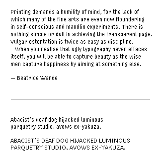
OK, here's a view of a "beta" of Mana-11 Regular:

This is a last-minute request for feedback before the font is released. Thank you for any views, macro or micro, positive or negative!

Notes:

1) No kerning yet.

2) Thanks to Karen Huang for the great Bea quote.

3) The pangram in the bottom half is sequential - the letters "a"-"z" occur in order, to make it easier to evaluate a font.

hhp

On Nov.17.2004 at 03:24 PM
Hrant’s comment is:

So does the silence mean it's perfect, or too horrid to even address? ;-)

hhp

On Nov.19.2004 at 12:31 PM
Nate’s comment is:

I'm looking forward to checking out Mana 11 when it is finished! :)

On Nov.19.2004 at 01:27 PM
Armin’s comment is:

Hrant, my biggest "complaint" would be about the lowercase i. Because it doesn't reach the full x height it creates an odd wave when reading. It's like you need to go down one step to read the i, then go back up one step to read the following character. It's interesting because I read your sample paragraph a few times and the "effect" eventually went away. But I still feel it threw me off. It creates a texture that readers are probably not accustomed to.

And the uppercase V seems a bit wide.

Other than that it has excellent readability.

On Nov.21.2004 at 11:24 AM
Hrant’s comment is:

Not to pester - this will be my last "prod" - but this is important:

Does anybody have a problem with the lc "i"?

This is the biggest questions in my mind about this design. And I've only shown Mana-11 here on SpeakUp; not even on Typophile, since -like me- they're too "close" to type to give uncluttered answers. So I'd appreciate knowing your gut reactions.

hhp

On Nov.21.2004 at 11:28 AM
Armin’s comment is:

> Does anybody have a problem with the lc "i"?

I think we were both posting at the same time… see above your last comment.

On Nov.21.2004 at 11:54 AM
Hrant’s comment is:

Yes - spooky!

Thanks for the comments Armin.

Do others feel the same way?

The sad thing is that making the stem of the "i" full-height does make it "normal" but leaves only one pixel for the dot*, which makes it quite feeble, taking away the only distinguishing feature that character has... But the jumpiness is indeed a problem. Tough call. I'm actually leaning towards making it "normal", simply to remove barriers to acceptance - grayscale pixelfonts are already a "pushy" thing - if they behave too crazy they're even harder to sell - both figuratively and literally!

* Putting light grays on both sides of the dot helps its presence but makes it too blurry I think.

BTW, about your experience that the strangeness of the "i" fades away with familiarity, I was expecting and hoping that's true (thus making for greater readability in the long run) but re-reading something is not a good test of that: when you know what you're reading, you're just going through the motions, not actually making much decipherment effort. A real test would be reading a long piece.

As for the width of the "V" (shared by some other characters too), there are certain constraints, like it being a symmetric letter, and the need to enforce variation between sizes. With pixelfonts you often have to settle for funny features; and in planning ahead for Mana-9, I had to choose to err on the side of too-wide. Sometimes though when things got way too wide I had to go for a very different structure, like in the "w". I could have also given the "V" flat sides to make it look less wide, but I tought that was a worse compromise.

I gotta love them compromises... otherwise I'd be painting on canvas not pixels. :-)

hhp

On Nov.21.2004 at 12:37 PM
timfm’s comment is:

Hrant,

Mye eye has a bit of a problem the "i" as well, and the terminal on the lowercase "r" might benefit from a slight trim.

-tim

On Dec.04.2004 at 12:34 AM
Hrant’s comment is:

Of the three people who commented (you two and Karen Huang) all complained about the "i"... So it's now been officially made "normal". I would have left it like I first made it, but thanks to user feedback it's fixed. I did put very light grays on the sides of the dot though. :-)

The "r" needs to stay like that however - it's sort of part of the Mana character, and the strong beak improves spacing (without resorting to a complete neutering of the character of the "r"), even though Underware has likened that form to a water faucet. They don't drink water?

hhp

On Dec.06.2004 at 11:12 AM