


is a positive symbol. It helps signal a new United Way…
vibrant, exciting, colorful, positive and changing.
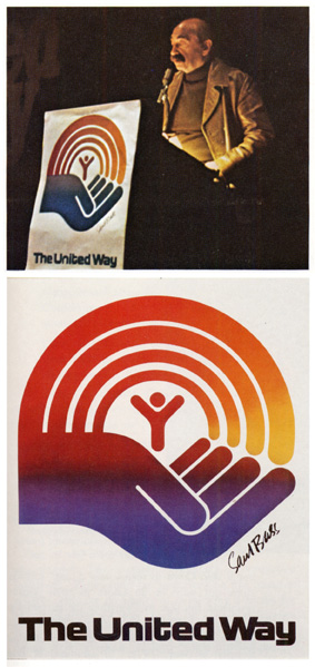
Saul Bass
Creator of United Way symbol
1972 United Way Leaders Conference
It’s been more than 30 years since Saul Bass created the identity for United Way, whose mission — as currently stated on their web site — is to “improve people’s lives by mobilizing the caring power of communities”. Until now they have mostly focused on fundraising through each of their 1,400 community-based independent organizations. Today, as United Way shifts their focus to being a community impact leader and their accruing to focus on results rather than solely money, the time for an identity change is ripe.
Saul Bass’ logo was designed to “Convey United Way as a contemporary organization, sensitive to the changing needs of our society”. Its three elements — the Rainbow, the Person and the Helping Hand — are at the core of United Way’s mission. The Rainbow is “A blending of human diversity, creates harmony and unity of purpose. [It] springs from the helping hand, representing the hope of a better life possible through United Way”. Then, the Person, “The symbol of mankind, is cradled by the helping hand. It shows that all people are uplifted by United Way”. And lastly, the Helping Hand, that “Symbolizes the services and program supported by United Way.”
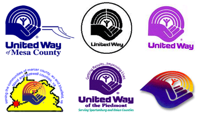
With 1,400 independently-run organizations the intangible core values are not as hard to maintain. Nevertheless a consistent use of the logo (which obviously represents said core values) is much harder to control.
Futurebrand assisted United Way in the development of their new identity. Keeping the original elements of the well-established and recognized mark, the new logo is simply — simply meaning good — a bolder, cleaner, more integrated iteration of Bass’ work. Whose red-to-yellow gradient is a highly questionable decision given reproduction issues and if done today would have sent most designers into a fit of incomprehension.
The new logo is encompassed in a rectangle to discourage use of the icon by itself, which was indeed recognizable but with many non-profits using a rainbow or hands in their own identities United Way was simply just one more. The new custom wordmark is perhaps the biggest change, with more friendly and voluptuous shapes. Although the chunky semi-slab-serifs are a bit overdone. The Rainbow has been trimmed down to three rings rather than four and the hand has been humanized with less-angular forms than Bass’. Overall, the new identity is stronger, more iconic and better integrated.
is a positive symbol. It helps signal a new United Way…
vibrant, exciting, colorful, positive and changing.”
Thirty years, and a redesign, later Bass’ vision and ideal — which are the attributes that ultimately drive a smart identity — are still standing. And for that, I’m grateful.


Armin and David:
Saul Bass redesigns are essentially very difficult. Because the imagery is so powerful. The United Way Identity was actually worked on by SAUL BASS, Art Goodman, and Mamoru Shimokochi
http://www.shimokochi-reeves.com/ms_frames.html
Siegel & Gale revitalized the Identity for Girl Scouts and changed the Font.
Pentagram revitalized the Livery for United Airlines and abstracted the Identity on the tail fin.
Great job by both of these Identity Consutancies.
David, I actually love the revitalization of United Way. Although, I have allegiance to the Original Identity. Always will. FutureBrand did keep the spirit and integrity of the Original Bass Mark.
This one will grow on me. The lines are not as angular as the Original. Result of T Square, Triangle and Ellispe.
Thus, a different style of Designing Identities today.
David, GOD BLESS you for not using highlights and three dimensional trickery. The new Identity Signals Change!!!!!!!!!
The original was 34 years old. The Original United Way Identity was my favorite Bass Identity in use.
Can you believe that. The same age as Tan. And older than Armin Vit.
Kudos to FutureBrand for not completely changing the Identity. Which FutureBrand easily could have done.
Oval Identities are on the comeback with this one.
Kudos and Accolades.
Sorry, you aren't Design PEDIGREE Felix!!!!!!!!!!!
Reminder, I am the HEIR to my Father's THRONE !!!!!!!!!!!!!

On May.20.2004 at 09:47 AM