Speak UpA Former Division of UnderConsideration
The Archives, August 2002 – April 2009
advertise @ underconsideration
---Click here for full archive list or browse below
  
Hip, Hip… Kay!

On the way to the airport (and not far) from our house we — well, the taxi driver — drive by a Kmart that also houses a Subway, a buttons store and a GameStop, all bustling with activity. Two years ago, during a summer trip, the Kmart was open when we left for the airport and by the time we got back it had closed. And along with Kmart, the pretty-button store and all other small businesses. Today, the lot is deserted and silent, with all stores empty and their signs untouched and, to add to the depressing scene, there is a cemetery across the street. (A perfect spot to start a fight club). This, after Kmart announced it would close around 300 hundred stores nationwide in an effort to stay profitable following their announcement of bankruptcy in January of 2002.

Kmart has had their share of troubles over the years. Some with the Kathy Lee Gifford sweatshop scandal which indirectly affected Kmart; then the bankruptcy two years ago; and, of course, there is litte ol’ Martha’s problems with the law. While, reportedly, sales of the Martha Stewart brand did not drop, it must have taken an emotional toll on Kmart shoppers. But what ethical harm is there in buying a soft, cuddly Daylilly 4-star towel?

Kmart_test.gif

In October of 2002, Kmart opened four prototype stores introducing various changes to the shopping experience, including bigger aisles, better lighting and a slight change to the Kmart logo. Conceived by Arnell Group, the new logo stepped away from its red/blue brand recognition into a gray/lime green combination because, as Peter Arnell said, “I think it’s great being green,” and added “It does mean the future and it does mean growth.” The stores were simply prototypes and it is unclear whether bigger aisles and better lighting have been implemented in existing stores. Luckily, the gray/lime green logo stayed as a vague idea.

On May of 2003, Kmart officially emerged from bankrupcy status and in May 2004 they reported that for the fourth consecutive fiscal quarter, “Kmart Holding Corporation improved year-over-year profitability and liquidity”.

Kmart_logos.gif

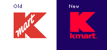
In an effort to put the troubled past behind (and hip future in front of) them Kmart has revised their logo to put emphasis on their big, bold, red K while dropping the script mart housed inside it. Perhaps in an effort to compete against Target’s red bull’s eye and separate themselves from stodgy, price-cutter Wal-Mart.

Kmart_ad.jpg

Lastly, to amp up the hip factor, Kmart has enlisted the stars of the WB to market their back-to-school campaign which gives plenty of play to the big K. The TV ads certainly reflect a new, fresher attitude from Kmart and almost make the deserted lot near our house seem fictitious. Yet, burying the past in TV ads with rocking music and pretty folks is no easy feat. But it’s a start.

Thanks to Amber Nussbaum and David Weinberger for links and insight.

Maintained through our ADV @ UnderConsideration Program
ENTRY DETAILS
ARCHIVE ID 2049 FILED UNDER Branding and Identity
PUBLISHED ON Aug.15.2004 BY Armin
WITH COMMENTS
Comments
Michael’s comment is:

I liked the way the angle cut into the gray/lime logo. It really enhanced the uniqueness of the logo. The red should definitely stay in the identity as well though. I just don't think removing the "mart" from the inside of the letter "k"is really enough to breath fresh air into the brand. It needed that clever angle.

But I could never stand by this kind of logic: as Peter Arnell said, “I think it’s great being green.” I really think designers have a responsibility to have stronger reasons for using certain colors other than something like "It looks cool". But to give Peter Arnell the benefit of the doubt, perhaps his comment was taken out of context.

And that letter spacing between the "k" and the "m" in the new blue and red logo look weird to me. Not to mention the bold "K" in the add doesn't seem to fit with the "MART".

On Aug.16.2004 at 10:01 AM
ps’s comment is:

next thing they'll be selling chick shirts...

i think the new "k" has a readability issue.

the rocking ads seem to be "trying" very hard. i'm certainly not sold. but then i'm not the audience.

On Aug.16.2004 at 10:02 AM
Jason T’s comment is:

K has a lot of ground to make up with all the success Target has achieved, through sales, marketing, and aesthetic. Now's the time for K to climb back to the top, if not up---a little bit at a time.

There isn't an IKEA in every city across the US for people to buy high design for cheap, but there are Ks and Targets. K needs to do something special, something unique, that will separate them from Target. They have to distinguish themselves. Are WB stars and celebrities the way to go? Yes, it's a start, but I believe they have other paths to consider than using lopsided television icons. Those people don't attract me to the K experience. That's part of the problem. My memory is full of miserable K shopping experiences. Families of 8-10 running around the stores with babbling babies and nagging teens. And watching mothers with more tattoos on their arms than Dennis Rodman, that whip their kids in public.

While I don't fault such consumers, and am in no place to judge them, I can speak from my own experience as a former K "employee." Directly out of undergrad, I worked on newspaper tabloids for Kmart and Martha Stewart Living at K's agency of record. The aesthetic we followed for building K ads and coupon pages was so undesigned, yet Martha Stewart had such panache and that's the way she wanted it. K looked cheap and that's the way they wanted it. Our art directors would bring us the latest work from the likes of Target, and fantasize about someday making things look that good. But executives did not see the value of design. They followed conventions that had been in place since the 70s. And here we were in 1998 still adhering to them.

What I see K doing now is great. It is a start. They've moved beyond the old standards, and are expanding their formal and visual language. One has to wonder the cause for these actions. Surely, it's complicated by so many things: Martha in jail, Target's great success, a wartime shopping explosion, and preparation for holiday shopping (months away). I love seeing the underdog come out on top, and hope K can make something really happen.

On Aug.16.2004 at 10:15 AM
justin powell’s comment is:

nice insight/overview armin.

i too have noticed an odd tension with the current tv spots and the vacated k-mart in my home town ( i think its a dollar general store now) it really is an odd feeling seeing the fresh/up-beat tone of the ads with the reality of the store in the back of my mind.

the campaign may be a start... but, the k-marts i know have a pretty crummy customer experience. in addition, their website doesn't align well either. the site does contain the new logo and some of the "fresh" imagery in the main content window. but as you'll notice the the user experience doesn't match up to the tv spots.

overall changing kmarts perception from "cheap" to "cool" will be a huge challenge. the problem comes with the user/customer experience: can the ads overcome the reality of the experience ? or can the user/customer experience step up to align with the ads? it currently feels as if they are trying to "trick" the customer into thinking k-mart is cool.

if the agency in charge can pull this off... what an amazing case study. its an interesting psychological study as well. it sure messes with my head.

On Aug.16.2004 at 10:19 AM
Armin’s comment is:

> . But to give Peter Arnell the benefit of the doubt, perhaps his comment was taken out of context.

Michael, yes, it was slightly removed from complete context at least. In hindsight, it was not "responsible journalism" on my part. Following the green is cool comment was this:

"It does mean the future and it does mean growth."

I'll update the main post to avoid tarnishing Arnell's rep.

(Which by the way… Arnell Group was also responsible for getting rid of the cow box from Gateway computers, so they have a tendency to mess with stuff).

On Aug.16.2004 at 10:29 AM
Gunnar Swanson’s comment is:

I know that bankruptcies and closings take place when a chain has the least discretionary cash but it’s always seemed to me that stores, restaurants, gas stations, and the like should remove their signs the moment they close a location. It is bad enough to leave a hole in a community but leaving a hole with a sign that essentially says “brought to you by our failing corporation” is not exactly a great brand building exercise.

On Aug.16.2004 at 10:46 AM
Amber’s comment is:

When I first saw the new TV spots, I remember thinking, whoa nice jeans. Ooh, cool blouse. Wonder which store this is for.. Express? American Eagle? I was pretty surprised to see Kmart at the end of the ad. (I admit even though I'm probably their target audience, I didn't recognize any of the WB people at all. My sister had to enlighten me.)

The TV spots made me want to go check out what clothes they have. Those models looked pretty darn cool.

But I hate going into Kmart. Even worse than Walmart. For the above-stated reasons. I think they have a good start. I'm anxious to see whether they can bring the other aspects of the "Kmart experience" into line with their new cool.

On Aug.16.2004 at 10:46 AM
Michael’s comment is:

Thanks for the update on the quote Armin, But I knew you weren't trying to intentionally tarnish Arnell's reputation.

> (Which by the way… Arnell Group was also responsible for getting rid of the cow box from Gateway computers, so they have a tendency to mess with stuff).

I didn't know this. Even though I never understood the cow reference, I certainly appreciated the unique identity it gave Gateway.

On Aug.16.2004 at 10:59 AM
Armin’s comment is:

> Even though I never understood the cow reference

Not to stray off-topic, but…

Gateway's cows reference come from the following:

"Much of Gateway's success can be attributed to its unusual brand personality. Gateway product boxes and mousepads are speckled with Holstein spots, while Gateway television ads and catalogs portray a "farm" motif drawn from the company's rural roots. Gateway founder and COO Ted Waitt is a fourth-generation cattleman who started the company in 1985 on his family's Sioux City, Iowa, cattle farm."

Source.

On Aug.16.2004 at 11:11 AM
RavenOne’s comment is:

I have never owned a gateway computer. But I thought the cow boxes were cute. A waste of ink, but...cute.

As for the new (green)logo? It really reminds me of toilet products. Like it should be selling ...toilet brushes or something... and it looks like an I and a funky C to me. (Ick?).

The revamped red-logo doesn't generate much of a response; neither do their comercials. But than again, I'm a bit of a freak for my age-group, and I tend to not get things for the 'cool' factor.

On Aug.16.2004 at 11:13 AM
Patrick C’s comment is:

Thankfully they didn't stick with that green/grey combo.

I wouldn't set foot in a Kmart if everything in the store was free. But then I wouldn't shop at Target or Walmart either so I'm not the target audience.

Having said that I think the new direction (what little I've seen of it) is a good step. But it has already been pointed out that Kmart needs to change more that the look of it's advertising and promotional material. It needs to revamp the entire customer experience. If they don't do that I don't see how they are going to turn things around.

On Aug.16.2004 at 11:53 AM
MC’s comment is:

The lime/gray logo evokes renewed energy for the company. I also like the cut line into the K. I don't care for the red/blue logo, removing the mart in the "k" reveals a fat naked "k" and gives the perception of a generic brand. Kmart has enough perception problems.

The lime green logo is a better solution, but the lime was probably too much of a departure from the traditonal red and blue. I would like to see the Arnell Group logo with a gray/blue treatment.

K-mart has a challenge ahead. Of course the logo is only one small step, in a myriad of "challenges." What good is a pretty logo, if the K-mart shopping experience is still scary?!! I was in a K-mart a few weeks ago, and I will never go back. The store was dark and the aisles were cluttered. Items were not marked on the shelf, and many items were missing. The employees didn't seem that happy either...can't blame them, who wants to spend 8 hrs. a day working in a cave? In the end, I had to go to another store to finish my shopping.

New uniforms would be a nice change (however, costly for a company emerging from bankrupcy). Companies such as Song Airlines and Jet Blue show that they can be low-cost while being stylish. ("Uniforms: The Good, Bad, and Ugly," future speak-up topic?)

Will their new, fresh attitude be carried throughout the organization? Embraced by both corporate and retail environments? Or, will this be a shallow make-over initiative? (I hope not.) This depends on the organization; the big K has to help the little k. The only bit of value a Kmart has in comparison to Target is better sale prices. But even that's diminished when I'm sent to the counter for a raincheck. Luckily, Kmart isn't the only shop in town.

On Aug.16.2004 at 11:56 AM
Jason T’s comment is:

Uniforms: The Good, Bad, and Ugly

Surely, I'd like to see this topic. Although, I've yet to see a "good" uniform at any retail outlet, or department store for that matter. Anytime people wear the same clothing for the betterment of corporate unity, it gives me the creeps. Films like Logan's Run, 1984, and Planet of the Apes show us that the future is only as grim as the clothing we'll be wearing.

On Aug.16.2004 at 12:35 PM
Diane’s comment is:

...better lightning and a slight change to the Kmart logo.

Better lightning?! Holy cow that should draw more crowds to K-mart!!! Lightning in the stores would be great! You could electrocute all of the screaming kids running up and down the aisles knocking merchandise off from the shelves. That would make my K-mart (or K-kmart according to how their new logo reads) experience much more enjoyable.

Damn, was that just a typo? Shoot, I thought you meant it. Well maybe the bigger aisles and better lighting will make their sales increase. Who knows. Well good luck to Mr. Arnell who is so enthusiastic about green although he left out it happens to represent MONEY as well.

p.s. The commercials were a bit interesting even though I had no clue who was casted in them. Maybe it will work.

On Aug.16.2004 at 12:43 PM
Armin’s comment is:

> Better lightning?!

Hm, yeah, I always type in that extra n when talking about illumination.

> Well good luck to Mr. Arnell who is so enthusiastic about green although he left out it happens to represent MONEY as well.

Arnell Group was only involved in that whole prototyping venture. I don't think they are or were involved in the actual redesign of the logo.

On Aug.16.2004 at 12:55 PM
Michael’s comment is:

> Gateway's cows reference come from the following:

Thanks for the research Armin. It makes sense now, and I appreciate the identity a little more too.

Getting back to the new Kmart logo... maybe it's just the shade of blue that is not inviting enough (in the way it contrasts with the red). Something a little lighter maybe, without going into pastel land?

On Aug.16.2004 at 01:05 PM
Tom B’s comment is:

Here in the UK many of our large supermarket chains use a green colour scheme for their branding.

Two that spring to mind are ASDA and Marks and Spencer.

Presumably the thinking behind these colour schemes is that green = fresh, natural & healthy.

Red always makes me think of blood - perhaps a good choice is you like big juicy steaks (mmmm, steak...) but as more and more people demand fresh, organically grown produce, green seems a fine choice.

The pictures of Kmart with the green and grey scheme look so much like an ASDA it made me chuckle. Could it be that the good ol' U of K is making waves in the retail world.

Incidentally, ASDA was bought out by Walmart a couple of years ago (boo!). and there was some talk of changing the branding. However, after some market research it turned out that nobody liked a blue supermarket - so it has stayed green (hooray!)

On Aug.16.2004 at 01:05 PM
Andrew Twigg’s comment is:

I agree with the sentiments of many people here that a change in design isn't everything. For Kmart, a change in imagery is not a change in image.

I grew up in a part of the U.S. that allowed me to see that, in these kinds of situations, these kinds of design changes aren't going to be made across the board. I used to go with my mom to Kmart, its delapidated sign on a delapidated building in a delapidated plaza... Kmart went through a similar excercise in the early ninties, I believe (pardon, but I can't find any references to this online, and I was young... it could have been the late 80's).

At any rate, our Kmart never got anything other than newspaper circulars with a new design. Those promised something slick, clean, bright... but all we got was dingy floors and bad lighting.

Now my parents live in another part of Pennsylvania where Kmart has managed a very firm grip on its customers, until Target moved into the area about two years ago. I will set foot in Kmart when I am in their hometown when, ineveitably, I've forgotten contact lens solution or deodorant; after all, Target is 30 minutes away. Or I'll stop if I want to make over my parents' bathroom with something a bit more... Martha.

But the problems with Kmart can't be fixed with a new design. The "brand promise" will exceed the reality, and while people may buy it at first, they won't be fooled for long. If Kmart wants to solve its problems, it needs more than Martha Stewart. And more than a re-stylized logo and WB stars. Besides, would anyone believe Beverly Mitchell and all of her beautiful friends shop at Kmart anyway?

On Aug.16.2004 at 01:09 PM
Tan’s comment is:

I still find it funny (as in strange) that you can still buy guns and ammo in KMarts, right next to skateboards and bicycles.

They've needed a revamp for a very, very long time. The new K works well for me. I think it's smart of them to distance themselves from the low-rent "mart" in their name, if that's in fact, what they're doing.

As to red, well, it's very effective for retail. Green is more often used for service, energy, and food industries — I'm sure that's the conclusion they might have come to in focus groups when deciding on the colors.

Boy, lots of stores are copying the hip Target commercials these days, aren't they? I saw a series of back-to-school commercials from JCPenney that was almost identical to a series for Target. In fact, it was better done — better music, hipper kid models, hipper choreography, etc.

But back to the guns and ammo. When I was a kid, Kmart was where you go to buy fishing and hunting supplies, Carthartt jackets and coveralls, and metal garage shelving. You know, the essential redneck home stuff. Now that they've changed, where are people supposed to get that stuff now?

On Aug.16.2004 at 01:19 PM
Michael’s comment is:

Wally World, which is what I grew up with.

On Aug.16.2004 at 01:43 PM
Josh’s comment is:

My town lost its K-mart as well. A few months later, in its place there grew a shiny new Best Buy. It's a good thing.

I may be in the minority about this, but I can't care less about a company's ads or image. If they have what I want and the price is right, they have my business. I never shoped at K-mart because they either didn't have what I wanted or they were charging more than what I wanted to pay.

On Aug.16.2004 at 01:52 PM
Steve K’s comment is:

I have to admit, I have a certain nostalgia for the Kmart of my youth. It was completely without pretense. They never tried to be hipper than they actually were. Their new efforts to be edgy and teen-relevant seem pretty hollow. They're trying so hard to be Target when all they need to do is figure out how to be Kmart again.

On Aug.16.2004 at 02:56 PM
mGee’s comment is:

2 words: TOP HEAVY

Rather than redoing the K, they merely filled in the outline area of the green logo with red and now you have this naked K, it is all too apparent that the upper and lower halfs join at the exact middle height which makes the character very top heavy.

Horrible typographical solution and lousy choice of font on the ads.

On Aug.16.2004 at 03:50 PM
Darrel’s comment is:

I agree with Steve. Kmart used to be must Kmart. Kid of like the Woolworths, Gambles and Montgomery Wards. Of course, they're all long gone, so maybe nostalgia has no place in the department store wars.

KMart fails, IMHO, just because shopping their is so horrid. The stores are ugly, usually too big, with products that are neither nice (ie, Target) nor incredibly cheap (ie, Walmart).

They did the whole 'BigK' thing a few years back which must meant more crap...not better stores.

Do not of Kmart's exec's visit actual Kmarts?

On Aug.16.2004 at 05:12 PM
Saman Rahmanian’s comment is:

I don't live in the States, so I have no particular relevant associations with KMART, but when I look at the logo, I can't stop thinking of the Kodak symbol, designed 1972 by Peter Oestreich.

On Aug.17.2004 at 02:47 AM
Steve K’s comment is:

I did a little research and found this little walk down Kmart memory lane.

On Aug.17.2004 at 08:19 AM
debbie millman’s comment is:

I still find it funny (as in strange) that you can still buy guns and ammo in KMarts, right next to skateboards and bicycles.

Really??? I thought that after Michael Moore's highly publicized and impromptu visit to Kmart (in the movie Bowling for Columbine) that the company agreed to stop selling ammo and guns.

And I like the logo--bold and modern.

On Aug.17.2004 at 09:11 AM
Armin’s comment is:

> I thought that after Michael Moore's highly publicized and impromptu visit to Kmart

I thought that took place in a Wal-Mart…

On Aug.17.2004 at 09:54 AM
Darrel’s comment is:

I thought that took place in a Wal-Mart…

No. K-Mart. Even Moore isn't stupid enough to mess with the Waltons. ;o)

On Aug.17.2004 at 10:10 AM
Armin’s comment is:

Okidoki then.

On Aug.17.2004 at 10:19 AM
MC’s comment is:

I did a little research and found this little walk down Kmart memory lane.

Ah, K-mart through the years. Nice research Steve K! Interesting to see the different logo variations. The only store photo that has any life is the Kmart oil painting.

Here's a question: Would a firm want to have the K-mart account?

The optimist in me says "yes!" but the pessimistic says "no!" I can't even identify a positive emotional experience with the brand...

On Aug.17.2004 at 10:28 AM
Steve Mock’s comment is:

The only positive emotional experience I can think of - albeit twisted logic - is how we all laughed when Dustin "Rainman" Hoffman utters "Kmart sucks."

Is it at all possible to trade on that? Like: "Yeah... We Know."

On Aug.17.2004 at 10:57 AM
jenny’s comment is:

My main memory of the "Kmart experience" was, as a young teen, being completely horrified when my mother dragged me there. My God, what if someone saw me (gasp, horror)!

Typical teen-think, it never occurred to me if someone saw me there, they'd have been at Kmart too.

I like the new logo - and I noticed an ad in a magazine today. But I'm with everyone else: if the shopping experience doesn't improve, it won't mean anything.

On Aug.17.2004 at 11:22 AM
Andrew Twigg’s comment is:

Steve K - thanks for finding that kmart info. Fascinating, expecially all the other info on that site about other discount retailers.

On Aug.17.2004 at 02:45 PM
Rob ’s comment is:

Debbie M. said

And I like the logo--bold and modern.

FIrst of all, these are two words I have never been able to associate with Kmart. And I don't see how, unless they are able to find an untapped niche, that they will ever be the major retail player they are now just the shadow of.

Wal-Mart basically rules the low-end and Target takes a high-end approach to the rest of it, and does it so well. So, strategically, I don't know where Kmart really fits. (Maybe someone more familiar with the superstore retail market would know). The competitve landscape is so remarkebly different now, that I think this is going to be an uphill battle for them.

As many people have stated, the problem with Kmart has been the experience. No logo or star-laden commercials are going to change that. And certainly, most customers are smart enough to see this as somewhat of a 'copy-cat' of the Target campaign or any other 'hip' retailer. But when we see the Kmart name, we are surprised (as in Amber). But what comes next. "Oh, yuck, Kmart?" or, possibly something more positive. Are cool clothes and a good TV spot enough to over come comments like "I hate going to Kmart?" (I'd be interested to know if Amber actually did go to Kmart to check out those jeans).

As for the logo itself, yes it's bold and modern but it doesn't work for me. I don't find the way it's applied on the web site, the top of the K is flush with the top of the nav bar appealing. It' feels cut-off. And the layout seems trapped between the new Kmart (here look at the attractive boys and girls) and the old Kmart, look at all these cheap, cheap prices. And last, but not least, why the BIG K and then repeating a lower case 'k' with mart underneath?

On Aug.17.2004 at 03:12 PM
Tan’s comment is:

>I thought that after Michael Moore's highly publicized and impromptu visit to Kmart (in the movie Bowling for Columbine) that the company agreed to stop selling ammo and guns..

Hmm, it's been a couple of years since I've been in a Kmart (one was closing in my hood, so I scooped up some cheap metal shelving for the garage). But I distinctly remember chuckling at the large selection of fancy gun cases and racks they had for sale. And when I passed by the gun counter, for the first time in my life, it seemed oddly out of place in a suburban department store. It didn't seem odd when I was a kid, shopping there with my older brother for fishing and hunting supplies. But that was in Texas, which still allows permits for personal, concealed firearms to this day.

I bet in farm country and more rural, small town locales, Kmart still sells guns and ammo, alongside hunting bows, styrofoam duck decoys, and camouflage tents. Michael Moore be dammed.

But back to topic.

A lot of people here are criticizing the shopping experience of Kmart. I agree. But maybe we're not their target customer audience. I know people who think Target is too fancy, and their merchandise is too urban. Wal-mart and Kmarts become a comfortable step "down" in retail environments. It may seem like slumming to designers like us, but to lots of people, those dimly-lit, unadorned aisles at Kmart represent more value for their family budgets.

On Aug.17.2004 at 03:48 PM
Steve K’s comment is:

I agree with Rob. Kmart is in a precarious spot.

WalMart operates under the same basic business model, but in massive volume.

Target has revolutionized marketing in it category and beyond.

So where does that leave Kmart?

It's cheaper at WalMart and cooler at Target.

Seems like commercial Darrwinism to me.

Survival of the fittest. Bye bye Big K.

On Aug.17.2004 at 04:45 PM
Darrel’s comment is:

I can't even identify a positive emotional experience with the brand...

Note even Slush Puppies?

On Aug.17.2004 at 05:01 PM
Darrel’s comment is:

note = not

On Aug.17.2004 at 05:02 PM
Tan’s comment is:

>So where does that leave Kmart?

It's cheaper at WalMart and cooler at Target.

It's difficult to tell how many niches a retail market can split. It's not always as simple as base-premium, ie. Walmart-Target. Some markets can bear a number of similar competitors

Look at clothing department stores like Sears, JCPenneys, Mervyn's, Kohl's, etc. I have no idea how all of them survive, but they somehow do.

I think Kmart has a fighting chance. In fact, I'm rooting for them — anything that battles Wal-mart is worth supporting.

On Aug.17.2004 at 05:14 PM
Michael H.’s comment is:

(Updating my name since there are too many Michael's around here...)

Tan said:

But that was in Texas, which still allows permits for personal, concealed firearms to this day.

It was actually outlawed for a while until Bush became governor. Once elected, he made it legal to carry concealed firearms as long as you had a license (concealed firearm, not driver's). However, several retail sites won't allow you to carry a concealed firearm unless you are law inforcement. So you'll see signs on their entrance doors with something to the effect of, each customer needs to be wearing shoes, a shirt, and not have a gun on them. Welcome to Texas. And yes, in the state capitol of Austin, Wal-Mart still sells guns and ammo in the sports department.

and Tan also said this:

but to lots of people, those dimly-lit, unadorned aisles at Kmart represent more value for their family budgets.

I was just remembering something one of my instructors (back in school) taught us when discussing layouts. He held up a Wal-Mart ad and asked us why it didn't look "classier". The answer was, of course, the target audience. They were attracting the custmers who don't like to afford to shop at Nordstrom, Eddie Bauer, etc. Anyway, my point is that I think Tan is right in that the shopping experience is tailored to that particular audience.

On Aug.17.2004 at 05:41 PM
Andrew Twigg’s comment is:

In an earlier post, I wrote: ...my parents live in another part of Pennsylvania where Kmart has managed a very firm grip on its customers, until Target moved into the area about two years ago.

My parents and their community are the ideal Kmart demographic: they're the suburb-of-a-suburb-of-a-suburb of Pittsburgh. And like I said, Kmart has done well until Target moved in. Even when WalMart moved into the area, Kmart held its grip... I don't know if it was that the community was devoted to the Kmart brand, or more devoted to keeping a major discount store in the area, but people chose Kmart over the WalMart an extra 20-30 minutes away.

However, the "new" Target is about 20 minutes away, and the effect on Kmart is visible. The store keeps "rolling back" store hours (discount store pun intended)... and if you visit a Kmart and a Target for every day things like toilet paper, pens, laundry detergent, and potato chips, you'll find there's not really a difference in prices.

Additionally, I don't believe that there are too many people out there who really think that Target is too stylish, even if they don't care for Isaac Mizrahi. There's no couture Bounty paper towel at Target.

If Kmart can fix its other problems, a redesign may help things out. But otherwise, I'm afraid its irrelevant. I think Tan may have been heading the right direction when mentioning Sears, JCPenneys, Mervyn's, Kohl's, etc: if the demographic for Target, Kmart, and WalMart overlap; WalMart can beat the others on price; Target can match price and its customers can Expect Even More (look at the top of the sidebar navigation); Kmart doesn't stand a chance unless it changes more than its marketing.

On Aug.17.2004 at 09:03 PM
Steve K’s comment is:

To some extent I agree with you, Tan, but in this case the situation seems pretty dire. Some markets can sustain healthy competition between comparably scaled retailers. Once one of those retailers becomes the nations's second biggest employer and the largest retailer of periodicals, CDs, DVDs, mayonaise, duct tape, etc...all bets are off.

WalMart's track record as a category killer is pretty solid. On the east coast, the rise of WalMart has meant the demise of several regional retail chains like Jamesway, Caldor, Ames. Where did all the Woolworths go? WalMart does what they do on such a scale, and with such precision and ferocity that competition is nearly futile.

So how did Target survive and ultimately flourish under such stiff competition? Out of neccessity, they began to market themselves as the cool alternative to WalMart. They became the anti-WalMart in order to survive.

Kmart's problem? They're trying to be a little bit WalMart and a little bit Target all at the same time rather than trying to truly rebrand and rebuild as a new, unique alteranative to their competition.

Jack of all trades, master of none.

On Aug.17.2004 at 09:22 PM
Allison’s comment is:

I live in the capital city of Missouri, where we have a Wal-Mart, Target, and KMart all within one mile of eachother. I'm really surprised our KMart has not closed down yet... it's only use to our city anymore is a parking lot to hold carwashes for cheerleading squads and farmer's market twice a week. The whole WB actors thing really bothers me because it's just a big lie (to our city, at least.) I can't think of a store to be "hip and cool" when people defecate in the isles (on numerous occasions.)

On Aug.20.2004 at 03:18 PM
DesignMaven’s comment is:

I've sworn off Branding and Identity Editorials for about a year.

Still Hoarse and Haggard from ywca.

Unless of-course IBM is revitalized or one of Rand's other Identities.

Other than that I'm Done.

Darrel:

I agree with Steve. Kmart used to be must Kmart. Kid of like the Woolworths, Gambles and Montgomery Wards. Of course, they're all long gone, so maybe nostalgia has no place in the department store wars.

Breaking Balls Darrel. Figured I'd enligthen you.

Any store that sell Snack Foods and Condiments with retail e.g. Men and Women clothes, Culinary,

Bath and Linen, has a soda fountain or eatery inside is a Five and Dime.

Ala, K Mart, Walmart, Walgreens, Kohls, Target,

Aims which used to be called Zayre.

The aforementioned are not Department Stores.

Of course many 5 & 10s have soda machines and franchise restaurants such as, Little Ceasars Pizza.

Good old Fashioned 5 and 10 cent stores. Which is what they were once called.

The Original Model Woolworths and SS Kresge have disapeared.

K Mark was developed from the SS Kresge Model.

Essentially all SS Kresge became K Mart.

Department Stores High End.

Neiman Marcus, Nordstrom, Saks 5th Avenue,

Lord & Taylor, Bloomingdales, Macy's

Marshall Fields.(only in Chicago) Bergdof & Goodman (only in New York) etc.

Middle of the Road Hecht's,

Bargain Basement: Sears, JCPenny, Montgomery Ward, Filene's Basement,

Sims. etc.

Just categorizing. Not putting down any particular entity.

The smart shopper shops in all three categories.

Depending on the lattitude they have with their finances.

Sweat Socks and underwear are no better at High End than at Bargain Basement.

Not even I can afford a $ 125.00 dollar pair of Versace Briefs or Boxers. Utterly Ridiculous.

Lets face it Skid Marks are Skid Marks. None of them Haagan Doz or Breyers.

To the person that uttered Nordstrom with Eddie Bauer. Probably Eddie Bauer is the only Catalog Store in your locale. Speaking the names in the same sentence is a Major, Major Fashion Fopah.

Eddie Bauer not better than any of the other Catalog Stores. Definitely over priced. No better than Norm Thompson, Land End or LL Bean.

Now, LL Bean. That's a Brand Promiss all entities can learn from. You can buy a product from LL Bean Keep it for 25 years. Retrun the product from being worn out. And LL Bean will replace it. NO QUESTIONS ASKED.

I love shopping the High End Stores. Strategically and in moderation. There's only so much Missoni, Lora Piana, Luciano Barbera and Ferragamo a young man can have.

Big Up's to K Mart Branding Team for keeping the Spirit and Integrity of Anspach Grossman Portugal's Original Modern K Mart Identity.

Designed by Ken Love. Now President of Lippincott & Margulies.

Yeah, Yeah I know, But I'll never address them by their new name.

Walter P. Margulies contribution to Corporate Identitiy is to important to be ignored.

Anybody that has applied the Psychology of Color

to prototypes and Schemes.

Green does not work for Retail. Thus the interiors would have to be Green and Gray.

Kind of Gloomy !!!!, don't you think ???

Almost anticeptic!!!!!!!

Back TO MY BRANDED CELL.

Wearing my Route 66 Shirt, Dixie Shorts and Ferragamo Shoes.

On Aug.20.2004 at 10:36 PM
Armin’s comment is:

> Marshall Fields.(only in Chicago)

Not that it furthers the discussion, but…

> Speaking the names in the same sentence is a Major, Major Fashion Fopah.

And that is a major, major spelling faux pas… sorry Maven, just, as you say, breaking balls ; )

Regarding the actual logo… I like the simplicity, it is a strong, bold, red K, it's a little disproportionate in some areas, but it works really well on TV — where the details get lost. I don't like the kmart spelled out underneath though. Looks very old-fashioned, as in 80s Helvetica; it reminds me a lot of this.

On Aug.21.2004 at 11:36 AM
Tom B’s comment is:

I think this may say something very interesting about cultural differences.

A few people have stated that 'green doesn't work for retail'.

However, as I said in my earlier post, here in the UK green is the predominant colour for large grocery stores. Only one, Tesco, uses red and blue.

Red and blue seem to me to be greedy, corporate colours, whereas green feels natural and honest. Maybe it's something to do with our flags. Even though the british flag is red white and blue, we don't have the same positive attitude to our flag as most Americans do. Too many years of racism and bigotry (the by-products of Britain's empire) have left us with a cautious attitude towards nationalism.

Don't get me wrong, I think the UK is a fantasic place, and I'm very proud to be British, but I feel slightly uneasy when I see the Union Jack flag.

I'd like to know more about how American people feel about these colours. I think our cultures are pretty similar, but this seems to be highlighting an important difference.

On Aug.21.2004 at 11:42 AM
DesignMaven’s comment is:

Armin:

I ain't perfect. I shoud've checked.Thanks.

The mistake was the double "K".

Which is why Gene Grossman's and Ken Love's Original K Mart Identity work better.

Essentially, K Mart and Wal*Mart sell the same merchandise.

I'd like to know who actually Developed and Implemented the program.

C'mon, Helvetica ain't all that Bad..

Bad enough TAN doesn't like

Frut...ger. I can't even bring myself to say it.

On Aug.23.2004 at 02:29 PM
debbie millman’s comment is:

Can anyone tell us who designed the new logo, please?

On Aug.30.2004 at 10:43 AM
Tan’s comment is:

>Bad enough TAN doesn't like Frut...ger.

Frutiger is ok. Never said I hated it. I don't have as much of an aversion to it as Gills. Not on top of my list of faves, that's all.

It's just that there's better sans out there more worthy of mastering. Univers, Helvetica, Meta, Futura, Geometric, Trade, News, Franklin, and so on. It's a preference thing.

>UK green is the predominant colour for large grocery stores.

and like I said earlier, here in the states, green is most often used for food/consummables (grocery stores, Starbucks), gas/energy companies, and financial institutions. It's less used for non-food retail applications.

It should be noted that in the energy industry, green is the international color designation for water. That's why those giant round tank reserviors in industrial parks and neighborhood hydrostatic tanks are painted green. White and black is for petroleum and solvent liquids.

On Aug.30.2004 at 11:22 AM
Derek’s comment is:

Can anyone send me pictures of the k-mart eatery? I am unable to find any, and I really want to see it. Our k-mart no longer has an eatery, it hasn't for 10 years or so. So please... Send those eatery photos!

On Nov.21.2004 at 08:00 AM
Mark’s comment is:

Kmart's commercials have been lately gone through a radical change.

Sigh and its not a great one either,They have a new Kmart song "I found love at a Kmart Store" I'm NOT kidding this is the actual lyrics and its country music ech,and at the end it has a i heart/love K, man, if Kmart choses this as they're new slogan they have lowered the bar waaaaayyy down.

C'mon Kmart you can do better than that!

As for Derek requesting a pic of Kmarts eatery here ya go.

this is some small pics of a Little Ceasers in Kmart

another design (I never got to see it)

Most common design, the last design (its way in the back in the picture) at the left of the word "Cafe" was the 1990s to 2003 Kmart logo the "script "mart" witin the red K" logo

sadly Kmart has been phasing out eateries for more product space :(

On Sep.27.2005 at 08:12 PM
Mark’s comment is:

.I don't live in the States, so I have no particular relevant associations with KMART, but when I look at the logo, I can't stop thinking of the Kodak symbol, designed 1972 by Peter Oestreich

Heh, for me that not even close. Fire Alarm company Kidde's old logo at one time is very similar to Kmarts new logo.

I recently discovered this old logo on a fire alarm at Mystic Seaport in New London,CT

anyway here it is seen on a instruction diagram about fire extinguishers, I think its in German.

On Sep.27.2005 at 08:44 PM
Linda’s comment is:

Wow, there are a lot of comments on this. It is too different from the bright cheerful red of the old logo. I am actually taking up a corporate Identity class in college right now and viewing this logo is a part of my class lecture, believe it or not! lol I think the blue with the red is better but I do NOT like the repeated "K" in the logo. I have become sooo accustomed to reading their logo as K-mart that it trips me up some. Like K-kmart. Redundant. They could have simply put mart under it and it would flow better. As for the Green & grey, All I can say is that I don't like the green & grey Kmart logo at all. What I get from that is more of a gas station or fuel company trying to compete as a more enviromentally friendly company type of feel to it. It just seems really out of the department store catagory. I don't shop at gas stations unless I need coffee, candy, ar lottery tickets for my Grandpa. I don't know how you all feel about it but that is what I get from it. I also heard it said that green means the future and growth. Another said that it could represent money. It could also represent sickness, which is what I expect Kmart would face financially if they adopted this new logo. ;)

On Oct.29.2008 at 07:56 PM