Speak UpA Former Division of UnderConsideration
The Archives, August 2002 – April 2009
advertise @ underconsideration
---Click here for full archive list or browse below
  
Recent Rebrandings

In this edition of Recent Rebrandings two companies merge and then, literally, do the same to their logo; an argumentative plea precedes a new identity for an Ivy League school; and one of the world’s largest corporations states its case.

1. Cingular Wireless

cingular_wireless.gif

Like an in-law pleasing marriage, Cingular and AT&T Wireless, have hyphenated their identity. In all instances possible. Most noticeably, the two corporate colors, Cingular’s orange and AT&T’s blue, have been integrated in the logo. Then, the equity of AT&T’s signal bars forced their way to the end of the tag line, which also is a — pun alert — rollover from AT&T’s branding. BBDO Atlanta and New York are in charge of the multi-million advertising initiative to present the new company to the public. Ladies and gentlemen, it is my honor to present to you Mr. and Mrs. Cingular-Wireless, you may kiss the merger.

2. Cornell University

cornell_logo.gif

For Ivy League schools image, reputation and notoriety is everything. Yes academics and athletics too. A year ago, a good, old fashioned brouhaha erupted around Cornell University’s standings in U.S.News & World Report — which recognizes the best colleges in various categories each year — and the blame landed on the college’s image. In a report — supposed to not circulate — drafted by the Ad Hoc Committee on Improving Cornell’s Image a handsome case is made for the need of a new identity for Cornell. Sentences like “It will require a multi-pronged, multi-dimensional approach to improve Cornell’s image and enhance its status as a global brand”, or “The Cornell logo is and should be at the core of Cornell’s marketing package. Strong trademarks are crucial to coherent brand identity. Powerful, unique, and memorable logos elicit visceral responses from consumers,” and even proposed tag lines like “If you can get through Cornell—you can get through anything” (original emphasis), make it one of the most compelling rebranding initiatives one can read.

A year later, Cornell University rolled out the new identity designed by Chermayeff & Geismar. In the introduction to the new brand, Cornell’s President, Jeffrey S. Lehman, states “[we] listened to our alumni, students, faculty, staff, and trustees”. With a report like that, one better listen.

Lastly, an interesting read about the previous Cornell logo, “The Big Red Box”, designed by Lippincott Mercer.

3. BASF

BASF_logo.gif

What exactly does BASF do? Until now, I at least, wasn’t sure. Now, it’s crystal clear, they are “A Chemical Company”. The new logo still uses a bold Helvetica — redrawn it looks like — with two hollowish squares, one in negative, one in positive. Tony Spaeth, on Identityworks, urges to “[not] look for meaning in ‘two squares’”. BASF’s 2003 Annual Report offers the following, “The two squares stand for mutual success in partnership with our customers, employees, investors, neighbors and society”. The new identity, to boot, features six joyous corporate colors to emphasize the company’s diversity. However, I’m still not sure what BASF does.

Thanks to David Weinberger on the background of Cornell’s redesign and to DesignMaven for alerting us about BASF.

Maintained through our ADV @ UnderConsideration Program
ENTRY DETAILS
ARCHIVE ID 2151 FILED UNDER Branding and Identity
PUBLISHED ON Nov.25.2004 BY Armin
WITH COMMENTS
Comments
DesignMaven’s comment is:

Armin:

Why do you consistanty get all the Identity Editorials. Don't answer (laughs)

Just Jealous !!!!!!!

I never liked seals especially the ones Government Agencies use.

Cherymayeff & Geismar incorporated the proper Design.I'm proud.

Cingular, I always thought their Identity was pretty dismal. Until I saw it moved.

Doesn't AT&T have the largest equity. The new Identity is confined to the wireless operation.

Sorry Brady. Now I'm a big fan of the Identity.

Something I learned from you. Often times an Identity has to be animated to appreciate it's true essence.

Yeh, even an Old DOG like me can learn something from someone younger.

BASF, I LOVE !!!!!!!!

On Nov.26.2004 at 11:23 AM
DesignMaven’s comment is:

Armin:

Sorry for the second post.

The below referenced lines are attributed to you.

Something I learned from you. Often times an Identity has to be animated to appreciate it's true essence.

Yeh, even an Old DOG like me can learn something from someone younger.

On Nov.26.2004 at 11:54 AM
Michael Surtees’s comment is:

Cingular Wireless

I don't know much about the merger of services - is it a 50/50 thing?. It looks like Cingular won some serious equity by keeping their avatar while AT&T is conotated with their blue. Blue alone doesn't neccesairly say AT&T like brown does for a certain other company. The balance seems 90% Cingular, 10% AT&T.

On Nov.26.2004 at 12:10 PM
Patrick C’s comment is:

Briefly (and by the way I love these posts...very interesting):

Cingular: was never too fond of their icon, but it isn't bad. The new mark I have to read like a book which I don't particularly like. There's just too much going on and a conflict, for me, between the two icons. And I would never have guessed that the bars were a reference to AT&T. Such a hodgepodge.

Cornell: First, universities need good overall branding. The local university I do some work for has gone through a number of branding changes and the current one is a joke (not that any of them have been great)...a joke that students and faculty are all too aware of. Students have gone so far as to use the branding in student organization campaigns against the university for some of the actions it has taken against the student orgs. And the students did a great job too. Ivy League schools should look old I suppose. They should reek of knowledge, history, power, etc. What else are you paying for?

The new look isn't original, but of course it's the right way to go.

BASF: The only thing I've ever known about BASF is that they made cassette tapes once upon a time...I think. But I liked their simple type. However, I find the addition of the positive/negative squares mesmerizing. I could stare at those for hours. I'm not sure why, but it works for me. I sort of see a connection between the squares and chemicals...you know...the whole and the part...the something into another thing...acid and base...etc. I like.

On Nov.26.2004 at 04:15 PM
Colin’s comment is:

Strange that Cornell decided to restore the "university" to its official brand, while my alma mater just recently made a big deal about dropping the tag. Always behind the times, Brown, always behind the times. Well, we still have Dartmouth and Penn to keep us company.

On Nov.26.2004 at 06:01 PM
DesignMaven’s comment is:

Wow Armin:

I just read the article by Paul S. Cohl, The Cornell Daily Sun. This can be another Speak Up Topic altogether.

Interesting, Cornell is looking for an Identity steeped deep in tradition. However, fashionable to have enough equity to command millions of dollars via merchandising.

Curious to know, why these misgivings of the Lippincott & Margulies Identity didn't surface before it launched. And address the issues discussed in the article from onset.

Why weren't the problems discovered in the Development Stages of L & M's

Identity ? Such as the production problems, and generic quality, lack of equity and memorability.

How much market research was commenced, Qualitative Analysis, Quantitative Analysis, Ethnologic (sp?) Analysis. Terminology I learned from Identity GODESS, Debbie Millman.

Lippincott & Margulies didn't Design the Identity for JCPenny. Wrong, Unimark International Designed the Identity for JCPenny. L & M may have put the box around Unimark's Logotype. Not sure.

Personal Note: I'm also annoyed by all the Universities and Colleges that incorporate Identities similar to New York Yankees and Yves Saint Laurent Identities.

Except Notre Dame. Which was one of the first to incorporate the overlapping Capitol Letters.

It's overdone, redundant. And no longer in-vogue.

Michael Surtees: Spot on with your assessment of Cingular and AT&T Identity.

The Blue Stripes of AT&T, perhaps should've been superimposed over Cingular's Identity.

The verticle bars at the end of the tagline; is reminiscent of addidas Identity.

On Nov.26.2004 at 08:25 PM
Greg’s comment is:

Does it not amuse anyone else that Cingular is now plural?

On Nov.26.2004 at 08:46 PM
Su’s comment is:

Sad about BASF. I always liked their "We make things better" concept. "The Chemical Company" feels...blah.

I realize that I'm extremely cynical about advertising-type things, but I can't be the only person who feels like this is a steaming load.

If I'm reading the Identityworks thing correctly, the squares are only there to indicate "this is a new logo." Which it isn't. Except that they stuck those two squares over there, so now it is. What the hell does that mean?* Oh, yeah: they mean nothing. Unless you ask. Then you get some post-rationalist bullshit that sounds like they came up with it because they knew everybody would immediately say, "What are those things for?" And the circle is complete. If the squares don't mean anything, then couldn't(shouldn't?) the also-added blurb easily carry the weight of indicating something's different?

Funny how "The Chemical Company" would probably be uncomfortably small(or opposite for the BASF) if there weren't some extra horizontal space to work with in creating that nice left-right alignment between the logo and blurb.

And of course, nobody's going to say, "We thought one color might be kinda boring." Nonono. Colors mean diversity. And dynamism. Different uh...stuff is good. And stuff. I'm reminded of a scene in a Daria episode where her dad's just bombed a presentation at his new dot-com job and stands there looking really nervous, squeaking out, "Edgy?" before getting fired.

Doing something meaningless, or even just saying it is, requires commitment. Having a fallback explanation conveniently on hand kinda invalidates the idea. One of the few times I've seen this followed through is Jonathan Barnbook's ID system for Roppongi Hills. Third page: "These are the three main logos, pick whichever. Here's four others, as a little something extra." End of story.

The only other case I can think of at the moment is Matthew Carter's Walker font, where the serif sets again have no particular assigned purpose or importance; they're just available for flexibility.

Greg: But, it's not plural. The new company is (S/C)ingular. It's a merger, not a, um...aggregation, or whatever.

*Yes, let's do crack open the design-is-more-than-window-dressing thing here.

On Nov.27.2004 at 07:44 AM
Tim Cowlishaw’s comment is:

I have to say I find the Cornell University identity puzzling... Have they reverted to an old / traditional logo, or is it a cynical attempt to look 'traditional' by appropriating 'traditional' imagery? I'm afraid I don't really know the history. Still. the type has improved vastly. The kerning in the 'red box' logo is terrible.

I am also cynical of Cornell's claim that they want to become a 'multi-million dollar enterprise'... I never thought this would be a priority of an educational institution. Still (for the time being at least) education operates in a very different way here in the UK to how it does in the states... maybe this is the norm in the US educational system?

On Nov.27.2004 at 10:13 AM
marian’s comment is:

Having recently written screeds of email to a RISD student re my extreme misgivings about critiquing design work (caveats here), I must be careful in what I say.

The most interesting thing here, to me, is the Cornell identity. That was an good read over at Cornell Sun, though I do think he's ranting a little out of the box at times. He was spot on, though, with the "corporatization" issue. OK, so they've definitely uncorporatized.

I've been thinking about crests quite a bit lately. I have traditionally been very anti-crest, because they all look the same. If an institution or university wants to visually distinguish itself, the crest is not the way to go. Looking at the Cornell crest I can't, by memory, tell how it's different from the UBC or SFU (it doesn't matter what these stand for) crests, both of which I've used extensively without really ever absorbing much information about them except for the fact that they were crests.

So, interesting that they would go from a wordmark in an indistinguishable red box to a wordmark beside an indistingushable red crest.

And yet, is there not a way to create visually unique and interesting crests? I think so. I haven't done it yet, but it's on my list of things to do. The crest ... hmmmm ... the crest ...

.....

Re: BASF

From a purely visual perspective, I, like Patrick C, am ... well, at least liking those 2 squares. I would prefer it without the tagline (which sounds ominous to me), the u/lc of which I think destroys the nices, solid linear block formed by the logo.

Does it "mean" anything? Not to me. Does it matter? I don't think so.

If you want a logo rich in iconography that tells a story, well ... consider using a crest.

On Nov.27.2004 at 03:10 PM
marian’s comment is:

And yet, is there not a way to create visually unique and interesting crests?

Perhaps a gradient was in order!

(har de har har ...)

On Nov.27.2004 at 03:12 PM
Greg’s comment is:

Marian...did you just quote yourself and then write a witty retort? Excellent.

Greg: But, it's not plural. The new company is (S/C)ingular. It's a merger, not a, um...aggregation, or whatever.

Ok, so I stretched the joke a little, but I think it's still funny. And for this being a "merger," they sure are banking heavily off of both reputations in the commercials. The motion graphic at least. Maybe their print campaign is leaning S/Cingular.

On Nov.27.2004 at 11:30 PM
Greg’s comment is:

Marian...did you just quote yourself and then write a witty retort? Excellent.

Sorry, just wanted to try it out. Hmmm... something witty...

On Nov.27.2004 at 11:32 PM
Armin’s comment is:

A scaffolding covering:

Do notice the bars — literally raising — breaking the top orange rule.

> I don't know much about the merger of services - is it a 50/50 thing?

Michael, from what I have read, Cingular is the company acquiring AT&T and as such will be the face of the merger and, I assume, the majority benefactor. AT&T stores will be converted into Cingular stores. (Yesterday, we walked by a Cingular store where all the walls were painted Cingular orange; I wonder if hue-induced seizures are covered in employees' benefits?). What I find interesting is Cingular's decision to embrace, and graphically fuse, part of AT&T's branding into their own. It's probably not rare, but these seem clashing visual identities that should not be mixed.

On Nov.28.2004 at 04:22 PM
DesignMaven’s comment is:

Armin:

What you've just reported about the merger,

and retail outlets. The merger makes less sense to me now.

Kmart bought SEARS, for eleven (11) billion. Both entities are keeping their respective Identities.

The merger of both companies will be named

SEARS HOLDINGS.

Thus SEARS purportedly has the largest equity.

Armin: What Advertising Agency or inhouse Department is handling the current Transition Campaign ??? (laughs)

Catch my drift ???

Doesn't seem an Identity Consultancy is handling the transition.

I was hoping Bradley Gutting would Chime In, to give us some insight. Since he was/is employed with VSA Partners. The Consultancy responsible for creating Cingular's Identity.

"What I find interesting is Cingular's decision to embrace, and graphically fuse, part of AT&T's branding into their own. It's probably not rare, but these seem clashing visual identities that should not be mixed".

It has happened in the past. The norm is to drop the Identity with the less equity over tmie.

Which is why I posed the question. Doesn't AT&T have the most equity ???

Most recent, the merger of NBC and Universal has been the most repulsive and amateurish.

Link Below.

http://www.identityworks.com/reviews/2004/nbc_universal.htm

On Nov.28.2004 at 06:11 PM
JonSel’s comment is:

Doesn't AT&T have the most equity ???

Most equity for what, that's the question. I, frankly, have no idea what AT&T is about these days, although I think it has something to do with VoIP. They don't do long-distance. They're out of wireless/cellular. Since Cingular purchased the wireless division from AT&T, it makes sense that the AT&T identity wouldn't be transferred.

Like you, Maven, I'm curious about how they decided the bar campaign and blue color were worth more than Cingular's black color and other ad campaign. I would assume that the bar tagline is temporary to make the former AT&T wireless customers less nervous about the new company, and that in 6 months to a year, Cingular will move on to a new campaign.

Doesn't seem an Identity Consultancy is handling the transition.

This seems to be more common everday, unfortunately. I don't think BP, for example, would have been near as good a launch if Landor hadn't been involved. I think Sears and Kmart are better off developing a new combined store identity that brings the best products from the old stores — Craftsman, Martha Stewart, etc. — into a new venture. It wouldn't be saddled with old baggage and it would give them a chance to begin anew.

On Nov.28.2004 at 06:40 PM
Armin’s comment is:

> Doesn't seem an Identity Consultancy is handling the transition.

Since BBDO is handling the advertising campaign, and since there wasn't much "done" to the logo I would believe that BBDO is in charge of the new look. I really doubt VSA was (re)involved.

On Nov.28.2004 at 06:50 PM
Rob’s comment is:

What Advertising Agency or inhouse Department is handling the current Transition Campaign ??? (laughs)

I can't speak of an ad agency's ability to handle a transition campaign but from personal experience, and having led such a thing internally, I can say that an in-house department can do things the right way without the help of a identity consultant.

Okay, now about the actual transition. I would say that the AT&T brand is no longer what it used to be and the equity of the brand has been damaged ever since the government deregulation of the phone business. Of course, years of bad mangement decisions don't help AT&T's case at all.

My guess is that Cingular had the least amount of baggage and was seen as the better brand long-term. As well as probably being the better name to associate with wireless services. Whenever I see AT&T I still think long-distance.

As for the logo itself, I think one could live without the bars. It makes the mark too horizontal and it will be difficult to use in many situtations, unless of course they have developed an alternative version for more vertical application situations. Though from Armin's photo, they are more reminiscent of smoke stacks to me. And while I often like a blue and an orange being used together, in this case I don't think the colors really work. They don't seem to complement each other at all, and if anything are doing exactly the opposite.

Quick thoughts on the other two. Cornell. Great move. I have ot say that I agree, in order to be an Ivy school you should look like an Ivy League school. Crests do that and while it is turning back the clock in some ways, it seems like the right thing to do. The old logo was just poorly executed, by an established identity firm nonetheless MAVEN, and it's good that the mistake was realized quickly though not before many dollars were spent.

BASF: Intrigued by the two boxes but left confused by the rest. The tagline is somewhat generic and really still doesn't tell me what they do, nor does it add anything visually to the logos impact. And the more I look at it, the more it seems to just be floating there rather than feeling like a part of the logotpye above.

On Nov.28.2004 at 07:14 PM
Gunnar Swanson’s comment is:

Most equity for what, that's the question.

Since AT&T was three different companies, the question might be most equity for whom.

On Nov.28.2004 at 07:28 PM
DesignMaven’s comment is:

Thanks guys

Always Glad to hear your VOICE in these matters JonSel.

You're correctomundo with Landor being involved with BP. It would not had been the same.

Armin: Great Photo. The signage with AT&T bars is strange. Since Cingular's Avatar is DWARFED by the rising bars.

Shame VSA Partners is not involved. I love BBDO. Seemingly, everyone is equipped to handle mergers and acquitions, these days. Without the aid of Identity Council.

To the trained eye; absence of Identity Council is evident.

Interested in what others have to say. Now that the Holiday Weekend is over.

On Nov.28.2004 at 07:44 PM
DesignMaven’s comment is:

Seems, if Rob, Gunnar and myself posted at the same time.

Rob, there are 1 or 2 exceptions to the rule.

Sorry, most inhouse departments don't posses the Breadth of Knowledgeto handle Identity. In the respect of being impartial. Commanding respect from the CEO, Marketing, Communication, and Public Relation, Division. Properly leveraging a Corporation for Financial Growth. Inspiring Investors. And boosting employee moral. Addressing and Defining Corporate Culture.

We've talked, I understand your capability.

Generally, not many inhouse Designer(s) have

your understanding, experience and expertise.

Re-read my comments in reference to Cornell.

What I was alluding to, and did not state.

If you read between the lines.

I wholeheartedly BLAME the interim Identity Manager at Cornell. Or whomever Cornell gave the responsibility. To write the brief and request

RFP's from Consultancies. Albeit interviewing

prospected said consultancies.

Lippincott & Margulies can only commence their Research and Design based on Cornell's brief.

On Nov.28.2004 at 08:24 PM
agrayspace’s comment is:

The new Cingular Identity is a terrible mess.

And frankly I don't see any real connection of the bars and the original AT&T brand. Different orientation, different context. Seeing the bars as an attempt to cash in on some ATT brand equity is something only a designer would see. Its a stretch to say the least.

To the ordinary eye those bars recall nothing of the ATT brand and are a just carryover from the last ATT advertising campaign. A campaign that was sure to peeter out in a couple months and dissappear anyway. And after it has worn out its legs for Cingular, I don't think it will remain for long.

All in all the identity has way too many competing elements and is obviously designed by committee who undoubtedly insisteed on too many things to be literally represented.

PUKE.

But kudos to Cingular for becoming the dominant brand. It had way more freshness and emotional character and that really speaks to people.

On Nov.29.2004 at 10:01 AM
Feluxe Socksmell’s comment is:

i cant raise a hand to pat

any of these logos on the back.

BASF seems to be a difficult

statement to wanna own.

Very 1950-60's with no contrast

in typography.

the Cingulaire bug, over time has

kinda grown on me, but this

new ID adds nada. Another shiny

turd for the deep 6 cannister...

On Nov.29.2004 at 11:04 AM
Derrick Schultz’s comment is:

I just saw the cingular billboard while I was in chicago this weekend. I thougght it was ridiculous if only for the sole fact that the line suddenly becomes three-dimensional and there seems to be more (quantitatively) of it than there should be.

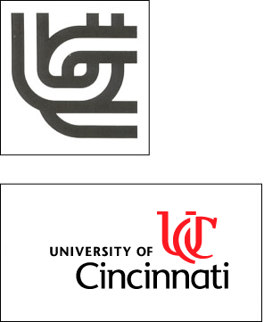
As for the Cornell logo, I can only say that it is much much better than my own school's recent rebrand, the University of Cincinnati. Design Maven talks about the horrible overlapping of of capitals, well, here you go. It does thankfully work better when applied to motion graphics, but not by a lot. To make things worse, LPK (the local design firm that did the branding) sold a very very similar identity to a suburb (!) not half an hour away. Needless to say, UC is already undergoing a rebrand. Its sad that we have one of the best design schools in the country and the University refuses to let the students handle it.

The BASF logo is interesting. I'm glad to see they kept it simple. I was afraid of some sort of futuristic chemical icon. I'm always a sucker for negative/positive stuff, so the squares dont bother me much visually, though their obvious "we did it and rationalized it afterward" approach does.

On Nov.29.2004 at 11:26 AM
DesignMaven’s comment is:

Armin:

I've got to shout out agrayspace.

How's things on Hillsboro Street ???

If you get some time. You should visit North Carolina States Design Dept. Maybe get a part-time teaching position there. Kick Ass Department.

I haven't been to Crabtree Mall in 30 years.

Felix, Isn't everything old new again ??? Point well taken.

Derrick,

Libby Perszyk Kathman, has a great reputation as Packaging Designers.

On the level of Sterling Group, Lipson Alpert Glass, Wallace Church. (others)

I can't comment on your schools Identity until I have more detail. Identities should be unique unto themselves. To many instances where Consultancies are peddling Prosaic Shallow and Sub-standard work.

As Cornell emphatically stated Universities need to make MILLIONS from they're Identity in Mechandising. (laughs)

What has this WORLD come to ?????!!!!!!

In defense of my comment. I love the New York Yankees Identity as well as Yves Saint Laurent and Notre Dame.

I just don't think everybody else should be looking like them.

Libby Perszyk Kathman, website below.

http://www.lpkdesign.com

Gunnar:

"Since AT&T was three different companies, the question might be most equity for whom".

Astute observation. I forgot AT&T was originally

the consolidation of Bell System, Bell Labs,Western Electric and American Telephone and Telegraph.

(GTE) General Telephone and Electric was not a part of that consolidation.

Who owns GTE ???

Apologies for so many posting(s) I'm a BIG OLE LOLIPOP for Identity Discussions. It is my Kryptonite !!!!!

On Nov.29.2004 at 01:16 PM
Tan’s comment is:

I think what Gunnar meant was that AT&T Wireless is its own separate company from AT&T. They share name and brand, but not finances or corporate operations.

Let's be clear here, Cingular Wireless just bought AT&T Wireless, not AT&T or its separate holdings.

Never really loved the Cingular logo, so this rebranding doesn't do anything for me either.

I liked the old Cornell, but it doesn't look collegiate. The new coat of arms logo isn't so bad.

On Nov.29.2004 at 01:54 PM
Derrick Schultz’s comment is:

My point was that LPK has had very shady dealings when it comes to branding. I have my own personal beliefs with their company (I have quite a few friends that work there) and while I believe their packaging is as good as you say it is (though I would probably choose Lipson Alport Glass and associates, another local firm you mentioned, over them any day) their branding at this point has been nothing but a disappointment. I won't even begin to explain the unprofessionalism I see in selling a simplified version of the same logo to another client less than a year later.

It just seems colleges are automatically lumped into two categories: crests a la ivy league (and Cornell's new reworking), or typographic ligatures a la Notre Dame. Neither of which are appropriate for an urban school that is known for its creative programs and not its scholarly programs (though im sure someone will debate that).

And just beacuse I know you are a huge fan of Identity and its history, DesignMaven, here is the original logo and a few subsequent ones. While it held up poorly in testing, I think it fits the school better.

sorry to pull it off-topic.

On Nov.29.2004 at 03:34 PM
JonSel’s comment is:

Who owns GTE ???

GTE merged with Bell Atlantic to become Verizon.

On Nov.29.2004 at 04:04 PM
Darrel’s comment is:

It looks like UCLA just got a new (and IMHO, poorly letterspace) logo as well.

Some comments

">here

and here.

On Nov.29.2004 at 10:46 PM
Darrel’s comment is:

crap. Messed up those last links:

Editorial: New UCLA logo a waste of school’s money, talent

New logo a pricey, puzzling letdown

This quote from the first article is interesting:

Worse, UCLA ignored its own design school in the process. While a film student made our new television commercial, an outside firm was apparently needed to master the italicize function.

And it rings true. I was at college when our school redesigned their logo. I had the same thought...why pay for an outside firm to whip up a fairly gaudy mark when there was an entire graphic design department that could have done so much more for so much less.

Has anyone attended or worked for a university that had the insight to actually use their own assets to create their identity?

And before you say it, yea, yea, market research experts, demographic studies, blah, blah...I know the UW-Stout logo wasn't derived from that and it sure doesn't look like the UCLA came about from that process either, so I'm not sure if those are valid arguments.

On Nov.29.2004 at 10:53 PM
Jeff Gill’s comment is:

New UCLA mark - Yikes!

When I was a kid back in the the University of Arizona in my hometown of Tucson bought a new identity from an outside firm for about $20,000. There was of course outrage that the UofA did not do it internally or even locally, the mark was derided, etc.

10-15 years on I think it's looking rather good. Maybe those "professionals" they hired actually knew a thing or two about design & branding.

On Nov.30.2004 at 05:19 AM
DesignMaven’s comment is:

Derrick

Many thanks for sharing the history of University of Cincinnati Identity Design. Interesting to say the least.

I'm in agreement with you. And from my personal professional assessment. The Identity created by design Professor Joseph Bottoni is the better Design. Although

angular in Design. It was unique and memoriable. Which are the governing principles that constitute Good Identity Design.

What often happens, when something is developed inhouse it doesn't command the respect of the decision makers. Which is what I was explaning earlier to Rob. This is primary the reasonale used to acquire expertise from outside.

The Identity at the top was Developed and Designed by Legendary Identity Designer, DON ERVINin the 1960s at Sandgren & Murtha.

Perhaps the first interlocking Identity Design for a major

Non Profit Organization. Without question, one of the best.

No doubt LPK, Libby Perszyk Kathman was highly influence by DON ERVIN's 1960s Urban Coalition Identity for Sandgren & Murtha.

LPK's is poorly executed, not original. Doesn't have the Memorability or Propriety of the Urban Coalition Identity.

Can't help but associate the two Identities.

TAN, many thanks for clarification.

I've read nothing in reference to the merger of the wireless companies. Only saw the TV Ad Campaign.

Jonsel, Many thanks. How mindless of me. I have Verizon's Identity Manual. The information you provided is within the Identity Manual.

Darrel, Thanks for the 411 on UCLA

Identity.

I've always respected Keith Brights' work. Research is something paid by the client. Not all Consultancies incorporate research into their practice.

However, the name is Keith Bright Strategic Design. Certainly, Strategic suggest Research Orientated Design.

Formalist Approach, is without research. Design Driven solutions.

Functionalist Approach is research driven. Marketing and Communication Driven Solutions.

On Nov.30.2004 at 08:33 AM
Darrel’s comment is:

Certainly, Strategic suggest Research Orientated Design.

I'm not judging Keith in anyway, but will say the word 'strategic' in the title doesn't always imply a certainty that research was involved. ;o)

(Again, Keith probably did a ton of research...I'm just saying 'in general')

In the end, post-secondary educational branding has more to do with making sure they can sell a lot of sweat shirts than anything else. Again, IMHO. ;o)

On Nov.30.2004 at 12:07 PM
DesignMaven’s comment is:

Darrel:

Correctomundo, Identity Design i.e. Logos on Merchandise in the consciousness of the public is BIG BUSINESS and out of control.

Look at the plethora of people in the entertainment industry with their own clothing line.

According to Cornell, they needed to make millions off their Identity. (laughs)

Nuff said !!!!!!!!

We could spend a week on Speak Up discussing Knock Off Brands.

On Nov.30.2004 at 12:38 PM
jake’s comment is:

Yeah I seem to recall reading somewhere that AT&T are keeping the AT&T name. AT&T Wireless was a spinoff that ended up being a totally separate company that just had the name basically. The article went on to discuss AT&T reviving the name and starting a whole new company. Maybe they won't run it into the ground again. (It was built by buying some of the better smaller, regional wireless companies and then turned into a big bureaucratic mess with a bunch of different wireless standards running amok).

And I think it made more sense when BASF bragged that they made "a lot of the things you buy better".

On Dec.02.2004 at 08:16 PM
heather’s comment is:

i'm ashamed to admit my alma mater has joined the "interlocking capital letters"

some crap about sharp angles and the athletic teams. apparently we had some money left over following the NCAA championship ;) (go orange!)

note: we used to be the "orangemen" and are now reduced to the politically correct: "the syracuse orange".

On Dec.03.2004 at 04:14 PM
Gunnar Swanson’s comment is:

I’m not big on the whole group public dissection of logos thing. I worry that those of us who don’t understand goals of a particular project will project our narrow aesthetics and promote a superficial judgment of graphic design, ultimately adding to the common view that graphic design is all about making things pretty and that a talented nineteen year old with a computer is the design ideal. That said, Maven asked me this morning about the new UCLA mark that has been mentioned in this thread. Although I went to UCLA long ago, have been a long-time observer of the Bruin identity, and know Keith Bright in a seeing each other at gatherings and I say “Hey, Keith. How’s it going?” and he recognizes me but I don’t know for sure he remembers my name way, I have no inside track on this. For better or worse, the following was my answer to Maven.

I'm sure knowing Keith and that school of procedure that the whole thing was process-heavy and I'm also sure that it was politics/meeting-heavy so the hours probably added up to the bill as reported. I think the people who say “We should have had our great design students and faculty do this” are idiots. But there are some obvious problems:

He and the UCLA folks should have known going in that a monogram would be the probable result and that nobody would value that as an object at nine or ten grand. Some sort of system and related design should have been provided and stressed in the publicity and they should have emphasized the process in any discussion about the price tag. (I know Keith did say something and you don't have much control over what other people report but they could have done much better.)

All the bullshit about the Bauhaus should have been canned. What does that have to do with UCLA? It's the problem that is so pervasive: a design solipsism where all design is about design. To the extent that it's true, designers should learn to shut up about it. Keith is old enough and experienced enough to know better.

There is a giant value to a UCLA logo as an object for sale. Busloads of Japanese tourists go to Westwood every day and head straight to the Bearwear section of the ASUCLA store to buy $75 sweatshirts. As much as some people mocked Cornell's statements, an identity system for a university is a product for sale. I don't think this one dealt well with that, thus it will be likely that all sorts of variants will be made (officially and otherwise) for sale, diluting the program.

Speaking of which, the whole “everybody but athletics” thing always happens with universities but the sports teams are the main way people know most universities. They should have dealt with the sticky and hard problem of sports and sports politics and ended up with one identity rather than two (or, at very least, two integrated identities.)

My visceral reaction is largely but not completely irrelevant. I’m not a fan of most oblique sans. That's partly my reaction to the letterforms but more importantly in this case it’s because they usually fit clumsily with other stuff. The left margin isn’t as clear as it is for an upright form.

It is very hard to deal with all caps set tight and a logo generally calls for tight setting to make is suitably a thing in and of itself. The LA spacing is a nasty problem. It seems to call for custom lettering or non-standard letter fitting. This monogram doesn't deal with the obvious spacing challenge well.

On Dec.03.2004 at 08:34 PM
Gunnar Swanson’s comment is:

nobody would value that as an object at nine or ten grand

Sorry. I guess I had the CT Tourism thing stuck in my head. I meant ten times that, of course.

On Dec.04.2004 at 09:32 PM
Logan’s comment is:

Does anyone know who actually did the rebrand of the BASF logo? Curious if it was a firm or in-house.

On Dec.10.2004 at 02:17 PM
JonSel’s comment is:

NexSprintel is my best guess.

On Dec.15.2004 at 03:29 PM
Mark’s comment is:

It just seems colleges are automatically lumped into two categories: crests a la ivy league (and Cornell's new reworking), or typographic ligatures a la Notre Dame. Neither of which are appropriate for an urban school that is known for its creative programs and not its scholarly programs (though im sure someone will debate that).

Well,be suprised when I reveal my college's logo

Introducing Nortwestern Connecticut Community College logo that breaks the mold!

The logo is based on this building added in 2003

Well this logo is used in print and for the website.

For other things such as shirts etc. this logo is used. (sometimes minus the box)

heres the website:http://www.nwctc.commnet.edu/nccchome.htm

please type in the website in the address bar yourself,because if I typed it as a link that you click it strangely goes to Microsoft homepage, strangely enough as I observed from previewing my post.

On Sep.27.2005 at 07:32 PM