Speak UpA Former Division of UnderConsideration
The Archives, August 2002 – April 2009
advertise @ underconsideration
---Click here for full archive list or browse below
  
Cha- Cha- Change …

Change of fools …

I’ve been meaning to write this post for months. But after the bison coin, then that Adidas stamp turned up in recent Quipsologies, I knew it was time to get this article finished and posted. Then I got scooped by Richard Zeid and his money post. Was it a scoop? Or was it serendipity? …

I don’t spend a lot of time in the US, so when I was down there recently I was surprised to find these quarters in my change:

Yes, old hat to you, as they’ve been out for a few years, but my perception has always been that Americans are a little funny about their money: It has an iconic status that y’all seem very reluctant to fuck with. (And yes, I think that there is a closer relationship between the appearance of your money and your culture/world image—call it a Brand, if you will—than other countries have.)

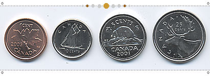
In Canada we have our standard series of circulation coins, which originated in 1937 (and are still minted today). I consider these acceptable coins, athough design-wise they bear little relationship to each other. I’ve always been fond of that beaver, but the typography on the quarter and the dime are quite nice.

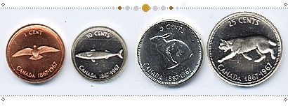
Then, in 1967 we got our first (in my living memory) alternate series with the Centennial coins, by artist Alex Colville, which remain our most beautifully designed set to date. Simple, well-rendered artwork, uniformly framed by some decent type. (How hard can it be?)

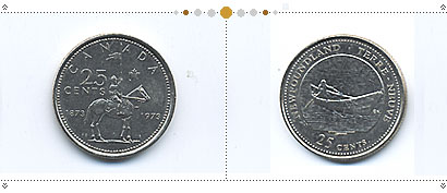
In 1973 we got the RCMP centennial quarter, but we started seriously messing with our coinage in 1992, when we issued our 125th Anniversary monthly coin series, featuring one of each of our 10 provinces (+ 2 territories) each month.

After that all hell broke loose at the Royal Canadian Mint, and we’ve been issuing so many variations of the quarter, in particular, that I pity the poor tourists trying to make sense of their change. Basically, a quarter is a round thing the same size as an American quarter, with some version of the Queen (or reigning Monarch)’s head on one side and pretty much anything on the other. Since the relatively attractive provincial series of ‘92, it has been a fast and slippery slope to graphic hell, with coin design succumbing to that now all-too-familiar “contest.”

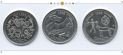
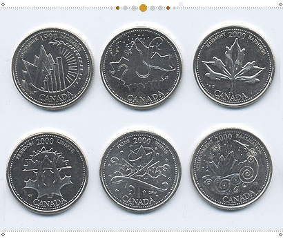
Over 1999 and 2000, the Mint issued at least 24 new quarter designs: one for each month over the 2 years. This has netted us the usual array of voyageurs and pioneers …

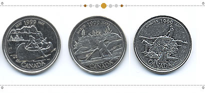
… and some fairly decent art-inspired designs (I genuinely like the one on the right, from pictographs, and here’s another nice one).

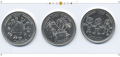
But there is an unfortunate mass of coins from what appears to be randomly computer-generated patriotism. This is what you get when you dial “nationalism,” “flag,” “monument,” “people holding hands” (and, in the case of the first one here, “Mussolini”) into the instamatic coin generating machine:

Then of course, there’s the ever-popular kiddie-drawing; of which we have at least 4. There is one hideous piece of [oh! excuse me!] which has always looked to me suspiciously as though it was drawn in CorelDraw! The following at least began in crayon:

The Royal Canadian Mint has an excellent web site by the way, and to view the full set of monthly contest winners of 1999, go here and choose each month from the drop down menu.

For the 2000 quarters, go here. Or, for a more opinionated view, here.

Given that it must cost … er … a mint to issue new coins, I’ve long wondered why we keep doing this. But it seems to be a crowd-pleaser, and the Mint seems to be in the business of manufacturing souvenirs and collectables, more than issuing currency.

Oddly, we haven’t changed the beaver on the nickle since 1967. Being our national animal, perhaps its image is sacrosanct. It’s mostly the quarter which has become the canvas for our national exhuberance, although the dime, the loonie ($1) and toonie ($2) coins are not without their variants.

Speaking of which, what do Americans do when they need chocolate money? How do you live without dollar coins? (The one on lower left is a real coin; the other 2 are foil-wrapped chocolate. Not bad, eh?)

(An aside, and personal beef of mine, is that modern-day minting is far inferior to that of the earlier coins. An old penny, even now after years of use will often still have a deeper, sharper impression than a current coin, which tend to look about as well made as … chocolate money.)

The other incredibly exciting thing about Canadian coins (and, of course the coins of any country which portray a living person), is watching the Monarch age (or change) across time. Queen E has been around a long time but it wasn’t so long ago that King George VI, and even George V coins were in common circulation, and they do still turn up from time to time.

Interestingly, they’ve removed the Queen’s crown in the recent issue. Now she’s just an old lady. Very symbolic. More monarchy watching here.

OK, but here’s the revolution in coin design, invented by our very own Royal Canadian Mint. Colour. Yes, folks, those inventive Canadians have figured out a way to print colour onto coins (albeit as crude as a jailhouse tattoo), and the result is this quarter (enlarged for your viewing pleasure):

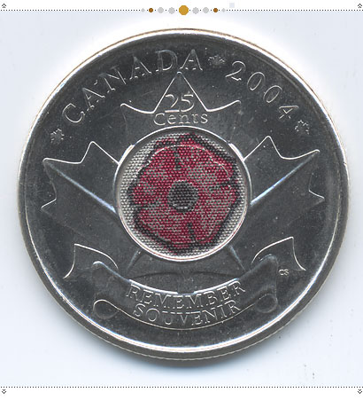
The Poppy Quarter is remarkable for one other reason as well. When it was issued, it was available only at one location … no, not a bank, and not from the Mint or any other government institution, but from … Tim Hortons. That’s a donut shop (a Canadian donut shop, mind you). This from the Mint’s press release last October:

Beginning on October 21, 2004, the new poppy coin will be available from Tim Hortons locations across Canada. Tim Hortons, a distinctive Canadian enterprise, is the Mint’s exclusive distribution partner for the poppy coin. Because coins are produced to meet demand, poppy coins will also be available at financial institutions in the months following the coin’s unveil.
“The Mint has created one of the most unique coins in the world that features a special symbol that all Canadians can relate to and be proud of,” said Bill Moir, Executive Vice President, Marketing for Tim Hortons. “Canadians have supported Tim Hortons for 40 years and our Veterans and current members of the Canadian Forces are some of our most loyal customers. So when the Mint approached Tim Hortons, we knew we had to be a part of this commemorative launch.””

Imagine the possiblities from here. Coloured coins and corporate sponsorship together could pave a whole new era in coin design.

God have mercy.

…………………….

All of the above are circulation coins: i.e. coins minted for general use and circulation, and do not include special collector editions, of which there are many. My research also led me to this Santa coin, which I have not heard a thing about previously.

As well I ran across this special-edition coin. You want colour? We got colour. That’s a hologram, darlings. See it and weep.

Maintained through our ADV @ UnderConsideration Program
ENTRY DETAILS
ARCHIVE ID 2248 FILED UNDER Essays
PUBLISHED ON Mar.17.2005 BY marian bantjes
WITH COMMENTS
Comments
M Kingsley’s comment is:

Marian,

It's spelled "color", eh?

On Mar.17.2005 at 04:12 AM
Plamen’s comment is:

@Kingsley: well, my good old dictionary would say that colour is also correct as it is the word the English invented when compiling this language :)

On Mar.17.2005 at 05:17 AM
Andrew Twigg’s comment is:

Here's my two cents:

Thanks again Marian, for a great post. I had no idea you Canadians had such wonderful money (as if I needed another reason to relocate from south of the border).

I almost can't believe the holographic coins. Awesome! I had to do a little googling and came across these images as well:

I wonder how long it will be until I can get my holographic colourised U.S. dollar coin at the local Dunkin Donuts.

On Mar.17.2005 at 08:33 AM
marian’s comment is:

Hey Andrew, great images. This whole collector's edition thing though ... this is the reason I didn't delve into it. There's just too much of it! It really doesn't count as currency, to my mind.

Now when they make nickles with holographic ... oh, um ... let's say when they make dimes with a holographic ship on them (the Bluenose, btw). Then I'll start doing the big Nya Nya nya Nya Nya lord-it-over-you dance.

By the way, most of the images in my post came from my loose change (of which I have quite a bit), so they are all coins that are still in circulation, and most of them quite common. The only rare surprises in that batch were the George V dime (which is made of silver) and the centennial (rabbit) nickel. The other centennial coins (which seldom turn up in circualtion any more) and the holographic coin were culled from other sources.

On Mar.17.2005 at 10:34 AM
Corey’s comment is:

Marian, beautiful collection, thank you for sharing.

The moose coin actually uses Comic Sans - I thought a better view might be nice.

On Mar.17.2005 at 12:35 PM
Michael Surtees’s comment is:

That jailhouse tattoo printing quality quarter is amusing, I wasn't aware that the colour printing was intentional. I've only seen the quarter once and thought that some social anarchist was making a point one quarter at a time by hand.

On Mar.17.2005 at 12:41 PM
calliope’s comment is:

excellent article marian! i remember as a kid finding the alex coville pennies and nickels and being entranced by the perfect minting of the bird and rabbit. i never was lucky enough to come across that lynx though.

and let's hear it for those other canadian/british words like favour and neighbour that freak out american-based spell-checking software.

On Mar.17.2005 at 12:43 PM
marian’s comment is:

Corey, thanks for that ... is that putrid or what? It's so hideous it's endearing.

Calliope, yes, it's interesting but I too remember those centennial coins from when I was a kid. I knew they were good, even then. I mean really, design that captures the attention of a 4-yr-old and holds it in memory for a lifetime, how great is that? And we're not the only ones: read the 2nd-last paragraph of this.

BTW, a new Canadian $1 coin has just been unveiled, featuring Canadian hero, Terry Fox. I would comment, but my comment would lead deep into the territory of [inept] monuments and failed symbolism ... it may in fact turn into a post of its own.

On Mar.17.2005 at 01:03 PM
RavenOne’s comment is:

*wants the native/eagle motif quarter and uhm... American money is fugly. Why is canadian money so much prettier? Why have I hoarded a canadian $2 bill since I was in 3rd grade? ---the world may NEVER KNOW.

On Mar.17.2005 at 02:07 PM
M Kingsley’s comment is:

My dears Plamen, Andrew Twigg, Michael Surtees, and Calliope:

Marian started it!

> And yes, I think that there is a closer relationship between the appearance of your money and your culture/world image—call it a Brand, if you will—than other countries have

The emphasis is mine.

The difference is ours.

My own personal, and obnoxious, affectations spell it "la couleur" — Canada is a bilingual country after all. And when I realized that my small joke fell flat, je me suis coloré — a bright shade of rouge.

On Mar.17.2005 at 02:53 PM
marian’s comment is:

Mark, forgive me ... your joke ... I took it as an amusing bit of disengenuity; was there more to it than that? Was it deeper? I know ... a joke shd never be explained.

On Mar.17.2005 at 03:12 PM
Armin’s comment is:

> And when I realized that my small joke fell flat

I got it… and laughed.

The Alex Colville coins are really beautiful, that's some nice type on them coins.

On Mar.17.2005 at 03:24 PM
Michael Surtees’s comment is:

MK, it was funny and by the looks of it the comment is taking new flight.

On Mar.17.2005 at 03:30 PM
M Kingsley’s comment is:

Marian, yes... a small bit of disingenuousness... in the dead of night... while ripping a large pdf file... and while listening to CBC radio sur l'internet.

I once made a Canadian trip with an English friend, who couldn't contain his bemusement at all the remains of what he simply called "Empire". Remains such as the constant need for everyone to know what the Queen currently looks like; displayed on coins.

On Mar.17.2005 at 03:41 PM
Andrew Twigg’s comment is:

I was just jumping at the opportunity to use an "-ised" spelling over an "-ized" spelling...

On Mar.17.2005 at 04:46 PM
Nicole’s comment is:

24 special edition quarters over two years?

Aaaaah... my Canadian tax dollars at work...

On Mar.17.2005 at 05:51 PM
Sonyl’s comment is:

We Americans never get fun money. Between the Aussie paper money and the holographic Canuck change, I'm surprised we haven't just given up and adopted foreign currency.

By the way, I haven't seen any of those coins besides the basic set - apparently only those get accidentally mixed with with U.S. currency to end up in our tills, given out as freak change.

On Mar.17.2005 at 07:37 PM
Patrick C’s comment is:

Thanks, Marian.

The most interesting thing, for me, was the point you made early on about our circulation coins "bearing little relationship to each other." MY GOD! I had never really noticed this.

The coins are all different in their typography and even the style of their illustrations. And, looking at them lined up, I'm surprised by how ugly and cramped they are. Especially when compared with the Colville coins below (now that's a set we should have just kept minting).

And Nicole...I was thinking the same thing.

On Mar.18.2005 at 11:10 AM
Michael Surtees’s comment is:

ok, most of those coins are atrocious! but it's not all bad when it comes to design from crown corporations. canada post tends to commission great stamps, just like this.

On Mar.18.2005 at 12:11 PM
marian’s comment is:

Patrick, to be completely honest, I hadn't noticed either, before I assembled them for this post. That's the funny thing about the stuff that's been with us all our lives ... we just don't see it anymore.

Michael ... yeah, stamps. One day soon. It's on my list.

On Mar.18.2005 at 12:20 PM
Tan’s comment is:

I've always been very impressed with Canadian currency design, even more so with this post.

But it seems that Canadians are almost obsessive when it comes to currency design — to the point of fixation and fetishness. Canadians seem to revamp their currency in some fashion every two years or so. Doesn't that seem just a bit excessive to anyone?

Is it about personalization in currency? Is it about variety? Or do you guys just get bored with your money really quickly? Stamps are one thing, but currency should have just a little more permanence.

Just thought I'd ask.

On Mar.18.2005 at 09:32 PM
marian’s comment is:

Well, Tan, as I noted in this other post, we do seem to redesign our money a lot. But remember, it's cold up here and there's not much else to do. In fact, most design activity in Canada takes place during the winter months, when we really can't be bothered to go outside, and it's dark most of the day anyway, so we just sit at the warm glow of our computers obsessively redesigning things.

And you know how it is, new papers and printing techniques even in our industry can get you hankering for a little more ... imagine what it must be like in the paper currency industry. Once those irridescent foils came out, wouldn't you be straining at the leash to work them in somewhere?

I'd be willing to bet the creative team at the Bank of Canada is busily working away with holographs and transmigratonic threads for the next series of Canadian banknotes even as we speak. After all, our money's not a brand ... we can change it as often as we like.

On Mar.19.2005 at 01:08 AM
Keith Fox’s comment is:

This was an interesting essay. I'm a Canuk also and I wasn't aware that the "poppy quarter" was first issued at Tim Horton's. Like an earlier commenter, Michael Surtees, I wasn't aware at first that the colour was intentional. I thought someone had used a coloured pencil or marker to make a red blotch on it.

On Mar.20.2005 at 02:18 PM
Shahla’s comment is:

Nice follow-up post, Marian.

Since you’ve written before on money (SpeakUp’s �Love over Money’) not only as subject matter for �graphic’ review, but as a �sticky’ situation —the way we evaluate it is, interestingly, providing visual information in the form of MRI’s which highlight the areas in the brain active during financial decisions.

After seeing the coins posted here I can imagine a hologram of �money on the mind’ appearing on a coin someday, in Canada. Not in the USA where it seems the majority like their coins to be, simply, metallic.

I agree a joke shouldn’t be explained but it was so much fun when posting a one-liner that only those who read DO and SpeakUp in tandem would have caught regarding the �drapes’ in Central Park. It was absurd someone had listed 5 things the artists could have done differently to improve the project. Number five being that other ways to �add texture’ should have been pursued rather than a pleat! And actually —one would need to know about �dressing’ a window avec rideaux to �get’ my SpeakUp comment.

Some get so testy when their joke is missed ; )

On Mar.21.2005 at 07:36 PM
Michael Surtees’s comment is:

To add to Tan's question about the change fixation - my best guesstimate is that it has more to do with politics than with the fixation of new. If the mint stays in the press for positive things like getting kids involved with designing, or celebrating a moment, they are less likely to feel budget pressure or cutbacks...

On Mar.22.2005 at 10:18 AM
gb’s comment is:

How do we live without dollar coinage? Very well, thank you. When I lived in Australia, I hated getting change. The one and two dollar coins drove me nuts. Perhaps American's just have have a coin phobia... I don't know. I'd just rather have a couple of bucks in my wallet that do not jingle and tear holes in my pocket.

Speaking of tearing—isn't Aussie "paper" currency awesome? I love trying to get people to rip up the 10 spot I carry with me...

On Mar.23.2005 at 05:45 PM
martin’s comment is:

Yeah, well we've got a blue one in Latvia, though

On Mar.24.2005 at 03:02 AM
marian’s comment is:

Wow! Those Latvian coins are the nicest I've ever seen! Are they in circulation, or a special edition? I wonder what this says about the general state of design in Latvia.

On Mar.24.2005 at 08:19 AM
Stv.’s comment is:

Hey MB - nice essay! I kindof like having tonnes of variations of currency, although it worries me that we're reducing the sanctity of our coinage in preparation for eventually selling off branding rights to corporations. Could you imagine how much it would be worth to say, CIBC, to have a special "CIBC Quarter" issued for even just a couple of months one year? That advertising would last for years and years and year. And because we'd all already be used to our currency being and looking different, we'd only shrug and say "Ain't Life Modern?"

I have it in my head that we're to shortly get a new nickel design. I seem to recall seeing a design somewhere, where the beaver is larger, and flush to the edge of the coin on one side. Does anyone else recall seeing this design somewhere? Did I dream it? I can't find anything about it online in a 5-second google attempt...

On Mar.24.2005 at 03:39 PM
marian’s comment is:

You dreamt it, Steve (nice to see you!); they know that we may lie down for currency branding, but the nickel ... [and here i really must restrain myself from making extremely crude puns and allusions] ... let's just call it the proverbial line in the sand.

On Mar.24.2005 at 04:25 PM
tara l large’s comment is:

i have some coins that look like the one u have there and i would like to sennd some pictures of them please email me when u can

On Nov.10.2007 at 03:02 AM