


January 2005 saw the simultaneous launch of the redesign of two of the world’s leading design magazines: Print and HOW. Now, redesigning a magazine is a daunting enough task, but redesigning a design magazine can be described, well, as nothing short of formidable. How do you possibly redesign a magazine that will be evaluated, assessed, analyzed, investigated and challenged by a readership that could very well do the job?
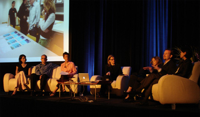
This past Monday, at the HOW conference, I moderated a panel discussion with six of the key players of both redesigns and revealed the soft and luscious underbelly of the entire process: DJ Stout and Abbott Miller from Pentagram, the award-winning editors of both publications: Joyce Rutter Kaye, from Print and Bryn Mooth from HOW. The art directors of both magazines were also there: Tricia Bateman and Stephanie Skirvin. We tried to pull the curtain away from this thrilling and slightly scary undertaking, showcasing both publications as they redefined their visual image, following the strategy behind the decisions that were made and reviewing the subsequent results.
In publication since the spring of 1940, Print is the oldest graphic design publication in the world. During its 65 year history Print, has evolved from a technical and scholarly journal aimed primarily at the printing trade, to a mainstream magazine that provides critical reporting and analysis of all facets of graphic design and visual culture. But even in its earliest stages, Print’s editorial content was eclectic. The first issue showcased a magazine that was completely ahead of its time: it featured Bruce Rogers’ thumbprints on the cover, and nothing else—not even a logo. Print’s early issues set the editorial breadth and tone for all of its successive issues. Even its early production values, with tipped-on inserts and die-cut pages, seemed to presage contemporary magazines such as Nest. Then came a spate of logo experimentation throughout the forties and fifties, until the logo was designed by Herbert Bayer in 1959, which was used until 1990. Throughout the magazine’s history, it has been identifying emerging trends and issues in design. Martin Fox, Joyce’s predecessor, mentor, and Print’s editor for 40 years was committed to having Print show all of the influences in visual culture—high and low—that affect designers, and also reveal to designers their impact on the world of visual culture. It is a mission that Joyce has continued as well as enhanced.
HOW magazine was founded in 1985 as an offshoot of Print; its early focus was on the techniques and practice of design. It was acquired by F&W Publications in 1989. Over time, it’s evolved away from presenting topics in a step-by-step manner, but it’s never lost its mission of providing practical, how-to information. HOW strives to serve the business, technological and creative needs of graphic-design professionals. As I am sure you all know, the magazine provides a mix of essential business information, up-to-date technological tips, the creative whys and hows behind noteworthy projects, and profiles of professionals who are influencing design.
These days, HOW is like a career coach, creative guru and business mentor all rolled into one; HOW’s goal is to help designers, whether they work for a design firm, for an in-house design department or for themselves, run successful, creative, profitable studios. Prior to the current design, HOW last underwent an overhaul in 1999, in the very capable hands of Alexander Isley. Scott Menchin was the very first art director, and over the years, HOW was designed at various points by staff art directors or professionals like Lori Siebert. The cover had been tweaked at a couple of points, but it’s retained its recognizable, chunky HOW logo since the second issue.
Prior to my being asked to moderate this panel, Armin asked me to do a post about both magazines being redesigned by Pentagram partners, and we thought it might be funny to call the discussion “The Pentagramization of America’s Design Magazines,” but now that he too is at Pentagram, it seems, well, not quite as funny. In any case, I interviewed both Abbott Miller and DJ Stout prior to the panel discussion and what follows are the transcripts of those interviews. I am also enclosing a PDF [2.9 Mb] of the entire presentation that we made, with some additions, so you can see the before and after designs of both publications, a sneak peek at some new covers, as well as some wonderful work in progress. In a day and age where media is changing by the milli-second, it is comforting to know that more traditional media is not only staying in the game, but continuing to raise the bar, setting a new standard for all media.
My interview with Abbott Miller:
DM: How do you feel about the work you did for the redesign? Are you happy with it? Do you wish you had done anything differently? What are you most happy about? What are you most unhappy about?
Abbott: I am happy about the design, and how it works to really showcase the content. I am pretty unhappy about the quality of the printing and the paper, but this is something Print is working on. The most dramatic change we could have effected would have been to organize the heavy stock inserts and advertising so that they did not create such physical impediments to the reader. But we were not asked to come up with a new business plan!
DM: what was the biggest challenge working on this redesign?
Abbott: Because the previous iterations of Print have been so varied, there was not a very strong element to oppose, so it was not hugely challenging. I suppose designing for your fellow designers gives the situation a bit of self-consciousness, but that is okay.
DM: Did (if at all) the research that was conducted for the magazine influence your work?
Abbott: Very much. I got a very strong impression of the loyalty of Prints core readers, and a strong sense that they did not want to see the design take the magazine to far from its personality. It was okay to make Print look better, but it had to be organic to the spirit of the magazine.
DM: Can you tell me how you went about choosing the new fonts?
Abbott: Lexicon is a model of clarity and beauty, and is also sort of under-utilized. Its serious and almost sharp in its execution. I liked how it contrasted with the softer Gotham rounded, which we asked Jonathan Hoeffler to develop. Fortunately he had already had the idea (of a rounded version) and done a number of drawings, so it was feasible to finish the font for Print. Gotham and Lexicon are used as the two leading players: they are allowed to exchange roles, but they are always playing off each other.
DM: Originally, an idea about curved edges was in the mix for the redesign. Why did you nix it?
Abbott: MONEY!
DM: If you had to describe the redesign in one sentence, what would it be?
Abbott: A readerly and elegant showcase for the diverse world of design.
Some stray thoughts from Abbott:
I wanted to make a framework that maintains its separateness from the design that is being showcased. I wanted to design it so that, once you gained familiarity with the language of the design (fonts and organization) you could easily distinguish the frame and the picture, so to speak. I was not after a neutrality in the frame, more of a consistency of expression.
I like the clarity of the organization: fewer, longer features, grouping like materials together, creating more emphatic pacing. One of the most consistent problems of Print’s previous design was that it was not always obvious that a feature was indeed opening because the interpretive typography often got lost within the visuals being shown.
My interview with DJ Stout:
DM: How do you feel about the work you did for the redesign? Are you happy with it? Do you wish you had done anything differently? What are you most happy about? What are you most unhappy about?
DJ: For the most part I’m pretty pleased with the effort. Like every job I have ever worked on however, there are things about the redesign I am happy about and there are things that I think could be better.
HAPPY THINGS
1) We were able to raise the bar on the design and improve it from where it was.
2) I think the design we came up with is appropriate for and resonates with the perceived readership.
3) The staff at HOW is very satisfied with the redesign. They have embraced the new design and are starting to make it their own.
4) We solved the problem we were given within the parameters of the project.
5) So far HOW has very good and favorable feedback from their audience.
6) We loved working with the staff at HOW. They listened to us and they were respectful. It was a great collaboration and we made some new friends.
COULD BE BETTER THINGS
1) In my opinion the overall issue is missing some grand moments of “eye candy”. I wish there were just a few full page photographs or illustrations that were spectacular and arresting visually. I wish there was a completely art driven feature in the mix. (part of the reason why this is missing in this launch issue is budgetary but also because the issue was a special 20th anniversary issue for HOW that was made up of lots of lists)
2) I wish the cover concept had come across in a clearer more dramatic way with the launch issue. The idea for the cover is that the giant HOW logo is supposed to be used by the featured illustrator or photographer as a part of their commissioned art. Their challenge is to use it as a part of their visual communication. I don’t want the cover to be thought of in the traditional sense where an artist is hired to create the cover art and then the Art Director just slaps the logo on top of it. I want the logo to be considered by the artist and effectively utilized in the finished execution of the cover piece. David Plunkert who created the cover art did a beautiful and effective piece of illustration but I wish I had pushed him a bit harder to make the cover concept, which is innovative and unique for magazine covers, a bit clearer. The next issue of HOW does a much better job of this. The cover design concept will start to become much more apparent to the reader with this next issue.
3) They didn’t go with the cover direction that I was really jazzed about. But they did go with my second choice so I can’t complain.
DM: What was the biggest challenge working on this redesign?
DJ: Working with a low art budget.
DM: Did you conduct any market research for this redesign? If so, did it influence your work at all?
DJ: We didn’t- but HOW did provide us with some market research and reader survey findings before we got started.
DM: Can you tell me how you went about choosing the new fonts?
DJ: My Senior Designer, Erin Mayes, loves type and she’s very knowledgeable about new fonts. She selected the type-faces and I thought they were appropriate for what we were trying to do.
DM: If you had to describe the redesign in one sentence, what would it be?
DJ: Artfully Diagramatic.


How do you possibly redesign a magazine that will be evaluated, assessed, analyzed, investigated and challenged by a readership that could very well do the job?
Hmmmm, well, you design it like anything else. There's still a target audience/demographic to consider. True, this demographic will most definitely be more critical than the average, but design, regardless the audience, will never please or satisfy all masses, right? Especially in this case, where their's multiple demographics under the main "umbrella" demographic being "designers". Despite the audience, it's still the "reorganization of form and content"...as you know who might say....agreed?
On Jun.15.2005 at 07:27 PM