Speak UpA Former Division of UnderConsideration
The Archives, August 2002 – April 2009
advertise @ underconsideration
---Click here for full archive list or browse below
  
I’ve got dust in my eyes…

So I was listening to a new CD in the car the other day, when I came across a track that really moved me. It actually moved me to tears, right there, in the middle of evening traffic. I don’t know what triggered it, but there was something about the lyrics that resonated with me directly. It was only the second time in my life that I’d been so moved by a song.

It started me thinking…

A few movies through the years have also moved me to the point of tears, and I’m man enough to admit it. Thankfully, I’m not susceptible to sappy tearjerkers like my wife is — but there are some movies that no human being can avoid shedding some tears. The last movie that did it for me was Hotel Rwanda. You’d have to be almost inhuman not to be moved by that movie.

What about television commercials? There’s an incredibly powerful series of commercials with home movie footage of toddlers who are eventually killed in drunk driving accidents. They’re even more powerful to me now that I’ve become a parent.

What about art, or public works of art? Maya Lin’s Vietnam Veterans Memorial (Wall) comes readily to mind. And personally, I find works by Mark Rothko incredibly moving, especially if you understand the personal context of the artist’s life. I’ve seen people weeping as they leave galleries after seeing his work.

And let’s not forget literature. Many can be listed here.

So what makes a piece of music, film, art or writing so effective that it can elicit such an emotional response from its audience? I don’t think it’s as simple as a sentimental subject matter. I think authenticity is key —�to the point of brutal honesty. I also don’t think that the subject matter or concept has to always be one of tragedy or loss. It can be a revelation, a truth, or just a humanist observation.

It also made me wonder — have I ever been that moved emotionally by a piece of graphic design? Emotions can be an incredibly powerful trigger for effective visual communications. It also speaks to the depth of the message — to be more than just a visual pun or superficial witticism.

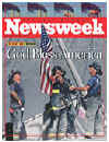
Editorial design can be extremely powerful emotionally — like these magazine covers after 9/11.

But this type of editorial design is journalism more than design, so it doesn’t really apply

I’ve always admired much of Luba Lukova’s work for its powerful imagery — but her work just goes so far for me.

I’ve thumbed though a few design magazines and annuals, and nothing so far has jumped out as being particularly powerful emotionally. Lots of decent concept; lots of humor and lots of complex messaging. But nothing emotionally powerful…

Hmmm. Is there something about our medium that prohibits us from showing more heart? Is it because of the type of work we do that keeps us emotionally shallow? Or is it simply because we choose not to, because it’s inappropriate or some other reason.

Do you have examples of graphic design work that has affected you emotionally? It can be print, environmental, web, etc.

Show me what moves you.

Maintained through our ADV @ UnderConsideration Program
ENTRY DETAILS
ARCHIVE ID 2493 FILED UNDER Discussion
PUBLISHED ON Dec.12.2005 BY Tan
WITH COMMENTS
Comments
felixxx’s comment is:

As with the Rothko example, I think it helps enormously if theres an existling dialogue between the artist and viewer. In our profession, no one better displays a viewer dialogue than Chris Ware or, better yet, Christoph Niemann

His versatile, annonymous style speak volumes. Some designers I've met have never heard of him, perhaps because he doesnt enter design shows (aside from American Illustration) or send our postcards like the rest of us (we're hacks) or perhaps its due to the lack of style (?).

Last thursday he had a little show on the ninth floor of The New York Times of "1000 spots".

I had to go back on friday to see them up close and personal again. I wept openly. Then I went home and cried some more.

On Dec.14.2005 at 05:28 PM
Jason Tselentis’s comment is:

The book Evil Doesn't Live Here had a profound impact on me with its images and posters about the Bosnian War.

On another note, Tan, Luba's work has been the only "design" to give me shivers and spike my emotions. Largely, that's because of the content she deals with. I would put James Victore in a similar category too, although his work draws as much on anger as pain and grief. The video made me want to throw my computer away, and then collage, ink, cut paper, or scribble about injustice for the rest of my life. Watching that video, you'll hear Victore state that design is about "social/political" stuff, not for "selling socks." Perhaps the reason more design doesn't stab at our emotions is because so much of it is used for selling and while a majority of us find that acceptable, you have very few Victores and Lukovas out there.

More than anything, I wonder if we want to foster more emotionally driven work? And if so, will it be used to sell socks or do something different?

On Dec.14.2005 at 06:32 PM
Tan ’s comment is:

>I wonder if we want to foster more emotionally driven work? And if so, will it be used to sell socks or do something different?

That's exactly one of the issue that I'm querying w/ this thread.

...

On that note, here's one of my all-time favorite commercials. It's a good example of using emotions to sell socks.

VW's Jetta/Wedding commercial

On Dec.14.2005 at 07:09 PM
Pesky Illustrator’s comment is:

Art that produces a deep emotional response:

I heard Irvin Mayfield - he's a young lion of Jazz from New Orleans - doing "a Closer Walk with Thee", a traditional Jazz Spiritual Standard from back home. His father was, at the time, still missing from the flood following Katrina. Irvin was crying as he played. But the notes were pure and straight like arrows to the heart. I never heard such emotionally charged music as that.

It wouldn't be for another month before they found the body of his father.

That moved me, Tan. And my heart is still broken.

On Dec.14.2005 at 08:02 PM
James Song’s comment is:

Damn Jason beat me - I was going to point out Victore's work also. I think there's something to be said about selling socks well - my favorite commercial of late has to be the Bravia commercial shot in my hood of SF. It's a branding video that communicates joy and irreverence and is incredibly moving. The music helps a lot, though. My girlfriend must have listened to that Jose Gonzales song for 2 weeks straight now.

On Dec.14.2005 at 08:05 PM
danny’s comment is:

The only time I can recall being moved by a piece of graphic design was the first time I saw this site. The works are honest and anonymous.

And these people aren't even designers.

On Dec.14.2005 at 08:12 PM
danny’s comment is:

Also, Bordertown, is a very good example of emotionally moving graphic design.

On Dec.14.2005 at 08:25 PM
Randy’s comment is:

This is a moving piece of art-direction. Perfect choice of music, great, great metaphor. I'd love it more w/o the advert. bumper at the end, but I'm willing to forego too many complaints. This is beautiful:

http://bravia-advert.com/commercial/braviaextcommhigh.html

On Dec.14.2005 at 09:05 PM
Derrick Schultz’s comment is:

I'll readily admit that design make me tear up. I never actually cry, but i get that feeling in the pit of my stomach when the moment it right.

Two things I have noticed about that feeling:

1. It is always in collaboration with someone else. I never get it alone working on my computer. It is always when in a discussion with someone. mayeb it is when the discussion leads to the perfect solution, or when i present a solution and the viewer smiles and you can tell they think it is perfect.

2. It is never in presenting a final product. its is always during the process stages.

This says something to me personally about design and its effect. The common ideas that design isnt personal or that it is about the process instead of the result seem to make the most sense when I feel that gutwrenching feeling.

On Dec.14.2005 at 10:48 PM
aubrey island’s comment is:

I had a song once that did it for me, a while back. I didn't cry, god-forsake I admit to that, but it really got me. Goodbye Girl by Hootie and the Blowfish. And although, I really haven't ever had our medium bring strong (and I mean tear-tuggin' strong) emotions to me before, I've seen alot emotions create some crazy images. Including many of my own. Sometimes, when I should be crying, I do it in my typography, or color choices. I've seen when people are crying in thier art, even when people type the 'crying face' :'( in my IM, but I know they're really doing it.

I guess I will take some time to look through some of the links on this page... But hold up a bit, I have a story.

There was this macabre artist in my History of Graphic Design class. He seems like an alright fellow, aside his mohawk and stapled up head. He's one of the top graphic artists I see making it one day. But, one day, he showed us this picture he created entirely from photoshop, of himself. He was naked, and you could belive it was how he really looked too (har-har). He was sitting on this weird chair thing, full of spikes and wires. It said "Nekkid" on it too. It had to be the saddest / scariest image I've ever seen. It must have took alot of guts to go up there and show that image. But, anyway, I saw him sitting outside afterwards. I couldn't talk to him. I had the chills and everything- I just couldn't do it. It was a very strong experience for me.

Well, that's my story. If I find out he has a website or something (before to long) I'll make sure and post it.

On Dec.14.2005 at 11:44 PM
Rob’s comment is:

Personally, I think there have to be several elements in play—from the design to the music to one state of mind—to bring about a strong emotional reaction.

This will seem almost silly next to Tan's Hotel Rwanda, but I actually found myself getting teary during the Father/son scenes (where they are having problems communicating) in Chicken Little. I'm sure it has something to do with my Dad, who passed away last year, but still, the response was there.

As for design, I was moved to total silence by a t-shirt design inspired by manic depression created by a student in the NY AIGA mentoring program. This high school student truly captured visually what being mentally ill, or being around someone who was mentally ill, might feel like and the 'feeling' coming out of the art (no other way to describe it) was incredibly powerful and moving.

And to finish my list, was the most surprising. When travelling through Germany I stopped to visit Dachau. The village itself is pristine, friendly and joyous. A very pleasant place to be. All of that changes the minute you step foot onto the grounds of the Nazi concentration camp, Dachau. While it's the same dirt that was outside the fence, you can feel something there that is unmistakably a permanent prescence. I told friends it was like death could never leave that place. And it's a feeling I'll never forget.

Wow, those were some heavies for the list. Maybe I'll just refer back to James Victore's more colorful work.

On Dec.15.2005 at 12:05 AM
debbie millman’s comment is:

Hey Tan--wonderful discussion.

Two books have moved me to tears over the years--many years ago Gabriel Garcia Marquez's book Love in the Time of Cholera made me cry on the beaches of Puerto Rico and I just recently wept openly on an airplane as I finished reading Middlesex. Both were incredible books--journey's really.

I have cried upon listening to two songs as well, the first time I heard Joni Mitchell's Two Grey Rooms from the extraordinary CD Night Ride Home and Bob Dylan's Don't Fall Apart on Me Tonight (how ironic) from Infidels.

As for movies--I am a total crybaby. I cry at everything. I even cried during Electra and I wept like a baby throughout the second half of Prime. Go figure.

One last thing--art, music, movies, books--in many ways, these things provoke emotions quite intentionally. What about unexpected gestures? I can be moved to tears by watching watching my best friend Sue when she doesn't know I am looking at her, seeing strangers on the street, even seeing my brothers together.

On Dec.15.2005 at 12:17 AM
Ravenone’s comment is:

Francis Bacon's screaming Popes certainly impacted me, and left me in near-tears after working on a 10 page paper on the paintings... only to have my computer crash 1/2 way through printing it out for class the next morning. There's just something about the paintings that strikes me on a deeply horrific level. Yes. I am afraid of the screaming popes. And Intrigued. It messes with the mind!

On Dec.15.2005 at 02:39 AM
Tan’s comment is:

> I actually found myself getting teary during the Father/son scenes

That's not corny at all Rob — and I'm glad you shared. I lost my father almost 20 years ago, and to this day, everytime I hear the song "In the Living Years" by Mike and the Mechanics, I'm still affected.

And your account of a visit to Dachau reminded me of the National Holocaust Museum in DC. Oh my God, what a devastatingly sad and powerful place that is. That museum is a perfect example of emotionally powerful design. It takes a historical tragedy and makes it an intimate, personal experience for each patron that goes through. Just incredible.

And James and Randy — thanks. I'd never seen that Bravia commercial before. It's great.

Lots of other amazing links here. Thanks Deb.

On Dec.15.2005 at 03:18 AM
Michael B.’s comment is:

Uwe Loesch's poster "Little Boy." It only works if you know that was the nickname of the bomb that was dropped on Hiroshima. Then the irony is ghastly and heartbreaking.

http://www.uweloesch.de/pages/littleboy.html

On Dec.15.2005 at 06:24 AM
Jason Tselentis’s comment is:

That VW commercial made me weepy . . . and at 6 a.m. in the morning, no less.

All of this has driven me to ponder the question, is there something about our medium that prohibits us from showing more heart? I would reply by saying that designers rarely use pathos (emotion) as a communication tool because it is not something that was embedded within the Modernist cannon of design education—it was ignored. The Bauhaus forefathers of design education did not want anything to do with the bourgeois Victorians and their notions of romanticism and fluff. Instead, they wanted to equate themselves with the intellectuals and thinkers of that time period. After hearing instructors say, "I don't care about the content, it's all about the form, baby; or let's try and make something with a degree of sophistication, none of this flowers and hearts nonsense," I presume that if you too look closely at design education, you will see the anti-emotion line of thinking.

However, Tan and others have shown a number of examples of illustrations and advertisements that use pathos as a means of reaching the audience. Pathos (pathetic, sympathetic, empathetic) caters to our feelings first, and bypasses critical thinking. Journalism can do this successfully; reality television will too; and so does persuasive communication such as advertising. Pathos moves us, gets our attention, and elicits a reaction. This is a strong persuasive tool, and one that made me want to by a VW Jetta after viewing Tan’s link. Pathos, logos, and ethos are all rhetorical devices, and they’re overlooked during most designer’s education in favor of snazzy, chic, modernist, or evocative form-language.

It's a shame that we feel guilty for appreciating the emotions we find in our culture, but as Tan said, there's nothing wrong with that. It reminds us that we're human. And, what if the whole world was "designed" perfectly, streamlined so its substance was hidden and concealed. I wouldn't want a place like that.

On Dec.15.2005 at 06:55 AM
Jason Tselentis’s comment is:

And . . . that would be canon for goodness sake, not cannon for killing. Too sleepy.

On Dec.15.2005 at 08:03 AM
Armin’s comment is:

> mayeb it is when the discussion leads to the perfect solution, or when i present a solution and the viewer smiles and you can tell they think it is perfect.

Derrick, you are very right. As designers we can get heavily involved, beyond kerning, with a client project and really care for the final product and feel a certain attachment to it.

Recently we did a project for New York University School of Law to launch their capital campaign. We collaborated with a film production company called Tribe to develop a video to be shown at a gala. (The video can be seen here). We designed all the materials and had little to do with the video, other than the graphics. But one advice we gave — that I think made a huge, yet stupidly small, difference for the conclusion of the video — was for the final fade in of the logo. In one of our weekly meetings with the client we all saw the video in its final iteration together. When the logo came up at the end — granted, following a very smart and heartfelt commentary from one of the school's professors — I could feel the goosebumps and throat lumps from all of our NYU clients. While the video may not be emotional for anyone who isn't involved with NYU, it was amazing to see how a small (design) gesture can complete an experience for a group that cared deeply for their school. Heck, even I got the goosebumps.

On Dec.15.2005 at 08:48 AM
Theo’s comment is:

Personally, I found the New Yorker 9/11 cover by Art Spiegelman to be by far the most moving and powerful in its simple evocation of mourning:

On Dec.15.2005 at 09:39 AM
agrayspace’s comment is:

I wept like a baby at the end of Baraka. I felt so helpless and small and pathetic. I couldn't control it. It felt great. In many ways I changed the day I saw that. And as the years move on, and I succumb to making the difficult but positive choices that have been years in the making, I can feel that movie inside me acting as the catalyst for all change in my life.

I wept like a baby at the end of Farenheit 911 too. So much sadness and anger. I don't care what rhetoric people may use to marginalize Michael Moore, that movie kicked my ass.

As far as design goes, I can only think of one example that stirred any emotion. The one wireless phone commercial where the husband and wife are fighting and not talking. They drive to work in silence and the tension is thick and sad. Then the wife is sitting in a business meeting looking sad and in walks her husband holding a sign saying "i'm sorry". You realize at the end he really sent her a text message. The dynamic of that is very real and touching to me as a husband and it hits to the core of how technology can play in our real lives. Brava.

The "and Babies" poster has been something I never forget.

The work of Tom Gauld has a wonderful sweet melancholy that I respond to.

On Dec.15.2005 at 09:39 AM
christina’s comment is:

A friend in Iceland stumbled upon her local Amnesty International archives of posters spanning some 20 years (they were gathering dust in the filing cabinets in the rear of the office)

She photographed them and when she presented them to us as part of a discussion panel, the room carried a lingering silencee long after she finished speaking.

To this day, I have yet to be moved by anything in quite the same way. Design can be as powerful as any medium.

On Dec.15.2005 at 09:47 AM
Darrel’s comment is:

The recent Pulitzer Prize Photography show exhibit moved me. One of the quietest rooms I had ever been in. It was packed but not a peep out of anyone.

On Dec.15.2005 at 10:54 AM
marian bantjes’s comment is:

Unfortunately I'm pressed for time and will have to come back much later to follow links and read more in-depth. But in very brief I think that what makes us respond emotionally is a personal connective trigger: when we see something that reminds us of ourselves and an emotional experience. There is a lot of evidence of this in the above comments. We respond to things that strike our hopes and fears for our own children, that touch nerves of our past and tap into our direct experiential present.

Advertisers are constantly looking to make this connection, but the thing that works against them and designers is that the marketing message kills the emotional response. It can even make us angry: to see something that moves us and then have it followed by the cheap sell. Note however, that the sell is not cheap when the "product" itself is part of our memory. Armin's NYU logo fade in is the perfect example: people's time at university is a very special part of their lives, their identification with that via the logo is very strong—it symbolizes not an institution but years of achievement, friends and personal transformation. That's the trigger.

The greatest opportunity to create that connection with design is in Common Good causes, or messages that have no marketing attached: work about social issues, disease, war, etc. This is a major reason, I think, why Victore's work is often cited in this. It's not just his brilliant connections (and his undeniable ability to get right to the core, immediately) but the fact that the message is about something that touches something we already care about: racism, war, etc.

It's when these opportunities are squandered by boring, mundane, poor, inept, or egocentric design that it is truly tragic, because if you can't make an emotional connection with someone about AIDS or poverty, you're really lost.

On Dec.15.2005 at 11:41 AM
szkat’s comment is:

in 2002 i was in Capetown, South Africa at the museum of modern art. they had an exhibit called "Life Positive" (i think), it was an extensive collection of people whose lives have been ravaged by AIDS, their pictures hung next to their stories. it seemed pretty straightforward at first, but realizing the sheer volume, and realizing that it was only a reduced fraction of the whole, was shattering.

then woman who i took to be a curator came over and thanked me for coming. we talked briefly, then she took me to her picture and that's when i lost it completely. we held hands and talked about her life. and she cried because i literally touched her.

the design of the exhibit was about as simple as it could be, but left a permenant resonance because of the context.

i had an interview recently, during which the interviewer described my work as "relentlessly organic" (it was a positive comment, i asked to make sure) but i think that's what makes the reaction in us. from iPod's dancers to Victoire's posters, it's when we can feel the concept breathing from inside the presentation that it becomes something real.

On Dec.15.2005 at 11:59 AM
Tan’s comment is:

>The Bauhaus forefathers of design education did not want anything to do with the bourgeois Victorians and their notions of romanticism and fluff.

This is a great theory, Jason. I'm sold. Furthermore, I would say that the Modernist mantra of "Form and Function" inherently leaves out the emotive and the visceral — elements of design that are impossible to quantify and define.

In today's branding world, you hear lots about the value of establishing and strengthening the "emotional connection" between product and customers. It seems that we're about to come full circle again, and see the limitations of a design world lead by form and function alone. It's not enough for a product or brand to be purposeful. A brand's relevance, esteem, and differentiation are all tied in with the emotive power it has with customers.

Also, emotions supersede logic and practicality. It takes over, and turns a consumer purchase from a "need" to a "want."

>the marketing message kills the emotional response

Yes, but not in all cases. Some products and brands seamlessly integrate the two. Coca-Cola's classic "Hilltop" commercial is a simple, direct brand message that's strengthened by its emotive appeal.

I can't find an mpeg of the commercial, but here's a jpg still from it — you know the one. C'mon, sing it with me...I'd like to teach the world to sing...

On Dec.15.2005 at 01:30 PM
Caren Litherland’s comment is:

I think the thing that moved me the most visually within the past couple of years was opening the New York Times one day and seeing a two-page spread of the first 1,000 American casualties in Iraq. Candid, understated, and completely shocking.

Other examples from the past year or so:

  1. ASPCA's "Whatever you can imagine, we've seen worse"—don't know the genesis of the design; it's a Saatchi & Saatchi campaign
  2. 100% Evil (Blechman, Niemann)
  3. And of course Luba Lukova, always and forever.

    On Dec.15.2005 at 01:33 PM
    danny’s comment is:

    In today's branding world, you hear lots about the value of establishing and strengthening the "emotional connection" between product and customers.

    Do you think the most sought after emotional connections are made through a brand's overall charm or trustworthiness/credibility? More so than sadness, humility, or remorse?

    It seems so.

    On Dec.15.2005 at 02:02 PM
    Jason Tselentis’s comment is:

    Tan, you bring up an excellent point that brands try and leverage emotions, or at least make emotional connections with consumers. On that note, brands succeed at targeting and triggering our pathos more than any other means of design.

    Thanks to tireless work by marketing and advertising gurus over the years, VW means so much more than cute cars from Germany. Oh, the irony, http://www.hitler.org/artifacts/volkswagen/" target="_blank">here’s a car created by Adolf Hitler, his sketchbooks illustrated the "people’s car" alongside ideas for the now infamous Nazi logo: the swastika. Hitler knew the power of leveraging emotions long before folks at Y&R, Price McNabb, or Landor created a methodologie for it all. So, can we infer that if Hitler were alive today, he’d work in branding and corporate identity?

    On Dec.15.2005 at 02:21 PM
    Tan’s comment is:

    Well Danny, it's a little of both. Maybe not remorse, but more sentimentality. Before the "Can-you-hear-me-now?" crap, phone commercials used to be real emotional tearjerkers. Now they're just stupid and goofy. Is it any wonder that the telecom industry has 0% customer loyalty and retention.

    But regardless of whether it's peppy or sappy, the emotive impression must be a positive one. You can't shame, terrify, or devastate a consumer's emotion and hope that they'll come back for more.

    On Dec.15.2005 at 02:21 PM
    Derrick Schultz’s comment is:

    Jason and Tan's comments on modernism/bauhaus vs. pathos are interesting, but i also think its too black/white of an interpretation.

    One of the things that I think the emotional response does is divide audiences very quickly. For example, Tan loves the "hilltop" Coke commercial. I absolutely hate it (I also hate campfire songs, so you can probably understand my reasoning).

    Pathos being personal was the reason it didnt make it into the moderinist books. it was meant to be a universal design (whatever that means, it obviously being impossible and flawed reasoning). So modernism is essentially an emotion in itself (in the same way aetheism or agnosticism is a religion, without trying to pull the religion card). I have always felt modernism (and the aesthetic usually associaed it with it) was a way of saying "we wont pander to you and try to touch a nerve" and have respected it because of such.

    In many cases, I have always wished companies would stay away from my heart and speak to my mind instead. but again, these are personal choices and will always be a dividing line. And that is why there is identity and branding for individual companies. One will choose the mind, and another will choose the heart. and im alrght with that.

    On Dec.15.2005 at 02:29 PM
    bernie’s comment is:

    I teach part-time at the University here in Edmonton, Alberta, Canada and one project for my class is a human rights poster. The project comes from steven heller's book teaching graphic design.

    The idea is that each student picks an article from amnesty's declaration of human rights and defines why we need this article and why we need an inernational declaration of human rights. Then they all draw up scenarios surrounding the article, (i.e. you're a mother of 4 in south africa in 1919; you're a young girl in berlin in 1940; etc). The project is strickly image-based with a standard black bottom on all of the posters with the written out declaration.

    Although the student work isn't always as refined as it could be the aspects are their for lots of dialogue. Once finished the posters are all displayed in a high traffic area of the university and it's always amazing to see the people stop and stare. Literally every year a crowd gathers and the students feel, in some way, that they've touched people through images. Last year a pschology teacher wanted to buy the entire set of posters.

    As a teacher I don't know what makes me choke up more, the work or the reactions.

    On Dec.15.2005 at 02:35 PM
    Darrel’s comment is:


    It's not enough for a product or brand to be purposeful. A brand's relevance, esteem, and differentiation are all tied in with the emotive power it has with customers.

    I don't want to have an emotional relationship with my vacuum cleaner.

    On Dec.15.2005 at 04:46 PM
    debbie millman’s comment is:

    Darrel said:

    I don't want to have an emotional relationship with my vacuum cleaner.

    um, it appears as though some folks do.

    On Dec.15.2005 at 05:31 PM
    Tan’s comment is:

    >I don't want to have an emotional relationship with my vacuum cleaner.

    Sure, but how does a company like Dyson get you to buy their $500 vacuum when a perfectly adequate, comparable Hoover costs $250?

    An emotional buy doesn't mean you have to cry at the store — it just means that there's something about the brand or the product that resonates with you beyond the practical features and price point. It could be aspirational. It could be sentimental. It could be a sense of elitism. It could be a need for individuality.

    When you just feel good (or proud, nostalgic, whatever) about owning a brand you've always desired, no matter how you may rationalize it — you've just made an emotional purchase. Desire is based on an emotive trigger vs. need which is based on practicality.

    On Dec.15.2005 at 06:35 PM
    Michael Surtees’s comment is:

    On the aspirational side of things, Honda has struck a chord with me. I haven't seen the campaign here, but I've heard some of their radio spots in the U.K. Titled “The Power of Dreams”, it's all about the stuff that drives them. You can see what it's all about at www.thepowerofdreams.com

    And since we're in the age of blogging, the agency (w+k london) that did the work has blogged all about it at Impossible feedback

    On Dec.15.2005 at 08:21 PM
    Derrick Schultz’s comment is:

    I fear we're already being led into another branding discussion. And I had such hopes and dreams (and emotions) for this thread.

    One of the biggest examples where emotion is missing from design, but is very readily available and useful, is in exhibit design. I caught a beautiful special exhibit at Alcatraz over Thanksgiving weekend on senior citizen prisoners (many of whom are lifers). To be honest, the content was not overly emotional (in fact, many times I understood why these people should be in jail), but it was so appropriately done and fit the exhibit space so well that it created a certain feeling for it before you even read the content. the typography and story made it all the more interesting. And this is where I find emotional design useful: grabbing you, and then its up top the designer (and oftentimes client) getting you more content once the feeling subsides. All too often emotional design grabs your attention, and then gives you nothing else once the feeling fades.

    I will post links to pictures of the exhibit (titled Prisoners of Age) when I get back from work.

    On Dec.15.2005 at 08:26 PM
    Tan’s comment is:

    >I fear we're already being led into another branding discussion.

    Yes, sorry...that's a bit my fault. Can't turn it off sometimes, you know. But enough for now, promise.

    By all means, let's get back on our original track and see more wonderful examples of emotionally powerful design work and stories.

    On Dec.15.2005 at 08:44 PM
    Derrick Schultz’s comment is:

    Prisoners of Age exhibit photos:

    1

    2

    3

    4

    5

    6

    7

    (Probably easier to download and put into Preview or something)

    Theres a website as well, but it, and the book it sells are so bad that it would probably ruin the good that came out of the exhibit. I'll spare you all (but google Prisoners of Age if youre really interested).

    On Dec.15.2005 at 11:47 PM
    Darrel’s comment is:

    Sure, but how does a company like Dyson get you to buy their $500 vacuum when a perfectly adequate, comparable Hoover costs $250?

    Oh sure, I'm not disagreeing that folks do have emotional attachments to brands.

    It just seems a bit icky after discussing things like the VietNam memorial, Holocaust museum, Amnesty International, etc. ;o)

    Yes, I used the word 'icky'.

    On Dec.16.2005 at 10:20 AM
    unnikrishna Menon Damodaran’s comment is:

    Do you have examples of graphic design work that has affected you emotionally? It can be print, environmental, web, etc.

    Show me what moves you.

    One and only graphic design book The Design of Dissent : Socially and Politically Driven Graphics

    by Milton Glaser, Mirko Ilic, Tony Kushner

    Well, tears may be up to each individual but this book make you emotional and gives an urge to live and cry to the world.

    Emotionally graphic. Wonder why no one is coming up with a book review in SpeakUp

    On Dec.17.2005 at 04:08 AM
    Frank’s comment is:

    Tan, I think your article is probably one of the simplest, most thought provoking articles I've read on SpeakUp in quite some time. After hearing Stefan Sagemeister's "Design that Touches the Heart" presentation over a year ago, I've become a bit obsessed with exploring this design topic. So much so that I started a blog to explore the heart and soul of design (something I felt was missing in most design forums). I've looked at questions like:

    Can design touch the heart?

    What purpose should design touching the heart serve?

    What are some practical examples?

    I'm saddened by the fact that design has not touched the heart the way art or music or film has. I've only been moved to tears once by this piece that probably borders more on art than design. What are the limits of design in moving the heart beyond sentimentalism and towards authenticity? Is design's heart held captive by business and advertising pharaohs? I don't know.

    I do know that I've decided to do something about it. We're sponsoring a "Design That Touches the Heart" show that is free and open to all. Hopefully we'll uncover some work that moves the human heart beyond selling socks.

    On Dec.18.2005 at 01:31 AM
    Tan’s comment is:

    Thanks Frank. I just have one question —�I realize it's your blog, so you can do what you wish, but why does exploring the heart and soul of design have to come from a "Christian perspective" as stated on your site?

    Why can't it just come from a human perspective? Emotions, compassion, pathos — they are not ideals that are exclusive to the Christian faith. In fact, they aren't exclusive to any faith in particular.

    Why can't we just be people first?

    On Dec.19.2005 at 06:11 PM
    Frank’s comment is:

    Tan, great question, and you're not the first person to ask. I deeply struggle with that word "Christian" in perspective on exploring design's heart and soul. I've taken it off, thrown it down, put it back on, taken it off, and put it back on the site many times for just the reasons you mention. You're right. We need to be people first, sharing a common ground and facing the same needs. These ideals (touching the heart, exploring truth, moving the human soul with design) are not exclusive to Christians, however my beliefs do influence the what and how my communication process and ultimately the why.

    I don't have an agenda in this exploration, I just want to see design move beyond its current self imposed boundaries to connect to the truth and effect change for the good. I just can't figure out how to get there, or even what there looks like. I get glimpses as you did, but know that there is more. It's like the current state of design is a bologna sandwidch in a brown paper bag when there is a whole banqueting table of rich foods spread out and waiting for us. And I think there is a growing sense in the design community that we have and continue to toil and produce design that is less than what our hearts know it should be.

    Where do we go next? How do we explore further? Suggestions...

    On Dec.20.2005 at 12:38 AM
    Tan’s comment is:

    Thank you Frank. That was a very direct, sincere answer.

    And I hope you'll pardon me for asking in the first place — it's just that the issue of religion often complicates most things these days.

    >Where do we go next? How do we explore further? Suggestions...

    My one suggestion would be to start small. Recognize individual work, individual voices —�and share with others.

    Go from there...

    On Dec.20.2005 at 12:17 PM
    Hudson’s comment is:

    Photos of people standing by the tracks as Bobby Kennedy's funeral train passed by:

    Click HERE

    If you're unmoved by these photos, there may be something wrong with you.

    On Dec.28.2005 at 12:47 AM
    Mark ’s comment is:

    I've check out that link above and I only can say one thing.

    "So sad"

    I almost teared up looking at those pics

    oddly enough I could picture the casket going by even though I never saw it in any of the pictures.

    BTW another piece of graphic design that was so simple yet effective was Time's cover four days after 9/11 its just one picture with the "Time" logo behind it and a black border.

    Yet when I still see that cover I think "My.. god.."

    simply put it illlustrates the the sudden shock of what happened.

    inside theres only pictures and descriptions of the events no articles at all.

    another piece of good piece of graphic design though not as emotional was the Court Tv "fingerprint" logo that gave a feeling of crime and grittiness of the streets.

    Almost hard-hitting in a way

    Then for some dumb reason it was "sanitized"

    On Dec.30.2005 at 11:08 AM
    Mark’s comment is:

    I'm not sure about the rest of you but when seeing the networks logo on tv and being ever so present on the internet kind of tones-down the emotional impact of whats happening almost saying "its just everyday news"

    basically I'm saying is that "branding" the news takes away the full fledged emotional impact of whats happening.

    compare the pictures below

    with logos

    the worst yet

    without logos

    The transparent logos arn't a big deal but the "flashy" types with the scrolling news zipper and permenant lower 3rds behind the logo get to be too much.

    I'm NOT saying to abolish all graphic design on tv just tone it down a little.

    To see how much news as a priority has changed compare CNN to its first broadcast in 1980

    to how it looks today

    CNN25video.htm

    these are videos of it's launch now compare how the news is handled at that time versus today.

    below is a good source for how CNN and other news agencies have changed over the years,

    for the U.S. click "international" and then click on "United States of America" and then click on the stations featured.

    gives you an idea how graphics overtook the screen on tv.

    .uk/

    On Dec.30.2005 at 12:21 PM
    Mark ’s comment is:

    DANG it.

    I meant THIS website :

    www.tv-ark.org.uk/

    copy and paste link into the address bar

    On Dec.30.2005 at 12:25 PM
    Mark’s comment is:

    The Manhattan Bagel logo inadvertantly causes an emotion almost a sense of longing for what was lost on 9/11:

    our innocence AND the Twin Towers

    giving a feeling of yearning for the "good times"

    on the other hand this logo angers me.

    gambling money through the NAMESAKE of a place that was DESTROYED in a horrific disaster where REAL people DIED?

    even the name sounds sickening "Twin Towers Bingo"

    look at this picture below and tell me this doesn't anger you.

    caption would read:freedom of speech? AH! Phwey! who needs it anyway?

    On Dec.30.2005 at 12:52 PM
    Mark’s comment is:

    As for the best of emotional graphic design check out the book The Design of Dissent 100s of many emotionally crafted graphic design.

    copy and paste the link below

    http://www.amazon.com/gp/product/1592531172/ref=nosim/103-8255774-8657431?n=283155

    and checkout some of the pages by clicking on "Search Inside!"

    this link has reviews of it.

    http://www.tictap.com/s/1592531172 copy and paste link.

    I got this book already.

    I must say it is definately an emotion getter.

    On Dec.30.2005 at 01:06 PM
    Mark’s comment is:

    One VERY effective piece of audio design (I guess you could call it that) was in a segment in Fahrenheit 9/11 (when it was playing in theaters)where they had the attacks happening(from the crashes to the collapses) but they only played the audio of the attacks over a completely blank dark black screen.

    I was litterally CRYING in that segment not loudly but quietly.

    In fact it was so powerful that I even remember the sensation I had, the back of my head felt heavy and my stomach felt nauseous and I clearly remember that the tears where being FORCED out of my eyes!

    It was like my body was forcing me to cry uncontrollably a pretty strange sensation in fact.

    Its unsual for something so simple to be so powerful.

    On Dec.30.2005 at 01:26 PM