Speak UpA Former Division of UnderConsideration
The Archives, August 2002 – April 2009
advertise @ underconsideration
---Click here for full archive list or browse below
  
Quipsologies
~ Vol. 52 ~

The letter Q is the proud purveyor of this week’s edition of Quipsologies.

~ ARMIN ~

Michael B. tackles a taboo topic among design blogs: writing about stuff that doesn’t relate directly to design.

~

One city’s garbage is another man’s art.

~

50-year-old Miffy, the rabbit, will get a museum exhibit, and so will his creator, Dick Bruna. “With a permanent collection of his work, Bruna takes his place alongside other Dutch masters, Rembrandt, Mondriaan and Van Gogh”. [Thanks to John Stephenson for the link]

~

The Cooper-Hewitt is putting a $2 Million gift to good use by envisioning a future web site for the museum where users can curate their own shows online. Flickr is, of course, mentioned as a source of inspiration. San Francisco-based Method is leading the charge for the museum. [Via Coudal]

~

Jason Fried of 37 Signals and Jim Coudal of Coudal Partners deliver the opening remarks at SXSW: less is more, curious is better. Download the MP3. More SXSW podcasts here.

~

Video game fans, rejoice at this jaw-dropping collection.

~

When Typography Attacks II: Cleavage Edition. [Clusterlinked back to Gizmodo]

~

Chromeography: Admiration of the metal logos and lettering affixed to mid-century automobiles and appliances. [Via Coudal]

~

Truth in clothes labeling.

~ BRYONY ~

Martha does it again. Will it stick?

~

Unusual cards by Francesca Berrini. [Via Sam Potts]

~ PETER SCHERRER ~

The streets come alive! An in-depth look at those wacky sidewalk illustrations.

~ M. KINGSLEY ~

Opening soon — Modernism: Designing a New World 1914-1939 at the V&A.

~

Sometimes you just don’t wanna know The Truth about the Billable Hour. (gee thanks Plep, now I’m depressed)

~

A well-designed diagram that shows where your tax dollars go. (gee thanks Boing Boing, now I’m even more depressed)

~

The war in Iraq is now three years old and Students for a Democratic Society (SDS) is reforming on campuses across the country. Their proposed sticker and flyer may not look as nice as P. Diddy’s or Howard Stern’s clenched fists, but they’re a welcome return to the image’s roots.

~

Brown University Library’s Center for Digitial Initiatives has an impressive online collection of the SDS-affiliated publication Radical America.

~

More SDS graphics.

~

La poésie est dans la rue and while there have been sightings of Atelier Populaire posters from 1968, I suspect such reports are either wishful thinking or perhaps misidentification of look-alike slogans.

~


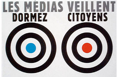
While searching the web for current manifestations of Atelier Populaire posters, I came across this groovy 2001 image from Quebec Indymedia (“Media is watching. Sleep citizens.”).

~

On the Grotesque.

~

On the twilight of film photography. (via 2 Blowhards)

~

On Hand-drawn lettering & experimental typography.

~

A friend claims that whenever you walk into an art gallery, you see either “doodles” or “porn”. Perhaps these would be considered refined doodles.

~

Porn.

~

Doodles.

~

Who says nudity doesn’t pay?

~

Who says you can’t read in the dark?

~

There are more Hip-Hop flyers in the world than dreamt of in your philosophy.

~

Comic critique through medical criteria.

~

Copyright critique through comics.

~

Jerry Lewis’ comic adventures (Happy 80th, you Legion Commander).

Maintained through our ADV @ UnderConsideration Program
ENTRY DETAILS
ARCHIVE ID 2561 FILED UNDER Miscellaneous
PUBLISHED ON Mar.20.2006 BY The Speak Up Authors
WITH COMMENTS
Comments
m. kingsley’s comment is:

Hey Armin — no mention of Quipsologies' one-year anniversary?

On Mar.20.2006 at 12:19 PM
Randy’s comment is:

Martha manages to have a tag line that's twin to dear Ellen's site.

On Mar.20.2006 at 02:28 PM
Armin’s comment is:

Mark, seems like the anniversary was back in February 15. I missed it then... Less luck in remembering it a month late. But, yeah, a year: cool. Imagine all the links we wouldn't have linked had we not started it. Long live the power of the link.

On Mar.20.2006 at 03:40 PM
m. kingsley’s comment is:

> Long live the power of the link

...and its effect on Google rankings.

On Mar.20.2006 at 04:12 PM
Tan’s comment is:

I'm a fan of Martha's Living — it's a great example of editorial design; the articles about fine cooking and home designs are insightful and instructional, giving a glimpse into the professional side of those skills.

But I think Blueprint might have taken the magazine off the craftmaking cliff. The panel of expert editors seem to be anything but designers —�which makes it clear that their target audience is the scrapbook/dollhouse/craft-crap-making crowd. Ick. Craft makes me want to power-vomit.

As a designer, I take a little offense to the term design being used in their tagline. Craft is not design, and it definitely is not my life.

On Mar.20.2006 at 07:29 PM
Jose Nieto’s comment is:

Martha manages to have a tag line that's twin to dear Ellen's site

Also, there's already a design magazine called Blueprint. I wonder if they know about Martha's new venture?

On Mar.20.2006 at 07:34 PM
EJV’s comment is:

I'm surprised that in this version of Quipsologies, sponsored by the letter Q, there was no mention of Quark's new NEW logo.

On Mar.21.2006 at 08:27 AM
EJV’s comment is:

I'm surprised that in this version of Quipsologies, sponsored by the letter Q, there was no mention of Quark's new NEW logo.

On Mar.21.2006 at 08:27 AM
Mr. Frankie L’s comment is:

You mean this?

Looks like they decided to go 3D just to play it safe :)

On Mar.21.2006 at 09:53 AM
Mr. Frankie L’s comment is:

Here is a quote from the article given by EJV:

"Our internal creative team designed the new logo," he replied, "and we received feedback from a variety of outside consultants throughout the design process. Then we undertook all the appropriate business, legal, and creative analysis in review of our new logo."

On Mar.21.2006 at 09:56 AM
Darrel’s comment is:

"Our internal creative team designed the new logo," he replied, "and we received feedback from a variety of outside consultants throughout the design process. Then we undertook all the appropriate business, legal, and creative analysis in review of our new logo."

Translated: it was designed by committee.

On Mar.21.2006 at 10:04 AM
Armin’s comment is:

EJV... You are right, it was the perfect opportunity to flog it again (it is mentioned in the "Quark Reloaded" discussion). Just goes to show you that Monday morning blogging can leave a lot to be desired.

On Mar.21.2006 at 10:28 AM
Pesky Illustrator’s comment is:

Just as a tangent to Armin's post:

Quick question: How many designers hate Mondays or - alternately - are energized by the potential of a new week? The reason I'm asking is that creativity has sort of a biorythmn dependant on certain peaks. I wonder if anyone else experiences this?

On Mar.21.2006 at 10:57 PM
Kevin’s comment is:

Regarding Mondays: horrible

Regarding Quark: horrible

Regarding sidewalk optical illusions: cool

Regarding the Atelier Populaire poster (which I always thought could be read in the imperative, or at least onbliquely as well - "veillent citoyens "): Ne pas plier

I was in quebec city for the demo, and worked with the ne pas plier bunch to distribute the graphics. It was certainly quite something. Also see the mask factory.

On Mar.23.2006 at 01:07 PM