Bazooka, Sprite and St. Pauli Girl

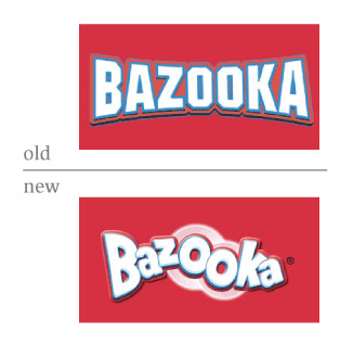
Bazooka
“No one would dare remove Bazooka Joe’s eye patch,” Topps President Scott Silverstein said.
Sprite
![]()
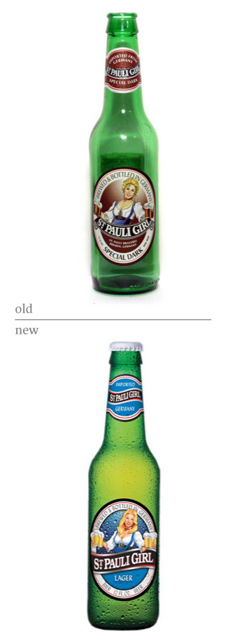
St. Pauli Girl
Just for Tan, here is a link to the complete visual history of the St. Pauli Girls.


Bazooka, Sprite and St. Pauli Girl
Bazooka
“No one would dare remove Bazooka Joe’s eye patch,” Topps President Scott Silverstein said.
Sprite
![]()
St. Pauli Girl
Just for Tan, here is a link to the complete visual history of the St. Pauli Girls.
Interesting to see both St. Pauli Girl and Bazooka leave behide the vertical line of symmetry. There's something about that form that reads antiquity to me. That said, neither bother me much.
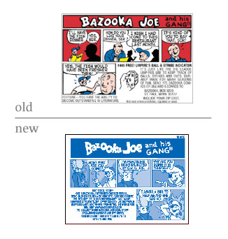
Bazooka looks more fun and less baseball, though the one-color comic busts my bubble.
St. Pauli Girl got a photo-retouching makeover too. Mmm, it's glowing like those new Heine ads.
On Jun.07.2006 at 09:24 AMSprite? I'm not in love with it, but I prefer it over the previous version. Thank goodness they've taken away the more literal citrus and incorporated into the primary element.
On Jun.07.2006 at 09:36 AMi think the new sprite branding is atrocious. i agree the can needed to be updated (and possibly the wordmark), but this is just plain ugly.
in 2004 ogilvy's brand integration group did some brand work for sprite, which i think more captures the spirit of the brand, which can be seen on the aiga's design archives.
On Jun.07.2006 at 10:54 AMBoy oh boy.. That sprite can is ugly. Ryan's comments are right. I think Bazooka looks great. By far the best rebrand. I always wondered how St Pauli Girl carries 3 heavy mugs in each hand and looks so happy about it. Strong lady.
On Jun.07.2006 at 11:29 AMThat emboss on the Sprite lemon/lime, yin/yang "S" is just wrong. Might as well have a blurry drop shadow, too. Vault does something similar:
![]()
And the blue/green on the can is just too centered. Feels like the green should come down lower or something.
St. Pauli is fine.
Bazooka wins.
On Jun.07.2006 at 01:18 PMBazooka: I'm on the fence. Initially, I really liked the new version. Then after looking at both for a while, I'm starting to wonder. I'm considering if the original has more strength and individuality. The rebrand looks great, but the original starts to feel like it fits the name better.
Sprite: The rebrand is fine, but doesn't leap out at me in any way.
St. Pauli Girl: An improvement - though I think I would have kept her hair up. Stay with the traditional image of the Octoberfest girl. I get they wanted to modernize it, but some images I think don't 'modernize' well. I don't see the version with the hair down as being as obvious what she is to represent.
On Jun.07.2006 at 01:51 PMBazooka Gum's logo is OK, but they should have kept the comic in color. Who wants a monochromatic comic?
Sprite: I don't drink the stuff, so I don't really care for it. The "car logo look" of the two interlocking lemons is very Nascar.
Sure, we all love our beer with Teutonic silicon chested Barbies on it, but next time I hope they make her blonder and just plain naked. Maybe eight mugs in her hands too....(looking for the ironic smiley face icon to insert here)
I think Sprite should have kept the type as the dominant visual. I'm afraid to drink from the new can because the razor-sharp lemon/lime icon is going to slice apart my throat. Not good.
On Jun.07.2006 at 02:05 PMSprite: I'm not feeling it at all. Does anyone know who designed this? Looks like focus groups to me...focus groups and typical COKE art direction.
On Jun.07.2006 at 02:19 PMbazooka joe -- not a fan. totally not a fan. reminds me of the Baskin Robbins change over, sacrificing something that looks fine for something that looks young. the mid-life crisis of a brand that wants to be on top but really doesn't have anything to offer that elevates it above its competitors. except monochromatic comics? they're jacking around unecessarily with their only differentiator.
sprite -- i dig the change. the old can was too "my mom had me drink this when i was home sick," a kind of comforting splash of flavor. the new can is urban, interesting. though that p makes me twitch and the green/yellow shapes make me think of the Power Rangers for no discernable reason. somehow i still totally prefer it to the old one.
st pauli's -- is there a difference, really? i wouldn't go so far as to call this a rebrand. maybe i'm wrong, i would be curious to see how much change actually comes from changing the hairstyle of a cartoon. i don't sense a demographic shift here, whereas with the other two i do.
my $0.02, nothing more :)
On Jun.07.2006 at 02:40 PMAlthough I like the new Bazooka a bit better, I too, feel the Baskin Robbins effect on this one. Seems like blasphemy to monotone the comic.
Sprite Synthetic Motor Oil– keeps your engine cool and your exhaust smelling lemony-liminy fresh
If the two St. Pauli Girl bottles were next to eachother on the same shelf, I'd just think it was a difference between the 'Special Dark' and the 'Lager'– not a re-brand.
On Jun.07.2006 at 05:20 PMMy first impressions:
Bazooka-Neither Bazooka logo does much for me, but seeing the color stripped from the cartoon makes me sad. I'd rather have a monochrome wrapper and a color cartoon.
Sprite - That "P" is messed up. The green/yellow wedge shapes being more prominent than the product name make it look like a sub-brand -- "L7 Sprite."
St. Pauli Girl - Her hairstyle doesn't strike me as particularly modern, it makes me think of Loni Anderson, or maybe Seka. Perhaps not a bad choice for a beer label...
On Jun.07.2006 at 07:12 PMBazooka: Far more kid-friendly. Not a huge fan of the rounded bevel. And, the comic makes me think they were going retro, which doesn't jive with the photoshop-rubberized logo. Also - does anyone else see breasts in the o's? Paging Dr. Freud...
Sprite: Allow me to be the lone voice of praise in this rebranding. YEA! Though it does tend to make more sense in the context of the commercials. And I grant that the type, while an interesting experiment, didn't really do what I think they may have been intending to do with it, and that is to look more graffitiesque (?). Also, I have a predilection for logos with rotational symmetry. And the bevel here wasn't necessary either. And the two halves of the yin-yang should probably meet in the middle, it's generating too much tension. Hmm. I may downgrade my praise to a hearty, "Good try!"
St. Pauli: I also have trouble seeing too much difference with the logo. Though it probably can't be bad that they hootched up the girl a little more. A little younger, blonder, and bustier. Dark is better than lager any day of the week, though.
How is it that we haven't covered Sprint local's conversion to Embarq?
On Jun.07.2006 at 09:45 PMand bustier.
I was going to say, "is it just me, or does the new St. Pauli girl have bigger tits?" but Greg put it more politely than me.
On Jun.07.2006 at 10:14 PMmarian-- i don't think the breast are larger, i think it's just a new bra.
is it just me, or do are all of the re-brands terrible?
Being a lover a beer, i'd like to point out that the colors, for st. pauli, have always been blue for the larger and brown for the special dark, those aren't part of the re-brand. I would not reccomend St. P, of any flavo, to anyone.
On Jun.07.2006 at 11:15 PMBazooka - I think the old logo fits better for the word "Bazooka" as a stand alone. But the rebrand is pretty good when applying the name to bubble gum. As for the monochrome, I suppose it's more a budget decision than something they think is best for the brand.
As far as Sprite, if you have committed to rebranding, I like the *idea* of the lemon/lime 'S', it's a nice concept. But the execution tries to be too modern, with the sharpness and the bevels. Like previous comments, too moter oil-ish.
And that 'p' in the logotype is just way off - no wonder everyone is noticing it, it stands out - in a bad way - and makes the 'S' of Sprite look really weak.
As far as St. Pauli's, not much difference to me, except for the banner - and I think I actually like the wavy version over the half-circle type version. Though I agree with previous comment - I like the hair up, more Oktoberfest. But I don't drink it, so I guess, I'm not the target.
- Chris
On Jun.07.2006 at 11:25 PMGregg-- I forgot to mention that the Special Dark is also a lager, they are both brewed with bottom fermenting yeast. ...maybe they'll be a beer thread of some kind soon, and if so, i'll share more.
On Jun.07.2006 at 11:34 PMI meant to add on the Sprite can, that the one change I really like is the aluminum showing through at the top and bottom. I like the effect and it makes it stand out.
On Jun.08.2006 at 08:12 AMThe new Bazooka simply looks expected. It says: this is for kids! This is allegedly fun! It certainly has lost its originality. I never cared for gum of any sort, but I remember always hating Bazooka as a kid. I'd read the comic then throw it away.
The Sprite can certainly stands out more. I agree that it's too angular and sci-fi. The "p" really jabs the eye. I also would extend the green portion of the background a bit. More green might balance out the can. As it is, it looks top-heavy with that bold logo. The bevel makes it look bizarre. I would soften all those angles. This looks very unfriendly and tense. I suppose that's what they were going for. This whole "edgy" thing the kids like.
I don't drink, I can't stand sexist ad campaigns, and so the whole SPG thing irritates me on a level that doesn't allow objectivity. :)
On Jun.08.2006 at 08:57 AM"Sprite: Allow me to be the lone voice of praise in this rebranding. YEA! Though it does tend to make more sense in the context of the commercials." - greg
i think there have been a couple of peeps being pro-sprite in this thread... so you're not alone in this cruel world... but more importantly, i'm with you 100% on the sprite commercials, i LOVE THEM.
although the sublymonal (tm) site is giving me a headache and slowing down my computer, it looks like it's building to be a very integrated campaign.
Click here to see the commercial.
On Jun.08.2006 at 10:25 AMRobert’s comment is:
Sprite: I'm not feeling it at all. Does anyone know who designed this? Looks like focus groups to me...focus groups and typical COKE art direction.
On Jun.08.2006 at 01:34 PMBazooka - looks fine to me. I'm actually not bothered by the monochrome wrapper. What bothers me most is that it's that shade of blue - I would have gone darker. Easier to read/see. The logo itself does give a good vibe. When I think of Bazooka, I always think of a hard block of pink "gum" that lost it's flavor in about 5 minutes. The new, softer look actually makes me think of a softer gum (like Hubba-Bubba), instead of that hard-to-the-touch block you had to gnaw through.
Sprite - In a word: haphazard. The silver top and bottom, creating a blue and green silouhette, makes me think of a reversed-city skyline, the bubbles of hip-hop, and that razor-sharp "S" thing of a ninja video game. True, those are all Urban, young hip images, but the collage of them all together on a can of soda comes across as disorganized, hastily conceived, and amateur. The typography, as others have said, is also amateur. The bubbles, a now-Coke standard it seems, makes it look like we're submerging into some great depth of water, and again, that we're bumping and grinding on the way down.
The best I can say of this is, I do actually like the reversed-skyline effect they have going on, and even the bubbles. Lose that ninja-star lemon-lime "thing" and rework your typography and we may have something worth promoting on our hands.
St. Pauli Girl - Someone at St. Pauli must have finally realized that their "mascot" adorns many a wall with the male college student population. Someone also must have realized that she's getting a bit too old to hang with the frat boys. This, it seems, is her daughter, primed and ready to cheer-on kegstands the country over.
On Jun.08.2006 at 01:46 PMSprite — no one has picked up the similarity between the lemon-lime yin/yang and the Pepsi logo.
Odd strategy for a Coke brand.
St.Pauli's Girl — the girl was one of my first love. Not the beer, but the girl. I had the poster up on my wall through college, then one day, it unexplicably disappeared. My then girlfriend, now wife, swore that she had nothing to do with its disappearance. We still don't really talk about it.
And yes, her tits are bigger. So what's the problem?
On Jun.08.2006 at 02:37 PMMy opinion.
Bazooka Joe - Love it! A nice move away from the WWII connotations. I think the mono comic hints at a retro feel. Reminds me of the old Dyeline or Blue-line proofs from the pre-computer printing days.
Sprite - Shite. An ugly, XTreme, Urban Grunge, Post-post-modern headache. Go back to the drawing board, if that is indeed where this design started.
St Pauli - Not familiar with the product, so it’s hard to make an objective comment, but it seems that Jeremy from marketing’s girlfriend just bought a WonderBra and he just can’t stop thinking about it! Perhaps he just knows the product’s target market – gratuitous.
On Jun.08.2006 at 08:20 PMJust a quick comment:
Didn't Sprite start targeting a much different audience in early 2000 vs. in the 90s? I grew up remembering Sprite being targeted towards young white population. Now it seems to be urban and geared more towards the young to young adult African American population. Not that this is a race issue, but rather an audience shift. The new look might actually work, even though most designers admonish the look. Almost like McDonalds. Look at their advertising, too. Just a thought...
On Jun.08.2006 at 10:31 PMNow it [Sprite] seems to be urban and geared more towards the young to young adult African American population.
What gives you that indication? The NBA ties (if they still have them)? Or something else?
On Jun.09.2006 at 07:12 AMInsert Image:
St Pauli Girl is a mere facelift. How about something more relevant?
On Jun.09.2006 at 08:58 AMBazooka - They still make this stuff? I like the re-brand, although it does lose ALL of its nostaglic aesthetic. The updated icon doesn't have that hand-drawn, old-time feel to it... but the primary demographic is the kids being raised now... not the ones raised 30 years ago. Grade = B
Sprite - Looks like it was designed by a hack. Nothing about this packaging hints at good design. It looks like all the time was burned up on the rave-like logo and the type treatment was neglected. The only thing they are doing that I like is allowing the aluminum to show on part of the can. Grade = F
St. Pauli Girl - If it ain't broke, don't fix it. The original girl, with the strand of hair in her face, looked more realistic... like a girl at work. She has way more sex appeal. The new girl seems vapid, and yes... she has Loni Anderson hair. Gross. Grade = C
On Jun.09.2006 at 10:59 AMI'm just glad someone else knew who Seka was.
And 1/C or 4/C...it doesn't matter. Those comics were always lame.
The Bazooka logo hits the audience intended. As well as the Sprite rebranding. Isn't that what they want? I may not find them aesthetically pleasing, but they want to move product, not set up shop at a gallery.
On Jun.09.2006 at 02:33 PMWhat gives you that indication? The NBA ties (if they still have them)? Or something else?
Nothing associated with the NBA. I didn't even think that. More from their advertising in past years via television and print. I will try to find some of their old television ads soon.
On Jun.09.2006 at 04:20 PMis it just me, or does the new St. Pauli girl have bigger tits?
Is it me, or did the Bazooka logo get bigger tits? Call me sophomoric, but all I see when I look at that new treatment is "Holy cow! Check out them bazookas!"
On Jun.10.2006 at 12:29 AMThat Bazooka comic wasn't a redesign at all. Topps made it one color to save money on the printing.
On Jun.10.2006 at 12:03 PMFeldhouse, is Correctomundo.
Initially Sprite Targeted African Americans
via MILES THIRST. Remember MILES THIRST, The African American Doll that was the National Spokesman for Sprite.???
Jesse Jackson's Rainbow/Push Coalition had Sprite Pull the Plug on Miles Thirst!!!!!!!
MILES THIRST was a very Highly Successful Ad Campaign for Sprite. There is NO DOUBT whom was the Targeted Market. Although the Ad's didn't bother ME or my FAMILY. I did get Tired of Seeing Miles. However, my kids absolutely Loved Miles Thirst.
Somebody had a problem with Miles Thirst which is why Sprite was Forced to ReBrand and Target another Market.
The Crispin Porter + Bogusky Media Campaign is more Universal in Appeal, not necessarily Targeted at any Particular Market Segment.
Back Story and Link.
http://www.brandweek.com/bw/news/recent_display.jsp?vnu_content_id=1002425459
szkat:
Crispin Porter + Bogusky only Created the Media Advertising.
It is undetermined which Consultancy actually ReDesigned Sprite's Brand Identity.
Marian:
As WE SAY in my Community!!!!
Yes, I did NOTICE St Pauli Girl's TIG OLE BITTY'S
Critique of ReBrands.
Life Long Fan of Bazooka Joe.
The Guy has kicked as much Ass as Popeye.
Bought the Bubble Gum when I was a Kid.
Enjoyed Reading the Comic you got with the Bubble Gum.
The makeover is for another Generation of would be Bazooka Joe Fans. Nothing compares to the Original.
Sprite:
A Disappointment of a ReDesign. Nice Concept, however, Poorly AND Clumsily Executed. The Yin Yang Motif is Overdone and Abused and has now become VICTIM to any Brain Dead Designer(s) Fantasy that need to MERGE two Separate Images and make them one to assimilate Cohesiveness.
No need for the Bevel and Martial Arts Blades Effect. The Result is to
Militaristic for my Taste. At the same time, Reek the Abuse of Software Tools
with NO RESTRAINT or Regard for what's APPROPRIATE!!!!
'Computer Literate but Design Ignorant Desk Top Publishers'. Seem to be the NORM in Today's Climate of POOR TAST!!!!!
St Pauli Girl:
More Attractive Illustration to enhance Brand.
Perhaps the more Realistic Rendering will Persuade.
When I did Drink, many, many years ago. I was
a MOLSON GOLDEN ALE Man myself and preferred them over Heineken and everything else.
Back to my Sabbatical and ETTA JAMES CD.
DM
On Jun.12.2006 at 11:24 AM
Sprite: I first saw this about a week ago..I took one look at the 12 pack 'fridge case we buy at my house and thought "who dropped the ball on this one?" Apparently, I was not alone in my initial response. I agree that they are trying to target a younger, more hip-hop audience...But didn't that little Thirst guy ("Obey your thirst") Do that pretty well? (Not sure what Maven is talking about). I think the ones that were on the AIGA website were gorgeous, and much more representative of "graffiti," all the while being more aesthetically pleasing (for those of us who are not "down" with the urban culture) Yin-yang: overplayed and outdated and this can is just downright ugly (and now I have to look at it every day for the next 12 days until I can go out and buy some 7-Up)....Sorry, had to rant, I don't drink anything but clear soda, and I hate Sierra Mist..I guess I'm just a Third Party kind of guy.
On Jun.12.2006 at 03:32 PMKeith:
If you click on the Brandweek link I provided within my Commentary.
Read the last Paragraph it Discuss Nike's Lil' Penny and Jesse Jackson's Rainbow/Push Coalition having Sprite Pull the Plug on Miles Thirst.
In reference to you Questioning my Comment on Target Markets. At least on the East Coast, in D.C. the Sprite Commercials appeared to be Targeting a certain Market Segment. Don't know if the same Commercials Aired in Montana, Colorado, Hawaii,Puerto Rico, or Samoa.
Major Brands like Coca Cola Commission Several Different Advertising Agencies to Create Media; One for Mainstream Advertising and others for Minority Advertising.
The Sprite Commercials for Miles Thirst were Targeted at the African American Community. Don't know how they Played in other Ethnic or non African American Communities.
My Son Read my Commentary and emphatically informed me "Dad they're NOT Dolls, they're Action Figures. I Stand Corrected!!!!!!
Back to my BILLY PRESTON CD.
Nothing From Nothing Leaves Nothing, You Gotta have Something if...
DM
On Jun.12.2006 at 06:57 PMThe Sprite design is just plain wrong - way too trendy. Moreover, I can't grasp the entire direction of their new ad campaign. In a few scant years, they went from the brand message that "corporate branding means nothing - Obey Your Thirst" to "Corprorate Sublymonal Advertising - Obey"? Quirky imagery, to be sure, and will attract the target market on first glance...but once the message sinks in, it seems doomed to failure.
On Jun.13.2006 at 11:28 PMMaven-
I completely understand how a company can react to the pressure of such negativity. I suppose that my position as the "white" audience is skewed, due to the fact that I grew up in an environment where race wasn't something I really considered. When I look at Thirst, I don't see a symbol of hip young Urban BLACK culture, but just hip young culture in general. He is that "in" crowd you tried to imitate in high school. I know this is not how it really works, but that's my perspective. The other thing that we have overlooked is the insurgance of hip-hop culture in white suburban America. Thirst (and the new campaign, et, al.) is not only targeting an Africa-American audience, but anyone who has embraced the hip-hop culture.
In response to Jeff and others comments, I totally agree that they have taken out the idea of obeying your craving (thirst) and simply switched to "obey Sprite," and that hurts the little part of me that still considers himself independant of mass-media influence.
As a long time fan of Bazooka, I'm familiar with all their brand makeovers. I like the new logo but not the monochrome comics. The old ones look much more inviting: Bubble Gum Comics.
On Jun.16.2006 at 08:53 PMThe new St. Pauli Girl looks like Teri Garr in 'Young Frankenstein' to me.
On Jun.19.2006 at 05:03 PMCompletely tangential, but I think it's time to ditch the @underconsideration.com address, Tan.
On Jun.25.2006 at 02:09 AMBazooka: not bad
Sprite: yeesh, simply frightening their ads called "sublymonal advertising" make the drink seem more forboding, young kids (the demographic this soda is obviously not pitched to) will have nightmares just from seeing a glympse of the "S" logo and/or their pitch ads.
quick glances of "obey" on the ads is orwellian enough.
St. Pauli Girl: oh la la um very attractive....ahem sorry I meant very well done.
On Jul.23.2006 at 02:02 PMI hate the new Sprite design.
It's so strongly diet that it no longer tastes the same to me. Our house has switched to 7Up.
St. Pauli Girl... would be helpful to look at the older lager design, but it definitely punched-up refreshment. Spritzed bottle helps.
Sprite... it's a shame.
Bazooka... nice update, but agree that it's a pity to loose the nostalgic 4c comic.
Now back to my Zero 7 CD.
CDS
On May.11.2007 at 10:21 PM
Regarding the new Sprite look, I guess I'm not sure how I feel. They are definitely "Mountin Dew-ing" it up. I think the blend of the lemon/lime is smart, however, the type looks secondary at best. And what is with that "P"? The type doesn't match the rest of the elements on the can. It seems like that could have been more thought through. Maybe the client didn't pick the top choice...
The Bazooka and St. Pauli Girl pass.
On Jun.07.2006 at 09:20 AM