


Poor Hallowe’en has seen evil times over the past few decades. It’s been beaten bloody, smothered in cloying sweetness, stripped of its black and tattered robes, sprinkled with sugar sparkles and left for dead: toothless and riddled with gangrene. But lately, I believe Hallowe’en is extending a claw from the muddy earth and rising stiffly from its shallow grave.
For those of you young enough to think that All Hallow’s Eve is for dressing up as Luke Skywalker or the latest plasticated Disney character; even for those who hook it up with Frankenstein, bolts, green skin and protuberant muscles (or was that The Hulk?) or other monstrous graphic devices, I thought it might be a good idea at this time to provide some eyeball-popping basics. Consider this a small and faded pamphlet, crumbling with age, riddled with wormholes, dating from, oh, about 1960. Yes, that old. Ohhhh, so very old.
Hallowe’en is, of course, much older and dustier than that. You can use your own bony fingers to Google it yourself, and find its rich and varied origins. But this is a graphic design blog, and for our nefarious purposes, I hope to lead you through the malodorous debris of confused symbology, where we dredge through the muck in the hopes of finding the design essence of Hallowe’en. How do we raise Hallowe’en and not some other not-so-sacred occurence, such as Satanic rituals, your basic horror movie, a very messy garage, Mardi Gras, or roasting marshmallows? Read on, to resurrect Hallowe’en through the necromancy of graphic design.
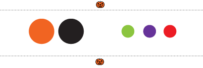
First, let’s slither down a narrow alleyway and examine some basic colours. Actually, there’s not much examining to do: I have only two words to offer you: orange and black. Of late, a miasma of other colours have come to stain the Hallowe’en palette: notably a slick of green (usually for slime), an excrescence of purple (for wizards, prostitutes and prose) and the stick and ick of red (for blood or fire, but keep red chained to Christmas, I say). Orange and black: together they are Hallowe’en and serve no other.
Next, a warning word about typefaces. For many, there is a temptation to drag out the wasted and catatonic display faces that lurk in the dankest corners of most operating systems. You know, those things that drip, claw, scratch and poke at our eyeballs. If you must. But may I offer a reminder that Hallowe’en is all about the very, very old, so consider please a Blackletter … or perhaps Garamond.
And now to the guts of the matter.
Before we venture too far, let’s exorcise some rotten, mouldering graphic debris. Pentagrams, out! Zombies and vampires, out (you heard me*)! Aliens, out! Dismembered bodies, out! Cute chubby cheeks, sexy goth babes, sparkles out, out, OUT! Let’s also extract wizards and all of “Middle Earth”—no elves, dwarves, orcs, balrogs or what-have-you(-lost-your-mind?). And while we’re digging around in the ooze of murky symbology, let’s bury the axes, knives, swords, truncheons, light sabres (especially light sabres!) and other instruments of torture, maiming and murder.
Now.
The lower icons of Hallowe’en design limp lamely onto the scene, useful only as slaves to a host of masters. Completely ineffectual on their own, these unpossessing symbols include scarecrows, haunted houses, eyeballs and other viscera, various birds (owls, vultures, ravens … ), brooms, the full moon, cobwebs and spiders (yes, I know). They work as set decorations, but don’t give them any speaking parts, for they are tongueless and mute.
Stumbling about backstage, are those which flesh out the overall scheme. Together, they coagulate into a lumpy, but discernible brew. Dismembered, they are:
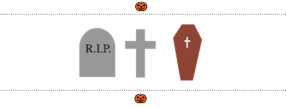
Tombstones & coffins, while somewhat lifeless, serve well as markers. It’s all about the dead walking the earth for a night, after all. But without help, they could stand for anything associated with death. Not very useful.
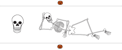
Skulls & skeletons
As an icon, I must decapitate the skull from the skeleton. The skeleton deserves its own props—although heavily shrouded in the Mexican Day of the Dead, and indentured into service for the medical cabal—there’s nothing quite like a jaunty skeleton to cheer you up. But the skull … well, bikers, boarders, rockers, pirates, dopers and thespians have all laid claim to the image of our bony cranium. And the skull has been such a philter to greasy teens, with its appeal to the perpetually immature, I can barely countenance it.
Bats
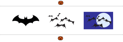
Perhaps because of their association with vampires,* bats remain one of the more potent Hallowe’en harbingers. Be careful though. A single bat with rounded wings conjurs Batman. The wings should be pointy, the bats should be black, they should flutter crazily in groups (‘cuz bats are completely bats!), and they benefit from a backdrop of the full moon.
*Which brings me to the case of zombies and vampires. Why have I banished them from this parade of the soulless? As the undead, surely they have a place in the barely beating heart of Hallowe’en’s luke-warm body? The thing is, they have been polluted, prostituted, warped and mutilated. Zombies and vampires have been so abused by movies and TV, so frequently made to walk among us, that they no longer hold any true iconic meaning for Hallowe’en. As if it were not bad enough to be nosferatu, headless, slaves to the night and robbed of their free will, they have also been castrated. If I were generous, I would allow them to lurk in the wings. If I were generous.
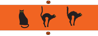
Cats
Black, naturally. But as with the bat, the cat must materialize in a familiar way. It must be thin, with back arched, tail raised and, preferably, fur raised as well. The cat can be either Guardant, or not but it should appear scared or spitting angry.

Ghosts
Very tricky business, here, as ghosts are hard to represent, and often haunt the unhallowed ground of B movies with the rest of the dismembered. Perversely, this is the one symbol that I prefer to see tamed: the sheet-ghost being the most powerful Hallowe’en-specific version. But note, not Casper. Beware the cosmetic nip and tuck of the ectoplasmic tissue: I find the phantom marshmallow mortifying.
While all of these serve well enough, all are manacled to a host of other meanings, and while apparent in context of the season, their Hallowe’en identity would be transient if manifested, say, in a field of springtime flowers—they would be mere spectres of their roles.
There are only two symbols which can faithfully hold the spell of Hallowe’en on their own, throughout the year.
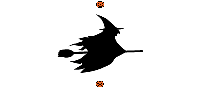
Witches
Witches, particularly when flying on brooms, simply reek of Hallowe’en. Typically with pointy hat, hooked nose and long, black robes, the witch is the Queen of Hallowe’en icons. She need not have much more detail than that, and in fact works better the less detail she has. A flying black witch left in a window and viewed in, say, July, is clearly a leftover morsel from Hallowe’en. Strangely (or perhaps not), this classic icon has been under-used for decades, but her potency is still very strong.
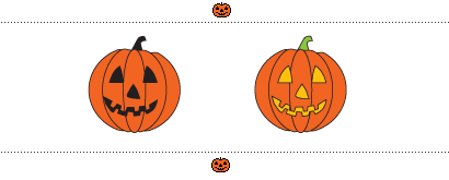
The Jack O’Lantern
Oh, pity the poor witch for she is Queen to a pumpkin. How could it be that so homely and homey a thing as an obese vegetable should stand as the singlemost identifiable icon of Hallowe’en? But such it is, the Jack O’Lantern serves no other earthly purpose than to signify Hallowe’en. If your time has been butchered, your budget slaughtered, and you can have one and only one icon to place in your window to say, “Yes, Hallowe’en is here,” the Jack O’Lantern is it. The Jack O’Lantern reminds us of our childhood, wielding knives and oversized spoons, it is bounty from the harvest, connected to the season, and not coincidentally, orange and black. Hollow-eyed, grinning and brainless, it stands for all of the undead, but shines its hopeful light for all that is living. It shines for our lost and frightened childish souls as we seek our way through the darkness, to find our way home.
And that is the essence of Hallowe’en: not so much to be frightened out of our wits; to revel in the gore of death; to roll in the funk of pre-packaged commercialism … nay, but to allow the dead to walk among us while we remain safe. While we celebrate the supernatural, we return ultimately to the natural: a pumpkin, a face, and a beacon of light.
Orange and black: together they are Hallowe’en and serve no other.
Except the Giants and Harley riders.
On Oct.31.2006 at 06:54 AM