Speak UpA Former Division of UnderConsideration
The Archives, August 2002 – April 2009
advertise @ underconsideration
---Click here for full archive list or browse below
  
High Priority Contest: The Winner

After somewhat thoughtful deliberation on a sunny Manhattan morning in a mid-town high-rise building (it being New York’s offices), a winner was unanimously declared for the High Priority contest by the five judges (them being Luke Hayman, Chris Dixon and John Sheppard of New York and us two). You may skip to the bottom of this entry and see the winner or you may read in calm order as the post builds up to the winner.

divider

The Process

Luke Hayman looking over the first round

Luke Hayman looking over the first round
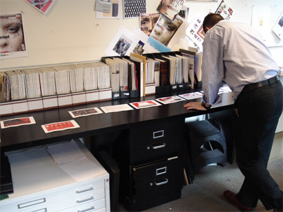
Luke Hayman looking over the entries during the first round

With nearly 200 entries and not a big enough table we went through the entries in bundles of twenty or so and simply made piles of “keep” and “don’t keep”. This was perhaps the most fun part as we combed through all the great entries. In this initial round we went by first impressions, if the entry displayed good execution plus interesting concepts it would get selected. Most of the entries not kept at this stage was because of lack of execution in typography, imagery and layout.

Entries that didn't make it through the first round
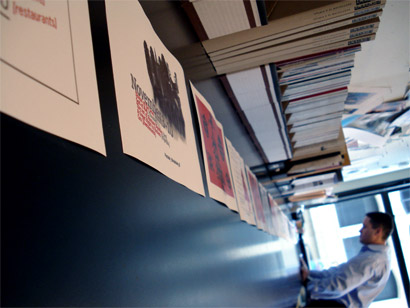
After an arduous first round, more than one hundred entries were cut

Entries still alive for the second round
All the entries that survived the first round

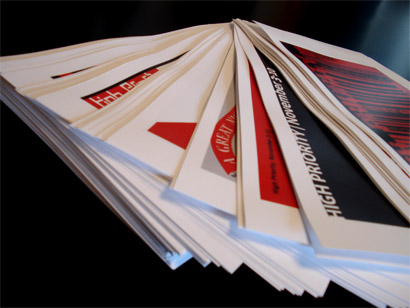
After the initial cut of close to 120 entries, we laid everything on the table to get a full sense of the breadth of entries and started to compare similar ideas against each other: Meat against meat; Christmas against Christmas; deli tickets against deli tickets; etc. We also started taking a closer and more scrutinous look at execution and concept, pulling out clichéd solutions, or ideas that were similar to previously published High Priorities… We were all looking for something with enough of an idea behind it and developed with cleverness, originality and typographic gusto. This second round brought out the litigious in all of us as we argued in favor or against any specific entry. Nonetheless, it was interesting to see that we were all on the same page (pun intended) of what we were looking for.

The top ten
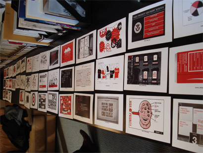
Top ten entries fighting hard in the third round

With ten entries left in the running, the New York team had some tough decisions as ultimately, the choice would reflect on the creative team and we are sure just like there is buyer’s remorse, there has to be judge’s remorse in wondering if the final choice is the right choice. The last ten entries showed a great range of ideas and possibilities and the ones we kept pointing to were linked by a sense of humor rendered with visual wit.

The top three
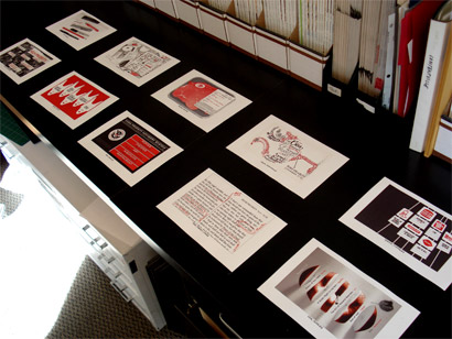
The top three entries, only one going home as the winner

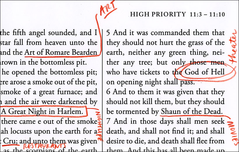
With the final three choices on the table, thoughts of printing all three spread throughout future issues proved to be too tempting but perhaps an easy solution. We had to choose one winner. We all gravitated to Abby Clawson Low’s entry because it was graphically interesting and the idea of highlighting the bible — passages 11:03 to 11:10 — was unexpected and well-received; the one thing we struggled with was the text, where at some points it flowed well and into the five choices and on others it didn’t. Monica Fraile’s entry was perfectly executed and delivered in an elegant, dead-pan way that captured the attention of all of us who have stood long lines fighting hungry New Yorkers for our turn at ordering that sky-high stacked pastrami sandwich; we wondered if deli tickets were a strong enough concept; finally, Spencer Fruhling’s entry had us all doing double-takes and snickering at the clever design/typographic jokes jacked up in those signs; the execution may not have been perfect but we all kept coming back to it for its concept of appropriation of junk food visuals in the name of culture. The choice was hard.

divider

The Winner

The Winner: Spencer Fruhling
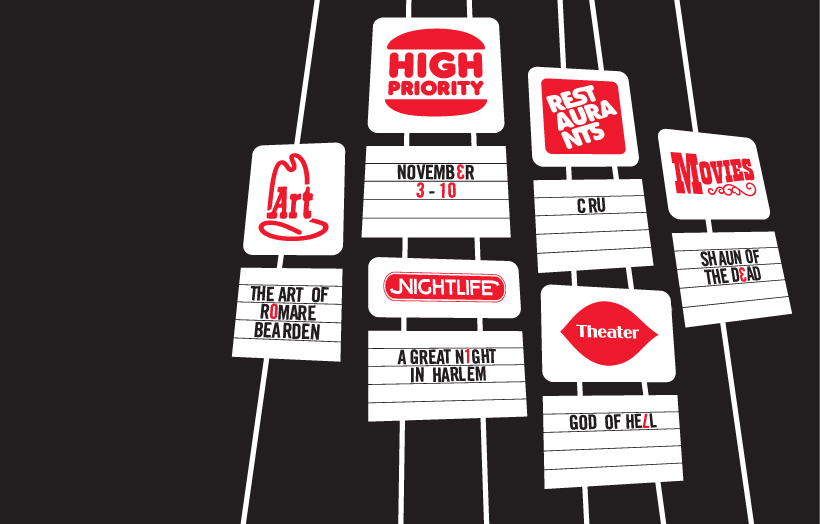
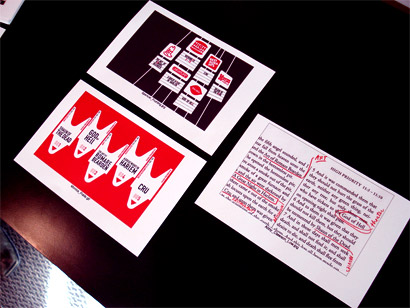
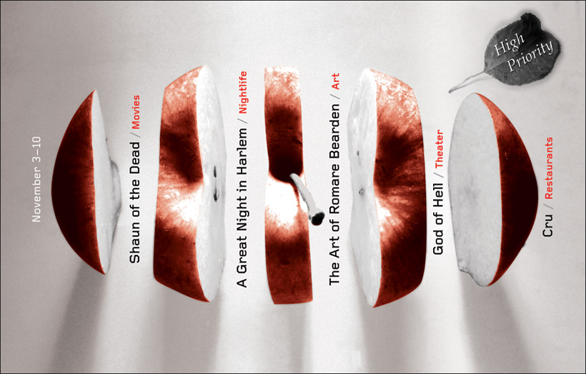
Winning entry by Spencer Fruhling of Richmond, British Columbia
[Click on image for larger view in pop-up window]

We extend our most cheerful congratulations to Spencer Fruhling, whose typographic mangling of Arby’s, Wendy’s, Dairy Queen, Burger King, Jack in the Box and Subway’s logos captivated us from the start. We all liked that it was funny for the general population but it packed an extra laugh for designers who know how hard it is to manipulate existing logos into new things. Well done Mr. Fruhling.

divider

The Runners-up

Runner-up: Abby Clawson Low   Runner-up: Monica Fraile
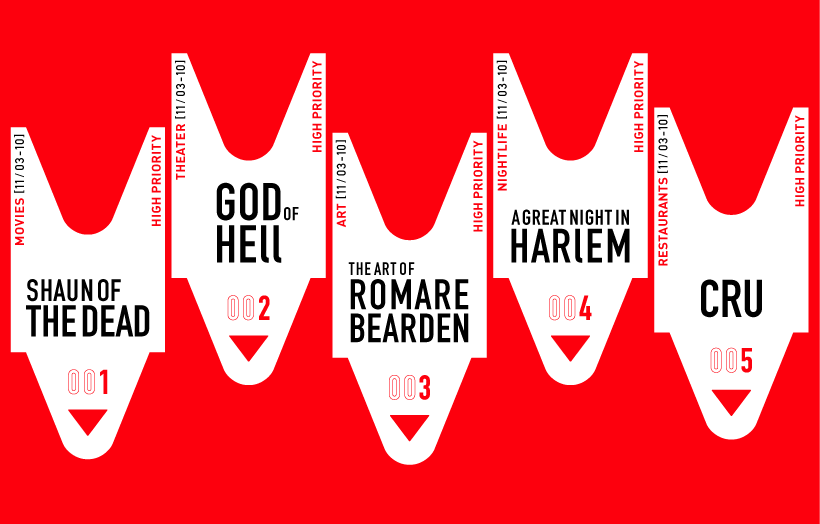
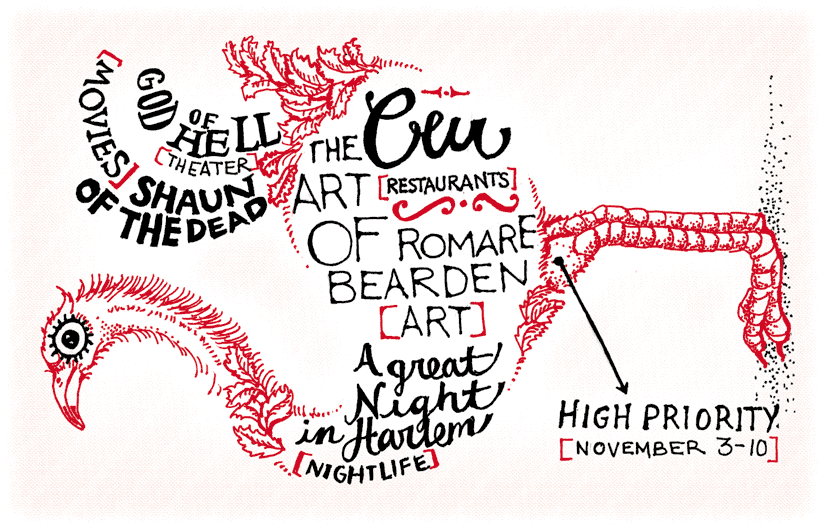
In close running were, from left to right, Abby Clawson Low of New York, NY; and Monica Fraile of Paris, France
[Click on images for larger view in pop-up window]

Abby and Monica’s entries were tough to turn down, but we were all definitely impressed.

divider

The Honorable Mentions

Honorable Mention: Max Kaplun   Honorable Mention: Valerie Desrochers   Honorable Mention: Chris Ritchie
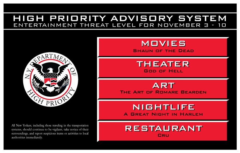
Highly enjoyed were, from left to right, Max Kaplun of New York, NY; Valerie Desrochers of Montreal, Quebec; and Chris Ritchie of Brooklyn, NY
[Click on images for larger view in pop-up window]

And, last but not least, we wanted to highlight three other entries that stood strong throughout the competition and gave the winner a run for its money.

divider

Thank You

A warm, big, juicy thank you to all those that participated. Your contributions exceeded our expectations and we couldn’t have asked for a better response. (Heated debate about contests and spec included!). And we were specially thrilled to see numerous entries from outside of New York City, making the gallery of entries enjoyably diverse and distinct.

Maintained through our ADV @ UnderConsideration Program
ENTRY DETAILS
ARCHIVE ID 2841 FILED UNDER Speak Up Announcements
PUBLISHED ON Dec.04.2006 BY Bryony & Armin
WITH COMMENTS
Comments
Jeff Gill’s comment is:

Congratulations, Spencer, two time Speak Up contest winner! Well done. (Now I really wish I had entered.)

On Dec.04.2006 at 02:03 PM
Spencer Fruhling’s comment is:

Thank you! It's a Christmas miracle!

I really can't believe it. There were so many that stood out, I thought mine would be overlooked.

I'm honored, and now I expect to hear some criticism.

On Dec.04.2006 at 02:15 PM
pnk’s comment is:

You better believe you'll hear criticism, Spencer. Your "piece" was utter... nah, just kidding.

Nice work, ya big show off. Congratulations!

On Dec.04.2006 at 02:22 PM
kaitlin foos’s comment is:

Thanks for the fun opportunity. Will there be more contests such as this? I enjoyed taking a little break and doing something for "fun". Congrats Spencer!

On Dec.04.2006 at 03:45 PM
yi’s comment is:

Nicely done. Your piece was clean, very well composed, open to interpretation and conceptually stimulating. I also took a glance at your portfolio and I was very inspired. And this is coming from an emotionless manic depressant. Thank you and congratulations.

On Dec.04.2006 at 03:53 PM
Keith McCord’s comment is:

Spencer for Mr. SpeakUp!!!
...and now our fabulous consolation prizes, a free copy of New York Magazine's December double issue!(?)
just a thought...

On Dec.04.2006 at 03:57 PM
Stephen Mcnally’s comment is:

I had selected the 2 runners up in my top 2, leaning toward the Abbey's marked-up text for sheer simplicity.

On reflection mine was dung – portraying Manhattan as 5 slabs of hanging beef probably didn't endear me to the judges too much :)

Great fun none the less.

And well done Spencer - hats off boy!

S

On Dec.04.2006 at 04:05 PM
Bradley’s comment is:

Really impressive piece of work, Spencer--totally unexpected. I love it! I'd have a hard time choosing between the three, I think I leaned towards the Biblical one at first, but I was also quite a fan of the homeland security spoof. Great thinking and superlative execution here. Bravo!

On Dec.04.2006 at 04:38 PM
pesky illustrator’s comment is:

VERY COOL, SPENCER!

On Dec.04.2006 at 05:28 PM
Leo’s comment is:

Congratulations Spencer! Well deserved.

Go Canada! :)

On Dec.04.2006 at 06:42 PM
Ricardo Cordoba’s comment is:

Congratulations to Spencer, the runner-ups and the honorable mentions! And thanks to Speak Up and New York magazine for giving us this chance to flex our design muscles and have some fun.

On Dec.04.2006 at 08:44 PM
Rick Slusher’s comment is:

This was great fun! Thanks Speak Up! Congratulations, Spencer!

On Dec.04.2006 at 11:53 PM
Unnikrishna Menon Damodaran’s comment is:

Congratulations to Spencer!

Thanks to SpeakUp for this great opportunity.

On Dec.05.2006 at 01:06 AM
Nick Fruhling’s comment is:

Spence, if you're going to properly represent your country, then you should be honoured.

With that said, it was a pleasure to lose to you once again. Say hi to Conan, Regis and the Statue of Liberty for me.

On Dec.05.2006 at 02:44 AM
DesignMaven’s comment is:

Congratulations Spencer:

Whether you know it or not.

Unlike many of the other entries, yours was endearing.

Identities get them everytime.
You injected Brevity, Wit and Humor in your Design. Something we don't see much of today from the current crop of Practitioners. Wit and Humor in Design was very prevalent in the 60s and 70s.

Layout Design 101.

1. You Developed your Focal Points which were the Logo Spoofs.

2. You Successfully Created Asymmetrical Space.

3. Perfect Contrast of Design Elements.

4. Thorough understanding of background and foreground
juxtaposition.

5. You created a Triangular Shape within your Design to carry the eye to Focal Points.

6. You used white space successfully to rest the eye and break up space.

This Triangular Shape is seen in the most successful Paintings, Illustrations, and Design.

Most important, you had a Genuine Idea that Successfully Executed and implemented the Principles and Elements of Design. Which are line, shape, value texture, color.

Balance, Proportion, Rythm, Harmony, Repetition,
Dominance, Economy of space to provide Unity.

Job Well Done!!!

DM

On Dec.05.2006 at 04:58 AM
Ravenone’s comment is:

Congrats to the winners, and everyone who participated. :)
Nice work; lots of creativity.
The High Priority Advisory System (Honorable Mention) reminds image me of my senior art show's original postcard (Level Orange) from '04- they could've been twins seperated at birth.
The bird is death by cute.

On Dec.05.2006 at 03:07 PM
KevinHopp’s comment is:

Congrats Spencer, from a distance it's nice and simple, almost reminded me of a 70s wallpaper. It's very clear what's going on - big bold headers, familiar type treatment.

I kinda have to disagree with Design Maven - I'm not sure the other entries were fundamentally poor.

I also recall Armin made a big fuss during the ny tree poster exhibit about original ideas, repurposing old ideas, relying on past directions, etc. Well after viewing Spencer's site I see kitchy cultural icons have been used as design gimmicks before. So I disagree with Design Maven that this is a "genuine idea."

I'm not really sure I agree with a lot of the judges on this one either. The judges said they pulled out cliched solutions. Besides Desrochers, these ideas are clichés and are mainly borrowed interest.

We may have to agree to disagree but the Threat Level piece, a totally sophomoric cliché to me. The apple being sliced in Photoshop - cliché - Do people really refer to NYC as the big apple anymore anyways?

The bible piece is super flat. I also think adlibs in any form are trite in the creative industry. Plus the copy is just working. It's not great, it's not horrible, it's just working.

I like the tickets even though there is plenty of borrowed interest. But the idea of tickets - being out, waiting in line, etc it seems like the strongest concept using a not-so clichéd motif. The shapes are not completely recognizeable, and they dance across the page in an organized and conservative manner. It's classic.

Where as the winning piece reminds me so much of stock illustration, or an ode to House Industries. Furthermore, the skateboard and college industry has been bastardizing logos FOR YEARS. Not a genuine idea, however a comfortable, very familiar, cutesy weekly itinerary - congrats.

On Dec.07.2006 at 11:02 PM
Valérie Desrochers’s comment is:

Congratulations, Spencer

It was great to see all different entries! Second of all, thanks to everyone for their good comments about my work I really appreciate it. It's always a good opportunity to have a second opinion from people worldwide about what you're doing!!
Merry Christmas to all!

On Dec.08.2006 at 09:24 AM
Keith McCord’s comment is:

The shapes are not completely recognizeable...

You've obviously never had to wait in line for deli meat...

On Dec.08.2006 at 09:53 AM
KevinHopp’s comment is:

Well you should know Keith, we're such good buddies!

If you think the shape of a pull ticket (which are not proprietary to delis, ex: government buidlings) is ubiquitous and oridinary, then I suggest you stop sprinklin' the cid on your corn flakes. I happen to believe that if you were to line up the shapes of a phone, a carrot, a car and a deli ticket, the deli ticket would lose accorddingly.

If you argue differently, then fine, maybe you hang out with people who eat meat 3 times a day and you grew up going to the deli for moms, I obviously don't know anything about you and still don't understand how your point is relative to my thread anyways.

On Dec.08.2006 at 03:39 PM
Jeremy Mickel’s comment is:

I just saw this week's New York magazine, and there's a High Priority by Kit Hinrichs.

Wasn't the winning design supposed to be out this week?

On Dec.13.2006 at 11:14 PM
keith’s comment is:

Dec. 18th double edition

On Dec.14.2006 at 12:26 AM