Speak UpA Former Division of UnderConsideration
The Archives, August 2002 – April 2009
advertise @ underconsideration
---Click here for full archive list or browse below
  
Dark and Fleshy: The Color of Top Grossing Movies

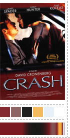
At some point last year I subscribed to e-mail updates from Box Office Mojo, thinking that weekly box office results was information I should be regularly privy too. Needless to say, I was bored after the first few weeks. On one occasion, though, the e-mail had a link for a list of the top grossing NC-17-rated movies of all time. Now this was fun information. Showgirls was at the top of the list — a movie so ridiculed as to become a punch line but not awful enough where people wouldn’t mind sitting through it to see “Jessie Spano”, all grown up, do the naughty hoppitty poppitty. Despite its cinematic shortcomings, Showgirls has its place in movie history and its (somewhat) iconic image, that served as theatrical poster and now DVD cover, of Miss Berkley’s long leg, mid section and cleavage set dead center against a black background is both unmistakable and irresistible. With this image in mind, I went down the list, and saw that Crash (the really shocking Crash, not the fan favorite, Oscar winning Crash) also made the list. A movie sporting a gripping image itself, with James Spader copping a feel on Holly Hunter inside a red car — the most prude part of the film, as it turns out. At the time, I started to think that NC-17 movies perhaps shared a common visual string in their marketing materials — dark and provocative — to make up in buzz for the large amount of people that could not see these movies. And, then, I forgot about it. Until last week. I went through the full list again and pulled up the respective posters to see if my lukewarm theory had any heat. It didn’t. But on further clicking I found something a little more interesting. And subtle.

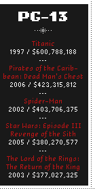
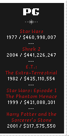
Back then I hadn’t realized that right next to the NC-17 top grossing movies were the same lists according to the rest of the MPAA ratings. I started with R and pulled up the top five movies’ posters. Less provocative but very dark. I moved on to PG-13’s five. Not provocative at all but dark nonetheless. PG’s five? Much friendlier but, yes, dark. It wasn’t until I got to the five Gs that I started seeing some bright colors in the movie posters. Now, I love black backgrounds more than anything else in the design business, and yet I was still very surprised to acknowledge how dark theatrical posters are and that, specifically, in this context, the top 25 grossing movies of all time across all ages didn’t run a very wide gamut. Only at the tot level did color start to play a real role. And while the psychological and emotional explanations of what colors mean are too varied to take any which one as authoritative, it is nonetheless telling that black is the color of choice in movie posters. Chalk it up to contrast if you want, but also don’t forget how many of our clients are afraid of using black, as they usually deem it scary, gloomy, heavy or depressing — and people that wear black are either mourning or designers caught in a time warp of the 1980s. Of course, a movie’s theatrical poster is only a very small part of the larger marketing and hype machine that turns movies into spectacular blockbusters, but as part of a whole, they are fairly representative of the “image” of any given movie. So, as an exercise in color trends, and to see if any significant pattern emerged, I decided to break down the colors of 25 posters — the top 5 of each MPAA category.

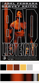
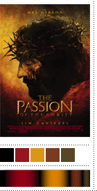
I looked for the final theatrical posters — as opposed to teaser or character-specific posters — which most fully represented what people saw on the streets or in movie theaters. Once lined up, I went over them one by one selecting a) the overall or background color, b) one or two of the most visible colors, and c) one or two accent colors. Ignoring any minimum-impact colors along the way. After picking out the colors, I arranged them, via gradients, on a horizontal bar, using the background color as the base and then eyeballing the “amount” of the rest of the colors to create an approximation of the colors you would see if you squinted at the poster or if you had really blurry vision. Clearly, this exercise is beheld to my own interpretation of color, based on the web images I found, the calibration of my screen (and yours) and my assumption on which colors are the most significant. But I like to think I have a pretty good eye for color, so for the sake of this exercise, you can trust me. And, yes, this took a long time. One disclosure I should provide, which should be apparent when you see the NC-17 list, is that I “disqualified” three foreign films, two by Almodovar (a color fiend!). My reasoning was that American films are marketed a certain way and movie posters follow unspoken rules that make every poster look similar to the next. Almodovar’s ¡Àtame! poster looks more like a small theater production poster than a real blockbuster. Hence, their disappearance from this exercise. What follows is the color breakdowns of 25 posters of the top grossing — actual, non-adjusted dollars, according to Box Office Mojo — movies of all time.

NC-17-Rated Top Grossing MoviesShowgirlsHenry & June
The Cook, The Thief, His Wife and Her LoverCrashBad Lieutenant
---
R-Rated Top Grossing MoviesPassion of the ChristMatrix Reloaded
Beverly Hills CopTh ExorcistSaving Private Ryan
---
PG-13-Rated Top Grossing MoviesTitanicPirates of the Caribbean: Dead Man’s Chest
Spider-manStar Wars: Episode III Revenge of the SithThe Lord of the Rings: The Return of the King
---
PG-Rated Top Grossing MoviesStar WarsShrek 2
E.T.: The ExtraterrestrialStar Wars: Episode I The Phantom MenaceHarry Potter and the Sorcerer’s Stone
---
G-Rated Top Grossing MoviesFinding NemoThe Lion King
Monsters, Inc.Toy Story 2Cars

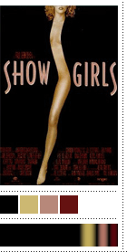
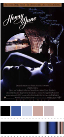
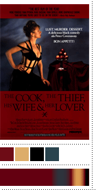
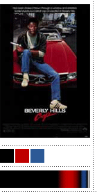
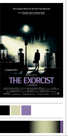
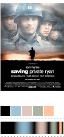
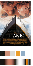
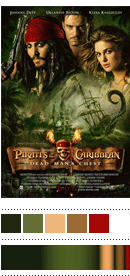
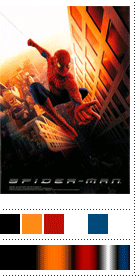
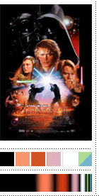
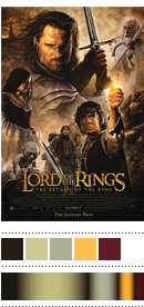
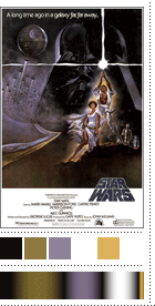
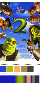
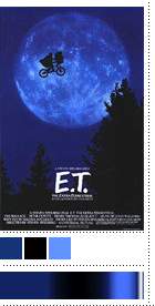
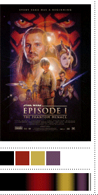
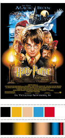
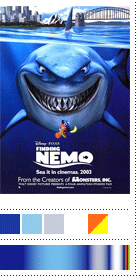
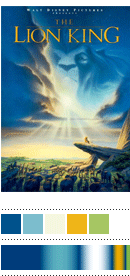
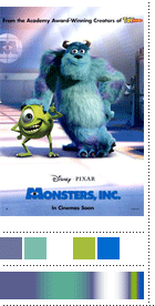
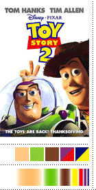
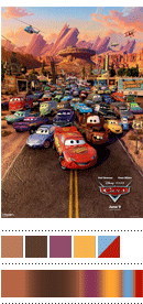
After all, it’s only 11 posters where black is the predominant color and another 7 where it’s a dark-hued background that dominates. Leaving 7 posters with a brighter background, with 5 of those being blue. Only one of these posters, Toy Story 2, uses white as the background. Flesh tones, appearing in all the pretty actors, was another recurring range of colors, but only 13 of the posters had them. As an accent color, white can’t be beat, showing up in 10 of the posters, with red clocking in closely with 8 appearances. There isn’t a hard lesson to be learned from this, or a groundbreaking discovery to brag about, but as an observation on the recurring color choices of a medium we are exposed to every single day I found this exercise oddly fulfilling. And it goes without question that this is anything but a definitive assessment, as these are only a minute percentage of movie posters out there — and that there is always the exception to the rule. Yet I’m still somewhat captivated by the color distribution in movie posters across the different ratings, more so after I put together this chart… But then again, like a kid in a candy store, I’m a sucker for pretty colors.

Top Grossing Movies Color Spectrum

Maintained through our ADV @ UnderConsideration Program
ENTRY DETAILS
ARCHIVE ID 3641 FILED UNDER Discussion
PUBLISHED ON Jul.17.2007 BY Armin
WITH COMMENTS
Comments
Ari Moore’s comment is:

Hotness. It would be interesting to pit American posters against Spanish, Mexican, Japanese, Indian, French ones, see the differences. I don't think that Almodovar is that unusual outside the US, where movie posters suck a lot less. Cool chart!

On Jul.17.2007 at 09:08 AM
katherine’s comment is:

Not to mention going back through each era of poster design or cross referencing it with theater posters.

On Jul.17.2007 at 11:02 AM
Jon Dascola’s comment is:

Awesome comparison Armin. I wonder how much of the ideas behind the posters and the studios are "if its not broke, dont fix it." I think the photoshop montage of all the characters and the cheesy typography needs to go. It doesnt seem like movie posters have changed too much in the past 15 years.

It would be interesting to have some of the best designers out there have their creative freedom with the posters and see what new places they could take them. Maybe to a galaxy far, far away.

On Jul.17.2007 at 12:39 PM
Mike K’s comment is:

Awesome analysis, Armin. I really love how you juxtapose artistic interpretation with cold hard facts. Well, if you consider "eyeballing" as a basis for statistic. Works for me.

On Jul.17.2007 at 03:20 PM
J. Puckett’s comment is:

Very intriguing indeed. Next, you should make a comparison between the logotypes used for each of the top 25 and see how serifs fair against sans for box office clout. Great color analysis chart!

On Jul.17.2007 at 04:55 PM
Bogdan’s comment is:

Well, it would make more sense to look at predominant colors from the movie itself, not the poster. Still, a neat idea.

On Jul.17.2007 at 06:01 PM
Rob Ray’s comment is:

I wonder if you've seen Jason Salavon's work, The top 25 Grossing Movies of All Time? If, not you should. Seems like you'd love it.

On Jul.17.2007 at 11:13 PM
Andre K’s comment is:

Wow. What a colossal waste of time. Just further confirmation that the cinematic promotional design is largely unimaginative and derivative in the extreme; much like many of the films these posters promote.

On Jul.18.2007 at 12:18 AM
Alex Charchar’s comment is:

Whenever the wife and I rent a movie, I tend to spend more time looking at the covers than I do deciding on what we'll get.. one thing thats caught my eye is the really-super-duper shattered glass concept thats being used at the moment.
three movies with essentialy the same DVD cover broken-glass concept, all new releases.

Interestingly though, as I was looking for these examples, it became apparent that for two of them, the design might only be for the Australian DVD release. It wouldn't seem like THAT big a deal if there was some time between movies being released, but these are almost all side by side.

On Jul.18.2007 at 04:10 AM
Isabel’s comment is:

An interesting exercise (which I'd do, except I'm having trouble tracking down the posters) would be to find the posters of the five Harry Potter movies so far and see how they've gotten "darker" in color as the movies have gotten "darker" in content.

There seems to be a clear darkening in the covers of the U.S. editions of the books from the first to the sixth; but the cover of the seventh book doesn't fit that trend.

I wonder if in general something similar to the original post is true for books.

On Jul.18.2007 at 10:53 AM
Alexis’s comment is:

Interesting. I wonder how the location of movie posters might affect their design choices. Namely, I'm thinking that movie posters are often hung in light boxes and are backlit, and they are also generally hung in a line next to other movie posters. To what extent might those things dictate the conformity?

On Jul.18.2007 at 02:00 PM
SuziQ’s comment is:

Very interesting comparison!
Is it possible that the use of black and the other dark colors is meant to simulate being in the theater where it is really dark? Just a thought.

On Jul.18.2007 at 03:13 PM
ed mckim’s comment is:

Just further confirmation that the cinematic promotional design is largely unimaginative and derivative in the extreme; much like many of the films these posters promote.

I think this represents the things American cinema-goers tastes more than the success of the design of the posters... the poster usually doesn't make the movie, though sometimes it has more quality than the movie.

As this is all the top-grossing movies, and not, say by genre or by time created (or even best poster), I think it's not a reflection of poster design, so much as the tastes in movies of Americans and how monotone and derivative the tastes are.

I wonder what the color scheme of my personal favorite movies is, and how that stacks up in this hierarchy.

Armin, does this reflect your personal tastes in movies? What is your color scheme?

On Jul.18.2007 at 04:49 PM
David E.’s comment is:

the naughty hoppitty poppitty

That's the best euphamism for sex I've ever heard.

On Jul.18.2007 at 06:29 PM
Madison Guy’s comment is:

Nice work. And damned if it isn't pretty much the same color palette as the Condos after Dark series.

On Jul.19.2007 at 02:06 PM
Tiryad’s comment is:

I never thought of movie posters as something to be interesting. Your wild imagination and your creative talent showed on this documentation.

On Jul.20.2007 at 03:54 AM
Andy Malhan’s comment is:

Armin, this type of article is exactly why I enjoy Speak Up so much. It is this type of insight and food for thought that keeps me coming back. Thank you.

On Jul.20.2007 at 10:29 PM
Fubiz’s comment is:

Amazing work !

On Jul.24.2007 at 01:14 PM
Darius A Monsef IV’s comment is:

Totally awesome work Armin! I can't imagine how much time it took to create this... I'm sure it was a true labor of COLOURlove ;)

P.S. We're sharing your love on the Color + Design Blog

On Jul.25.2007 at 04:11 PM
Derekh’s comment is:

Not surprising.

Dark colors convey dark themes. Bright colors convey light themes.

Movies made for adults feature adults in the posters, so you have the flesh tones.

Movies made for kids feature talking animals and cartoons, both of which are usually brightly colored.

On Jul.25.2007 at 05:19 PM
Randy J. Hunt’s comment is:

This diverges from color-centricity, but what struck me right away with these was how much a few of the posters stood out because of their itty-bitty focal points: The Lion King's elevated Simba, a flying E.T., and the poised silhouette on Saving Private Ryan.

They have pin-point focus compared to most of the other posters which try to show you every character in the film or simply overwhelm my eyes. I can imagine wanting to approach these posters to see the small detail from a closer vantage point. I've always felt that a poster should work--that is, be interesting to look at--at 3 different levels: about 50ft as an optical/visual object, about 10ft with narrative/symbolism/meaning discernible, and right in front of you with detail and nuance.

Perhaps this is just in the context of extremes, where the tiny image inside these tiny thumbnails is somehow emphasized, but regardless, I like it.

On Jul.25.2007 at 10:56 PM
Delores’s comment is:

You got mentioned at another deisgn site. The poster seems to imply that you copied this idea. Maybe you should SPEAK UP. Great work as always.

www.yayhooray.com/thread/122345/The-Color-of-Movie-Posters

On Jul.30.2007 at 04:30 AM
M.McVey’s comment is:

This theory helps explain why the posters for Knocked Up and The 40-Year-Old Virgin so refreshing! 2 R-rated hits using vibrant color, compared to the studio mean of dominant darks. It's a crowded market out there, and sleeper hits like the R-rated Little Miss Sunshine are visible partly because their going against these trends. Good stuff Armin!

On Aug.01.2007 at 10:36 AM
Chris W.’s comment is:

It's the circa-1965 school of subliminal visual advertising that brings us the "box of Tide" theory: Black, red and yellow (and sometimes white) are the color combinations humans will gravitate toward everytime. Of course, it helps if the movie is half-way decent.

On Aug.01.2007 at 04:57 PM
C’s comment is:

Very interesting article. What would happen, though, if one looked at the top grossing movies of all time with regards to adjusted inflation. Perhaps we'd see whether this trend holds true throughout the history of American cinema by including films like Gone With the Wind and others that in adjusted dollars have grossed more than the ones mentioned. Maybe a companion article to supplement this one plus one comparing the posters of cinematic failures and how the colors in those compare to the successes.

On Aug.01.2007 at 08:38 PM
Armin’s comment is:

I love all these possibilities for spin-off posts… But this one took enough time that I can confidently say that ya'll will just have to imagine them. I had originally planned to spend a couple of hours on this. It was around 8 or 10 in the end.

> The poster seems to imply that you copied this idea. Maybe you should SPEAK UP. Great work as always.

Delores, thanks for the heads-up. If someone can't tell the difference between analyzing the colors in posters and the colors in the actual frames of the movie, there is not much I can do at this point. If there is anything interesting from that observation is that the colors in my Titanic assesment are somewhat close to the colors in the movie, per Savalon's work.

Thanks to everyone that has enjoyed this color obsesiveness and have, perhaps, even linked here. Did anyone else know that imdb.com has "cool links" at the bottom of their page? I had never scrolled past the fold, I think. 6,000 hits later, I now know : )

On Aug.01.2007 at 10:32 PM
Bryan Tupper’s comment is:

I'd like to say, this is one of the most intersting analysis' of the movie industry. I've certainly learned a lot from the information provided. Thank you for also providing pictures and images as to correlate your findings so we could see what you're talking about. I will say that now I will view movie posters differently from possible oscar-worthy movies and possible blockbusters. Thank you for opening my mind up.

On Aug.02.2007 at 02:36 AM
Yolanda Anne Brown’s comment is:

Wow! You REALLY broke it down! And even though I am an Almodovar fan, I had to agree with you on the poster structure (And I am a HUGE fan of Atame! or Tie Me Up! Tie Me Down! here in the states).

On Aug.02.2007 at 02:40 AM
Jakob Montrasio’s comment is:

Wow, that must be one of the most creative analysises I have ever seen! Interesting how it goes from blue for children to red, the color of love and pain, for adults...
Great job, will check this site more often now...

On Aug.03.2007 at 04:44 AM
some guy’s comment is:

it's interesting, but it's obvious that you cherry-picked your data (i.e. the films) for the purpose of creating a graph that reinforced your hunch. this is not science, and as information design, it's misleading at best. try again with a larger data set, and if your hypothesis is reinforced, well, that would be impressive.

On Aug.04.2007 at 10:30 PM
ed mckim’s comment is:

it was the top-grossing films of all time...

how is that cherry-picking?

On Aug.05.2007 at 10:07 AM
Groovymarlin’s comment is:

Awesome analysis! I really enjoyed it.

I don't see how it can be called "cherry-picking." Armin didn't make up the list of top-grossing movies, the list is based on statistics. Certainly he made a judgment call on the prevalence of colors, but I think this is backed up pretty well by showing us not only his graphs, but the posters themselves.

Overall quite interesting. Thank you.

On Sep.12.2007 at 02:32 PM
S. M. ’s comment is:

Nice study! I does sort of make sense in many of the cases shown to use these colors: you have a sweeping epic or drama or thriller to market, and you want to convey the film tone to the customer when advertising. Psychologically, the color combo dark +reds/blues/violets = deep drama and emotion. So maybe that's part of the poster sameness. Plus maybe they err on the side of more contrast for grabbing attention on the street. But to see yet another rusty broken text title for a suspense flick... I think I saw the same "typewriter" broken or faded text a dozen times one year.

On Sep.12.2007 at 02:40 PM
Squeedle’s comment is:

To really refine this line of thought, find out whether movie posters are predominantly dark anyway by percentage. Then take a larger sampling of top grossing movies (adjusted for inflation and population growth, of course), then compare whether there is a difference in general darkness between posters of, say, the bottom 100 and the top 100 grossing films in each category.

On Sep.12.2007 at 08:20 PM
Squeedle’s comment is:

To really refine this line of thought, find out whether movie posters are predominantly dark anyway by percentage. Then take a larger sampling of top grossing movies (adjusted for inflation and population growth, of course), then compare whether there is a difference in general darkness between posters of, say, the bottom 100 and the top 100 grossing films in each category.

If you really want to get crazy, repeat the test for each decade since the 40s, then see if there are any studies (or perform one) where you show people posters for a variety of fictional films with both dark and light backgrounds and ask them which ones they think they would see in the theaters.

On Sep.12.2007 at 08:22 PM
Marlene’s comment is:

“the first color is white; the second is black; the third is red: the three together are the best”


-Roger Black

On Sep.12.2007 at 08:42 PM
Nick045’s comment is:

I think that you're on to something. Do you think that it is a possibility that black is cleaner? Do you think darker colors creates more mystery. Maybe white and light colors are more psychologically revealing. So it seems like the movie will be very predictable. Maybe light is just not tight, like darker colors sort of complete the picture while lighter colors leave everything kind of spread out. What do you think?

On Sep.13.2007 at 12:27 AM
evst’s comment is:

WOW. Muriel would have loved this. Someone start thinking up an algorithm to automate the color selection instead of hand-picking; should be pretty easy.

On Sep.13.2007 at 01:15 AM
gauhglina’s comment is:

hi, i sure it
helpful information cake recipes

On Dec.21.2007 at 04:01 AM
gauhglina’s comment is:

hi, i sure it
helpful information cake recipes

On Dec.21.2007 at 04:02 AM
Reinobox’s comment is:

Fantastic idea for analysis!

I enjoyed your speculations and the logic behind making them.
What is the last project you have worked on?

-Reinobox

On Mar.06.2008 at 06:30 PM
balabo1_ad’s comment is:


[@map/map_4g5_mordy.txt||5||p-1||1|| @]

On Aug.02.2008 at 02:06 AM
Albeta’s comment is:

That is so new for us! Thanx!!

On Feb.10.2009 at 06:14 AM