Speak UpA Former Division of UnderConsideration
The Archives, August 2002 – April 2009
advertise @ underconsideration
---Click here for full archive list or browse below
  
The New(er) Typography: Counterless, Bold and mostly Geometric

During 2007 the feed subscriptions in my trusty RSS reader grew from a modest dozen to six or seven dozen, allowing me to keep tabs on an increasingly addictive number of blogs throughout the world: Design You Trust™ in Russia, NiceFuckingGraphics in Mexico, Etienne Mineur archives in France, the borderless ffffound, and a large constituency of U.S.-based blogs as well. Together, these web sites paint a clearer and more current picture of the state of graphic design around the world than any magazine or single web site would ever hope. They are also highly reflective and representative of whatever trend may be sweeping the world, as it’s common to see the same project linked again and again in a variety of languages — a great .jpg or .gif knows no boundaries. As my feed count increased it became increasingly clear that this year’s trend was a new typography: Devoid of counters, generous in girth, and joyous in application. As 2007 comes to a close, here is a partial, yet global, celebration of The New(er) Typography — plenty remains out there and unnoticed here, but you’ve probably seen it on your own.

---

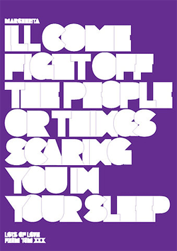
Look Ma, no Counters!

This is perhaps the easiest way to achieve this look: Remove the counters, preferably in extra bold weights.

Cover for Logo by Michael Evamy, designed by Spin / United Kingdom

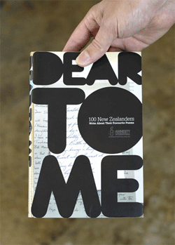
Cover for Dear to Me, designed by Inhouse / New Zealand

Cover for Look at This: Contemporary Brochures, Catalogues & Documents by Adrian Shaughnessy, designed by Non-Format / United Kingdom

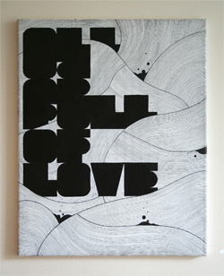
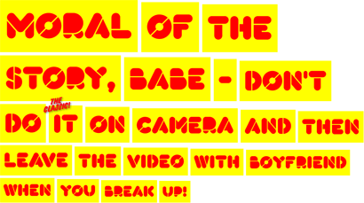
All is Full of Love by Art is Calling me / United Kingdom
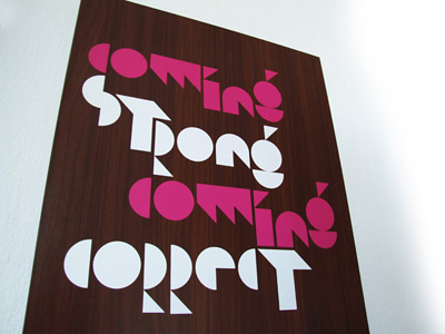
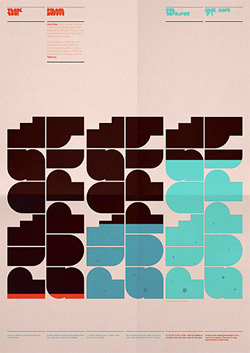
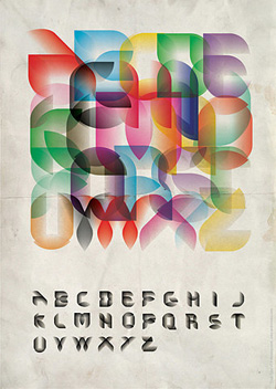
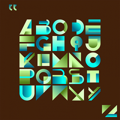
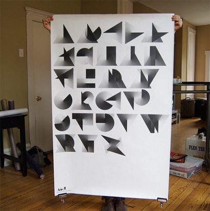
---

Geometrypography

The most pervasive manifestation of The New(er) Typography has been in the form of strictly geometric applications, forcing the alphabet into its most simple forms. Perhaps we owe it all to Milton Glaser’s Baby Teeth and, you know, that landmark poster of his.

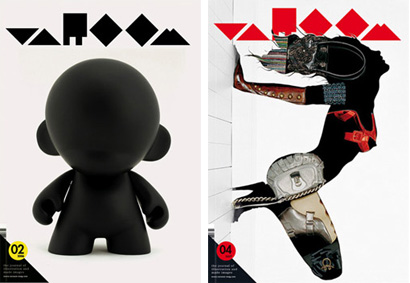
Logo (and covers) for Adrian Shaughnessy’s Varoom magazine, designed by Non-Format / United Kingdom

Packaging for Hanne Hukkelberg’s latest release, Rykestrasse 68, designed by Non-Format / United Kingdom

Image for Self-Service magazine, Work in Progress / France

Personal print, designed by Karoly Kiralyfalvi / Hungary

One of a series of posters for a design school’s canteen, designed by MejDej / Denmark

Poster (maybe), designed by tomlobo / United Kingdom

Poster about saving water (maybe), designed by Distrikt55/ United Kingdom

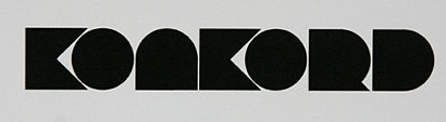
Identity for music label Konkord Agency, designed by Griskevicius Jurgis / Lithuania

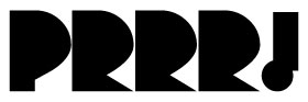
Identity for PRRR TV / Uruguay

Mono typeface, designed by Hula + Hula / Mexico
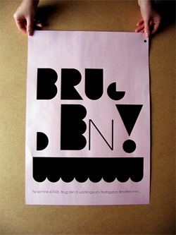
---

Plump and Juicy

As some may know, I’m a big fan of bold letters, and bold anything, so a full circle standing in for an “O” brightens my day like few things. The cover of Logo shown above would also fall nicely in this category.


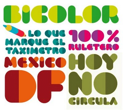
Bicolor typeface, designed by Hula + Hula / Mexico

Corpulent typeface, designed by Suitcase Type Foundry / Czech Republic

---

Stencilization

When you have that much matter to work with, nothing adds a touch of fragility like a stencil treatment and the introduction of Pylons — you know what a Pylon is, right?

Kada typeface, designed by RBG6 / Stockholm

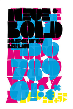
Neue Bold* typeface (or poster? or neither?), designed by mrio / Germany

Welcome graphic at Julien Vallée’s web site / Québec

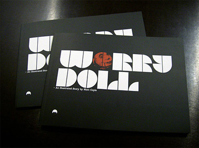
Cover for Matt Coyle’s graphic novel Worry Doll, designed by Designed by Muller [sic] / United Kingdom

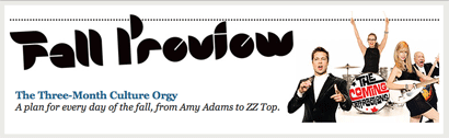
Lettering for New York magazine’s 2007 Fall Preview, designed by Omnivore / USA

---

Just Plain Weird

And, finally, there has also been a preponderance of highly illustrative and rigidly geometric letterforms that challenge counters and readability. Perhaps this will be The New(estest) Typography come 2008.

Trick typeface, designed by Andrei Robu / Romania

GBG typeface, designed by bns or pommade or something / Not Sure

Meaning is Made typeface, designed by Widmest / USA

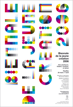
Poster for Biennale de la Jeune Creation 2006, designed by Fanette Mellier / France

Maintained through our ADV @ UnderConsideration Program
ENTRY DETAILS
ARCHIVE ID 4151 FILED UNDER Typography
PUBLISHED ON Nov.28.2007 BY Armin
WITH COMMENTS
Comments
JonSel’s comment is:

That type and poster by Andrei Robu is freakin' hot.

I do always wonder about typefaces like this, though, especially when they aren't really shown in use. Is this just a really pretty idea he had, or was there a project in mind? I'm sure it would be usable, but I'd like to confirm that the New(erestest) Typography has some practical functionality behind it.

I'm somewhat surprised by all the geometric stuff, though, as I thought much had been played out in the years post-grunge. Or maybe I'm just out of touch.

On Nov.28.2007 at 12:37 PM
53feet’s comment is:

It's all very nice to look at, but it is as gimmicky as a drop shadow. In most of the designs the missing counters rarely serve an informational or emotional purpose. It's just there b/c it looks neat.

On Nov.28.2007 at 12:48 PM
Doug B’s comment is:

There's nothing wrong with some pure, unadulterated form once in a while, even if it does fall into the "flavor of the month" category.

They're nice to look at. What's wrong with that?

On a lighter note (if that's possible), I haven't seen a numeral used in place of a letterform in a typeset word for a while now. I was hoping that convention would run its course...

On Nov.28.2007 at 01:02 PM
Pesky’s comment is:

Armin, you're right at seeing this trend through a wider window and across global boundaries. It is freakin' new and I like it...for now...

Gimmicky? I don't care. It doesn't have to last forever. Someone, at one time, probably said italics looked gimmicky too....

On Nov.28.2007 at 01:10 PM
Chase Langdon’s comment is:

I'm partial to the Dear To Me cover myself

On Nov.28.2007 at 02:09 PM
Joe Clark’s comment is:

84 feeds in your RSS and you consider that a lot? (Many people read over 600 feeds, some over 1,000.)

I have yet to figure out why, when you present yourself as such an online beginner, everybody buys it.

On Nov.28.2007 at 02:20 PM
Armin’s comment is:

> (Many people read over 600 feeds, some over 1,000.)

Hooray for them!

On Nov.28.2007 at 02:31 PM
marian bantjes’s comment is:

Terrific stuff, Armin, thanks for collecting this. I have to say I'm extremely fond of all of the "Just Plain Weird" examples, though, like JonSel, I'd like to see them in use. Not because I think they wouldn't work, but because I think they would, and the results could be staggering.

On Nov.28.2007 at 02:41 PM
Kosal Sen’s comment is:

Methinks this Pacman lettering is perpetuated by a wave of new type fans who find it easier to draw simple shapes than to spend time crafting original forms and curves à la Marian here.

On Nov.28.2007 at 03:52 PM
pnk’s comment is:

Man, I feel like such a band wagoneer saying it, but that Pylon font may be exactly what I was looking for... got a project needing something bold, contemporary, and a just little bit ornamented. Bingo! And if it winds up getting dated on the fast side... oh well.

Thanks for the help, Armin!

On Nov.28.2007 at 07:59 PM
diane zerr’s comment is:

I don't want to call it a gimmick and I don't want to say that it's a technique. I don't think I would ever use any of these as a typeface for my projects but I think in many cases it works well. I especially like the Worry Doll book cover and the Trick Typeface poster.

It's really limited in it's use but I like many of the ways it's been applied as shown here. Would I purchase it as a font? Probably not.

On Nov.28.2007 at 08:25 PM
Johnny Come Lately’s comment is:

Snooze. Been going on for a little while, definitely a while before 2007. The fact you have so many examples betrays how uncutting edge the stuff is. I mean KADA, as one example, was released in 2002. Reminds me of Rob Giampetro's Design Observer post where he names ITC Grouch the typeface of the summer of 2007, after it had been in use since at least 2003. Check out Chunky Chermayeff and Futura Black too, for predecessors from the 70s and 20s, respectively.

Anybody remember Test Pilot Collective? Rinzen? k10k.net? Didn't think so. That's the problem with trying capture 'the cutting edge'. You end up looking like a Johnny-come-lately.

On Nov.28.2007 at 09:08 PM
Armin’s comment is:

I typically don't respond to anonymous commenters and I typically don't respond to Joe Clark either, so I'll let this thread be the exception.

> The fact you have so many examples betrays how uncutting edge the stuff is.

I never said it was "cutting edge". A trend does not have to be cutting edge to be a trend--it's the recurrence of similar traits within a certain period of time that make it a trend.

> I mean KADA, as one example, was released in 2002. Reminds me of Rob Giampetro's Design Observer post where he names ITC Grouch the typeface of the summer of 2007

As opposed to Rob, I did not claim KADA was the exemplary font of this trend, I lobed it in there with others, as an example of fonts that display the counterless/bold/geometric traits that was getting heavy air play.

> Check out Chunky Chermayeff and Futura Black too, for predecessors from the 70s and 20s, respectively.

I also never claimed that this is the first time we've ever seen all this, or that Kada or any of the other fonts are the first of their kind.

> Anybody remember Test Pilot Collective? Rinzen? k10k.net? Didn't think so.

I remember them. So?

> That's the problem with trying capture 'the cutting edge'. You end up looking like a Johnny-come-lately.

Your zinger falls flat when you misinterpreted the point of this post. This is not about capturing the cutting edge; this is about a recurring theme, more prevalent now than in other years, in the type and style of work being done and talked/linked about around today's online design community.

I'm not one to shy away from snobby pronouncements, but in this case I was pretty clear on what this list is: What I've seen online, more than anything else, in the graphic design landscape. I didn't want to be the first to capture anything that hasn't already been captured, even if just unconsciously.

On Nov.28.2007 at 09:51 PM
elBarbon!’s comment is:

Hi Armin, many thanks for mention NiceFuckingGraphics!, i´m glad you like my blog and share it with your readers, you have a nice blog to!
Added to my google reader!

On Nov.28.2007 at 10:29 PM
Joe Marianek’s comment is:

Geometrypography is pure poetry.

On Nov.29.2007 at 09:20 AM
German P.’s comment is:

I found this on flickr... very nice.

On Nov.29.2007 at 11:45 AM
darrel’s comment is:

Not sure how practical Andrei Robu's Trick face is, but I'd love to have that poster on my wall.

On Nov.29.2007 at 12:33 PM
Sean Flanagan’s comment is:

These are all examples of the polar opposite of Clearview Hwy. They try to be as illegible as possible while maintaining some recognition. Clearview tries to be a legible as possible. As someone who tries to be a decent typographic designer, I'll take Clearview. These are the typographic equivalent of spam subject lines.

On Nov.29.2007 at 03:27 PM
darrel’s comment is:

"These are the typographic equivalent of spam subject lines."

Except these are pretty and fun to look at.

On Nov.29.2007 at 04:35 PM
Armin’s comment is:

Darrel, clearly you don't get the pretty and fun spam I get. I have been collecting Asian spam for a couple years now. I have been meaning to do a post about it for a while. Here is a sample:

I even have an awesome NSFW, ASCII one!

On Nov.29.2007 at 04:40 PM
JonSel’s comment is:

I only get russian spam. How do I get some of that awesome asian spam?

On Nov.29.2007 at 05:03 PM
Alex Charchar’s comment is:

hi Armin,

One thing i have to ask is, why do you use an rss reader? I've been thinking about this a bit lately - wouldn't you rather just go to the websites so you can enjoy their design and style? Rather than have every entry look the same in your reader?

can't figure out what I'm missing when it comes to the popularity of rss readers?

On Nov.29.2007 at 11:18 PM
darrel’s comment is:

"can't figure out what I'm missing when it comes to the popularity of rss readers?"

People like content.

On Nov.30.2007 at 09:43 AM
Jim’s comment is:

Very interesting to read through this after watching the DVD of Helvetica last night. When i see the typeface poster of Meaning is Made (above), i can hear Matthew Carter saying, "As soon as i have a few letters designed i start to put them into words, because that's how you know if they work." (paraphrased)

I do enjoy these faces however, especially when despite illegibility, i am still able to understand (or figure out) the words. (I have to admit i wouldn't have been able to read Art is Full of Love without your caption to help.)

On Nov.30.2007 at 01:52 PM
Kosal Sen’s comment is:

Jim & Armin, It's All is full of love. Legibility fault or just a mistype?

On Nov.30.2007 at 02:20 PM
Josh’s comment is:

For those of you that don't get it, start to...

I know....its about clear communication...no, its about art!

Clearly these are not examples of work for multinational corporation, they are pieces to experience and discover. Whether you call it window dressing or not, these works were self published expression or the open brief we would all kill for on projects.

I can't really drop the science when it comes to type history or large scale development but i do remember that the basis for typography is shapes. I'll let you folks who need the math help get the calculators out.

So if were giving the middle finger to such type for whatever reason, are we saying the Bauhaus never had any positive influence on our profession. Do we erase Neville Brody and Fuse from our memories?

Where is the imagination? Have you all gone red?

On Nov.30.2007 at 03:22 PM
Derek Mun’s comment is:

I think this is the pendulum swinging the other way again. In the 90's, it was "How far can we distort this typeface and it still be readable?" Now it seems, "How far can we simplify the letterforms and it still be readable?" Really getting down to the essence of the letterform.

I think some of this is the 80's aesthetic coming back as well. Never the less, I think it's fun when something at first glance looks abstract, then it is decoded. I love that feeling.

On Nov.30.2007 at 03:27 PM
Armin’s comment is:

> why do you use an rss reader? I've been thinking about this a bit lately - wouldn't you rather just go to the websites so you can enjoy their design and style? Rather than have every entry look the same in your reader?

Alex, one word: Efficiency. To keep tabs on all those blogs would require going to each one separately and hoping there is new content there. With RSS I just wait for the site to be updated and go there when needed. Also, most blogs don't change; you've seen the design once, you've seen all that you can get, so I don't think much is lost. With blogs, as a recurring visitor, it's more about the content than the design, so I don't mind sacrificing one for the other. And it helps keep my procrastination in check: I set the reader to update every hour and that's when I go browsing, otherwise it would be an all day affair.

> Jim & Armin, It's All is full of love. Legibility fault or just a mistype?

Kosal... Misstype! Since it was done by "Art is..." I just got that in my mind when typing "All is...".

On Nov.30.2007 at 03:36 PM
Hank’s comment is:

@ german p.

whats the link to this person's flickr page i'd like to check out more of their work.

I have been noticing a strong insurgence of this kind of type in the past year. Some of it's really great while some gets a little old.

On Dec.01.2007 at 09:35 PM
kspitale’s comment is:

To me, these fonts that do not contain counters are no different than ornaments or dingbats. The fonts serve little function and in many cases I find them un-readable without the title to “decode” the words on these posters. Some of the fonts (like the bicolor typeface) are easier to view/read because there is a sense of a counter through the “rest” that your eye can take reading across the letters and words. The fonts that contain lines or teeth (such as the “worry doll” cover) are also more readable because of the break of space as one reads across the page.

Counters, spaces or gradations in the fonts provide an easier readability than the solid colored non-countered font faces. I consider the majority of these posters as failed attempts if the purpose is to be readable by everyone with decent sight. (not the blind or near blind).

I think a positive reason for the absence of counters is to attract a viewer (to a book or poster in a sea of competition) because it is more bold than the boldest of fonts. Other than this, I really see no need for these overly used stylized blobs to be anything more than blobs.

On Dec.03.2007 at 11:42 AM
martin’s comment is:

this identity come from a french school

triangle. this identity is inspired by simple geometric form. its
derivation into a typeface and layout structure refers to process of translation two dimensions into volume. it is strong, evoluative and recognisable - much like the quality of students the school produces.


On Dec.03.2007 at 12:37 PM
martin’s comment is:

this identity come from a french school

triangle. this identity is inspired by simple geometric form. its
derivation into a typeface and layout structure refers to process of translation two dimensions into volume. it is strong, evoluative and recognisable - much like the quality of students the school produces.


On Dec.03.2007 at 01:45 PM
jenn stucker’s comment is:

I find it so very interesting how modernist most of these examples are. How are counter fills falling into less modernist approaches? And although these designs are interesting to look at, I am not sure how much I appreciate their ingenuity until I see a few of the category. At least in these examples there is an attempt to take the establishment of modernist typography to new levels and experiment.

I suppose the current counter fill type aesthetic, takes its steps away from modernist type is when it tries to say, "Hey I am not modernist, cuz if I was, you wouldn't even notice me."

On Dec.03.2007 at 06:16 PM
jenn stucker’s comment is:

CORRECTION: previous post left out an important detail (that is what I get for not previewing eh? anyway...

And although these designs are interesting to look at, I am not sure how much I appreciate their ingenuity until I see a few of the "just plain weird" category.

On Dec.03.2007 at 07:22 PM
John McCabe’s comment is:

Over use is the problem with some of the above examples as I agree with the points about illegibility and gimmickry.

Here is an example of the treatment being used sensitively and to great effect in combination with imagery.

http://www.whynotassociates.com/en/royal_academy/raa.php

N.B. this is 7 years old.

On Dec.04.2007 at 06:07 AM
Neil McGuire’s comment is:

Some examples (some already posted in your original) from Scotland/UK, where this trend reached it's peak in late spring / early summer 2007:

http://www.afterthenews.co.uk/wordpress/?p=96

http://www.afterthenews.co.uk/wordpress/?p=105

On Dec.04.2007 at 07:48 AM
Christina W’s comment is:

I can't offer any constructive comments other than that I am so unattracted to this kind of typography - except for the ones that are made up of colors, like the Biennale de la Jeune Creation poster and the GBG typeface. Tasty! I enjoy it more when it enhances the letterforms, rather than obscuring them, I guess.

On Dec.04.2007 at 10:04 AM
Marty S.’s comment is:

I'm glad Derek Mun introduced the fun factor of these kind of type treatments. There's something intrinsically humorous, or at least whimsical about these big fat forms. Its enjoyable to see how this whimsy varies in degree depending on the context in which it appears. It seems as thought the more simple and elegant the layout is, the less whimsey comes through. And conversely, as soon as the layouts get more complex and experimental, the more humorous the feel of the pieces become.

There's just something about those fat round forms that implies lightness to me. Even the examples that are more angular have a certain playfulness to them—like kid's toys. If I were to try and design something using this kind of type, I think it would be challenging to try and find a way to make forms of this nature look more serious. I think that would open the door to more diverse applications.

On Dec.04.2007 at 02:08 PM
Doug B’s comment is:

To me, these fonts that do not contain counters are no different than ornaments or dingbats.

I couldn't disagree more. There is a fundamental (and conceptual) difference between letterforms and dingbats/pictograms (regardless of formal similarities.) It goes to the very nature of written language.

On Dec.04.2007 at 03:23 PM
jenn stucker’s comment is:

Armin you have raised my awareness level. I went to this site today and discovered this one too (not sure how to post images correctly, still learning...):

http://aigasf.org/causeaffect/nominees/instant-karma

On Dec.04.2007 at 04:44 PM
Derek Munn’s comment is:

Your welcome Marty :)

While these letterforms are hard to read at first, I still believe some get down to the root of the letterform. You know, the general shape our eye "reads" for when "decoding" everyday letterforms and making words.

Where are the counterless pixel fonts for screen? I figure that's where counters get in the way most of the time when designing web type.

On Dec.04.2007 at 07:31 PM
Dezi’s comment is:

Designers copying designers --- Zeitgeist

"People don’t make literature, architecture, and art — the culture makes those things. We make books, buildings, and objects. We do our crummy little shit, and the culture assigns value to it." A great interview with Dave Hickey. (Via James Wolcott.)

if you take art (too)seriously - read this...

http://www.believermag.com/issues/200711/?read=interview_hickey

On Dec.05.2007 at 12:54 PM
Justin’s comment is:

re: pylons

what? I thought those were referred to as "bridges".

yeah? no?

On Dec.05.2007 at 04:44 PM
Jia L’s comment is:

I love these fatty guys. They are so joyful. This kind of typography is the opposite of Clearview for High way; one is totally counterless mainly for deco purpose, the other has bigger counter in order to make the font more legible.

The new fonts serve more like symbols or even patterns rather than characters which mainly function as message carriers. Obviously, no one would use these fat guys in a serious book. One thing I like the most is their simplified shapes and big shadows bring a sense of digitalized modernism.

On Dec.06.2007 at 02:10 AM
John McCabe’s comment is:

RE: Derek's comment:

You know, the general shape our eye "reads" for when "decoding" everyday letterforms and making words.

This is very true - the same applies when you remove the white space between the letters. I have done some work on this topic resulting in three typefaces; Contour, Plexus and Union (this one is most relevant to this topic).

http://jonnybongo.co.uk/typefaces.htm

Comments welcome!

On Dec.06.2007 at 04:25 AM
X. Zhang’s comment is:

Some of those who commented above as well as myself questioned about the legibility of the typefaces in the New(er) Typography era. I asked to myself, legibility vs elegance, or practical value vs aesthetics, how could I see them fit in one piece of design work?

Art/design was first born for practical purposes. When our ancestors drew pictures/pictographs on the walls of the caves where they lived, they meant to communicate. To make those pictures more eye-catching or touching must have been of secondary importance to them. Some believe that seals were the forerunner of printing, and seals in their earliest appearance were purely used for identification. As time moved along, designers put more elements that could be called art to their work, making design distinct from mere "products" that function as tools. It is probably true that a piece of design work is always a balance between satisfying practical and aesthetic needs since many times the two different needs run away from each other, and how to treat the balance is specific to the designer and the trend. While in the "Old" Typography era counterless, bold and "geometrypographical" typefaces were never in the mainstream, they look refreshing to most of us who have never looked at them closely before, because in them the balance point is shifted in favor of one of the two - aesthetics (at least to some of us).

On Dec.06.2007 at 09:35 AM
Atmostheory’s comment is:

Great post Armin.

I'd think it would be great if, as a reaction this post, you did a post on how typophiles get SO bent out of shape when the rules of typography are questioned, re-thought and pushed forward. I find this quite interesting in it's own right.

Personally, I find this direction in type quite interesting. I'm happy to be seeing more of this rather than more Helvetica explorations.

On Dec.06.2007 at 02:31 PM
tadzia_z’s comment is:

I have enjoyed watching for new fonts to be designed. As for myself designing it---I have not yet successfully designed a font that I could use for a specific project or projects. So far I have been working on two different fonts for the last year.

The fonts here on this site are fun and creative. I would like to use some of them in some of my work.

On Dec.06.2007 at 03:04 PM
The Worst of Perth’s comment is:

Speaking of Asian, there seems to be so little of this type of experiment with asian character fonts. I'd like to see something like this with chinese fonts.

On Dec.06.2007 at 07:36 PM
Greg Formager’s comment is:

I think one thing that really helped push this kind of typography into the height of its current popularity is the work of Non-Format. Their designs for the LO:AF albums especially: http://www.non-format.com/images/1197382271.jpg

People kept seeing this kind of treatment in so much of their work and eventually they realized that they liked it. Not that Non-Format was necessarily the first to ever do anything like this (I wouldn't know, wouldn't really care) but they did so much of it in the past few years that it really stood out. And it was right before everyone jumped on the bandwagon. These days it's feeling rather stale.

I think it's funny to read the comments of people who are type snobs and are getting their feathers ruffled by this. I think they're just pissed because the trendy flavor of the month is largely a realm of DIY. If anyone can make these childish forms why would they need a "real" typographer?

On Dec.12.2007 at 10:33 AM
A.Carlos Herrera’s comment is:

People, people, people...

I'll say it once again:

DO NOT HATE -- INNOVATE!

I know pretty much everything is a copy of a copy of a copy but if you can't even do an honest effort to innovate, then shut up :)

_

This world is divided in two kinds of people:
those who lead and those who follow (even observers follow).

Choose your side.


Nice selection of works, by the way.
Greetings from Mexico City!

On Dec.12.2007 at 04:33 PM
FAIRspot’s comment is:

Hey Armin, you should really listen to what Joe Clark had to say on his previous post and maybe take a look at his killer [we]blog for some ideas. hehe. Nice post btw.

On Dec.13.2007 at 12:18 AM
kk’s comment is:

can I get these fonts for free... serious....

On Dec.13.2007 at 04:23 AM
Mike’s comment is:

God some of you folks take this so seriously it's hilarious. From my own view, it's given young designers something interesting to look at. These are experimental forms of graphic design that I see exciting. These examples are examples of New Typography but please don't say they are cutting-edge or trend. Eric Ellis' Meaning is Made poster is evident enough that he has done visual research and if you look at the entire poster, you can see it does work. This is about having meaningful yet fun graphic design, not for a serious business client. Both Jon and Kjell have art-directed Varoom uses their expressive geometric forms because they have used that direction for quite a while and in many of their work. Their work also extends to a Letraset poster in Grafik.

All I can say is and something I've learnt is you have to appreciate everything whether you personally think is bad or not. I don't consider this as a trend but certainly those who have tried to do something like this adds to the long trail. But I can't doubt those that have value whilst being aesthetically beautiful and different.

Some of them are illegible and they don't really work, more so in an illustrative-art context. You could continue with others like the Two Faced book project. All I can say is it gives something exciting than the traditional use of cubism and dadism forms of typography.

And Armin, the Self Service poster is design by french design company Work in Progress who also produce the magazine. Just to let you know as I wouldn't think your someone who would read a magazine like that.

On Dec.13.2007 at 05:35 AM
Armin’s comment is:

Thanks for the note Mike. The post has been updated.

On Dec.13.2007 at 07:00 AM
psychic readings’s comment is:

There is some really interesting info here. Thanks for the article buddy

On Dec.13.2007 at 08:16 AM
Mike’s comment is:

There's absolutely nothing new about any of that. I guess you didn't live through the 70s?

On Dec.13.2007 at 09:42 AM
Don’s comment is:

Whatever flexes an up-and-coming typographic designers gray cells is fine with me. While it is fact that some examples represent exercises in type-graphic composition, others - if affiliated with actual products/services - could do very well in motivating sales.

Graphics, and type graphics' experimentation are fine, from an academic standpoint. But, avant-garde design that actually sells product/services/causes, etc, now that really interests me.

On Dec.13.2007 at 09:46 AM
Paul Stonier’s comment is:

I'm not sure how I feel towards this New(er) Typography, but something that I am extremely interested in is the work of Tauba Auerbach and her book How to Spell the Alphabet. In this, she experiments in ways of communicating letters in ways that go beyond drawing a letterform even in geometric simplification (which is something she has done as well).

On Dec.13.2007 at 11:37 PM
David Mills’s comment is:

It pretty much sucks. I guess naked emperors are the Big Thang.

On Dec.13.2007 at 11:41 PM
Johnny Come Lately’s comment is:

I'll say it again. Been there done that. It's called 'modularity' and in most of these examples it's expressed with sensibility of a three year old playing with two pieces of legos. The French school example is probably the worst one of the lot. Might work for the rave set, if theyre still around.

The problem with 'trends' is that they are black holes that suck designers who follow them and their work into anonymity.

On Dec.23.2007 at 04:06 AM
Matthew Wahl’s comment is:

I know this is way after the fact, but it got me thinking...

Why are people so surprised every time a new trend pops up? It's the way it's always been and the way it will always be. Some designers set trends (not on purpose I might add because that's impossible). Some carry them around in a bag of cheap tricks. The rest of us are somewhere in between. If you're currently designing and you're not on the counter-less 'trend' you're definitely on some other one.

There's a huge blurry line somewhere between original, thoughtful designs and the latest trend. On good days I gravitate towards the former. Priding yourself in avoiding (what you perceive to be) the latest trend is lame. Just make your contribution and don't sit still -- keep pushing yourself to grow as a designer and think deeper about what it is you're doing. Man, I wish that would become trendy.

Besides, no one who's creating these chunky fonts (Non-Format included) is even trying to fool the rest of us into thinking they're being clever and original. But they are part of a bigger conversation where back-and-forth spawns interesting spin-offs of the originals. And that's how we push ourselves onto other (and sometimes better) things.

Here's my wacky contribution

Personally I think tightly tracked Helvetica bold will be the 2008 trend. You heard it here first kids.

(Nice post by the way!)

On Jan.31.2008 at 08:18 PM
AC’s comment is:

I'm all about the new type but when I saw Sunsilk's commercial during the SuperBowl on sunday (although it had apparently aired before that, I simply don't watch much tv) with their new "Life Can't Wait" logotype I felt a little sick. Sunsilk:LifeCan'tWait (I can't seem to get just an image to work, but you can see it on their site.

On Feb.05.2008 at 10:59 AM
Armin’s comment is:

Ha!

On Feb.11.2008 at 05:39 PM
steve’s comment is:

a list of some those big, bold, typefaces via identifont

http://www.identifont.com/similar?LGM

though i would advise making your own as its more fun.

On Aug.22.2008 at 03:07 PM
xpez2000’s comment is:

These kinds of typographic forms reveal how some designers recently discovered the sometimes pleasing, sometimes obfuscating optical phenomena of exaggerating positive and negative space with typography.

It's really VERY EASY to do.

BUT there is one exceptional work in this group - THE LOGO book cover is good because there is a readily apparent idea that comes to mind when I look at it.

The word LOGO actually takes on the characteristics of a graphic form as logos usually do. The tight kerning allows it to optically vacillate between a form and a word. This allows the graphic form to becomes a kind of neutral signifier for all of the logos in the book. This is successful because had the designer used a regular typeface the word LOGO would have been entwined with very specific connotative baggage that would detract from the idea of the book's name.

A less sophisticated designer might think that these choices in the LOGO book were part of a larger design trend because similar visual choices can be found elsewhere. When in fact, the other examples are mostly self-inspired stylings whereas the LOGO BOOK actually used a visual idea (not the trend) to great effect to communicate an intrinsic idea about the content of the book.

On Oct.14.2008 at 03:55 AM
xpez2000’s comment is:

These kinds of typographic forms reveal how some designers recently discovered the sometimes pleasing, sometimes obfuscating optical phenomena of exaggerating positive and negative space with typography.

It's really VERY EASY to do.

BUT there is one exceptional work in this group - THE LOGO book cover is good because there is a readily apparent idea that comes to mind when I look at it.

The word LOGO actually takes on the characteristics of a graphic form as logos usually do. The tight kerning allows it to optically vacillate between a form and a word. This allows the graphic form to becomes a kind of neutral signifier for all of the logos in the book. This is successful because had the designer used a regular typeface the word LOGO would have been entwined with very specific connotative baggage that would detract from the idea of the book's name.

A less sophisticated designer might think that these choices in the LOGO book were part of a larger design trend because similar visual choices can be found elsewhere. When in fact, the other examples are mostly self-inspired stylings whereas the LOGO BOOK actually used a visual idea (not the trend) to great effect to communicate an intrinsic idea about the content of the book.

On Oct.14.2008 at 03:57 AM
Matheus’s comment is:


TRADITION
NOT TREND

On Nov.08.2008 at 08:53 PM