Speak UpA Former Division of UnderConsideration
The Archives, August 2002 – April 2009
advertise @ underconsideration
---Click here for full archive list or browse below
  
The Video Flipthrough is the New Finger Hold

One of the ever pressing matters for graphic designers is how to display our work, especially work that is best experienced by interacting with it or seeing it at 100% size and reality. With online and PDF portfolios becoming the norm, it is increasingly hard to convey the experience of flipping through a book or magazine, or holding a bottle of some fancy vodka, or staring at a poster half the height of a human being — of course, we have figured out how to show posters, through the preeminent Finger Hold.

Arms outstretched, they nip the work gingerly between finger and thumb. Who are they? Is it the same person each time — some kind of professional poster holder-upper who, seizing their chance, has carved out an unlikely career in the graphic display business?
Patrick Burgoyne over at the Creative Review blog

Creative Review

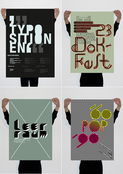
Poster work by Michalt Slawek, as shown at Creative Review.

Now a ridiculed cliché, the Finger Hold is one of the few ways of portraying the relative size of a poster and capture a hint of the texture of the paper and the printing process. This is certainly better than showing a flat digital file that might as well be a postcard. Of course, posters could be photographed in situ, but then you lose control of the lighting and who knows what may be beyond, around and underneath the poster once it has been placed. The Finger Hold also allows to add some personal flair — which may be what irks fellow designers — if you take the picture in your loft office and show the exposed brick wall, or it lets you show off your Asian designer jeans that cost as much as the production of the poster. The Finger Hold is not perfect, but it works and is popularly used.

Craig Oldham

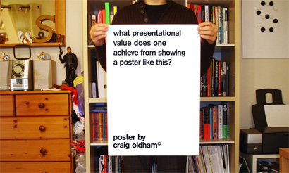
British designer Craig Oldham questions the Finger Hold.

Manystuff

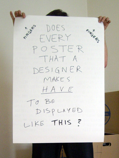
Craig Robinson from Flip Flop Flyin provides a clear diagram of the problem.

JK Keller

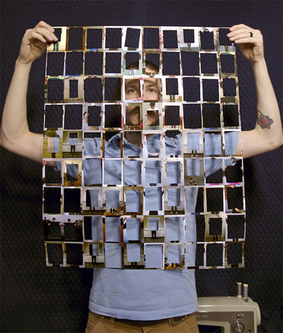
JK Keller took a bunch of these images, made a poster out of it, and then cut the posters. So incestuous.

Emigre

My theory is that issue 54 of Emigre started the trend back in 2000 when they showcased this “mysterious” collection of design by white-gloving each piece.

Fingers on Book

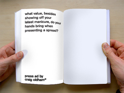
I see little reason to get your mittens thumbing over a spread of work that can to do all the talking alone.
Craig Oldham still questioning

So, with the conundrum solved (for the most part) for posters, there is a new trend emerging that takes advantage of the simplicity of shooting a short video, uploading it to any of the numerous services that hosts the video and lets you embed the daylights out of it anywhere you want. The Video Flipthrough allows designers to showcase editorial work as it’s usually experienced on a first interaction: A quick flip, stopping at spreads that capture the attention. This method has the benefit, as the Finger Hold, of showing the relative size of the project in contrast to someone’s hands; it can also portray the quality of the printing and the paper; and, most importantly, you can show almost all of the pages in a short period of time — something you can’t do when you are painstakingly shooting single spreads hoping the book or magazine doesn’t close shut at mid exposure, and where no viewer will sift through 100 photographs to get a sense of the book. The Video Flipthrough packs the most experiential-punch-to-time-spent-viewing ratio. It’s not perfect, of course, as typographic details are nearly impossible to capture and you are beholden to the manual abilities of the flipthrougher, but as a way to showcase editorial work in this Web 3.0 world — yes, bye-bye Web 2.0! — it is effective and proportionate to the amount of attention anyone is willing to spend viewing a single online project online.

Following are a few Video Flipthrough examples:

The designer flipping through Weird Weight by Andy Dixon.

A shaky, Ken Burns-like flipthrough of Rebel Visions — not too enjoyable an experience.

Static Versions

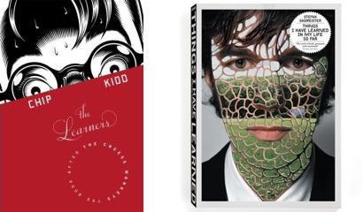
Flat images of Chip Kidd’s The Learners and Stefan Sagmeister’s Things I have learned in my life so far. Unless you know, it’s impossible to tell that the red field in Chip’s book is the jacket, or that Stefan’s book is die-cut and is comprised of several little books.

Bennett Holzworth (of the recently retired Be A Design Group) showing Stefan Sagmeister’s Things I have learned in my life so far.

Bennett flips through Chip Kidd’s The Learners.

Someone going through Irma Boom’s books like if his house were on fire.

Unstoppable, Bennett showcases Modern Dog’s book.

Flipthrough of Ellen Lupton’s Graphic Design: The New Basics.

And the Flipthrough to end all Flipthroughs, Marion Bataille’s mock-up of her upcoming eye-popping book, ABC3D.

Maintained through our ADV @ UnderConsideration Program
ENTRY DETAILS
ARCHIVE ID 4760 FILED UNDER Discussion
PUBLISHED ON May.07.2008 BY Armin
WITH COMMENTS
Comments
Derek Munn’s comment is:

Until I bought it and opened it, I thought, "Why the hell does Stefan have a lizard face?" Then it all made sense.

On May.07.2008 at 11:07 AM
Chad K’s comment is:

It might also make sure their whole book is great, because they won't have just a few spreads to highlight, covering up the rest of a bad book. And make people conscious of their cuticles

On May.07.2008 at 11:19 AM
Jose Antonio Contreras’s comment is:

Awesome post!

I have used the finger hold method for posters, covers, business cards, books, pretty much everything. And yes, the main reason has been to show scale relationship and three-dimensionality.

However, I have been tempted many times to change my site and just do flat images. The idea has crossed my mind because it seems less sentimental, less "I'm trying to convice you that this project exists" kinda thing.

The downside I see in video presentations is that there's a forced sequence (in books this is not a problem) and possibly that it can take longer to see (download speeds, etc)... but maybe I'll try it out one of these days.

Cheers!

On May.07.2008 at 01:16 PM
Jody’s comment is:

I can definitely see the value in using video to show print work, but my company has also been using it to show movement in the online work we do. We have screen recording software that allows us to capture high-quality quicktimes, sans cursor. This is especially great for presenting our Flash work, which (althought nicely designed) is better appreciated in motion. We've been using keynote a lot, too, because you can plug the video right in.

On May.07.2008 at 04:31 PM
Mike’s comment is:

I'm the marketing/web editor guy at Fantagraphics Books and the "videographer"/"hand model" of the flip-through video for Rebel Visions (cover design by Jacob Covey, interior by Greg Sadowski). It's funny that you included it here since it is our (my) first attempt at such a thing. Some technical notes:

- shot in my apartment with available daylight
- shot with my personal digital camera that I've had for 5 years; Fantagraphics does not have an office digital camera, believe it or not
- handheld because I don't own a tripod
- one take with ambient sound and autofocus clicking because I don't have video editing software

That's how we roll at Fantagraphics! It's more "Dogme" style than Ken Burns style, I think. Anyway, this post has been very instructive and my next attempts should be much improved, I hope.

On May.08.2008 at 01:43 AM
Armin’s comment is:

Mike, it's all in the tripod!

On May.08.2008 at 08:23 AM
Bennett Holzworth’s comment is:

Nice post Armin. I wasn't sure if anyone else was doing this, until the day I posted my first "flipthrough". That was the day someone sent me the link to the ABC3D video. That is the coolest.

On May.08.2008 at 09:37 AM
agrayspace’s comment is:

Great post armin.

I think it's funny when designers start to "eye roll" at trends when they become as ubiquitous and the finger hold. As if originality is more important than communication. Please.

In the usability world, "trends" like these are often called templates, and are studied and prized for their value as useful tools in a growing toolbox of techniques for communication and interactivity. No one is worrying about trendiness, but just if it works or not.

Anybody who questions the fingerhold, strikes me as someone who is just not thinking about it very deeply. They are just reacting to its ubiquity.

I think the benefits of scale and realism that are achieved by the finger hold trend is so obviously superior to the flat image, that the question as to its pervasiveness is already answered. It just works better. I haven't heard a compelling argument to the contrary. Yet.

Ditto for the flipthrough. We should thank our frickin lucky stars that technology has now allowed this to happen so easily. It's obviously a better way to "see" a book online. I give amazon a year before this is pervasive on their site.

Seriously, is there going to be a hipper than hip, eye-rolling, backlash against everything just because it appears a lot in designers portfolios? even if it makes sense and is useful?

On May.08.2008 at 01:11 PM
Steven’s comment is:

I'm actually jealous of the finger hold trend, in that I haven't had an opportunity to design a real poster recently. And, doing a finger hold on a 6' tall, 15' wide tradeshow booth panel doesn't really work. "Hey, what are those little pink nubs on the top of your booth graphic?"

Regarding video flip-throughs, I like that they indicate the dimensional, tactile aspect of a book or brochure; even though they don't really show finer detail. I think the sound of ruffling, crackling sound of pages provides a better experience than no sound. And music overdubs ads an extra layer of emotive impact, and becomes a defacto book "soundtrack".

One other issue I've noticed both here and in many other instances, after the You Tube video plays, it always seems to end in that messy UI with the replay and scrolling movie stills. Is there a way you can code this so that the movie just goes to the beginning again? Or are you basically just sticking a link into a table cell or frame, and you're stuck with how the You Tube code works?

The worst case of this was a site that had a prominent You Tube video on its home page. After the video finished, it was very tempting to be distracted by poking around in the little inner You Tube world, rather than dig into the "parent" web site. Plus, that end You Tube UI was an ugly eyesore that conflicted with the rest of the homepage.

On May.08.2008 at 09:46 PM
Daniel’s comment is:

Aside from Marion Bataille's (which is amazing), I can't bear these videos. They're either a bit creepy in their almost-silence, or soundtracked by something so carefully selected to be cool that it may as well just be a video of the Asian designer jeans.

Plus they remind me of a kids show I used to watch (it may have been Pob), where a mute pair of hands showed you how to make a rocket out of an old coke bottle and some pipe-cleaners.

On May.09.2008 at 12:03 PM
Patrick Burgoyne’s comment is:

When your fingers get tired, there's always the bulldog clip...

On May.09.2008 at 12:20 PM
Bennett Holzworth’s comment is:

Daniel, We will let you do hours of work on photos and rollover animations (which won't give you any real idea what a book is actually like). The music was used to get rid of the annoying ambient noise . . . oh yeah, there is always the mute button if you don't enjoy cool music.

On May.09.2008 at 05:25 PM