


Tuesday 5.20
9pm
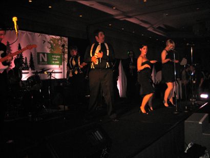
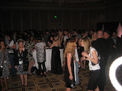
Tuesday Evening Reception sponsored by Neenah Paper
Neenah could never outdo Sunday night’s reception sponsored by Mohawk Paper… or could they? The event is being held at the America Ballroom in the Westin Copley. That’s my hotel, but I won’t need to go outside to get there, as this entire campus around the Pru is connected by glass walkways filled with shopping and restaurants. I just had to pop my head out on Boylston Street to get some fresh air, because I literally haven’t even seen outside in 24 hours. It’s a weird feeling, kind of like Pauly Shore in Bio-dome. Boylston Street has a brand new 3-level Apple Store, which I believe is the biggest in the US. In my best Matt Damon Boston accent, it’s “wicked awesome.”
. . . . . . . . . . . . . . . . . . . . . . . . . . . . . . . .
6pm
Portfolio Review sponsored by The Creative Group
This is a great event, as HOW has reserved 4 large rooms upstairs and allowed design students to bring in their portfolio books and get creative feedback from conference attendees and speakers. Debbie Millman was on site, chatting up the students, whose work varied from ok to really strong in some cases. Von Glitschka was there as well giving advice and talking to the students. Von warned me about something special in his 9:45am presentation tomorrow AM, so we’ll see what he has cooked up then. I ran into 2 seniors from the BFA design program at Purdue in Indiana whom I originally met on Sunday, and asked them if they would answer a few questions about the conference from a design student’s POV. They gave me some great answers, I’ll type that up later…
. . . . . . . . . . . . . . . . . . . . . . . . . . . . . . . .
3:45pm
10 Secrets of Typographic Success
Allan Haley
Director of Words & Letters
Monotype Imaging
Georgetown, MA
How speaker link
How session link
Allan Haley’s www site
An article by the Allan Haley on typographic details from 2006 Dynamic Graphics
A book by the Allan Haley: Typographic Milestones (1992)
The online session listing asks the following, “Ever wonder if there’s a “rulebook” for typographic success that only designers the likes of Paula Scher and DJ Stout are privy to?” This type of question troubles me a bit, and I hope this session isn’t a sophomoric approach to typographic methodology, but I can’t pass up lectures on type…so I’ll keep an open mind.
Image above: one of Allan’s slide show pages. Given the subject matter of the session, I expected better looking typography on the slides!
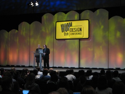
HOW doesn’t determine which sessions are in which auditoriums or ballrooms until they get close to the actual event, because they track registration numbers and pair the session attendance to the properly sized room. This session is in the largest auditorium, and the place is packed. People are taking notes like I haven’t seen at this conference yet. Allan is scrolling through various editorial typographic designs and speaking rather fast about what he likes in each piece, ie: “I love this!” and “This sucks!” He has a slightly raspy voice, and a very confident presentation style. This is indeed Type 101, but Allan’s delivery is keeping everyone tuned in, and I could look at good editorial typography all day.
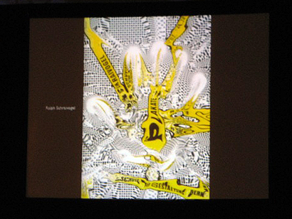
Allan just used the term “Horsey,” and made a claim that, “fonts are cheap, they’re only 29 bucks.” I expected a punchline after that, but none came. I’m starting to lose my patience for this particular lecture. Yes, I am a type snob, but I don’t think $29 fonts are the secret to typographic anything (except mediocrity.) However, Allan’s got a good plan to keep things simple, use punctuation for fun, and use scale to make an impact. He’s asking everyone to “sweat the details” such as: watch rags, clean up margins, kern where necessary, and use the correct characters, like ligatures and small caps. He’s addressed techniques for creating distinctive display text, but hasn’t yet mentioned handling body copy. Hold on, the lecture has just ended, but he only gave us 4 secrets… Allan Haley, get back in here, you owe us 6 more secrets!
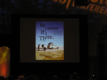
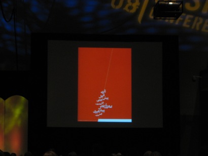
Image above: Arabic letterforms are just plain beautiful.
. . . . . . . . . . . . . . . . . . . . . . . . . . . . . . . .
2pm
Inside Red Nose Studio:
The Creative Process of Illustrator Chris Sickels
Chris Sickels
Illustrator
Red Nose Studio
Greenfield, IN
How speaker link
How session link
Chris Sickels’s recent interview from HOW
Chris Sickels’s www site
Chris Sickels’s personal blog
Chris Sickels’s book: The Look Book (HOW, 2007)
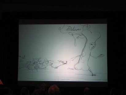
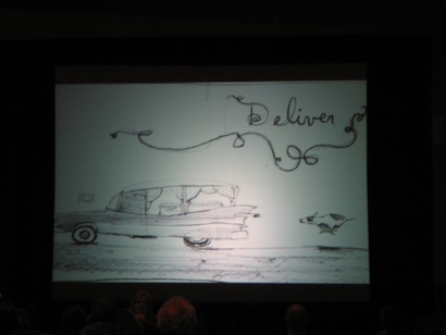
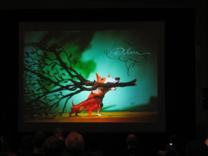
Chris’s work is both eerie and incredibly engaging at the same time. The Look Book is hard to put down, and every time I look through it, I find another small important detail that I missed the last time I read it. The main text is hand drawn with Hunt 108 pen nibs and waterproof black ink and is both gestural and stunningly beautiful. I’ll be meeting Chris right after his book signing later tonight, and will ask him about his process, and what he has on tap next.
Chris has taken the podium, and is showing a sped-up video of his sculpting process in his studio above his garage. You might be familiar with Chris (and his signature hat) from the high profile campaign he did with Epson. He’s not an experienced presenter, but he’s genuine and funny, and his video is a complete documentation of one of his projects: from creating the characters with Scupley, to painting and assembling the background, to lighting the shot.
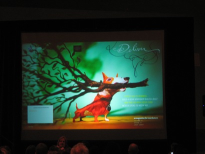
Images above: from sketch to finished, printed piece for the USPS.
More examples of work-in-progress: He sets up his 4x5 camera and does some tests. Then, he shows the final image as used in an editorial setting. The second project is for a Norwegian appliance manufacturer called Asko. Chris shows the art director sketch (kind of lame,) then shows his interpretive sketches and finally the actual model he built for the photo shoot. The final product is absolutely amazing. There’s a depth he creates with the flat background elements and the lighting that juxtapose the 3-D models that is impressive.
Chris is leading us through a few more projects, from art director sketchy idea, to his version of the sketch, to the model building, and finally the shoot itself. He’s started to experiment a bit with animation as well, and shows a few really funny shorts with some characters interacting. Many of the props he uses in his shoots are simply found objects from his house: he makes a set of dinner plates from plastic caps, and tiny beer mugs filled with beer made from expandable glue shards that were stuck to his workbench.
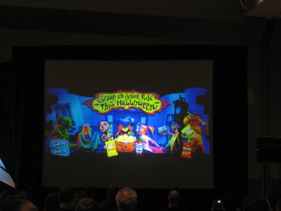
Image above: a detailed model Chris built and shot for Lay’s Potato Chips. He cut apart Lay’s bags, scanned then, printed them out at 1/10 scale, and reassembled the bags with foam filling to create the props in this shot. Chris spends anywhere from 5-8 hours building each individual doll, but doesn’t reuse many in a featured way because their faces are so distinctive. As a result, he has quite a collection growing on the shelf in his studio.
The Look Book: Chris describes how he sold the idea to Megan Patrick at HOW books, and then shows some sketches of Ann and Ian as they are developed for the narrative. If you haven’t read The Look Book yet, you need to. The illustrations are mesmerizing, but the wordplay in the story is brilliant as well. On the surface, the book looks like a children’s book, but there’s more going on here than that. Many of the passages are somewhat scary: first page: Ian saw a bird soar overhead. (Illustration: serene bird flying overhead.) Second page: Ann saw a bird with a sore head. (Illustration shows the bird with its head chopped off!) He’s done a great job of documenting the various steps of his projects from initial concept through finished image, so his slide show is really rich and the audience is laughing regularly.
. . . . . . . . . . . . . . . . . . . . . . . . . . . . . .
10:45am
Combining Type and Image
Nancy Skolos & Thomas Wedell
Principals
Skolos-Wedell
Canton, MA
How speaker link (Nancy Skolos)
How speaker link (Tom Wedell)
How session link
Speakers’ personal page (bio/info PDF):
(Note to all graduating designers: please see above pdf for reference on how to design a simple, beautiful CV)
Speakers’ www site
Nancy Skolos’ RISD faculty profile
Speakers’ books: Type, Image, Message: A Graphic Design Layout Workshop (Rockport, 2006)
Tom and Nancy have taken the stage and are showing some if their early poster work, which features a lot of photographs of intricately designed models. Tom made a point (to younger viewers in our audience) that there was no computer used, it was all hand done and then photographed.
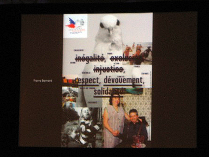
Now they’re showing come work from the German firm CMYK as well as from fellow Cranbrook alum Lucille Tenazas.
They’ve broken down their process to a few simple themes:
Separation: border/frame and compartments
Fusion: shared surface or tension, motion or gesture.
Fragmentation: type and image opposing one another, colliding.
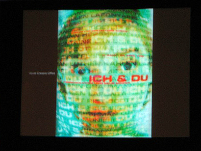
Inversion: type and image trading place, changing roles. Image as type is an example, and they’re showing a lot of other designer’s work to support these ideas. Here’s a few pix:
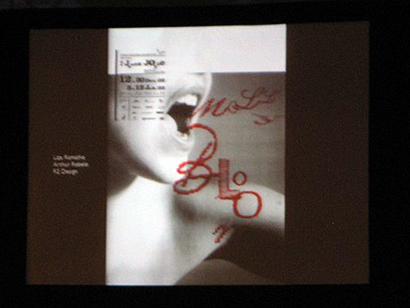
The above is from R2 Design in Portugal. Absolutely stunning use of embroidery merged with the image as gestural speech.
Tom and Nancy are taking audience questions, here’s a great one: how do you get a client to pick a particular version of a design you want them to choose when you present?
Nancy’s answer: Stack the deck! Put something crazy at the front of the grouping, and something more conservative at the end…steer them to your choice in the middle. Classic.
. . . . . . . . . . . . . . . . . . . . . . . . . . . . . .
9am
Swiss in America: A Sixties Revolution that Transformed American Graphic Design
Speaker: Katherine McCoy
Partner
McCoy & McCoy
Buena Vista, Co
How speaker link
How session link
Kathy’s personal page (bio/info)
Kathy’s www site
Kathy’s AIGA Medalist bio (excellent, written by Lorraine Wild)
Kathy’s books: Cranbrook Design: The New Discourse (1990)
This was another tough choice, as the other 2 general sessions at this time slot were Charles Anderson: The Design Entrepreneur and Design Matters LIVE: with Debbie Millman interviewing an obscure NY designer named Michael Bierut.
However, being a Cranbrook alum made my choice easier. Kathy McCoy lived and worked during the period of high Swiss modernism in American design, and, as co-chair of the Design Dept. at Cranbrook Art Academy from 1971-1995, was a big part in the emergence of postmodernism in graphic design that followed. Hearing her lecture on the former is not to be missed. I’ve arranged to meet her after Nancy Skolos and Tom Wedell present Combining Type and Image at noon, and will try to pry some additional designerly goodness from her massive brain at that time.
Kathy has taken the podium and is speaking about the changes that Swiss modernism brought to America in the late ‘60’s as the term “graphic design” began to replace “commercial art” among the vernacular in our industry. The Swiss approach to graphic design was the logical extension of the constructivist and Bauhaus aesthetic applied to commercial art and what was traditionally called “art direction” and “layout.” Philadelphia’s Museum School was instrumental in bringing Swiss design to America by inviting Armin Hoffmann to teach a semester at the school. Hoffmann’s class was so radically different, that one student remarked it was “from a different planet.”
Kathy has transitioned to speaking of Armin Hoffmann’s connections with Bradbury Thompson and Paul Rand at the Yale School of Art. As a young designer just out of college in 1967, Kathy was first introduced to Josef Müller-Brockmann’s grid work on the bookshelves of her first corporate design job at Unimark International in Detroit. The Kansas City Art Institute was seminal in bringing the new Swiss modernism to American design education. American Rob Rob Kelly of the KCAI brought Inge Druckrey to Kansas City as the first Basel School modern designer to teach in the States.
1965: Unimark International forms, includes Massimo Vignelli and Herbert Bayer. Unimark thought big, and had big plans for big clients, but a simple geometric approach with abstraction and typographic grids. They expanded aggressively, and tried to gain a foothold in a major city with one large client, then approach other potential clients in that same city. It didn’t always work, but their work attracted a lot of professional attention (Kathy is showing Vignelli’s body of work.) Kathy began at Unimark in 1967 right out of Michigan State and wore white lab coats at the ‘office’ with a systematic team that had a minimalist office aesthetic. The best compliment that they could give a particular piece of design was that it was “clean.” In all, Unimark ended up hiring over 400 designers before they closed in the US in 1979.

image above: Kathy McCoy (in front) and the Unimark staff.
The Expo 67 in Montreal was the first universally designed modernist exhibition. Helvetica and Univers were everywhere, and they were just becoming commercially available. Kathy and the Unimark staff took an overnight train to see it, which included one of Bucky Fuller’s geodesic domes. This exhibition is widely credited with inventing the practice of environmental (signage) design.
By 1971, the Swiss modern style was the new norm in corporate firms in both the US and Canada, and featured simple geometry, bright colors, angled compositions, tight cropping, full bleeds, and lots of ink. In typography: one font, 2 weights at the most, flush left + ragged right. In order to get tightly packed leading in body copy (ie: 7pt text on 6pts of lead), some designers had to convince printers to shave the shoulders off their hot type letters!
Very nice historical presentation on how Swiss modernist design arrived and redefined graphic design in America in the late 60’s through early 70’s from a designer (and historian) who lived it.
. . . . . . . . . . . . . . . . . . . . . . . . . . . . . .
8am
Continental Breakfast
How much free coffee can I drink in 30 minutes? (not a rhetorical question)
Great coverage on the Swiss in America, really wanted to see it. I was able to catch the Design Matters: Live w/ Michael Bierut though. Debbie is always stellar and Bierut never fails to amuse.
On May.20.2008 at 10:39 AM