Speak UpA Former Division of UnderConsideration
The Archives, August 2002 – April 2009
advertise @ underconsideration
---Click here for full archive list or browse below
  
Comic Sans: One Good Application

Hatred for Comic Sans has come to be a design cliché, everyone hates it, even if they are not sure what makes it such an infuriating typeface. While its design is less eminent than that of, say Gotham or Bembo just to pick two examples out of a hundred, it is the consistent overuse and misuse, appearing in the unlikeliest of contexts, of Comic Sans that makes it so unbearable. Because if you consider its name — comic — and original intended use — as a typeface used in speech bubbles for a Microsoft application — the design makes perfect sense and is contextually appropriate. Nonetheless, designers and amateur Comic Sans haters have continually bashed the poor typeface.

While perusing Flickr to find examples of it in use I was heavily amused to find out that, other than Helvetica’s whopping 11,000-plus images, Comic Sans is the most commonly tagged typeface with slightly more than 1,700 results. Among them you can find examples of the sheer ubiquity and randomness of its applications, from ATM user interfaces to lady underwear with the words “Bite Me!” across the butt. Somewhere around result page number ten I stumbled across the image below, which took my breath away — not because it is the most beautiful design I have ever seen, far from it, but because it was the first time that I have seen Comic Sans used well, even cool.
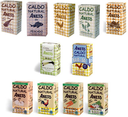
Aneto 100% Natural

The image, which you can see bigger here, is part of the collection of Spanish Flickr user ocascsms, a semi-acronym for Organización Contra el Abuso de la Comic sans (Organization Against the Abuse of Comic Sans), showcasing the packaging for the Aneto 100% Natural stocks, a Spanish company producing ecologically conscious and natural yummy stocks. If you are curious, here is an ad for their paella stock.

So, as I mentioned, these packages are not extraordinarily designed, and would fall under the snobbish description of low-brow design. The combination of Comic Sans, with the simple and matter-of-fact illustrations and the picnic tablecloth backgrounds, all in earthy colors come together to form a very interesting set of packages that bring a smile to my face. Comic Sans has long been considered the exception to the “There’s no such thing as a bad font, merely a font badly used” adage but, as the Aneto stocks demonstrate, Comic Sans can be properly used.

Maintained through our ADV @ UnderConsideration Program
ENTRY DETAILS
ARCHIVE ID 5008 FILED UNDER Typography
PUBLISHED ON Jul.10.2008 BY Armin
WITH COMMENTS
Comments
Nigel’s comment is:

You are joking, right? Or are you designer baiting?

I'm afraid your justification doesn't stand up. The imagery I can live with (the woodblock effect is even quite attractive and spot on semiotically), the tablecloth gimmick and colour palette are bearable despite being strained and smelling of 'how many ideas can we throw at this to make it sell' that betrays a lack of confidence in the designer. But the oversized and awkward ill fitting treatment of the brand name is awful. There's a visual pollution going on in the limited space available that is unbecoming for what is supposed to be a natural product.

I have seen Comic Sans used sensitively and it can work well in a small pt size (as it was designed) but only in the appropriate setting. Take it anywhere above 11pt, and certainly when you use it as a display font, and it is simply atrocious.

I admire your bravery in trying to re-address the maligning of the font, especially by those that can't articulate their reasons for such bigotry. However, I'm afraid this is not a good example to save Comic Sans from the criticism it gets because of the way it is naively used.

On Jul.10.2008 at 12:45 PM
Jon Dascola’s comment is:

Beautiful.

On Jul.10.2008 at 01:17 PM
Aires Almeida’s comment is:

It IS designer-baiting to say poor comic sans is getting a bad rap, but this one isn't so bad. If calling this bad design is snobbish, then my 2 yr old daughter is a snob. She knows enough already to spot a weak creative and a poorly thought out concept. It's not so bad? That argument makes it worse. We're all in this game to make it a better. There are no consolation prizes. It works or it doesn't. This doesn't. And no, it's not all Comic Sans' fault, but it didn't help.

On Jul.10.2008 at 02:54 PM
Jürgen Siebert’s comment is:

The German typographer Jens Kutilek (he is working at FSI FontShop International, publisher of the FontFont library) has created a lively alternative to Comic Sans called »Comic Jens«. It is more fun, it is OT and it is free:
http://www.fontblog.de/alternative-zur-comic-sans

On Jul.10.2008 at 03:02 PM
Jeff’s comment is:

I don't think anything can save those gross letterforms.

On Jul.10.2008 at 04:43 PM
Pesky’s comment is:

I love Comic Sands. But not when the grains get in my teeth.

On Jul.10.2008 at 09:24 PM
Tselentis’s comment is:

This gives new meaning to Comic Sans being tasty.

On Jul.10.2008 at 11:28 PM
Sheepstealer’s comment is:

I appreciate the “glass is half full” approach to this, but I have to say this is a stretch.

It seems like you’re saying that this use of Comic Sans is good because it's not quite as bad as other design projects that are typographically butchered by this ubiquitous but unattractive font. If the designer really felt that a light-hearted, approachable design was needed for this packaging, I can produce a huge list of fonts that would fit perfectly well. CS would not be on the list.

But here’s my list of appropriate uses for Comic Sans:

- fliers (designed by preschoolers) for a pre-school spaghetti-feed fundraiser

- a ransom note from someone who kidnapped Matthew Carter

- a birth announcement for a newborn litter of ferrets

and finally,

- As a way to get a dusty old blogger to chime in on a post when he hasn't for a long time. =]

On Jul.11.2008 at 02:59 AM
Sheldon Kotyk’s comment is:

I agree with Sheepstealer as long as the pre-schoolers are not my kids. It would still be wrong in that case.

On Jul.11.2008 at 01:10 PM
Doug Bartow’s comment is:

I just got a sample in the mail of a VIP invitation I designed for an international opening of a new experimental arts center this October. The piece and envelope were printed on Curious Iridescent Morphing Mauve 80# text (very nice.) I had spec'd the mailhouse to use Arial for the inkjet addressing (as it's a PC thing, and I wanted a non-descript face for the name/address.)

Somehow, all the names got sprayed on the outer envelopes in Comic Sans-all caps.

oh, the horror...

On Jul.11.2008 at 01:17 PM
Diogo’s comment is:

i like them!

On Jul.11.2008 at 01:42 PM
Kristin’s comment is:

Perhaps if I had never seen Comic Sans before, I could fully appreciate this design.
However, I've seen the typeface so many times, and used in so many horrible ways, that there's no way it can look anything other than horrible to me. It has too much of a bad reputation behind it, and I don't think it's a strong enough typeface in the first place to shake it off.

On Jul.11.2008 at 02:05 PM
Armin’s comment is:

> You are joking, right? Or are you designer baiting?

For the record, I'm neither joking nor baiting designers.

I genuinely react positively to these packages. Not in the same way that I react to a Paul Rand logo, an Imaginary Forces opening title, or a Turner Duckworth package, no. This is different. It's an appreciation of a piece of design that falls outside of everything that is deemed "good" but that displays more personality, contextuality and attitude than much of the work that passes for award-winning.

On Jul.11.2008 at 02:31 PM
matt’s comment is:

still looks like ass

On Jul.11.2008 at 03:04 PM
David E.’s comment is:

I like the top row... the monochromatic, color coded tablecloth ones. They really suggest the tasty dishes you could make with them. I think that if they did all of them like this, it would be a really attractive packaging line. I would buy one of each and display them lined up on my kitchen counter (if I had the room, which I dont).

On Jul.11.2008 at 03:08 PM
Darrel’s comment is:

mmmmmmmm...liquid fish! Nothing goes better with liquid fish than comic sans!

On Jul.11.2008 at 03:08 PM
Darrel’s comment is:

What I hate most about Comic Sans is that is has become the replacement for actual home-grown handwriting. Instead of kids writing a sign for a lemonade stand, they pick Comic Sans. Instead of a teacher handwriting a worksheet, they use Comic Sans. Instead of a restaurant making a menu chalk board, it's printed in Comic Sans.

These packages seem to WANT to be a great, organic, 'made in the barn by hand' label, and they almost are, except for the ubiquitous comic sans.

I will say the intent was OK here, but the could have done so much more.

Comic sans, alas, isn't a great replacement for handwriting. It's a great on-screen typeface for small GUIs.

On Jul.11.2008 at 03:11 PM
David E.’s comment is:

I agree with Darrel's comment about people using this typeface instead of handwriting... but in this case, a line of packaging, you wouldnt want the inconsistancy that you'd have with handwriting. I honestly cant think of a typeface that would have worked better for these. It just works with the simple, symetrical "non-design" (of course it is design, really).

On Jul.11.2008 at 03:23 PM
John Mindiola III’s comment is:

These are ridiculous. It looks like they were designed in-house by your local WIC office. My son has Austism, and is on a gluten- and casein-free diet, so we frequent stores like Trader Joe's. I can't tell you how horribly upsetting it is to see the shelves full of these non-designed, organic-looking packages. Trader Joe's appeals to a different crowd, often a more highly-educated crowd, so why is there this campy KidPix crap everywhere? Wouldn't the brands offering these higher quality products, often free of many allergens, want to seem more luxury, more top-shelf than the junk food you can find at your local grocery store? And please, can we stop this whole "if it's an off-brand, it must look off-brand" deal? Why should we assume that smaller-budget families like this anti-aesthetic approach? It all just makes me sick.

On Jul.12.2008 at 11:12 PM
Joe Moran’s comment is:

Was going to call the ALMIGHTY "bullshit" on this one. And still think it deserves a little bs calling… HA!

But it made me think.

Can anyone design something truly beautiful with a "crappy" typeface?

A former professor once gave my class an assignment thusly: Pick three of your worst favorite colors and design "X" with them.

Some of the submissions were quite beautiful.

So here's the challenge. But from a typographical point of view… (Armin, are you listening? This would be good "Word It" material.)

Can anyone design something truly beautiful with Comic Sans, or -- insert hated typeface here -- that's worth a damn?

Note: A woman from Russia (pre-post Communist) once came into the Kinko's I worked at right out of college. She wanted a flyer done in all CAP courier. It was wonderful when complete to my surprise. Not one graphic, just the type on the page. BEAUTIFUL!!!

NO BS!

Still wondering.

VR/

On Jul.13.2008 at 01:13 AM
Dave’s comment is:

Its a trap.

On Jul.13.2008 at 10:33 AM
Eric’s comment is:

Cutting on Comic Sans is so, well last decade. I think creatives should be more creative in the fonts they choose to cut on.

Which is why I started to like this post, but it is still Comic Sans...

I still think the most over-used font of all time is Papyrus. When it can't be Helvetica or Times, it is always Papyrus, and it is used from cheap bad design (any ethnic restaurant or "green" business) to more expensive applications (Hollywood movie titles).

Who doesn't love Banco?

Now that is a font to be loved and hated, used by amateurs and professionals alike!

On Jul.13.2008 at 08:45 PM
Peter Whitley’s comment is:


Comic Sans is tragic.

On Jul.14.2008 at 10:30 AM
Peter Whitley’s comment is:

Comic Sans is tragic.

On Jul.14.2008 at 11:10 AM
Moeskido’s comment is:

Even before I became aware of the anti-Comic Sans population out there, I had little interest in using it. Comic Sans just doesn't convey enough of anything it was ostensibly designed to suggest.

It's not tragic or hideous. Just mediocre. Even Tekton is more interesting and cohesive. There are quite a few better handwriting and comic-book typefaces out there which convey informality and mood. Comicraft makes many of them, to name one source.

On Jul.14.2008 at 01:24 PM
Darrel’s comment is:

"so why is there this campy KidPix crap everywhere? Wouldn't the brands offering these higher quality products"

Trader Joe's branding would be an interesting post in and of itself. My gut answer would be that their product branding is in direct retaliation to the current 'organic = fancy, expensive, high class' market that Whole Foods and the like currently own. They are purposefully trying to be the opposite of that.

"you wouldnt want the inconsistancy that you'd have with handwriting"

Sure, sure. I agree. That said, why couldn't they have handwritten the packages, made that a font, and then gotten both consistency, and something unique and different from all the worksheets my son's kindergarten teacher sends home? ;o)

"Can anyone design something truly beautiful with a "crappy" typeface?"

To be fair to CS, it's not necessary a crappy typeface. It made perfect sense for it's initial context. That said, 99.9% of the time, it's used WAY out of context, and so is seen as a bad typeface, when, in reality, there's just a whole lot of bad designers out there. ;o)

On Jul.14.2008 at 01:31 PM
noelle’s comment is:

so i guess it's cool to be too cool to hate comic sans. the "intended use" argument in no way justifies its horribly ugly existence. i guess i'm just not hip enough to appreciate this blog.

On Jul.14.2008 at 04:20 PM
Mark Notermann’s comment is:

I think Comic Sans means "without humor."

On Jul.14.2008 at 08:35 PM
Darrel’s comment is:

"the "intended use" argument in no way justifies its horribly ugly existence."

Sure it does. If you take anything out of context, it's easy to rip it apart.

Comic Sans was designed for MS Bob. And it looked fine there. MS Bob was a failure, and, alas, Comic Sans lived on, and was quickly misappropriated.

In other words, don't hate the tools...hate the person that used them wrong. ;o)

On Jul.15.2008 at 10:18 AM
Peter Whitley’s comment is:


(Sorry for the double post earlier.)

Joe, that's a novel concept; "can anyone design something 'truly beautiful' with an ugly typeface?"

I'm inclined to think so, sure. That is, if the only intention is to do just that...e.g., make art. And there are probably loads of applications for Comic Sans where it really is a viable type option. (I'm thinking of the pre-reader aisle at Toys R Us, for example.) Comic Sans, like other campy "kiddie" handwriting faces, makes an important linkage between consistent typeface and hand-lettering. I wouldn't be too quick to discount this important mission. Are there better? Well, sure...context is everything, after all...but there is also worse.

And where we would be without Hobo to kick around? We'd be kicking around some other sad-sack font.

Joe, your question sparked the memory of an exercise that I wanted to do once with some of my black-turtlenecked friends: Design a display face for a foreign alphabet that you don't understand. Arabic, cyrillic, kanji, or whatever...you pick...but it must be clearly evocative and have some clear emotional quality. We never did it but the idea still seems fun. It's probably been done before.

On Jul.15.2008 at 11:56 AM
John Mindiola III’s comment is:

okay, i get it. trader joe's is trying to NOT seem snobby in its organic endeavors. but c'mon, most of the stuff looks terrible. there are plenty of non-snobby package designs that are far better than comic sans and random clip-art. i mean, method is such a good example of this. i think you could take those same ideas and infuse them into healthier food alternatives. if you're not ashamed to eat gluten-free snack mix, then you shouldn't have to be ashamed to place the package on your coffee table as you entertain guests. (and yes, the package matters. think about it: taking it out of the package and putting it into a bowl is wasting water, soap, and electricity. so, if it's going to be a resealable package, then let's make it worth looking at for a while.)

On Jul.15.2008 at 12:38 PM
Joe Moran’s comment is:

Darrell and Peter,

Thanks. You both made me think more.

Type doesn't know if its "ugly" or "beautiful." That's up to us. As is beautiful or ugly design -- or whatever. Would argue this holds true with commercial or fine art, too.

We're all projecting our definition of beauty or ugly on the faces we use, no?

Recall trying to make a "gorgeous" typeface work in a few layouts. Some layouts didn't like it. Had to go with something else. Type goes on.

So can the opposite be true? Could I make a truly "crappy" design with a beautiful typeface? FULL DISCLOSURE: I have. You may too someday.

And Peter that type project sounds "beautiful." You should do it someday.

Ok, back to drawing X's through "ugly" typefaces with my sharpie. Ha!

VR/

On Jul.15.2008 at 10:25 PM
Neil Singh’s comment is:

common sense not Comic Sans

On Jul.17.2008 at 12:38 PM
nic’s comment is:

I agree with the subtext of graphic design not needing to be an elitist endeavor per-se given that design in general is supposed to be a socially engaging practice instead of being a hierarchically condescending one.
Trying to communicate and connect en-masse with "low-brow" audiences is part of the practice right?.
Maybe the cuteness of the packages might be in their careful and unassuming natural ways -even if unintended-. Maybe the designer is not -intending- to be -Mr Super Designer who'd never use sans serif ----eeew!-, but instead: " just a person that would like to go to the store and would be amused to find a lo-fi package just like that, which is cute and kind of haphazard in it's ways... ["just like my lo-fi kitchen, and my new trendy, recyclable, organic, sometimes raunchy looking "environmental" things"]".
there
:)

On Jul.20.2008 at 01:37 AM
danielle’s comment is:

Nope. Just can't get over it. It evokes the same reaction as walking in a stinky bathroom...my senses overpower any rational thinking. Although––good news for Aneto––I do have friends that will probably stock their pantries full of it just to spite me when I come over.

The only one that doesn't seem like a packaging-created-by-bored-warehouse-staff design is the reduced salt label.

Armin, there must be some subconscious associative reaction going on with you!

On Jul.21.2008 at 02:43 PM
Armin’s comment is:

Maybe I just like stock.

On Jul.22.2008 at 10:21 AM
Fabric’s comment is:

Comic Sans is not a bad font when used correctly. However, the amount of incorrect use is what makes designers outraged.

On Oct.28.2008 at 12:57 PM
Bofknonge’s comment is:

Добрый день

От беспокойства до паники - 28 дней

увидимся

On Dec.09.2008 at 09:14 AM
inansiops’s comment is:

Добрый день
Маловато комментариев, а тема то хорошая

On Dec.17.2008 at 09:01 AM
SigedeareeRen’s comment is:

Бесспорно, неожиданная работа

On Jan.16.2009 at 03:28 PM
nuhFrornber’s comment is:


блог - это всего лишь часть жизни, и когда нет времени писать в блог - значит все время уходит на другие, не менее приятные дела.

On Jan.16.2009 at 04:31 PM
Женя’s comment is:

Готова перечитать статью ещё раз. Хороший матерьял и написанно просто! ТО что надо.

On Jan.20.2009 at 10:36 AM
Jacques Rigaut’s comment is:

I used to think people heavily into computers were very nerdy indeed. That is, until I discovered there were people heavily into fonts. People, there is a great big world out there!

On Apr.14.2009 at 11:31 AM