Speak UpA Former Division of UnderConsideration
The Archives, August 2002 – April 2009
advertise @ underconsideration
---Click here for full archive list or browse below
  
Dear Lulu, The New Standards

It’s funny how things change. Five years ago I wouldn’t have given second thought to producing print material with digital printing. No, only offset printing. The thought of a brochure, annual report or catalog printed as if it had come out of Kinko’s — excuse me, FedEx Office — was just unbearable and even the much-hyped and pushed feature of individual customization — Dear Jon, from Chicago, IL 60660… — didn’t seem to be much draw. And seeing samples of digital printing where a block of color looked as if it had been filled in with streaky watercolors and colored type looked as coarse as the graphics in an Atari 2600 game didn’t help either. Needless to say, digital printing technology has improved vastly and so has the quality of the finished product, which, like offset printing, has a range of quirks that have to be tested as you go to be improved. Over the years, printers and paper manufacturers have produced elaborate promotional materials that show you how to make the best of offset printing by showcasing examples of 1-, 2-, 4-, and 6-color printing, varnishes, skin tones, gradients, metallics, and subjecting papers to all sorts of other processes equivalent to being crash test dummies. More or less, the art of offset printing has been properly documented and even mastered. Now it’s digital printing’s turn.

Well, sort of. This past July, fourteen students attended a two-day workshop at Germany’s Hochschule Darmstadt University of Applied Sciences with Prof. Frank Philippin and London-based designer James Goggin. The brief, as explained by Goggin:

My plan for the workshop is to investigate the visible and tangible parameters of graphic design — type specimens, halftone screens and, in particular, colour tests and calibration charts — and make a book of our own self-produced tests which we will send to print on Friday afternoon using the online print-on-demand system Lulu. The book project will therefore act as a colour/type/pattern test of the very system with which it is produced. “Print-on-demand” is an increasingly important production system which can serve to make us designers rethink the impact our profession has on the environment and to question the often wasteful print volumes and production methods requested of us by our clients. Graphic designers, and especially students, have a chance to use and subvert these relatively new (and fairly cheap) technological systems to our advantage.

Dear Lulu

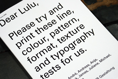
The result of the workshop is Dear Lulu, a fantastic and imaginative resource that puts digital printing to the test through a Do-It-Yourself presentation that fits right in with philosophy of print on demand that makes it such an alluring proposition for designers looking to publish with little financial risk and with pretty decent results in return.

Dear Lulu

Dear Lulu

Dear Lulu

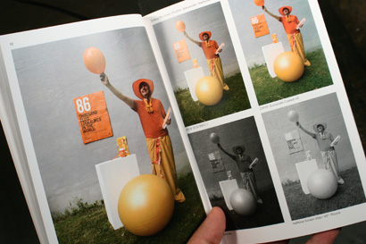
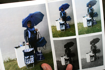
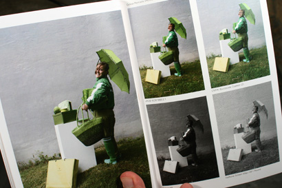
The first section of the book testing color portraits, shows the students, each dressed in a different color, posing outside in still life photographs featuring other random items in the same hue. The photos are then reproduced as CMYK, RGB, Grayscale and Half-tone so that you can see which color model is better — pretty amazing that RGB prints so well, and pretty amazing to think that sending an RGB to offset printing could cost a designer his or her job or thousands of dollars to reprint the washed out photo.

Dear Lulu

Dear Lulu

Dear Lulu

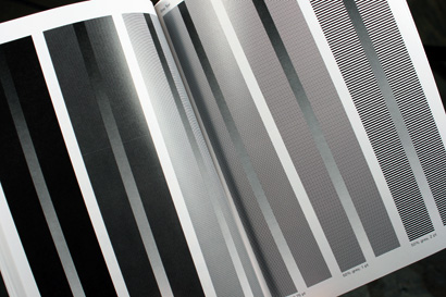
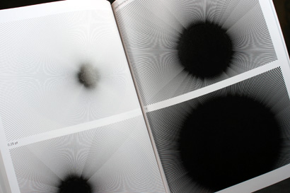
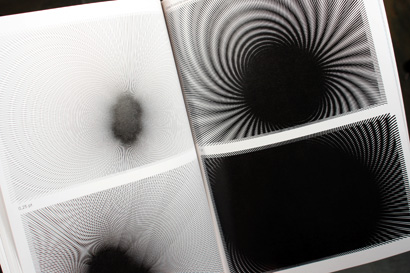
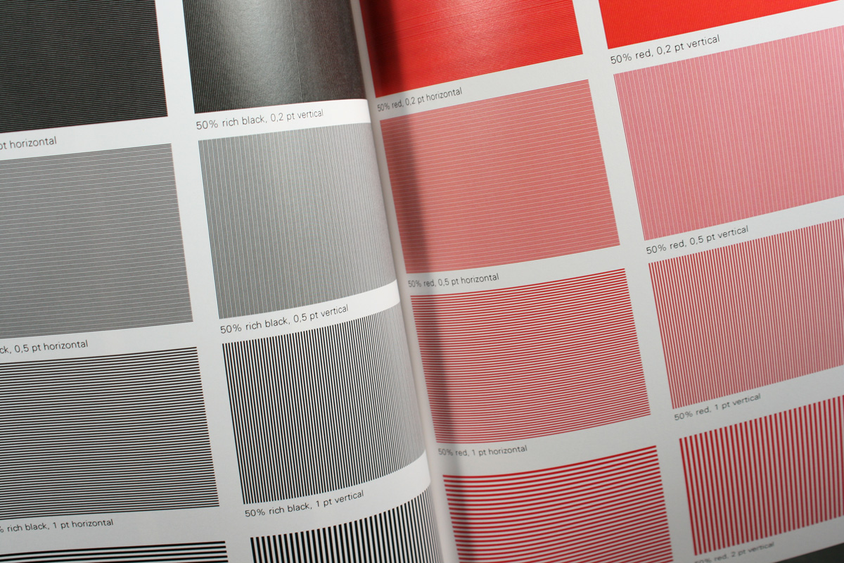
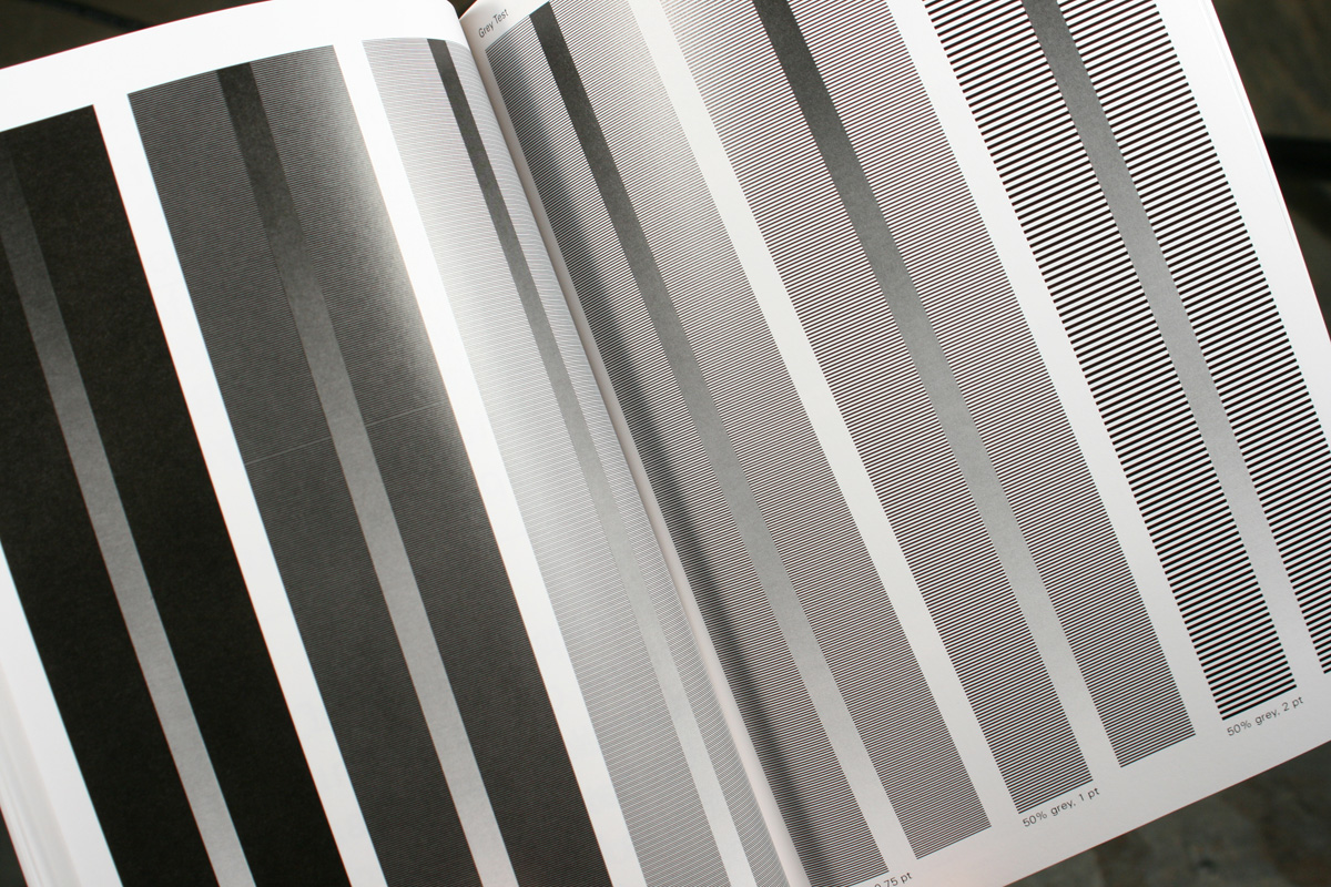
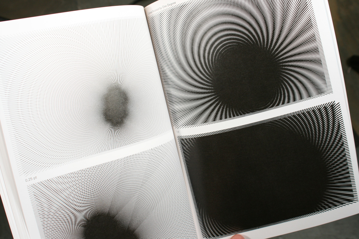
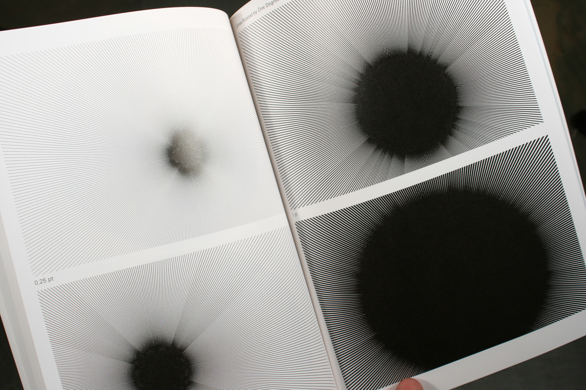
Line and pattern tests are interesting, just to see how far you can go with thick and thin lines and how crazy you can get with radiating patterns.

Dear Lulu

Dear Lulu

Dear Lulu

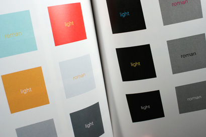
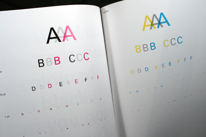
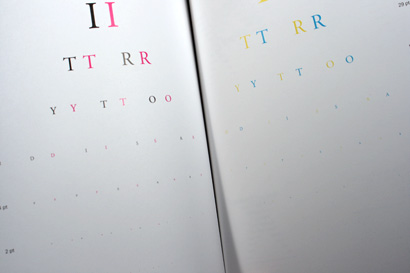
The typography tests are very helpful, as I think it’s always been the weakest point of digital printing. Black type always looks good, as it just requires drawing ink from the black “cartridge” of a printer much like offset printing, but whenever color type enters the equation, things get messy quickly, but as is clear in the book, as long as you do color type on a white background it will look pretty good. A surprising thing from this book was to see how well small type (around 4pt) in black holds up, and also when reversed.

Dear Lulu

Dear Lulu

Dear Lulu

Dear Lulu

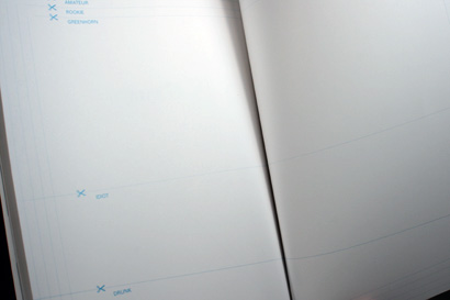
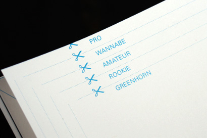
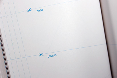
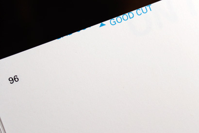
One of the most interesting sections of the book is in the end, where the students test the finishing capabilities by seeing how close to the edge you can get, and drawing guidelines to see how straight the trimming is. My copy on page 96 demonstrates how things are not perfect: At top edge of the page there is text that says “Good Cut” and to its left I can see the very bottom of text, positioned outside of the document’s margins that says “Bad Cut.” Funny.

Dear Lulu is a great tool to test digital printing. You can do it for Lulu, of course, by purchasing the book but you can also do it for your own printer by downloading a free PDF. The book lacks the sophistication of your typical paper or printer promotion but, as I mentioned, things change. Graphic design is no longer solely about the most beautiful photograph or the most expensive paper in the most refined layout: It’s about effectively producing messages and experiences that can be easily distributed.

Maintained through our ADV @ UnderConsideration Program
ENTRY DETAILS
ARCHIVE ID 5154 FILED UNDER Review
PUBLISHED ON Aug.20.2008 BY Armin
WITH COMMENTS
Comments
Thomas Jockin’s comment is:

very very smart.

On Aug.20.2008 at 11:46 AM
Doug Bartow’s comment is:

from page 68:

"One word in
this sentence
is coloured
rich black.

Can you guess
which one ?"


...that's great!

On Aug.20.2008 at 11:55 AM
Adam Duquette’s comment is:


A lot of the digital printers run better using RGB profiles as opposed to CMYK. I learned that the hard way on a brochure run of 200 last year.

On Aug.20.2008 at 01:10 PM
Neale’s comment is:

My copy on page 96 demonstrates how things are not perfect: At top edge of the page there is text that says "Good Cut" and to its left I can see the very bottom of text, positioned outside of the document's margins that says "Bad Cut." Funny.

If you look closely at the PDF, you can see that the bottom edges of "Bad Cut" DO overlap. So that's not lulu's mistake ;)

Other than that, this is a great find. I was thinking about doing something similar with a lulu book myself, though much less intelligently and thoroughly. The RGB vs. CMYK thing is interesting, kind of feel sorry for CMYK...

And do you have higher res images of the line and pattern tests? Hard to see how well those worked on such small images, maybe I should buy a copy.

On Aug.20.2008 at 02:44 PM
Design Benign’s comment is:

Lulu is pretty good. I had them print my senior thesis book and I was very pleased with the results. They do nice hardcover binding, too.

On Aug.20.2008 at 04:24 PM
Lorraine’s comment is:

Sweet: what a great idea. I can't wait to get a copy!

On Aug.21.2008 at 01:14 AM
Sal’s comment is:

Great find. It's tending my qualms about digital printing. Sad part is, the domination of gangrunning megaliths like Overnightprints and Vistaprint has taken control away from the designer. Clients who don't see the value in uniqueness favor the cheapness of the default. I call it "favoring the cheapness of the default". How can we take printing decisions back from the clients when know about 5000 flyers for 90 bucks?

On Aug.21.2008 at 09:18 AM
Blake Stenning’s comment is:

Excellent example of “form follows function.” The layout is well thought out and executed. Plus it's fun to look through! Nice job.

It would be interesting to take it a step further and run this book on a traditional offset press and compare the results to LuLu’s.

On Aug.21.2008 at 10:12 AM
Armin’s comment is:

> And do you have higher res images of the line and pattern tests?

Neale, 01, 02, 03, 04.

On Aug.21.2008 at 03:07 PM
James Goggin’s comment is:

Thanks for the write-up, Armin.

In light of my utopian wishful thinking on digital printing's potential ecological benefits, as seen in the excerpt from the brief above, I thought I'd note the disappointment Frank, the students and I had in Lulu's European production and distribution model. Namely, printing in a warehouse in Spain and air delivery by UPS to London (and/or Darmstadt). We had naively hoped the system would operate with local printing and delivery in each country represented on Lulu's site (UK, France, Italy, Germany etc.) Sigh.

I'm curious to hear how Lulu's US operation works in this regard.

On Aug.21.2008 at 06:46 PM
Thomas Jockin’s comment is:

James,

I'm curious to hear how Lulu's US operation works in this regard.

I believe Lulu prints out of Rochester, NY and its shipped out.

On Aug.22.2008 at 06:33 AM
Jodi Bloom’s comment is:

Great article about a very cool-looking book. I will have to get hold of a copy. Interestingly, this week, I just ordered a book of poetry from Lulu, my first purchase. Local to DC area poet Hiram Larew's book, More Than Anything... and regardless of print production values (it hasn't arrived yet), he is the best poet on the planet. So there is an example of the wondrous value of such modern manufacturing models. But I digress.

Meantime, one of the comments above touches on my questions; I too wonder about issues of variables and control. I still encourage my dwindling print-buying (through me anyway) clients to budget for a press check, knowing that even with the sophistication, testing, and digital controls at my best printers... a bad day at the plant--even with my impeccably designed and produced files-- could equal a very poor job.

What are the digital variables? Does black or yellow toner run low halfway through the book? Can we truly rely on the test as a sample for future pieces in an run that could span months or years (or decades!)? Will the paper on page 2 match the paper on page 92?

We've all run into such problems even at the best printers. Some of my jobs run super smooth, others have hit unexpected snags while I'm still on site to problem-solve and still others look good when I sign-off early in the run only to turn unacceptably terrible after I've left the plant.

So, is Lulu's the McDonalds of printing? Will every burger (ugh!) taste 100% the same whether you are in Idaho or Amsterdam in January or April?

Finally, does anyone (ie, our clients) care anyway?

Even more finally, does it really matter or is the democratization totally worth the loss of any control (even if we learn how to design and produce to this model)?

Great article.

On Aug.23.2008 at 10:13 AM
Drew Thaler’s comment is:

Great article! Keep in mind that what works for one Lulu printing location may not work for another, and your results may vary.

Consider the experiences of Greg Dean at Real Life Comics: http://www.reallifecomics.com/archive/080318.html ... In Greg's case, he submitted vector art with transparencies, which worked beautifully when printed by Lulu's US affiliate(s), and which failed miserably when printed by Lulu UK. I'm not sure how many printers Lulu actually works with -- I get the feeling that it's meant to be hidden, just like you don't really care which warehouse your Amazon order came from -- but apparently there's still something to watch out for there.

On Aug.23.2008 at 11:16 AM
Mike Taberner’s comment is:

Great article! - A couple of points to note, digital printing is not the Utopia simply an addition to your your options when it comes to producing your finished publications.

The ability to produce once off copies which compete with litographic quality means that no-one out there now has an excuse for presenting sub standard work.

In terms of Adam's comment about RGB running better, it would be great to know what kind of printer it was produced on and if the printer had a RIP on the front end?

Lulu is one option, but many traditional lithographic operators offer digital solutions. So check these out as well, this will give you the option to support someone closer to "home".

cheers!

On Aug.25.2008 at 01:46 AM
Steven’s comment is:

Digital printing has indeed gotten a lot better, but it's still pretty much hit-and-miss in many cases from my experience. At my recent gig at a B2B company, I worked with one print rep who had a lot of experience with digital printing. He worked with digital printers who had very tight relationships with HP (Indigo digital printers), and the quality of printing was very close to offset. The quality was also remarkably consistent. On the other hand, another printer before him (not my vendor choice) was sooo freakin' awful, that our office color laser printer did a better job than what I got from him. (I immediately stopped working with this hack when power centers shifted.) So overall, I think the digital printing world is still very dependent on the competency of the person running the job.

However, the thing that was a constant frustration for me was the fact that the print runs at that job were consistently so low (>500) that I could never justify offset. In fact, the only time I ran offset was for a brochure project that needed to run on vellum. The irony was that my former employer was a $300 million dollar company working deals with $1 billion dollar companies. But that largesse didn't work it's way toward quality printing. As long as it was better than what came out of the color laser printer, it was fine with them. To be honest, they really were more interested in their PowerPoint presentations... (Sigh)

I will always love offset printing, because there's a real sense of craft in printing. The pressmen (really, in 25 years I've never seen a woman running a press--not that a woman couldn't mind you...) anyway, the really good printers are masters of subtle nuances and details, and the fluid complexities of ink on paper. And offset is still the best "high-res" print experience going.

But digital is here to stay. And there's something to be said for being able to do a 200 unit print run of something. I guess it's up to us graphic designer to keep digital printer's feet to the fire, continually pushing them to produce better and better quality work. And we can still be thankful that the economies of doing print runs of over 500 still falls on offset, dear forsaken offset...

On Aug.26.2008 at 04:21 AM
Donna B’s comment is:

Why does everybody else have trouble with color printing and book publishing?

I've copied painted and drawn files, used PhotoShop, PaintShopPro and Seashore to color files, dumped everything into InDesign and done all of the above with OpenOffice -- both inside of the book and the cover.

My color always comes out beautifully, the print is as portrayed, and the cover is lovely.

This is easiest with Lulu, of course.

Am I im some kind of mysterious Printing-Is_Easy time-warp? Of course, Lulu is just the best on the market.

Maybe Amazon will figure this out someday.

On Aug.26.2008 at 01:33 PM
Becca’s comment is:

It is nice that it is a free download for checking out.

A criticism for the creator is that on the skin test page there is no diversity among the people photographed.

On Aug.26.2008 at 05:17 PM
Lisa’s comment is:

"Am I im some kind of mysterious Printing-Is_Easy time-warp?"
Yes, Donna B, you are. ;) Or perhaps you're just not as picky as the rest of us?

Printing has driven me crazy since the first time I worked with a laser printer. I am particularly picky about colour, if the magenta or cyan are too heavy, I go back to my printer and ask why. Offset printer, I mean, I'm not talking to laser printers.

With my book through Lulu, the first one was gorgeous. The next one I ordered was so heavy on the magenta, everything was pink. And it's very strange how vectors with transparency in a PDF may or may not print correctly.

On Aug.26.2008 at 05:42 PM
James Goggin’s comment is:

Becca,

A criticism for the creator is that on the skin test page there is no diversity among the people photographed.

I agree the lack of diversity in the skin test section is a shame, and not as useful as it could have been from a calibration viewpoint.

However this is perhaps more a reflection of German design school student demographics than necessarily the fault of the designer(s)! We made the project in only two days, with the resources (and bodies) at hand.

Another question for US recipients of the book: did it come from Lulu's US printer (in Rochester? Thanks, Thomas) or all the way from Spain? I'm curious. Hopefully Lulu at least keeps it local on a continental scale?

On Aug.27.2008 at 03:06 PM
Ellen Lupton’s comment is:

As several folks have noted here, quality does vary on Lulu, even within the run of one project. Furthermore, each format the company offers uses different paper and perhaps other variables, which effects outcome from product to product. Also, if you use their ISBN service in order to create a "legitimate" publication for sale on Amazon, the folks at Amazon will print it on their equipment, which is far inferior. I am a big fan of Lulu for personal projects, student work, and prototypes, but it is still no substitute for offset printing with proofing and print checks.

On Aug.29.2008 at 06:11 AM
Bill Klingensmith’s comment is:

Hey All,
Lulu is the service not the printer. Each book is printed at a regional print center. For instance, my books are printed right here in Rochester, New York at a place called Color Centric. Most of their books are printed on the iGen.

I case you did not know... There is a really cool varnish effect you can create by laying down 100% black and changing the CMY. iGen prints Black first, CMY prints over. Awesome.

They also print books for the online service called QOOP. The mini photobooks are great. No Apple Logo and you can get a 20 page book to start and add pages up from there, Photobook is a little bigger than a business card, too. Great for leave-behind for students.

PROOFING: It is so worth, proofing your book. (Just Order One). Making color tweaks and re-upload a new PDF.

I second Ellen's comments on Amazon. Sell your book through LuLu's Service. Cost is minimal to use their service.

On Sep.01.2008 at 08:47 PM
Rahim Taliesin Snow’s comment is:

Has anyone tried this clever test with LightningSource?

Rahim

On Sep.08.2008 at 03:57 PM
Stephen Tiano’s comment is:

This is a great study. I always wonder, as a book designer and layout artist, whether the pains I take to create a design that—at least insofar as my intention—is precise and methodical are continued at the printer's end. Most of the time, of course, I see copies. But, on occasion, for various reasons, I never see copies. (I sometimes forget to ask and, by the time a book goes to print, can be off a few books down the road.)

Even with offset printing—I’ve noticed it not so much in quality, but in the difficulty in getting to high quality—with foreign offset printing. I'd always imagined that with service like Lulu, used in the main by people with little publishing experience (tho' clearly that has now changed), problems with digital printing my go unnoticed unless they were of some grand magnitude.

So this is welcome information, to be sure.

On Oct.13.2008 at 09:21 AM
Jeff Lazerus’s comment is:

From the printer's perspective: Digital printing is now approaching offset quality in a lot of ways. Book printing is especially suited to digital, and digital truly democratizes that process, as this demonstration proves. Without LuLu, or Lightning Source, or any of the other quality shops (Vistaprint and its ilk are not designed to do high end design work), you'd still be paying megabucks just to get job set up, and you are left with the question of where to store the 5,000 copies you didn't sell.

This is one of those "I wish I'd thought of it" ideas.

On Dec.12.2008 at 07:15 PM