


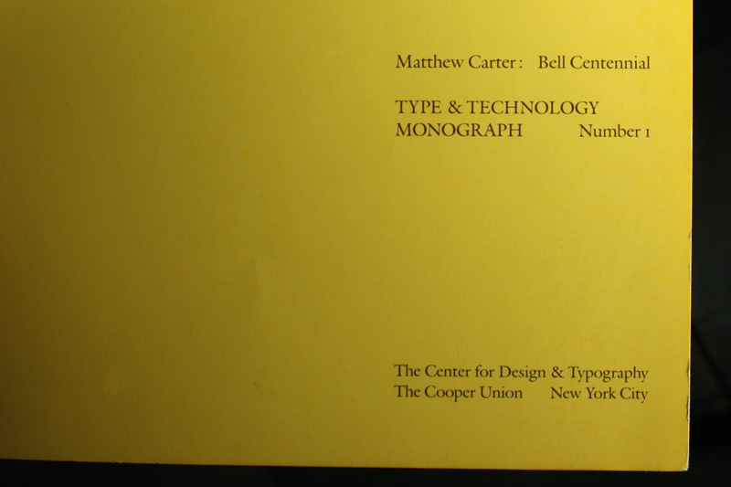
In 1982 the Center for Design and Typography at The Cooper Union (which I believe was the precursor to the Herb Lubalin Study Center of Design and Typography that was established in 1985) published its first Type & Technology Monograph on the development of Matthew Carter’s Bell Centennial — the type family he developed in 1976 for AT&T when he was commissioned by Mike Parker, Director of Typographic Development at Mergenthaler, to update Bell Gothic, the typeface designed by Chauncey H. Griffith and used in the company’s phone books since 1937. Carter was kind enough to lend us a copy of this hard-to-find booklet for our research on Bell Centennial, here are some photographic highlights.
You may click on any image to see it bigger.
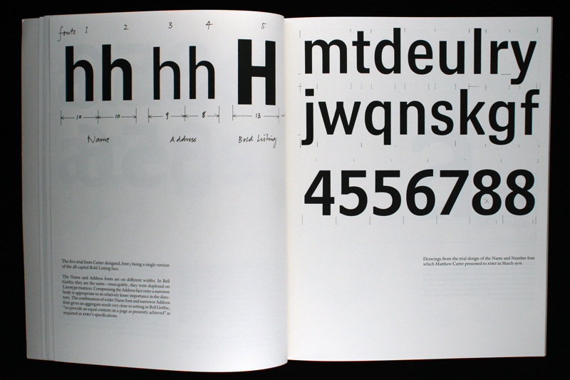
Carter developed a family consisting of four styles: Name and Number, Address, Sub Caption, and Bold Listing (the fifth font in the image above is an all-caps version of Bold Listing). The right-hand page shows the trial drawings of the Name and Number typeface.
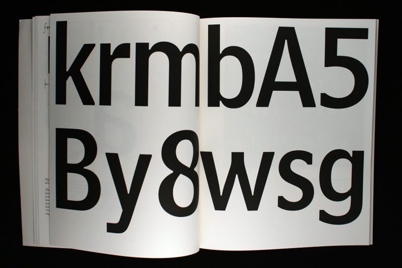
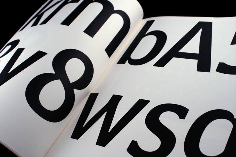
No explanation needed: Large, juicy letters!

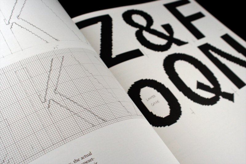
One of the biggest challenges was the production of the actual font to be used in AT&T’s CRT (Cathode Ray Tube) typesetting machines which required the characters to be designed as bitmaps and to make the typesetting machines operate at the fastest speeds it required the least amount of bits, rendering the fonts coarser. So Carter had to translate the smooth characters he had designed into coarse versions of themselves, making every decision to “turn on and off” bits critical. Can you imagine if Fonstruct had been available then?
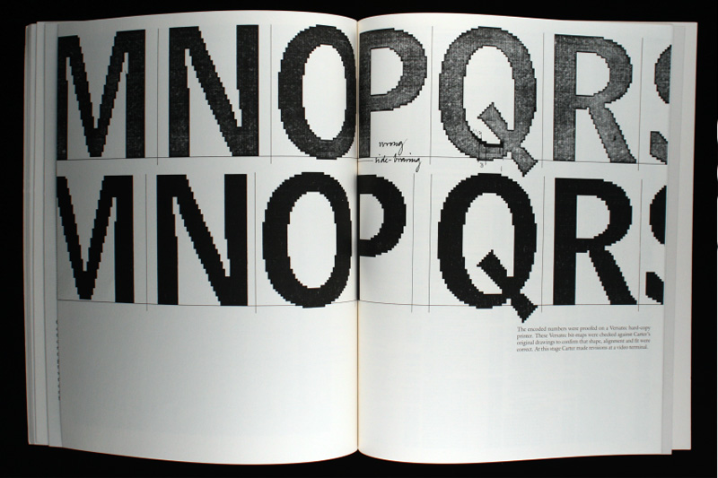
Comparing the digitized characters to Carter’s original drawings.
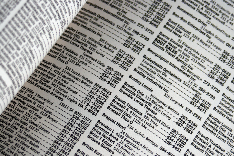
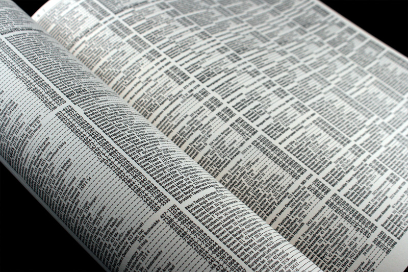
The final result is best appreciated in the relatively formidable phone book, and here are some samples of Bell Centennial typeset in its intended use. As Bell Centennial became available as a retail type family in the digital age, designers found an attractive feature in the functional ink traps of the Bold Listing weight and happily blew it up to sizes that would be anything but economical in a phone book.
So, here’s to Bell Centennial, Matthew Carter and all the wonderful booklets that show the design process with so much detail, we certainly could use more of these.

are the ink traps visible in the sketches?
On Sep.24.2008 at 02:22 PM