
Nick Shinn
August 6, 2003
by Christopher May
Speak Up: When you begin to
create a typeface like Merlin or Fontesque, do you have specific criteria you
set initially, or is the process an open exploration? In other words, do you
say to yourself "damn I feel like designing one of them 'bitchin' wizard
fonts!"
Nick Shinn: Both. I try to explore
as many ways of, and reasons for, designing typefaces as possible. Blame it
on Sgt. Pepper. But any particular typeface wouldn't be worth doing if there
was only one reason. It's the interplay of criteria that creates the design
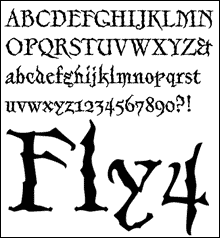
challenge. Merlin, for instance, was inspired by the word Errazuriz (all caps)
on a wine label. I didn't recognize it as a typeface (still don't), so I thought
"Hey, I wonder what the rest of the letters could look like." Of course,
Errazuriz was only the starting point. The intricately drawn finish was another
concept I was thinking about at the time - serifs on serifs on serifs - kind
of fractal. And the idea of mixing blackletter spikeyness with humanist letterforms
was something else that got mixed into the pot. But in general, yes, I was probably
thinking, "Dude, time for a kickass goth monstrosity".
SU: I read a publication where you were quoted saying "I also want to create faces that are design solutions"...
Can you elaborate on that statement? What typefaces in particular does this
apply to??
NS: Most of them. Handsome,
for instance, was a design solution to the criteria:
* Fully cursive script
* Written directly in Fontographer with the pen tool, using a Wacom tablet
For Eunoia:
* High contrast sans serif
* A family of 3 self sufficient typefaces, with distinct personalities, whose
members can be mixed with one another as alternates
* Includes a unicase (I've been teaching a type design course for 4 years at
York University, in Toronto, and the student project is to design a unicase
typeface, so I thought it was about time I walked the talk.)
My most recent face, Preface, is an attempt to combine trendy letterforms from
a variety of hot faces into a single typeface.
So they're not really design solutions for particular uses, more design solutions
to sets of formal criteria.
However, Brown, Walburn, and Worldwide were commissioned specifically for newspapers.
And Richler as a book face. )

|
 |
|
But in general, yes, I was probably thinking, "Dude, time
for a kickass Goth monstrosity".
|
|
SU: How old were you when you
designed your first typeface?
NS: Twenty two.
SU: What was the catalyst that
led you to design type?
NS: I have always liked to write
and draw, and disliked specializing. I took Fine Art because it gave me the
opportunity to do both, and I went into advertising for the same reason. Typography
fascinates me because it's at the junction of word and image, at the heart of
culture. So type design is an ontological pursuit. The catalyst that pointed
me in this direction was probably the school I went to, Bedford, in England.
It's a very old public school - those institutions put a strong emphasis on
intellectual curiosity.
SU: Was your first attempt
a trophy piece or something you quietly swept into a box, and put in the closet
underneath a pile of magazines?
NS: My early work wasn't very
good. I was outside the loop, and had no formal training in graphic design or
lettering. My first published face was Gryphon, for Headliners in 1980. Shinn
Sans (1985) was the first that wasn't embarrassing, But it was so much work, because
I had to piece together photocopies to see how the design set. Being able to generate
and test fonts as part of the design process, with Fontographer (I started in
1993) made all the difference in improving the product.
SU: Who would you say has been
your biggest influence on your work, what inspires you?
NS: My children have been the
biggest influence in recent years. When my son got into drum and bass, and my
daughter into hip hop, my first response was, fuck this shit isn't even music,
but they turned me on to the good stuff, got me out of the fogey rut. I'm a
member of the Type Club of Toronto, and often it feels like the Historical Type
Club of Toronto. I am so angry at the present state of typography, dominated
by old sans faces, - that gives me the strongest motivation to design new typefaces.
My biggest inspiration is the way the "?" follows the "f"
in Charter. I try to design all my characters to fit together that immaculately.
|
Seeing my typefaces in real applications makes me high. |
|
 |
|
SU: Fontesque is a face that
I have seen in many executions including broadcast media and packaging. What
type of reaction do you feel when you see your fonts in real applications?
NS: Seeing my typefaces in real
applications makes me high.
SU: Was there ever a time when
you observed one of your typefaces in a piece that you either disliked, disagreed
with, or wanted no association with?
NS: Never.
SU: Would there be a situation
or application in which you would never want to see any of your typefaces used?
NS: No. As long as the license
is paid for. As a professional, one does one's job, irrespective of the client
or customer's ethics or design skills.
SU: What is your all time favorite
typeface? why?
NS: Nicolas Jenson's 1476 typeface.
It's the definitive typeface.
|
 |
|
As a professional, one does one's job, irrespective of the client
or customer's ethics or design skills.
|
|
SU: How serious do you take
type design? Is it something you live religiously or is it something you enjoy
simply as a job while pursuing other passions outside of the studio?
NS: I work all the time, but
not much of it is actually type design, maybe 20%. There's time spent on the
business side of ShinnType, and I also write, teach, speak, and am involved
with a number of type organizations. I also art direct; recently book covers.
Outside the studio, apart from the usual vices, I play squash 2 or 3 times a
week.
SU: Do you have any new projects
you are currently working on?
NS: Death to Helvetica!
SU: Could you fill us in on
this?
NS: Helvetica is the #1 selling
typeface at
MyFonts. It's given
away with every operating system. It's the corporate face of the multinationals,
be they the Gap or Getty Images. But it's only one of the many old sans fonts
that dominate today's typography. What does this say about the present age, when
its spirit is best expressed by vintage and traditional sans faces? It speaks
of a fascist aesthetic˜banal, conventional, monolithic and utilitarian. In
1923 Paul Renner designed Futura, which he termed "The Typeface of Our Time"
The typeface now known as Helvetica is a rip-off of Akzidenz Grotesk (1898), itself
derived from faces originally designed in London in the 1830s: it a typeface of
the 19th century, not the 21st.
Helvetica must die!
SU: Are there any last words
of advice you would like to leave our readers?
NS: Don't use stock. Support
your local photographers, illustrators, and type designers, or do it yourself.
If you buy creative from the multinationals, you are digging your own grave.

This interview has been conducted exclusively for Speak Up.
Reproduction without our written consent is strictly prohibited. Please if you would like to use it for educational purposes or if you are interested in other means of reproduction. Thank you for your understanding.