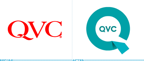

I just spent the seven most painful minutes in recent memory for the love of the rebrand. At 10:54 pm I decided to tune in to QVC to see the new identity in action. First, I had to locate it in my cable line-up: QVC is sandwiched between ShopNBC (I had no clue!) and Brooklyn Community Access Television (sweet!). A lady and a man with an ear-piece were selling a jewelry box. I watched, knowing that at the turn of the hour I would get a chance to see an interstitial or ident showcasing the emperor’s new clothes — which, by the way, you can buy in four easy installments! My patience was rewarded with a white screen coming to life beautifully with a near-cyclic animation of the new, ribbon-like Q that shelters the perfectly classic and simple letters that form the name of the channel, which also animate nicely on screen. Then Joan Rivers’ Classics started and, before I poked my eyes out, I swiveled to my computer to write this.
Continue reading this entry


