

NOTE: This is an archived version of the first incarnation of Brand New. All posts have been closed to comments. Please visit underconsideration.com/brandnew for the latest version. If you would like to see this specific post, simply delete _v1 from the URL.
![]()
I just spent the seven most painful minutes in recent memory for the love of the rebrand. At 10:54 pm I decided to tune in to QVC to see the new identity in action. First, I had to locate it in my cable line-up: QVC is sandwiched between ShopNBC (I had no clue!) and Brooklyn Community Access Television (sweet!). A lady and a man with an ear-piece were selling a jewelry box. I watched, knowing that at the turn of the hour I would get a chance to see an interstitial or ident showcasing the emperor’s new clothes — which, by the way, you can buy in four easy installments! My patience was rewarded with a white screen coming to life beautifully with a near-cyclic animation of the new, ribbon-like Q that shelters the perfectly classic and simple letters that form the name of the channel, which also animate nicely on screen. Then Joan Rivers’ Classics started and, before I poked my eyes out, I swiveled to my computer to write this.
The new identity, last updated fourteen years ago, is part of a larger advertising and marketing campaign that support a major overhaul of the channel. One that attempts to monopolize the letter Q — even if the U.S. Trademark database returns 1,971 results for anything filed simply under “Q”. Their motto, iQdoU? (I Q, do you? Just in case it took you as long to get it as it took me), takes center stage amidst a Qstatic frenzy: As The New York Times reported, there was “a house band called Q Man Group (with special guest Motley Q) [that] performed rock songs” during the unveiling at the company’s headquarters in West Chester, Pa., then there is the Qture (It’s so Q. It’s so U.) products, the QLounge, and everyone’s favorite Queer Eye, Carson Kressley, delivers the channel’s first National TV ad’s punch line Merci Beau Q. (I do have to apologize; yesterday I had seen the ad online, but now I can’t locate the link).
All in all: Cheesy, bubbly and slightly icky in that TV shopping way. Yet, despite the unwatchable content (at least for me), the new logo surpasses any expectations I may have had about QVC. It is a delightfully simple idea — it’s a ribbon, who doesn’t like ribbons? specially when you are the one unraveling it — executed in an amazingly restrained manner — a perfect, thick circle, with a notch-and-fold at the 45-degree mark, punctuated with a simple, restrained and pertinent shadow that makes the logo feel as if it were about to peel off the screen. The simple QVC sans letters in the middle of the Q don’t add much to the logo, but as part of the requirement, they are perfectly acceptable. This is a tremendous leap for QVC, it feels modern and bold, yet in the color choices (teals, purples, pinks) it portrays a softer side, aimed at their female audience, which I would go out on a limb and wager it’s the majority. What this logo does, that I haven’t wanted to do in a long time, is it makes me want to reach and touch it, pull that loose edge and unwrap it. Hmmm, that jewelry box doesn’t look so bad at midnight.
Update 9/30/07: Unconfirmed references of who may have designed this identity have been removed as requested from interested parties.


Jump to Most Recent Comment
Paul’s comment is:
Really drawn to the negative space in the new logo, for some reason; it is speech bubble-ish, but doesn't feel forced.
Modern, fresher, way nicer than the stodgy old mark.
On Sep.28.2007 at 12:21 AM
Mr. One-Hundred’s comment is:
I just finished a “Q” logo (Qmusic) and am now working on another highly classified Q logo. However, I live in Queensland, so they are probably much more common in this part of the world.
This rendering of the letter Q kicks arse on everything I have done thus far, and the fact that I popped into Brand New just now as a respite fom Q logos makes me think i should seek further respite by going home.
Bye!
On Sep.28.2007 at 12:27 AM
Dale’s comment is:
From the press release:
"Formed by a ribbon in the shape of a “Q”, the new logo suggests the feeling of a package that’s being opened."
It doesn't read as a ribbon to me at all, more like a sticky decal that someone has decided to partially peel back (perhaps in manner of a price tag?) A ribbon doesn't lie flat in a perfect circle like that and since they're insisting we see it 3-dimensionally, that's an issue.
If they think it's a ribbon...fine, whatever. But: if viewer supposed to make the mental leap that ribbon = gift = package = shopping, I don't see that happening.
On Sep.28.2007 at 12:28 AM
brian’s comment is:
Love it, best refresh we have seen in a long while. Great work.
On Sep.28.2007 at 12:35 AM
Ty’s comment is:
A fine job. Definitely, won't be watching QVC anytime soon, however.
On Sep.28.2007 at 12:42 AM
Splashman’s comment is:
Dale, you're over-thinking it. Part of design is being able to see things through they eyes of a regular Joe, which necessitates putting one's micro-analytical design sensibilities on hold.
My first reaction was not "ribbon", but I got "unwrap" right away, and from there it was a short leap to "ribbon". That's how I think most people will see it, if they think about it at all. And that's a pretty impressive achievement for such a simple logo. Also impressive is the restraint that kept the designers (and the suits at QVC) from adding a faux-satin sheen to the ribbon.
I'm sure y'all can imagine animations of this logo that will deliver "ribbon". Whether QVC does that or not, I say this logo delivers, in spades. As Armin said, it makes me want to grab the edge and yank.
Can't stand the green with the teal, I must say. With the size differential, the slight difference in hue reads as a mistake. Armin, does QVC actually use that color scheme anywhere? It's not on the their website, thank goodness.
(Counting down to the first commenter whining about this logo not working in lineart/fax/emboss: 5...4...3...2...)
On Sep.28.2007 at 12:53 AM
Tim Chambers’s comment is:
Ditto on splashman's comment regarding "unwrap" as a first impression.
As you mentioned, it's very tactile and makes me want to reach up and grab it. I guess I'd need a TV before I could see it in action, though. Do they sell those on QVC? How would I order one?
On Sep.28.2007 at 01:47 AM
Lucian E.’s comment is:
Nice work! Simple and clever.
On Sep.28.2007 at 04:25 AM
Frank’s comment is:
I think this logo will not be working in lineart/fax/emboss.
;)
Christian Palino’s comment is:
Noting the previous logo/wordmark, this is a step in the right direction. The new choice of typography is less dated and stands a better chance at holding up over the years (especially given the removal of the poorly handled knocked-out Q tail). The color (while not to my subjective liking) suits them well. And certainly relying on the "Q" in a bold, graphic way will pay-off when context demands only a small logomark.
However I do take some issue with the lock-up and the logo.
• The size of "QVC" in combination with the drawing of the "Q" in this type face put some serious limitations on the logo being scaled down. The "Q" does not read very well at small sizes, especially on screen. While you may be able to get away with it in the context of their site (http://www.qvc.com/), outside a fully branded context the "QVC" would suffer less recognition. This is a key point if QVC is rebranding in an effort to get into new contexts and attract new audiences/customers.
• As for the logo itself, I'm someone who thought about… painter’s tape, and it falling off the wall. Certainly we all immediately see something different in this strip of paper/ribbon/tape forming the "Q" – the question is how effective is this solution at communicating ideas of unwrapping/gift/shopping in a positive and reinforcing way. I might be missing something but I would argue that irrespective of what the circle is made of, the chances of the audience seeing a circle that is falling off the surface are high and possibly carry a negative connotation (I know it did for me). Could there have been a more unmistakable solution?
Overall this rebranding is strong and I agree, remarkably well restrained – with many application opportunities. However, could it have been better, more unmistakable in its syntax/semantic references? Perhaps, but it certainly is better than most of what we see these days.
…As for "iQdoU", that doesn't stand a chance. Sounds like a rather senior panel of executives trying to wield the new/hip/young/techy language of the youth … from the 90’s.
On Sep.28.2007 at 05:30 AM
Dav(id Hubner)’s comment is:
Lovely mark, so I say. Yea, they probably should have spent some more minutes on rethinking the size of the inner 'QVC' part, but nice nonetheless.
On Sep.28.2007 at 06:06 AM
LKM’s comment is:
The text in the middle looks like avc to me.
On Sep.28.2007 at 06:58 AM
Chad K’s comment is:
The size of "QVC" in combination with the drawing of the "Q" in this type face put some serious limitations on the logo being scaled down.
The logo, for instance on there website, is quite small already. If you can image one that size on a letterhead, it would not have to be scaled much further if at all. What is also nice is that the outer Q makes the whole marked self contained so you do not need to worry about a separate wordmark interfering with other design elements that you may be using. I think there is a potential, although it will never reach the same recognition, to completely get rid of the inner QVC and treat the mark as the identity (example - Target).
I might be missing something but I would argue that irrespective of what the circle is made of, the chances of the audience seeing a circle that is falling off the surface are high and possibly carry a negative connotation (I know it did for me).
I think the answer is in the question—"the chances of the audience". Anybody who watches QVC or knows what they do will certainly not see it as painters tape. There is a subtle detail that portrayed ribbon to me. It was that they did not simply break the circle and fold it up. If you would imagine the folded part laid donwn back over the circle, there would be an overlap. Because of the extra, we'll say material in this case, it makes me think of the excess ribbon that hangs from a package when tying a bow. See the more literal translation below:
Blake’s comment is:
Okay, why do they have to take the Q thing so far? Emphasizing the Q is fine by me. Don't really mind it. It's cute. The logo works well enough. Of course, they had to add a drop shadow there on the bottom. Otherwise I think it's actually a nice sell. I really disliked the old one.
But like I said, how come they have to take the Q thing so damn far? We get it. It's a Q. QVC starts with a Q. We get it. You don't have to force it down our throats with weird slogans.
Bah.
On Sep.28.2007 at 08:25 AM
dale the merciless’s comment is:
i am such a fan of this. such a breath of fresh air from the recent rebranding tripe we have seen.
On Sep.28.2007 at 08:49 AM
jj’s comment is:
Armin,
Everyone knows that you should never watch QVC when you are sleepy. (Not to mention, under the influence, lonely, depressed, or even slightly melancholy.) Before you know it, you'll have purchased a plus-sized dress, an eliptical trainer and one of those nascar die-casts to fill the void.
Not that it's happened to me...
On Sep.28.2007 at 08:58 AM
andrew miller’s comment is:
this is nice. a successful rebrand.
i could do without the "iQdou?" thing, though.
On Sep.28.2007 at 09:02 AM
Christian Palino’s comment is:
Chad K,
The legibility of the "Q" in the QVC is certainly debatable – and a small issue that I am picking on… but we know what they say about details. On their website it is soft. It seems there could be large-scale and small-scale versions that employ some light wells or adjusted drawing, likewise with a screen version.
As for the Q logo
I think the answer is in the question—"the chances of the audience". Anybody who watches QVC or knows what they do will certainly not see it as painters tape.
I know what QVC is and I saw painter's tape – though this is beside the point. The question isn't what do people see but rather could it be less mistakable and better steer the viewer to form certain visual connotations and therefore derive more specific meaning. In addition, my comment on this is aimed at new contexts and audiences as noted – specifically people not familiar with QVC.
See the more literal translation below:
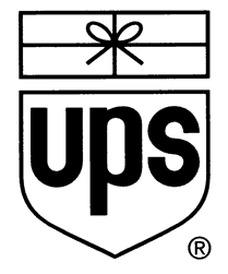
Comparing this QVC logo to Rand’s masterful UPS logo to note the effectiveness of the ribbon/package concept is utterly lost. These logos are truly not in the same league and thus we return to the question – could this QVC logo be better?
On Sep.28.2007 at 09:23 AM
darrel’s comment is:
Nice.
But, uh, what does QVC actually stand for? Anyone remember? I don't.
On Sep.28.2007 at 10:20 AM
Chad K’s comment is:
Quality, Value and Convenience
On Sep.28.2007 at 10:37 AM
Chad K’s comment is:
These logos are truly not in the same league and thus we return to the question – could this QVC logo be better?
That is exactly my point. What makes the UPS logo better? The lack of gradients? The more literal translation? What could be taken from this to help QVC?
On Sep.28.2007 at 10:40 AM
sukisouk’s comment is:
well, it is so much like quicktime…

color, silhouette, proprtions…
but o.k., i’ll never watch it anyway ^^
Mark’s comment is:
I like the logo, fresh,clean,unique.
The problem I have is the size of the text,and the inner "Q" the stem part is so short that on a small scale it seems to read "OVC" or AVC"
The logos really quite cute.
The slogan however doesn't work for me "iQdoU?"? please. I can see their trying to target a younger audience but the slogans too forced.
One plus, you've got me to look at QVC (well watching it muted, that is)
Quite original overall,reminds me of that old abc logo where the "abc" is inside a larger lowercase "a".
On Sep.28.2007 at 12:53 PM
Persia’s comment is:
I love it! Remember that things you order from QVC are shipped directly to your home-- so the 'opening up' is far more immediate to the mind than painter's tape falling off the wall.
My mother shops from QVC all the damn time. I have to admit, sometimes she gets decent stuff. (And Tim, they have a website!) I think this is perfect for customers like her, and also closer to what a younger audience might like than the previous logo.
On Sep.28.2007 at 01:40 PM
Splashman’s comment is:
Christian, show me a hundred good logos and I'll point out how every single one can be interpreted differently than the designer intended. No logo is "perfect" in that regard, and nobody here will make that claim for the QVC logo. It goes without saying that any logo can be made "better," at least in the minds of all of the backseat designers on this blog. I (and the other commenters, I believe) am merely opining that this design is pretty dang good, all things considered. You're welcome to disagree, of course, and to propose ways to improve this design, but there's no need to build and attack strawmen.
Sukisouk: yawn. You could have chosen any of a hundred other logos that employ a "Q". This sort of post gets tiresome very quickly. "Color"? Um, yeah, and if QVC's new logo was orange, you would have found an orange Q to post. "Silhouette"? Um, yeah, it's exactly the same, except for where it's not. "Proportions"? Gawd. If someone complains that "Q" isn't original, I'm gonna barf.
I agree with other commenters that the tail of the Q needs to be augmented for the small-scale, low-res web logo.
And yes, the tagline is kinda lame. But it leverages the "Q" of the logo nicely. All in all, a well-considered re-branding, IMHO.
On Sep.28.2007 at 02:50 PM
disgruntled designer’s comment is:
if abc, quicktime, and goodwrench had a ménage à trois this is what would come out.
On Sep.28.2007 at 04:05 PM
disgruntled designer’s comment is:
... nine months later that is.
On Sep.28.2007 at 04:07 PM
exigent’s comment is:
Bravo on a great rebrand. I find it much more attractive than the Quicktime logo.
On Sep.28.2007 at 04:18 PM
Red Sox Jim’s comment is:
I hate home shopping channels (they're scams or cheap crap 24/7) but that logo is GREAT.
On Sep.28.2007 at 05:56 PM
Joe Marianek’s comment is:
So hard to say goodbye to the bastard ITC Americana.
On Sep.28.2007 at 09:57 PM
Joe Marianek’s comment is:
So hard to say goodbye to the bastard ITC Americana.
On Sep.28.2007 at 09:58 PM
Ty’s comment is:
I really dislike how there is little continuity between the small Q and the large Q.
On Sep.29.2007 at 09:54 AM
John Colucci’s comment is:
This is absolutely a fantastic rebrand. Absolutely amazing!
On Sep.29.2007 at 02:34 PM
Splashman’s comment is:
So, Ty, what's your solution? Dumb-down the large Q? Or use the pulled-ribbon Q on the small one?
(For those keeping score at home, the answer is "neither," for what should be obvious reasons. QVC got it right.)
On Sep.29.2007 at 07:23 PM
Ty’s comment is:
Splash,
Although I appreciate your rush to judgement, I think it would be entirely feasible to remove the gradient shadow from the large Q and scale it down to the small Q. And you could even close the Q, the main thing to bring continuity to is the tail on both Qs.
On Sep.30.2007 at 12:46 AM
brian’s comment is:
In my opinion, this a very mature, effective use of a gradient in a logo. I too would be concerned about this particular mark in very small sizes as Christian and Chad commented above.
Here it is at 50%
![]()
Use the Q only?
![]()
Use an alternate set-up?
![]()
I'd love to know the "official solution." Also, even though I think this is a good use of a gradient in a mark, I'd also like to know if they created a one-color solution for alternate use.
Anyone able to stomach this?
![]()
Christian Palino’s comment is:
Christian, show me a hundred good logos and I'll point out how every single one can be interpreted differently than the designer intended. No logo is "perfect" in that regard, and nobody here will make that claim for the QVC logo. It goes without saying that any logo can be made "better," at least in the minds of all of the backseat designers on this blog. I (and the other commenters, I believe) am merely opining that this design is pretty dang good, all things considered. You're welcome to disagree, of course, and to propose ways to improve this design, but there's no need to build and attack strawmen.
Splashman, easy there we're all in this together, all the new brand marks here are just a point of discussion. I believe I noted that this QVC effort is strong and better than most, I'm not intending to tear it apart by engaging in a bit of critical banter.
Certainly there can be many different interpretations of visual/graphic marks and exercises, and this is one of them. I have not claimed that the mark needs to have only one undebatable interpretation – merely that it could be more focussed.
On Sep.30.2007 at 03:14 PM
Kyle Hildebrant’s comment is:
I just love this. Kudos to whoever did it.
On Sep.30.2007 at 06:12 PM
Splashman’s comment is:
Christian: My point was that your "critical banter" ("could be more focused") could apply to almost any logo, including the hallowed UPS (what does a shield have to do with delivery? Put the package on a truck! /sarc), and to me seems tedious for the same reason that sukisouk's Quicktime comment is tedious. But maybe it's just me.
I'll shut up now. (cheers from the gallery)
On Oct.01.2007 at 02:51 AM
Chad K’s comment is:
I still think the small one works. No alternate necessary. I orginally thought an alternate might be appropriate also but as seen in brian's comment. It just looks funny–like something is missing from the inside of the Q. I don't mind the one color example either.
Thanks for the examples brian. I think if more people showed us what they were thinking than just stating that there could be a better solution, we would get a lot further in our evaluations.
On Oct.01.2007 at 07:42 AM
agrayspace’s comment is:
Enough with the questions about 1 color solutions. Seriously we need to embrace the future. Fax machines, really?
Anyway I'd say this is beautifully restrained. I wonder if the ribbon idea would have been just a little stronger if the peeled up part had just an oh-so-subtle curve to it.
On Oct.01.2007 at 12:02 PM
Von Glitschka’s comment is:
Christian Palino's said "No logo is "perfect"."
Anathema!
![]()
![]()
Splashman’s comment is:
Brian: apparently you didn't take a gander at the QVC website which Armin linked to. There, the logo is even smaller than your reduction, and it works just fine, IMHO. In an earlier comment, I agreed with another commenter that at smaller sizes, the Q in QVC should be modified to lessen the risk of it being mistaken for an "a", but I've changed my mind. Today's more savvy public will be expecting a tie-in between larger and smaller, and I'm confident that virtually all will see the smaller Q as a Q. And keep in mind that one of QVC's primary goals is to "own" the letter Q, which requires that they push "Q" more than "QVC" (can't emphasize both -- there's that "lack of focus" thing that somebody mentioned).
Lineart/fax considerations are too negligible to appear on my priority list, but to answer your final question, your reversed "tab" is, in my opinion, too different than the original (back side of ribbon different color than front side). Here's how I'd do it:

The width of the white edge would have to be adjusted for various sizes/resolutions. In this case, I thickened the white edge before reducing.
On Oct.01.2007 at 02:09 PM
stock_illustration’s comment is:
Kudos splashman. That's just how I would expect the b/w version to look. I also was concerned about the small sizes, but after seeing it reduced, it really isn't much of an issue. Plus this will look great as the onscreen watermark logo (whatever that's called).
On Oct.01.2007 at 04:19 PM
brian’s comment is:
Splashman, yeah I took a gander at the website — it is slightly smaller there. So I'm softening a bit on this mark having problems at small sizes…
I dig your version. I would probably go ahead and completely clip the top-edge of the Q's tail.
Agrayspace, I recognize that in this super-fancy modern world of ours one-color solutions aren't always necessary. Call me old-fashioned but, I thought it was fun to explore a possible solution during my free-time.
But now that you mention it, I think ALL possible reproductions should be explored when creating an identity for a sizable client. How will it look in CMYK? Hows 'bout as a nifty animated mark? I'm sure QVC coughed up more than enough dough to have a complete identity created for their brand.
On Oct.01.2007 at 04:22 PM
Chad K’s comment is:
Nice one color update. The solid ribbon tail really emphasizes the tail of the Q–Something that was missing in brian's.
On Oct.01.2007 at 04:28 PM
Splashman’s comment is:
Brian, I agree with you that "all possible reproductions should explored..." Some folks (not you, I'm guessing) seem to think that faxability (or some other consideration) should trump all -- meaning, if you can't fax an unaltered logo, it sucks. That's where I get off. Yes, some companies have frequent need for lineart reproduction, and it goes without saying that those companies' logos should reflect that need. For most companies these days, however, lineart is rarely used or required, and when it is used, a reasonable variation can be created (see above). Until there is reason to believe otherwise, I'll give the QVC designer the benefit of the doubt by assuming that faxability was considered, but placed far down on the priority list (right next to "must be able to recreate it with linguini").
On Oct.01.2007 at 04:39 PM
Steven Clark’s comment is:
I really love the simplicity here… even the gradient makes me smile. So what makes this mark so much more successful than the Chevron mark? Maybe Chevron could learn something about use of gradients from QVC?
Subtlety, subtlety, subtlety…
Works on television.
Works on web.
Forget about fax.
Sc/
On Oct.01.2007 at 07:15 PM
Matias’s comment is:
Could you write something about another "Q" logo, the Quark logo? Seems like it has been changed for 3 times in a short time span.
On Oct.02.2007 at 11:35 AM
C-Lo’s comment is:
Spic and Span. Just how I like em. The one color I think holds its own. And as my old teacher said "If it doesn't work in one color it doesn't work with any color." Something like that.
On Oct.02.2007 at 02:42 PM
alba’s comment is:
I think the logo is confusing (or repetitive). Is the name QQVC? How about this instead?

or

Splashman’s comment is:
I strongly recommend y'all don't dig into the source code to get the links to Alba's, uh, interesting attempts. I did, and gawd almighty, hotballs are no fun. *urp*
On Oct.02.2007 at 03:28 PM
Chad K’s comment is:
Terrible examples as to possible solutions–to a supposed problem–only exemplify how nice the new logo really is.
On Oct.02.2007 at 04:00 PM
Christian Palino’s comment is:
Von Glitschka’s comment is: Christian Palino's said "No logo is "perfect". Anathema!
Von Glitschka, I didn't say that "no logo is perfect" – that was Splashman and he was referring to not being perfect in respect to interpreted meaning I believe.
I am definitely of the mind that there are perfect logos.
On Oct.02.2007 at 04:41 PM
SP+O Aaron’s comment is:
I'm reminded of Overstock.com when I see this campaign of "it's all about the letter". I wonder if they took a "Que" -pun intended- from Overstock.
On Oct.03.2007 at 01:05 PM
Wes’s comment is:
This may have been already addressed, but it's late and I'm not wearing my glasses.
This logo, in my opinion, blows. It blows pretty hard.
QVC's original logo was nothing to be proud of, but this looks like a complete rip off of Quicktime.
It appears to me that QVC is trying to rope in Mac enthusiasts by getting our attention with something that we see when we use our favorite toys.
To put this into more palpable terms: This logo is the equivalent of taking Versace and selling it at Kmart under the "Home Living" Section.
I mean, honestly.
Jeunesse’s comment is:
"Wes’s comment is:
but this looks like a complete rip off of Quicktime"
It's a capital "Q" , all capital Q's look like that people!
Can anyone explain to me how this is rip off of the Quicktime logo?
On Oct.11.2007 at 12:14 AM
Greg’s comment is:
i do not like it at all i like the old one better.
On Nov.01.2007 at 04:47 PM
Kellie’s comment is:
I love the Q.
I think it modernizes the mark, adds value to the brand and speaks to a younger, more sophisticated audience without losing their die hards.
When you see it in action, you see the full system of colors and categories. I think it's truly well thought out and brilliant.
Personally, I watch QVC because they are marketing/sales experts. Anyone who can sell 10,000 units in less than 5 minutes is on to something...and it's something I should listen, learn and bring to my clients. Don't be a snob. These QVC people are your client's customers.
On Nov.04.2007 at 12:16 AM
Douglas CohenMiller’s comment is:
Can anyone say "Quicktime"?
On Nov.05.2007 at 07:00 PM
Mark’s comment is:
ugh, please enough with the Quicktime refrences, it looks nothing like Quicktime.
On Nov.05.2007 at 10:40 PM
Theresa’s comment is:
Hello, everyone. I know it has been a while since your discussion here, but I just stumbled upon it this evening and was fascinated by all your insights & input. I was glad to read similar thoughts though I'm not in your industry, but I am an avid QVC shopper with a BFA who's very visually oriented.
I did not know of the intent to update the logo before it launched... In western PA there weren't all the billboards. And I did see the IQdoU spots, but since I already do 'Q' and have referred to my shopping as "Q-ing" for some time now, these spots were lost on me. However, when I did see the logo for the first time, my mental process was as follows. Firstly, I thought, new logo sorta looks like a ribbon... but kinda stiff, like the construction paper Captain Kangaroo used to use...very heavy stock -the good stiff stuff. Then, as someone mentioned previously, I also thought to myself, ...but a ribbon doesn't lay like that. You'd have ruffles in the interior if it were ribbon laid out in a circle. And also a ribbon tail would be softer and slightly curved, not seemingly standing out from the page. But remember, the ribbon WAS my first impression of their efforts. (and WHO DOESN'T love pulling ribbons??)
And I don't know if it is an optical illusion, but it appears to me that if I were to 'unfold' the tail of the Q and flatten it out to overlap the other end, well, it looks as if it wouldn't match-up. Like it would end a bit into the center of the circle. Almost as if the arc along the inside bottom is smaller than, say, the other 320 or so degrees. And my eye is drawn to that and it kinda bothers me. I really just wanna reach in and unfold it and straighten it if need be. A little OCD? Perhaps, but these are the things I notice.
Also, previously mentioned was the negative space resembling a speech balloon I really appreciate negative spaces and also noticed this. With the smaller QVC inside, it's as if it's subliminally being spoken.
Anyhow, I liked that it was cleaner than the older red QVC, the cooler teal is a noticeable change for me. The same with the website design. Very modern, clean, almost minimalist first impression. But again, to specifically address the logo, all in all I like it. The novelty of it is eye catching for even those of us who tune-in almost daily. Also, of the three, Quality, Value & Convenience, I personally feel the quality is most important. ('First word' in Television shopping as I've heard) so to just zero in on the 'Q' I saw as rather clever.
By the way... in regard to the color: The holiday scheme has the new logo in a deep pine-like green. I like it better in this deeper color, actually. Not necessarily the green, just a deep dramatic color.
I know I have noticed some things the average non-designer person may not notice and I do tend to over-think the visuals sometimes, but I thought I'd share my thoughts with you, the pros, and let you know there are some laymen out here that do notice the details. Thanks for listening to my comments!
On Nov.26.2007 at 12:12 AM
Joe P’s comment is:
I'm pretty sure that eventually this logo will be able to stand alone and was probably the intent. Whether it's a ribbon, package, or however it is interpreted it gets people thinking and is noticeable.
Simple, simple, simple.
EXCELLENT job.
Jason Jersey’s comment is:
I'm not going to sit here and stroke QVC one bit! I am a former employee of the QVC, St Lucie Customer Services call center for over a year. No, I am not some ungrateful fired employee. I am just some guy who was indeed hijacked by QVC and yes I quit!!
This is nothing but mumbo jumbo to you at this point.. But the rock bottom deal is I am a bad asz developer and QVC filed suit against me to single handedly jack my 'styles and format' and buttons which they screwed up..
If you are interested.. Then read here: http://www.planetqvc.com
On Nov.30.2007 at 12:02 AM
David Carvalho’s comment is:
Looks nice!
On Dec.26.2007 at 11:19 AM
Jacob’s comment is:
It was Mode (www.modevisual.com) and Imaginary forces (www.imaginaryforces.com) who did this rebrand.
On Mar.04.2008 at 10:04 PM
Menk’s comment is:
Win. Perfect shape, color, tasteful use of gradiation, excellent type choice.
On Dec.12.2008 at 10:23 PM
Comments in Brand New, V1.0 have been closed.


