|
JUNE 12 |
OCTOBER 16 |
NOVEMBER 13 |


• Opposites Attract ’08 Home
• OA’08 has been organized by UnderConsideration LLC and is hosted by the Art Directors Club
• OA’08 is run with Six Apart’s MovableType 6.1
• With a few individual entry exceptions, OA’08 is programmed to be W3C compliant and is valid XHTML 1.0 Transitional
• Syndicate / RSS Feed
Disclaimers
• All comments, ideas and thoughts on OA’08 are property of their authors; reproduction without the author’s or OA’08’s permission is strictly prohibited
• OA’08 reserves the right to delete any comment deemed offensive or unnecessary
Contact
By all means, please

October 09, 2008![]()
The Joy of Centered and Justified Classic Typography
It seems like an easy typographic mannerism, to just space out some classic serif typography in a centered arrangement, but it takes real devotion to achieve this kind of elegance and simplicity.
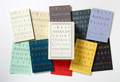
Various covers for The Best American Series by the Houghton Mifflin Company. A bigger image available at Carin’s web site.
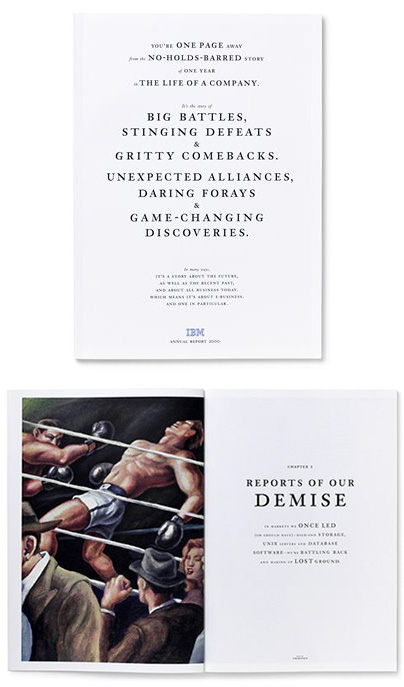
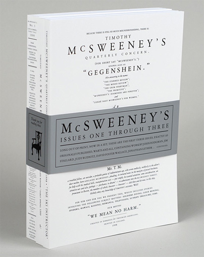
VSA’s 2000 annual report for IBM remains one of the most striking publications in the realm of corporate communications and beyond. From the typography, to the photography, to the copywriting it was all simply outstanding storytelling. Was the cover intentionally too close for comfort to issue one of Timothy McSweeney’s Quarterly Concern? We’ll find out at the event.
![]()
Filed in Arnett/Goldberg • Link