Speak UpA Former Division of UnderConsideration
The Archives, August 2002 – April 2009
advertise @ underconsideration
---Click here for full archive list or browse below
  
VH1: Behind the Logo

So have you seen the new VH1 logo?

I’ll admit it — I watch more VH1 than MTV. Don’t know when it happened, but it did. So I’ve been watching the VH1 series “I love the ’70s” and noticed a new funkadelic logo that VH1 was using. I thought that it was just a temporary thing, but it’s now on everything. Apparently, the old logo has been banished to VH1 Classic in favor of this new mark.

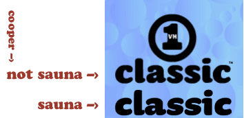
Compare the old and new logos here.

Hmmm…it’s slightly retro. It’s more technicolor. It’s got a little of the blocky 3-D MTV thing happening. Not sure about the backwards “1” though. And why the change?

Did the old logo take its fame for granted, fall into a life of drugs and abuse, only to find redemption when it lost everything? (Cue the reflective music…)

What do you think?

Maintained through our ADV @ UnderConsideration Program
ENTRY DETAILS
ARCHIVE ID 1579 FILED UNDER Branding and Identity
PUBLISHED ON Sep.02.2003 BY Tan
WITH COMMENTS
Comments
Justin’s comment is:

It is my opinion that they could have done more with the old logo to make it fresh again -- maybe something with color, maybe something with a theme, who knows. It's been my experience that trends go in cycles and I believe that they unmasked the new one just when their first one was about to be cool again. On a personal note, I've always like their first one.

On Sep.02.2003 at 07:22 AM
brook’s comment is:

i don't really like the new logo, but i like the usage in all of their new on-air promos. i think it's basically what MTV has always done... crappy logo, creative executions.

On Sep.02.2003 at 07:49 AM
Kiran Max Weber’s comment is:

I liked the old one better. More iconic. The change was most likely due to Viacom's rebranding and increased attention to the station due to lost market share to MTV, which they also own. 3D and Illustraty, I don't know. Kinda .com and is that a flame or a leaf coming off the V? The cut h, hmmm... Is the square supposed to make me think "TV?" I'll stick with the old one. Sometimes I wonder where these new logos/marks come from. Feels like no thought, or less thought, goes into them.

On Sep.02.2003 at 07:52 AM
Tan’s comment is:

I'm pretty sure the old logo was designed by Adams/Morioka in LA. Not sure who did the new one. I liked the old one, but the circle was nothing that iconic.

Viacom also owns TNN, which was rebranded to Spike TV.

It does seem trendy, but it's not necessarily the norm for Viacom -- look at the MTV logo's longevity.

On Sep.02.2003 at 08:10 AM
Armin’s comment is:

Gut reaction: this is one of the most poorly developed and executed logos I have seen in a long time. Looks like an intern in a mexican design firm did it. And that's no compliment.

On Sep.02.2003 at 08:28 AM
Rebecca C.’s comment is:

Ugh. Marketing. Meh.

On Sep.02.2003 at 08:58 AM
Brent’s comment is:

I don't like it - wasn't necessary. I think maybe that they were thinking those of us brought up on MTV in the eighties now watching VH1 are having some kind of identity crisis and needed a new logo? Fully cementing us/them there and paving the way for the newly branded generation of MTV brats. If so, what a terrible way to go about it.

On Sep.02.2003 at 09:42 AM
Todd Dominey’s comment is:

The question is, how are they going to squeeze that 3D block into a favicon? If it can't reduce that far, it isn't worth a damn.

On Sep.02.2003 at 09:46 AM
Davin’s comment is:

If I didn't already know what it was I would say that it reads as, "VHr" and I have no idea what that little flame is doing there. It's not a logo for a custom car detailing shop or a Zippo lighter retailer that I know of...

On Sep.02.2003 at 09:47 AM
Sarah B’s comment is:

I noticed it while flipping through the channels last night. I stopped at "I love the 70s" and the only thing that kept my attention was the logo ( I liked "I love the 80s" much better)...and eww, I kept staring at it. There is that "leafy" detail above the v, which I did not even notice until I went to VH1.com. Not sure that it was neccessary...again, if it aint broke, dont fix it, ...even if you are bored.

And also, on a side note - I guess there will be a "I love the 80's - Strikes Back" in October or sometime in the fall... too funny!

On Sep.02.2003 at 09:59 AM
Armin’s comment is:

>VH1 Classic (which btw is set w/ Cooper Black -- a fave w/ some of us around here)

I think that "classic" is actually Underware's Sauna.

The more I look at the logo, the more disgusted I am with it. Let's start with the fact that VH1 did not need a redesign. The clean, sober look of the one in the circle fit the channel's programming and demographics perfectly. This just looks like a really poor attempt at looking hip.

If they had at least created a great logo... then we could possibly discuss that. Whoever did this logo is now on my blacklist. Not sure if anybody cares, but they are.

Terrible, terrible, horrible, despisable logo.

On Sep.02.2003 at 10:03 AM
David Cushman’s comment is:

Rumor is the new logo was done by WeWorkForThem, the agency SpeakUp seems to love to hate. Discuss.

On Sep.02.2003 at 10:08 AM
Mongrel’s comment is:

Meh. Looks like a fruit drink logo. And a bad one at that.

On Sep.02.2003 at 10:11 AM
Katie’s comment is:

I was hoping that someone would bring this up soon...

I'd just noted the new logo, not because it was wonderful, but because I'd been repeatedly subjected to "I Love the 70's" by my boyfriend's television viewing choices.

I looked around a bit but was unable to find the parties responsible...

As Brook said, while the logo itself leaves something to be desired, the promo pieces where the logo is featured are captivating. And I second the notion of the logo reading, "VHr".

In summary, I don't hate it. But I think that the change was uneccessary. And Todd, you're kidding about the favicon thing, right?

(Ohhhhh....that's what Spike TV is!)

On Sep.02.2003 at 10:41 AM
jonsel’s comment is:

I would love to know the strategy behind this. Visually there was nothing wrong with the old mark. (And yes, I think the "classic" is in Sauna. Purty.) The new mark looks more like a specific show on MTV than a station identity, but of course that's subjective. Hmm...gonna go do some research on this.

On Sep.02.2003 at 10:41 AM
jonsel’s comment is:

What's a "favicon" ? (yeah, I'm in my thirties...)

On Sep.02.2003 at 10:42 AM
Armin’s comment is:

> the promo pieces where the logo is featured are captivating.

I will have to look at that tonight to form a full opinion.

>Rumor is the new logo was done by WeWorkForThem, the agency SpeakUp seems to love to hate. Discuss.

No comment. Although that would allow me to rest my case.

On Sep.02.2003 at 10:44 AM
Darrel’s comment is:

The favicon is the icon next the URL on a web site. Silly name. Semi-useful widget.

Remember that the new VH1 audience is the old MTV audience so it's somewhat natural to start borrowing the MTV-esque-fluff-for-the-sake-of-fluff style.

On Sep.02.2003 at 10:49 AM
Khoi Vinh’s comment is:

We all know that sometimes logo redesigns are watered down and conspicuously lacking in semantic quality because too many narrow-thinking stakeholders -- we often call them 'suits' -- have had their say. I think this new VH1 logo is the result of too many broad-thinking stakeholders -- we might call them 'designers' -- having had their say... it's a collision of at least 4 or 5 different concepts and it makes absolutely no sense.

On Sep.02.2003 at 11:10 AM
Armin’s comment is:

>Remember that the new VH1 audience is the old MTV audience so it's somewhat natural to start borrowing the MTV-esque-fluff-for-the-sake-of-fluff style.

I think there is not enough marketing mumbo jumbo in the world to justify the ugliness and terrible execution of the logo.

At least MTV's fluff is usually perfectly designed and well thought out. Even if it's just for fluff's sake.

On Sep.02.2003 at 11:12 AM
Armin’s comment is:

Even VH1 viewers are appalled.

On Sep.02.2003 at 11:30 AM
Tan’s comment is:

Well I'm glad everyone seems to be in agreement -- the new logo is weak.

The ads though, are beautiful. Very Sergeant Pepper's/Peter Max homage looking. And the one I saw used one of my favorite songs by the Flaming Lips.

I can't seem to find any info on it yet. I'll see if Adams/Morioka will comment on the rebrand -- I know they were responsible for the last logo, as well as the TNN rebranding, before it became Spike TV.

I can't say if it looks like their work or not. I don't think it is, but I'd reserve judgement on rumors of FB's involvement till we know it's a fact.

So don't light up the lynching torches yet.

On Sep.02.2003 at 11:32 AM
amanda’s comment is:

I don't like it, poorly executed. It reads horribly!

On Sep.02.2003 at 11:36 AM
Kiran Max Weber’s comment is:

Still no info on who did it?

On Sep.02.2003 at 11:36 AM
jonsel’s comment is:

Still no info on who did it?

I've found complaints about it on the HOW Design forum and some site called radio-info.com as well as VH-1's boards. But the VH-1 site has NO contact information for anyone in marketing or promotions. Same with the Viacom site.

On Sep.02.2003 at 11:59 AM
debbie millman’s comment is:

I believe that Nancy Mazzei designed it, she works in the in-house design group at VH-1. But I am awaiting final confirmation, will give you an update as soon as I get the info.

On Sep.02.2003 at 12:11 PM
David Cushman’s comment is:

One of the animations was done by this guy, who also sells stuff through YouWorkForThem. The plot thickens.

On Sep.02.2003 at 12:12 PM
rebecca’s comment is:

Hate it.

On Sep.02.2003 at 12:13 PM
Tan’s comment is:

> I think that "classic" is actually Underware's Sauna.

damn. you're right dude. you know Armin -- you must be one of those people that are really smart, but just don't test well. Too much pressure. Only way I can explain the 8.5 on the quiz.

On Sep.02.2003 at 12:20 PM
Armin’s comment is:

>you must be one of those people that are really smart, but just don't test well.

I somehow actually flunked my way through high-school and college. Thank God I don't need to answer tests anymore as a graphic designer, I would be earning like $13,000 a year.

Oh, and must be? I am much smart.

On Sep.02.2003 at 12:25 PM
Armin’s comment is:

>Rumor is the new logo was done by WeWorkForThem

Not true. Just fact-checked. The new rumor has it that Debbie could be on the right track — it might have been done in-house.

Man, what a bunch of geeks we are.

On Sep.02.2003 at 12:29 PM
jonsel’s comment is:

what a bunch of geeks we are.

But we're concerned geeks.

On Sep.02.2003 at 12:33 PM
Tan’s comment is:

Funny -- when David C mentioned that it might have been done for WeWorkForThem -- I thought he was using a euphamism for FutureBrand, so I went Googling for it.

Turns out FutureBrand does do a bunch of stuff for Viacom also -- mainly for Showtime. They also farm out work to Elevator Design, who in turn, did a bunch of stuff for VH1. Interesting...the mole hunt continues...

On Sep.02.2003 at 12:37 PM
Sam’s comment is:

I don't think it's Sauna either. The Sauna 'a' is different, and the 'i' has the extra bend at the top, not the bottom. I had a moment of thinking it was Souvenir, but it's not. My guess is some similar Seymour Chwast-Herb Lubalin-era design, but I can't find it.

On Sep.02.2003 at 12:44 PM
Sean Adams’s comment is:

I'm reticent to say anything about the new logo because I don't know the strategy behind it. The old logo did its job simply and clearly. It had equity. It wasn't the most clever mark on the planet, I'll leave those to the corner coffee shop (it's a dog and a cup). It was built to reinforce the channel's mission of Music First, and be protected from party hats and other logo violations.

Fred Seibert at MTV once told me, "In television, if it plays the way it's supposed to for 15 minutes, you've done your job."

It's T.V.

On Sep.02.2003 at 12:45 PM
Tan’s comment is:

Ladies and gents, the always charismatic Sean Adams of Adams/Morioka. Thanks for posting Sean.

Don't know what ya got till it's gone I suppose. My deepest condolences.

Alright, now my impatience is slowly turning wicked. Who did this???!!!

On Sep.02.2003 at 12:55 PM
debbie millman’s comment is:

final confirmation: it was done in-house by the VH1 design group. Quote by source, who shall remain anonymous: "they should be shot."

On Sep.02.2003 at 01:27 PM
Tom’s comment is:

I think it's one of the freshest, non-conformist, non-expected mainstream logos I've seen in a long time.

I had nothing against the old one, but VH1 has obviously changed their strategy. This one has character and an agitation about it that has certainly struck a chord with all of you. For a network that covers people who will do anything for attention, this redesign certainly has worked today!

It's almost as good as the new UPS logo!

On Sep.02.2003 at 01:47 PM
Tan’s comment is:

Tom -- you're just saying that to make trouble, aren't you? Drop a bomb and see the melée.

It doesn't abhor me as much as the UPS debacle, but they weren't raping a Rand mark this time either.

I just think it's a missed opportunity. But like Sean said, I want to reserve final judgement until I know more about the brand strategy behind it.

In-house. Hmmp. Typical.

Thanks for the detective work Debbie.

On Sep.02.2003 at 02:01 PM
Armin’s comment is:

> I want to reserve final judgement until I know more about the brand strategy behind it.

PLEASE! Why are we trying to be so politically correct here? Even if the "brand strategy" supports this logo it fails entirely in a visual level. I'm no design critic but I know shit when I see it. And that logo is shit. Apologies if I have offended the creator, but the logo is an aberration of anything that is decent in design. There is not even a hint of taste on the logo, my opinion is purely subjective I know but this logo marks a sad low in graphic design — regardless of the brand strategy.

I would make a t-shirt with the UPS logo and a slogan that says "fuck Rand" before wearing anything associated with this new VH1 logo.

Maybe I should ease up a little.

Nope.

PS. Tom, don't make go to all the way to Georgia and kick your ass.

On Sep.02.2003 at 02:10 PM
Brent’s comment is:

In-house. Hmmp. Typical.

Target?

Is all in-house bad then?

On Sep.02.2003 at 02:43 PM
jonsel’s comment is:

Debbie, thanks for sussing that out. Any chance we could get some strategy too? Even off the record? ;-)

Still haven't seen anything on-air yet, but definitely not liking the logo. Maybe it will be like the MTV logo eventually; the 3-d box will be the constant element and the VH1 type will constantly evolve and change. At this point, it feels like style and not strategy.

I agree that "Music First" is absolutely not reflective of VH1 any longer. Obviously, videos just don't do it for a station any longer. VH1 is much more like an E!-type network now, with a more pop-cultural view than strictly artists and music. I mean, were half the "Movies That Rock" even about musical subject matter? And "Grease 2" doesn't count because it most definitely doesn't rock.

On Sep.02.2003 at 02:47 PM
stacey’s comment is:

"In-house. Hmmp. Typical."

Don't be such a hater, Tan.

I say better to be in-house and employed than an elitist snob on the street. Mama's got mouths to feed.

On Sep.02.2003 at 02:47 PM
Tom’s comment is:

you're just saying that to make trouble, aren't you?

Maybe... who doesn't love a good logo debate?

But really my comments were accurate. Do I "like" it? Would I have created it? No. But, it does have something about it. I think what draws me to it, is that it breaks a lot of rules. I hate the colors so much that I love the choice of them.

Dare I say, what's the use of graphic design if it all looks like it belongs in CA? Could be the no sleep because of unreal deadlines talking, but hey I threw it out there.

Tom, don't make go to all the way to Georgia and kick your ass.

C'mon!

On Sep.02.2003 at 02:52 PM
Tom’s comment is:

Oh yeah, I forgot.

In-house. Hmmp. Typical.

Design Snob. Hmmp. Typical.

On Sep.02.2003 at 02:56 PM
Brent’s comment is:

what's the use of graphic design if it all looks like it belongs in CA?

The title "Communication Arts" might have something to do with it. Pretty yet ineffective work only hurts our industry. The idea that something is eye-catching but serves no real purpose only puts power in the hands of those who would see us out of a job-making hobbyist designers as good as those with real design education.

On Sep.02.2003 at 03:03 PM
Armin’s comment is:

>what's the use of graphic design if it all looks like it belongs in CA?

I'm not saying that good design needs to look like CA awardee stuff. I'm saying... you know what? You are right, five years from now all the kids are going to be doing these ridiculous logos that make absolutely no sense because that was what they got exposed to in their formative years.

Hopefully they will be watching MTV.

> I think what draws me to it, is that it breaks a lot of rules.

What rules? Of design? This is so far removed from what effective graphic design is that it's not even acknowledging the existence of rules.

Sheesh, I thought I said I was gonna ease up a bit.

On Sep.02.2003 at 03:05 PM
Bradley’s comment is:

Well, this is interesting.

I always, always, always remember what Rand said about logos, and how the reputation of the company represented in the mark determines the "quality" of that mark. Just as cultural norms and activities can determine the meaning of colors or symbols in other contries (white = death, etc.) so too perhaps can institutions and their logos.

Personally, I don't think the IBM logo is the greatest example of Rand's design abilities...the letters always looked blocky and kind of awkward to me, they get progressively wider/heavier, and there's a weird rectangle formed between the I and the M that for me, slows it down. I don't think I'm crazy for saying this, I've heard others make similar comments.

On the other hand, IBM is a good company and put a lot of value on strong design, and has typically acted in an admirable fashion. They're also huge and have been consistently huge. So we tend to regard the logo as good, and would correctly think them crazy if they ever re-designed it.

Another interesting thing is that because of the visibility of that mark and the strength of the company behind it, we've associated horizontal lines with computers and technology for years.

And so it goes with the VH-1 logo. The old one was good, relevant, and meaningful...the new one is unexpected. I'm with Armin on this one, the whole thing looks like shite; that backwards 1 looks like a cancerous tumor on the h, and the leaf doesn't fit into the vocabulary at all! What the hell is going on here? Additionally, that cube they put it on makes me feel like I'm peaking around a corner on my left-hand side.

Now this logo is just beginning to piss me off.

But...but...I get a sense for why they did it. And I think it might work out for them because, well...it's unexpected. Any layman could tell you that the design isn't good, but at the same time, it looks designed, it looks like somebody thought about it. It definitely sets a different tone for the network. Dare I say it, this mark might be...successful.

On Sep.02.2003 at 03:11 PM
Tan’s comment is:

> "In-house. Hmmp. Typical." Don't be such a hater, Tan.

hey there kids. Don't be so defensive. I didn't say in-house design always amounted to excrement. You only took it that way -- so whose baggage is that? Mine or yours? Hmph.

And Brent, I agree -- some in-house work kicks ass like Target and Starbucks. Thus, the word "typical" which denotes more often than not, instead of the word "always" which denotes all shit, all the time.

But in this case, is it not true that the in-house work is shit?

> Design Snob. Hmmp. Typical.

...and..l-o-v-i-n-g every minute of it.

So let me get this straight Tom. You hate the logo, yet because it was so bad and it broke a number of rules of good taste in design -- you actually like it. Man, that makes no sense.

On Sep.02.2003 at 03:46 PM
Tom’s comment is:

what's the use of graphic design if it all looks like it belongs in CA?

The title "Communication Arts" might have something to do with it. Pretty yet ineffective work only hurts our industry. The idea that something is eye-catching but serves no real purpose only puts power in the hands of those who would see us out of a job-making hobbyist designers as good as those with real design education.

Ah, objective discourse. I totally agree. As Tan was quick to catch, I only threw out the subjective argument because until we can verify our value - what's the point.

On Sep.02.2003 at 03:53 PM
Tan’s comment is:

> PLEASE! Why are we trying to be so politically correct here?

and Armin -- I'm the last person to be anything-correct. But the last time I was quick to slam something -- I ended up eating crow. Thanks to Sam -- the lost "th" in Sher's Henry the 5th poster still haunts me at night.

On Sep.02.2003 at 03:55 PM
Brent’s comment is:

Tan, yes I agree and point well taken. That's why I questioned your comment rather than inferring. Ah, semantics.

On Sep.02.2003 at 04:01 PM
Tom’s comment is:

I only threw out the subjective argument because until we can verify our value - what's the point.

Plus it's more fun to get Armin going.

Drop a bomb and see the melée.

Moo-Ah-Hah!!

On Sep.02.2003 at 04:05 PM
Armin’s comment is:

>still haunts me at night.

Wuss.

On Sep.02.2003 at 04:05 PM
Tan’s comment is:

> Wuss.

..ahem.. what was the low score on the quiz again?

On Sep.02.2003 at 04:10 PM
Armin’s comment is:

>..ahem.. what was the low score on the quiz again?

You said so yourself, I test poorly, but I'm smart.

>Plus it's more fun to get Armin going.

Wuss.

On Sep.02.2003 at 04:22 PM
M Kingsley’s comment is:

a bit of clarification about who designed the previous VH1 logo:

We were involved in the VH1 logo re-design back in the early 90's. As I remember it, the chosen logo was a numeral one with rounded corners ala Neville Brody's Blur font, the letters V and H placed in the center of the one, and "Music First" set underneath -- also set in Blur).

We were one of many firms, large and small, that were involved in this early game of "Design Survivor". Others included were Doublespace, Bureau and a very talented in-house designer named James Spindler. Memory fades over this amount of time, but it was either Doublespace or Mr. Spindler who drew the initial logo.

A few months later -- possibly a year -- the president of VH1, John Sykes (the man behind MTV's Little Pink House Giveaway contest) requested that a circle be drawn around the One.

This was years before Adams/Morioka even had VH1 as a client. From their website, it looks like they TWEAKED various logos for MTV networks including Nick @ Nite, Nickelodeon and VH1.

I suspect they are the ones who sharpened the corners of the One and replaced the font for the language that reads "Music First".

Forgive my frankness, but I would credit branding efforts and logo tweak to Adams/Morioka -- not from-the-womb Design and Authorship.

Now on to the new logo -- frankly, it is stupid and a waste of all the money that VH1 is going to spend printing up all new stationary, T-shirts, ect.

My partner has reminded me that it also looks somewhat like the old logo for defunct channel The Box -- anybody remember that?

On Sep.02.2003 at 04:27 PM
Armin’s comment is:

The plot thickens. Thanks Mark.

On Sep.02.2003 at 04:42 PM
marian’s comment is:

Well, I don't watch a lot of TV so I'd never seen this, or their old logo. When I followed the link it took me quite a while to figure out where the logo was. And I still wasn't sure until I came back here and started reading. OK, so it was that poorly executed graphic in the box.

(Which makes me wonder, when is a logo not a logo? Can anything be a logo? Can a map be a logo? Can a panoramic photo be a logo? Can a straight line be a logo? Can you say, "that's not a logo, it's some squished letters on the side of a multicoloured gradated box?")

And, BTW, definitely not Sauna.

On Sep.02.2003 at 04:43 PM
Armin’s comment is:

>And, BTW, definitely not Sauna.

Damn! No, not Sauna.

There goes the "Armin is smart but doesn't test well" theory.

On Sep.02.2003 at 05:09 PM
jonsel’s comment is:

defunct channel The Box -- anybody remember that?

Thank you. I knew I had seen some similar design(s) before and just couldn't place it. It doesn't feel unique for them and it feels targeted towards the still-watching-MTV crowd, not the slightly older typical VH1 viewer (which may be changing...).

not from-the-womb Design and Authorship

Good clarification, Mark. This is not an uncommon occurence in design firm marketing efforts, especially in the land of big-branding (Landor, FutureBrand, Interbland).

Can anything be a logo?

I'd say yes, but it really depends on circumstances and the nature of the client's business. A photograph halftone is fine for a local shop that doesn't need to worry about far-flung locations reproducing the logo in 20,000 different situations. Now, a good logo? That's a different (and completely subjective) story.

On Sep.02.2003 at 05:15 PM
Tan’s comment is:

Mark -- thank you for joining the discussion and for the clarification. I don't think Sean meant to claim birth to the logo, but it's more that it was in their possession last. Their ownership stemmed from their augmentation to fit the brand strategy during their 15 minutes. Obviously, things have changed.

But let's not be so quick to crucify and condemn.

If only the designer of the new logo would Speak Up and put things in his or her perspective...hmmm...I wonder.....

On Sep.02.2003 at 05:36 PM
damien’s comment is:

Uhh - I like it.

When I first spotted it - I thought it had something to do with the 'I love the 70s' show that was on, but it seemed to stick around.

I don't think its a 'Rand' logo - in being simple, iconic or particularly clear.

but if it were presented to me as a first sketch I would have definitely suggested pursuing more time on it to fix it.

I do think it's final execution is flawed - but I like the concept fundamentally. And I don't think VH1 has to have a whole lot of strategy behind its branding. Especially if its not going through an overhaul like Spike TV. But I do wonder - why the box?

As Todd said - its not particularly 'innernet' friendly, but the inhouse team might have more up their sleeves than we currently know about.

Anyway stone me to death - but I don't think its as bad as some of you are making out...

On Sep.02.2003 at 06:19 PM
Tan’s comment is:

I agree with you Damien. It's not that horrid -- it feels half-baked, like there's more to the story, like it's almost there. It's ambiguous, but in a pedestrian, uninteresting way. It feels unrefined -- I can't explain it more than that. But I'll stop short of saying that I hate it.

But with a brand like VH1 -- "almost there" is perhaps as harsh of a criticism as something more colorful.

Like I said, a missed opportunity for something greater.

On Sep.02.2003 at 06:27 PM
Armin’s comment is:

Ok. I got help from the Typophile people. The typeface for VH1's Classic logo is Oz, by Patrick Giasson. A modern version of Cooper Black.

On Sep.02.2003 at 06:34 PM
Tan’s comment is:

By the way, Spike TV sucks too. It's supposed to be a macho channel for men, but their logo looks all soft and tender like the shopping catalog Spiegel. Hell, Spiegel is even a little rougher.

Now, that's shit.

On Sep.02.2003 at 06:38 PM
damien’s comment is:

Now, that's shit.

damn right - now that whole rebrand and repositioning seems to be a considerable exercise in wasted effort and rank ignorance.

On Sep.02.2003 at 06:44 PM
amanda’s comment is:

you know, the person who did this logo could have had a really tough time working with the exec/decision makers. We have all had it happen, something perty gone sour because of client changes and client changes and client changes. Being inhouse is especially challenging because you have your client over your shoulder everyday. Paying your salary. Being bully like. I know from experience.

Just a thought. So it does not come off so personal.

On Sep.02.2003 at 07:28 PM
Tan’s comment is:

I hear you Amanda. Doing in-house work can be some of the toughest assignments. I know from experience too.

I don't think any of us are making judgement on the designer here -- especially because we don't know who it is. But we are making judgement on the logo, which unfortunately must bear the full burden of examination and criticism.

It's not personal -- but it's also not an excuse to blame the client, regardless of whether it's in-house or not.

And my guess is that the designer in charge of the project is most likely someone of seniority and experience. He or she is likely able to defend the work and separate the comments made from a personal affront. It's about being professional about it.

Debbie Millman is a wonderful example of this professional attitude.

On Sep.02.2003 at 07:37 PM
nancy mazzei’s comment is:

yes, it was me Nancy Mazzei and yes I work for the in house for vh1. I designed the "new logo' just wanted to let you all know.

On Sep.02.2003 at 10:07 PM
nancy mazzei’s comment is:

debbie, thanks for the call

On Sep.02.2003 at 10:11 PM
Bradley’s comment is:

Nancy--

Can you talk about what the process was like? I already commented on it from a design point of view--and I was pretty critical. And I stand by that, I'm not the biggest fan of the design, but I can also see how it IS successful. The form of it doesn't do it for me, but it'll be interesting to see what the general reaction & response is.

I'm just curious as to how everything went down, what the deal was, etc. How do YOU feel about the final product?

Thanks for visiting the site, by the way. Nobody here means anything personal.

On Sep.02.2003 at 10:54 PM
Tan’s comment is:

Yes, a sincere welcome Nancy. Debbie was hoping you'd join in. It must be like walking in on a conversation at a party and finding out it was all about you. Surprise! It's a crit!

Wow, it's past 11pm in NY. It's late -- but I do hope you'll find some time tomorrow and give us just a little more inside perspective on the logo's creation.

Believe me, this crowd is not as tough as it sounds. A bit rash and over-opinionated maybe, but not tough. Anything you can add to the discussion would be most appreciated.

On Sep.03.2003 at 12:55 AM
nancy mazzei’s comment is:

ok everyone, it's not like I'll be crying in the corner over every comment, everyone gets it in the end. It's early or late right now... I'll give some thought to my first round of "explanation" and post something wed. just dont "crit" me on my spelling, everything else is open warfare.

cheers.

nm

On Sep.03.2003 at 04:21 AM
Tan’s comment is:

Very cool. Fire 'er up Nancy.

On Sep.03.2003 at 07:34 AM
Armin’s comment is:

>A bit rash and over-opinionated maybe, but not tough.

Right...

I will just second that this is not personal. I have said my peace and have little to add or to substract to/from my previous comments.

I did see the logo on TV this morning and all I can say is that it is big. One cool thing about the logo is that it has that pink/orange-dunkin dounts thang goin'. I also saw one of the promos and was far from impressed, the logo at the end could very well be MTV's and no one could tell the difference.

>Dare I say it, this mark might be...successful.

Anything playing 365/24/7 is bound to be "succesful" in some way or another. Even UPS' logo (Hi David!).

On Sep.03.2003 at 08:29 AM
jonsel’s comment is:

I'm liking this trend of us critiquing a design, then getting the designer to step up and provide some insight a la Paula Scher and David W. (sort of...the real designer of UPS has ashamedly hidden his/her face in her FB cubicle).

I'm really looking forward to your rolling back of the curtain for us, Nancy.

On Sep.03.2003 at 09:29 AM
Todd W.’s comment is:

Ugly, ugly, ugly. And, since taste is subjective, it doesn't match at all with the target VH1 audience, adult contemporary. Which is probably VH1's biggest problem, it doesn't know what it wants to be anymore. It wants the MTV audience, but doesn't want to alienate its core audience. The brand is confused and this new logo is just a symptom.

On Sep.03.2003 at 09:42 AM
amanda’s comment is:

I just wanted it to be clear that it was not personal. Now that Nancy will be involved in the crit & discussion I feel much more comfortable.

Hardy/harsh crits are super, but it is only fair that both sides of the story are brought to the table so we can understand the situation & rationalizations before making a judgement. Yah yah yah, bad design is bad design, but still. I don't like the idea of speak up being a community that appears to be just a bunch of snooty designers bashing other design work for no other reason then to bash it. It is healthy & super to have strong opinions, but I think it is good to temper that with a bit of kindness, especially when we don't know shit all about her situation. We are all on the same team here folks.

On Sep.03.2003 at 11:05 AM
Tan’s comment is:

I agree. I love SU, but because of the impersonal nature of online posting, there can be a mob mentality sometimes. Lord of the Flies kind of syndrome (Kill Piggie!). Always better to debate, rather than bully.

Harsh honesty. Fairness. Kindness. Bashingness. Snootiness. Hey, it's all good in a crit -- and much better than no conversation at all.

On Sep.03.2003 at 11:33 AM
amanda’s comment is:

i certainly agree Tan.

On Sep.03.2003 at 12:19 PM
Brent’s comment is:

>and much better than no conversation at all.

exactly.

The idea that we have a community of talented, well-recognized designers within easy reach is invaluable. It would be foolish to tromp on that with ridicule and pretention. I love that I can come here to learn from all and participate in something like this. I'd rather have someone challenge my work and be able to defend my choices rather than get half-hearted praise or nothing at all.

On Sep.03.2003 at 12:22 PM
nancy mazzei’s comment is:

First, this logo did not suffer from and marketing executives so you wont hear me hiding behind that old routine, if you guys hate it’s all me!

I don’t want to over- think my answers or put some big �theory” meter on why I did what I did.

Some comments here in themselves are as shallow as your making this logo seem.

Here goes:

yeah. VH1 is changing yes we are re-thinking who we are and people here thought the old logo wasn’t us anymore, we are no longer “music first” which to me always sounded like a kindergarten after school program. We did the usual, get a few design studios to pitch logo’s but under the agreement that anyone in- house could submit logos too. I really wanted to do something imperfect and by that I don’t mean “bad”. The another half of the logo, what goes in it? something? nothing? the “leaf” element a tip to nature? maybe, there are so many “graphic worlds’ I feel like no one goes outside for inspiration anymore. vhr? it’s a 1 work for it —we’re all snotty consumers who know everything how could it be an “r”?! That’s right it’s an attitude and you either like or you don’t just like any product you buy or don’t buy —I wanted that irreverence to BE something other than a hollow word in a creative brief...unfinished, weird, off, abstract. If the channel is about “pop culture” we’re in the biggest pretty/ugly, yes/no, i like it don’t like it area there is... I felt the logo should/could be PART of that not just a symbol for it. This kind of answer can open me up to all of you comments being a bit “true’ but, this wasn’t created with no thought in mind as your all suggesting. cool. nm

On Sep.03.2003 at 01:11 PM
Kiran Max Weber’s comment is:

this wasn’t created with no thought in mind as your all suggesting.

The logo is way cooler now that you described it like a designer that gives a damn. Very honest. Congrats and thanks for sharing.

On Sep.03.2003 at 01:24 PM
Tan’s comment is:

First off. Thanks.

Secondly. I have to say, regardless of what the logo looks like, or what I agree/disagree with -- I'm glad to hear that the process was not ruled by analytical focus group findings or brand words like "synchronized". It sounds like your design decisions, right or wrong to others, was more visceral than pragmatic. And for that, I say "cool". More of us should work this way.

But design-wise, it's still not my flavor. Yes, there's lots left open for interpretation in the logo -- but there's a fine line between abstraction and vacuous-ness, intention vs. execution.

On Sep.03.2003 at 01:32 PM
Milan’s comment is:

So.

Basically, this is an 'unfinished logo'.

There's interesting aspects to the theory behind this logo -- now that nancy explained -- but isn't there SO much more grey matter to be explored regarding that mindset?

On Sep.03.2003 at 01:39 PM
debbie millman’s comment is:

>It sounds like your design decisions, right or wrong to others, was more visceral than pragmatic. And for that, I say "cool". More of us should work this way.

Tan, I am all for emotive design, but I believe that there needs to be a balance between the visceral and the pragmatic. A balance between the magic of the process and the logic of the intended or hoped for results. Otherwise it just feels too subjective to me. Afterall, who should the design be for?

On Sep.03.2003 at 01:40 PM
Tan’s comment is:

Sure Debbie, I believe in both. It is after all, a commercial business -- the end result has to be answerable to pragmatic goals. But the process of designing a logo/brand is too often driven by concrete dictums where there's nothing that's really concrete. And at the end of it all, you get judged by a bunch of opinionated people who are going by their gut reaction.

There's also a sense of risk that's involved with saying "screw what the focus group says." I believe that more often than not, risk taken out of design passion pays off.

Maybe I'm a cynic about this -- but maybe if design was more visceral and unexpected, there would be more genuineness in marketing and less skepticism from consumers.

On Sep.03.2003 at 01:55 PM
jonsel’s comment is:

This explanation is fine and good if we were describing a brochure or a promo or similar one-off design. But we're describing a brand identity for a very large cable network. Is this satisfactory? Is the visceral the only dimension upon which this should be judged? According to Nancy, the point was to have something that could be interpreted differently by different people and that they could judge, as in any pop cultural item, whether they like it or not. The implications of a viewer-defined logo are, to me, that VH1 is whatever the viewer wants it to be. Is that right? That strikes me as somewhat of a cop-out, that the execs don't know where to position the channel any more now than they did 5 years ago.

On Sep.03.2003 at 02:13 PM
Armin’s comment is:

I think it's my time to chime in, since I have been the most vocal about the wrongness of the logo. First of all, I don't think anybody's been insulting towards nancy nor the logo. A critique is a critique, whether good or bad it's based on our opinions and expressed through common language like "shit, sucks, stupid, synchronized." The fact that we are over-opinionated, outspoken and harsh and we do it with our gut instinct should not diminish the value of our assertions. They are what they are — for good and/or bad.

Now to the logo insight. As all here, I appreciate the explanation and the openness of Nancy — I know it must be hard to walk into a place with hungry wolves. I applaud the "gut instinct" and "visceral decisions" and that's totally cool, or whatever. But graphic design — effective graphic design — is, and needs to be, more pragmatic than that. The fact that the logo requires such a lengthy explanation, and a convoluted one at that, it means that it's far from effective. No logo should require more than a sentencee to explain, hell, it shouldn't even require an explanation. I enjoyed the "you have to work for it" attitude, that's kind of cool and I'm glad somebody is willing to act on it instead of just talking about it — yet in the final execution it seems a bit irresponsible. Communicating "hipness" doesn't sound easy, and I'll be the first one to admit to that I would be scared shitless of tackling such a hefty project as this one right here. But I'll also say that this was a great opportunity to show what design can really do and how graphic designers can change people's perceptions of a stagnant brand for the good — instead of just adding confusement by having to "work for it."

I wish I could be more supportive, maybe a tad more positive about this but my visceral reaction is that this logo fails on many levels.

On Sep.03.2003 at 02:19 PM
nancy mazzei’s comment is:

If you want to know more about the mindset please ask. My initial email was meant as a wide statement please feel free to get more specific. Let’s clean up the grey area. As for it being or feeling unfinished I totally disagree. It sounds like there is some logo handbook I didn’t get for class. It seems most people’s “philosophy” is the same here... which is fine but it may not be my “flavor” as you say.

On Sep.03.2003 at 02:29 PM
jonsel’s comment is:

Nancy, thanks for submitting to this stuff. You're a good sport.

Could we get some more background on what VH1 is after as an image? We know they want to move beyond Music First. Good move. So where to? What was your brief, beyond, "we need a new identity" ? Maybe this can help us understand the final outcome a bit more. In the end, some of us are going to hate the logo and some may love it, but it's vastly helpful to learn what the process was and understand the decisions that were made before design began.

On Sep.03.2003 at 02:33 PM
nancy mazzei’s comment is:

Armin,

Okay now this makes sense, look I find it REALLY hard to take criticism from anyone who would be “scared shitless’ to even attempt a project like this —your shouting from the sidelines!! Go buy your “fuck rand’ t-shirt.

On Sep.03.2003 at 03:11 PM
Tan’s comment is:

whoa here....let's not pull out the tshirts yet.

take a breath....hey, anyone seen a good movie lately?

On Sep.03.2003 at 03:23 PM
damien’s comment is:

Armin - dude. A lot of people asked for Nancy to Speak Up, so her explanation of the logo was warranted and not there to justify her work.

We're tackling a logo without seeing it in the context of how it is to 'live'. logos are meant to be marks of aspiration and positioning within a system of services, branding and products.

As VH1 evolves the logo will carry it.

I think we're really missing the point to trash a mark all on its own - flicking through logo books and going "Mmmm - thats a good one" is bullshit - and today, especially today we have to look at brands as an entire system not just the logo.

All apart from UPS' though (I'm kidding).

On Sep.03.2003 at 03:26 PM
Armin’s comment is:

> look I find it REALLY hard to take criticism from anyone who would be “scared shitless’ to even attempt a project like this

The fact that I would be scared about it would never ever diminish my abilities as a graphic designer — neither my willingnes to tackle the project. Everyday, every time I leave a comment here on Speak Up I'm scared, affraid, panicked that people will think I'm an idiot, or that I have no clue what I'm talking, but that has never, not once, stopped me from speaking my mind — that should give you an idea of what "being scared" means to me.

And on the contrary, being scared would only fuel me to do the best possible solution that not only surpasses my expectations but that of the veiwers. Admitting to be scared is better than not admitting when a logo didn't reach its full potential.

You can take or leave the criticism, it really makes no difference to me. If you choose to ignore it that's your loss — or your win.

The "fuck Rand" t-shirt is in production, will wear it then.

On Sep.03.2003 at 03:27 PM
Armin’s comment is:

>Armin - dude. A lot of people asked for Nancy to Speak Up, so her explanation of the logo was warranted and not there to justify her work.

If I have to be the "bad guy" on this thread that's fine. I have no problem with that. I'm just voicing my opinion as always.

>especially today we have to look at brands as an entire system not just the logo.

I thought we were talking about the logo.

I'm gonna go get an apple.

On Sep.03.2003 at 03:31 PM
surts’s comment is:

I think there's some elements to the logo that make it very memorable. In my mind, memorability is good. Would I run online to buy a T shirt with the logo on it - probably not. But from the perspective of the average vh1 viewer that isn't a designer, I would guess that the logo will resonate in their minds. Depending on how it's implemented through the different mediums, time will tell if its successful.

On Sep.03.2003 at 03:36 PM
damien’s comment is:

I thought we were talking about the logo.

Execution-wise, yeah - but it seemed to get dangerously close to someone having to explain the thinking behind it in order for it to 'work'.

I don't disagree with critique on the crafting of it and so on - but the reasons why she did it, or why it is needed is irrelevant.

I do agree with all your points, and always prefer it when you're the bad guy on a given topic I just think we should look to distinguish when we're criticising a logo, person or the organization.

On Sep.03.2003 at 03:38 PM
nancy mazzei’s comment is:

Jonsel,

The channel as a whole needed to be re-freshed, I’d been here about a year until the new logo idea came up. we have been really thinking about what the channel needed to be, there a many really dedicated people here some came over from mtv and some like me are new and from the outside.

We know we want to reflect pop culture and that means constant “change” also pop culture has a certain phenomenon to it that can’t be predicted. This was another consideration for the logo if you notice it on-air it “changes”..the type can change —for example if we are promoting the 70’s the typography can reflect a 70’s style font this made sense to us because the logo than changes to whatever it “lands” on this makes it hard for the logo to be dated and allows it to grow as we do. The colors change too we call it “the chameleon logo”. We knew that the new direction of the channel was going to have to be based around a change philosophy because of the climate in television right now. and we knew we didn’t want to have another tag line we wanted to be able to attach lines to ourselves according to campaigns sometimes a “tag line” cant be all of those things at once..this idea opens up great possibilities for current copylines that reflect the here and now. So designing a system that could go in many different directions was definitely a mandate when embarking on this project.

On Sep.03.2003 at 03:46 PM
Armin’s comment is:

> it seemed to get dangerously close to someone having to explain the thinking behind it in order for it to 'work'.

If the logo 'worked' we wouldn't need an explanation.

On Sep.03.2003 at 03:48 PM
Darrel’s comment is:

anyone seen a good movie lately?

No. And I'm rather pissed about that fact.

On Sep.03.2003 at 03:48 PM
damien’s comment is:

If the logo 'worked' we wouldn't need an explanation.

and how does a logo not work?

On Sep.03.2003 at 04:00 PM
jonsel’s comment is:

because the logo than changes to whatever it “lands” on

Now this I'm intrigued by, and I wish I was seeing more of it on the station. I haven't seen any of the typography changes yet, and that second box is just crying for some visual attention. I just stare at it and not at the VH1 side. I assume this is because the graphic overhaul of on-air graphics hasn't been completed yet.

I'm really fighting myself over the dichotomy of the logo vs. the identity, because I don't really like the logo as I've seen it, yet I definitely like the notion of an ever-changing identity system to reflect its time or contextual situation. Conceptually, that just fits what VH1, as a pop cultural repository and broadcaster, is.

On Sep.03.2003 at 04:01 PM
Armin’s comment is:

>and how does a logo not work?

Just one reason off the top of my mind: if you can't tell what it means it doesn't work. Just like Altria's. UPS' succeeds in this area, you know what it means and what it stands for.

On Sep.03.2003 at 04:09 PM
Tan’s comment is:

> because the logo than changes to whatever it “lands” on

But let's not forget that the first logo to adopt this "change" theory was....drum roll....Viacom's own MTV.

Remember? Big blocky M in bricks, grass, concrete, meat? There's irony here.

I would argue that the adaptive nature of a logo is something all identities should have, not just VH1. But then it gets back to the idea of "identity" itself.

But I can understand the distinction and the reasoning. Again, not convinced w/ the execution, which is the point of this entire discussion.

And Damien, I have to back Armin a little here. A logo "works" if it's a dynamic, conceptually effective metaphor and representation of what it stands for. Either it works well, or it doesn't.

On Sep.03.2003 at 04:13 PM
nancy mazzei’s comment is:

jonsel,

I saw some places where it was rapidly changing however, we haven’t fully blown it out yet we couldn’t do everything at once but this was the system that was "approved" it definitely will allow for endless executions we are all very excited about it. It will also give any places that we hire out to an opportunity to add to the channel in a way that’s hard when the logo is just the logo. over time it will prove to be an interesting identity.

On Sep.03.2003 at 04:17 PM
jonsel’s comment is:

if you can't tell what it means it doesn't work

Often, logo meanings lie more in emotional attributes - bright, active, trusty - than in pure concrete terms - a rock, a horse, etc. A logo is partly what you make of it, so what looks bad by itself may indeed be part of a greater whole that explains and gives it the necessary meaning. I have no idea what IBM's logo means (don't tell me CRT lines, because there's no relevance in that to today's market), but it definitely works, and that is in no small part to its consistent and clear use over 40+ years as part of a greater identity system.

To judge a mark out of the gate is the hardest thing to do, simply because you have no context for it and no sense of what kind of legs it can build. Hate the craft or hate the color, if you will. Meanings come through time and use and through any existing equities carried through - e.g. "VH1".

On Sep.03.2003 at 04:19 PM
nancy mazzei’s comment is:

tan,

did anyone say vh1 was the only channel that has this option?

On Sep.03.2003 at 04:20 PM
Tan’s comment is:

No, Nancy. I wasn't contesting any claim to exclusivity/originality.

I just wanted to point out what i thought was ironic -- after all, both channels are siblings.

On Sep.03.2003 at 04:23 PM
Patrick’s comment is:

>But let's not forget that the first logo to adopt this "change" theory was....drum roll....Viacom's own MTV.

Let's not forget one of my favorites, Nickelodeon's identity, another Viacom property. They constantly change the outer orange shape, keeping the k/o type the same. It's a great balance of consistency and always having a fresh logo.

I've always been intriguied by the idea of a morphing identity (and not just flexible, as all IDs should be). Maybe a company like VH1 could get an entirely new logo every year to match whatever trends are going on in pop culture? Or every month? Or for every commercial? Can anyone think of anyone who has taken this approach, other than a cable station? It seems that it would take a strong brand with established equity to really pull it off.

On Sep.03.2003 at 04:26 PM
debbie millman’s comment is:

>if you can't tell what it means it doesn't work

I agree. Here is a test I like to put logos through to see how effective they are. Take the letterforms out, or away. If the logo has been around for a long time, can you still identify the mark? Do you know who the company is? What it does?

If it is a new logo, for a new company or a reinvigoration of an old logo, how does it represent the company? Does it reflect the values of the company? Is it a single-minded representation of what the company stands for?

On Sep.03.2003 at 04:29 PM
damien’s comment is:

I don't wish to simply repeat Jonsel's comment - but I think its great if you can extract meaning out of a logo but all to often its not possible or simply hasn't been done. I've never been fully aware of the meaning behind NBC's logo or ABC's. And to many Apple's logo isn't really that obvious.

As you said Armin, 'one reason' implying there were more, I think that as Jonsel summed it up - meaning is often built through time and experience.

Whether it works 'well' or not is different - and in this case the VH1 mark might not but its not totally because it doesn't have a self-explanatory meaning attached to it.

On Sep.03.2003 at 04:38 PM
Tom’s comment is:

Can anyone think of anyone who has taken this approach, other than a cable station?

Burton and K2 snowboards took this approach very successfully during the 90's, not sure if they still are.

On Sep.03.2003 at 04:39 PM
jonsel’s comment is:

the meaning behind NBC's logo

The peacock was meant to symbolize the network's use of color on television. Obviously it doesn't have that relevance today. When Chermayeff&Geismar refreshed it in the 80s (?), they ascribed each color feather to a separate division - news, entertainment, etc. That sounds simplistic when you think of the nature of television and media companies today, but I guess it was logical to do then.

On Sep.03.2003 at 04:43 PM
jonsel’s comment is:

Burton and K2 snowboards

Many counterculture brands get away with this really well. Art Chantry did several hundred logos for Estrus Records, changing the logo on almost every release. I think VH1 could take this approach. They just need consistent lettering or a constant framing device to build new and everchanging imagery in. This is how Nickelodeon works - same type always but an unending array of dazzling orange shapes. And the way they adapted that to Nick Jr. is awesome.

On Sep.03.2003 at 04:47 PM
damien’s comment is:

I agree. Here is a test I like to put logos through to see how effective they are. Take the letterforms out, or away. If the logo has been around for a long time, can you still identify the mark? Do you know who the company is? What it does?

I think this is mixing the testing of a brand with testing 'the effectiveness' of the mark. The brand equity is inextricably tied up with those marks.

Marty Neumeier suggested a similar thing by swapping out a mark for another's and seeing if it stood out as incompatible - this is rediculous, once integrated within an organization the mark is accompanied with experience, marketing and other branding.

On Sep.03.2003 at 04:49 PM
graham’s comment is:

>Can anyone think of anyone who has taken this approach, other than a cable station?

www.sony.net/SonyInfo/dream/ci/en/

On Sep.03.2003 at 04:49 PM
KM’s comment is:

Jeez, I step away for a day and this is what happens! First off, I don't think the logo is as "bad" (whatever that means) as the majority thinks.

maybe, there are so many “graphic worlds’ I feel like no one goes outside for inspiration anymore. vhr? it’s a 1 work for it —we’re all snotty consumers who know everything how could it be an “r”?!

Nancy, is gestalt being implied here? But perhaps too subjective for a brand? Overall - I don't hate it and won't shit on it.

On Sep.03.2003 at 04:53 PM
damien’s comment is:

Sony have a program about a 'connected identity' which is some weird-ass "live" identity thing created by some little-known UK firm.

Okay - I jest. Tomato created the interactive connected identity for SONY. (I am right aren't I Graham?)

an article

The site: http://www.sony.net/SonyInfo/dream/ci/en/

On Sep.03.2003 at 04:57 PM
Tan’s comment is:

Damien, he beat you to it. Hey, that's pretty cool graham.

........

but not to get picky, but there's a difference between generating a hundred different iterations of K2 and generating a hundred different applications of the M in MTV while still retaining the initial form.

It sounds like VH1 is more intended to be the latter. If that's the case, then it's a matter of whether or not it was originally designed to do so, or it was an addition to the system after the fact.

On Sep.03.2003 at 04:59 PM
damien’s comment is:

sorry - I see Graham's post now. The article is also much more about "designers who define the web" rather than about the interactive project, its just where I first saw the mention of Tomato's project with Sony.

On Sep.03.2003 at 04:59 PM
Darrel’s comment is:

if you can't tell what it means it doesn't work.

A logo doesn't have to mean anything for it to work. It is simply a visual mark used to identify a product/service/organization. The product/service/organization is what gives the logo meaning.

Nancy's description, in my interpretation, is that it looked cool, so that's what they went with. There isn't anything really wrong with that approach, IMHO, as long as their is a viable product/service/organization that will back it up.

As for the 'morphing' logo, MTV has done that, but I think Viacom's other offspring, Nickelodeon, has done it best with their mark.

On Sep.03.2003 at 04:59 PM
Tom’s comment is:

In the true spirit of critique, the work holds less weight after the reasoning. Etherial and abstract references that aren't really explained do not help the profession, and I think that is all of our goals here.

Inspiration that is only explained as being based on being different and an irreverent attitude and disrespect for the "snotty consumers" to get it, well, clients should expect more value for their money. In-house or Out house. As mentioned before, it is nice to throw caution to wind sometimes and take a risk beyond what focus groups provide, but we need to be abe to explain what a graphic communication is communicating.

On Sep.03.2003 at 05:13 PM
nancy mazzei’s comment is:

hey thanks everyone. this was fun. I'm on my way.

nancy

On Sep.03.2003 at 05:28 PM
Armin’s comment is:

Coast's clear? I was feeling so left out for a moment.

Thanks Tom, you nailed it my man.

No conclusions from me, I've said what I had to say, and let that be a lesson to you all... or something.

Great, great thread, 125 comments in less than 48 hours. Thanks for starting it Tan.

On Sep.03.2003 at 06:02 PM
Tan’s comment is:

My pleasure Armin. Who knew it would get so juicy?

On Sep.03.2003 at 06:05 PM
JLee’s comment is:

It was interesting to see this thread change from a casual logo discussion to an exchange with the actual designer. (those old college crit days came racing back!)

Earlier in this thread someone raised the idea of regularly critiquing logos and other design work and I think it's a great idea. Once a month a SU reader's design piece could be brought forward to discuss with the creator.

Could be fun...

On Sep.03.2003 at 06:56 PM
nancy mazzei’s comment is:

olive,

if you see this your in the right place.

this shit is classic.

On Sep.03.2003 at 07:11 PM
pk’s comment is:

i personally think a logo's purpose is not to convey they corporate entity's beliefs or values. that particular definition is one which was generated by an earlier generation of marketing professional which strove to honestly inform a consumer. the marketing landscape has changed drastically since that premise was formed, and even more so in the last ten years. i now think a mark's primary purposes are to:

1) provide a platform upon which the audience is able to base some personal identification ("this feels like part of my personal lifestyle").

2) remain memorable at any cost, especially in a media landscape as cluttered as the american one is.

any further communication beyond that is optional. we are way beyond the point where a pop-culture company like VH1 needs to portray themselves as a rock-solid entity. that's something that'll be proven by the company's public behavior. as well, VH1 can afford to be playful with their identity at this point in their history since everyone pretty much knows what to expect from them (in terms of programming that fits the corporate personality).

this whole thread is reminding me a lot of the one that brought debbie to us.

On Sep.03.2003 at 10:10 PM
Darrel’s comment is:

Nancy is talking to the olive in her Martini. I hope we didn't drive her to drinkin'!

On Sep.03.2003 at 10:14 PM
Tan’s comment is:

I'll join you Nancy, if you don't mind -- and I'll buy the next round.

"Bombay Gibson please -- w/ an extra onion"

On Sep.03.2003 at 11:59 PM
felix’s comment is:

damn, i always snooze on good threads.

I dont mean to dogpile you Nancy but that is one terrible logo. Its totally "I want my MTV box from 3 years ago". For once, the panel here is correct in deeming it "irresponsible".

VH1's "first" is no longer music. Its whats behind it. Which in and of itself, is old- retro.

Nancy just popped a cap of "New Coke" and my watch is set for the old flavor's return.

On Sep.04.2003 at 08:48 AM
Sarah B’s comment is:

I think all that i could have, might have said here has already been taken... Nancy, darlin', you created the logo for your reasons explained. I for one believe that no logo, especialy one that is an identity for a LARGE company should ever have to be explained. The only exception to this rule is for companies (ie, Apple, CBS, NBC) where the logo was created at the beginning of all of this "corporate identitity" stuff. When something visual was needed to stand for quality. (I know, I am kinda contradicting myself - kinda)

I hate to quote professors, but I had a few great ones. "No mark (thats what he called a logo, icon, etc) should need to be explained, it should explain itself and stand on its own" - and I agree... esp. for a company that is recognized with a previous mark. Again, all of this has beensaid in some shape or form.

You created it for a reason, and at least you've got that. Now it just needs to work - it might work for you and be your "flavor" (I kinda like that) but it needs to be appealing to the mass in this case..and obviously, from this and the message boards on VH1.com - its not.

And as with all the crit here...take it or leave it....hadnt it been for painful crits in school, I would probably have been crying by now if I was you... but, at least they taught me that!

All - this thread was incredible!!

On Sep.04.2003 at 09:55 AM
ant’s comment is:

God damn youre some heartless bastards. I love it.

1) provide a platform upon which the audience is able to base some personal identification ("this feels like part of my personal lifestyle").

2) remain memorable at any cost, especially in a media landscape as cluttered as the american one is.

I would tend to agree. especially with item #1. Things have changed. Beliefs are out the window anymore- you need something that looks good on a t-shirt, and can have endless variants. Corporate ideology is so passe.

Its still a bastard logo though.

then again i know nothing.

On Sep.04.2003 at 10:14 AM
Tan’s comment is:

> i now think a mark's primary purposes are to:

1) provide a platform upon which the audience is able to base some personal identification ("this feels like part of my personal lifestyle").

2) remain memorable at any cost, especially in a media landscape as cluttered as the american one is.

Patrick -- I agree with your criterias, but where we differ is that I think they are additions, not replacements for the requirements of a logo. A logo should encompass a company's beliefs or values -- hence the term "identity". The problem is, in many companies these days, beliefs and values are convoluted or contrived -- derivatives instead of visionary. So as a designer, it feels futile to create a logo that has any chance of longevity or integrity. But that doesn't mean it's not worth pursuing.

The 2 criterias you've given amount to style more than concept. Or style as concept.

On Sep.04.2003 at 10:14 AM
luumpo’s comment is:

I think I'm a little behind the times with this comment, but...

I love the new vh1 logo. I am totally buying what nancy said and I bought it before she even said it. I think the only reason you people feel like the logo needs to be "explained" to "work" is because it is so very different. It's totally unlike most logos I've ever seen - and, sadly, I think all of you people are basically saying that it doesn't work because it doesn't look like other logos that work. Which is complete bullshit - it looks different, people will notice it. They're going to be putting it on air all the time anyway - it _will_ become associated with Vh1 - and that means it's working.

On Sep.04.2003 at 04:54 PM
amy’s comment is:

The new logo seems to suffer from multiple personal disorder. I don't think I'd say that if it weren't for the leafy offshoot off the V, but that just screams to me of the same kind of trendy stuff that brought us the universal swooshes and swirls.

On the other hand, I do like the idea of an evolving logo. I kind of use that for my site and promotional material; the elements are always the same, but sometimes the colors vary, and the mark itself might be on top of the words or next to the words depending on the format.

As a sidenote: wowee! I love this site. It warms the cockles of my cold, bitter, lonely heart to find such a thoughtful, wellspoken community of my brethren... :D

On Sep.04.2003 at 07:03 PM
Tan’s comment is:

welcome Amy. What a nice comment on such a vicious thread :-)

On Sep.04.2003 at 07:05 PM
Tom’s comment is:

The problem is, in many companies these days, beliefs and values are convoluted or contrived -- derivatives instead of visionary.

Lot's of truth there Tan. Lots! Where are the visionaries?

They're going to be putting it on air all the time anyway - it _will_ become associated with Vh1 - and that means it's working.

If they put a wet dog on air all the time...

Association does not equate to "working".

On Sep.05.2003 at 10:16 AM
luumpo’s comment is:

If they put a wet dog on air all the time...

Association does not equate to "working".

Well, then, I would like someone to give a definition of what it takes to create a successful logo. I was under the impression that as long as people recognize the logo and know what the logo represents, then the logo "works."

I can understand that there might be clarity concerns with a logo. That I can accept empirically.

Anything anyone else can say about a logo, though, will merely be a candy-coated way of saying "I prefer these sorts of logos" and not actually evidence that a particular type of logo is better than another.

On Sep.05.2003 at 07:04 PM
Tan’s comment is:

> I was under the impression that as long as people recognize the logo and know what the logo represents, then the logo "works."

ah, but this is design, isn't it?

What makes one car design "better" than another? What is the basic difference between a Chevy Malibu 4-door and an Audi A4 4-door? Context. Brand image. The dynamics of the form. The intagibles of a design that somehow, for some reason, makes strangers all see the same thing. The lack of empirical "evidence" as you put it, does not mean that it simply comes down to a style preference.

Right or wrong, substance or not -- it's evident that there are a number of designers on this thread who thinks that this logo does not work. Those judgements alone are strong testaments against the success of this logo.

> Where are the visionaries?

They're all on vacation with their dotcom winnings.

Seriously though, this is part of a much bigger discussion. Has the world changed so much that it's no longer possible to succeed with true innovation and vision? Is it better to just differentiate through style, but not substance? Sadly, maybe so.

On Sep.06.2003 at 11:04 AM
jonsel’s comment is:

there are a number of designers on this thread who thinks that this logo does not work. Those judgements alone are strong testaments against the success of this logo.

I'm not sure this is backing up your argument, Tan. The judgments by this "number of designers" is only evidence if we all accept them as experts. If you dislike my design work, am I really able to express an opinion on other design work that you'll give creedence to? If Nancy critiqued one of your pieces, would you listen?

The majority of opinions here that have hated the logo seem to dislike it on a stylistic basis. This is fine. I don't love it either on that level. But there's a larger picture by which it should be judged, since it so often is seen only in that context. By Nancy's admission, that larger context hasn't been fully put together, and that's the shame, because then they have simply jumped the gun and thrown something out into the world that's not fully-baked.

true innovation

I'm not sure we'd know true innovation if we saw it until much later. Innovative ideas are always distinctly different from our visual norms. It takes time for these to gain wider acceptance. Even MTV's graphics - generally accepted as innovative - are often second-hand discoveries and adaptations.

On Sep.06.2003 at 04:13 PM
Armin’s comment is:

>Anything anyone else can say about a logo, though, will merely be a candy-coated way of saying "I prefer these sorts of logos" and not actually evidence that a particular type of logo is better than another.

Ok, picture it like this. An architect builds a house — terrible woodwork, ugly ceiling, no windows for natural light, it's all off-level and it's built on top of an indian burial ground. Not only that, the foundation that the house is built on is very flimsy and the house could fall apart any minute. So the arhitect figures that if they put enough extra beams (and screws, and whatnot) to sustain it, it might just hold up, nobody will notice that the basis of it is all wrong. So the house never falls, people live in it and nobody gets hurt, right? same with the VH1 logo.

There are certan things that a designer must consider when doing their job. Balance, rhythm, color, accuracy, strength. Attributes that are the most basic among graphic designers, attributes that young designers learn at school and seasoned designers have perfected. None of those attributes, not even one, is reflected in the VH1 logo. Maybe color.

So what if the foundation of the logo is wrong, right? As long as people recognize it nobody will know it's falling apart. That is not a fully effective logo.

On Sep.06.2003 at 04:54 PM
Tan’s comment is:

No Jon -- I should clarify. My point was not to say that we are all expert judges of design -- on the contrary, my point was that we're nothing more than typical consumers.

luumpo had asked about actual evidence of a logo working -- my response was that the value of design isn't always tangible. It's not any one element of brand adherence, but a combination of things that put together, makes a design. The public's acceptance of that design (in this case, the SU public) becomes a test of these intangible qualities that either works or doesn't. And the fact that it doesn't work can't be solely discounted to a style preference -- it's more complicated than that.

If a majority of us sees the logo badly, there's no amount of context that can change that. Time and saturation of the logo will only garner acceptance. But that's not a measure of any success. That's a measure of mediocrity -- when something's just good enough.

That's my same argument with the UPS logo as well.

On Sep.06.2003 at 07:54 PM
damien’s comment is:

It feels like its being argued that the execution and the purpose of the logo are the same thing, where because it was put together badly (without Armin's list of things: Balance, rhythm, color, accuracy, strength.) it can't possibly fulfil it's purpose.

The other element (not limited to this though) is the function of the logo in how it is used.

So to carry on Armin's story: if the 'house is propped up with extra beams to make it safe and work' then perhaps no one cares about its poor execution so long "as it works". Or it is in the right place in the right time.

But more importantly - there are an immense amount of activities at play in presenting the logo or brand of a company today. Either through advertising, in picking what prime time spot to run in, associations, if the logo is to have motion, will it be over extended like Target used to do in it's television advertising - or will it be screwed with to add personality like AT&T used to do with it's globe logo. And then there is your own perception of how the logo is presented and where it sits in your own hierarchy of brand.

So you can't simply say that since a logo wasn't executed very well it doesn't work. Granted it might be a handicap but it can still fulfil its purpose of being a memorable mark for the organization depending on how the company uses it.

On Sep.06.2003 at 08:57 PM
man334’s comment is:

Hey everyone, I’m joining really late here and I actually read through this entire chain

Before joining in there are a MANY things I would call “suspect” here hope you don’t

Mind if I take the liberty and say what they are. While this “seemed” like a critical

Site at first it really has turned into sadly for Nancy a bit of a “witch” hunt.

1. The overall response is only to people who come right on and say “I hate it”

They are greated right away by the group. Sadly, anyone with some interest or likes of the logo are given a sarcastic answer to their point of view or somehow ignored .

2. At the beginning you all said nothing was “personal” wow if this wasn’t

“false advertising”. Armin the way you swoop in on every discussion sounding like “Dad’s home” was killing me. And, when you make side comments (to people you know in the room) it does nothing but back slap the person’s work whom you are critiing. Of course all of your comments are agreed with which brings me to my next point.

3. I researched this whole site and there are definitely 4-5 people that stick together on all topics�When I organize criticals with my team and I have 5 people who agree on everything and are friends that socialize together I doubt their motives I think this is only natural I would feel the same way if I was with 5 friends making comments, not accurate.

4.

5. I read your “interview” with Rudy Vanderlands if you listen close enough he says he doesn’t “try” to please everyone with �migré which I don’t think is too far from the “vibe” Nancy was giving out while hers may not have been as “tight” in explanation. You should respect people “coming from the same place” as that is how your operating on your site right now.

6. Then I did some digging on Nancy Mazzei and who she is seems she designed backspacer for émigré, teenager and gladys for David Carson, and shit, a boat load of other stuff so I doubt she is “unable” to take a group such as this. I wish the right forum had been created to get a little more “meat” from her before you all started talking at the same time. What a missed opportunity.

7.

8. Then, I did some digging on Armin, nice stuff but definitely not from the same “place” Nancy comes from in terms of style or thinking not saying either is “better.” I can see what your saying about being scared of doing a job like this one. (although, in your response to Nancy about this you turned your statement to benefit you) Don’t want to leave off bad here, I liked your stuff, but your stuff is not what this email is about.

9. Does anyone know that when Paul Rand did most of his logo’s no one in the “in-house” corp. or public got them? And lot’s of hatred was expressed? By going to the vh1 website (which I also checked out) and dumping that into the conversation “even their own viewer” don’t like it ”cheap shot” you guys know like any designer “people hate change.” Most new logos brilliant or not are not embraced from the internal company or the public for at least a year afterwards.

10. I refuse to even say if I think this is a good logo or not I feel you had it’s creator in your hands for about a second and then lost her with your weak digs at HER everything else said was just agreeing with friends or making new friends because they agree with you. Maybe some good points came up, but they were too buried in bullying to be accurate.

11. Actually talking about how many hits: you got during the discussion for me was the ultimate in bad taste. Then a day later you mentioned it in your “we are one year old” article. This was truly horrific and once again the SAME 4-5 people responded up to congratulate you.

This is a horrible place to show work I will spread this word to as many designers as I can even if 5 see my point I’ll feel that much better, A word to Nancy wherever you, are it seems you’ve worked with some great people, get a critical from THEM, it will be more accurate good or bad. Man, I’m glad �migré will be doing long form critical writing again, I’d rather be reading that then anything on SU.

On Sep.07.2003 at 10:01 AM
Armin’s comment is:

Tough weekend.

Well, man334, I appreciate your honesty. I still wish you would have had the decency to go with your real name, but that's expected. I'll address point by point.

1. Then maybe that says something about the logo, don't you think? Anybody is more than welcome to back up their points, if a sarcastic commentary is enough to drive their opinions away, then it's each person's loss not to come back with a response.

2. What's for dinner?

3. We've been called cliquey before, I don't really doubt anybody's motives. It just happens that we share similar points of view and are more than happy to back each other up. It's called cammaraderie. And before you go making the judgement that "we stick together" you should read all the discussions where those 4-5 people go at each other.

4. What's up with the empty points?

5. Not sure what you are trying to say here. I respect where Nancy was coming from, that's cool or whatever, I don't respect the final outcome. As opposed to Emigre — I respect the outcome.

6. You mean backspacer for Emigre? Should be dropped off the catalog if you ask me. The "meat" is out there, people are free to google and make their own opinions and measure if Nancy's past work "explains" the current logo.

>"I wish the right forum had been created"

Cool you try it. Let me know how it goes.

7. Empty.

8. Yes, my stuff is not what this email is about. But I hope you found some interesting stuff about me, Google really likes me.

9. Let's not even compare VH1's logo with anything from Paul Rand. If in 20-30 years VH1's logo is mentioned in the same breadth, even in the same sentence as any of Rand's work I will publicly shred my design degree, scan it, and post it on the site for all to see.

10. I would like to know what you think of the logo.

11. Hits? You mean comments. It's public information, I'm just reiterating what's general knowledge.

>This is a horrible place to show work I will spread this word to as many designers as I can even if 5 see my point I’ll feel that much better,

Cool, I can send some business cards your way to spread the good word.

>Man, I’m glad �migré will be doing long form critical writing again, I’d rather be reading that then anything on SU.

So ironic. So sweet. Read the last Emigre (65)?

On Sep.07.2003 at 12:39 PM
jonsel’s comment is:

I respect where Nancy was coming from, that's cool or whatever, I don't respect the final outcome. As opposed to Emigre — I respect the outcome.

Armin, why is this?

On Sep.07.2003 at 07:01 PM
Tan’s comment is:

man334 -- I just want to point out that this is not a moderated crit. Although Armin is the site's keeper, and I was the originator of the thread -- the discussion was a random community discussion on a given topic, nothing more, nothing less. To call it a "witch hunt" is simply juvenile rhetorics. Throughout the discussion, there wasn't a single posting that referred to Nancy's personal body of work, her credentials, or any prior conflict she may have had with anyone on this forum. The primary discussion centered around the logo from beginning to end, simply wrapping all other associations as peripherals. In fact, your posting was the first mention of Nancy outside the context of this logo. Now, who's being personal here?

It was fortunate that one of our authors knew Nancy, and was able to invite her to join. It was really her decision to come, and her decision to value or not value the discussion. Yes, I believe the outcome of the 'crit' did turn out to be rather one-sided against the logo -- but it's the unfortunate nature of a blog sometimes. To suggest that this was somehow planned or deliberate is absolutely ludicrous, and a waste of everyone's time here.

Yes, most of the regular posters are familiar with each other -- so what? It's a common trait with all contributing editorial groups. And the fact is, if we always agreed with each other, then there would never be a point to a good discussion on any of SU's topics in the first place. I, for one, would have fucking better things to do with my time. Authors and postees on this site are mostly generated and recruited from some of the most wicked discussions -- where there are often huge disagreements.

You either find the discussions fair and join in, or I'd just suggest that you spend your time elsewhere.

But let me ask you this man334. If you were interested enough to "research" Armin's site, and incensed enough to compose your lenthy posting -- then why don't you put your money where your mouth is, and support your points on the logo, rather than sling trash as you just drive by? I believe that would be a much more interesting read for everyone.

> This is a horrible place to show work

don't flatter yourself buddy. You ain't Nancy.

On Sep.07.2003 at 08:08 PM
Armin’s comment is:

>Armin, why is this?

Not sure what you are asking about Jon. Why do I respect where she's coming from but not the outcome? Or something else?

On Sep.08.2003 at 09:09 AM
Jose Luis’s comment is:

Lovely new motion work for VH1 from one of Armin's favorites: WWFT

On Sep.09.2003 at 07:19 PM
Armin’s comment is:

Sure, rub it in Jose Luis.

On a sidenote:

For all you out there who feel like doing some negative criticism of me or the site. We (I) are very willing to hear it and usually take into consideration for future reference. I love hearing what we are doing wrong or what type of things could be better. But it is very hard to take anybody seriously who just comes in all gung-fucking-ho and doesn't have the nerve to come clean up their droppings after being challenged back by me or anybody else. Grow up and be accountable for what you say. Or don't say anything at all, we don't have time for childish behavior.

Oh, yes, I'm talking to you man 372 or whatever.

On Sep.09.2003 at 07:27 PM
jonsel’s comment is:

Not sure what you are asking about Jon.

I wasn't particularly clear, sorry. I was wondering why, when, despite having disagreements with some of what Emigre publishes, you still respect the outcome, whereas you disagree with Nancy's logo, so you don't respect that outcome. I'm not sure if I'm reading more into this than is really necessary. It reflects my opinion that on more than one occasion, I've seen people base part of their criticism on the designer and not solely the design. It's also a reflection of the "rock star" mentality. In the Paula Scher thread, Eric, especially, was really taking the Henry 5 design to task. But upon Scher's posting, everyone pretty much left the topic to die. Did the compaints suddenly dissipate upon her justifications? Or are we too much in thrall of her and her status to go at her directly? (Yes, this is getting WAY off topic.)

I respect Nancy. Even she admitted it wasn't her best. But I respect the work that went into the logo, especially after she explained her reasoning. That doesn't mean I think the mark is a great mark. It just means that I understand and respect where she's coming from. I honestly don't read Emigre that often because I think it tends to be a lot of over-intellectualizing. But I respect it and the people who write it, because I certainly couldn't.

That's all. I'm not taking any personal swipes here.

On Sep.09.2003 at 08:25 PM
josh’s comment is:

I heard that weworkforthem did it. It was posted today on the newstoday.com site.

I have nothing to say other than, even students know when something is garbage.

On Sep.10.2003 at 11:20 AM
amy’s comment is:

Seriously though, this is part of a much bigger discussion. Has the world changed so much that it's no longer possible to succeed with true innovation and vision? Is it better to just differentiate through style, but not substance? Sadly, maybe so.

I don't think so. In fact, I would say the contrary. The companies that truly differentiate themselves through substance and quality, albeit with some style, are doing way better than many companies that do not. Here are my two favorites...

  1. Would I get booed off the stage if I said that there are indeed companies that make it by being visionary, and that Apple is one of them? Sure, they pander somewhat to the lower common denominators (but not, thankly, the lowest), but that is how they subsidize what they do do that is truly innovative. Part of the innovation is providing top-quality, well-designed, thoughtful products in a market where most stuff is ugly, boxy, impersonal crap even now. (One of the reason we love our Macs is because the Mac seems like it was designed to help us work the way we want to, not the way the maker wants us to!

    But the real innovation is that they don't stick with something just because it kinda works. Notice how their industrial design has changed since the iMac... now it's all grown up. They used the Fisher Price colors to get themselves some coverage and then switched to where they truly wanted to be: sophisticated, refined, minimalist. Sexy. And ooh, the next release of OS X... they're making it *faster*. That's innovative for any major OS release! Also, Exposé and some of the other features I can't talk about are totally innovative. Woo.

  2. Also consider Trader Joe's. A health food store? Not innovative. A small grocery store that carries only products with high quality ingredients, makes every product pay its own way -- no loss leaders, and rebrands some major brands to their house brand so that the local grocery stores don't whine about competition? Very innovative! By making every product pay for itself, they keep all prices down, even though the products are usually much nicer stuff than you'd find at a grocery. Even their fresh produce is cheaper.

    AND, TJ's is an excellent case of innovative *and* evolving branding. They have different labels for different lines of food. Their pasta products are branded "Trader Giotto's." Their texmex stuff is labeled "Trader Juan's." Their Chinese food is invariably labeled "Trader Ming's." They use different fonts for these and they don't have a logotype (image), but the overall effect is very unique. And where else would you buy a box of two plastic packs of guacamole titled "Avocado's Number"? The description on the back even talks about Abrogado and says, "While there aren't 6.022 x 10^32 avocados in every pack, there ARE 5, and that's a lotta avocado!" (Approximate quote there. The guac didn't last very long in our fridge, it was too tasty.)

    They have fun with their product names, and there's no flashy super-branded glossy products in their stores. And their stores are another side of the equation... very branded, but in a way that is not at all obnoxious. Even though our TJ's is located in an expensive shopping center (under a road, no less), next to a B&N and a Pier 1, they have it decorated with a sailing/tall ship theme. The walls are wood paneled and they have handpainted signs, life preservers, nets with plastic fish/crabs/seafish all nailed to the walls, the checkout lanes are decked in wood as well. They do funny displays, like a giant stuffed gorilla in sunglasses behind a little hibachi grill for summertime grilling stuff. They couldn't avoid these huge cement pillars (holding up the road above!), so they painted them with cartoon themes... the one near the frozen seafood is an undersea theme with smiling (and no doubt delectable) fishies and squids.

    And everybody is nice (and paid well, w/ benefits), they notice if they haven't seen you for a while, the stores are smallish and crammed with goodies. It's really like a mental vacation!

OK, I'll stop effusing. But there are two great examples of companies that are really very successful by almost every stretch of the imagination, and they are successful because they differentiate themselves with quality. AND style. Studying either Apple or Trader Joe's would teach any design student/business person a lot. Study them both and you'll see how similar they really are: they have the same core values. (Quality product, even if it has to cost more; have a sense of humor; be personal, not impersonal; don't forget style while your'e at it.)

On Sep.10.2003 at 11:26 AM
Armin’s comment is:

>I was wondering why, when, despite having disagreements with some of what Emigre publishes, you still respect the outcome, whereas you disagree with Nancy's logo, so you don't respect that outcome.

I may disagree with the things said in Emigre and the point of views of many of their authors but I always respect them because they are challenging me, making me think of design in different ways and they are creating something that's actually valuable.

The VH1 logo says nothing to me at all — even after the explanation.

>I'm not sure if I'm reading more into this than is really necessary.

I think you are, but I'm happy to oblige.

>It's also a reflection of the "rock star" mentality. In the Paula Scher thread, Eric, especially, was really taking the Henry 5 design to task. But upon Scher's posting, everyone pretty much left the topic to die. Did the compaints suddenly dissipate upon her justifications? Or are we too much in thrall of her and her status to go at her directly? (Yes, this is getting WAY off topic.)

Way off topic. But valid. But not in the same league at all though. So I won't go into details here.

On Sep.10.2003 at 11:26 AM
marco’s comment is:

it is a good logo

yall are FUNNY

nancy you need to print out your favorites and frame to wall

:)

On Sep.10.2003 at 01:58 PM
Eddy’s comment is:

it is a good logo

.... you prob like this logo too

seriously.. this was a poorly done rebranding by an internal. Seems like a 1st year art students design. I predict a new logo soon.

On Sep.10.2003 at 02:25 PM
eric’s comment is:

Jon re the Scher discussion �for my part I was pretty exhaustive about what I didn’t like. She came on and gave us some supporting information. I think the discussion went a little further but she didn’t intend to defend it so what was the point of continuing to harp on it. Nobody else had new info on how mediocre it was.

Something that’s a bit more unique to this particular thread is the 3rd party defense of Nancy’s logo.

I’m not a fan of kicking the snot out of all designers on any given day. I would probably never have thought to post about the Scher poster as in my original abrupt comment of “tedious” meant to express that it didn’t warrant much attention from me when I’d passed it on the street. Historically, however, her work had floored me.

In the case of Nancy’s logo, I’m not a fan. I didn’t think the justification made it any better. You can’t really excuse away a problem.

If you look at the “Smackdown” thread, which seems to continue the recent tide of criticism and review� I put up the last logo for a record company that design-raped me to the finishing line. I was nothing more than a wrist at the end of the day. Ok, that’s an overstatement, because I actually helped to back-pedal the client out of a future copyright infringement issue and in their dictatorial feedback I managed to at least “charm it up a bit”. That said, I still wouldn’t put it in my portfolio unless I get hard up for character design work.

Not to put the whole kitchen sink in one thread but there are cross-purposes here. I think it’s also very important that we find a way to support designers also. Sniping is easy. Making the work is hard. Very very hard.

On Sep.10.2003 at 03:06 PM
Armin’s comment is:

> Making the work is hard. Very very hard.

Nobody said it was easy.

>I think it’s also very important that we find a way to support designers also.

Like by being polite on logo critiques?

On Sep.10.2003 at 04:28 PM
eric’s comment is:

A bit surprised by your comments Mr. Vit.

Being polite isn’t the only criteria, but trying to keep in mind to be constructive is certainly helpful. And importantly to try to cleanse your palette with offering up things that you love. Ostensibly that’s what you did with the Paula poster. And again what I was doing with the v23 thread.

I’m certainly guilty of bad behavior in the past. I would like to be reminded that there are also better paths to take. This forum shouldn’t devolve into a knife fight in a monkey cage.

On Sep.10.2003 at 04:36 PM
Tan’s comment is:

eric, I understand and agree w/ your points -- I don't think anyone wants to be brutal about anyone's work publicly. But the thing is, we all do it at the water cooler, in conference rooms, among friends over email, etc.

This site provides a forum alternative -- a little uncontrollable at times -- but an alternative nevertheless. The hope is that conversations do remain civil, and somewhat relevant to the design in context. But people's definition of what 'civil' is may be different.

I think there is value in our crits. You know, there must be dozens of online chats out there about the VH1 logo -- including Viacom's own feedback section. But to my knowledge, Nancy only personally participated in this discussion. There had to have been some value and legitimacy to this discussion to have pulled her interest.

Sure it wasn't pretty or polite at all times, but I think the conversation itself was valuable for many. Ok, maybe not man334, but other people including me.

On Sep.10.2003 at 04:57 PM
Armin’s comment is:

>A bit surprised by your comments Mr. Vit.

I was being sarcastic. Just a bit.

Look, I'll be the first to admit that I may have crossed the "civility" line a little bit and harped a lot on my own point of view. I'm not saying I take any of it back — 'cause I'll be damned if I do — I'm just saying I could have handled it with more civility than a monkey in a cage with a knife. But that's for me to decide and you to judge.

Next time we bring out a logo for majot crit — that the majority like and approve of — it will be interesting to see how that thread develops.

On Sep.10.2003 at 05:15 PM
Darrel’s comment is:

man334:

You have good points. The only thing I'd say is that any graphic designer producing work for the public eye needs to realize that people talk about these things. I think a lot of this thread *was* a lot of 'it sucks' but so what? It's just a logo. We all take these things WAY to personally sometimes. It's OK to dislike something someone created. I don't think anyone here was saying they dislike Nancy.

On Sep.11.2003 at 09:27 AM
Robert D’s comment is:

The new VH1 logo looks to me like they finished the logo and then someone demanded it be put on a cube. I think the lettering would have stood on its own quite nicely (I actually quite like the "leaf" coming off the V).

On Sep.11.2003 at 01:37 PM
nancy mazzei’s comment is:

totally right robert d.

On Sep.11.2003 at 08:08 PM
debbie millman’s comment is:

welcome back, nancy. so glad you are still with us.

On Sep.12.2003 at 08:26 AM
Tan’s comment is:

Yes, welcome back nancy.

If you'd like, please join our "Logo Smackdown, part one and deux" currently in progress. Turn the tables on those of us who had you under the microscope.

Have fun, and let 'er rip.

On Sep.12.2003 at 08:43 AM
Armin’s comment is:

Since Emigre got thrown into the mix, I wanted to share one of the best descriptions I have read of what a critique should be. This is from Emigre 65, Anthony Inciong's "You mean we have to read this?" article:

Critiques are not celebratory. They are investigations, a dismantling of sorts to reveal a designer's motivations.

I have no hidden agenda in this post. I just wanted to share.

On Sep.12.2003 at 11:45 AM
nancy mazzei’s comment is:

totally get what a Critique is, thanks. but I think most people under estimate the word "reveal" in the whole "Critique equation" and another word that gets lost: Listening.

On Sep.12.2003 at 05:28 PM
Armin’s comment is:

>totally get what a Critique is, thanks

Oh, I know you do. Like I said, I had no second intentions with that quote — there was no ahem, wink, wink intended.

On Sep.12.2003 at 05:55 PM
luumpo’s comment is:

Armin: (and others)

Ok, picture it like this. An architect builds a house — terrible woodwork, ugly ceiling, no windows for natural light, it's all off-level and it's built on top of an indian burial ground. Not only that, the foundation that the house is built on is very flimsy and the house could fall apart any minute.

This is a completely flawed analogy because the house is not serving its purpose. A house should protect you from things. There are many other things a house CAN do, but primarily, you have a house because you don't want to sleep outside in the rain and you don't want to worry about it falling down on you.

Houses serve many other purposes - we can decorate them according to our tastes in order to express ourselves. We can make money by selling them. And so on.

A logo is different because there is nothing common to all logos except recognition. Symbolism. A logo is a symbol for something. It doesn't protect you from anything. Its only purpose is to get people to think of a certain organization when they see the picture.

This is a bit cross-topic, but after seeing all the logos posted since this discussion originally took place, I am firmly standing by my judgement that this is a good logo. It's different, unique, and has quite a bit of cleverness to it that make it an appropriate symbol for Vh1.

There's something about all the other logos that looks the same to me - although they were crafted by many different people. There seems to be a style that you all are subscribing to - I will call it the corporate style, since from what I gathered most of the logos are for corporate clients.

Nancy's logo doesn't seem like that style to me, and that's why I think most of you find problems with the logo - you see it as either a) cheapening the profession b) a threat to your source of income. My money's on the latter.

My whole point - it's not "bad design" as long as people recognize the logo. There is no such thing as bad design - people will go about recognizing ugly-ass logos and designs no matter what we do. If you always go to the same tire place, you will recognize their clipart logo. Good design, however, makes it easier, and sometimes fun.

On Sep.12.2003 at 07:13 PM
Tan’s comment is:

> There is no such thing as bad design - people will go about recognizing ugly-ass logos and designs no matter what we do.

I really disagree with you here Kevin. There is such a thing as bad design. Just as there is bad food, bad movies, bad fashion, etc. Let's say bad logos were hot dogs, and good logos were filet mignons. You're saying that most people can't tell the difference, or they don't care. So why not just let them just eat hot dogs the rest of their lives. Why should we care, as long as they eat? What's the difference?

Well sorry, but as a designer, I see the difference -- and more importantly, I think it's our responsibility to give the public steak, eventhough they only expect hot dogs. There is value to good logos -- and if you don't see that, there's no use in convincing you otherwise.

> Nancy's logo doesn't seem like that style to me, and that's why I think most of you find problems with the logo - you see it as either a) cheapening the profession b) a threat to your source of income. My money's on the latter.

Nancy has nothing to do with my income, and vice versa. Our professional universes will most likely never cross -- I'm almost positive of that. And stylistically, whether it's music or high-tech or a bank -- most of graphic design can be called "corporate", including VH1. In fact, Viacom, the parent company, is a fortune 50 corporation.

And whether or not the VH1 logo meets a "style preference" of this group is irrelevant -- the truth is nothing more than the fact that a majority of visitors here think it's a weak logo. There's no ulterior motive or ill will more than that -- no matter how much you try to spin it.

On Sep.12.2003 at 07:48 PM
Michael B.’s comment is:

Since, as I understand it, the polling numbers are meant to be the final arbiter here, I have to go on the record and say I like this logo. In fact, I prefer it to most of the logos posted in the Smackdowns Parts One and Two.

Most of the logos posted there go down nice and easy. Sometimes they look nice and they have a good idea, sometimes they just look nice. The VH1 logo, though -- and I'm imagining it as Nancy says it was intended, without the box, which I sense is temporary -- is arresting. It manages to be both clean (which the medium requires) and quirky (which the subject matter and the audience require). This is a weird synthesis to achieve, which is one of the reasons why the debate about it has been so prolonged.

Despite earlier claims, a graphic design is not always architecture, and a logo is not a house. Some pieces of graphic design have real functional requirements -- a presidential ballot, say -- but logos simply have to have (to quote Mr. Rand) "the pleasure of recognition and the promise of meaning." The meaning is acquired through exposure and association, which is why, for instance, people now think that a red dot with a red circle around it is cool. Of course, there is nothing inherently cool (or, really, inherently anything) about the Target logo: we think it's cool to the degree we think Target is cool.

Now, not everything can be a logo -- but most things can. Only time will tell to see if the VH1 logo lives up to its promise. (The MTV logo, which -- admit it -- is really a much worse basic drawing, became a national treasure through inventive application.) That leaves the "pleasure of recognition," which brings us back to good old personal preference: do you like it? Most people here have said no. I say yes.

Through this whole thread, I've heard echoes, if not word for word quotes, of things that my own clients have said to me as I've presented logos to them. Presenting logos is the hardest thing I do. Why is this?

We designers have taught our clients to be obsessed with logos. The truth is, they're not that important. We should get over it.

On Sep.13.2003 at 07:33 AM
Tan’s comment is:

> The truth is, they're not that important. We should get over it.

Blasphemy Michael! Utter disillusionment. Rand just rolled. I'm going to have to take down your poster from my wall now.

....

Ok, enough sarcasm. You're right of course -- not about the VH1 logo, but about putting things into perspective. They are just logos. I'm going to go play w/ my kids now. See ya...

On Sep.13.2003 at 09:35 AM
eric’s comment is:

Michael,

"and I'm imagining it as Nancy says it was intended, without the box"

with all due respect, imagining it "better" does not in fact make it better.

On Sep.13.2003 at 10:38 AM
Michael B.’s comment is:

Tan, I didn't mean logos aren't important as in graphic design isn't important. I meant that the role that a logo plays as part of an overall institutional image and communication program has been exaggerated by designers and clients both.

The logo is just one element in the mix. Too often we ask it to do too much. It can't communicate everything that an organization's all about. All a logo can be is a well-shaped vessel for meaning and the fulcrum for an ongoing concerted program of intelligent, engaging communication. "Well-shaped": well, that's up for grabs. Let the debate rage on.

Anyways, you should still go ahead play with your kids.

On Sep.13.2003 at 10:55 AM
Joe Pemberton’s comment is:

WeWorkForThem lists the VH1 project under their "Broadcast" section, but not under the "Trademarks" section... I'm drawing my own conclustion.

But why hang on to the old logo? This isnt' a rehash of the UPS thread? Sure nothing was wrong with it, but nothing was great about it either. It was stagnant, symmetrical and vanilla. That's why I appreciate their need to move on.

I'm not sure what to think of the logo. The leaf, the hacked h and flipped 1 feel fresh. But overall it seems kind of slapped together. The stroke weights of the V h and 1 don't fit and Helvetica just seems tired here. I also agree about the box -- it smacks too much of a wannabe MTV thing.

But the net takeaway is the logo change is good and lets VH1 grow up, finally taking its rightful place over the tired MTV.

The logo aside, the broadcast work is rock solid. The whole play on pop culture is fun and the original scoring is great. Finally, to beat the MTV comparison to death -- you can tell they're not deifying the logo like MTV did.

On Sep.13.2003 at 07:06 PM
Joe Pemberton’s comment is:

That should teach me to post something and then read the whole thread... Kudos to Nancy for speaking her mind. Kudos for Nancy for daring to do something different and take risks. We're all too busy studying the annuals and boning up on what the olde guarde did that we forget to innovate.

I'm not rescinding what I said, I still think the logo feels cobbled together and I still feel that the net effect is a good one. Frankly, I'd love to see this logo evolve over time. Tweak some element of it annually until there's nothing that resembles a V, an h or a 1. If there's any industry where a brand can get away with abstraction it's the music industry. Come on people, the Ray Gun style may be dead and the magazine may be old news, but the lesson is still there: people who identify with a brand will bend over backwards to 'work for it.'

Cheers.

On Sep.13.2003 at 07:34 PM
luumpo’s comment is:

Good stuff, Michael.

On Sep.14.2003 at 11:40 AM
Tan’s comment is:

> The logo is just one element in the mix. Too often we ask it to do too much. It can't communicate everything that an organization's all about.

I agree with your rationalization Michael.

But a logo's form is as important as its function. You can't dismiss one over the other, citing - well, let's see how it fulfills its promise over time. (I'm paraphrasing) That, in itself, is admission that the present state is incomplete - half-baked. So if all logos are completely empty vessels, then why attempt to make them distinct at all? Or communicative? Or dynamic?

It's funny that many well-known logos out there never needs this time for completion. They somehow work right out of the gate. No excuses.

But in the end, I agree that it comes down to personal preference. It is just one element in the mix.

On Sep.15.2003 at 08:07 AM
Michael B.’s comment is:

Tan, you're such a romantic: you believe in love at first sight.

When I'm working on logo projects with my clents, I always remind them that almost no logo works "right out of the gate." This includes the Nike logo, which was recieved with almost no enthusiasm by Phil Knight and his fellow entrepeneurs.

There is no shortage of other examples. William Golden wrote about the CBS eye: “To tell the truth, I had submitted three identifications to a dozen or so people. I can’t report that any of them -- including the �eye’ -- were received with uncontrollable enthusiasm by the group.” Even Paul Rand was told that his striped logo for IBM looked like a “Georgia chain gang” when first presented.

I agree that there are logos that are well-designed, and ones that are ugly and stupid. Whether they "work" or not seems to be another thing entirely.

On Sep.15.2003 at 10:02 AM
Michael B.’s comment is:

Not to belabor the point, but I thought I might share my favorite logo story. It is taken

from "Swoosh: The Unauthorized Story of Nike and the Men Who Played There" by J. B. Strasser and Laurie Beckland.

“I don’t like it,” Woodell said, staring at a sketch of what appeared to be a fat, fleshy checkmark. “Looks like an upside-down Puma stripe.”

“Looks like the logo from that Chrysler campaign a few years back,” said Bork. “What was the name of that thing? Forward looks or something? I don’t like it either.”

Woodell, Knight, Bork and Johnson were sitting around a table in Portland trying to come up with a name and a logo for their new shoes. This was no Madison Avenue operation with creative presentations and media plans. This was a few guys sitting around looking at sketches done by a local art student named Carolyn Davidson whom Knight had met at Portland State. Knight had asked her to design what he called a “stripe,” or logo, for the side of the shoe. (Because Adidas used stripes as its logo, all athletic shoe logos, no matter what shape, were called “stripes.”)

You know what Adidas stripes look like? Knight asked her. You know how they go up and down? Well, that’s a support system. It’s functional and at the same time it looks distinctive. Try to come up with a stripe that is functional like that, but also visible from a distance. Try, he added, to make it reflect movement and speed.

She was the one who set her fee: $35.

Davidson fretted for hours over her designs, coming up with, among other ideas, a thick stripe with a hole in the middle. After hours of frustration, she informed Knight that support and movement were hard to reconcile, graphically speaking. Support was static, she explained; movement was the opposite. So she recommended he incorporate the support system into the shoe itself, and that she use the stripe to convey movement.

1

After sifting through the stack of drawings, Knight and the other men in the room kept coming back -- albeit with something less than enthusiasm -- to the design that looked like a checkmark.

“It doesn’t do anything,” Johnson complained. “It’s just a decoration. Adidas’ stripes support the arch. Puma’s stripe supports the ball of the foot. Tiger’s does both. This doesn’t do either.”

“Oh, c’mon,” Woodell said. “We’ve got to pick something. The three stripes are taken.”

That was the trouble, thought Davidson. They were all in love with the three stripes. They didn’t want a new logo; they wanted an old logo, the one that belonged to Adidas. Davidson liked [them] but found it disheartening to go out on her very first real job and get this kind of reception.

Finally, they agreed to go with the checkmark.

Throwing her an apologetic smile, Knight at last spoke. “I don’t love it,” he said. “But I think it’ll grow on me.”

On Sep.15.2003 at 10:06 AM
Armin’s comment is:

>Whether they "work" or not seems to be another thing entirely.

I have to say the VH1 logo will work, and it will work great. The sad thing, to me, is that it is poorly developed. But that's just a subjective opinion based on my perception and understanding of what a good logo is and should be. I wholeheartedly agree with Tan that there is bad design and this logo in my opinion fits that category and I also agree with Michael that the logo is only part of the bigger scheme. The way VH1 is using their logo in a supreme-eye-candy fashion within their promos is very well executed and probably working wonders in moving VH1 from an old-farts channel to a new hipper crowd. So, that makes the logo effective, so who cares if it's butt-ugly, right?

And only time will tell what happens to this logo. Most probably everybody here will scorn me ten years from now for bitching about the logo. Ten years from now I will keep my stance.

>This is a completely flawed analogy because the house is not serving its purpose. A house should protect you from things.

Exactly.

On Sep.15.2003 at 10:30 AM
Armin’s comment is:

> there is bad design and this logo in my opinion fits that category

I have to make a clarification. I meant (and I'm sure Tan was referring to it in the same way) it was "bad design" in terms of development, execution and superficial beauty. It is good design in terms that it communicates what VH1 was aiming for and that's what's important about design. At least part of it.

On Sep.15.2003 at 10:49 AM
nancy mazzei’s comment is:

say what ya'll will but this logo is not "unfinished." THAT is a "opinion", and one that should be noted by anyone commenting on it. it's finished like it or not. and WAS thought out believe it or not. I said this from the beginning.

as far as:

I have to make a clarification. I meant (and I'm sure Tan was referring to it in the same way) it was "bad design" in terms of development, execution and superficial beauty. It is good design in terms that it communicates what VH1 was aiming for and that's what's important about design. At least part of it.

stick to your story..your starting to not making sense.

nancy

On Sep.15.2003 at 09:36 PM
j.mac’s comment is:

Don't fret Nancy...I'm quite sure PoisonText

bellyached Nirvana's Text arrival circa 1992--kickin' and screamin'-like...you rock on.

On Sep.16.2003 at 12:04 AM
j.mac’s comment is:

aww...duh

On Sep.16.2003 at 12:07 AM
nancy mazzei’s comment is:

yep.

On Sep.16.2003 at 07:10 AM
Armin’s comment is:

> stick to your story..your starting to not making sense.

What?

There are pragmatic issues to logo design. Which, like luumpo mentioned before, make any logo a "good logo." VH1's logo abides by most of them. That's what I was referring too in my "good design" comment.

Then there are the subjective "opinions" on logo design for which I'm sticking to my story thank you very much. And I'm tired of explaining it.

On Sep.16.2003 at 09:52 AM
Tan’s comment is:

>I agree that there are logos that are well-designed, and ones that are ugly and stupid. Whether they "work" or not seems to be another thing entirely.

So Michael, let's summarize what we're discussing here. Because I think we're really starting to mix how we're talking about them -- nevermind just the VH1 logo.

So when you or I say "work" -- that term to me can be divided into three categories (I'm sure there are more). This is just my take. I'm not lecturing you on what a logo means or anything here. So:

1. The aesthetic of the form -- in other words, the style and how it looks; whether it's dynamic and attractive, or awkward and ugly; and its visual distinctiveness and originality.

2. The concept and intelligence of communication -- this is the message communicated by the form; what it means or represents and its appropriateness to the parent entity; it's accuracy of translation of the personality, and other intangible aspects of the company it represents.

3. The branding/business value of the logo -- how it adapts and flushes out over time; whether it achieves the business goals set for it; its recognition/acceptance/associative factor with target audiences; its ability to translate to merchandise and other channels of brand marketing.

.....

So by these general criterias, I contend that there are many logos that do "work" right out of the gate -- within the definition of 1 and 2 -- and not 3, which as you've pointed out, only time will tell. That's the basis by which I've judged the VH1 logo -- nothing more complicated.

In most cases, it doesn't take time to evaluate the attractiveness of a logo's form or its messaging. It either "works" or it doesn't. But whether or not it "works" by definition 3 -- I agree -- is another story.

On Sep.16.2003 at 11:05 AM
Darrel’s comment is:

And only time will tell what happens to this logo. Most probably everybody here will scorn me ten years from now for bitching about the logo. Ten years from now I will keep my stance.

Hopefully we're not all still sitting around talking about this still 10 years from now. ;o)

On Sep.18.2003 at 12:48 PM
Tan’s comment is:

In ten years, we'll be critiquing the new logo for Viagra, Rogaine, and Depends. Ok, maybe 20 years...

On Sep.18.2003 at 01:34 PM
ragged_blossom’s comment is:

i strongly agree. they do not need a new logo. the old one was perfect!

the box is too big. that flame is too distracting. and what did they do to the number 1?!?!?! i do not like them letters overlapping!

bring back the old classic better logo, just the way i like it.

On Sep.28.2003 at 07:39 AM
jonsel’s comment is:

I don't want to harp in the logo any more, but we need to do something to get this discussion over 200! It would be the first one, yes? ;-)

On Sep.28.2003 at 04:16 PM
debbie millman’s comment is:

In the recent issue of Print Magazine, Steve Heller reviews the redesign Sterling did of the Hershey Bar packaging. He was very polite and respectful, but the word was there: he feels the redesign is "bittersweet." It got me thinking. I sometimes see a brand redesign and get upset...not because the new design is not as good as the old one, but just because it has been changed. As if the new identity or package, just by virtue of being different, is somehow less aesthetically or philosophically pleasing. Eventually I get around to embracing the new design work, though it takes some time for me to get used to it.

Here's my question: WIth brands that have been around a long time (Hershey), or even a substantial amount of time (VH1), do you think we are more cranky and less accepting about change because of our own inherent needs for stability? Do you think we are so mired in our own expectations of a brand and its equity that we are simply predisposed to not like anything that changes those visual expectations?

On Sep.30.2003 at 11:06 AM
Tan’s comment is:

I'm very critical of brand changes -- but I don't think it's a resistance against the idea of change. For me, when a brand gets redone -- it's a time to re-evaluate the things that make the brand what it is, and to judge the execution of the new brand against it. All rebrands represent opportunities to elevate the brand through design.

There are brands that are obviously inadequate and in need of refreshing, and therefore, gain acceptance more easily with consumers and design critics like us.

And then there are brands that should've been left alone, because they worked just fine. Those are the marks that get slaughtered and questioned.

On Sep.30.2003 at 11:42 AM
M Kingsley’s comment is:

While I dislike many, many things about the new VH1 logo, I do see a certain logic (and sadness) about their need to rebrand.

Before the "Music First" logo, VH1 consisted of endless reruns of "WKRP in Cincinnati" and mindless documentaries on the 1970's. At the time, MTV was in the middle of the grunge phenomena and VH1 seemed out of touch.

Early MTV-veteran John Sykes was made president and initiated a return to "Music First". Remember that show where 4 music critics sat around and deconstructed one subject i.e. hip-hop, women in rock, etc.?

VH1's current programming is better described as "Music Last". They have obviously made a conscious decision to exist in a hellish niche between E! and "Extra". The pointless ranking shows (50 Best Record Covers, 50 Sexiest Videos, etc.) have a familiar stench to what VH1 was BEFORE "Music First". In software it’s known as shovelware.

The whole rebranding is a top-down effort and the logo is simply a small part of a cable channel redirecting focus (i.e. losing its way). The backwards "1" or the confusion about whether Nancy actually intended to put it on a cube -- or was directed by a marketing person -- are all small issues when contrasted against the cynical decision to turn VH1 into yet another outlet for the Hilton Sisters. In fact, after further consideration� I think it is the PERFECT logo for the new VH1.

It's disappointing, but given the volatility of television, I predict a new programming direction (and new logo) in a couple years. Until then, I’ll stick to Gawker. It takes less time and offers better crap without the commercials.

On Sep.30.2003 at 12:58 PM
Armin’s comment is:

So, 200 comments later I still despise the new logo. Have I grown to accept it? Perhaps. I don't watch VH1 anyway, so I really don't give a shit what they do with their channel — I wouldn't mind more Hilton sisters though.

In answer to Debbie's question, I think there will always be that part in us that doesn't want to let go of the things we are accustomed to. Even designers — preachers of change. I had no sentimental attachment to the old VH1 logo, I simply liked it because of its strength and stability it represented. To see it go, meant absolutely nothing to me. To see what it got replaced with did.

Like Tan said, rebrandings are opportunities to make the world a better place if you will. Funny thing is, this is the last of anybody's concerns. Not VH1's not the designer's. There would be more accountability at stake, and nobody wants that right?

It's too fucking easy to say we did what's best for the business as a cop out to any sort of responsibility associated with the graphic design part of our profession.

On Sep.30.2003 at 01:23 PM
Tan’s comment is:

> The easiest thing in design criticism is to say It sucks and run off into the woods without an explanation.

...so can we run off into the woods now?

Hitting 200 was a little anti-climatic. That's because we're probably all a little tired of hitting this particular sack of potatoes.

...all good discussions must come to an end it seems.

On Sep.30.2003 at 04:35 PM
David W’s comment is:

It's too fucking easy to say we did what's best for the business as a cop out to any sort of responsibility associated with the graphic design part of our profession.

I believe the cop out is saying what an artist you are and that you would never do something so horrible. And its easy to say that design should be used to make the world a better place when the projects you work on aren't on the same scale.

We are big on comparing graphic design to other professions here, well I sure would want my doctor to do what's best for me. My plumber too.

Doing what's best for our clients is the responsibility of graphic designers.

On Sep.30.2003 at 05:08 PM
Armin’s comment is:

Ouch. Well said David. No witty comeback, you got me.

Except on this:

its easy to say that design should be used to make the world a better place when the projects you work on aren't on the same scale..

So I'm not allowed to say anything because the clients I work for never have six, seven-figure budgets? And if I was working on projects of such scale I wouldn't have to worry about making the world a better place... doesn't sound like such a bad deal then, maybe I'll get me some Fortune 100 clients.

Ok, and on this too:

I believe the cop out is saying what an artist you are and that you would never do something so horrible.

I never said I considered myself artist. I don't. That I would never do something so horrible — guilty as charged. And proud to say it.

Fine, this too:

well I sure would want my doctor to do what's best for me.

Ever heard of malpractice? Doctors make mistakes too, even if they are doing what is best for you.

I tried to shut up and take it David, but I just couldn't. I really tried ; )

On Sep.30.2003 at 05:26 PM
jonsel’s comment is:

do you think we are more cranky and less accepting about change because of our own inherent needs for stability?

What you touch on is the very reason that brand managers quake before embarking on a design revision. Stability and trust are major reasons brands exist. We buy the same thing over and over again because we trust what it stands for and what it delivers. So, a changed brand, even as simple an update as Hershey's, makes us nervous that our favorite coffee or special flavor of ice cream may not taste the same anymore. Well that just rocks our world. I guess this is why companies need to assuage our fears with "New Look! Same great taste!" violators. If a brand loses your trust, how easily will it win it back?

(And Print owes you an apology, Ms. "Mellman".)

On Sep.30.2003 at 05:28 PM
eric’s comment is:

"Mellie" doesn't really have the same ring to it, does it?

On Sep.30.2003 at 06:41 PM
Tan’s comment is:

> ...all good discussions must come to an end it seems.

well, apparently not. lets keep goin boys and gals. 300 here we come...

On Sep.30.2003 at 06:41 PM
debbie millman’s comment is:

>So, a changed brand, even as simple an update as Hershey's, makes us nervous that our favorite coffee or special flavor of ice cream may not taste the same anymore. Well that just rocks our world. I guess this is why companies need to assuage our fears with "New Look! Same great taste!" violators.

Aha! And herein lies the place where this thread intersects with the UPS discussion. You got it, Jon: The changes rock our world. I couldn't agree more. And to quote the Wicked Witch of the West, "What a world, what a world..." Too bad the new UPS logo couldn't come with that lovely violator too: "New look, same great service that we are actually trying to improve!"

Seriously--what does that say about our culture when we need to depend on a disclaimer, (for goodness sakes!) to let people know that though the brand look is different, it still tastes the same?

Is it possible to see a brand change and say, "Woo hoo! Change! How fabulous!

-mellie

On Sep.30.2003 at 08:42 PM
jonsel’s comment is:

what does that say about our culture when we need to depend on a disclaimer, (for goodness sakes!) to let people know that though the brand look is different, it still tastes the same?

Isn't this a bit our own fault? We (the brand design folk) have pushed and pushed the notion of branding as an emotional promise, a surrogate, for the actual product. When you've nurtured that type of an attachment to something, change is unacceptable. I, frankly, can't believe I'm writing this, because it is the exact attitude I fight against when redesigning something. Maybe I just learned a new lesson? The thing is, if your best friend gets a new hair style and some new clothes, you don't need them to say, "Great new hair cut, same great personality," do you?

Is it possible to see a brand change and say, "Woo hoo! Change! How fabulous!

In the case of a dated design or a lackluster brand, then this could be the reaction. I wonder what reaction has been to the Juicyfruit/Doublemint updates.

But some brands change constantly and don't seem to have problems. Coke and Pepsi don't smack big nasty violators on their cans announcing redesigns. Why is this? Do their customers expect the update and even anticipate it? Considering the debacle over New Coke, you'd think Coke would be especially careful to guard against misperceptions of their product quality.

On Sep.30.2003 at 09:14 PM
Jen Smith’s comment is:

Wow, I am really late to add to this discussion, I wish I would've found it earier. I always despised the new VH1 logo, ever since it first came out. And I believe I have a good eye for design (whether fashion design or web page design. Innate ability as an artist, I believe). I think the designer (in this case Nancy) tried too hard. I noticed the conversation went from very opinionated to more 'oh now that you explain it I like it better' nature after the designer started to post. It should be irrelevant if the designer is in the fray or not. You should critique never the less. I don't mean go balls-out, but if she is really that hurt from HONEST comments then she should re-evaluate her stance as a designer. Every artist must endure critiques. Also, I think having a voice could show VH1 that the people aren't mindless drones accepting whatever the channel dishes out. People don't LIKE it. And they shouldn't have to live with it.

I always thought, "VH1 should never change their logo. It's so classic and stands the test of time." Whoops, there they go, changing their logo. I visited their website and just stared at its mysterious shape, to see if I would eventually like it. And, my eyes began to hurt. It doesn't register well in the brain. The backwards "1" is more kindergarten than "Music First", as Nancy mentioned.

I especially dislike its bulkiness. Logos should be petite yet strong. This comes off as fragile yet blocky. It shows the channel is trying to deal with its own self-image and comes up with something that is bi-polar. Fitting, isn't it? But it certainly can turn off viewers, especially since it is opaque and constantly resides on that lower corner during programs.

OK, trying to say something positive here--all critiques should have both positive and negative aspects. It's a nice try at trying to target the hip audience who tune into their pop-culture shows. The colors are nice and vibrant, they pop out.

It certainly is no one's fault that it didn't get a huge round of applause, but I think companies should be more careful when they do a rehaul like this.

I think the design could be fixed (more friendly to the eye in a sense) if they made the blocks square instead of tilted. Hell, get rid of the other block and just keep one to make it smaller. Switch the "1" around, because backwards it just looks SILLY. Keep the leafy thing. Make the "h" thicker. There, I think it would look more grounded and yet still have that trendy feel to it.

On a side-note, most consumers dislike it when a company changes their logo. It's the innate fear of change. You get used to routine. I know there are many situations in which you should break this, but I feel that TV companies should stick to what they had. Sure, they can tinker with the quality and font, but they shouldn't do such a huge redesign like this. It just catches you off-guard.

Plus, I don't see this design holding 20 years from now. I see another re-design coming...maybe in about 5-10 years. It's going to get old fast, like the trends they showcase on their "I Love the 80's/70's" shows.

On Nov.21.2003 at 03:41 PM
nancy mazzei’s comment is:

the thing is I'm not "hurt"..this is really what I dont understand about this whole thing. people have thier opinions fine can we move on?

"if she is really that hurt from HONEST comments then she should re-evaluate her stance as a designer. Every artist must endure critiques."

WOW... I didnt know that really????

yawn

On Nov.21.2003 at 07:06 PM
surts’s comment is:

On a side-note, most consumers dislike it when a company changes their logo.

It seems to me that designers/students dislike new identities when they're not doing the redesign. Shouldn't things be uncomfortable when it's released? How are things going to progress otherwise. My overall impression of crits on SU is that people are using safe examples of "what is good design". Push your concept of design and think for yourself.

On Nov.21.2003 at 11:08 PM
jonsel’s comment is:

It seems to me that designers/students dislike new identities when they're not doing the redesign.

Surts, that's such a good point, and very true. Oftentimes, we are as reticent to change as the focus group populace we love to decry. It's just human nature. When I see something that I hate get critically raved about, I really begin to wonder if my standards have become unreasonable or if I'm falling into that hate first/ask later trap.

On Nov.22.2003 at 10:55 AM
Pete Tschudy’s comment is:

This marks the first time I have ever publicly spoken out against a logo redesign. For Pete's (my) sake! What is going on in your design department?

You had one of the most classic, timeless, and recognizable logos in all of television and what do you decide to do? You toss it aside for a "hip" logo that will be dated and redesigned again in 6 months.

Shame, I say. Shame on you.

Please bring back the old logo.

It's not too late.

Pete

On Jan.06.2004 at 11:08 PM
Sean Adams’s comment is:

I was directed back to this thread by one of my students. My original response about the redesign of the VH1 logo was diplomatic (I don't know the strategy, so I can't make a judgment). Either I'm getting older and angrier, or I'm tired of being diplomatic. My previous response was honest, but frankly, bullshit. I don't like the new logo, not because it replaced ours, I just don't like it. There is no discernable message and it's not purty. The real issue here is not whether the new VH1 logo is better or worse than the previous version, it's done. The issue here for me is why do we whitewash? Speak Up is one of the only communications that plays it raw. Why is that? Why do most design publications talk only about the nice stuff, the successes and final products? This philosophy perpetuates the idea that my life as a normal designer is bad, while others have charmed lives.

On Feb.04.2004 at 11:19 AM
Tan’s comment is:

Fucking amen Sean! Armin, I, and others here agree -- this business is becoming intolerably "whitewashed". SU is the only design place that I know of that has the balls to speak the truth. Isn't that amazing and pathetic at the same time?

We all make shit now and then. It's only human. Have the courage to be honest -- if not to clients, then at least to peers.

Older and angrier beats young and fake anyday. Unless you're Michael Jackson.

On Feb.04.2004 at 11:34 AM
Armin’s comment is:

I think this deserves it's own thread� allow me. (No more posts on this OK? Give me five minutes).

On Feb.04.2004 at 12:11 PM
art student’s comment is:

to be honest, i really liked the previous logo and no matter how the new logo was thought, i think it just does not work well as a logo. it looks awful on tv screen and it bothers me every time i watch vh1. it forces me to change the channel. whatever the ideas were, if it does not look good at a glance, it means it is not successful logo. i wish the old one would come back on the screen.

vh1 does not have to change i think. changing things is not always going in right direction. hope to see another "new" logo from vh1. good luck with your job, ms. mazzei.

On Feb.15.2004 at 07:28 PM
Byron’s comment is:

This is in reference to your series Kept. I think you all did a disservice to the African American male. I watched the series last night and I felt Anwar won hands down againg his druken counterparts. But silly of me to think that an African American man would be accepted into such a lavish lifestyle and high society which is prodiminately a white society. I believe Anwar was kept in the series to keep African Americans like myself watching. Anwar wasn't going to be picked anyway. Next time be real and rule out the brothers. Does Anwar have a web site or address where I can express my concerns for his outstanding display of a kept man.

On Jul.29.2005 at 03:53 AM
Mr.Frankie L’s comment is:

"This is in reference to your series Kept."

Uhm, not that I didn't enjoy your posting, but

wouldn't it be more effective if it were written to

or at VH1's homepage?

Originally I disliked VH1's new logo for the very

same reasons as everybody else.

However, given their direction in television shows,

it seems to fit in just nicely -- which can be

interpreted as a slight to the network or not.

On Jul.29.2005 at 09:50 AM
Mark’s comment is:

Vh1's new logo

UGLY UGLY UGLY looks like a 2 year old cut things out of construction paper and put it together

img src="http://images.zap2it.com/20040319/vh1_logo_240_002.jpg">

One old Vh1 logo great

One before that best

One before that retro!

The very first one, very plain.

On Aug.18.2005 at 07:48 PM
Mark’s comment is:

Vh1's new logo

UGLY UGLY UGLY looks like a 2 year old cut things out of construction paper and put it together

On Aug.18.2005 at 07:51 PM
Mark’s comment is:

Well the logo could be a bit changed like this:

Make the "1" bigger put it in the center between the "v" and "h", "v" at left "h" at right.

minimize the orange other part that creats the "corner" effect

On Aug.18.2005 at 08:43 PM
Von Glitschka’s comment is:

It's CRAPTACULAR!

On Aug.18.2005 at 09:17 PM
Mr. Frankie L’s comment is:

The quality of the programming speaks for the logo.

On Aug.18.2005 at 11:30 PM
Vic’s comment is:

What a hot debate this has become... I’ve been reading some statements above which I want to mention... "The idea that something is eye-catching but serves no real purpose only puts power in the hands of those who would see us out of a job-making hobbyist designers as good as those with real design education" ...this is so true... I agree VH1 logo is awful and still don’t know what that leaf is (without mentioning that 1 or r), this kind of job gives the idea that anyone who uses Photoshop or Illustrator can feel ins a designer without haiving any studies... That’s not fair for anyone with major studies in Design but that feeling is very common... "In-house. Hmmp. Typical." C’mon... I’ve been working for five years in the in-House design agency for the major TV Network in Mexico, Televisa, and I think that most of our work is of great quality... we design from logos for Televisa’s productions to all the advertising in printed media here... I hope this two years after that comment had changed your minds. By the way, Armin, we were classmates at Anahuac, 10 years can be gone in a breath....aaah... nice forum you’ve made... felicidades y recibe un abrazo...

On Aug.22.2005 at 03:14 PM
Armin’s comment is:

Vic... "Vicky"? "Victor"? "Victoria"? Hmmm... I can't be that forgetful. Pero bueno, gracias!

On Aug.22.2005 at 05:43 PM
Vic’s comment is:

> Vic... "Vicky"? "Victor"? "Victoria"? Hmmm... I can't be that forgetful. Pero bueno, gracias!

Well... yes... it was my fault... actually I am Vicente... we were the first year together... you know... "tronco comun"... then you went "bi" and me "tri"... and here I am, working as a "bi"... of course you and me know what that means... for those who don’t, "bi" is bidimensional and "tri" is tridimensional design or graphic and industrial, just the name it was used at our college... not what you first thought... Well, at this time we are redesigning the image for Televisa’s music-video channel "Telehit"... so I went to yahoo.com and asked for "vh1" and almost at the top of the results was a link to this forum... very interesting indeed. I had already known Speak up website before... almost a year ago, I received a mail from Anahuac University in which there was a note about you, Armin, and your experience in Atlanta... I visited the website and of course, submited my e-mail to recieve your monthly quote since then... Bueno, espero ya te hayas acordado de mi... Recibe un cordial saludo desde estas tierras lejanas... pero nunca distantes...

On Aug.24.2005 at 01:09 PM
willow’s comment is:

I am a fan of hogan knows best I started thinking as I was watching. wouldent it be great that if he started a show where he helps people to get into shape like on the biggest loser he would be so good at it he had to do it his hole life.and this is a think his whole family could help out in.

On Oct.10.2006 at 07:54 PM