Speak UpA Former Division of UnderConsideration
The Archives, August 2002 – April 2009
advertise @ underconsideration
---Click here for full archive list or browse below
  
It’s All About the Money

Canada got the 4th in a series of new banknotes on Wednesday. I don’t know if we Canadians revamp our money more often than most other nations, but in my lifetime I’ve seen 4 complete redesigns of our paper currency (+1 for our Centennial year in 1967. Yes, I’m that old). We also mint coins like they’re made out of chocolate but that is definitely another post.

Our new series is sortof an odd design mix between Dutch-influence and a vaguely Fascist heroism (my Italian boyfriend disagrees with me on this, and he should know, but I can’t help but seeing it still). The designs for the series were completed by design teams at Canadian Bank Notes (CBN) and BA International, led by Jorge Peral, Artistic Director at CBN.

The series kicked off several years ago with the $10 bill on the theme of “Remembrance and Peacekeeping,” and is the one that reminds me the most of Italian fascist-era graphics, though perhaps it’s just the war memorial monument. What strikes me as amusing is the depiction of a young woman, boy and (presumably) grandfather standing in the foreground wearing decidedly … um … inelegant clothes. I’m not sure what people should be depicted wearing while hanging around on the backs of money for all eternity, but I love the way the boy is dressed in an oversized, misshapen parka, with his arms hanging listlessly at his sides (at least he’s not pointing with enthusiasm at the monument). They look perfectly Canadian, actually, and I approve.

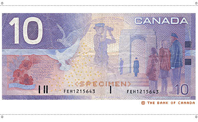
There is a quotation from the poem “In Flanders Fields” by John McCrae. Each bill in the series has a literary quote set in near-impossible-to-read type (“Can you bump this up a size or 6?”), and I like that, too.

Next up, over 2 years ago we got a very charming new $5 bill (why they don’t issue them in denominational sequence is beyond me), with a winter play theme featuring a game of outdoor hockey that includes a girl player—how very PC of them. Not only is this my favourite of the bills by far, it also has a great quotation from the famous story, “The Hockey Sweater,” by Roch Carrier. Very Canadian, with a kind of innocence I’ve never seen on any currency anywhere. How could you look at this and not love us completely?

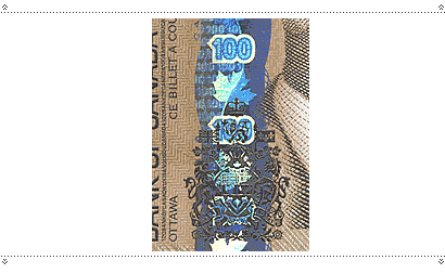
Earlier this year, the new $100 bill was issued. It reminds me oddly of … the new UPS logo. This one has a theme of “Exploration and Innovation” and heralds what will soon be antiquated space junk: they should have stuck with themes of longevity like hockey or fishing. Well, no, maybe not fishing. Anyway, I was all set to pronounce this bill “butt ugly,” until I got my hands on one. One-hundred dollar bills are not dispensed from cash machines, so for the sake of Speak Up readers I made a special trip to the bank to get one.

Luckily the one I got is in mint condition and it positively shimmers with security features (see more below). There’s an overprint of spot varnish in places that looks so much like envelope glue I’m tempted to lick it. There’s a ribbon of irridescent foil on the front that is so beautiful I can’t stop playing with it (it looks mostly copper coloured, but as you can see below it has scanned as blue). And it in turn is engraved with a positively stunningly detailed Canadian crest. I’m going to have a hard time handing this over to a cashier in exchange for toilet paper and some change.

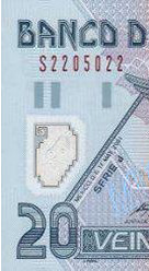
The $20 bill that was just unveiled is unlikely to reach my wallet for a while, so all I have to go on is from the Bank of Canada Website (a very nicely organized and designed site, by the way). This one, interestingly, depicts the art of the Haida artist, Bill Reid, the studio of whom was a client of mine while he was alive. It predominantly features the sculpture “The Spirit of Haida Gwaii,” which I’m a little tired of as it has become somewhat of a default native-Canadian icon, versions being here at the Vancouver Airport and at the Canadian Embassy in Washington, with the original plaster at the Museum of Civilization in Quebec.

In many ways this new $20 disappoints me the most. Where the $5 has a dynamism and unusual, yes, playfulness (snowflakes!); the $10 has that unintended humour buried in its predictable iconography; and the $100 has that gradient, the $20 seems to squander an opportunity to use the natural graphic sensibilites of Haida art (issues of cultural appropriation aside). Instead, they have chosen to float four artefacts in and around each other in a distinctly Photoshop sea, without connection to each other or to the graphics of the bill itself. Admittedly, it could be worse, but given the source material, it could be so, so much better.

The fronts of all of these are all similar in design, featuring one of a few past Prime Ministers who most people have forgotten: Laurier, Macdonald and … um … Borden (had to look that up: never heard of him), and our Queen, who we share with England. The Aging of the Queen as Represented on Money and Stamps is perhaps another post, but let’s just say that assuming they’re still flattering her, she’s not looking too good, poor thing.

Of course the design of money is a science of useability and security, and in this respect they certainly measure up, to my eyes.

Our money has been colour coded in blue (5), purple (10), green (20), red (50) and brown (100) since, well, at least since I was born. The 1969–79 series was famously a riot of colour, but still within that range.

On our new series, the denominations are very clearly printed in large—and I mean honking big numbers on both front and back, and if that’s an identifiable typeface I’d love to know what it is: I simply love the shape of the “0” … on the ten, anyway—the face has been disturbingly condensed or changed on the 100.

And just in case you actually are so blind you can’t see that, each bill is embossed with braille. Except, maybe there’s something about braille that only the blind understand but it looks/feels exactly the same on the 5 as the 100 (6 dots). The braille tends to get worn down pretty quickly, but nice effort anyway.

The security features are many and varied, including holographic stripes, security threads, watermarks, “see through numbers,” flourescing inks and fibres that glow under UV light. Probably pretty standard stuff, but it all looks and sounds cool to me.

In all, I’m happy to see these new notes replace the 1986 series. The design of the latter was an intense disappointment to me as its dull and not-particularly-well-rendered graphics replaced what must surely be one of the more psychedelic set of banknotes on the planet, those of the 1969–79 Series (check out the mouseovers), designed by Thomas de la Rue. The first issue of the $20 of that series was purportedly too green and thus confusing with the $1 (by the colour-blind, presumably), following which it was re-released in distinctly, er, fruit-loop colours.

Call me tacky, or perhaps just predictable, but those really were my favourites, despite the oil refinery on the back of the $10 (with the simple 1954 series, designed by Charles S. Comfort, running a close second). The $50 of that time is my second favourite note in the world, next only to the Dutch 50 Guilder. It had an image of the Mounties’ Musical Ride on the back that was so finely rendered you could see the maple leaf which they back-brush by stencil into the hair on the horses’ rumps. How cool is that?


I guess the $50 is the next up for the new series. I’ll be waiting in restless anticipation to see if they’ll restore some of that former glory in it.

Maintained through our ADV @ UnderConsideration Program
ENTRY DETAILS
ARCHIVE ID 2094 FILED UNDER Critique
PUBLISHED ON Oct.01.2004 BY marian bantjes
WITH COMMENTS
Comments
Jeff Gill’s comment is:

Ahh, the queen. Isn't she cute? That's a pretty good picture of her on the new 20.

Great post, Marian! I have to agree with you about the 50 Guilder note's fantastic-ness.

One of my all-time favourites is Sweden's 20 Kronor note.

On Oct.01.2004 at 05:20 AM
kevin’s comment is:

Interesting. Fun. Thanks for reminding me how much fun it was to be holding a fifty when the mountie bills were common.

I'm not sure it's fair to criticize the new twenty for not exploiting the Haida theme more. I think that's not the story of the bill.

Bill Ried's work is already an interpretation of Haida culture. To call his pieces artifacts is to downplay that this is important contemporary art. I like the idea of using our money simply as public space to celebrate Canadian things, in this case the work of Bill Reid.

I like the idea of the bill and look forward to actually holding one. My thought is that it would have been too much to incorporate another layer of interpretation of haida culture. It would be adding unecessary content in the form of style on top of the four artworks. It would be a bit like displaying William Morris' Kelmscott Press work within huge decorative borders.

On Oct.01.2004 at 05:52 AM
Bryony’s comment is:

Love the subject Marian!

In October 1994, the Mexican government introduced a new kind of bank notes (long story short we had a new currency denomination, meaning there was no option but to design a brand new set of everything). The most important change was the fact that we would have different sizes! Up to this point, there is a debate between those who favor this system, and those who hate it. You usually don’t find a middle ground.

Many revisions and updates have taken place since they were first issued, and one of the latest and most intriguing to me, is the new counterfeit system. The 20 peso bills now have a clear embossed seal in them. I wish I had one with me right now, since a picture would show more clearly what I am talking about. Now, this is way cool! I still don’t know how they do it.

On Oct.01.2004 at 08:18 AM
Jason T’s comment is:

Those notes are so visually rich. Comparing them to US currency, we (our policy makers) don't place enough emphasis on aesthetics. US currency is more engineering than design. So much so that the bills look stripped down when viewed next to Canadian bills. In the States, even the new designs being employed aren't much different than the old. So what? The dead presidents have bigger heads, and there's some watermarking. Let's see some real changes. Give me color. Give me contrast. Give me emphatic typography that isn't based on some old wood cut.

All I need to do is look at your samples, Marian, to make me feel like moving out of the States. After all, Seattle doesn't pose that far a move for me to get across the lines.

On Oct.01.2004 at 08:46 AM
Rebecca C.’s comment is:

Despite the best (?) efforts of the Federal Reserve, Treasury & Secret Service, our (US) paper money still looks like mud. Green mud. With huge faces of dead men disconnected from the lives of citizens.

One of my favorite assignments back at school was to design a $20 bill any way we wanted. Color, type, imagery; it was too fun. After I graduated, I worked at a bank for a year; as a banker, not a designer. I saw many instances of elderly people unable to distinguish between bills of different denominations due to their uniform design. Talk about a failure of design--and on such a large scale. One of my favorite reference books is still the Banker's Guide to Foreign Currency. So many beautiful examples.

Marian--great post topic, and I love the feelings you mentioned from the $5 bill. Why shouldn't something we use everyday be well-designed? Why can't it make us feel happy?

On Oct.01.2004 at 08:53 AM
Darrel’s comment is:

Beautiful.

(Darrel adds 'hockey money' to his list as resaon #22 to move to Canada)

On Oct.01.2004 at 09:46 AM
Patrick C’s comment is:

Great post Marian.

I too have a fondness for the 69-79 series. Both the 20 and 50 in that series (but as you rightly point out especially the 50) were great.

So far I have found the new 5 and 10 a real disappointment. The backs of both have far too much going on and are too monochromatic, lacking contrast and punch. The 10 especially ended up looking washed-out and messy. This is where the Dutch bills shine. They are much stronger graphically and brighter. I love them.

And Jeff, that 20 Kronor note (I assume you are referring to the one with the geese) is beautiful.

On Oct.01.2004 at 10:08 AM
marian’s comment is:

To call his pieces artifacts is to downplay that this is important contemporary art.

Well, "artifact" (or, in my spelling, "artefact") doesn't mean old, useless thing, it refers to an object made by human workmanship, which is how I intended it.

Also, I wasn't advocating that the back of the 20 become a piece of Haida art, but that given the strength of that art, the narrative of it, and the forms in it, it could have been integrated more strongly into the design, or been used to greater advantage than it is.

I think one of the things I love about the $5 bill is that, with the exception of the toboggan floating off on the left, the whole back is a scene. The way that smiling boy is coming toward us gives us a real connection to the image. It is engaging in a way that I've never seen on any other currency.

"The Spirit of Haida Gwaii" and much of Bill Reid's other work is similarly engaging: there's a story, something happening there, and it would have been nice to get a sense of that, rather than "here are some things he made": i.e. artefacts floating in space.

Re: the Dutch, I am extremely fond of all of their (old) bills, and was very, very sad that the Euro didn't live up to those standards.

Bryony, I am in favour of bills in different sizes. There's something about getting a large denomination note that's, well, large that's extremely satisfying.

On Oct.01.2004 at 11:34 AM
M Kingsley’s comment is:

As someone who grew up a short drive from the Canadian border, I'm going to miss the Loon on the back of the 10 dollar notes.

Since everyone's reminiscing about their favorite currency, check out the work of J�rg Zintzmeyer for the http://www.snb.ch/e/banknoten/alle_serien/alle_serien.html" target="_blank"> eighth series of notes for the Swiss National Bank (follow the link). I saw the http://www.snb.ch/e/banknoten/aktuelle_serie/persoenlichkeiten/content_50.html" target="_blank"> 50 Franc note on a business trip the year they came out and was immediately drawn to the vividness of the green and the haunting image of http://www.snb.ch/e/banknoten/aktuelle_serie/persoenlichkeiten/lebenslauf/taeube.html" target="_blank"> Sophie Taeuber-Arp. On my return, I studied the note under a loupe and found a small square above her head that contained the most amazing bit of micro-writing; a paragraph of her biography in each of Switzerland's four languages: French, Italian, German and Romanche.

The whole series is inspiring. Each person depicted was an artist, musician, writer or architect instead of a political figure (Le Corbusier on the 10 Franc!). And Speak Up readers might appreciate that Zintzmeyer's name appears on each note.

On Oct.01.2004 at 12:49 PM
Tan’s comment is:

I love everything about the new beaver bills except the inexcusable use of Eurostile. It's soo Eurotrash and 80s. Blech.

But I think paper currency is going to go the way of the dinosaurs, fax machines, and film cameras — probably within the next 30 years or so. Our kids will probably be the last generation that use more paper currency than virtual currency.

Heck, I rarely carry cash anymore, and if I do, it's for incidental expenditures like a can of Coke or box of Altoids. I don't remember the last time I bought something over $20 with cash.

I tried to find some info on US currency design, specifically just on design itself, but came up empty. The government just no longer sees our currency note as a visual entity anymore — it's now a piece of secured technology, with no more soul than a pc operating system.

But I did come across this very interesting site with tons of money facts and trivia

On Oct.01.2004 at 01:00 PM
Jeff Gill’s comment is:

Mr Kingsley, vertical money.

How cool is that! Does anyone know of any other countries that use vertical notes?

-

Patrick, yep. The geese.

On Oct.01.2004 at 01:08 PM
marian’s comment is:

check out the work of J�rg Zintzmeyer for the eighth series of notes for the Swiss National Bank

Thanks! Yes, I was looking for this an hour ago ... I remembered coming across it when I was writing my article, but I lost the page and forgot which nationality these beautiful notes were issued for (and my initial guesses at Swiss were taking me to the wrong series). They are truly wonderful. I admit our own Canadian currency doesn't really compete on an international stage, but the old $50 remains a favourite for sentimental and jingoistic reasons.

From what I've seen, the Dutch have it down, with the Swiss in hot pursuit. Why is this no surprise?

One of my favourite money sites is here. To bad no thumbnails, but hours of entertainment, nonetheless.

On Oct.01.2004 at 02:00 PM
Matilda’s comment is:

Marian,

I love it when you post stuff about Canada...I too love the $5, basically because of the features you mentioned and because the designer varied the size of the depicted objects (ie: on the back of both the old and new $20, all the objects vie at the same level for attention) so one feels the depth of the hockey scene.

And the $100 bill may be pretty, but the number of shops in Montreal -- where we apparently have a HUGE counterfeit ring happening -- who will accept a $100 bill are very rare...

Canadian stamps deserve a post, too!

On Oct.01.2004 at 02:07 PM
marian’s comment is:

Wow, I simply can't imagine counterfeiting that $100 bill.

Canadian stamps deserve a post, too!

Actually, I have something vaguely planned, but probably for the distant future.

On Oct.01.2004 at 02:33 PM
Steve Mock’s comment is:

Here's a little bit about the US mint sculptors/engravers:

Link

On Oct.01.2004 at 03:50 PM
amanda’s comment is:

I love our rainbow money. I would have to say the 5'er is my favorite as well. Too bad NHL hockey is in a sorry situation right now.

Love the sunflower fifty. PRETTY.

On Oct.01.2004 at 04:55 PM
Andrew Twigg’s comment is:

Marian

Great post as always.

Meanwhile, in the US we can't seem to get past the color green. And periodically we like to try introducing out $1 currency in coin form. That seems to go well: people putting dollar coins in parking meters that only take quarters, accidentally blowing ten dollars on a wash load at the laundromat, and dropping $5 on a bottle of water while waiting for your clothes to dry.

But the canadian paper system looks pretty alright. It's easy to spot a $1 from a $100 miles away and with each variation on the motif, you'll have something besides the Weekly World News to stare at while you wait in line to buy that toilet paper.

On Oct.01.2004 at 08:43 PM
Jill’s comment is:

What a great post! I was working on this book around the time the US Treasury Department was revamping our paper currency. I remember when J.S.G. Boggs and Lawrence Weschler came to Chicago shortly after its publication, Boggs mentioned something about the engravers’ proposals for the “new” U.S. currency, which he apparently viewed in their earliest incarnation. Richly colored and exquisitely detailed, Boggs said they rivaled the international notes that have shamed us for so long…but (no surprise here) they were ultimately rejected by Congress for looking too much like “play" money. Or so the rapt audience was told....

I have always wondered what happened to those original engravings.

Thanks for sharing Canada's latest offerings; and that Dutch 50 guilder is a beauty.

On Oct.01.2004 at 10:16 PM
Rob’s comment is:

First, Marian, great post. Especially considering that, as mentioned, the design of US money leaves much to be desired. And the older Candadian $50 (the Mounties) felt oddly reminscent of old cigar box designs. I think it must be the color of the 'field' or something.

And Mark: Thanks for that incredibly wonderful contribution. Wow, the design of that currency is breathtaking. Just so, so beautifully done, I can't even find words to adequately express how special they really are. Any how, thanks.

And who knows, maybe someday, those of us here in the US, might just have money who's design is something worth being proud of, and not just the technical wizadry.

On Oct.02.2004 at 12:06 AM
Gunnar Swanson’s comment is:

Let me add my “Nice post, Marian” to the list of your admirers’ affirmations

someday, those of us here in the US, might just have money who's design is something worth being proud of

the international notes that have shamed us for so long

in the US we can't seem to get past the color green

US money has taken some steps backward in the last few years (not the least of which was making Andy Jackson look like a dowager who could no longer afford a hump) but the typical designer envy of snazzier bills makes little sense to me.

Every design is a piece of rhetoric and the rhetoric of US currency is “In God we trust but you can trust us.” US currency may not get you far these days (I spent twenty-three bucks for two beers in a Reykjavik bar last month) but it has a history of solidity. The image of the small-r republican 19th century evokes the long-term stability that is the US dollar’s selling point. The recent changes in US currency lost some of the 19C dignity in the name of security. A much better job could have been done in preserving the brand even while making technical improvements.

As much as Kangaroos, ugly queens, and clear plastic windows or hockey kids, donuts, and ugly queens, or imaginary historical sites may amuse me, there’s much to be said for keeping the greenback green(ish.)

On Oct.02.2004 at 05:45 PM
marian’s comment is:

I'm inclined to agree with you, Gunnar. The US$ is an icon like no other currency, and as such falls under my most recent mantra regarding logos, which is "Keep your logo, use it, and use it forever." (I reserve the right to change my mantra at any time for any reason.)

Canadians have a history of changing the appearance of our currency, but even if we didn't and then we did, who would care? Our dollars do not have nicknames, are not printed on posters and t-shirts all over the world and are not simultaneous symbols of good and evil all over the world.

To be honest, we've always been a little amused by the appearance of the US$, but like some crazy old aunt wearing last century's clothes, we secretly don't want her to change.

On Oct.02.2004 at 06:12 PM
Young’s comment is:

great post. I can't wait to get one of these. personally I love the look of the new bills, they look so bright and fresh.

Apparently, next semester I'll have the opportunity to design some currency as well. I'll have to keep these wonderful links on file.

p.s. glad to see the word "honking". very canadian

On Oct.02.2004 at 10:56 PM
Andrew Twigg’s comment is:

but the typical designer envy of snazzier bills makes little sense to me.

Gunnar... my comment about the color green was more related to the fact that different colors for each denomination just makes for increased ease of use. I don't have anything against green in particular, but I think it's easy to argue that variation in hue from one denomination to the next would make using money easier, particularly for those with mild to moderate visual impairments.

I'm actually not for "snazzier bills"... though advances in anti-counterfit technology are always welcome, I don't want my money to look like a three-ring curcus. But I think these are two separate things anyway.

And I completely agree with you that the recent redesigns have lost some dignity... some details have made the bills look a bit cartoonish.

Incidentally, I wonder about the "typical" designer envy you were talking about. I've seen enough undergrad currency design exercise end-product to know what you're talking about. To be fair, color use seems to be a problem there. But I don't think that doesn't mean it couldn't be used effectively.

On Oct.03.2004 at 09:58 AM
Andrew Twigg’s comment is:

But I don't think that doesn't mean it couldn't be used effectively.

Oops, I meant:

But I don't think that means it couldn't be used effectively.

On Oct.03.2004 at 10:00 AM
Gunnar Swanson’s comment is:

Andrew: Of course nobody asked me to redesign US currency but I would have used the anti-counterfeiting extra colors differently on each bill to provide a bit of the color distinction you suggest but green is the brand. I wouldn’t have let as much color as the current twenties sneak in. I also would have done the blind friendly stuff with a clarendon instead of a sans (I remember a sans on the twenty before the current one but my pockets are empty enough right now that I'm doing this from memory), let the presidents and Alex be large but keep them in a cartouche, and generally keep the stiffer look now only seen on the one. And pyramids and eagles and frufru on the back instead of buildings. At least they’re neoclassic buildings but leave the architecture without eyes to the Euro.

Marian: Canadians do nickname coins.

On Oct.03.2004 at 05:49 PM
marian’s comment is:

Marian: Canadians do nickname coins.

Yep, and most countries probably have nicknames for their own denominations of currency (which are even, within the country, regional). But the "greenback" is known fairly widely outside of the US. That's the dif.

On Oct.03.2004 at 06:58 PM
Matilda’s comment is:

I think that because the American dollar is held as a standard, there is more incentive not to change it, despite the ease of use issue. As Marian posted, "Canadians have a history of changing the appearance of our currency, but even if we didn't and then we did, who would care?" who indeed would care if guilders, or any less prominent money to the world economy changed?

On Oct.04.2004 at 02:56 PM
Seth’s comment is:

I really enjoyed this article and the comments. I personally agree with Gunnar about the history and brand of US currency. I remember when my dad saw the new bills (not a designer--in fact, a lawn mower blade machinist), he said they looked like "third world currency."

I really like the hockey scene and the flowers and all the beautiful Canadian bills, but somehow it seems like it would be a wrong step for America. Good point on the functional problems with people with poor eyesight though. But I guess I'm still a fan of the old American greenback. It's as much an icon as the American flag, which incidentally, isn't all that terrific aesthetically either. But I think sometimes the history transcends aesthetics.

On Oct.06.2004 at 08:36 PM
Brad Connell’s comment is:

Just saw this today:

Link

I'm not too crazy about this one at all.

On Oct.14.2004 at 02:52 PM
marian’s comment is:

YIKES! What have they done?? This is brutal. It's like the nail in the coffin of the whole series.

On Oct.14.2004 at 03:13 PM
Matt Warburton’s comment is:

Great critique as always Marian. I'll buy you a beer at next week's GDC event where we get to hear about Casey's staying power (or is it Ray's?!?!). I wish I'd seen your story earler than today (November 18) when I posted a query on the GDC listserve about the new $50s that were released yesterday.

Personally I always loved the series when we had scenes of Canadian birds on the backs.

And I completely agree with you about the Photoshop .sea on the $20. Very poorly done.

If only we could get our coins back to the standard of the 1967 centennial series. The new quarters with the red poppy are pathetic!

On Nov.18.2004 at 04:30 PM
abi’s comment is:

Good article, though I have little exposure to Canadian currency. But I loved - and miss - the Dutch currency, with its vivid colouration.

A very clever aspect of the Dutch notes was that each of them had, in that tiny tiny type they use to make forgers' lives more difficult (so no, they couldn't size that poem up), the text of the Dutch law on counterfeiting. In other words, in the process of making the funny money, you were automatically unable to claim ignorance of the law.

Here's something beautiful done with that currency - even more spectacular in person (though technically illegal, I am informed.)

On Dec.24.2004 at 03:18 PM
Wayne’s comment is:

I'm nobody in particular, but enjoyed your insights on the new designs. And I've always thought the old Dutch currency was the best! Too bad we didn't just adopt them worldwide.

On Oct.23.2007 at 02:45 PM
AnaemyAntenda’s comment is:


benz mercedes tulsa

On Oct.24.2007 at 02:49 PM