Speak UpA Former Division of UnderConsideration
The Archives, August 2002 – April 2009
advertise @ underconsideration
---Click here for full archive list or browse below
  
A Contribution to the Ethical Taxonomy of Political Signage

One of the tried and true conventions (pun intended) of each Presidential election is the slightly satirical analysis of each party’s signage. The focus — usually on the perceived meaning conveyed in type selection and letter spacing — sometimes helps deconstruct the man. For example, in 2000, reports of Al Gore’s fixation on the details of his logo helped expose his micro-managerial style.

kingsley_gore_logo.jpg

In the white-hot intensity of the current election cycle, Americans have had ample opportunity for their own exercises in candidate deconstruction. And given my particular interests as a designer, my attention was often directed towards the construction of the message — and I suspect, so were many of my colleagues. But instead of trying to glean meaning from interpreting typographic details, it was the application of the signs that I found compelling.

Delegates at both conventions had an uncanny ability to erupt with cued spontaneity, depending on who was speaking. When the Democratic candidate for Illinois Senate, Barack Obama spoke, they loved Obama — which is amazing, because I certainly didn’t know who he was…

kingsley_obama.jpg

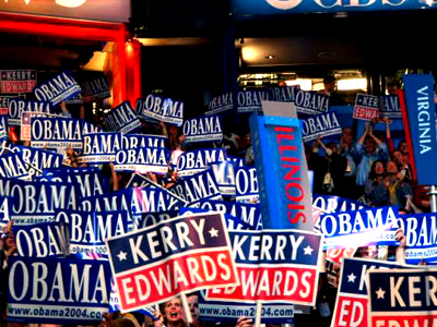
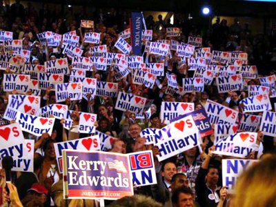
When Hillary Clinton, spoke, they loved Hillary…

kingsley_ny_hearts_hillary.jpg

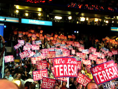
…and when Teresa Heinz Kerry appeared, they loved Teresa.

kingsley_teresa.jpg

You occasionally saw a handmade sign or two…

kingsley_dnc_pittsburgh.jpg

kingsley_dnc_handmade2.jpg

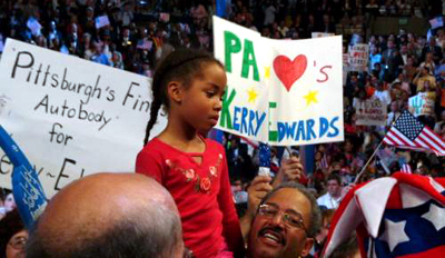
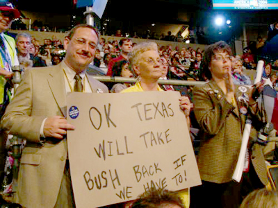
…but these made sparse appearances because of a ban, present at both conventions, on such signs. Due to security concerns, you could only bring in what you wore.

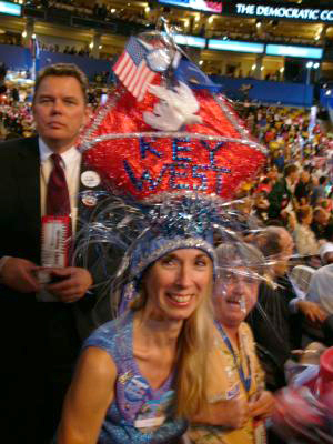
For example, here’s a Democratic delegate…

kingsley_dnc_hat.jpg

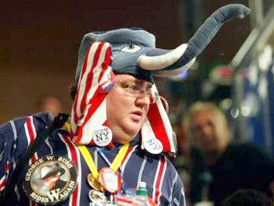
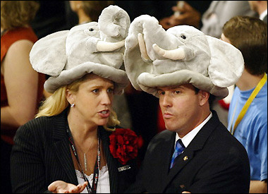
…and a couple Republicans.

kingsley_elephant_hat.jpg

kingsley_elephant_hats2.jpg

Obviously, these spontaneous displays of sign waving were directed — confirmed in the Discovery/Times Channel film Making The Message — by rooms of staffers with eyes on closed-circuit monitors and phone lines to delegates in the audience. And you can’t blame them for this. Political conventions are no longer gatherings to select a candidate and construct a unified narrative, but a full-on commercial for a pre-selected ticket and a pre-selected message. It’s an opportunity to establish the brand and they would be lax if they did otherwise.

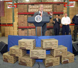
During the Republican Convention, one minor item was occasionally mentioned in the news media and blogosphere — the handmade signs visible throughout the week were not home-made by delegates, but actually mass produced by volunteers. Given that the GOP is if anything, admirable in their ability to stay on message; this little tidbit seemed a bit odd.

A good example of their focus would be a comparison between the Bush/Cheney logo of 2000 and this year’s logo.

kingsley_bushchenney2000.jpg

kingsley_bushchenney2004.jpg

The only photographic evidence of this mass production of one-of-a-kind items that I could find comes from Konrad Fiedler of the New York Sun.

kingsley_konradFiedler_nysun.jpg

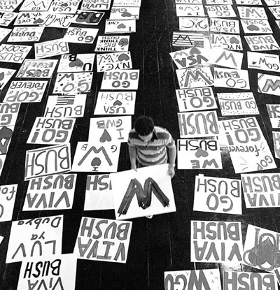
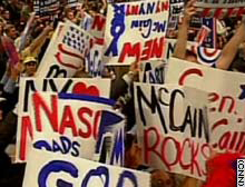
In the battle for the hearts and minds of NASCAR dads and security moms, the Republicans were quite capable in the battle of constructed folksiness, making up to 35,000 signs. Problem is, there’s only so many phrases you can come up with.

Cheney Rocks (he does?)…

kingsley_cheny_rocks2.jpg

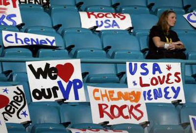
…and so does Senator John McCain.

kingsley_mccain_rocks.jpg

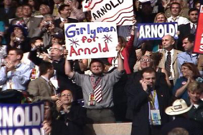
Seeing a speaker’s lines echoed in the audience, while underscoring the message, instantly deflates the spontaneity. This appeared during California Governor Arnold Schwarzenegger’s speech, which made use of the phrase economic girlymen.

kingsley_girlyman.jpg

Now outside of the scripted political convention, the sign-jinks get a lot sloppier. Here’s CNN reporter Wolf Blitzer just after the third Presidential Debate. Notice the guy in the background with the beard.

kingsley_blitzer_1.jpg

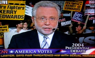
Here, he holds a sign that reads Kerry Eats Babies.

kingsley_blitzer_2.jpg

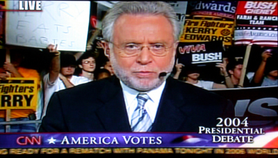
The crack Kerry/Edwards Sign Brigade jumps into action…
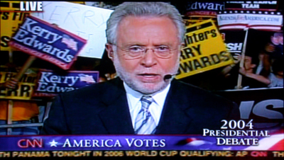
kingsley_blitzer_3.jpg

…and all is well.

kingsley_blitzer_4.jpg

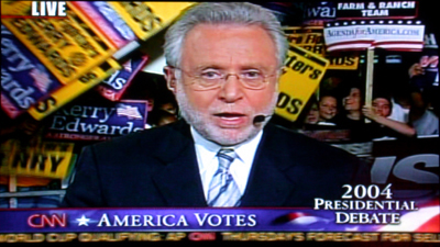
Reading the crawl at the bottom of the pictures helps give a sense of how much time this sequence took.

To extend the metaphor slightly, consider another form of directed mass sign waving: the card stunt. These synchronized sign activities are nothing new — they’re a common sight at football games — and one could consider them a first cousin to the cued signs at political conventions. But just raise the level of detail and you get something like the North Korean Arirang Festival or Mass Games.

kingsley_peopleseconomy.jpg

kingsley_science-highest-level.jpg

kingsley_bayonets.jpg

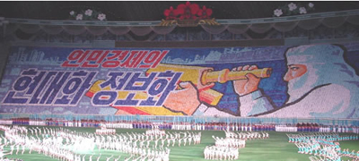
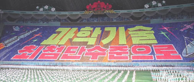
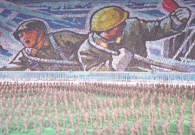
All these mass images are comprised of individual cards, held by rehearsed audiences, all in service to Fearless Leader. And in an era where attendees at recent Bush rallies are asked to take the “Bush Pledge”, edges become blurry and opposites don’t seem so far apart any more.

Maintained through our ADV @ UnderConsideration Program
ENTRY DETAILS
ARCHIVE ID 2124 FILED UNDER Essays
PUBLISHED ON Nov.01.2004 BY m. kingsley
WITH COMMENTS
Comments
Stuart McCoy’s comment is:

"I took several of the suggested designs and kind of recombined them and added a different approach... I 've always felt that logos and other visual symbols that are seen over and over again actually are pretty important."

Isn't this the sort of thing we despise as graphic designers?

This brings up a series of bigger questions though. Who designs political signage and promotional materials, including television ads? What would political campaigns look like if firms like Hillman Curtis or Chermayeff and Geismar took a stab at them? If firms of this caliber are already deigning these materials why are they so awful? Are these projects so micro-managed by political control freaks as to destroy any semblance they may have had of effective graphic communication?

On Nov.01.2004 at 09:22 AM
M Kingsley’s comment is:

>What would political campaigns look like if firms like Hillman Curtis or Chermayeff and Geismar took a stab at them?

Stuart — along with the slightly satirical analysis of each party’s signage, the New York Times also engages in the Real Designer What If Game — where the better known of the local scene are asked to suggest solutions for candidates during the primaries. The results span the range from comedic to brilliant to tragic.

In the case of this essay, I guess you could say that I'm interested in aspects of the 'branding' instead of engaging in critiques of specific signs. You may be interested in this dicussion.

On Nov.01.2004 at 12:10 PM
Feluxe Socksmell’s comment is:

Nice work, Kingsley.

I found it interesting that The New York Times did an Op Ed (designed by Paula Scher) on the subject of how bad Kerry's logo was. "Cant he afford to pay a graphic designer?" it read.

If he loses, we have design to blame.

In the interim, here is a shot of my homemade front yard sign which uses James Victores optimistic Kerry-with-attittude fist:

talk about logo smackdown...

On Nov.01.2004 at 12:23 PM
Feluxe Socksmell’s comment is:

John Kerry aka: the brass taxer

On Nov.01.2004 at 12:26 PM
Feluxe Socksmell’s comment is:

btw- there will be a story on CNN tonight deliberating on Kerry and Bush signage specifics.

How did I know beforehand? Well, thats my dirty little secret.

On Nov.01.2004 at 12:28 PM
M Kingsley’s comment is:

Felix — since you're in the know... What time, and will it be repeated?

On Nov.01.2004 at 12:31 PM
Feluxe Socksmell’s comment is:

I'll find out...

On Nov.01.2004 at 12:36 PM
marian’s comment is:

I have to say, there's something thrilling about all those signs together. It's like Church ... you walk in, see the stained glass windows, the vaulted ceilings, hear the choir and fall to your knees (it happened to me—almost—in St. Paul's Cathedral in London).

Interestingly, the completely mundane (or bad) individual sign is transformed into a thing of power by this mass repetition. To make yet another analogy, it's like chorus girls: one dancer dressed in sequins and tapdancing her little heart out is anywhere from charming to depressing, depending on your point of view, but 60 of them doing it all at once is always fascinating.

Choreographed repetition inspires awe, whether it be political signs, military parades, Busby Berkeley films or The Wave.

Silly hats, on the other hand, are just funny.

On Nov.01.2004 at 12:41 PM
Greg’s comment is:

What do you suppose the cost of printing all those individual signs for the North Koreans? Besides looking really cool, what purpose does it accomplish? Isn't this the same country where more than half the population are starving?

On Nov.01.2004 at 12:56 PM
M Kingsley’s comment is:

>Besides looking really cool, what purpose does it accomplish?

1. The repression of individualism for the good of the party.

2. A public relations display of unity.

3. A shift in focus away from the personal problems.

All applicable to both North Korean rallies and American conventions.

On Nov.01.2004 at 01:20 PM
marian’s comment is:

All applicable to both North Korean rallies and American conventions.

Politics, religion, sports, the military, fandom ... (think about the Crusaders: sports, religion, politics and the military all in one! What a branding moment! )

All are about the repression of individuality. For most people it feels good to join something; to be a part of something bigger. This is why branding works. You join a team, give up your individuality to the team, hold a sign or placard, paint your face, wear an outfit, wave a flag ... and then when viewed from a distance you can look back on the crowd and say "that's me."

On Nov.01.2004 at 01:51 PM
Feluxe Socksmell’s comment is:

compliments of emily oberman

On Nov.01.2004 at 02:33 PM
Feluxe Socksmell’s comment is:

pronounced with a silent S... looks German but sounds like "Boo".

Rather subliminable.

On Nov.01.2004 at 02:35 PM
marian’s comment is:

Coordination being key.

On Nov.01.2004 at 04:01 PM
Darrel’s comment is:

That is hilarious. ;oD

On Nov.01.2004 at 04:02 PM
Shahla’s comment is:

The thought of him being in office another 4 years is pretty scary : )

Thanks to Feluxe and Emily.

On Nov.01.2004 at 04:23 PM
omit’s comment is:

Brian May was in charge of signs for the Democratic Convention. He wrote about the experience here.

On Nov.01.2004 at 06:02 PM
heather’s comment is:

interesting topic kingsley...

is the fact that design plays such a small role in kerry or bush's campaign a sign of how low it is on the priority list? that article about Gore was downright mean. so what if he spends extra time micro-managing his logo development? good for him! at least someone was paying attention.

i find both campaign logos pretty bland, but agree with marian: with repetition, it can be powerful.

On Nov.02.2004 at 03:03 PM
M Kingsley’s comment is:

>is the fact that design plays such a small role in kerry or bush's campaign a sign of how low it is on the priority list?

I would contend that "design" is a crucial element of modern campaigns. For example, press events like these:

Some of us may remember the dust up surrounding this one. The sign in back said "Strengthening America's Economy" but underneath the brown tape, the boxes in front said "Made in China". Definitely one of those times when it's better for the design to be invisible.

Also, every time you see a backdrop with "Help Is On The Way" or "Keeping America Safe" as a repeat pattern, you just know that a team of campaign strategists spent some time on it, parsing... parsing... and parsing...

On Nov.02.2004 at 06:20 PM
Chris Vivion’s comment is:

I did a small essay on political signage, focusing on protesters signs and their choices in message, typeface, homemade verus prefab signs....

I've posted a small edit here:

http://www.herenotthere.com/archives/2004/11/standing_in_the_1.html

I think it is relevant. Enjoy.

On Nov.08.2004 at 01:25 AM
Chris Vivion’s comment is:

I did a small essay on political signage, focusing on protesters signs and their choices in message, typeface, homemade verus prefab signs....

I've posted a small edit here

I think it is relevant. Enjoy.

On Nov.08.2004 at 01:26 AM