Speak UpA Former Division of UnderConsideration
The Archives, August 2002 – April 2009
advertise @ underconsideration
---Click here for full archive list or browse below
  
100 Unused Logos and What they Reveal about my Design Inclinations

This past Wednesday I gave a presentation at the HOW Conference in Atlanta, GA. As a respite from the pristine show and tells of finished work sprinkled with anecdotes that support the fabulous work on screen I wanted to focus on the unglamorous side of graphic design. The endless revisions, the variations, the changes, the odd requests — “I like turtles, can my logo have a turtle?” — and the inevitable doom of much of the work we do as bezier- and pixel-based compost for piles of archived CDs, DVDs and 200-gigabyte hard drives. For my slide show I went through almost ten years of archives looking for all the files that never quite made it… the good, the bad and the ug… nay: The tired, the poor, the huddled files yearning to breathe free, the wretched refuse, the homeless and, yes, even the tempest-tost. (With apologies to Miss Liberty).

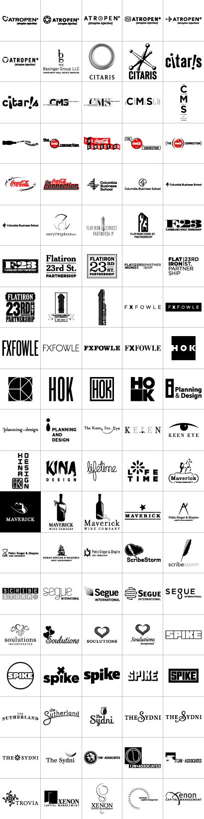
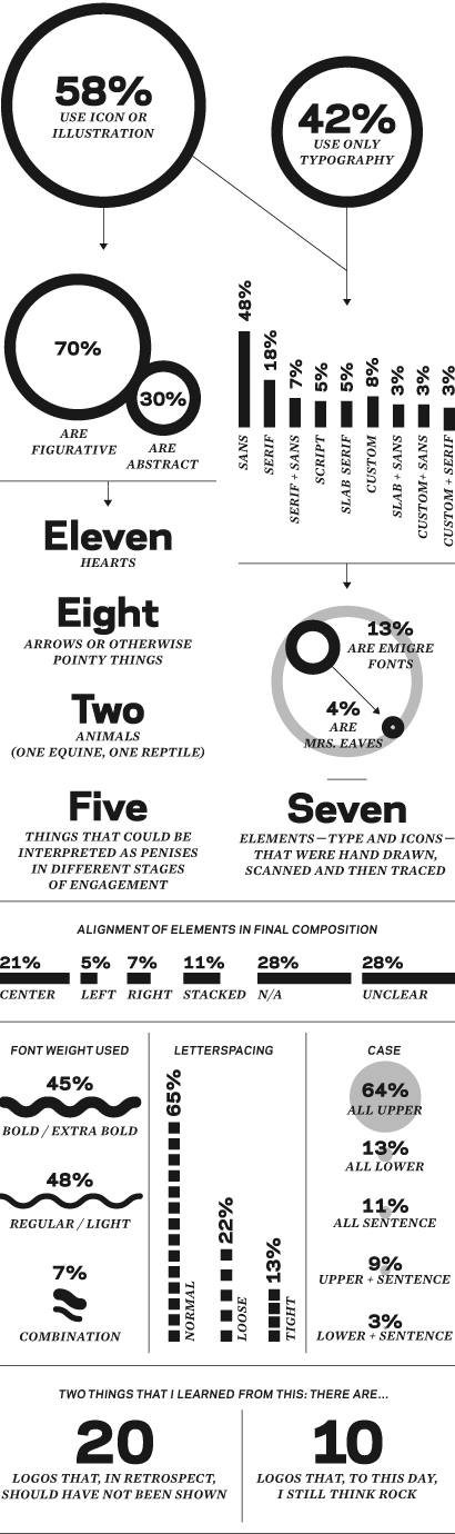
For a section called “75% of your files are trash” I specifically looked for 100 logos that were never selected — or never actually used if they were selected. This is not a Best Of selection. Some of the logos are embarrassing: Half-cooked, half-assed, off-topic ideas with sloppy kerning and poor execution. Equally, there are some very competent logos in there, ready to be printed and shipped. Most of these, if not all actually, were shown to a client. Some were mocked, others praised and a few more ignored. I have another 50 logos that I could have added, but due to confidentiality agreements or because the project has not closed I can’t add them (yet) to this psychotherapeutic exercise. Going through all this work proved to be a soothing/stressing experience as I was able to reflect on the work that I have shown as responses to briefs and made me wonder what would I do differently now. I also noticed a lot of patterns and repetitive executions in my proposals: Plenty of sans serif type and centered arrangements, and a few too many instances of Mrs. Eaves. Was this accurate? Could there be more? After coming back from the conference I decided to do a little forensic exploration of all these deceased logos to unveil my design preferences. Here, then, are 100 unused logos and the ties that bind them.

You can click on the logo grid to see a bigger image, pop-up style.

100 Logos

divider

100 Logos Statistics

Maintained through our ADV @ UnderConsideration Program
ENTRY DETAILS
ARCHIVE ID 3536 FILED UNDER Branding and Identity
PUBLISHED ON Jun.19.2007 BY Armin
WITH COMMENTS
Comments
Dav, formlos’s comment is:

Quite an insight. Very nice post. (Maybe I should do something like that as well, sometime.)

On Jun.19.2007 at 10:53 AM
marian bantjes’s comment is:

I'm simply astounded that someone named their company Citaris. Really? Really?!! And didn't you do a mocking, overtly ... uh ... female logo for it, not even in fun? And I count 10 penises, more or less.

On Jun.19.2007 at 11:46 AM
Armin’s comment is:

Marian, clearly you have a much dirtier mind than I do.

On Jun.19.2007 at 11:57 AM
art chantry’s comment is:

armin -

geez! people actually PAY YOU to play sktechy-sketch with their precious identities like that? weird. that looks like fun (getting the check, i mean)

you very lucky fella, yhoo betcha!

- art

On Jun.19.2007 at 12:01 PM
bryony’s comment is:

One more item to count: feminine vs. masculine.

I am continuously surprised by your feminine touch on some of the logos you have worked on. I guess it stems from one of your many hearts.

On Jun.19.2007 at 01:28 PM
Jose Nieto’s comment is:

We could all benefit from this kind of self-assesment -- nice post.

On a side note, I used to work at the Flat Iron building many moons ago, and I have to say that the rejected concepts (particularly the one with the broken "partnership") do a better job of capturing the spirit of the building than the non-descript approved solution. That place was a pain in the ass -- slow-as-molasses elevators, weird nooks, ancient wiring -- but it still makes me smile whenever I think of it. I get the Broadway/5th Ave intersection concept, but it carries none of the flavor that makes the building special.

On Jun.19.2007 at 02:46 PM
Jose Nieto’s comment is:

...of course, being that the partnership covers more than the Flatiron building, I guess the sketches were a bit too specific...

(Probably should have read the website before linking to it.)

On Jun.19.2007 at 02:59 PM
Kirk Roberts’s comment is:

I was in the audience for this talk... thanks for sharing all your not-quite-good-enoughies. And I particularly appreciated the portfolio website constructed entirely of hot, hot fire.

Does anyone want to comment on what they do when contracted for, say, 5 logo directions and do have 5, but only 3 they think are actually good?

On Jun.19.2007 at 03:50 PM
Rett’s comment is:

Wow, thanks for putting this together!

I'm curious which are the ten that you still love...I personally really like the maverick bandana logo, says it perfectly.

On Jun.19.2007 at 04:36 PM
Armin’s comment is:

Jose, indeed, having an image of the Flatiron building was too limiting for the purpose of the BID (Business Improvement District), as it serves a larger area than just the few blocks surrounding the Flatiron. We wanted to convey the new energy of the neighborhood, which hosts Madison Square Park, a nice amount of shopping, excellent restaurants and is home to hundreds of modern-day businesses in remodeled, refurbished, superwired offices that are not quite well represented by a 105-year-old building. The building, in small sizes, looked too weird too.

> geez! people actually PAY YOU to play sktechy-sketch with their precious identities like that? weird. that looks like fun (getting the check, i mean)

Art, they pay for the one they choose : ) The rest is, indeed, fun.

> I'm curious which are the ten that you still love.

Rett, I'm leaving this one open for interpretation.

On Jun.19.2007 at 05:04 PM
Mary’s comment is:

At least you are now past the fire era :) Great presentation at HOW, I enjoyed it, and so did many, many of my other HOW going friends! It was great to see all of your hits and misses. It really puts things into perspective! It was great meeting you and Byronny at the book signing (aka: binder signing!).

On Jun.19.2007 at 05:05 PM
diane witman’s comment is:

Many of these logos are pleasing to the eye, they may not have been the right fit for your client but they are all quite good. (Flat Iron are among my favorites)

Some refer to their unsused logos as a logo graveyard, I like to think that they are in more of a logo limbo in hopes of being pulled out and used again one day.

Does anyone recycle or go back to previously developed logos to be used for other clients?

On Jun.19.2007 at 05:07 PM
Roger Wong’s comment is:

My favorite part is your infographic analysis. Very easy to understand at a glance.

On Jun.19.2007 at 06:19 PM
randy h’s comment is:

I was just thinking today of how I am often fond of the rejects of marks. I was actually wondering what some of the leading designers thought on the subject, and what their rejects might be like.

Thanks!

On Jun.19.2007 at 08:35 PM
The other Randy (J.) H(unt)’s comment is:

Armin, I'm surprised some of these escaped the non-disclosures.

I don't know what the Trovia one is all about, but it looks tasty.

And...in all seriousness, did any clients make Black Pearl jokes when you presented the Pekin Singer & Shapiro ship?

Thanks for this one.

On Jun.19.2007 at 10:59 PM
marko savic’s comment is:

Maverick Wine Company, the bandana bottle is by far the biggest loss. Seriously, no offense, but I detest the one they went with. It makes me a little bit sad inside.

My favourites:
Atropen #3
CMS #2
Flat Iron #6 (It's so... industrial era metal stamp craftsmanship love but #7 is great too and more the feel I suppose they wanted)
The Keen Inc Eye ;-)

In other news, Scribe Storm # 3 is so Showcase (Canadian HBO)

This makes me happy though, and makes me want to work in Corporate ID when I grow up. It would be interesting to see if you traced your inspiration for the logos back to anything in particular what patterns would emerge about how you worked, if any, and if so, which ones created the best logos?

Looking forward to the logo for Mulva.

On Jun.20.2007 at 12:02 AM
Todd’s comment is:

Oooh Citaris! Good times.

On Jun.20.2007 at 07:52 AM
Armin’s comment is:

> I am continuously surprised by your feminine touch on some of the logos you have worked on.

For the Lifetime explorations, we joked that I was the one doing all the girlie logos, while two of the girls in our team were doing all these other corporate, "manlier" logos.

> Maverick Wine Company, the bandana bottle is by far the biggest loss. Seriously, no offense, but I detest the one they went with.

Marko, no offense at all. I also loved the bandit bottle. It was maverick, and it was wine. But I did like the one we ended up with as I was finally able to get a ROI on my purchase of Stephen Farrell's Volgare.

> In other news, Scribe Storm # 3 is so Showcase (Canadian HBO)

I was actually, and blatalntly, trying to rip off IDEO.

On Jun.20.2007 at 09:25 AM
Armin’s comment is:

> And...in all seriousness, did any clients make Black Pearl jokes when you presented the Pekin Singer & Shapiro ship?

This was way before pirates, the caribbean and Johny Depp in mascara were popular. I would attribute this logo to the endless hours I spent playing Pirates! when I was a kid.

On Jun.20.2007 at 09:37 AM
m.kingsley’s comment is:

By my count, there are 12 penises, 17 vaginas, and 4 anuses -- with some in combination. For example, the second Lifetime logo is both an ejaculating penis and an anus -- the anus, by the way, as immortalized in Kurt Vonnegut's "Breakfast of Champions."

*

On Jun.20.2007 at 10:26 AM
m. kingsley’s comment is:

Oops, on second count, make that 11 anuses.

Armin!

*

On Jun.20.2007 at 10:39 AM
Brad Gutting’s comment is:

Speaking of Stephen Farrell, what's he up to these days? Slipstudios.com goes to something entirely different now. I always liked his work, and thought that VAS was a super cool book.

These are good logos and its about time someone tackle this subject in a formal presentation. I as well have a collection of unproduced work. It's called "my portfolio." I figure if Rem Koolhaas can build a reputation on models, well, dammit, maybe designers can have the same option.

On Jun.20.2007 at 10:54 AM
Robin H.’s comment is:

I made a collection of rejected logos from past projects; I feel they are among the best work I've ever done. (Not all of them, of course.)

In a portfolio, why not display the work you'd like to be hired to do? There are a lot of things I COULD show that I hope nobody ever makes me do again.

In the digital age, will this unseen work ever be uncovered, recovered, discovered?

Good for you for rolling it out.

On Jun.20.2007 at 11:40 AM
Darryl C’s comment is:

Armin

I think your logo analysis is off to a good start. The more important data may lie in comparing the rejected work to the accepted work. Are there any significant changes in the patterns of accepted logos? More penises or fewer? After all, your rejected logos are really a subset filtered out by your clients.

On Jun.20.2007 at 12:56 PM
Shane Guymon’s comment is:

I was wanting to know your 10 favoites, but I saw that you already commented that you wanted to leave it to us to decide, so my decision is your ten best should be my ten favorites:

In no specific order:

The Coke Connection #3
Maverick #3 & #5
The Sutherland #1
The Sydni #4 & #5
Flatiron #1 #7 #9
Columbia Business School #3 or #2

Well their are quite a few that are impressive, and it sounds like a nice presentation, wish I would of been their.

On Jun.20.2007 at 01:10 PM
Shane Guymon’s comment is:

Also I wanted to say that I have been doing a similar thing, only it is for myself because I don't see me getting anyone who will ever want me to do a presentation any time soon. So it was cool to see someone else doing it as well.

On Jun.20.2007 at 01:35 PM
Abraham’s comment is:

Definitely dig this post, good stuff!

F 23rd logos rock for sure.

I actually save all my unused id work and call them my "spare parts", i've used parts for other logos quite often. I think of it as visual mechanics!

On Jun.20.2007 at 02:30 PM
Chris3Dogz’s comment is:

Hey Armin,
I missed your session at HOW so thanks very much for posting this. I heard a lot of people talking about it. Funny how a lot of speakers (us included) put themselves out there to show failings, although in your case, I echo a lot of the sentiments on here: the clients missed the boat on more than a few here.

Bottom line: revisit, learn from, and enjoy the "old" stuff.

On Jun.20.2007 at 03:31 PM
Chris3Dogz’s comment is:

Hey Armin,
I missed your session at HOW so thanks very much for posting this. I heard a lot of people talking about it. Funny how a lot of speakers (us included) put themselves out there to show failings, although in your case, I echo a lot of the sentiments on here: the clients missed the boat on more than a few here.

Bottom line: revisit, learn from, and enjoy the "old" stuff.

On Jun.20.2007 at 03:33 PM
Erica F’s comment is:

I love exercises like this! Although there are quite a few project dev sketches that I can't show because I swiped those unused designs later for other clients.

But I have to ask: Concept and image exploration is a part of identity dev, but how can one company, and an asset management one at that, be represented by a ship, a turtle, a compass, and an hourglass? (I assume this the "I like turtles" logo.) Rather than being variations on a concept, they seem to be entirely different concepts. What in the world was the brief/strategy behind this project?

I never see penises, et al, in my work. Gets me in trouble sometimes. (I once had a project plagued with interpretations of both penises and cannabis. Ugh.)

On Jun.20.2007 at 03:38 PM
Ivan Boden’s comment is:

Armin, I attended your session and was glad you posted these. I gave-up taking notes and sketching each logo at the show. Ouch!

I too have a huge dead logo file. Some of my best and worst work! I look at them in secrecy for fear someone will see. It took some guts for you to show us your underwear too!

Best, Ivan B.

On Jun.20.2007 at 04:45 PM
Armin’s comment is:

> but how can one company, and an asset management one at that, be represented by a ship, a turtle, a compass, and an hourglass?

Erica, good catch. I prefaced these logos (Pekin Singer & Shapiro) in my talk by saying that the following logos were going to be all over the place. The first thing to note is that there was no brief. The second thing, which led to 4 or 5 rounds of design explorations with this client was that the original partners, two older gentlemen were making a younger gentleman a partner and there was never an agreement on what the logo should feel like: conservative, risk-taking, old, new... We were all over the place. It was mostly our fault that we were never able to pin them down on a direction. In the end, and this was done after I had left that job (Norman Design), they made someone else partner! Not Mr. Shapiro, but someone else. So having confusion internally never helps a logo.

> The more important data may lie in comparing the rejected work to the accepted work.

Darryl, that would also definitely be interesting. My guess is that there is a wider variety of executions in the finished work. The problem is that I don't have 100 finished logos yet, and I love the shock-and-awe title of 100 logos!

> Does anyone recycle or go back to previously developed logos to be used for other clients?

I meant to answer this earlier... I have only completely recycled a logo twice (same icon, different name). Both times it felt like cheating. I just don't see how a different client, with a different personality, different context, different needs, etc. could yield two identical logos, so that's why I find it very weird to recycle logos. However, I do recycle ideas, executions and visual trickery often.

On Jun.20.2007 at 05:44 PM
Nikki’s comment is:

I was in your session at How and it was fantastic. It was my first conference and I am planning on attending every year now. I've been designing for a few years and I just finished school in December. It's so refreshing to see that successful designers deal w/the same crap that new designers are handling. I guess I always had this envisionment that more famous designers' work started out great and just got better and they didn't have to deal w/client rejections and endless revisions. It was a great session. Thanks for making it so fun! Try to keep it short next time :)

On Jun.20.2007 at 06:54 PM
Amanda Woodward’s comment is:

neat. Love the stats!

My favourite is the lightning bold scribe storm.

I will admit to rebirthing parts of logos from the logo graveyard. Not proud of it but when you do a logo for the third flowershop in as many years it would be silly not to do some file diggin'.

ps. We've all done our share of sloppy kerning, I'm sure.

On Jun.21.2007 at 02:44 AM
Mark Notermann’s comment is:

Thanks for sharing. It takes some cajones to put this kind of stuff out there (although your work is up to a consistent professional standard).

This is exactly the kind of work that is most worthwhile to students and people just starting out like myself. Honestly, the Graphis books and other annuals can only provide either fodder for theft or intimidation while learning, and its much more instructive to see the miscues and be reminded that talent takes time to develop.

------

@ Kirk Roberts’s comment

Does anyone want to comment on what they do when contracted for, say, 5 logo directions and do have 5, but only 3 they think are actually good?

There must be a designer's law (names anyone?) that says the idea you don't like will get picked.
My recommendation: show the three you like. If you have to show five? You're not done yet!

On Jun.21.2007 at 03:32 AM
Daniel Green’s comment is:

Ah, yes, I once had a logo rejected by a client because it was deemed to phallic. I should known better. It was for a group of psychiatrists.

On Jun.21.2007 at 08:12 AM
Daniel Green’s comment is:

Ah, yes, I once had a logo rejected by a client because it was deemed too phallic. I should have known better. It was for a group of psychiatrists.

On Jun.21.2007 at 08:16 AM
diane witman’s comment is:

Armin thanks for answering my question:
> Does anyone recycle or go back to previously developed logos to be used for other clients?

I meant to answer this earlier... I have only completely recycled a logo twice (same icon, different name). Both times it felt like cheating. I just don't see how a different client, with a different personality, different context, different needs, etc. could yield two identical logos, so that's why I find it very weird to recycle logos. However, I do recycle ideas, executions and visual trickery often.

I have to agree, it does feel like cheating. Creating fresh concepts is probably always the best solution.

I also liked Abraham's analogy:
I actually save all my unused id work and call them my "spare parts", i've used parts for other logos quite often. I think of it as visual mechanics!

And that's probably because my fiance is a mechanic and I never thought of my unused work as a junkyard rather than a graveyard. I never thought of it that way, thanks Abraham!

On Jun.21.2007 at 10:25 AM
Prescott Perez-Fox’s comment is:

Brilliant example of self-archiving. I hope that in time I have such a collection of castaways.

On Jun.21.2007 at 06:22 PM
Tselentis’s comment is:

My goodness, this has left my post in the dust, you've gotten far more sexually explicit denotations and comments here.

On Jun.22.2007 at 01:39 PM
danny’s comment is:

Armin, nice work man. There are some really great logos in there. thanks for taking the time to break it down in such an interesting way. very rad.

Keep up the good work. Hit me up when things slow down.

On Jun.24.2007 at 09:56 PM
katie’s comment is:

Hey,

I found this really interesting :) Thank you for sharing.
Out of curiosity--which logos do you believe should not have been shared with the client?

On Jun.26.2007 at 10:25 AM
katie’s comment is:

Hey,

I found this really interesting :) Thank you for sharing.
Out of curiosity--which logos do you believe should not have been shared with the client?

On Jun.26.2007 at 10:25 AM
Sherry’s comment is:

I was intrigued by this posting as well. A lot of time put into cataloging the lost designs. I'm curious which ones you think ROCK?

On Jun.28.2007 at 01:03 PM
DadoQueiroz’s comment is:

great post, armin!
very brave, honest and fun....
funny that i thought there were way more emigre in there than the official numbers show ; )

On Jun.29.2007 at 03:31 PM
Mr. Rob Lowe’s comment is:

Yippy, skippy.

I'm not sure I really 'get this'.

And, I'm not trying to be rude, or knock the work...

But, at this point in your career, don't you have an established process?

I just find it strange that you studied your likes, dislikes and failures. Wouldn't a study of what you did right and wrong be more beneficial?

And I don't see 100 logos up there, I see 15 or so with tons of variations. Call 'em logos if you want, just remember I don't 'get it'.

On Jun.29.2007 at 06:57 PM
cornhustlah’s comment is:

awesome.

On Jun.30.2007 at 10:52 PM
Stiff Dan’s comment is:

Pretty good what you have done there.
Also very impressive. Very inspirational indeed.
I look forward to do something similar too

On Jul.05.2007 at 02:55 PM
Max’s comment is:

As an upcoming designer i raelly see this as a source of motivation. i have at least learnt something. To all those who made a comment either positive or negative, know this, that no matter how good you are someone is better than you.

On Apr.14.2008 at 07:53 AM
Evan’s comment is:

Best. Flowchart. Ever.

On Aug.05.2008 at 07:20 PM
ilovepeiji_com’s comment is:

This collection of bad designs is quite good. Perhaps, if you put half the effort into designing the logos as you did with the flow chart, you may never have a need for this post.

Incredible.

On Sep.27.2008 at 09:01 PM
Scott Saunders’s comment is:

Great article and analysis of your work. I have to agree with many of the postings here. I loved a lot of your solutions, but I also really LOVED your integrated flowcarts, graphs, and the overall layout of your examinations.

If all of us designers went through this exercise, I believe that we would be able to identify the styles and general design decisions that our creative juices default to. Not only with default font choices, but overall shapes and preferences.

Thanks for sharing...

On Nov.06.2008 at 07:52 PM
LB’s comment is:

Awesome exploration. Its great to see things maybe go too far then maybe some that dont quite do enough or something that sorta falls in between there. Then the numbers break down too.

On Nov.07.2008 at 04:32 PM
Nicole’s comment is:

As a student of design, I often find exploration of this type from a presenter to be way more entertaining and telling than a "Best of..." act and I applaud you for coming clean on your use of Mrs. Eaves.

Best wishes,
Nicole

On Nov.29.2008 at 09:50 PM
shirley ann’s comment is:

hey guys....HELP!!!!! i'm suppose to design a logo 4 ma dream company and with dat design 5 things the company mite need....lyk calendar,letterhead, calendar.... and i'm lost so HELPPPP!!!! with the design n all

On Dec.09.2008 at 11:33 AM
Bruce’s comment is:

Armin, I was at the presentation, and really enjoyed it. Having it pop up again like this is a good refresher. I have to agree that your infographic is great!

A disappointment related to work not used is good work that is not used anymore because A) the company went out of business, or B) the work was for an event, campaign, or some other thing with a defined lifespan. Some of my best work falls into those categories.

On Dec.10.2008 at 11:46 AM
Carolina’s comment is:

Hi! i really enjoyed reading this... was very inspirational.
I wonder if its not used by publicity they were oficially registrated anyway?

sorry if my english is wrong, i'm learning :)

On Mar.24.2009 at 01:56 PM
Armin’s comment is:

Carolina, they were not registered.

On Mar.24.2009 at 02:20 PM
Mike’s comment is:

If there is one thing I've learnt over the years of designing logo's it's that you should never submit one you're not sure of.

You can guarantee it will get picked and you'll begin to hate it more and more and see it everywhere.

On Apr.02.2009 at 09:17 AM