Now that we have discussed a little bit about what we are looking for for our book, let us move on to the next category: Packaging. Anything goes: Music (records and CD), food and beverage, consumer goods, software, etc. Old and new.


For music packaging, I'm assuming that you're including the usual brits (Saville and Oliver), but I would also include Colin Fulcher (AKA Barney Bubbles), especially his Hawkwind sleeves, as well as Hipgnosis's groundbreaking work with Pink Floyd and Led Zeppelin. Both Paula Scher and Stefan Sagmeister have their share of landmarks in this category as well.
I would look at the whole Criterion Collection DVD packaging as a series, even though they've been designed by different people: I think it's outstanding how they've been able to create a visual position in the marketplace strictly through innovative packaging rather than graphical repetition.
There's a lot of obvious ones in this category, and much potential to get mired in Mark's tedious pseudo-populist argument (do you include things because they're ubiquitous, or because they've impacted the design profession?) I would probably gravitate towards packaging that is more self-consciously designed (the Absolute bottle, for example, or Sharon Werner's work for Meyer's Clean Day, or Deborah Adler's prescription drug packaging for Target), than packaging that pretty much arose out of industrial processes or aesthetic preference (the original Coke bottle, for example, though you could make a strong case for that one as a landmark anyway). Clearly, there's a lot of consumer product packaging that straddles the line here.
I'm curious, Armin: do you see book covers as packaging, or are you giving them a separate category?
On Dec.29.2007 at 03:16 PMthe Absolute bottle
Hm. I'd say the bottle itself as a designed object re: packaging is pretty uninteresting, and possibly not even all that great. It's the "Absolut [something]" advertising campaign that really made it, and primarily just the outline at that. So while I might've agreed with putting it into an (advertising) posters section, I think I disagree with it here. For what that's worth.
On Dec.29.2007 at 04:54 PMSu, I agree that the Absolute bottle is not particularly beautiful. It is, however a landmark example of the use of packaging design to turn a commodity into an iconic product. The advertising was brilliant, no doubt, but it was developed to support a strategy defined by the package design.
On Dec.29.2007 at 10:14 PM> do you see book covers as packaging, or are you giving them a separate category?
Jose, I've always had trouble with that. Many annuals bundle book covers in the packaging category, but I believe it's more of an editorial work and process. We will have a separate post for book covers.
Re: Absolut
This is a tricky one, as it is indeed an iconic design. But as Su points out, the design of the package (not the bottle itself) is not too interesting and maybe not even that good. It's the advertising that turned it iconic, and most of that work had little to do with graphic design, and more with art direction and the collaboration with artists. So this one is still up for debate.
> I would probably gravitate towards packaging that is more self-consciously designed
Yes...
On Dec.30.2007 at 08:29 AMWe will have a separate post for book covers.
I think that's a valid approach, for the reasons you stated. Still, one shouldn't minimize the role that packaging design concerns -- shelf presence, marketing strategy, audience and positioning, etc -- play in the design process, particularly at the trade level. Covers may start with the editorial team, but they fairly quickly shift to the marketing group -- and, more significantly, the sales force.
Funny, I wouldn't have thought that Absolut would be so controversial. I'm not sure how one can divorce the shape of the bottle from the overall packaging design: the bottle is the package. The thinking that led to that distinctive shape is, without a doubt, a design process. (Whether it is graphic design -- as opposed to industrial design -- is open to debate.)
It's the advertising that turned it iconic I disagree: it became iconic because it was so different from other packaging in its category. Today, the idea of selling liquor in a minimalist bottle without a label is almost trite; back in 1980, it was pretty revolutionary. As a thought experiment, take a few of TBWA's famous Absolut ads and substitute the shape of, say, a Smirnoff bottle -- see if they still work.
On Dec.30.2007 at 02:09 PMJose,
The "idea" of a container's shape indicating its contents goes back before even Greek pottery. And within the past couple hundred years we can identify many wine bottle shapes like Burgundy, Bordeaux and Riesling which have signifying bottle neck/shoulder combinations, These were the products of regional history and are now considered traditional.
According to Wikipedia, Absolut was introduced in 1879. I don't know the history of the bottle shape; but while there probably was design "thinking" behind it, you should look at other brands which were developed in the same time period. Coca Cola, Jack Daniels and Heinz Ketchup are also packaged in distinctively-shaped bottles which are now trademarks.
And the argument that Absolut's lack of a paper label is unique ignores earlier examples. Chateauneuf-du-Pape bottles generally have a papal symbol embossed in the glass and Chianti traditionally came in round-bottomed bottles covered in straw.
I would argue that Absolut's brand is the combined result of bottle shape, Futura typeface, as well as punny advertising copy and art direction.
> There's a lot of obvious ones in this category, and much potential to get mired in Mark's tedious pseudo-populist argument
scrolling down...
> The thinking that led to that distinctive shape is, without a doubt, a design process.
An effrontery followed by a similar line of argument -- no greater compliment. Thank you.
On Dec.30.2007 at 11:09 PMTotally random, there's a chocolate brand at Target called Choxie. I have to admit i love a lot of their packaging. It's simple and eye catching. I've purchased the product solely because of the packaging, and I gave the chocolate to my friend (dark chocolate espresso, She said it was good, i don't like espresso).
I couldn't find a good picture of their various packages but i liked this shot:
single bar boxes
there some more shots here
The Absolut discussion brings up a several problems:
Divorcing structural design from applied graphics is unwise either in design/production or in criticism/'reconsideration in all areas, especially in packaging design.
"Unique" or "first" don't necessarily equal "iconic" or "famous for."
The Absolut bottle and its applied graphics were strong but restrained and, dare I say, tasteful. That made it unlike most of the competition and, to some people's minds, a liability. The advertising was a recognition that there is no way to do the David Ogilvy product benefit thing with clear, colorless liquid competing against other clear colorless liquids and that the packaging rather than the product was the real recognizable thing. It took what was perhaps a mild liability and made it into the strength. That's something that great advertising has done on several occasions. In recent years, Carl's Jr. made the absence of service (and only secondarily the low price) into the selling point for their Six Dollar Restaurant Burger. Twenty years ago Smucker's used the self-mocking "With a name like Smucker's, it has to be good." Marty Neumier recently used Smucker's as an example of a great name. I wonder if he would have thought so were it not for that ad campaign.
In the end, as Mark points out regarding posters and Paul Rand pointed out regarding trademarks, the graphic designer and the graphic design itself often have little to do with what makes great graphic design. It may be great ads, it may be a great client company, it may be nice nipples.
We have a lot to do with our work being good. I wonder how often we have control over our work being great.
On Dec.31.2007 at 10:56 AMSu's suggestion of Dr. Bronner's is one I would second. It brings up another one of those great graphic design vs. the work of great graphic designers problems.
Many years ago I went to a health food show with a client and was introduced to Dr. Bronner. Merely shaking his hand and moving on seemed rude so I came up with the first small talk that popped in my head and told him that I had assigned my students the problem of redesigning his packaging for mass market without losing the current market. It was one of those things you say and even before the sound gets out of your mouth you realize that there is no way the person listening is going to care.
He replied "Concentrate on the thirty-two ounce quart. There's not enough room on the other sizes. Concentrate on the thirty-two ounce quart."
On Dec.31.2007 at 11:05 AMThe band Tomahawk had an awesome foil stamped flourish pattern on their CD Mit Gas. It was as well done as the music.
On Dec.31.2007 at 11:56 AMThis is a challenging category for the reasons so well stated by Messrs. Kingsley and Swanson above. It can be hard to separate the surface design from the form factor, and both often play directly into the larger branding platform. Argh!
I assume form your post that you are looking for landmark designs which have stood the test of time and the marketplace. Ironically, one package I thought of was the Snickers Bar, and a quick Google for historical info took me right to this SpeakUp article A Century of Candy Bars: An Analysis of Wrapper Design (#1 result for "snickers bar design history")hmm... you seem to be cornering the infomarket here =)
Here are a few other ideas:

Altoids (stole my thunder, David)

Chanel N°5 for iconic design--the label has barely changed in
80-odd years

Izze Soda great shelf appeal; simple, flat art in contrast to the overblown soda category.

Lucky Strike the Raymond Loewy classic, I would assume is already on the list.

Pet Rock My nod to the Farrah poster, as well as the chunky type post from a few weeks back. Pure packaging at its finest!
Lucky Strike belongs on the list if for no other reason than to illustrate the complexity of design lore. Raymond Loewy spread the $50,000 bet story about his genius in changing the green pack white and putting the red circle on both sides--the latter to make shelving foolproof and the former just because it was aesthetically superior. (I've also seen the design of the "logo" wrongly attributed to him.)
Adrian Forty ended the book -Objects of Desire- with an analysis of how pretty much any designer would have come upon the idea of using white to indicate purity and the tactic of making the front and back the same wasn't quite the bit of solitary brilliance that Loewy would have had us believe.
The 1942 ad campaign claimed that they were saving copper for the war effort even though the green ink wasn't copper based. It also pioneered the obnoxious repetition of a slogan technique now used by "Head On." "Lucky Strike has gone to war. Lucky Strike has gone to war."
The salient fact seems to be that women thought the dark green looked too masculine and females were becoming an important part of the cigarette customer base.
On Jan.02.2008 at 12:30 PMfor actual packing goodness.. How about Wonderbread? I mean I know slicing the bread was fantastic and all, but I'm pretty sure it went unnoticed until they made slicing white bread such a fun wonderful thing... adding the clear shiny packaging with the primary color dots enticed people...
On Jan.02.2008 at 01:22 PMI think this is a really hard job you have Armin.
I guess there is the aesthetic appeal of a can of Campbells. Does that count?
I'm sure in modern times some of Sagmeister's work could be in there.
Tazo? (via Sandstrom).
Just like any book or list you're never gonna get everything in there. If more pop in i'll be sure to post
On Jan.02.2008 at 01:25 PMAn effrontery followed by a similar line of argument -- no greater compliment. Thank you.
Mark, I'll get back to you offline about the use of the word "tedious," but I can say here that it was not meant as a personal insult -- I think the argument is tedious, not you. By the way, nice portfolio!
Now, to be clear, I never argued that the Farrah poster was not designed (read through my comments in the previous thread) -- I happen to agree with you on that point. I just wouldn't consider it a landmark of design, since its success has much more to do with the subject than any of its design qualities. (Frankly, I don't think it's even that good a photograph, though I was always more of a Jaclyn Smith man, so maybe its power is lost on me).
In any event, my argument is that the Absolut bottle was consciously -- and extremely successfully -- designed to position a brand within an overcrowded marketplace. (You can read more about the history of the bottle shape here. The current bottle design dates back to the brand launch in the US). Your comment about Greek and French bottle shapes misses the point: these were not the result of conscious design processes but of aesthetic tradition (though you could probably argue that the French bottle shapes were part of an effort to "brand" particular wine regions). Ultimately, the issue is not technique (which I agree is not new) but intent.
I think you're on more solid ground with the Coke bottle, which, according to Wikipedia, was designed to "distinguish it from other beverage bottles..." Still, considering that Coke has been available in a variety of containers, I would argue that the shape of the bottle is less significant to the brand than with Absolut.
Now I'm the one who's being tedious...
On Jan.02.2008 at 09:25 PMGreat recommendations so far. The suggestion to include Izze reminded me of Jones Soda, which I had forgotten. Tazo tea is also an interesting one, as it was a very invigorating entry into an otherwise bland category.
Things like Campbell's and Wonder Bread will probably make it...
Keep 'em coming.
On Jan.02.2008 at 09:50 PMI don’t know how we can talk about packaging without addressing overpackaging and its negative impacts on the environment. Pangea Organics recently pioneered the plantable package (with Cargo close on its heals). A biodegradable package that contains seeds is such a profoundly dramatic step away from the standard, earth-choking package that it’s nothing short of revolutionary.(IDEO)
Innocent Drinks just developed the very first 100% post-consumer recycled (PCR) plastic bottle, which is another tremendous milestone.(Pearlfisher)
And don’t forget Method’s significant sustainable packaging efforts.
All good design, and good design, too.
There are many more soon to follow (especially with WalMart’s new sustainable packaging scorecard recently unveiled), but these three are among the small vanguard that have broken the mold of outdated design thinking in the realm of packaging.
On Jan.02.2008 at 10:16 PMI thought about Jones Soda and left them out because, well..I'm not crazy about the label design. They are significant for anticipating and embracing the advent of user-generated content and custom orders. This is where I start to question the design vs. branding boundary.
I can't get this stuff outta my head. More to come.
On Jan.03.2008 at 01:22 PMI think this book is supposed to be a reference, but if there's a lot of old stuff it might feel a little academic and maybe a touch stuffy/boring.
Creating packaging today is not like what it was when, say, Lucky Strike was a new brand. The packaged goods world is teeming with zillions of categories and products. It would seem you could learn from the past, but design fundamentals may have shifted over time.
Armin - I'm curious how this section is being laid out? Is it going to be word-based with an image included for illustrative purposes? Or, is it more a picture book, sort of scrapbook style?
I think packaging and associated branding terms with accompanying images to illustrate their meaning would make this a really useful reference.
On Jan.03.2008 at 03:34 PMYael, I totally hear you about the staid packaging. There's a lot of interesting new stuff out there. I'm trying to think of work that holds up over time, and was some kind of breakthrough for its product category, such as...
Even this example is more about form factor than surface design (tho the logo is kinda fun) and it all works to support the larger brand concept.
On Jan.04.2008 at 02:15 AMWhat about Jagermeister. A label that has gone unchanged for centuries. Everything about it is ancient. The deer with the cross is as old as the german lengend of St. Hubertus. The german writing around the label still says "It is the hunters honor that he protects and preserve his game, hunts sportsmanlike, honors the creator and his creatures."
Talk about staying power
On Jan.10.2008 at 02:14 PMThe packaging for Paul Smith's book 'You Can Find Inspiration in Eveything' is quite remarkable, so much so that I am scared to damage it and have it hidden away. It's an expanded polystyrene 'book' designed by Jonathon Ive. Very nice.
Also, CD packaging for Lemon Jelly by Airside is always beautiful.
On Jan.11.2008 at 09:15 AMFor all you Dr. Bronner's lovers: A documentary film about it!
On Jan.31.2008 at 12:18 PM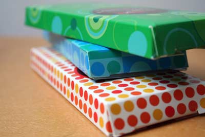
Dr. Bronner's!
This might be hard to get your hands on, but the original clear plastic "cans" that Clearly Canadian launched with. I blame them for starting the whole clear-food thing. (I'm pretty sure it was CC; someone correct me if I'm wrong.)
The limited-edition Fargo DVD package with the wood chipper scene snowglobe. I think this was one of the first that did that sort of thing.
The original iPod box(despite the colossal waste.)
Toblerone? Not that I've studied it, but I don't think they've touched their packaging in at least as long as I've been alive.
On Dec.29.2007 at 02:25 PM