Speak UpA Former Division of UnderConsideration
The Archives, August 2002 – April 2009
advertise @ underconsideration
---Click here for full archive list or browse below
  
Open Letter to Adobe

Dear Adobe,

I have been using your software products since 1995, starting with Illustrator 5.5, Photoshop 3.0 and even Pagemaker and have embraced every upgrade since — well, except for Illustrator 9.0, which both you and I know was utterly useless. I have also fought many printers and clients that have insisted on me using QuarkXPress instead of InDesign and only in a few cases I have not persevered — but I have always gone to the mattresses for you, no matter what. However, dear friend, you have recently let me down. Your Adobe Acrobat Professional and Reader version 8.x have jeopardized my reputation and almost cost me more than four months of work. My unwavering commitment to you makes this even harder to admit publicly. But let me explain.

You see, about four months ago while I was still working at Pentagram, we started working on the rebranding of a large national organization, whose identity (pun semi-intended) I can’t reveal as they have not gone public with the change yet — the only thing I can say, which is relevant to this missive, is that its name contains four letter “i”s. After an arduous process of design, discussion and selection we arrived at a solution that employed five weights of the beautiful, sans serif Gotham typeface, and we set the name in all uppercase. Perfectly round “O”s, curvaceous “S”s, authoritative “R”s, and deceivingly simple “I”s made this logo a favorite among the committee and the numerous constituents that had to bless this logo. Amazingly it was this last letter, the simplest of forms—a rectangle with four vector points — that triggered a series of unfortunate events. And it was your fault.

Adobe, you have synchronized the kooky and complicated workflow of graphic designers with that of our non-designer counterparts through the miracle that is the PDF. With the click of a drop-down menu and two dialog boxes later we can send our creations, hassle-free, to our eager clients so that they can approve, or circulate as necessary, our delightful work. And it was this process of PDF’ing our approved logo back and forth that placed us into so much trouble. I don’t know if you are aware of this problem, but when I PDF’d the logo, all the “I”s in it would render bolder, wider and wonkier than the rest of the letters, and as you zoomed out or as the logo was used smaller the illusion became worse. I didn’t worry too much about it at the beginning because I knew the logo was “right” and that, when printed, it did so appropriately. But as the PDF circulated all anyone could worry about was these fat “I”s and despite our promises that there was nothing wrong with this logo or the way we had executed it, it placed this solution on probation.

Wrong Rendering

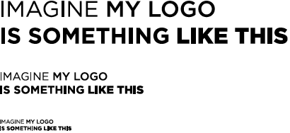
Dramatization of logo for example only. This is approximate to what the logo looks like, and here is shown as a screen shot from Adobe Acrobat Professional v.8.1.1, with the logo sized at 100%, 50% and 25%.

Wrong Rendering

And this is what happens when you zoom out in the PDF, so anyone viewing the PDF on a laptop, with less real estate than a nice 21-inch Mac Display, will have to zoom out.

For a while, to appease the situation and maintain the momentum we had garnered in getting the concept of the logo approved, I made the logo into a high resolution TIF to avoid this rendering problem as we presented applications of the logo to online and printed matter. The logo grew in its supporters and eventually we received the green light to produce templates for the stationery system. This past Monday, Adobe, and this is where I cursed thee the most — four months and countless conference calls into the project — we sent a business card design for approval where I used a vector file of the logo as it is what will print the best, the fat “I”s were circulated once again and Hell almost broke loose. Someone even called it a “deal breaker”. You know what this means? Going back to the drawing board on an identity for a national organization? Because of a problem you perpetuated? I was near a nervous breakdown. Also, in case you are wondering why I’m so sure this is your problem and not mine, I tested other logos with “I”s (same problem) and I tested them against Apple’s Preview application in OS X, which rendered them crisply and as God intended them to.

Other I Logos Wrong

Other famous logos with “i”s as seen on Acrobat. Roll over images to see the same PDF rendered in Apple’s Preview.

My Logo Wrong

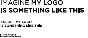
And, once again, here is my logo in Acrobat. Roll over images to see the same PDF rendered in Apple’s Preview.

Our clients demanded a solution and I had none, Adobe. I posted on a few obscure PDF forums to no avail. I had already drafted an e-mail to our clients explaining in detail what the problems were and that there was absolutely nothing we could do to correct the problem when using vector files, as we would never recommend the sole use of high resolution TIF files for their logo. I saved my e-mail as a draft and went to make myself some Apple Cinnamon tea. While waiting for the water to boil I had one last desperate idea which I though that, if it worked, it would be the most ridiculous patch to this bug. But desperate times call for silly measures. I opened my Illustrator CS3 file containing the logo, my clicking finger slightly jittery at the possibility of a solution, and added two extra vector points to the “I”s, one on each side at the halfway point of the vertical lines, giving the “I” a total of six vector points. I exported a PDF from Illustrator and… it worked. Mouth agape, I opened InDesign and placed the Illustrator file in it, exported the PDF and… it worked. One last test was copying/pasting from Illustrator into InDesign and making the logo at 100%, 75%, 50%, 25% and 12.5% to make sure the problem held up at all sizes and… it worked. I was ecstatic. But I was also mad.

Solution

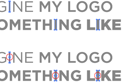
As simple as it may seem (NOW!), just adding two vector points solved the problem.

Solution

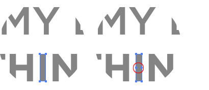
Here is a close-up, just for kicks.

Mad, Adobe, that such a simple thing could cause such grievance. Sticks and stones usually don’t break my bones, but when it comes to rendering “sticks” (like an uppercase “I” or lowercase “l”) you, my friend, almost broke me. But I forgive you, of course. As I write and prepare this I’m using four of your applications — Dreamweaver, Acrobat, Illustrator and ImageReady (which reminds me, why oh why, did you get rid of ImageReady? Did you know that Photoshop’s “Save for Web and Devices” completely distorts the original color of the file? Would you be surprised if I told you that I have to take a screen shot of my Photoshop file and then open it in ImageReady to get the color I want? *) — and I will continue to do so for a long time.

So please, Adobe, fix this problem. Soon.

Sincerely,

Armin Vit
Adobe User since 1995

*Update: Many thanks to Jason Santa Maria, who had the same problem, for pointing out a fix for this.

Maintained through our ADV @ UnderConsideration Program
ENTRY DETAILS
ARCHIVE ID 4301 FILED UNDER Hardware/Software
PUBLISHED ON Jan.10.2008 BY Armin
WITH COMMENTS
Comments
yomatiase’s comment is:

You can solve the problem with your colors on "save for web" going to: view > proof setup > monitor rgb

Besides that, we have a lot of problems too with font rendering on Acrobat 8, we jus stick with apple preview, wich by the way, its a lot faster.

On Jan.10.2008 at 02:41 PM
Andrew’s comment is:

Ah yes I've had this issue for a long time as well. Lucky for me my work didn't circulate very far and I could control who saw it and were as it was proofed. Thanks for the workaround.

And "Save for web...". Did I just not notice it, or did save for web not change the colors in CS2 and before? The color shift in CS3 has caused me many hours of headaches, and I can't figure out what's going wrong. Setting up proper color profiles helped - but just a little. I've often thought of just taking a screenshot of the psd file as well, but I get the feeling that solution would only work on a small fraction of computers that are configured just like mine.

If anyone at speakup knows what the cause and solution to the color shift is I' love to see an article on that as well!

On Jan.10.2008 at 02:58 PM
Armin’s comment is:

Apologies for the douple-post and overall slowness of today's service; our hosting provider seems to be having issues.

Please comment on this post. I think the other one has already disappeared into the ether.

Andrew, Jason Santa Maria pointed me to a fix as well. I updated the post to show it at the bottom. Here is the link:

http://tancredi.co.uk/2007/5/13/photoshop-cs3-and-save-for-web-issues

On Jan.10.2008 at 03:06 PM
karen’s comment is:

this is the greatest. post. ever. I've had so many headaches due to this insane "i" problem, and it never once dawned on me to add more points to the "i". while we shouldnt have to do it, it should just WORK, i'm glad to know there is a way to control this.

i absolutely LOATHE acrobat 8. i have had nothing but problems. 90% of the time i cannot print from it, getting an error saying a "document cannot be printed, drawing error has occured", and i have to re-open the document in acrobat 7 just to print it. we have tried so many things to fix this problem, and nothing ever works. so sad.

thank you for this post. i feel like you read my mind.

On Jan.10.2008 at 03:40 PM
Enrico’s comment is:

I'm so happy that this has finally gotten some attention. I agree with Karen, Acrobat 8 is awful. About ten minutes after launching, it always will bounce in the dock for absolutely no reason. It crashes on a regular basis. And the aliasing problem you describe, I've seen it so many times...argh!

Adobe, what happened to you?

On Jan.10.2008 at 04:15 PM
Tselentis’s comment is:

Dear Armin,

Thank you for writing this wonderful letter to Adobe, while sharing it online with all of our readers. As a fellow user who shares your sentiments, and who has experienced what you demonstrate above, I hope that Adobe will remedy this problem. Sooner than later, goddammit. Since Apple released Preview, I have felt that Preview's strongest attribute is that of rendering (as well as speed, another issue completely). And yet, Adobe's Acrobat, and its other PDF viewing tools such as Bridge and Photoshop, do a poo-poo job of rendering. However, Acrobat and its PDF compatible CS3 tools handle the complex tasks very very well. What gives? Why do the basics poorly, but deliver so many advanced and fantastical tools few of us use?

Sincerely,
Jason Tselentis
Adobe User Since 1988
(Illustrator 88)

On Jan.10.2008 at 04:18 PM
benjamin’s comment is:

Dear Mr Armin, I had the save-for-web-color problem too. You have to use the right colorspace in photoshop (sRGB) — see more here:
adobe forums

hopefully this helps…

b

PS nice post, I can name a dozen more of these Adobe "bugs" that make our lives just a tad more difficult than it should be…

On Jan.10.2008 at 04:34 PM
Jonathan Hoefler’s comment is:

Oh, Armin, THANK YOU for observing this. I thought I was alone in my madness; this rectangles-in-Acrobat problem is a relatively new one, and it's been driving my berserk this whole time. Since I'm actually in a position to control the world's supply of Gotham (cue 007 villain music), I'd had half a mind to stick another pair of points into the I, for this very reason...

...and the l. And the i, and the dot over the j, the period, the ellipses, the centered period, the hyphen, en-dash, em-dash, underscore, minus, vertical bar, the dots in the fi and ffi and fl and ffl, the underscores beneath the ª and º, the macrons... You see? I wasn't born evil, it was ACROBAT that MADE me that way...

On Jan.10.2008 at 04:59 PM
Jonathan Hoefler’s comment is:

...sorry, had to step out for a second: A new version of Adobe Updater is available for installation. Click OK to install it now. You will have to close the application Safari.

On Jan.10.2008 at 05:01 PM
Jonathan Hoefler’s comment is:

OK, I'm back. As I was saying -- oh, hang on, there's a new version of Acrobat available. Be right back.

On Jan.10.2008 at 05:06 PM
Jonathan Hoefler’s comment is:

Hey, they've fixed the problem in the new Acrobat!!!!

Oh wait, they haven't. Oh but there's another update already, hang on...

On Jan.10.2008 at 05:15 PM
Jonathan Hoefler’s comment is:

New version of... Adobe Updater... why do they make the tops of these pill bottles so hard to open?

On Jan.10.2008 at 05:17 PM
Jeff Savage’s comment is:

Jonathan-

Brilliant.
(Now that is a word you don't want to view in Acrobat 8).

On Jan.10.2008 at 05:34 PM
Jeff Savage’s comment is:

Jonathan-

Brilliant.
(Now that is a word you don't want to view in Acrobat 8).

On Jan.10.2008 at 05:35 PM
Sheepstealer’s comment is:

In my experience with Adobe products there's a simple definition.

upgrade = move all of the tools so I can't find them anymore. Change a few commonly used key commands. Cause some of the functions to which I've become addicted to stop working periodically.

The one exception has been the pathfinder tool in Illustrator. I believe that's the most wonderful advance in software history.

On Jan.10.2008 at 05:54 PM
Tselentis’s comment is:

I think Johathan is in a clear lead for best comments of 2008, and it's only Jan. 10.

On Jan.10.2008 at 06:55 PM
Bone’s comment is:

I have noticed this for a couple of years - how Acrobat could not render cap I's and lowercase L's properly but a small, lowly app like Preview could.

Add it to the growing list of reasons why I have developed a disdain for Adobe's seeming lack of care - especially for their Mac products - for how their products perform. Does this happen with their windows products?

Here's to offering a sacrifice to the gods that Apple does what it does best. Create better technology and products than those that have been doing it for decades.

- Bone

On Jan.10.2008 at 09:39 PM
Joe M.’s comment is:

Armin,
You are the teacher in this video.

On Jan.10.2008 at 11:37 PM
Alexander Fjelldal’s comment is:

Thank you thank you thank you thank you thank you. This problems has given me a lot of headaches when preparing presentations.

On Jan.11.2008 at 03:25 AM
Adelie’s comment is:

Bones:

Yes, it happens with Acrobat for Windows as well. Like Andrew, I've also been able to control who sees the work and make sure they understand the problem, but we've all (Mac & Windows users alike) been getting pretty frustrated.

On Jan.11.2008 at 09:01 AM
Derek Munn’s comment is:

*slow clap*

Bravo, sir. Bravo.

On Jan.11.2008 at 10:54 AM
Pesky’s comment is:

This is why we love you, Armin.

I hope, eventually, the flatfooted upgrades slow down and some of us that are "behind" in our purchases can breath easier and still function at our jobs.

On Jan.11.2008 at 12:37 PM
Pesky’s comment is:

This is why we love you, Armin. You articulated this so well, the frustration with what-you-see-is-what-you-don't-get....

I hope, eventually, the flatfooted upgrades slow down and some of us that are "behind" in our purchases can breath easier and still function at our jobs.

On Jan.11.2008 at 12:38 PM
Jw’s comment is:

Oh, those fat verts... I don't know how many times I've had to explain those away over the years! I always include a jpg to view on-screen, and a PDF to print from, and let clients know to do it that way. I usually don't get a call back with this method.

Was there ever a version of Acrobat that didn't have this problem? I've been aware of it since at least 6.

On Jan.11.2008 at 02:59 PM
Kevin M. Scarbrough’s comment is:

Dear Mr. Vit,

Please understand that Adobe (a proud product line from Oligarchy Incorporated) appreciates your businesses as a loyal consumer of our products.

However, you must understand something: while you are designing one logo, for one client, our software is simultaneously designing logos for every business model available (and then some).

Clearly, we understand the task of logo development. While we love and respect the work completed at Pentagram, to be frank, our experience outshines you.

What you have uncovered in your development is not a "bug", but a "feature". Our latest software release package has been infused with a type of "artificial intelligence" that automatically detects, then corrects, mistakes in logo design and development.

In short: your logo was faulty, and our software fixed it automatically.

We appreciate the time you've taken in writing, and the money you've given us in upgrading, and look forward to (automatically) serving your needs in the future.

Sincerely,
J. H. Johnson
Adobe Support Team - LiveTrace, Letterform Correction

On Jan.12.2008 at 09:01 AM
Allison’s comment is:

Talk about a "sad-but-funny-but-true" read! And I also have noticed the bounce-happy icon on my dock. I've been tempted more than once to invent some sort of way to have my other icons beat it up so that it will stop causing such a disruption!

On Jan.12.2008 at 08:00 PM
Lua’s comment is:

wow, i've seen that before, it`s happened to me.
It`s a shame.

On Jan.13.2008 at 03:27 PM
Lorenzo’s comment is:

"Does this Acrobat v8 make me look fat?"
Hola Armin,
You know, I too was experiencing the same issue with Acrobat v8. The difference though, compared to your outlined text, was that I was dealing with only a 1 pt. stroke. The Acrobat v8 PDF was adding that extra weight to the top and bottom of the stroke.

After reading your post and appreciating your perseverance, I put your workaround into practice. And guess what? I lost the weight!

By outlining the stroke and adding the additional points to the object it successfully corrected the issue!

Dude, good work!

On Jan.13.2008 at 10:20 PM
Mark.S.’s comment is:

Armin,
Thank-you so much!
Cheers
Mark

On Jan.13.2008 at 10:52 PM
Comet’s comment is:

Please, try CorelDraw, for logos is fantastic!!

Besides, I would never use the last version of a software, always last version -1.

On Jan.14.2008 at 12:25 PM
Lonn Lorenz’s comment is:

Vit,

Thank you for expressing your concerns and issue to Adobe - we value this feedback and use it to improve our products. We have heard you and know about this issue. We are investigating solutions for future release - based on identifying the problem and displaying properly as well as possibly using print industry standard file formats to identify when this solution should be used.

There is a reason this is happening - it is a solution to the problem of converting Office and other files to PDF - where fine lines were dropping out / not being seen when spreadsheets, for example, were converted to PDF. In order to make the fine lines show up, they are thickened for viewing. Unfortunately, that solution for one group of users has become a problem for you and others.

Because your text is no longer live text (having been converted to outlines and modified), it is effected by this viewing solution. Vector lines are the issue and that is what is being addressed in the possible solutions - to identify when the line thickening should be turned on or not.

The immediate solution is to not outline the text or to do what you have done to troubleshoot the vector artwork. We are working on the better solution of properly identifying and displaying and will release that solution asap.

We greatly appreciate your feedback and dedication to Adobe and our products.

Lonn Lorenz
Creative Suite Sr. Product Manager

On Jan.14.2008 at 01:41 PM
Katie’s comment is:

The "i" in the Bank of America logo does that. Never knew what was going on there! Thanks!

On Jan.14.2008 at 01:55 PM
agrayspace’s comment is:

brillian post. that FAT i problem has plagued me for years. Thanksfully my clients have never been uptight enough to notice so it was never an issue. PDF look shitty. Its a fact of life most people have adjusted too.

But the color changing Save for Web bullshit has plagued me for years. And it has always been this way. Not just with CS3. Only in CS2 there is no simple fix like Mr Santa Maria suggets. And ImageReady won't take in large web comps (anything over 40mb)

ARGGGG

On Jan.14.2008 at 03:54 PM
BAMm’s comment is:

i tell you all....IT'S THE CURSE
OF THE GHOST OF
MACROMEDIA FREEHAND!!!

mark @
illustrationISM &
BAMm

On Jan.14.2008 at 05:16 PM
Laura Salesa’s comment is:

Dear Mr. Johnson,

Thanks for your response on this issue. I have been having this problem for many years now. Certainly, if you don't convert the text into outlines in Illustrator before creating the pdf, the problem is solved. My question now is:
how would we solve the problem when we are sending the file to an external client who does not have the fonts we are using in his/her computer and therefore cannot see our designs with the fonts we have created them? That is the reason why we convert text into outlines...

Laura Salesa

On Jan.15.2008 at 12:22 PM
Laura Salesa’s comment is:

Dear Mr. Lorenz,

Thanks for your response on this issue. I have been having this problem for many years now. Certainly, if you don't convert the text into outlines in Illustrator before creating the pdf, the problem is solved. My question now is:
how would we solve the problem when we are sending the file to an external client who does not have the fonts we are using in his/her computer and therefore cannot see our designs with the fonts we have created them? That is the reason why we convert text into outlines...

Laura Salesa

On Jan.15.2008 at 12:23 PM
Thomas Phinney’s comment is:

Laura,

I take it you haven't heard of embedding fonts in a PDF? Most PDFs have the fonts included with them, and the viewing computer is not required to have its own copy of the fonts to use them in rendering the text. This is one of the things that makes PDF superior to, say, HTML, for visual fidelity to a design.

Converting fonts to outlines degrades the quality of the text, especially on screen, but also in print to some degree (though more so with lower resolution devices). At sufficiently large sizes and high resolutions, the difference goes away, but it can be detected even on imagesetters.

Specifically:

- different rendering modes are used by PostScript printers and many screen renderers (including Adobe Reader) for text vs graphics. The usual graphics rendering mode is to turn on any pixel that is touched by the outline. The usual text rendering mode is to turn on a pixel when the center is inside the outline. Thus rendering text as text is more faithful to the outlines and rendering text as graphics makes the letters heavier.

- fonts have special information known as "hinting" that helps maintain consistency of stroke thickness and other font features. This information is lost when the font is converted to graphics. Again, this is most problematic at low resolutions such as on screen. (I gather Apple's rendering tends to largely or entirely ignore hinting, so this may not be a problem for Preview.)

Regards,

T

On Jan.16.2008 at 04:59 AM
Laura Salesa’s comment is:

Dear Thomas,

Thank you so much for your response. Certainly I have heard about embedding fonts in a pdf and in most cases this is enough to get things right. However, I have come across few times with some cases when I have been forced to convert the text in outlines from Illustrator. One case is for example, when for licence restrictions, one of the fonts is not supported by Adobe Acrobat and the pdf does not come out properly. I have this habit of converting always text into outlines to avoid coming back to the file when this happens. I was not aware this degrades the quality of the text!

Thanks for your advice, I am learning so much from you!

Regards,

Lau S.

On Jan.16.2008 at 05:56 AM
Joe’s comment is:

I had this exact same issue with my resume last summer. Having designed it on a mac, I didn't realize my first impression with a lot of recruiters probably made me look somewhat inept until after I found work. I can't help but wonder if anyone scoffed at the thought of a person claiming production experience sending out a glitchy resume.

On Jan.16.2008 at 07:38 PM
Tselentis’s comment is:

I credit Armin for recognizing this, and taking the time to write about it here. Still, so many of us have seen this happen. It's a presumption, but I feel that only a Mac user could have really identified this and composed an explanation like Armin did here. For one, we have Preview. And if a Windows user had another tool such as a Windows equivalent of Preview, I can count on one hand the number of people that know how to do screen shots. Yes, that's under 5 people (who are designers) that know how to capture a screen shot on their Windows box. Like the Acrobat rendering problem, this is another issue that always amazes me.

On Jan.16.2008 at 10:00 PM
Viviane’s comment is:

Armin,
Thanks for taking the time to get to the bottom of this problem.
I've worked on so many projects where the "I" was getting undue attention - I had no idea there was a fix.
How often did I need to tell clients "it looks funny on the screen" but they can sign off on it - it will look ok when it's printed.

Working on creating final files for a building identity that contains "MADISON" and once again the "I" was doing its own thing -

I remembered reading this discussion, added to points and voila - it looked normal.

Un. real.

Thank you.

On Jan.16.2008 at 11:41 PM
Michael’s comment is:

Armin - Thank you — this is a wonderful post (and your work-around is brilliant).

We've battled the same issue and often resort to bitmap PDF proofs, which, as you point out, is only a temporary solution.

A running joke (if you can call it that) in our studio is that Adobe doesn't know what we do. Ironically, the company whose product is essential to our company's product, often seems completely clueless about our most basic requirements.

For instance, how could you develop software for graphic designers and then make it so difficult to dig up the Pantone solid color palette in a new document?

Forget about that — how is it that the same PMS color generated in Photoshop, Illustrator and InDesign can look completely different on the same monitor and the same printer? This is supposed to be a MATCHING SYSTEM?

The response from Mr. Lorenz of Adobe suggests that my rant is off base — it's not that Adobe doesn't know what we do, it's that sometimes they don't seem to care. To solve the problems of Office users, the Acrobat dev team threw designers under the bus.

On Jan.16.2008 at 11:55 PM
Elliot’s comment is:

A bit of testing seems to indicate that the problem is confined to perfect rectangles aligned orthagonally - the effect disappears if any one point is moved, or if the rectangle is rotated by a tiny amount. It's aliasing - increasing the dimensions to the next whole-pixel boundary.

I can see why this would be useful for spreadsheets, but not why it's not at least an optional effect controllable alongside text and line art smoothing preferences.

On Jan.17.2008 at 05:41 PM
Elliot’s comment is:

PS: For those Windows and Linux users who don't have OSX's Preview: Foxit Reader also exhibits the problem, to save you downloading it.

On Jan.17.2008 at 05:48 PM
Lonn Lorenz’s comment is:

In response to all, especially Michael. It most certainly is true that Adobe DOES care about our customer and the use of our products - we care very passionately - that is why we are here. Part of the inherent problem is caring about different kinds of customers with different problems to be solved. Sometimes a solution to one problem interferes with others - something we try to avoid, but it happens. Luckily, we have users who provide this useful feedback so these problems can be solved asap.

My bottom line: the best case is to not convert text to outline, for a variety of reasons including this issue. That said, it is certainly understood that outlining is necessary and should not result in poor viewing - that is what we are actively working on resolving asap.

With much appreciation,

Lonn Lorenz, Creative Suites Product Mgr

On Jan.18.2008 at 02:37 PM
Michael’s comment is:

Lonn -

Your attention here is appreciated, and I understand that Adobe is an easy target. The problems you cause are generally given more scrutiny than the problems you solve (which, I'm sure everyone here agrees are considerable).

It's fair to say that Adobe in general, and Acrobat in particular, have changed computing for the better.

But designers are right to demand that Adobe never lose sight of its responsibility to the professional market. We should come first.

Keep the upgrades coming.

On Jan.19.2008 at 01:08 PM
Lorne Hobbs’s comment is:

Mr. Vit, I thank you. Thank you!

I read your posts semi-regularly, but somehow missed this one. (Yes, I'll now read regularly.) Saw your note over on Brand New in response to my and another's lament over the "fat I" issue. A simple and easy fix that had never occurred to me.

As for Adobe products, they can indeed be exasperating. But we couldn't get much done without them. I'm quite productive in a combination of CS- and CS2-level apps.

Again, thanks.

On Feb.05.2008 at 06:52 PM
Freelancelot’s comment is:

OMG, Thanks Armin. I just stumbled onto your article today. This has been bugging me since Reader 6.0. I too, have been using Ai since v5.5 and Photoshop since v4.0 on Macs. At first, I almost freaked until I was assured by various printers, etc that my outlined Ai pdf files would print fine and it was just a display issue.

The adding points workaround you mentioned in your article is huge, too (for the win!!) when presenting pdf's to my customers who luckily have been very understanding, but do pose the question about the random faux bold display characters from time to time.

Thanks again!

-Freelancelot

On Aug.19.2008 at 09:33 PM
Mikael Siirilä’s comment is:

This fix does not seem to work if an EPS in embedded in a Word document, then converted to PDF using Acrobat 9 Pro. Somehow the added points on outlined I, L and E letters get "optimized" and the added points simply disappear.

Anybody know how to prevent this optimization?

On Oct.20.2008 at 01:27 PM
brian online’s comment is:

thank you very much. I too just found your post about this problem. your story is inspiring and brilliant.
I was creating an identity and any rectangle was giving me problems but the ones in the words such as the i and l were noticed since they are compared to other letters for continuity.

I cant thank you enough. my biggest problem of the day has now been solved before 10am.

thanks
Brian

On Oct.28.2008 at 01:28 PM
Tim’s comment is:

I thought I was the only one who suffered from this problem. It's good to know I am not alone (bear hug).

Seriously, it made me crazy. This glitch was the source of endless frustration for me. Thanks for this post.

On Mar.11.2009 at 08:33 AM
Matt’s comment is:

Seriously! Why can't adobe fix these problems? The wonky pdfs and save for web distorting drives me crazy. We buy updates for 1000's of new lines of code that slow everything down and solve few bugs.

On Mar.11.2009 at 10:59 AM
Percy’s comment is:

This problem has been around forever. I have to send files to China for printing so every 't' has to be crossed and every 'i' has to be dotted. The recipients in China often have a limited set of fonts to choose from and many of the fonts I'm instructed to use can't be embedded for licensing reasons.

I am always having to explain that the out-of-whack appearance of my pdf files are a screen issue only, and have to bear the looks of disbelief until a proof can be arranged.

Please fix this, the whole community would be grateful.

On Apr.14.2009 at 10:03 PM