About the Identity
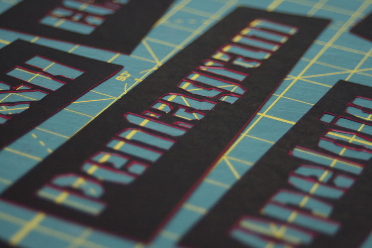
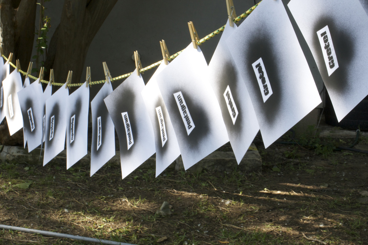
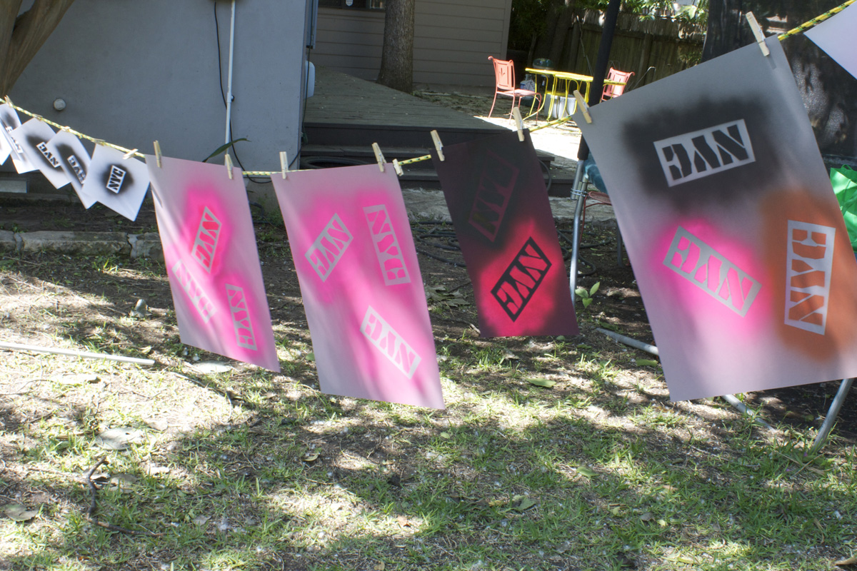
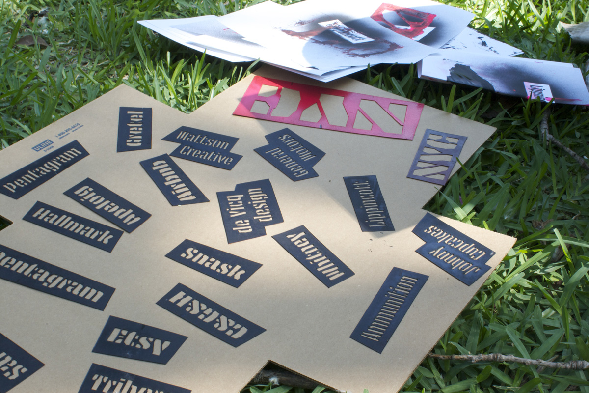
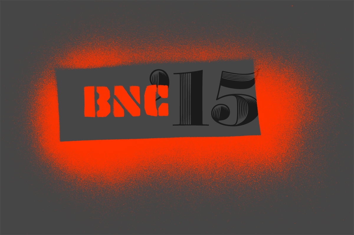
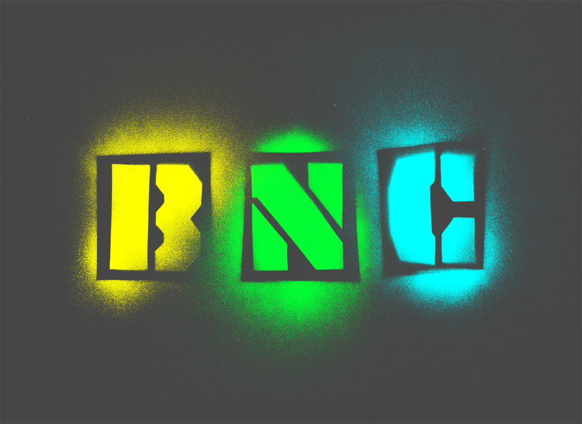
Unlike last year, where the identity was the result of a layered range of concepts, ideas, and visuals related to Chicago, this year’s identity came about in a less didactic way and was more the case of serendipity. A few months ago we spotted the newest type family from Underware, Tripper Pro, a bad-ass stencil with multiple weights that each had its own interesting flavor. At first we thought that using a stencil font would be too easy as they can be trendy and there was no real concept behind it other than “it’s cool”. We couldn’t shake Tripper though, so we pushed a little bit: what good is a stencil font if you are not going to use it as a stencil? That led us to thinking about a long-forgotten time when subway cars in New York were drenched in graffitti.
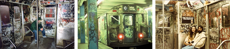
Much of the current safety in New York is attributed to having cleaned the subways and thank the authorities for that but, man, isn’t graffitti awesome? The texture of the spray paint is one of the best. So… we are coming back to New York with the conference, we have a cool stencil font in mind, let’s relive some of that dinginess! That’s the first element of the identity.

The second is a reflection on the contrast of yesteryear’s nasty New York with today’s very affluent, sometimes opulent, money-demanding New York — the one where the 1% thrives.
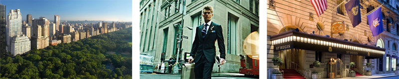
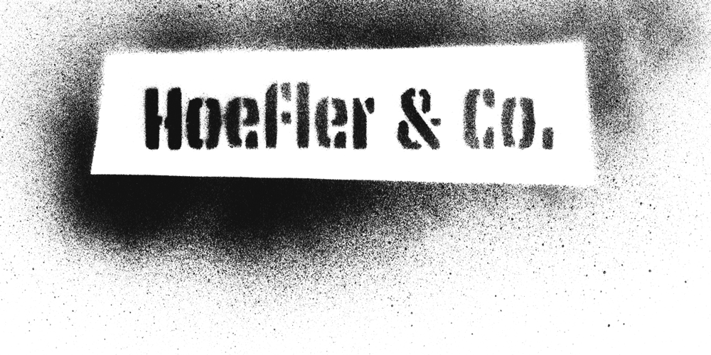
Before you think this is turning heavily political or social, don’t be fooled: What we were really looking for was an excuse to use Hoefler & Co.’s Obsidian. We really liked this combination of grungy, dirty, rebellious stenciled graffitti with this super elegant, finessed, luxurious serif.

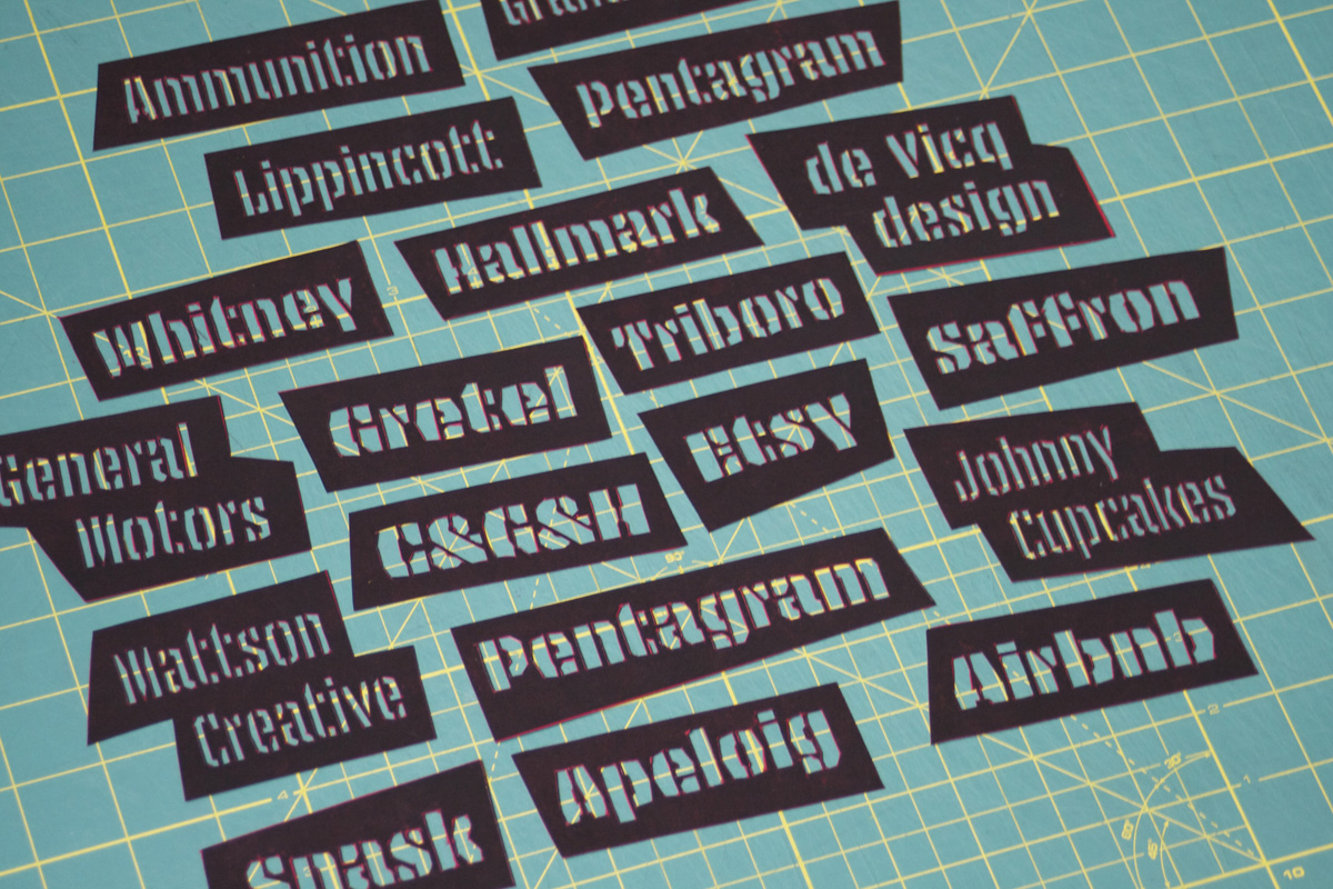
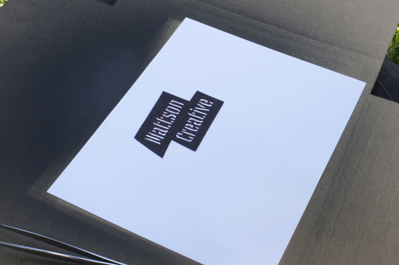
There is no “logo” this time, instead the identity will be applied by the mixing and matching these two languages and letting the overall scheme come together that way. We have some interesting production ideas in mind for the programs, badges, and venue decorations that we are currently testing and trying to figure out the logistics of. We hope the result feels New York-ey in an interesting subtle way.
For now here is a behind the scenes look at what we’ve done so far and some of the things we’ve been playing with visually.
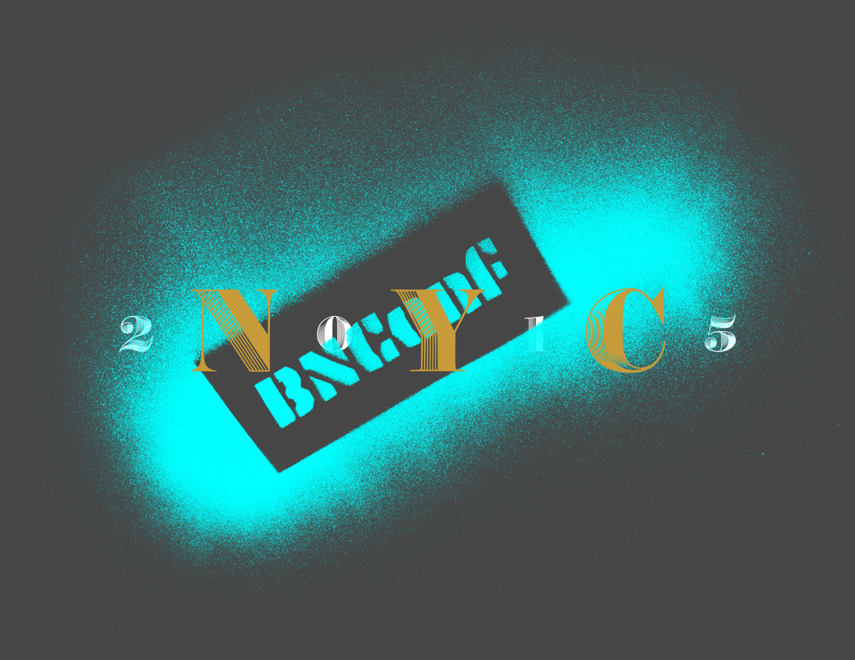
2015
Brand
New
Conference
- Register
- Speakers
- Prices
- Schedule
- Webcast
- Past Videos
- Sponsors
- After-party
- Venue
- Hotels
- About
- @BNConf

Typography Summary
Tripper Pro by Underware.
Obsidian by Hoefler & Co., served through cloud.typography
Georgia Pro by Steve Matteson for Font Bureau, served through fonts.com
P22 Underground Pro by Richard Kegler and Paul D. Hunt, served through Typekit
September
24 – 25
2015
New York
Presenting Sponsors


Event Sponsors


Supporting Sponsors


Boost Sponsors
Type Directors Club
AIGA Chicago
AIGA Connecticut
Media Sponsors