Given that the venue for the conference is in Downtown Las Vegas — the original townsite and original gambling district of Las Vegas prior to the Strip — we were heavily attracted to the 1940s and 1950s version of the city, which manifested itself in an eclectic combination of the niceties of Mid-Century Modernism and the tackiness of neon light casino-ism.
The book, Vegas Gold by David Willis, and the Instagram hashtag #VintageVegas, became our guiding lights — pun semi-intended. While the neon signs are indeed the heroes of vintage Las Vegas, we were equally attracted to the unsung marquee signs that, underneath the glitz and glimmer of the neon signs, announced the various acts that were playing at any given casino and/or hotel in movable utilitarian fonts.
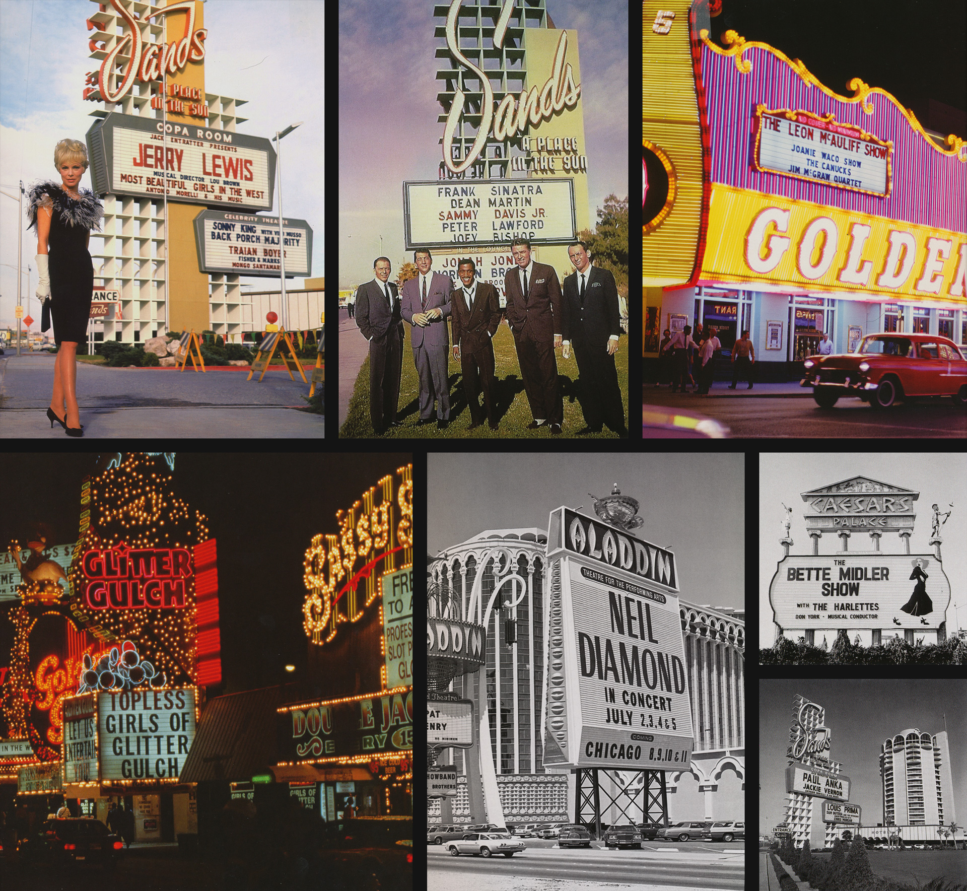
Various marquee signs from Vegas Gold. Photo credits, top row: Photofest (left and middle) and Charles Phoenix Collection; bottom row: Melvyn P. Lawes, Wolf Wergin, and Las Vegas News Bureau / Las Vegas Convention and Visitors Authority (two far right images).
In some initial ideas, we had considered replicating the lettering of the neon signs as the identity’s typography but a) that was perhaps obvious and b) we are simply not good letterers, so the idea of using one or many of these heavily mechanical fonts from the marquees seemed both interesting and feasible. At first we tried to find existing typefaces that we could buy and use but what we found was either too slick or too grungy so we turned to our old friend, eBay. We were able to locate a full package of vintage marquee letters that would provide us with a starting point.
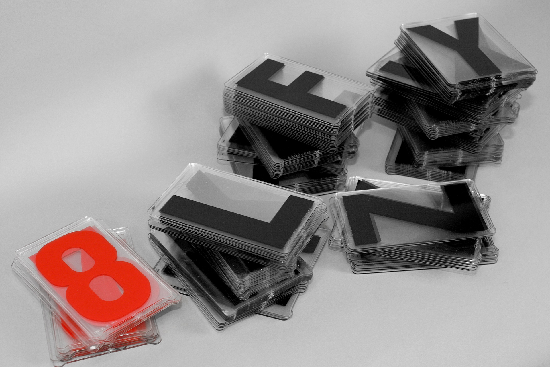
The full stack of 6-inch, Gemini-brand marquee letters.
Our first step was scanning them and our original approach was to keep the designs as they came: wobbly edges, crooked angles, and relatively odd structural relationships between characters. While there was a certain charm to this approach, the finished product looked a little too much like a font from the 1990s’ grunge factory so we cleaned it up, established some mathematical boundaries, and treated each character as if it had to be drawn with a ruler, compass, and French Curves.
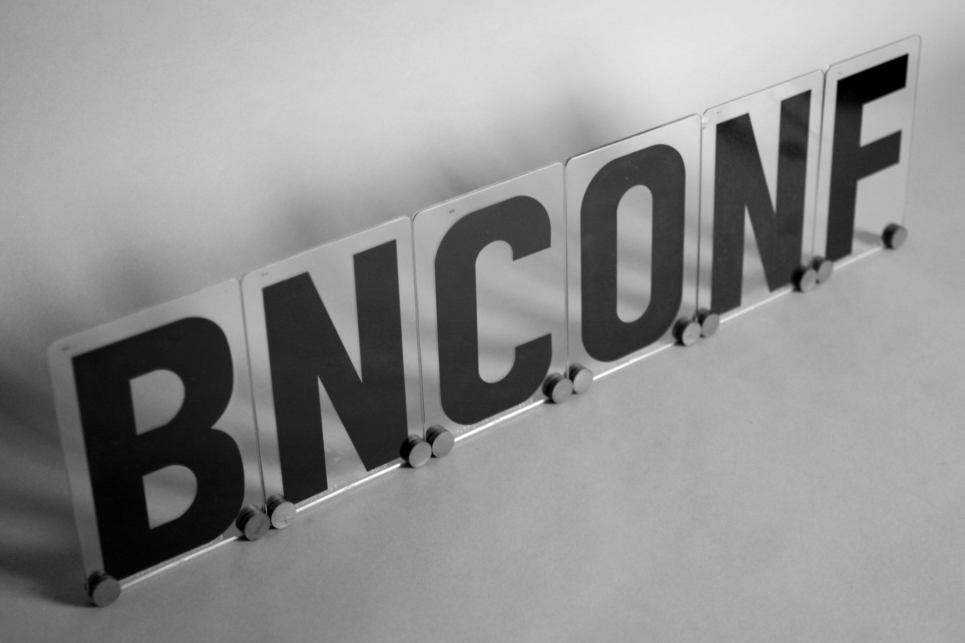
“BNCONF” in the marquee font.
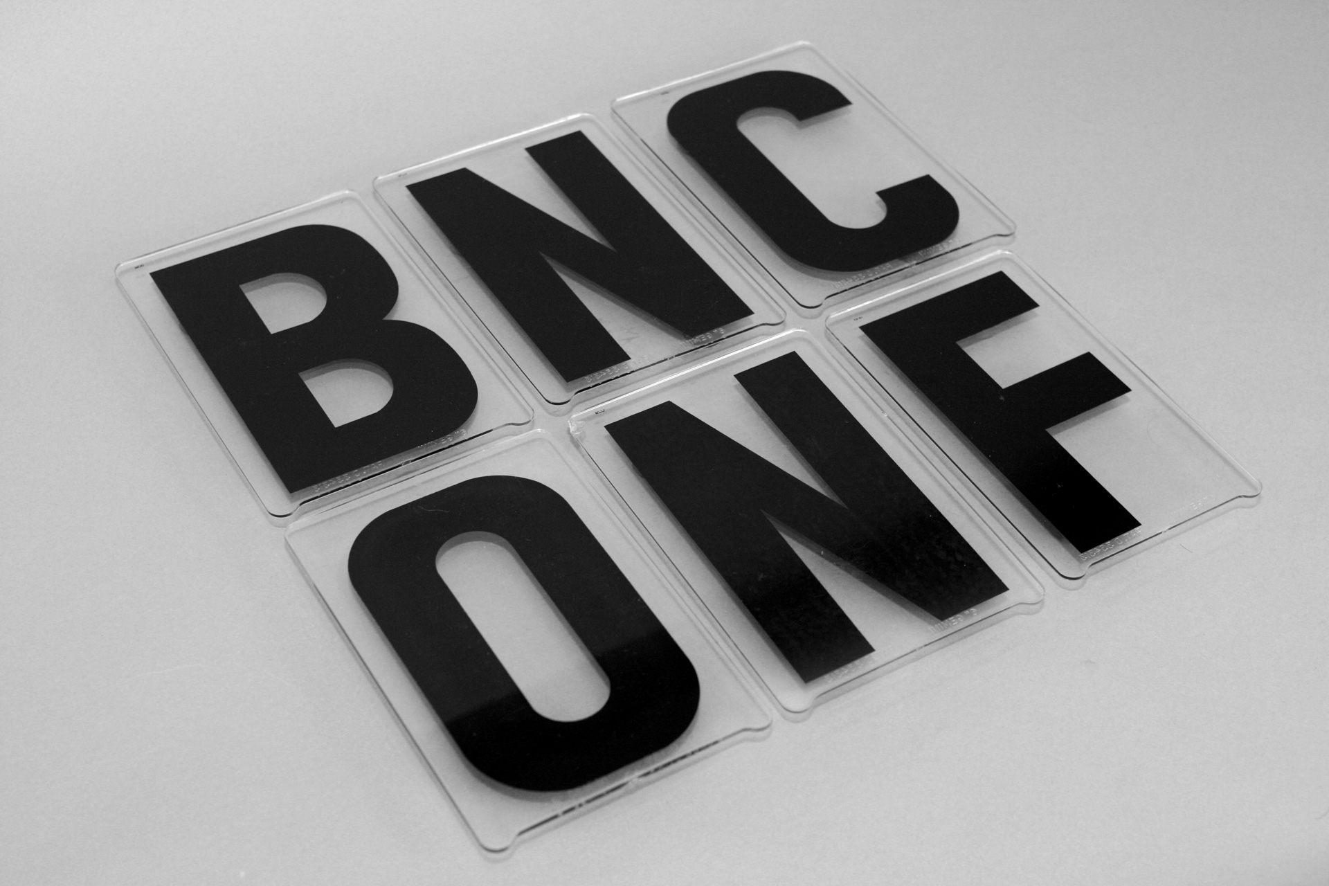
“BNCONF” in the marquee font, stacked arrangement.
We also fell in love with the modularity of each character and their flat tops and bottoms that became more evident when the font was stacked and, once we tightened the line-spacing on our own font, that started to drive the aesthetic.
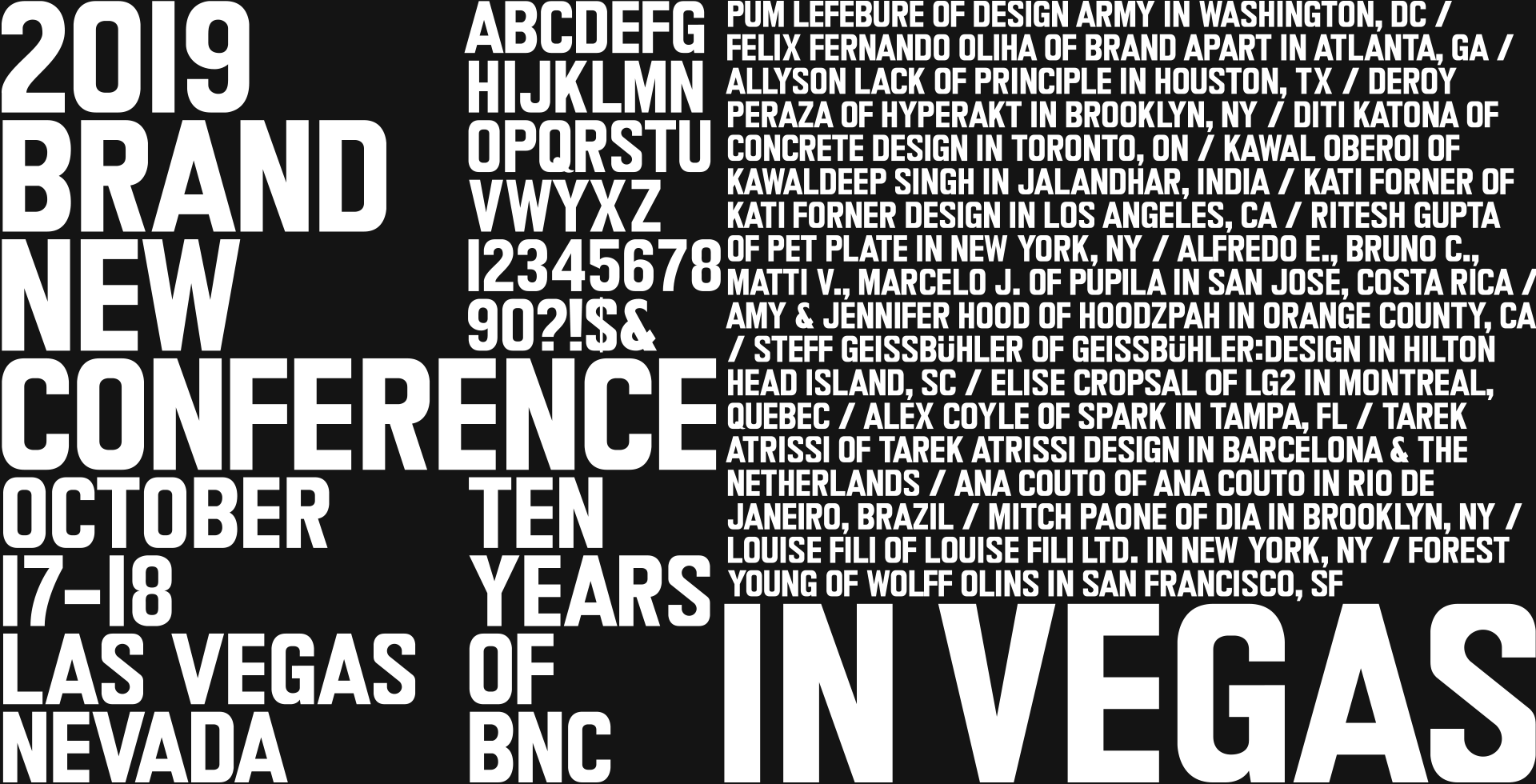
BNConf Marquee — guess the font needs a name.
The font on its own is fine but we still needed something to tie it back to Vegas and we knew we had to incorporate the neon signs somehow. After a proverbial “a-ha!” moment that we had where we decided what we wanted to do with the cover of the printed programs and badges — which we will reveal at the event, naturally — we arrived at the idea of the font functioning as a device to deliver an expression of the neon signs. In short, a logo-as-window approach but… a little more trippy.
We wanted to capture the visual and sensory overload of being in Las Vegas and specifically of walking along Fremont Street — where many of the original neon signs still stand — which is a kind of frenetic on-off-on-off flickering of neon signs, light bulbs, and letters and the constant dinging of the slot machines inside. We took a special trip to Las Vegas, armed with a telephoto lens, and photographed every possible neon sign that we could stand under and photograph in bursts so that we could capture as many “On” and “Off” states as possible.
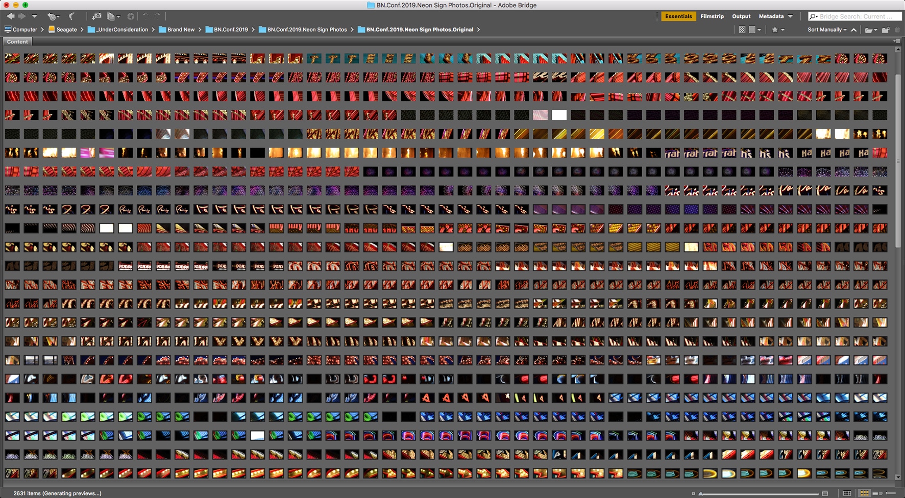
A fraction of the 2,600+ photos taken.
From the vast range of images we selected the ones that yielded the best on-off states and from that first edit we then selected the ones that looked cooler as abstractions of neon signs.
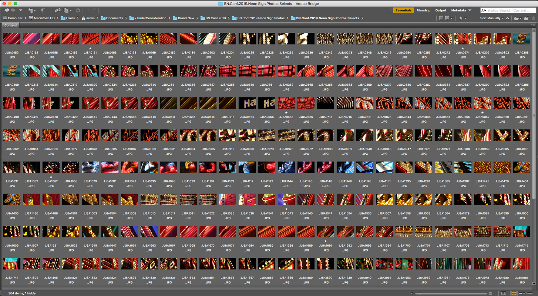
Narrowing it down to 150 on-off pairs.
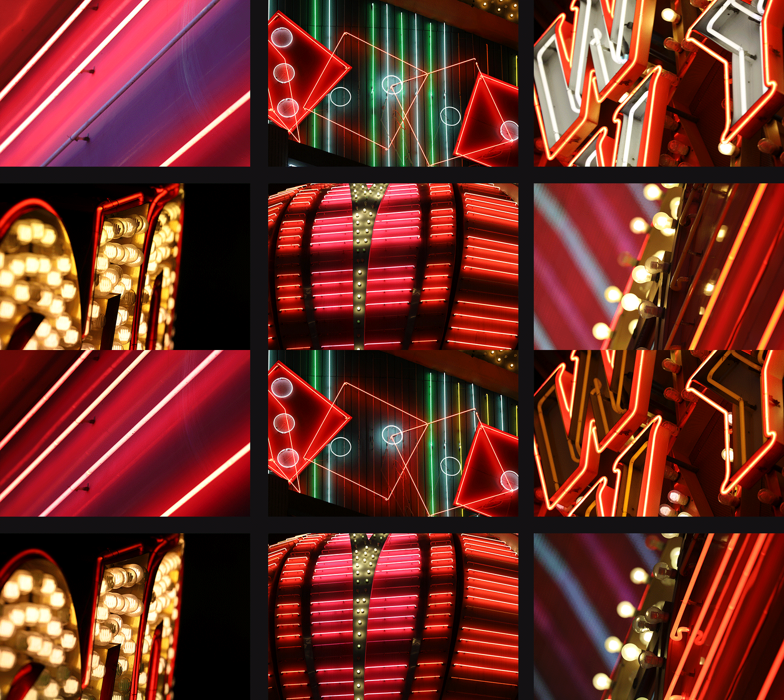
Sample on-off states.
We then combined the photos with the new typeface by going back to the physical composition of the original marquee font in real life, where each character lives centered inside an acrylic frame, which we replicated in a looser way with wider margins so that the images could show through better. This modularity then allows to mix and match the different images that, when paired, create that sensory overload feeling you get from being there.
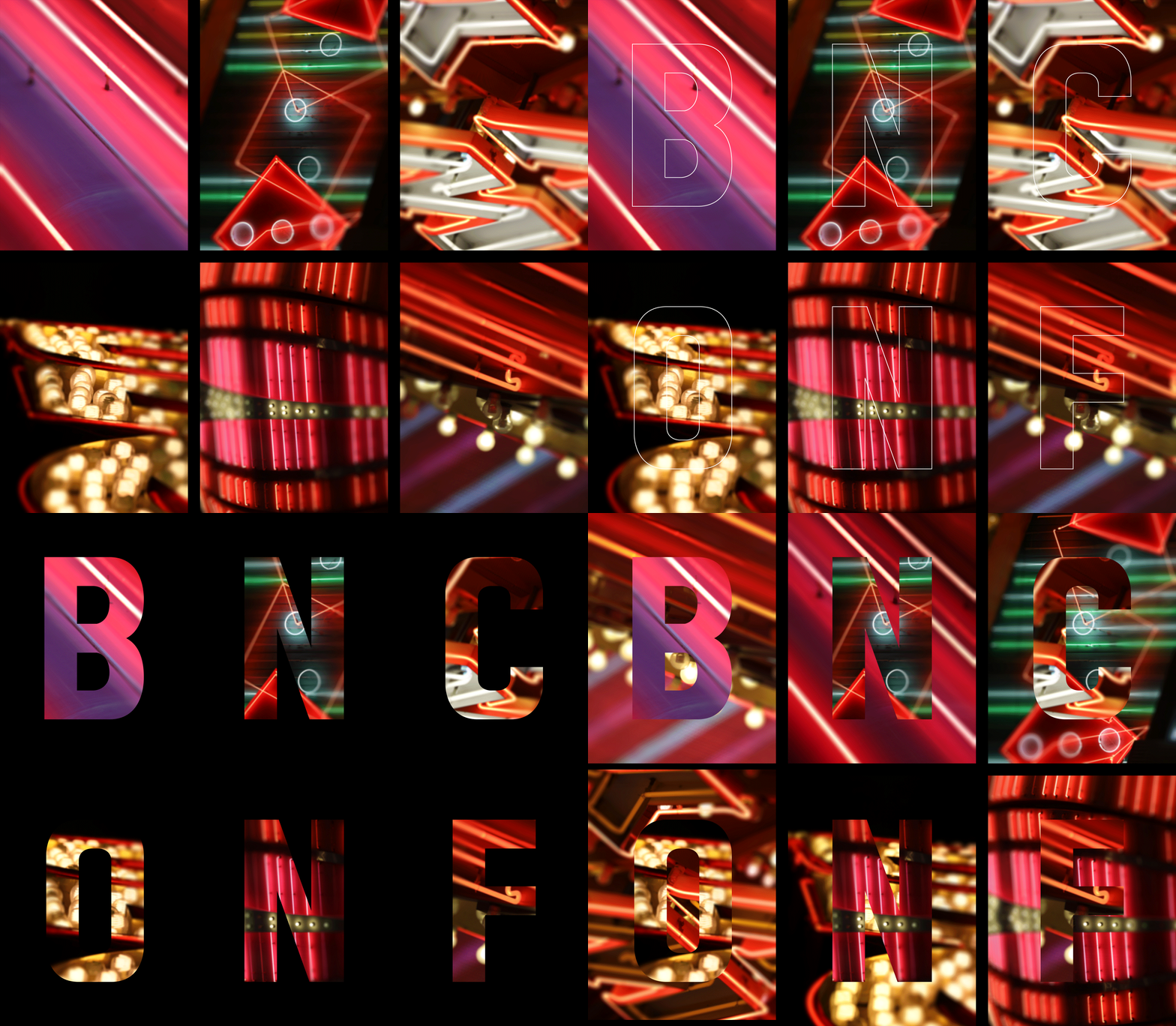
Using BNConf Marquee to frame and pair the images.
We softened the photos a little bit, using a tilt-shift blur, so that they wouldn’t be as harsh and instead of doing stark on-off transitions we did quick dissolves to make it more pleasant and less jarring online. As mentioned earlier in this write-up, we already know how this will translate into a couple of physical applications that we hope you will find surprising. In the meantime, it’s all digital.
Detail of one of the finished on-off compositions. The rest you can see on the home page and headers of all other pages.
Lastly, the supporting typography is fairly straightforward — no obscure font choices! — using Clarendon and Futura as they were popular fonts in the 1950s and 60s, so we wanted the type to feel as if it came from a tourism postcard from the West coast. As a glimmer of the lettering flair of the 1950s we are using Quotes from Sudtipos as an accent. The color palette is heavily black because Vegas comes alive at night and the bright colors use come from the yellows, reds, oranges, and pinks of the lit neon signs.