|
JUNE 12 |
OCTOBER 16 |
NOVEMBER 13 |


• Opposites Attract ’08 Home
• OA’08 has been organized by UnderConsideration LLC and is hosted by the Art Directors Club
• OA’08 is run with Six Apart’s MovableType 6.1
• With a few individual entry exceptions, OA’08 is programmed to be W3C compliant and is valid XHTML 1.0 Transitional
• Syndicate / RSS Feed
Disclaimers
• All comments, ideas and thoughts on OA’08 are property of their authors; reproduction without the author’s or OA’08’s permission is strictly prohibited
• OA’08 reserves the right to delete any comment deemed offensive or unnecessary
Contact
By all means, please

October 28, 2008![]()
Three Down, One to Go
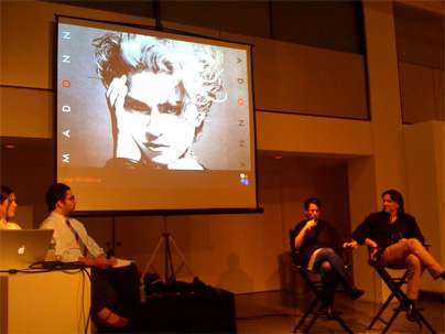
The third Opposites Attract is now in the books and we are now getting ready for Robynne and Gail on November 13. [Thanks to Debbie Millman for the above photo]
![]()
Filed in Arnett/Goldberg • Link
October 15, 2008![]()
Bold Colors, Type in a Band
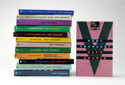
Various covers (and spines) for Kurt Vonnegut by Carin.
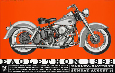
Poster for Harley-Davidson’s “Eaglethon” annual fundraising event by VSA.
Never fails!
![]()
Filed in Arnett/Goldberg • Link
October 14, 2008![]()
Rocking the Geometric Sans in Favor of Corporate Collateral
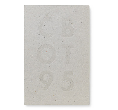
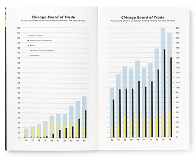
VSA’s 1995 annual report for the Chicago Board of Trade.
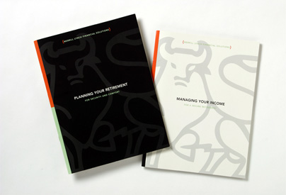
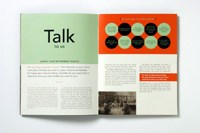
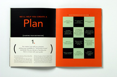
Carin’s brochure for Merrill Lynch Financial Solutions.
![]()
Filed in Arnett/Goldberg • Link
October 13, 2008![]()
Café Olé!
Whether you are in Chicago or New York, both of these establishments are sure to fulfill the need for caffeine, snacks and delicious textures and colors.
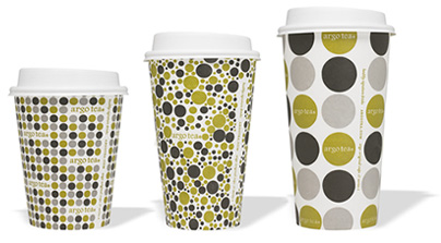
Identity for Chicago’s Argo Tea by VSA.
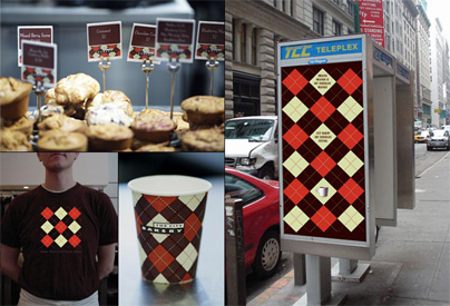
Identity for New York’s The City Bakery by Carin.
![]()
Filed in Arnett/Goldberg • Link
October 10, 2008![]()
You don’t know Jack
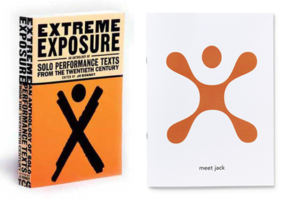
On the left, Carin’s book cover for Extreme Exposure: An Anthology of Solo Performance Texts from the Twentieth Century, and on the right, VSA’s logo (only a part of the larger identity work they did) for the now defunct Cingular Wireless.
![]()
Filed in Arnett/Goldberg • Link
October 09, 2008![]()
The Joy of Centered and Justified Classic Typography
It seems like an easy typographic mannerism, to just space out some classic serif typography in a centered arrangement, but it takes real devotion to achieve this kind of elegance and simplicity.
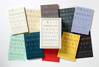
Various covers for The Best American Series by the Houghton Mifflin Company. A bigger image available at Carin’s web site.
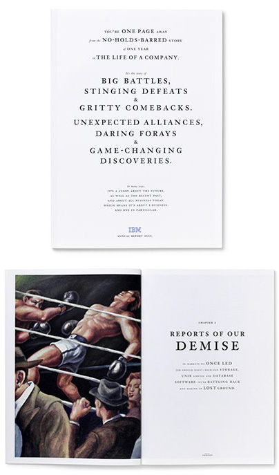
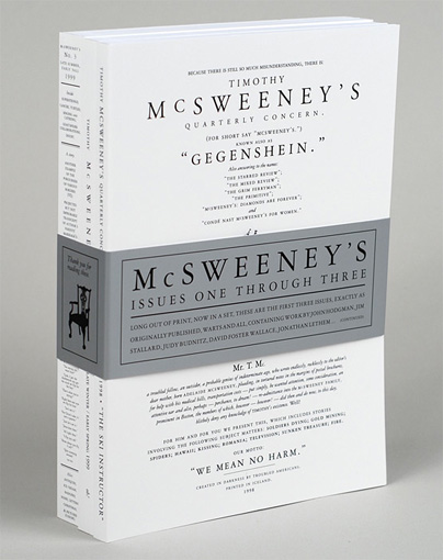
VSA’s 2000 annual report for IBM remains one of the most striking publications in the realm of corporate communications and beyond. From the typography, to the photography, to the copywriting it was all simply outstanding storytelling. Was the cover intentionally too close for comfort to issue one of Timothy McSweeney’s Quarterly Concern? We’ll find out at the event.
![]()
Filed in Arnett/Goldberg • Link
October 08, 2008![]()
Reliving the Past
Both Carin and VSA have a knack for breathing new life into visual tropes of graphic design history — sometimes it results in seemingly literal translations, while other times as new interpretations, but always interesting and appropriate.
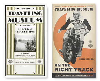
Posters by VSA for the Harley-Davidson Traveling Museum, which showcased memorabilia and classic motorcycles.
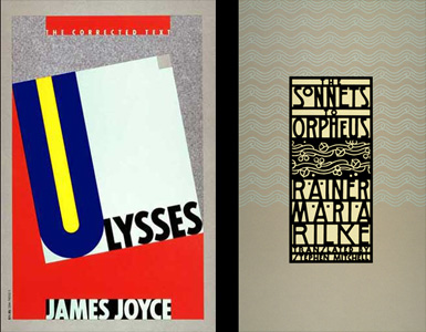
Two book covers by Carin: Ulysses is directly influenced by a Paul Renner poster (shown below), which drew a bit of negative criticism from Tibor Kalman. (This is a subject we’ll talk about at the event, part of it is explained here). The Sonnets of Orpheus is a lovely graphic ode to Art Nouveau.
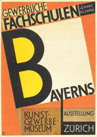
Poster for an exhibition of work from the Bavarian Trade Schools held in Zurich.
![]()
Filed in Arnett/Goldberg • Link
October 06, 2008![]()
Different Worlds, Shared Typography
Our past opposites have, admittedly, shared more in common than in contrast in terms of career trajectories, types of clients and range of projects: Sam and Martin had both done plenty of work in editorial and entertainment world to find common ground, while Post Typography and Ed Fella shared uncanny abilities to meddle with type. In this case, Dana and Carin stand at broad opposites of the kind of careers, clients and projects that a designer can grow into.
![]()
Filed in • Link
October 06, 2008![]()
OA’08: Dana Arnett • Carin Goldberg
The third event in the opposites attract series brings together Dana Arnett and Carin Goldberg, two designers with a characteristic flair for fusing sophisticated typography, arresting imagery and thoughtful concepts into imaginative projects — all with decidedly opposite results. as they share their work and talk about their background in a moderated discussion, we presume the differences and similarities will quickly be apparent.
Thursday, October 16, 2008
6:30-8:30pm
ADC Gallery
106 West 29th Street, NYC
To register for this event, please visit ADC.
![]()
Filed in Arnett/Goldberg • Link

(Total Number of Pages: 1)