Speak UpA Former Division of UnderConsideration
The Archives, August 2002 – April 2009
advertise @ underconsideration
---Click here for full archive list or browse below
  
GE: the Great Escape

Last week, GE unveiled their new Corporate Identity system. A Rebranding? Speak Up is all over it. Armin is sharpening his claws and Felix is practicing his outrage in the mirror. “You talkin’ design to me?” But wait, the logo is the same…almost.

The GE symbol was created in the late nineteenth century and redrawn in 1986 by Landor. This time, Wolff Olins one-ups Landor by making the slightest of adjustments to the drawing. That’s fine, I guess.
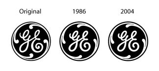
GEProcess3.jpg

I have always thought of GE as one of the tightest and well-managed Identity systems around. It generally uses a dominant masterbrand approach which means divisions and companies have names like GE Plastics, GE Financial and GE Healthcare as opposed to unique brand names. One of the benefits to this is driving up all positive associations to the parent brand. A problem GE is faced with, is that many people think of washers and dryers when they hear their name. I think of washers and dryers when they hear their name. This is not who GE is. GE needs to escape associations that have been around for decades.

Will tweaking their logo do this? Certainly not. So what can? For the first time ever, in fourteen shiny new colors, the GE logo is breaking away from laundry.

Wolff Olins has also developed a new and complete visual system to surround the logo. Here is a sample brochure. There are colors and layouts and templates and image styles and a cool new, proprietary typeface, GE Inspira, all for your downloading pleasure. This system is thorough and well-done and I hope it is not too sophisticated to be implemented.

Maintained through our ADV @ UnderConsideration Program
ENTRY DETAILS
ARCHIVE ID 2021 FILED UNDER Branding and Identity
PUBLISHED ON Jul.22.2004 BY David Weinberger
WITH COMMENTS
Comments
geeky’s comment is:

I think GE did a fantastic job of recognizing that they're best known for home appliances, and getting to work to change that. They're latest commercials have done a great job communicating that message.

On Jul.22.2004 at 11:49 AM
geeky’s comment is:

er.. sorry about the bad grammar :)

On Jul.22.2004 at 12:04 PM
Tom Dolan’s comment is:

I always think of GE as the owner of NBC (thanks to pre-CBS golden era David Letterman) and the nation's largest defense contractor. Maybe pink will be the logo color for the smart bombs and cruise missle division. It's always an interesting problem when worrying about handing over a complex identity system to the client. 14 colors? Do they expect the public to actually percieve the associations that go along with those tones? I'd say FedEx is pushing the envelope getting the average person to associate orange with Express and green with Ground. Quick, name the color for FedEx Freight! Perhaps it's just a question of time (perhaps a lot of time). Will be interesting to watch. I'm not sure I'd want to be commandante of the logo police with 14 color variations flying around the globe.

On Jul.22.2004 at 12:07 PM
Tan’s comment is:

No real opinions about the logo finesse. It's fine I guess. The multi-colored versions seem a bit excessive.

But I'm w/ geeky, I love their "Beauty + Brains" commercial. You know, the one where the nanotechnology professor collides into the supermodel in front of the laundromat, they fall in love, etc. Great commercial — ranks up there w/ the VW one where the guy drives like mad to stop a wedding.

On Jul.22.2004 at 12:17 PM
Brent’s comment is:

I'm interested to hear how they will refer to the new logos internally, considering it's known as the meatball.

PMS 282=frozen meatball, PMS 485=meatball with sauce?

Right away, I thnk process cyan seems really out of place. I'm so used to thinking that the logo is always in black that the sample brochure logo seems like it's not finished its press run yet.

On Jul.22.2004 at 12:25 PM
Justin’s comment is:

I guess Lando needed to give Adobe a reason for a zoom greater than 6400% in Illustrator.

On Jul.22.2004 at 12:28 PM
Justin’s comment is:

D'oh! Landor! Now my feeble joke is relegated to the relam of star wars trivia about Lando Calrissian. Carry on, nothing to see here.

On Jul.22.2004 at 12:30 PM
jo’s comment is:

Reading through the color palette pages in their branding documentation, it looks like the 14 colors can be used for any purposes, rather than a specific one for a specific sub-brand. I kind of like them; they're like jellybeans.

On Jul.22.2004 at 12:47 PM
Omar’s comment is:

Didn't Motorolla do the same thing with their logo? Re-issuing an existing logo in new and modern colors is...it's cute at most, though it didn't elicit much more than a roll of the eyes and a smirk. Its on the level of colored cellphone face plates.

I admire GE's sincerity and restraint. No, seriously.

On Jul.22.2004 at 01:04 PM
Jerry’s comment is:

Maybe I just need to see the work in action but that logo always says �fridge’ to me, no matter the color it’s in. The amount of color variations seems a bit excessive.

Could this peachy display be another attempt by a megacorp to clean up (or protect) its public image? To further anesthetize the public about the reality of certain clients’ practices?

On Jul.22.2004 at 01:06 PM
justin powell’s comment is:

i'm blow away at the breadth of this project. what a daunting task to create and police this enormous brand.

i'm in agreement at what David hinted at: is this too sophisticated to be implemented? wow, i tend to think so... but, the more i look over the guide, the more i think they really have this look locked down.

not noticing much with the logo. a tighter/more open swirl?

the "meatball" comment made me chuckle too... its the monogram, not the meatball.

On Jul.22.2004 at 01:09 PM
amanda’s comment is:

it is funny how most people associate GE with just a fridge or stove - yet they pretty much run the planet.

If I could get paid thousands dollars to pick jellybean colors I would be one happy gal. I like them all together like that. Indifferent when they are all apart though.

On Jul.22.2004 at 01:09 PM
Rob ’s comment is:

The depth and breadth of the program is quite impressive. The cohesiveness of the key elements and the communication of the brand's messages is tight but not overbearing in terms of image and voice.

They have created a system that clearly is what the brand wants to convey: simple, precise and optimistic. And they do this all without being overly controlling as many other brand's can be. There's no image library, there is variance in terms of the layout of covers and text pages. There is as they say, room to play, and still convey the key messages of the brand.

On Jul.22.2004 at 01:25 PM
Darrel’s comment is:

In many ways you'd think GE would want us to keep on thinking they just make Fridges while they continue their world domination in the background.

On Jul.22.2004 at 01:44 PM
Michael’s comment is:

Omar,

Yes, Motorola started doing that a few years ago as well. There were other graphic changes too, more noticable in the ads and other collateral, when they updated their branding.

On a side note, it is very admirable how Wolf Olins handled this job, and also how GE initiated the whole thing and then agreed to this final product. I work "in-house corporate" for another international company, and we've gone through two rebrandings in the last two years. Both were painful and not nearly in the scope of Wolf's (referring to the downloads page) efforts, even though it should have been. But to be fair, there were a lot of cooks in the kitchen.

Rob is very correct in his post. Bravo to Wolf Olin for tastefully completing this task. Also, I do believe that the colors are a great solution to GE's "washer and dryer" delimma. Like Brent said, since we are all so used to seeing the logo in black, the various jellybeans will surely, but subtely, open the doors of perception for consumers.

Funny thing, I was just in Barnes & Noble the other night doing some research and flipped through a book on logos, and of course the GE logo was in there. It gave the name of the creator and date (1894 I think) of the logo creation... but for the life of me I do not remember who created it. Anybody else know? Is this the oldest corporate logo to date? I mean, besides the small updates it's still essentially the same. That's over a hundred years!

On Jul.22.2004 at 01:48 PM
Jim Amos’s comment is:

I'd really like to know how much Landor was paid for this. A few bezier tweaks that will be completely imperceptible to the general public and a new color palette. Wow. Whatever will they come up with next?

On Jul.22.2004 at 01:52 PM
Jim Amos’s comment is:

*looks up* I meant Wolff Olins. Some guy was talking about Lando and my mind wandered.

On Jul.22.2004 at 01:54 PM
marian’s comment is:

Grape Nuts!

I'm just relieved to see recognition of the longevity of a great logo. Obviously, as I've burbled many times before, it's the actions of a company and their historical associations that define what they mean to us, not their logo. (see Tom Dolan.)

As for the 14 colours it seems as though the point is "colourful" as opposed to specific brand identification. Colourful=diverse. Too bad, Tom, no gun-metal grey.

I'm pretty damned impressed with that web resource (and a little surprised it's publicly accessible), but then I've never run in those big branding circles.

On Jul.22.2004 at 01:56 PM
kev’s comment is:

I am quite surprised at how different the logo (er, meatball) looks in different colors. It's quite astonishing, really, that we've lived with the black for so long.

On Jul.22.2004 at 02:28 PM
Brady’s comment is:

After reading the last 3 annuals and seeing the transition of GE's business structure (from hundreds of divisions down to 14) I had a feeling this was coming.

GE has remained a giant, but they have gradually become more and more understandable partly through shrewd introspection and an increasing commitment to design - beyond their products.

Thank God for Jeff Immelt.

The least of, but still heart-felt, thanks are directed to the sparing of the monogram. Understanding the simplicity and the undeniable equity of the mark was inspired in these days of slash and burn re-branding.

Add to that the continued relegation of the 3-D version to broadcast applications.

At first glance it seems that 14 colors are a lot to master. Then you look through the brand expression guidelines and the B2C advertising guidelines PDFs and it all makes sense. The guidelines are fairly open for such a large, global entity. The color palette allows some freedom to express the character of the market, the product and ultimately the corporation.

Further, by opening the color palette, the identity can better compliment the colors inherent in the accompanying photograph.

The section that best shows the effectiveness of the new brand expression is the showing of examples of the advertising transition.

Seeing this kind of work and the thought that went into not just designing the new visual brand, but discovering what the brand is supposed to mean to the company and it's customers and then expressing it so beautifully — is very inspiring.

Thank you, Mr. Immelt.

Now if the broadcast advertising will transition into the new expression.

> They're (sic) latest commercials have done a great job communicating that message.

Sorry 'geeky', can't completely agree with you on that one.

Yes, they do address the we do more than washers issue.

But seriously, Lassie doing the Matrix and lounging robots are not really 'on brand' with the new expression. Much less do they make me remember that GE does security technology and thermoplastics.

> A few bezier tweaks that will be completely imperceptible to the general public and a new color palette. Wow. Whatever will they come up with next?

Jim,

The bezier tweaks are strictly for enhancing the production of the monogram across media. Newsprint wreaks havoc on marks like this.

New color palette? There is much more to it than that. There was a lot of thought and understanding that went into the process to bring GE to this point.

On Jul.22.2004 at 02:31 PM
danhq’s comment is:

we do some work with one of GE's brands and i've got a few things to say:

this is the second rebranding in 3 years (anyone remember 'imagination at work?'). frankly i liked the other one better. trade gothic extended was a nice clean font. this new font looks unfinished to me (maybe unpolished is a better word). and it's craptacular at headline size IMO. one thing i will say though - the new style yields a vastly superior website 'look and feel'. [check out here vs. here.

On Jul.22.2004 at 02:43 PM
David’s comment is:

I downloaded the PDF file that covers the interactive guidelines for the brand but was disappointed. It just discusses what typefaces and RGB colors to use. (It also refers to the "GE Online Design Center" but I don't know what/where that is.) ugh.

In general this seems to be a case, once again, of interactive not being a key part of a brand.... and of branding firms being too print-centric.

I'd rant on and on about the need for more multi-disciplinary branding solutions, but don't have the energy today.

On Jul.22.2004 at 02:44 PM
jason’s comment is:

justin powell, it actually is referred to as 'the meatball' within GE.

On Jul.22.2004 at 03:01 PM
justin powell’s comment is:

not anymore. they now say that is improper use.

third paragraph down.

On Jul.22.2004 at 03:49 PM
Brady’s comment is:

> anyone remember 'imagination at work"?

Dan,

Umm.. , it still is 'imagination at work'.

> I downloaded the PDF file that covers the interactive guidelines for the brand but was disappointed. It just discusses what typefaces and RGB colors to use.

David,

I don't think that believe interactive is not a key part of the brand expression.

If you read the the TITLE and the TABLE OF CONTENTS on the first page, you will notice that it is an INTERIM GUIDE and that the meat of the document will be coming soon.

This was probably due to a need to convert the easiest elements of the web site ASAP. Since the type and colors had already been approved this was logical. The coming sections: iconography, graphic elements, grid templates and imagery take a long time to develop and test for such a behemoth of a global corporate site.

Oh... It further iterates this by stating on the GE Brand site, "Be aware that these guidelines are still in development."

I'd rant on and on about how interactive designers don't read but, but I don't have the energy today. (ha, ha.)

On Jul.22.2004 at 03:52 PM
David’s comment is:

Brady - yes I read that. And understand. But I also get the impression that the "interactive" is done after the "print" branding.... rather than simultaneously. It seems like it'll be tacked-on rather than letting it influence the print side of things. No real design dialog between the two - more a one-way hierarchy... the print branding comes first, all other stuff is done second. But if they were done simultaneously, then the design process of each would influence the other and a more truly integrated brand design might emerge.

On Jul.22.2004 at 04:00 PM
Darrel’s comment is:

My favorite design-firm-not-getting-interactive story was at my first large design firm gig out of school.

We did a large rebranding of a hospital a few years earlier (before I was there). We then worked on the web site and had to break a lot of the identity guildeline rules that we had made to make it work online. The client actually called us on that. ;o)

On Jul.22.2004 at 05:14 PM
Don’s comment is:

Got color?!

Doyald Young collaborated with another designer on the last update of the GE logo (or was that the first? Just kidding Doyald). Glad to see it stand the test of time.

(Applause) that this one was not rand-omized like the Brown swoosh.

On Jul.22.2004 at 06:02 PM
Dan’s comment is:

Anyone think GE's new identity is eerily similar to the Grant Thornton Identity? http://www.grantthornton.com

On Jul.22.2004 at 06:23 PM
Brady’s comment is:

> Anyone think GE's new identity is eerily similar to the Grant Thornton Identity?

HUH ? Umm... No.

> But I also get the impression that the "interactive" is done after the "print" branding.... rather than simultaneously.

David,

I would venture that your impression would not be true in this case.

I mean give Wolff Olins and GE some credit.

First, your impressions are based on assumptions as to the inner-workings of a huge global brand shift and something that we are even fortunate enough to see.

Who else grants access their brand guidelines so openly?

Second, GE has recently become one of the most forward thinking corporations to consider their brand as equal to their corporate structure.

GE's new ID was scheduled to launch as they were reporting 2nd Quarter earnings. (July 9, 2004)

While they were probably working on all aspects simultaneously the web portion of their brand presence is so deep — i'd venture a guess that a large portion (majority?) of it is B2B and intranet and therefore not public facing — that to put it on that same schedule would have been ill-advised. And delaying it so they can revamp their entire online presence would have been too late.

Even the advertising is going to take about 6 months to transition to the new look —

"There will be a transition period until January 1, 2005, during which time we will phase in the new brand expression, medium by medium."

Thusly, your impression maybe gleaned from the opposite reality, that they are putting a lot of stock into the online presence and they want to get it right.

That's my 'benefit-of-the-doubt' for the day.

I could be wrong.

On Jul.22.2004 at 08:10 PM
Don Julio’s comment is:

it is funny how most people associate GE with just a fridge or stove - yet they pretty much run the planet.

Actually the logo reminds me of sitting at the laundromat in college as the clothes swirled inside that round glass window. Maybe their appliances alter our brainwaves with that low frequency hum as part of a bigger scheme.

On Jul.22.2004 at 08:23 PM
RavenOne’s comment is:

I remember as a child gaining the stove-asociation with the brand when I burnt my hand on it; the logo happened to be at the level of my face.

>,> Talk about asociation under trama.

On Jul.22.2004 at 10:25 PM
Greg’s comment is:

Mmmmm.....meatball jellybeans. Oh wait. Ew.

Honestly, with the colors they've gone from bland to just-a-little-less bland. And I thought process cyan was an odd choice. It's kinda like green ketchup...a meatball by any other color is still a meatball.

P.S. I read the thing that said "don't call it meatball." I scoff heartily in that direction.

On Jul.23.2004 at 09:02 AM
Rob ’s comment is:

It seems like it'll be tacked-on rather than letting it influence the print side of things. No real design dialog between the two - more a one-way hierarchy... the print branding comes first, all other stuff is done second.

I would disagree. It's seems to me since the majority of their products exist in the world outside the web, the print would be the first priority from a business point of view. This doesn't mean there wasn't any dialogue between the creations of the web and print design.

Don't assume just because print was done first means that the interactive stuff is an afterthought. It seems to me that this was totally a 'how best to sell our stuff' kind of decision then a print is better the interactive. Really, can't we just get over this us vs. them mentatlity?

On Jul.23.2004 at 10:18 AM
Michael’s comment is:

Just wanted to throw this into the mix:

Interbrand: Best Global Brands by Value

On Jul.23.2004 at 12:37 PM
Nick’s comment is:

The colors are a palette.

But there is a "curve clash" between the symbol and the new typeface.

The idea that relates the Inspira corporate font to the logo lettering is apparent: both are light monoline, rounded-terminal "Speedball" lettering.

The "engineering lettering template with Rapidograph" quality of Inspira could possibly work with the symbol -- but not when the basic curve form is an oval, which jars with the complex, hand-drawn curves of the symbol.

The shape of a typeface's curves is more important than the detail of terminal finish or contrast. A classic grotesque (Helvetica, Trade Gothic) would work better here, because the complex curves of a grot relate to those in the old symbol, and are of the same era.

Strangely, a pure geometric with circular "o"s would work also, the shape relating to the roundness of the symbol.

The oval curves of Inspira provide a contemporary condensed-sans look, and the curving of diagonal strokes is cuddly-cute, but the mechanically precise oval curve shape that underlies Inspira is in fundamental discord with the meatball.

On Jul.26.2004 at 02:50 PM
erik spiekermann’s comment is:

But there is a "curve clash" between the symbol and the new typeface

That is the least of the problems: can anybody imagine reading this typeface at, say, 7pt for technical information on a package? Or reversed out of 4c in an ad? I think i know who designed this for WolffOlins back in London, and they're not known for designing hard-working text faces. And WO have always been doing those rounded-terminals fonts; recently for the New Tate gallery in London, years ago for VAG (Volkswagen Group) with a sort of Futura Rounded. And i myself was involved in my first rounded typeface for the German petrol company, ARAL, back in 1976 when i worked at WolffOlins. This is not going to age well, and they'll soon have to extend the family. And they chickened when it came to Powerpoint templates, allowing Arial there, rather than programming them with embedded fonts and making a version of the new font with Arial widths, so that old documents will not break differently.

Other than that, i cannot believe that people will trust GE to be such a light, pleasant company. All that white space and cool illustration style will soon hit the wall of corporate mediocrity and consumer reality. I still congratulate the effort, but don't see much in the way of layout style that would enable a smaller ageny or less-than-award-winning designer to make good pages. Just 6 columns on a page can hardly be called a literature concept. While good designers need only to understand the philosophy of a brand, less experienced colleagues need tight grids and even style sheets.

And finally:

print always gets documented first, because it takes months and years to get implemented. Online guidelines can be applied over night, literally. It is not a question of one being more worthy than the other.

On Jul.26.2004 at 08:10 PM
Antonio Moro’s comment is:

> print always gets documented first, because it takes months and years to get implemented. Online guidelines can be applied over night, literally.

?!?!? where? on Mars maybe.. It's funny to read a print designer speak about interactive and an interactive designer speak about print.. it's always "so easy", "are you paid for that?!?" and "can be applied over night"...

;)

On Jul.27.2004 at 02:59 AM
Jerry Kuyper’s comment is:

As a member of the original team that created the GE identity program in the 80s, I would like to offer some historical perspective.

In the original Landor guidelines the color standards were simple, the monogram could appear in Platinum Grey, black or reversed out in white. This last option allowed for a wide range of colors (several dozen neutral, dark and bright colors) to be part of the GE visual system while establishing a consistent expression of the monogram. Jack Welch and others had made it clear they didn't like seeing the monogram in pink or in any color other than Platinum Grey, black or white.

Launching a new identity — even with one of the most comprehensive set of standards ever created — is always a good challenge. One of my most memorable moments in working on the program was attending a retirement party for one of the key GE team members. He took me aside and said he wanted to introduce me to the individual who had approved the Annual Report, of which 20,000,000 copies had just been printed. In clear violation of the the standards and Jack Welch's wishes, the cover had a six inch dark blue monogram front and center. The fellow was an ashen grey not dissimilar from Platinum Grey.

There are several aspects of the new program that will be interesting to follow.

How much resistance to change will occur?

It is hard to overestimate the power of the individual consumer businesses. I'm looking at a recent GE light bulb package that for 18 years has resisted following the basic tenets of the identity program. While the revised monogram is used, it is blue and is contained in a box.

Which colors will be used most prominently?

Color palettes are seductive in the controlled arena of guidelines, but will a dozen brochures on a table with six dark blue, one light blue, one invisible blue, one orange, and three black monograms appear friendly and approachable or chaotic?

Will certain businesses or product lines use specific colors to tie their communications together?

It is commendable that no attempt to color code is being mandated, but the universal desire to find and create order and connection will make color associations inevitable.

Based on the broad appeal of blue — some estimate 60 to 70% of American companies are blue — I would bet that over time we will see a blue GE (Pantone 7455) emerge. If that happens, I will be longing for Platinum Grey.

On Jul.28.2004 at 10:47 AM
erik spiekermann’s comment is:

It's funny to read a print designer speak about interactive and an interactive designer speak about print.. it's always "so easy", "are you paid for that?!?" and "can be applied over night"...

I wrote "applied" deliberately. Designing the online presence takes just as long as doing the print stuff, depending on the complexity and depth of either. But when printing hundreds of sales brochures, packages, POS materials, stationery, etc (and the important annual report only gets printed once a year), it can take months if not years before anybody can see the complete programme, the online identity can be designed and kept on the pre-live server until ready to launch. That launch can literally happen overnight. I've done this with the programmes we've designed for brands like Audi, VW, Heidelberg Printing and many others. While i may "only" be a print designer because i carry the stigma of being over 30 years old, that doesn't disqualify me from knowing how to implement large corporate design programmes. I would never say it is easy and i certainly would never do anything for free.

And lastly: Jerry's comment about peoples' universal desire to find and create order is spot on. It won't be long and GE will have separate colour schemes for sub-brands and department. Nothing is more difficult to implement than an open system, and it certainly goes against everything people in large corporations expect. I do, however, hope that the system stays as flexible as it's intended to. The world doesn't need another blue corporation.

On Jul.28.2004 at 04:19 PM
Antonio Moro’s comment is:

:) Erik now I've get it.. sorry your message was not so clear for my bad english (I'm Italian).

My comment was more on other usual comments from interactive designers discussing how much a brand designer is payed for "just create a logo" and on print designers discussing on webdesign... it wasn't an "attack" on you ;)

On Jul.30.2004 at 03:33 AM
John AL’s comment is:

seem to have missed the boat for this discussion...

"The GE symbol was created... and redrawn in 1986 by Landor. This time, Wolff Olins one-ups Landor by making the slightest of adjustments to the drawing." OR Landor should have redrawn it smoother, from the comparison you show. So are Wolff Olins just correcting an almost finished logo?

If you read the guidelines the meatball is the brand, hertitage of General Electric.. blah blah blah. So why would they want to change it. Jeff Imelt is trying to move them forwards, but they are GE.

All the credit to Jerry K, as they did a great job otherwise it wouldn't have lasted 18yrs. This must be a start of a new GE surley the new colors etc will take a few years to filter through GE, they have 250,00 plus people so nothing is quick with them.

The fonts great and unlike Mr. Speakermann I couldn't find the page that said Arial is the primary powerpoint font. If you get the properties listed (WIn XP) it does have embeds permitted. Maybe Erik glanced over it. How would he approach a GE sized font design, they must have 101 uses? Its good to see an Expert set for a change, I like ligatures! Does anyone know if there are restrictions to downloading the font?

Vote Kerry!

JAL

On Sep.06.2004 at 01:55 PM
mike abbink’s comment is:

hey spiek,

i think the typeface reads pretty well at small size! i must add that i think it's pretty ballsy for GE to have accepted this typeface design.

On Sep.07.2004 at 02:46 PM
JLee’s comment is:

John AL -

Does anyone know if there are restrictions to downloading the font?

It does say under "About GE Inspira" on this page that "GE Inspira is proprietary and will not be available to those outside the company."

On Sep.07.2004 at 03:18 PM
mike abbink’s comment is:

the GE Inspira typeface is proprietary and should NOT be downloaded. but they have some problems to solve in order to make the brandsite password protected. until then it will be difficult to prevent anyone from downloading it.

On Sep.07.2004 at 10:58 PM
mike abbink’s comment is:

nick i must disagree with the curve clash you brought up. the lettering inside the circle are what the letters are relating to and these are not round and geometrical. infact they do share similar attributes in structure and shape. the inspira letters serve as a contemporary brother, not a literal translation. i believe the meatball and the typeface go well together.

On Sep.07.2004 at 11:10 PM
Mark’s comment is:

GE is and still is the best company to use evolutionary redesign for their logo and keep it recognizable.

Plus their advertisents are clever and are forward-thinking in how GE can improve and move beyond its horizons of what it did in the beginning as a company.

Google "General Electric logo" and enjoy!

(I'm a proud owner of a GE microwave)

On Nov.08.2005 at 01:19 PM
Enaliomma’s comment is:

I simply mad about this forum!
http://srubibablo.com
Many thanks!

On Nov.30.2007 at 08:19 AM
Andy Malhan’s comment is:

I'm throwing this in a few years late, but thought you all might be interested to see this. I wonder if Edison drew that! Just for a smile, have a look at this too :)

On Feb.18.2008 at 11:13 PM
Ken Watabe’s comment is:

Hi, im few years late also, but can any1 tell me where i can download the guidelines & templates, GE has their brand central locked up.

Thanks alot.

On Oct.19.2008 at 08:26 AM