Speak UpA Former Division of UnderConsideration
The Archives, August 2002 – April 2009
advertise @ underconsideration
---Click here for full archive list or browse below
  
You’ve Got New Logo!

There are few things that designers subjectively agree on, luckily, one of them is the hideousness of the AOL logo. Created in 1991 — in internet years, that is as old as dinosaurs — as the brand identifier for America Online, it has become the epitome of the visual style of most identities designed during the dot com boom: unconditionally swooshy, forcefully friendly and somewhat globally omnipotent. Unless otherwise noted in the forthcoming discussion here, this logo remains unclaimed for in terms of authorship, it probably was an internal job. Probably explaining its unforgiving, clichéd, graphical execution. The pyramid, the swooshy “eye”, the silly script typography… in unison, showing what graphic design, at its worst, can be.
AOL_logo_newspaper.jpg

Today, AOL launched an aggressive — dare I say integrated — campaign to showcase their new commitment to customers. Through TV, radio and newspapers AOL will “drive our employees to one common goal: to make life online better for our members, and in so doing, to improve their lives” as a spiffy, expensive, two-page ad in The New York Times reads today — designed by The Martin Agency. The ads highlight eight key points:

› Protect members from online threats
› Safeguard children
› Protect member privacy
› Protect members against spam and scams
› Provide the best communication tools possible
› Provide simple solutions
› Innovate
› Offer comprehensive customer service.

So how does that translate into a new logo?
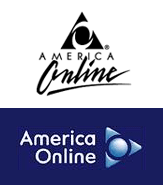
AOL_old_new.gif Simple, you flip it. Designed by Desgrippes Gobé, the new logo struts a friendly, rounder typographic treatment and, obviously, rotates the well known pyramid ninety degrees clockwise. To point forward, see?

The new logo is intended to help celebrate, and mark, the company’s 20th Anniversary — which is seven years away — it will be interesting to see if the currently-trendy, shadow-enhanced logo lasts that long. Rotating the pyramid seems a smart move, as pyramids are not very friendly — people get buried in those things — and losing the internal swooshes helped clean up the logo, unfortunately the icon now seems like something a Storm Trooper might have emblazoned in its battle uniform in the next installment of the Star Wars Sixology(?).

Nonetheless the new, overall look quickly sheds all past brand gaudiness and literally points in a new direction… but is it the correct one?

Maintained through our ADV @ UnderConsideration Program
ENTRY DETAILS
ARCHIVE ID 2101 FILED UNDER Branding and Identity
PUBLISHED ON Oct.07.2004 BY Armin
WITH COMMENTS
Comments
Rob Weychert’s comment is:

The old AOL logo sucked, but it was considerably more distinctive than this one. How do you make something friendly? Make it puffy! Genius. But actually not.

On Oct.07.2004 at 01:30 PM
Kevin McGuire’s comment is:

Althought I haven't decided if I like it or not, it is undeniable that it is better than the old one.

First thoughts: like the ups logo, I think the use of gradients is weak. Unlike the ups logo, I think this one could work in black in white.

America Online is worthless anyway. They are always talking about how their services are wonderful and and that you need to sign up right now, when in reality what they offer has been available from other companies for years.

In a way, I think the bad logo was more fitting for such a bad company.

On Oct.07.2004 at 01:31 PM
Greg’s comment is:

I'm sure later on down the thread I'll get ripped for this, but I kinda like it. I always hated the old logo, for one really subjective reason; they left the first "A" in America hung out to dry. There was so much potential for the A's to line up with that pyramid. I suppose, though, as far as early nineties logos go, it wasn't that bad... I always associated the pyramid shape with the one off of the back of the (american) dollar bill. The overall impression was of an all-seeing eye.

I kinda think, off of a very brief first impression, that it looks an awful lot like a computer's start button, and I'm sure that's on purpose. You're supposed to think of AOL right when you're turning on your computer or some such. I'm not sure I get the pointing forward thing. In the old logo it was very clear that the pyramid was an A and the swooshes in the middle were supposed to make the O, but in the new logo that's not as clear, and if you try to make it clear then you end up turning your head slightly to the left and then the "arrow/pyramid" is pointing up and to the left. The type treatment is just ok... there doesn't seem to be much relation to the image (other than that it is the name of the company for which the image was created).

Hmmm...maybe I don't like it. Who knows.

On Oct.07.2004 at 01:32 PM
Chris Rugen’s comment is:

I find it less offensive in a design sense, but also less distinct. Its offensiveness also made it so... appropriate. However, it'll be nice to have a less annoying logo printed on their 'FREE AOL 30,000 HOURS EXTRA-PLATINUM' CDs that seem to occupy every nook in the universe.

On Oct.07.2004 at 01:48 PM
Tan’s comment is:

I like it. Gobé did a great job. I think the type is professional, yet approachable, and the mark takes the A triangle, and turns it into a media icon — something that is indicative of AOL's future market.

Before critiquing the graphic execution, let's consider the business.

I did some work for AOL a while back, and know that their current market is the under-15 crowd, and the over-50 crowd. Yup, only kiddies and grandmas use AOL. The popularity of their IM buddy list is what keeps them afloat with teeners and betweeners. Likewise, the friendly, low-tech simplicity of their service is what keeps them popular with the older crowd. For them, AOL was their entry point to the web and dammit, they're sticking with it.

So their huge challenge is to rebuild credibility and relevance with our group — meaning people 18-50 who are no longer internet novices. They've become archaic and irrelevant to working professionals.

So how and where do they go? The next battleground for the net is media and entertainment in real-time and its seamless integration with mobile and other portable, wireless devices. Not to mention XM satellite radio. It's still largely a home-use market, but that's where the largest untapped potential lies.

I think this new identity is a very smart foray into that market.

On Oct.07.2004 at 01:55 PM
Tan’s comment is:

And how could I forget — remember that it's AOL/TimeWarner now. Further proof that their objective is to integrate web and media/entertainment.

It ain't the AOL of yore anymore.

>rotates the well known pyramid ninety degrees clockwise. To point forward, see?

It's also a "Play" button. The "O" in the triangle alludes to the universal "Power" icon as well. That's what I meant by a media icon.

On Oct.07.2004 at 02:00 PM
laura’s comment is:

As I was reading through this entry I noticed the old logo, and then clicked on the icon below thinking a window would pop up revealing the new logo design. I didn't realize that THAT was the new logo! I thought it was a rollover. But a real nice rollover...

On Oct.07.2004 at 02:01 PM
ps’s comment is:

hmm,

when visiting their site the new logo was not there yet...

seems odd

On Oct.07.2004 at 02:09 PM
Rob ’s comment is:

Well, I do think the typograhy works. It seems more solid and more 'serious'. As for pointing right, is it really? Because depending on how you interpret it, there are arrows in three directions. And one of the three is down.

That being said I'm not ask convinced as Tan that this is a mark is so incredibly wonderful. I'm not sure the faux 3-D effect on the logo is working for me, personally. And in some ways the logo reminds me of one of those old starships from the Atari generation (Asteroids?) and not so much something that is necessarily going to appeal to what has been defined as their key target audience.

As usual, not having the brief in hand, it's hard to be fair in either direction. So, for now, I'll let the forces of capitalism be the judge and we'll see how it all goes.

On Oct.07.2004 at 02:30 PM
Stefan Kjartansson’s comment is:

I hadn't seen that before. That's great!

With all the generic shapes, uninspired A and O references, no ink traps and the hideous 3-D texture, it has to be the ugliest logo since UPS redesigned. What's the typeface they're using? Looks like a neutered Futura.

Where's Paul Rand when we need him?

On Oct.07.2004 at 02:33 PM
Chris Rugen’s comment is:

Looking at it again, my brain wants the pyramid to 'sit down' in the old position, so my mind's eye reads it as hopping or dancing. I haven't realigned my view of their mark as an arrow.

On Oct.07.2004 at 02:37 PM
Tan’s comment is:

Ok, you mean to tell me that none of you see any similarities between the new AOL icon and this universal icon?

I read the new mark as a button right away. But apparently it's not as clear as I thought it was.

On Oct.07.2004 at 02:54 PM
Armin’s comment is:

When I first saw the logo it reminded me of Siegel & Gale's work done on the Air Force logo.

While I hold the USAF logo in high regard (highlights, shadows and all), I think AOL falls short of being as impactful. It does look more techie and more modern but at the expense of some very basic gradiations — unlike UPS's which were actually very well rendered and executed, technically speaking. It does, however, speak to what they want to accomplish as Tan mentioned at the beginning and I also think it is a much "better" mark than the original, opening the door to potential new customers — me not included.

The typography is well done and its roundedness plays well off the icon's. Although the "m" and "n" seem slightly out of place, perhaps because they are the more unique characters.

The icon itself I think it lamentably works despite its simplicity, and I don't mean the good kind of simplicity — it is just a circle with a white stroke inside a rounded-corner triangle. Like the UPS logo, this icon loses strength without its gradients.

> it has to be the ugliest logo since UPS redesigned

I'm sorry, but no, it's not. There are far worse things that have been done in the past year and a half. And I wouldn't label, at all, this new logo as "ugly".

On Oct.07.2004 at 03:09 PM
Brian’s comment is:

I don't think the type and the mark flow as one and I think that is partly caused by the "puffy" 3D look of the mark and the flatness of the type. Kind of seperates the two a little too much.

As for the mark itself I'm still undecided. I'm glad the swooshes are gone but there's something about this one that seems awkward. It's better though. Doesn't look early 90's anymore.

On Oct.07.2004 at 03:28 PM
danielle’s comment is:

So they took one universal icon (the A/O) and married it with the other universal icon, added a basic 3D gradient, and called it forward-looking.

I suppose I'm disappointed because they went from something unique in the market and went to something that already looks outdated. TimeWarner has a press release on their site that calls it "up-to-date". It almost seems as if they went backwards. It certainly doesn't seem forward thinking... despite the direction the A -— or arrow, or button, or whatever it is -— points. If they wanted more of the middle-aged market share, is this all the appearance it takes to attract it?

What do you think was wrong with the "A/O" before? Why couldn't they have used the icon with a higher-quality gradient and a slight facelift and redesigned the type to modernize it, not just simplify it?

Even if they were shooting for a generic logo to tie the product line together, if you look at their other trademarks, this logo doesn't seem to me as if it's the leader of all the brands under the umbrella. The Netscape logo looks stronger and has a better 3D effect, the love.com logo looks more contemporary. This one seems like it's been neglected.

Maybe I'm just more critical because i've been dumping money into it for waaaayy too long now and have to look at it every day. (my own fault, I know...not seeking pity here!)

On Oct.07.2004 at 03:34 PM
marian’s comment is:

Yes, Tan, I too saw the "play" button right away. It was my first association, actually.

On Oct.07.2004 at 03:38 PM
Rob ’s comment is:

Ok, you mean to tell me that none of you see any similarities between the new AOL icon and this universal icon?

Tan, I think at some point I saw the play button but not as stongly as it hit you or Marian. The gradients it does use seem more spacecraft like and that's probably why it reminds of that old Atari game. Or as Armin pointed out, "something a Storm Trooper might have emblazoned on its battle uniform."

Clearly it was not designed with an audience of designers in mind and only time will tell how effective it is for them in the marketplace. I think while it is an improvement, graphically, over the previous logo, it's doesn't seem as unique.

Horror of horrors, everytime I look at it now, it just keeps spinning and changing direction. : ^ )

On Oct.07.2004 at 03:50 PM
erica’s comment is:

i really like that font that is used, but i'm just not convinced about the A/O thing. i don't like the soft, almost fuzzy gradation. i think if the shading had been more incisive, the whole thing would have had more presence.

also, because so many people are used to seeing the orientation of the original A/O, it seems like this new logo has it flipped 45 degrees to the left, which just looks awkward. i'm sure that concern will be solved by time and distance from the old logo though.

On Oct.07.2004 at 03:59 PM
Tan’s comment is:

In the not-too-distant future, I can imagine the AOL button sitting in a row of icons on my web TV browser screen, or in the navigation screen dock in my car, or on my iPod/PDA/phone device thingy. In that context (a 16/32 pixel icon), the "play" button reference would be much clearer I would predict.

It has strong media presence, which is exactly where it will be used most. So unlike the UPS mark, the 3D shading and rendering is wholely appropriate. It's pointless to wager its effectiveness as a flat, 1-color mark.

Keep in mind its application and usage as you critique its design.

On Oct.07.2004 at 04:05 PM
vibranium’s comment is:

It may not be bad, but it is boring.

On Oct.07.2004 at 04:24 PM
Armin’s comment is:

> So unlike the UPS mark, the 3D shading and rendering is wholely appropriate. It's pointless to wager its effectiveness as a flat, 1-color mark.

You think there is a chance that they might sponsor an event, and that the event's catalog is printed in one color? I don't want to get into a senseless debate about it, I see your point, but 'pointless'? (Still bitter about my snoring comment I see).

I think where this logo really succeeds is in that it still looks like that pyramid logo, even if it's rotated. Most people will see the new logo and not realize it has changed dramatically, simply that it magically improved.

On Oct.07.2004 at 04:31 PM
Gunnar Swanson’s comment is:

I'm not sure I follow the logic of the typeface: I get the round letters resonating with the round of the abstract symbol thing but if m and n have their upper left sides sanded down, why isn’t the same true for the upper right of the a?

The abstract symbol manages to retain a lot of equity from the old mark while being more positive, more versatile (play button, etc.), and working better at small sizes and low resolutions. The cheesy 3D effect makes some sense but the shape is strong enough that it could vary as needed.

Why does http://www.aol.com/ have neither the full ugly old symbol-with-signature or the new mark? Will they match what they have now and convert the new logotype to one line or is the relationship with the abstract symbol stable? Is there an AOL (as opposed to America Online) version? And why three letters for two words? An interCap would have made it easier to read: America OnLine.

On Oct.07.2004 at 04:40 PM
Greg’s comment is:

This discussion is indicative of a larger battle playing out in the work of designers everywhere: are gradients/shading ever acceptable, and when? A lot of designers think they're never ok, and some use them with reckless abandon. I tend to fall in the middle; they're ok when the outcome is desired, but just using it as an effect probably isn't the best idea.

I think here the gradient is called for, and frankly I was surprised with who in this discussion agrees with me. I half expected to be the only person to come out in favor of this logo. The mark needed to appear to stand out from the page so it would look like a button. It kind of calls out to be pressed, don't you think? Also, the shape is easier on the eye and more interesting than the pointy original, so without the gradient it will still resonate.

Now, if someone could just sell me on the type and the application of the type, I'd be set.

On Oct.07.2004 at 04:46 PM
Jason B.’s comment is:

I'd agree that the typography looks much nicer, it's professional and easy to read. I would say that it has a "friendly, foward-looking" appearance. The mark on the other hand... it's different than before. Not necessarily better, just different.

If I were AOL, I'd levy the already recognizable Yellow Man "buddy" icon as the company logo. The icon has already become something more than a symbol of Instant Messenger. They've used him in TV and print advertising (I'm thinking of the fun "Six Million Dollar Man" ad from last year and the "TopSpeed" commercials during this year's Super Bowl). It's a strong, immediately identifiable icon.

I don't see this new logo as being strong enough to remain relevant in 4 years. (The 20th anniversary logo? Why so early?)

On Oct.07.2004 at 04:52 PM
Tan’s comment is:

Ok, so maybe "pointless" is too strong a word. All marks need to work in simple and complex applications. "Not as necessary" then.

>I think here the gradient is called for, and frankly I was surprised with who in this discussion agrees with me.

I'm not saying that I love gradient, 3D marks in general. Because I personally wouldn't design one. But certain design cues are indicative of certain applications. 3D rendering and shading is used everywhere in food and product packaging. It's also the same in 99% of the software and electronic games industry. And it's permeated its way into web and broadcast interfaces. It has become an accepted design vernacular in many applications — whether designers agree or not.

And you've outlined out many valid reasons why it works in this instance. Good designers are open to context and use, not just rigid principles.

>If I were AOL, I'd levy the already recognizable Yellow Man "buddy" icon as the company logo.

That's actually a very sensitive issue at AOL. The running man was originally slated to just identify the AOL/IM and mobile division. But the ad agency thought it'd be a good idea to appropriate him for the ad campaign — and thus, turned him into a mascot for the entire company. Arguments ensued, heads rolled, agencies were reprimanded from what I heard. After much internal debates, external consultation, focus group research, etc. — I think the running man is going to go back where he was originally intended for. And after he had sex with Sharon Stone, no less. Poor guy.

On Oct.07.2004 at 06:02 PM
ian’s comment is:

due to the way they have advertised and packaged the cd i seem to get once a week from them, i always associate the yellow running man with aol and versa visa. its a strong mark and it's memorable. you see that little yellow guy (i'm assuming) and you think of aol. if i saw this new aol mark i might think it was a music division at sony or something. context is everything. the success of this mark is up to how the company embraces it.

i like it, but i'm a sucker for round letterforms and right aligned text. the gradient doen't bother me. personally, i like seeing gradients treated in more graphic ways, such as crosshatching, but it works. i hate it because it's aol. kinda like the kmart rebranding. until they make some major improvements to the shopping experience, it's still kmart...

On Oct.07.2004 at 06:34 PM
Frank’s comment is:

I can see the practicality and functionality

of the new aol logo...however as I am comparing

the two marks on my screen, the old one still

resonates more effectively than the new one.

The typography for the new logo is nicely set

and legible no doubt, however the entire mark

comes off as bland. They had a real good thing

going with the aol running man. Call it cheesy,

call it whatever, but my impression of aol has

always been that of friendly, outgoing, and easy

to use. Those elements have always been what

was unique about aol compared to other internet

providers. Where is aol going now? So they are

aiming to attract the 18-26 demographic? Am I the

only one who thinks this solution would not be

the answer?

Finally, perhaps they didn't have to give the

mark a 3-D look. For the internet browser or

something that would look good..but for print

they didn't have to do that.

On Oct.07.2004 at 06:43 PM
Frank Lin’s comment is:


I want to make a quick adjustment from my previous

post. I wasn't implying the aol running man was

part of the original logo..that remark was off-

tangent in regards to the overall branding of AOL.

Also I just visited the AOL homepage. Their logo

is not the same as the original one posted..must

be a special online version..

On Oct.07.2004 at 06:50 PM
Michael H.’s comment is:

I hadn't really noticed the "sanded edge" difference in the "m&n" and the "a" until Gunnar mentioned it. I like the font except now I think that "a" needs to be sanded down (but not the "r") to match the other letters. It's that last tweak that it needs.

The symbol, however, I am not so excited about. It's very Fisher-Price like. It's too simple and feels dumbed down. That gradient looks identical to the way Windows treats gradients and not as smooth as it could be. Rather, as it should be.

All that being said, I do hope that this new branding effort will be reflective of a (hopefully) new business and marketing strategy. I think AOL has some serious potential to be more than the joke that it is, they are just not leveraging their other capabilities (if for no other reason than to give Microsoft a run for thier money).

> You think there is a chance that they might sponsor an event, and that the event's catalog is printed in one color?

Thank you Armin. I thought the practice was (still) to create a logo with all future applications in mind whether they be one color publications or million color (gradients) multimedia venues. This new logo does it, but with a questionable implimentation of the latter.

I think one thing that was intentional (and it shows here) is that the new symbol is not only showing forward direction but motion. It has a restless quality to it that implies it's media potential. Several folks here have been commenting that they expect it to rotate one direction or another.

Another thing to consider that I will miss about the old logo, is that it had more impact. When I see it on an advertsiement or CD, I know immediately what it is and that I can throw it away. Now with this new, less-impactful, logo I'm afraid my eyes will miss it and I will be forced to spend a few more seconds than usual looking at whatever collateral it is placed on.

On Oct.07.2004 at 06:55 PM
Tan’s comment is:

>I thought the practice was (still) to create a logo with all future applications in mind whether they be one color publications or million color (gradients) multimedia venues.

Now hold on here. If it turns out that this logo will be used 99.5% of its life online and in broadcast media — you're telling me that it's still a failure if it can't be as dynamic in a 1-color, newspaper ad?

Or conversely, that's like saying that all print logos need to be scalable down to an 16x16 web icon, and be as legible and robust as the original.

Just like specific target audience and brand personality — a logo's principal application is a crucial determining factor in its form and function.

Not all things are equal all of the time.

On Oct.07.2004 at 08:13 PM
ian’s comment is:

when they screen print the mllions of cd's the send us, the old logo was one color. how the hell are they going to screen print the new logo with gradient on the blased cd's? thier logo does not exist 99.5% of the time digitally.

On Oct.07.2004 at 08:28 PM
ian’s comment is:

i meant "blasted cd"

On Oct.07.2004 at 08:29 PM
Tom B’s comment is:

I suspect this rebranding may have something to do with AOL's global strategy.

As the company grows into an international company, the name 'America Online' is beginning to sound a little bit counter-productive. Here in Europe they're just 'AOL' they don't like to tell us what these three mysterious letters stand for.

Maybe 'Any Old Logo'

On Oct.07.2004 at 09:20 PM
DesignMaven’s comment is:

Just Chiming In.

Thank GOD !!!!!!

Its about Fu... time. AOL Original Identity

was the Sears of Corporate Identity.

At best Laughable and Amatuerish !!!!!

The new Identity Signals Change and Forward Thinking.

I'd like to see the Identity Manual online or Hardcopy. To see the Staging

of the Identity.

Only True Identity Designer(s) will recognize the word Staging.

Also interested in the Official use of Color for Identity.

Alternate versions of the Identity.

What fonts can be substituted for the Logotype. If Any.

Desgrippes Gobé Group should be commended. They did a Kick Ass Job.

Great use of the Gradient. Gradients properly used and in moderation are Stupendous

BTW, I'm not one of those Designer(s) that believe Identities e.g. should be flat. And only one or two colors.

The World isn't flat. Logos were not meant to be Flat all the time in every application and usage.

Neither do I condone the abuse of Gradients.

Properly use and incorporated can add an extra dimension and dynamic to Identities.

If you thoroughly understand the Identity Business. There are other ways and means to save the client money. Albeit, little extra printing cost.

A little NIP hear and a little TUCK there.

Cost Expenditure Down. That's how its done.

I give Desgrippes Gobé Group a 21 GUN Salute.

JOB WELL DONE.

On Oct.07.2004 at 09:38 PM
Michael H.’s comment is:

Tan,

What I meant was that logos need to be more versitile. It doesn't have to be the same exact type and mark used everywhere. Media outlet has gradient, one color print is flat. But it needs to carry the same strength and presence at all times.

Rand did this. And there's been a large cry for the logo works of yore. Maybe this is why, because logo rebrands don't abide by basic principles.

> Just like specific target audience and brand personality — a logo's principal application is a crucial determining factor in its form and function.

Yes, this is true but all it takes is that one use in the unanticipated application to weaken the logo.

On Oct.07.2004 at 10:08 PM
Feluxe Socksmell’s comment is:

Well, I have to admit its an improvement.

Anyone but Bush? Sure. Biggie size it- anything but the (old) AOL logo. We're good.

Drive thru.

From a formal perspective, it undeniably echoes the standard "bubbling" trend of the day. Hey who started that? The Tele-tubbies?

of note: it reminds me of the Gateway logo which was recalled (i assume) for being unfriendly and disjointed...

On Oct.08.2004 at 12:14 AM
Andrej’s comment is:

seems like something a Storm Trooper might have emblazoned in its battle uniform

this seems to fit perfectly some of the eight key points of aol:

- protect

- safeguard

- protect

- protect

- …

why also design a friendly logo when the whole philosophy seems to be pretty rough.

On Oct.08.2004 at 03:39 AM
Keith McCord’s comment is:

OK, ok HOLD UP!

how can anyone think that this use of type and image isnt disjointed, at best if not completely off-kilter? i like what they did with the m and n, why not apply that to the a (or even the r perhaps) plus, it looks so "slapped on there" as a professor of mine would say. There's really not mot attention to scale or anything. its centered on the triangle (which does look about to collapse, but maybe thats just cause its next to he old one) and just flush right ragged left to fit next to the straight line of the very same triangle (play button, whatever)

bonus points to Tan for pointing out thats its AOL/Time Warner now...how will that be put into effect, if necessary, with this new logo? does it mimic anything the Time Warner has/d?

Gotta go now, those rounded edgs are making me dizzy...

On Oct.08.2004 at 07:20 AM
kevin’s comment is:

For a look at where AOL is going, visit the brand new: http://www.in-store.com/

Do some shopping. Use the search feature. Hey, I'm as surprised as many people here, but AOL is serious about not sucking.

On Oct.08.2004 at 07:59 AM
mark’s comment is:

I guess I never really looked that closely at the old AOL logo... It really is a mess, isn't it? Even the overall pyramid structure seems a bit wobbly. The script reminds me of off-the-rack surfer tees I wore as a child (Ocean Pacific).

To that end, the new one has a much cleaner look. I got a bit of a jolt, though, as the colors and font choice are eerily close to the identity of a client we're working with (and probably a million other identities jostling around the world right now).

My position on the gradient/3D effect? Maybe it works, maybe it doesn't -- but it makes me suspicious that the designers felt they had to include it in order to "finish" the logo. Perhaps the play-button icon isn't strong enough to stand (or lean, in this case!) on its own?

Oh yeah, and the font makes me think of hot dogs.

On Oct.08.2004 at 10:29 AM
schmittie’s comment is:

The script reminds me of off-the-rack surfer tees I wore as a child (Ocean Pacific).

NO DOUBT! Could this have been intentional, after all we do "surf" the web. I loved OP shirts, more than Izod! (ha ha ha)

I never noticed how much the "A" was left hanging in the original logo, but now I can't get past it. I guess that speaks to the weakness of the first logo in that I never cared enough or found it visully interesting to pay it any attention.

As for the new logo:

I thought an aspect of all good logos was to be timeless. What happens in a year or two when the "OSX icon" look is old hat?

I do see a power button. Nuclear Radiation symbol?

Someone (sorry-to busy to search for the author) above mentioned that the he wants to see the shape "fall". I agree, I think the gap between the right edge of the letters and the shape is too much. Closing the gap and allowing for the shape to anchor to the flush right text would take care of the visual "tension".

A pretty benign logo overall.

On Oct.08.2004 at 11:17 AM
ben’s comment is:

Too bauhausy. A poor revision of an already crummy logo. Merely turning the logo askew and then adding highlights and texture is not enough to make me feel its new. I'm still thinking on this one...

On Oct.08.2004 at 11:58 AM
David V.’s comment is:

mark’s comment is:

My position on the gradient/3D effect? Maybe it works, maybe it doesn't -- but it makes me suspicious that the designers felt they had to include it in order to "finish" the logo. Perhaps the play-button icon isn't strong enough to stand (or lean, in this case!) on its own?

I suspect it may have alot to do with the way it will be implemented in TV/web ads in the near future. I expect to see this 3d ninja star flying across screens and around corners in the near future, perhaps in pursuit of the IM man. This reeks of a logo created with motion graphics taking precedence.

On Oct.08.2004 at 12:35 PM
Tan’s comment is:

>thier logo does not exist 99.5% of the time digitally.

But do you really pay mind to their free CD's? Do you gain any value or relevance whatsoever with their brand, service, or product from that 1-color, 1/4" logo on a throwaway CD?

So, should it matter what it looks like on something no one keeps or use? Or should it matter most on digital media that it will be seen, used, and remembered by the public 99.5% of the time?

That's all I'm saying.

Look, like I said, I'm not a big fan of 3D logos — especially the new UPS. And I'm a Rand fan of the Nth degree. But you gotta look at the circumstance and primary application of a logo and its appropriateness before you start spouting out design dictums and principles that may not be relevant.

On Oct.08.2004 at 01:18 PM
DesignMaven’s comment is:

Michael Bierut:

Informed me this morning the new AOL Identity

is 3 Dimensional. I Didn't see that yesterday.

I have a Stigmatism. Didn't catch it on the link Armin sent.

At the same time, Overlooked it on the Editorial Page.

I hate 3 Dimensional Logos.

They're just trendy.

I love Gradients when used properly and in moderation.

AOL loses minor points from me on the 3D. effect.

Again, I need to see the Staging of the Identity. And Color usage.

I still give it a 21 GUN SALUTE.

Because I'm glad to see the old Identity buried. No longer in use.

The Flag is Half Mast on the 3D effect.

TAN:

I LOVE RAND MORE.

On Oct.08.2004 at 01:58 PM
Michael H.’s comment is:

> So, should it matter what it looks like on something no one keeps or use? Or should it matter most on digital media that it will be seen, used, and remembered by the public 99.5% of the time?

and...

> But you gotta look at the circumstance and primary application of a logo and its appropriateness before you start spouting out design dictums and principles that may not be relevant.

Oh boy... Tan, with all due respect I am going to have to butt heads with you on this.

I know you know the rules with logo design, so I'll spare you the mantra. I get the feeling this is more of a personal belief of yours to deliver a more appropriate logo to the client. But this is what I generally refer to as short-sighted design. Some people also refer to it as trendy.

A logo has to be able to carry it's strength anywhere it goes. That is it's job. Just because you or the client can't "imagine" it will be used very much in a certain way, does not mean that it won't be. Look at the logos that Rand and Landor and Bass had created. They are timeless because they carry their strength across to any application.

Another thing about the logo, is that it has no "flair". It's basic shapes, triangle and circle. There is nothing unique about it. However, if I were to be inundated with it (numerous trial CD's in the mail perhaps?) I'm sure I will get used to it and recognize it in a moment.

On Oct.08.2004 at 04:30 PM
ian’s comment is:

i also think it should work in any application it finds itself. because as soon as you utter the words, "it will never be reproduced that way" murphy is gonna slap you in the face and and make you use it "that way"

On Oct.08.2004 at 04:38 PM
Tan’s comment is:

>Just because you or the client can't "imagine" it will be used very much in a certain way, does not mean that it won't be.

I never said I couldn't imagine it being used any other way. I'm saying that the primary application is most important and most relevant.

That has nothing to do with pleasing a client, but has everything to do with being a savvy designer that understand the application, needs, and use of the logo.

>A logo has to be able to carry it's strength anywhere it goes...They are timeless because they carry their strength across to any application.

You're making rhetorical truth statements that you can't really prove, but sounds true whether it is or not. Timelessness is one separate issue. Strength in form is another issue entirely. And so is flexibility across applications — which, I may point out, Bass and Rand prioritized, often augmenting the media and material to best suit their logos, and not the other way around.

You accuse me of taking a stance based on personal beliefs. Well, better phrased is that I'm making a stance based on personal experience and judgement. Your beliefs, on the other hand, sound like they come from a book. Swallowed without being questioned or really understood.

> also think it should work in any application it finds itself.

Ok, you two — give me one good reason why a 3D logo will not work well for AOL's brand and brand audience. Better yet, name an application that the logo will "find itself in" that's more important and relevant to AOL than a web, broadcast, or digital media interface — and why 3D shading is unapplicable.

Stop talking in these nebulous, non-specific blurbs—and at the same time, accuse me of being short-sighted. Put your money where your mouth is.

On Oct.08.2004 at 05:48 PM
Tan’s comment is:

Speaking of Bass logos — what would you call the convention used on this logo?

or this one?

or this one?

On Oct.08.2004 at 07:44 PM
Don Julio’s comment is:

At last! At least AOL won't die with such an awful headpiece on their coffin.

And in some ways the logo reminds me of one of those old starships from the Atari generation (Asteroids?)

Hey Atari made a comeback too, sort of... At least I don't want to redesign it everytime I look at it.

Teletubbies?

Teletubbies meets OSX I'd say. And Toto (Gateway) too. But it still is a great improvement.

Neutered Futura = Feutura? The yellow man has been abducted by a Keith Haring poster.

But the biggest question I have, depsite the respectable work, is what's the point? Grannies and teens didn't care before. The security strategy is a bit behind the curve and I'll throw down the first Speak Up wager that AOL won't be here for a 20th anniversary. They probably did it now because they realized the 20 year mark would be too late.

On Oct.08.2004 at 08:12 PM
ian’s comment is:

Tan - Ok, you two — give me one good reason why a 3D logo will not work well for AOL's brand and brand audience. Better yet, name an application that the logo will "find itself in" that's more important and relevant to AOL than a web, broadcast, or digital media interface — and why 3D shading is unapplicable.

i'm all over it, just not tonight. sick and tired, literally.

On Oct.09.2004 at 01:16 AM
Michael H.’s comment is:

No, no, no... sorry Tan, didn't mean to call you short-sighted, just said that way of designing is. (Really not the same thing.)

And no, I don't read about this stuff and blindly swallow it. Like most of us here, I see it and practice it on a regular basis.

> I never said I couldn't imagine it being used any other way. I'm saying that the primary application is most important and most relevant.

I agree (to a point), but it seemed like you were also saying that if a it doesn't carry it's strength over to another medium (less intended or once-used), that's okay. I may have misinterpreted your statements though.

> That has nothing to do with pleasing a client, but has everything to do with being a savvy designer that understand the application, needs, and use of the logo.

Touché. I know you to be a savvy designer, that's why I'm a little surprised that we're disagreeing. Or maybe we're not we just haven't found the right words that agree.

> Timelessness is one separate issue. Strength in form is another issue entirely. And so is flexibility across applications...

Okay, educate me. I don't think these three issues should be seperate, but should be intertwined. ("Timelessness" is the only word I could think of at the time, which is a bit strong. "Longevity" is more appropriate.) A good logo has all three of these traits.

> give me one good reason why a 3D logo will not work well for AOL's brand and brand audience.

I think I should clarify my stance. I never meant to imply that a 3D logo wouldn't work (although I have a preference for AOl not to use one), but it's that they are relying on the 3D shading to carry it's strength which can not be used in all applications (e.g. one color productions). So what I'm saying is that this 3D logo will not work as well for AOL's brand and brand audience.

Those logos you presented (except for the JOMO which I am unfamiliar with) all carry their strength even as one color. Yes, the AT&T can be called 3D but as one color it's still got it's strength (and 3D appearance.)

The United Way logo (besides the colors being dated) still carries it's strength (and shows motion with the lines) even as a one color.

And lastly...

> Better yet, name an application that the logo will "find itself in" that's more important and relevant to AOL than a web, broadcast, or digital media interface — and why 3D shading is unapplicable.

I'll go first Ian.

I'm not saying that there would be more important applications for the logo, but I'll try to name a few applications where 3D shading would be unapplicable and therefor dilute the strength of the new logo.

-single color print jobs (and a dark color is the background/paper)

-embossing (no color)

-"fancy" print jobs (varnish/aqueous/metallic only with no color)

-anything-less-than-a-million-colors multimedia (shading quality would suffer)

-silk screening

-tattoos (lol)

and I'm sure there's more that I just can't think of at this hour. I think I'm coming across way more offensive then I intend to in these posts. Please understand that I view everyone's abilities here with all due respect and that I'm "attcking" the designers ideas, not the designers themselves.

On Oct.09.2004 at 03:09 AM
Tom B’s comment is:

What's all the fuss about this logo using shading?

I think it's a strong mark regardless of whether it's shaded or not.

Imagine it as a flat, one colour treatment. a circle within a triangle. That's a great mark - friendly, simple humanity (round) in a difficult world (spiky, triangular). And also all encompassing and comprehensive (round, focused on the centre) in a world of redundancy and confusion (triangular, pointing in three different directions).

The 3D shading is just one treatment among many posibilities. What is important is the strength of the basic form of the mark.

Granted, the typographic treatment of the name 'America Online' isn't perfect, but this is secondary to the impact of the brand's main voice: the graphic mark.

Too many logos fail because they try to be all things to all people: pictorial, metaphorical, simple, complex.

I think this new mark is a fantastic improvement on the old AOL logo. It's strength is that it holds itself regardless of its particular treatment.

The mark is just a circle inside a triangle. That's all. The 3D shaded version is just one representation of this basic concept.

If AOL are clever, they'll allow the 'circle in a triangle' concept to be used in all sorts of different, clever ways - building the brand with each new interpretation.

on-screen graphics have to stand out against all of the elements of the GUI. flat one-colour treatments just don't cut it on screen: they fade into the background.

The beauty of a mark like this one is that it can be used as a shaded, 3D object, and also as a flat graphical shape.

My only criticism is of the desicion to rotate the triangle so that it is pointing to the right. Not only does this destroy the reference to the letter A, but it presents a very arrogant, western outlook.

If AOL are really serious about becoming a global brand they ought to realise that left to right is only considered as a sign of progress in those countries where people speak european languages. In other countries, right to left is the natural sequence. In others it is top to bottom.

A person who writes in Arabic would see a right pointing arrow as a symobl of backwarrdness, not of progress.

Anyway, I've gone on for long enough. I just think we ought to be concentrating more on the overall form of the mark, and not so much on it's suface treatment.

On Oct.09.2004 at 08:31 PM
Sam Sherwood’s comment is:

I think it's amusing that they've traded one set of cliche elements for an all together different set of cliche elements.

Note, too, that 'online' — once hip — has been made less important... or perhaps America has been give more importance!

The 3D treatment feels like an afterthought, as if some yuckamuck saw the single color mark and said, "That's just too plain... Can it spin?"

I'm gonna put myself in the 'Well, it's something that isn't the old one' crowd, but I definitely wouldn't describe it as brave or even empowering.

I do not envy the team that had to get rid of the old logo... I bet it offered 500 hours of brand recognition on every attempt.

On Oct.10.2004 at 02:14 AM
Tan’s comment is:

I was more defensive on this position than I'd intended. That's why Armin wisely tried to avoid this argument earlier — because it's not something worth having a dragged-out disagreement over.

Maybe it would be helpful to clarify my points first.

First, I don't think the new AOL logo is the greatest thing that Gobé has ever done. But I did say that it was smart of them to design a logo that mimicked a web 'play' button (with 3D shading) — something that is instantly recognizable on the web, and in digital interfaces. Knowing what I know about AOL's business, I think that's a very smart approach, and would serve AOL's strategy well.

Now about 3D logos. I don't love them in general. But I disagree with the position that all logos need to be able to work in a b&w, 1-color application first and foremost, as a measuring stick over all other applications. In this particular instance, it's incorrect and somewhat irrelevant to the client's needs.

>I'll try to name a few applications where 3D shading would be unapplicable and therefor dilute the strength of the new logo.

What about if they pressed the logo into ham? Gradients wouldn't work as well for that. Your list just acknowledges my point — that marginal 1-color use of the logo just doesn't matter.

With a company the size of AOL, 4CP printing and carrying a gradient across the multitudes of applications is not likely to be a huge limiting factor for them. For God's sake—dont' forget—they own TimeWarner. Realistically, it's a non-issue.

...

We critique lots of marks here on SU. It'd be nice if we could try to consider the business circumstance of the work, before we dive into the design executions head-first. The circumstances and context does matter.

>I think I'm coming across way more offensive then I intend to in these posts.

Hey man — all's good. No need to pull punches if you feel strongly about something. That's the nature of crits and good discussions.

On Oct.11.2004 at 01:50 PM
Michael H.’s comment is:

> Hey man — all's good. No need to pull punches if you feel strongly about something. That's the nature of crits and good discussions.

See, I like discussing things with you Tan. I think most of us tend to get very passionate about what we are talkng about here, which is a good thing.

> Knowing what I know about AOL's business, I think that's a very smart approach, and would serve AOL's strategy well.

I think you may know more about AOL/Time Warner's business strategy then some of the rest of us. This may be one of the reason's you are more comfortable with this new logo.

But you're right in that the primary application of a logo (web and digital interfaces, in this instance) is important, however I disagree in that a one-color version doesn't "need to be able work". I just think it's unacceptable. I'm not going to try to convince you otherwise, I'm just going to acknowledge that I disagree with you.

For me, ignoring the one-color option of a logo's strength is like ignoring it's foundation. If it can't stand as strongly in such a simple form, are the other elements of the logo just eye candy? It's been said here already that the shading in question has a feeling of being added on. Maybe the client requested it at a late stage of revisions, or maybe the designer chose to do it. Either way, it has that feel.

That being said, I think the new AOL logo still retains it's "character" when viewed as one color, just not it's strength.

On Oct.11.2004 at 04:06 PM
MisterKen’s comment is:

What a shame.

While I understand keeping the triangle as a reference to the previous identity, this would have been a fantastic time to reinterpret the companies direction/focus.

This one just seems to reinforce the companies lack of direction and 'sameness'.

To me it reeks of design by committee and DGA is not known for that.

On Oct.11.2004 at 04:30 PM
Armin’s comment is:

> That's why Armin wisely tried to avoid this argument earlier — because it's not something worth having a dragged-out disagreement over.

Also, I have been thinking about it. The reason that "it doesn't work as a 1-color mark" is usually my first comment when I see shadowy logos is because there is an inherent process in working with logos that forces you to create the 1-color iteration first and foremost. This is in fact a "by the book" way of thinking, but let's be real, some things are in "the book" for a reason. My biggest gripe with logos that use gradients — appropriateness of medium aside — is that they are often employed as a visual device to make a logo "stronger". What I feel usually happens is that the client — or even the Creative Director in an internal crit — determines that a logo shown is not "strong enough" so the designer instead of trying to figure what could be wrong with the logo and figure out a solution on how to make it stronger resorts to gradients… it looks stronger, more dynamic, more voluminous, it pops. But so does a rendering of a turd with gradients. Now, of course, I am coming to conclusions on something that I have no facts about, but I have a certain idea of how things go when it comes to clients and logos that don't pop.

I agree with Tan, that this logo will live mostly in mediums that are not constrained by number of colors, making the shading appropriate for the business need. What I argue for and challenge is the "why", specially in a logo like this where the basic shape is overly simplistic.

> Imagine it as a flat, one colour treatment. a circle within a triangle. That's a great mark - friendly, simple humanity (round) in a difficult world (spiky, triangular).

See my point above. Tom, you are looking at it as the logo is half full, whereas I take the pessimistic view and see it as the logo is half empty. To me the mark is too underdeveloped. I know I may be reduicng the effort of the designer — again, this is the skeptic in me — but the logo takes 5 minutes* to re-reproduce in Adobe Illustrator. So does Target's logo, making my point slightly moot, but in essence the AOL logo is not nearly as strong as Target's.

The new AOL logo is better, no doubt about it, and it will surely serve AOL good and that is what matters in the end. That doesn't mean that the craft in its graphic development should not be discussed or scrutinized. Meeting business, medium and strategic needs is a fine and lofty goal, but let's not forget about graphic design.

* And I'm afraid that's really how long it took

On Oct.12.2004 at 08:51 AM
Don Julio’s comment is:

A person who writes in Arabic would see a right pointing arrow as a symobl of backwarrdness, not of progress.

The person in a country using Arabic may have more issues with the America portion of the company name. It would be interesting to see stats abroad, but I can't imagine AOL has a measurable international audience anyway... another lack of foresight, or western naiveté from the beginning that this company could circumvent the global Internet with it's own filtered micro-clusters of places to visit.

At this stage, I doubt that finally looking and acting more serious up will push this stock back up the charts. The old name is still part of the dotcom stigma. The idea of a new logo for AOL is a bit like washing the dog without cutting the dingleberries off it's fur.

On Oct.12.2004 at 11:01 AM
mark’s comment is:

I just got to see a TV ad with the new AOL logo. Interestingly, the old logo was still employed in the commercial as a piece of signage -- they saved the new one until the end.

The circle/triangle thingy flew around a bit, acting as a sort of animated bullet point to tick off some features before coming to rest in its original position -- just the sort of motion-graphical hijinks (I think it was) David V. predicted.

On Oct.13.2004 at 10:21 PM
Andy’s comment is:

It's purdy.

At least that's about as far as 99% of people will go when they evaluate it. Which is right in AOL's demographic. So it will be a success anyway.

Personally I like the type and hate the pyramid.

On Oct.14.2004 at 04:30 AM
keith mc cord’s comment is:

i too noticed those slightly too boardroomesque commercilas this evening. almost prominently displaying the old pyramid in the background on all the walls. What's up with that? I thought the purpose of having a new logo was to get rid of the old one? i guess it just goes to show you can't teach an old dog new tricks, or take away his old, slobbery, chewed-up, bone...

On Oct.14.2004 at 05:39 AM
Greg Young’s comment is:

I think it's a classy and sophisticated logo. I dont know who designed it but great work!

On Oct.17.2004 at 03:52 PM
Armin’s comment is:

> I dont know who designed it but great work!

Desgrippes Gobe… you can find a link to their site if you read the original entry.

On Oct.17.2004 at 05:29 PM
Michael H.’s comment is:

I just saw some commercials over the weekend with the new logo in action. It twisted and turned and bounced, just like Tan said it would.

Being used like that, I think would have had a hard time noticing that the symbol was part of the new AOL logo until the end of the commercial, when it found it's resting place to the right of the wordmark.

Is it just me, or isn't this usually a big -no-no? I thought it was a general rule not to use the logo as an element. In the commercial, it was being used to bulletize some points, like their "Broadband, Wireless, Dial-up" tag, I think.

On Oct.18.2004 at 02:22 PM
Tan’s comment is:

Michael — it wasn't me who'd predicted the logo's animation in commercials.

Personally, I hate animated logos, with the exception of a very few. Most animation is superfluous and totally violates the integrity of the marks.

A good example of a well animated logo is Marvel Comics. You see it right in the intros of their movies.

On Oct.18.2004 at 02:34 PM
keith mc cord’s comment is:

i agree/disagree with tan...i like moving logos, BUT when they are done well. marvel is a great example. AOL on the other hand...well i think they lived up to their horrible abuse of design yet again by making a decent mark do silly stuff in their commercials.

On Oct.19.2004 at 11:29 AM
Tan’s comment is:

I saw another good animated logo last night on tv — it was Bank of America, which also happens to be one of my favorite rebrands. The animation was super-simple — just a flutter of the flag before settling down in its position in the logo.

You know which animated logo I really hate? The Cingular man dancing and bouncing and shit. Ugh.

I also detest the fucking smiley face for Wal-mart — but technically, it's a mascot not the logo. But I still want to shoot it.

On Oct.19.2004 at 01:38 PM
Winston’s comment is:

It doesn't really matter if the logo sucks or not. It's done its job. Look how long we've been talking about AOL. Just like lime Coke, vanilla Coke etc... Being different directs attention to brands that have become stale and invisible. We've all been fooled. It's still the same old boring AOL. The same old UPS...

On Oct.19.2004 at 02:58 PM
Michael H.’s comment is:

I know it's been mostly accepted here on SU, but the AIM running man is in my opinion really bad. I don't like the commercials, I think they can be done better... give the running man a better personality.

Winston, I disagree with you about the new AOL logo "doing it's job". The point isn't only having a logo that's noticed, it's whether or not it's well done. Besides, a logo should be noticed for being well done, not for being in question of it.

On Oct.19.2004 at 06:28 PM
cardin’s comment is:

who redesign this new AOL logo? Do you guys know a strategy behind this? Why does AOL wants to have a new logo? What they trying to say in this new logo? i really want to know this...,, anyone knows?

On Nov.17.2004 at 07:15 PM
oli’s comment is:

i dont like the new one. its boring. the older one was better.

On Nov.30.2004 at 07:04 PM
Mark’s comment is:

Before when I first saw it I hated the new AOL logo but now I like it its clean and sleek and modern and fits its new non-cheap image.

On Aug.18.2005 at 06:53 PM
V’s comment is:

My father was the one who designed the old AOL logo for the company a long time ago on his old mac. I was a young boy then and we were living in a townhouse in silver spring.

On Oct.16.2006 at 04:47 PM
felix’s comment is:

remember what he got paid? was it more thatn $34.00?

On Oct.20.2006 at 11:05 AM
Joseph Haxzion’s comment is:

Hi People

Those of you who dont know - the same symbol appears everywhere - Triangle with circle/ eye

A symbol derived from the Illuminati

also on the back of the dollar bill!!

On Aug.23.2007 at 05:19 PM