Speak UpA Former Division of UnderConsideration
The Archives, August 2002 – April 2009
advertise @ underconsideration
---Click here for full archive list or browse below
  
Santa™

We’re all spending a lot of time around Santa these days, perhaps more than we’d like and whether we like it or not. But as I wandered the store aisles this week I began to think of him in a way I never have before. No, not that way.

Santa is an icon—an icon of Commercial Christmas—and although the mythology surrounding him varies from country to country, here in North America this icon is fairly fixed within a set of graphic parameters which makes him instantly identifiable within a wide variety of alternatives.

As I looked around, I saw Santa everywhere, but I was struck by just how varied the form of Santa is while still remaining Santa.

At its most complete, the Santa set comprises of: fat older white man, white beard and moustache, red outfit and pointy hat trimmed with white fur, wide black belt, boots, mittens and assorted paraphernalia and hangers-on (sleigh, elves, reindeer, bells, sack, etc.)

These ingredients are sufficient enough that the Santa icon can appear in any number of forms or media without loss of recognition. From ceramics to felt to knitwear, you name it, Santa’s been made from it.

But the Santa icon is incredibly flexible, to the extent that almost any of the characteristics can be swapped, altered or removed and still remain recognizably Santa. Let’s start with that suit.

The Santa on the left, above, is a kind of ersatz ur-Santa. Any robed Santa makes reference to his origins as St. Nicholas but remains decidedly Santa. On the right, the popular Chocolate Santa. Robed or unrobed, delicious.

These robed Santas are pushing the boundaries of costume to the extreme. The fellow on the left is decidedly Gandalfian, the one on the right fantastic. The question is, if this were July would we still recognize these figures as Santa? I say yes. The fact that the robes are red is the dead giveaway.

So is the colour red a requirement for the icon Santa?

It would appear not. Blue, green … still Santa. And check this out:

White, or no colour at all: still Santa.

What about facial features? Beyond the beard, what constants are required for this icon to remain Santa?

None. Santa is not a character. Although traditionally fat, he can be emaciated, have giant tumours for cheeks or have, essentially, no features at all and still be recognizable at 50 paces. I didn’t see a non-caucasian Santa, but I would posit that skin colour also does not matter. Neither does gender:

How about that jolly personality?

Not required. Worried, vaguely lewd or angry: still Santa.

Is the beard necessary? Absolutely, I think so. Does it have to be white? Well, that’s debatable. This from the Dec. 6 cover of the New Yorker, by Carter Goodrich …

Hilarious.

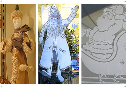
So if we identify a red outfit, black belt, white beard, rosy cheeks and a hat, do we have Santa?

NOT. That’s a different Christmas season character. It’s the hat, right? Gotta have that pointy red hat.

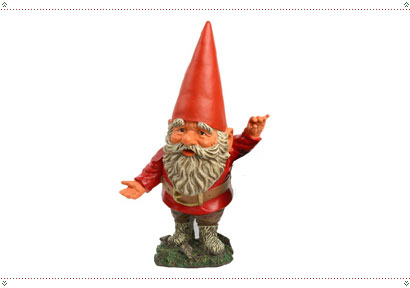
That’s a garden gnome. Admittedly there is a fine line between Santa and a garden gnome (mix in a few elves and you’ve got some suspicious genetic material) but what’s clearly missing is the fur trim. It would appear that white fur trim is an essential characteristic of the Santa icon.

The following diagram shows the basic progression from not-Santa to Santa:

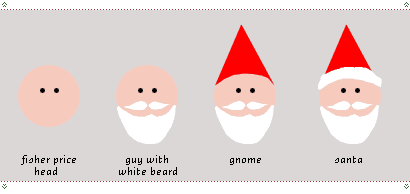
… and from there an infinite number of variations.

But what can we, as graphic designers, learn from this? Well, I’m about to propose a radical new thought. Anyone who has ever prepared a standards manual for a corporate identity is familiar with the concept of—if not the phrase— “thou shalt not twist, twirl, stretch, squish, rotate, 3D-ize or animate the logo …” [etc.]

But what if the identity were built from the beginning to be so robust, and so strong that it could eventually be Santaized (that is, changed, transformed; rendered in any medium; in whole or in part; abused and even mocked) to any person’s whim or desire and still maintain its essential nature as an icon of the company?

I would caution anyone that only an icon that has worked its way over time into our hearts and minds could survive such Santafication, but if you believe in the company you design for; if you believe they’ll still be around 100 years from now, I think this is a goal certainly worth aiming for. If you think of a logo in a new way: not as one that needs to be “locked up” forever, but one that will eventually be set free … I believe if you think of Santa, well, incredible things might happen.

Maintained through our ADV @ UnderConsideration Program
ENTRY DETAILS
ARCHIVE ID 2167 FILED UNDER Branding and Identity
PUBLISHED ON Dec.16.2004 BY marian bantjes
WITH COMMENTS
Comments
Jeff Gill’s comment is:

Excellent article, Marian!

An identity that could be Clausified would have to have a greater number of elements than is generally recommended. A super-simple mark couldn't take the changes & still be recogniseable.

-

I'm going to take a little liberty to share a Christmas card which one of my printers sent me. (Their printing is much better than their "designing.")

It's a remote control Rudolph. When Santa presses the button he vomits Christmas letters. How brilliant is that!

On Dec.16.2004 at 05:07 AM
DutchKid’s comment is:

You mean like Google?

On Dec.16.2004 at 06:55 AM
Jason T.’s comment is:

Is Santa giving a thumbs up, Jeff?

On Dec.16.2004 at 09:07 AM
Jeff Gill’s comment is:

Yeah.

On Dec.16.2004 at 09:09 AM
elv’s comment is:

"But what if the identity were built from the beginning to be so robust, and so strong that it could eventually be Santaized"

In my opinion, creating a standards manual IS santaizing : different colors (B&W, grays...), media, paraphernalia (baseline, TM sign...).

Would we really like people to be able to do anything they want with our logos? I don't think so :) Though it may be an interesting experience.

On Dec.16.2004 at 09:13 AM
BlueStreak’s comment is:

Elves... Elvis

Is there a connection?

I'm nominating my homeboy Elvis as possessing this undefinable, magical charisma and having achieved this branding status.

His qualifying qualities:

• He has first name only, worldwide recognition.

• He's never had an official logo.

• The body is gone, but the spirit lives and grows.

• You know him when you see him, or hear him.

• Put the funky sunglasses and sideburns on your grandma, and POOF she's Elvis.

• Put the rhinestone jumpsuit and cape on Osama BinLaden, and POOF he's Elvis.

• Do a little lip curl and hip swivel, if you can, and POOF you're Elvis.

Could we call this the Pixie Dust Club?

On Dec.16.2004 at 09:18 AM
Daniel B’s comment is:

Neither does gender:

This was the only statement that I disagreed with. Because there has been reverence to Mrs. Claus in catoons and in recent movies, any depection of Santa Claus with female attributes would referred to as Mrs. Claus.

On Dec.16.2004 at 10:27 AM
Tom’s comment is:

Great article.

It seems to me that we are always working on a continuum. At the one end is control and the other is exposure.

I remember my first reaction several years ago when seeing that Nokia released much of their graphic material via an open website (no login required). I thought this a bold step as they relinquished a great deal of the control over how there profile was to be used, yet I understood that they had a great deal of exposure to gain by this free approach. In hindsight it was a very perceptive move as the web and inexpensive dtp tools basically meant that people would be plucking logos here and there and producing a lot of promotional materials on their own anyhow.

While the brand image in the secondary markets was diluted through poor usage, it gained in terms of total exposure.

The control vs. exposure continuum has a corollary in sense that a company must have a certain amount of media saturation before it can successfully allow variation on its identity to proliferate without it becoming totally diluted, thus nearly worthless due to lack of recognition.

In practical terms this means that Joe's Garage probably shouldn't spread four different versions of their logo in three different colors if they are only going to be seen in a limited amount of media. On the other-hand more established companies with wider reaching media campaigns probably could successfully create frameworks allowing for a greater variation in the use of their profile. This being said, a profile consisting of "robust" design elements would certainly add to the likelihood of the campaigns success.

Now, back to Santa. The second Santa image shown here was created by Haddon Sundblom for Coca Cola. While there certainly are a number of historical images that contain the same basic elements, I'm not certain our popular image of Santa would be quite as strong and cohesive if this series of illustrations had be done for product with less marketing muscle behind it.

On the whole I agree, set the logos free, but be prepared for the mutant variations. It's all good fun until someone loses an eye.

Finally, I apologise for my long windedness, on the my very first post to this forum. Please feel free to give me a swift kick back to where ever I came from.

On Dec.16.2004 at 10:29 AM
Steve Mock’s comment is:

Do-it-yourself, viral advertising is the next big thing, according to this.

If you really love your brands, make an ad and spread it around. Can't get much closer to the experience than that.

I think Marian's hypothesis is really interesting. Set the icons free.

The fact that Apple didn't come down on that guy (yet), is perhaps? an indication of even more forward thinking from a company many of us hold in very high esteem. (Although the U2 versus negativland ipod fella' didn't fare so well, probably having more to do with U2 than Apple.)

On Dec.16.2004 at 11:14 AM
marian’s comment is:

You mean like Google?

Yes, like Google.

Would we really like people to be able to do anything they want with our logos? I don't think so

See that's the traditional approach; and it's desireable for most companies, but all I'm saying is that there is an alternate approach, and one that can work.

On Dec.16.2004 at 11:17 AM
Chris Rugen’s comment is:

As Tom mentioned, I am almost completely certain (but don't have any referene on hand) that the red and white Santa (TM) is the result of a very successful branding/ad campaign by Coca-Cola. Before then, he was a variety of colors.

Oh, wait, on the St. Nicholas Center website, it says:

"Dozens of artists portrayed Santa in a wide range of styles, sizes, and colors, including Norman Rockwell on Saturday Evening Post covers. But it was in the 1930s that the now-familiar American Santa image solidified. Haddon Sundblom began thirty-five years of Coca-Cola Santa advertisements which finally established Santa as an icon of contemporary commercial culture. This Santa was life-sized, jolly, and wearing the now familiar red suit. He appeared in magazines, on billboards, and shop counters encouraging Americans to see Coke as the solution to "a thirst for all seasons." By the 1950s Santa was turning up everywhere as a benign source of beneficence. This commercial success has led to the North American Santa Claus being exported around the world where he threatens to overcome the European St. Nicholas, who has retained his identity as a Christian bishop and saint."

And, for your viewing pleasure, here's one of Coca-Cola's Santas being pulled away from a delicious bottle of cola by a pushy Aryan kid.

On Dec.16.2004 at 11:20 AM
marian’s comment is:

any depection of Santa Claus with female attributes would referred to as Mrs. Claus.

The image that followed that statement looked like Linda Evangelista in a Santa outfit, to me.

On Dec.16.2004 at 11:22 AM
sheepstealer’s comment is:

Yes, Coca-Cola certainly perpetuated the image, but the true inventor of the Santa we all know and love, comes from political illustrator Thomas Nast.

And here's a more detailed history.

Once again this is a textbook example of how as graphic communicators we can have great power. "And with great power comes great responsibility." (says Peter Parkers uncle Ben.)

On Dec.16.2004 at 12:22 PM
Armin’s comment is:

> Yes, like Google.

Actually… not as much. Google's alternate logos always retain a lot of recoginzable, non-altered elements from the original (the type, the bevels, the colors, etc.) without much modification — and always with a dash of unnerving amateurism (but that's another story). The Santa factor goes well beyond Google. These are completely different interpretations in completely different mediums. Different materials, different context, different everything. To think of this as a branding goal is very interesting. Nearly impossible but interesting.

> Finally, I apologise for my long windedness, on the my very first post to this forum.

As long as there is a point to it, it's all good.

> any depection of Santa Claus with female attributes would referred to as Mrs. Claus.

Mrs. Claus also has a set of criteria that distinguishes her quite clearly: plump, smiling, cooking, apron, etc. But she depends on being with Santa to be recognized.

> The image that followed that statement looked like Linda Evangelista in a Santa outfit, to me.

And Playboy has the women-in-santa-outfits market covered quite well.

On Dec.16.2004 at 12:25 PM
Rob ’s comment is:

I'm nominating my homeboy Elvis as possessing this undefinable, magical charisma and having achieved this branding status.

Elvis is dead and has left the building.

Now back to Santa. Marian, another great article and a wonderfully insightful journey through the world of Santa Claus. Living in a city where caucasians are the minority, I can add that color does not make a difference when it comes to Santa. Thank goodness for that.

The consistency with which Santa appears through various countries and cultures throughout the world is remarkable. Santa's brand is at least as strong and recognizable as the "world's greatest book."

Santa is a state of mind and it's brand strength comes from its association with positive things like family, giving, and respecting others. Isn't that the lesson that A Christmas Carol teaches Scrooge?

In light of all this Santa talk,

I wish all of you the best for the holiday season.

On Dec.16.2004 at 01:05 PM
marian’s comment is:

Actually… not as much. Google's alternate logos always retain a lot of recoginzable, non-altered elements from the original

That's true, but in concept Google embraces Santafication. By starting with a milticoloured logo, they've opened the door to any single colour whatsoever. By regularly accessorizing and tarting it up—even amateurishly—they've de-sanctified it. For those of us familiar with it, I think it could be taken a lot further and still retain its identity.

Google has managed this by being a single location to which we all go, and by maintaining a very simple environment. In this they are almost the opposite of every other company model. Other companies have a product or service that they export (from their headquarters); we continually see their identities outside of their source; the identity always competes with background. There is only one Google location; it is white; the Google logo does all the rest.

Being locked in its own environment is what makes the Google logo free. They're creating a proto-Santafied logo by raising it in a zoo. Once we've all been to the zoo and got used to the chameleon nature of this creature, they can let it out, let it wander the streets in various guises, and we'll still recognize it. Of course, it helps that it's a word, but I'd bet that many of us would recognize even parts of it out of context.

On Dec.16.2004 at 01:09 PM
John B’s comment is:

Manhattan Design did this about 25 years ago with the MTV logo. How many different variations have been created over the years. Even the isometrically-drafted M isn't required. It's all about size and placement of the letters relative to each other coupled with vague font face requirements: block M with simplistic script TV. You could almost say change is the brand (oops, I used the 'b' word).

On Dec.16.2004 at 01:22 PM
M Kingsley’s comment is:

The image of Santa is mutable because he has transcended the realm of the linguistic signified/signifier into what Roland Barthes called Myth.

A Myth can be appropriated. In fact, it's whole existence relies on this ability. Myth's form is purposely ambiguous. If we see a picture of a boy next to a lion, we could think "Peacable Kingdom". Portray the boy pulling a thorn from the lion's paw, and we instantly know it's Androcles. Androcles could be dressed in droopy-ass jeans and a backwards cap with a doo-rag or in a toga. It doesn't matter because the gesture is all that's needed to signify the myth.

Your everyday logo can't be appropriated in the same way. There are some which have become mythological — the aforementioned MTV logo — but this is a function of Myth's other attribute: history. Objects become myth when they lose their specificity and are absorbed into the culture as a generality. Not every artist wears a beret, but when Paris was the center of the artworld, they probably did. The myth is a faint echo of the past, remade to signify a concept.

Again, I present this diagram from Mythologies:

The specifics of Santa's fatness, color of outfit, length of beard, etc. function on the linguistic level. It's the notion of 'Santa-ness' that functions as a mythological signifier.

It's an interesting idea to design a logo with the intention of it becoming Myth. To achieve this requires a whole lot of repetition in the branding. But all that's for nought if the logo doesn't stand for anything.

Here's a great paragraph from Mythologies seriously, you all should read this book:

Viewed as a transition the face of Garbo reconciles two iconographic ages, it assures the passage from awe to charm. As is well known, we are today at the other pole of this evolution: the face of Audrey Hepburn, for instance, is individualized, not only because of its peculiar thematics (woman as child, woman as kitten) but also because of her person, of an almost unique specification of the face, which has nothing of the essence left in it, but is constituted by an infinite complexity of morphological functions. As a language, Garbo's singularity was of the order of the concept, that of Audrey Hepburn is of the order of the substance. The face of Garbo is an Idea, that of Hepburn, an Event.

On Dec.16.2004 at 02:54 PM
DesignMaven’s comment is:

Marian:

Informative and enlightening Editorial.

Seems Santa is mostly depicted in Red Suit. Pre Twentieth Century Santa was depicted often in a Green Suit.

Those images with Santa in Green Suit are Rare to say the least and are highly collectible. Worth an enormous amount of money. From post card size to poster size. And Illustration or Painting reproduction with Santa in a Green Suit is as Rare as BIGFOOT and the LOCH NESS MONSTER.

Check your Family Heirlooms pre twentieth century.

Doesn't matter the artist, as long as the depiction of Santa is in Green Suit pre twentieth century.

If you own one. You may never have to work again.

You can get it appaised at the Antique Road Show, Sotheby's or Christies.

On Dec.16.2004 at 05:50 PM
Tom B’s comment is:

My grandmother was dutch, and I've always been fond of the Dutch version of Santa.

Sinterklaas, dressed in a bishops robe, arrives in a boat from Spain with his helper 'Little Black Peter' who puts candies and little gifts into the shoes of the good children, and lumps of coal into those of the naughty children.

I suppose it's no stranger than a fat man arriving on a sleigh pulled by flying deer, who climbs down chimneys.

I always liked the idea that Santa was Spanish though.

On Dec.16.2004 at 06:47 PM
Jason T.’s comment is:

If I was on the board of directors for the Santa� brand, I would change the name. Anything that's an anagram of Satan wouldn't deserve my backing.

On Dec.17.2004 at 12:32 AM
marian’s comment is:

So I guess you're not a fan of Pentagram as a company name, eh?

On Dec.17.2004 at 01:04 AM
M Kingsley’s comment is:

As Tan would say:

"...and he don't fly Quantas either."

On Dec.17.2004 at 01:31 AM
Baron’s comment is:

Just take a look at such ventures as Mickeytosh to see the spread of, and collusion of branding.

On Dec.17.2004 at 03:27 AM
heather’s comment is:

Great Editorial, Marian.

BTW I saw your feature in Step Magazine- very cool.

On Dec.20.2004 at 02:24 PM
Steven’s comment is:

"Anything that's an anagram of Satan wouldn't deserve my backing."

He does wear red and black though. Would you change those colors too?

On Dec.21.2004 at 03:11 PM
Matt Warburton’s comment is:

Great article as always Marian. There are some great illustrated Santa's on the Canadian Christmas stamps this year by Toronto illustrator Tim Zeltner. They're the most carefree and fun stamps Canada Post has done in years.

The Royal Mail (UK) has another infamous Santa on their stamps this year. It's a Santa character created by Raymond Briggs, whose Father Christmas is a working-class bloke who grumbles "blooming this" and "blooming that" in every frame of the stories!

I've heard that the newly released movie version of The Polar Express has taken artistic license of Santa to a new extreme. The book is gorgeously illustrated, and a real tear jerker, even after reading it to my kids for 11+ years. From what I've heard, the movie bears no relation to the book. Pity.

Joyeux n�el, Matt

On Dec.21.2004 at 05:56 PM
Betty’s comment is:

A pair of paper sculptures my Mom painstakingly taped together every year throughout my childhood. She ordered them from "The Family Weekly" Sunday newspaper magazine insert in 1960. Santa stands about 5 feet tall and requires two coffee cans in his legs to remain upright.

On Dec.22.2004 at 09:59 AM
Las.’s comment is:

The whole thing of the American Santa Clause taking out the European St. Nicholas gave rise to my awful artwork :)

On Apr.15.2005 at 09:40 AM
Ravenone’s comment is:

Santa IS an icon these days; I don't think anyone can deny it. I think it would be interesting to see brands turn into the myth/icon that Santa is, or to be at least as playfull as Santa is. You can draw Santas to your heart's content and play with their look, etc, and still be recognisable, without worrying too much about the legal demons coming to get you. I'm not so sure how safe it would be to play with someone's logo. Especially if it were TM'd.

On Dec.17.2005 at 05:31 PM
Ravenone’s comment is:

Am I the only one who isn't seeing the Santa article on the front page, just the link to the comments page in the sidebar?

On Dec.18.2005 at 03:49 PM
Armin’s comment is:

Raven, this is a year-old post, hence the no-show on the home page.

On Dec.18.2005 at 04:12 PM
Ravenone’s comment is:

Armin- thankyou. I'm stupid.

On Dec.18.2005 at 08:04 PM
oo’s comment is:

What about "Flaunt" magazine? A bit smaller scale compared to Santa, but always a different type/cover treatment. Seems to have been built this way on purpose. A bit of a departure for a newstand product that relies on visibility in the rack.

On Dec.19.2005 at 11:01 AM
Ravenone’s comment is:

I haven't seen "Flaunt" magazine. Got a link to a website perhaps?

On Dec.19.2005 at 03:05 PM
kimberley’s comment is:

can i plzz have a pink laptop plzz

On Dec.02.2007 at 07:29 AM
kimberley’s comment is:

can i plzz have a pink laptop plzz

On Dec.02.2007 at 07:29 AM
courtney’s comment is:

heyyah santa you okay will you give ellie have bratz stuff please and can mika have the same and can i have anything to do with high school musical please

On Dec.07.2007 at 03:02 PM
milo’s comment is:

So now we have a(nother) big identity - 2012, that aims to be set free, or Santarized, how well has it been done?

Personally, after having seen how the concept fails, I don't think the aim is very useful.

On Dec.11.2007 at 11:09 AM