Speak UpA Former Division of UnderConsideration
The Archives, August 2002 – April 2009
advertise @ underconsideration
---Click here for full archive list or browse below
  
Posterchild
Last year’s box office monsters are this summer’s DVD rentals. Before you even see the film, you see its marketing materials, and nothing is more programmed than a movie poster. Following the ever-popular rule of threes, most movie posters utilize the top, middle, and bottom for the masthead, image/icon, and credits to fit comfortably. Some break the mold with hesitation, and others take creative risks.


Paparazzi
Anytime a poster throws type at acute angles, I’m immediately captivated. And what’s not to like about the target/lens duality at play? Unfortunately, the caption leaves something to be desired, “One Good Shot Deserves Another.” What’s with the italics? None of this could have forcasted how one of the film’s stars, Tom Sizemore, has been a recent media target.


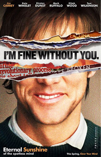
Eternal Sunshine of the Spotless Mind / I [heart] Huckabees / Tarnation
The checkerboard pattern really catches your attention, doesn’t it? I’d like to know which one of the designers or marketing specialists came up with the idea first. For all the similarity, at least Eternal Sunshine distinguishes itself with Carrey’s confused gaze. He’s the million-dollar star, and they could’ve made his face bigger.


Eternal Sunshine of the Spotless Mind (coming soon)
I really adored this campaign. In addition to Carrey’s ripped up face, Winslet and Dunst had their eyes ripped wide open in two additional posters. I don’t know what the pieces of paper and print below Carrey’s face mean, but I presume they relate to the memories his character had erased.


Ocean’s Twelve (coming soon)
I cherish this for its economy in color and form. A runner up would be another vehicle produced by Soderbergh entitled Criminal. Granted, most of us wouldn’t know that we’re being lured into the sequel to Ocean’s Eleven, but those hot on any of its star-studded cast wet their lips at the sight of this. Would’ve been nice to see more risk taken with the swipe at the top. Can we relate them to the acute 12? Why not dress those names someplace else? I’ll tell you why not…contracts, money, and ego.


The Life and Death of Peter Sellers / The Terminal
Continuing the theme of like minds think alike, we see Hanks and Rush gaze off the poster edge in near mimicry. If it weren’t for the camera near Rush’s nose and playful typography between him and the title, I’d easily confuse it for The Terminal.


Seed of Chucky
Insert your own comments because I won’t touch this one.


Danny Deckchair
I never saw this movie, but when I noticed postcards promoting it throughout Seattle it caught my eye. The postcard campaign floated Danny through some of the more recognized U.S. tourist attractions. Opting for extreme color and contrast, the poster forgoes any noticeable background in favor of a calming blue. I get sweaty palms just looking at this.


Alexander / King Arthur  / Troy 
My goodness, will somebody please do something original here? Sure, I know, if it looks like a duck and walks like a duck, it’s a duck. But I was hoping that at least Oliver Stone’s Alexander would have a differentiating marketing campaign. I don’t even have to see these movies to know that they’re basically the same animal, the posters already tell me that.


Primer (wide release / Australian release)
Shane Carruth made this film on $7,000 and it’ll become a cult classic. I just love how the machine’s cables and cords create the title. Adding to this whimsy is function. When driving by theatres in Seattle, I could make out the title from almost two blocks away. And then there’s the tribute factor. The theatrical release bears great similarity to another sci-fi one-sheet: Alien. Unfortunately, Primer’s Australian poster looks like it was art directed by Tron fanboys.


The Life Aquatic
An homage to Milton Glaser’s Dylan…what’s not to like.


The I Inside
I never saw this film, nor will I, but the fact that its poster allows the star to engage with me (somewhat) by touching the paper tickles me. In a Huxley future, I’ll reach out and touch back to feel Ryan’s soft and luscious fingertip.


Fat Albert
What I love most about Fat Albert is the emphatic type. Still, I feel they could’ve gone bigger. Had the designer been a little more convincing, he would have encouraged the marketing team to play up the “Hey! Hey! Hey!” and lose the fat guy altogether.


The Last Shot
Who saw this movie? Does this imagery remind you at all of Cannonball Run or the Smokey movies? No matter, this poster’s a throwback to everything great (and god awful) about Hollywood. And no, I’m not talking about the film’s theme. The poster caters to teenage boys with its saturated color, illustrative renderings, collage of scenes and stars waiting to collide, and half-dressed woman. What gets me is the rendering. Either we’re seeing a PhotoShop rebellion in the works or illustrators are charging less for their services than software gurus who’ve been layering type over actor’s faces on top of fantastical textures with hints of another actor starring alongside the star through a break in the noise. If only this poster had less noise.

And that’s the problem with most film posters. The marketing department will usually stuff too much into too small a space. At best, the teaser poster succeeds on all fronts. It will deliver just enough information to catch your interest without cramming the full monty required by the studio, actor, or director’s contract. Sadly, there are just too many posters out there that would do better with less gracing the one-sheet. Still, I can’t believe how much I like losing myself in the kind of sinful eye candy that posters like The Last Shot throw my way. For all the designer design that I crave, sometimes I can’t resist the worst stuff out there. Like a kid in a candy store, I want to eat it all up.
Maintained through our ADV @ UnderConsideration Program
ENTRY DETAILS
ARCHIVE ID 2302 FILED UNDER Critique
PUBLISHED ON May.03.2005 BY Jason A. Tselentis
WITH COMMENTS
Comments
Armin’s comment is:

Good roundup Jason. I rarely find movie posters to be engaging. They are attention-grabbing but rarely fulfilling. There is usually nothing to discover. Which, I guess, is not the ultimate goal of a movie poster.

Some of the most interesting movie posters I have seen are in Corey Holms' web site. A good portion of his posters are just comps, never seeing the light of day but they show what non-literal movie posters could be. And I'm sure there are thousands of other great posters tucked away in archival CDs. It's a shame that they get so marketized.

Did I already mention Posterwire? Yes. Okay: Posterwire — good.

On May.03.2005 at 09:21 AM
r agrayspace’s comment is:

Great link Armin and great discussion Jason.

The thing that I have always found perplexing is that givin all we know about marketing and branding, why can't movies be consistently represented graphically. I am sure they would benefit from "recognizeability".

Often times a movies teaser poster, official release poster, title graphics, web site and video/dvd cover are COMPLETELY different. ARRGHGHGH! What is that? Its mind boggling especially when the posters are done really well like the original Being John Malkovich One Sheet which was brilliant but was never carried over into the video or title graphics.

Is there no pride in the work? For all the money and time that is spent into making these 2 hour fantasies, you'd think that pure pride in the finished product would be the motivation to package it properly.

I Heart Huckabees was a recent example where the "branding" was carried through all stages of media. Maybe it doesn't really matter to the average joe but it makes me feel warm and fuzzy.

On May.03.2005 at 09:44 AM
Darrel’s comment is:

my favorite poster of recent memory:

Of course, it should be noted, the only time I get to the movies these days is when there's something the 3-year old wants to see.

It worked well as an 8ft teaser wall poster (the way I saw it) without the logo on the bottom.

(OK, I admit it...I wanted to see this movie too...)

On May.03.2005 at 09:50 AM
graham’s comment is:

this is a good site.

there's also somethinghere. sounds like the bloke hasn't got a clue what he's talking about. "transcending the form of the film poster to become social commentary." rubbish.

On May.03.2005 at 10:00 AM
m. kingsley’s comment is:

More here.

As a kid, I loved John Berkey's King Kong poster; perhaps more than Jessica Lange. Years later some friends, the wife and I would spend the middle of each May on a Mexican beach — always at the same time as Jessica, Sam Shepard and family. Needless to say, my opinion reversed.

On May.03.2005 at 12:38 PM
Jason Tselentis’s comment is:

I'm curious to see how they launch the campaign for the next version, done by Peter Jackson. King Kong has such tradition, they've got to do something big.

On May.03.2005 at 12:42 PM
Tan’s comment is:

These days, a movie makes or breaks within the first two, maybe three weeks from opening. The average movie lasts less than six weeks in a theatre before getting pulled.

So it's no wonder that studios have become incredibly risk adverse when it comes to a movie's promotional materials.

Forget creativity, forget artistic intent, forget cryptic conceptualization. Movie posters have become nothing more than ads. Giant, formulaic, quick-read ads. And like trailers, movie posters are depended upon to pull in as many viewers as possible, as quickly as possible. High-impact, star-power, grippy catchline is all that matters.

And you can be sure that the posters have probably been tested numerous times in front of focus groups until every square inch of it has been deemed acceptable for public consumption.

Given that, it's sometimes amazing how a poster like Ocean's Eleven (the better one IMHO) or Ocean's Twelve gets through.

Not surprisingly, the most interesting posters often come from no-name indies or foreign imports. They don't have big names and aren't easily summarized into a six word tagline. Course, they don't generate hundreds of millions of dollars either.

Here's another old set of twins that bothered me when they came out...even the typefaces are similar. The movies are totally unrelated to one another.

On May.03.2005 at 01:01 PM
Jason Tselentis’s comment is:

Another rare catch I left out.

Palindromes.

Not a typical one-sheet.

On May.03.2005 at 04:54 PM
Bradley’s comment is:

I got so damned frustrated with the posters for my favorite flicks that I started designing my own. I've loved Heat more and more over the past 7,000 times I've watched it, and for as deep a movie as it is, the poster has always sucked. Same for The Thin Red Line.

I had forgotten all about Corey's site--some of his posters are better than the movies they promote. Love the Pearl Harbor series. And that movie sucked worse than Heat's poster sucked.

On May.03.2005 at 05:54 PM
Candy’s comment is:

Here are a few posters that are pretty cool (at least in my opinion)::

Well this movie poster is, well, simply Outrageous!!!

I REALLY REALLY like this poster. The only thing i would change would be left aligning the very bottom credits.

Then there is this version of Suspiria though may just be partial to the dancer with blood pooling off of her legs (oh that is so beautiful). The type layout is better on the first poster, but i included this one to show the detail of the woman. The third one is a cool solution to a sequal poster.

On May.04.2005 at 01:07 AM
Candy’s comment is:

A few of my favorite KILL BILL posters:

On May.04.2005 at 01:08 AM
Candy’s comment is:

There is some audience interaction for ya. :0)

Again with the checkerboard. (I LOVE this movie)

p.s. is there a way to get e-mails when there has been responses to the threads?

On May.04.2005 at 01:11 AM
Tan’s comment is:

>Palindromes

Nice one, Jason. Reminds me a little of another past poster I liked....

...which leads me to Burton's latest summer flick...

...which isn't bad, but is kinda dull when you consider the possibilities of what it could've been.

This third one is a little expected, but I think is kinda dark and cool for a mainstream blockbuster...

course, one of the most eagerly awaited movie this summer is Terry Gilliam's The Brothers Grimm, which has not yet released a poster. I hope it doesn't disappoint.

And cool posters, Candy. Welcome to SpeakUp.

On May.04.2005 at 02:22 AM
r agrayspace’s comment is:

Of course no examination of movie posters is valid without a reminder of the Polish masters of the genre. Check out my modest gallery I made for inspiration on a rainy way. Poster Gallery

Also one my favorites from the last 10 years was for Gun Van Sants Psycho remake. Very Striking.

On May.04.2005 at 09:28 AM
Jason Tselentis’s comment is:

Ohhh. That Psycho one, I almost forgot about it. And, Tan, I didn't know Gilliam was doing Grimm. Hopefully, the movie'll be good, as well as the poster.

On May.04.2005 at 10:22 AM
marian’s comment is:

I have nothing to add, except ... what a great selection of posters and sites. Thanks for the thread, Jason.

On May.04.2005 at 02:28 PM
Jason’s comment is:

Come on, Marian. Not even a poster from last year you liked or hated?

On May.04.2005 at 02:51 PM