This installment of Recent Rebrandings covers a few popular food and beverage brands. Be careful not to spill anything.
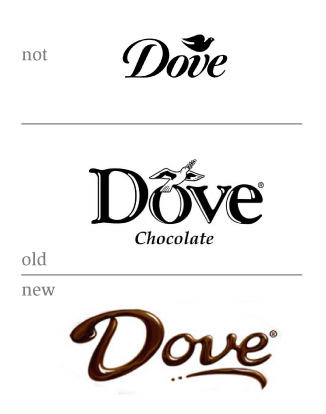
Not Dove, but Dove

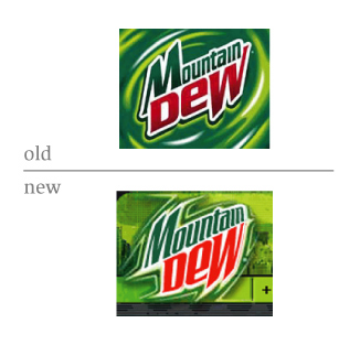
Do the New
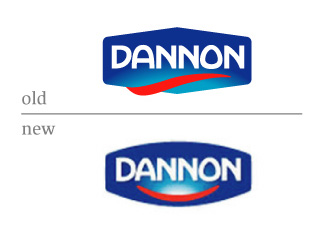
Happy Dannon
A quiet, happy change in identity.


This installment of Recent Rebrandings covers a few popular food and beverage brands. Be careful not to spill anything.
Not Dove, but Dove
Do the New
Happy Dannon
A quiet, happy change in identity.
At a quick glance, I prefer the original logos compared to the "new improved" ones. Still have to read the supporting text...
On Jun.29.2005 at 10:22 AMI had no idea Dannon had been bought out by Citicorp ;)

Ouch, Matt... but I agree, the old Dannon is much much better than the new one.
I don't care for the lighter red tone on the Mountain Dew either.
While Dove does suffer from swoosh-itis i prefer it to their old logo (much more in-line with their product)
On Jun.29.2005 at 10:45 AMHmm...let me try something...

Wow! Smilies do make everything better!
On Jun.29.2005 at 11:21 AMMy favorite smilie logo (and one of the few where it actually makes sense):
![]()
Mountain Dew's mark begins to look more and more like a biker tatoo with each update. Why don't they just have Jesse James redesign the damn thing?
On Jun.29.2005 at 12:07 PMthe old Dannon is much much better than the new one.
At least, as pointed out, there's a reason for the Dannon redesign. Er... not a reason, but there's something to get.
The other two have been put through the Amazing New Improved 3d-o-matic. Now, at last, these marks can sit at the table with UPS.
On Jun.29.2005 at 12:22 PMActually Dannon is a subsidiary of French Danone: Corporate
The Danone logo changed
from:

to:
![]()
sorry dave, this doesn't have anything to do with food or beverages... anyone know about this new one - is it actually new, or has a signmaker taken things into their own hands?

Dove
I do like this update. While I could do without the swoosh, it feels nice and smooth. Just like chocolate. Like something sweet, even good on a hot summer day. There are a few little kinks I would like to see corrected, such as the “e” (right were the v becomes the e, on the inside of the e, there is something funny going on), or the balance between “D” and the “o” and how they relate at that distance and position. Anyways…
Mountain Diah
Count Dracula had a rough night.
:)
This also reminds me of the sony dude,:
I could not find an image of a smiling dude...
On Jun.29.2005 at 01:15 PMJason Tselentis’s comment is:
Mountain Dew's mark begins to look more and more like a biker tatoo with each update. Why don't they just have Jesse James redesign the damn thing?
Because it was cheaper just to take it into Photoshop and apply the spherize filter?
On Jun.29.2005 at 01:19 PMDove: I'm not familiar with Dove Chocolate, but the new logo is an improvement. Looks like chocolate (or shit). Does it work in a solid colour? Do we care about that anymore? I think the underline/swoosh gives necessary emphasis to the chocolate feel and also balances the D well. So no complaints.
Mountain Dew: The new logo has even more 'tude, DUDE. Fits the drink and the target market. I actually think it's quite nifty.
Dannon: The D and A in the new logo are a vast improvement. The "smile" makes me uneasy. I do like the rounding of the container, however. I wonder if they could have ditched the red thing and just left the gradient in there as it had been in the original.
On Jun.29.2005 at 01:52 PMI really don't like the new 'dew logo. I think it looks... sloppy. Like a bunch of kids grabbed the edges of the old 'dew logo and played tug 'o war. I don't think it's as clear as the old one, either.
To me, it doesn't say 'new' or 'attitude'...
to me it looks like someone farted out the old logo and put it on a can or otherwise abused it and decided to call it 'new'. Now the background to the logo looks interesting....
I want the old logo back *sniffle*
On Jun.29.2005 at 01:58 PMPatrick,
Does it work in a solid colour? Do we care about that anymore?
I realise this is a topic in itself, but, really do we? Have we lost all regard for the spot color reproduction?
Kyle Hildebrant
On Jun.29.2005 at 02:41 PMI realise this is a topic in itself, but, really do we? Have we lost all regard for the spot color reproduction?
I dunno... color me a pragmatist, but whenever we have a logo smackdown or this kind of discussion all I can think is, "That thing will never reduce..." or "What, is that, like a seven color job?" or "How exactly is that gradient going to reproduce?"
I get hung up on those details. Points off if I can't embroider it / use it as a GIF / photocopy it.
On Jun.29.2005 at 03:00 PMGood to see the inhouse designers for Mountain Dew learned how to use all the pull down menu fx.
On Jun.29.2005 at 03:25 PMMichael,
That Halliburton logo has been around for some time. I am not sure if it has been replaced by the all caps or if it is some sort of sub-brand.
I too have a tendancy to judge a mark by it's ability to reduce, use a single spot color, etc. However, I don't know exactly how long these will be viable criteria. As printing technology continues to improve and become cheaper more and more people will be thinking 'why not use a gradient?'
On Jun.29.2005 at 03:26 PMdove: the old dove logo is classic, solid, can be reduced, can be used in almost any application. their packaging and branding is very classic; this new thing doesn't work at all.
mountain dew: Von Glitschka sums it up pretty good. It seriously looks like some Photoshop filter was applied to it. and its got a drop shadow! cheesy
dannon: why the gradient?
gradients have little if no place in identity design...
On Jun.29.2005 at 04:30 PMI read the new Mountain Dew logo as "Mountam Dew." It probably reads better at a larger size, but it IS logo, so it should reduce.
I like the Dannon's revised type. The "A" looks better, IMO. The new shape of the "D" and "A" look like they might be making some akward space between the "A" and "N," though.
The smily face being entirely inside the "box" kind of kills it for me. Seems less interesting than the red tail wrapping around.
Dove looks nice and viscous, but, like everyone else, I'm wondering how that's going to work in one color.
On Jun.29.2005 at 04:39 PMDove:
Dig it. Makes enough sense.
Mt Dont Dew it/ Pepsi:
Who cares. They introduce a new logo every year, right? Right.
(Hey I should know- I was an AD for Pepsi@ DDB)
Dannon:
Turn those frowns upside down. I dig it.
On Jun.29.2005 at 04:50 PMIt's interesting how much influence "shelf impact" has over identity these days. Although I understand the most visable applications of these marks are on packaging, therefore allowing for multiple colors and prodcution techniques, one can't help wondering if there is too much information.
In a world where everyones package is a plethora of colors, wouldn't simplicity make for distinction?
On Jun.29.2005 at 05:13 PMIn a world where everyones package is a plethora of colors, wouldn't simplicity make for distinction?
I humbly submit Izze
On Jun.29.2005 at 05:47 PMGood to see the inhouse designers for Mountain Dew learned how to use all the pull down menu fx.
The article doesn't make it clear, but I think that the new Dew logo was done by Tribal DDB Dallas, not in-house at Pepsi. Perhaps someone out there knows for sure.
In any event, Von, your assumption that such lazy work had to come from an in-house design group is not appreciated.
As to the other ones, Dannon's smiley face seems pretty derivative, and Dove's new literal approach seems to go against their "affordable luxury" image. But hey, I don't use either product, so what do I know?
On Jun.29.2005 at 06:57 PMdove is about refined, luxurious chocolate... not cheap chocolate syrup
On Jun.29.2005 at 07:54 PMthe new mountain Dew one looks like it should be a poster for a new horror slash movie. It doesnt look like it is moving at all,
Rubbish
On Jun.30.2005 at 03:55 AMDove -soap or chocolate?
Poor brand name for chocolate.
Dove is always a soap.
It can not be a chocolate?!
Dove should have consulted Debbie.
On Jun.30.2005 at 04:10 AMKeith Harper’s comment is:
dove is about refined, luxurious chocolate... not cheap chocolate syrup
Is that still true though? It seems like the American chocolate market has expanded its palate considerably in the last decade or so, and when you talk about "refined, luxurious" chocolate these days you're talking about Lindt, Godiva, Ghirardelli, etc. Dove may just be responding to the reality that in this market they dont have a chance of regaining that particular position, so they're going for the next best thing, which is to compete with the low quality but popular chocolates like Hersheys et al instead.
On Jun.30.2005 at 09:54 AMDove -soap or chocolate?
Poor brand name for chocolate.
On pure instinct, I'd agree. But in reality, they've managed to make it work and carved out their niche. So, it's really not an issue.
As for the new mark, I think it really works. And embraces the product in a great way. Plus it get's rid of the 'word' chocolate and just becomes it. Love that! Not a big fan of the 'swoosh,' but in this case, I can live with it.
Mountain Dew The old one was stronger visually and the other one, to the trained eye, looks like its been twisted in game of tug-of-war. But hey, maybe that'll work for the target audience.
Dannon. The position of the gradient and the smile are a bit disconcerting for me. Not sure if it's my screen or the image but the type in the old version seems brighter. To honestly judge the change, your really have to look at the packaging.

And more specifically, the old next to the new:


And what I've actually found, is that the old packaging seemed to be more confident. It certainly was easier to find on the shelf—at least for me. The new packaging, and its lightness in color feels more like you are buying a diet product rather than the regular version of Dannon. And maybe this what they intended. But for me, the change is certainly not for the better.
(My apologies in advance if there are any problems with the images.)
On Jun.30.2005 at 10:26 AMI dig the new Dove mark... if you squint you can see how it looks without the highlights. We all know how trendy Script logos are these days.
The last iteration of the MD logo was created by BLK MRKT. I think the 'new' logo has an 'intern with twirl filter' look... it doesn't look like it was worth the piles of money it has to cost to implement a change like that.
I like the new type in the Dannon logo... the old style was a bit too Hobo. The 'smile' blows it for me, though. It adds an awkward space between the two elements which they've highlighted with the glow.
On Jun.30.2005 at 11:19 AMMatt, I'm no expert on the chocolate market, so maybe you're right... but if you take a look dovechocolate.com, if you haven't already, it just doesn't fit. I haven't looked at new packaging in stores yet but I will at some point today or tomorrow as well :)
On Jun.30.2005 at 12:15 PMErrr which one are we talking about
Dove soap?

or
Dove chocolate?

One is from Unilever the other one from Mars (the food company) this a very good reason to redesign the whole thing
On Jul.01.2005 at 01:31 PM> dovechocolate.com, if you haven't already, it just doesn't fit.
Keith, good observation. It doesn't fit. There is a big disconnect between the inherit friendliness and bubliness in the new logo in contrast to the faux semi-luxurios look the web site wants to portray. Plus, there is a triple-whammy going on in that web site. 1) Mistral 2) Copperplate 3) Copperplate with a glow.
The Dove logo would have been a rather fine mark had it been left flat. This sadly seems like a case where Dove was not comfortable with a flat logo and asked for some volume. Either that, or the designer proposed it. I don't know which is worse. While I have been known to endorse flat logos, there are instances when volumizing has been done right, and in this chocolatey realm Hershey's is a good example. Dove is not.
> Errr which one are we talking about
Chocolate.
On Jul.01.2005 at 03:00 PMHershey's is a good example. Dove is not.
Sure Armin. And your nose is chocolate brown.
On Jul.01.2005 at 04:10 PMso you are all telling me that dove soap and dove chocolates are made by the same company?! am i that naive!
not sure how i feel about eating chocolate made by a soap company...i dont have a problem cleaning with soap made by a chocolate company:)
On Jul.12.2005 at 02:37 PMI am fine with the most of the food logos except with the Dannon logo smiling I'm not crazy about that, it looks childish
On Aug.18.2005 at 01:24 PMIf anyone is aware of it now Hostess has updated its logo recently also.
Old:

New:
Go to this link to see it:
personally I don't like the new logo it looks to slapped together and isn't unique,it just seems its buying into the love of the circular swish and not implimenting it well .
Plus it reminds me of this logo, which is better at implimenting the circular swish:

I think we should add the "swooshy underline" element to the list of design clichés and trends NOT to do anymore. Dove Chocolate, Sears, Visa, blah blah blah blah.
On Jun.29.2005 at 09:43 AM