Speak UpA Former Division of UnderConsideration
The Archives, August 2002 – April 2009
advertise @ underconsideration
---Click here for full archive list or browse below
  
Recent Rebrandings 7: Television
Maintained through our ADV @ UnderConsideration Program
ENTRY DETAILS
ARCHIVE ID 2365 FILED UNDER Branding and Identity
PUBLISHED ON Jul.13.2005 BY David Weinberger
WITH COMMENTS
Comments
Darrel’s comment is:

My god that PAX logo is just awful. Both the old and new.

I'll miss the ol' USA logo...one of the better network IDs IMHO.

Also, OLN redesigned their logo as well:

http://www.olntv.com/nw/article/view/828/?tf=OLNPressCenter_articles.tpl&UserDef=true

On Jul.13.2005 at 10:37 AM
Von K’s comment is:

"Logo" looks awkward to me in all three flavors.

Why so many?

The PAX logo is wierd. The middle one looks like a parody someone made in about one minute. I thik the one-color version is better than the old logo, though.

"...we are offering blocks of our network time to independent programmers and producers..."

Does this mean I'll be able to find Touched by an Angel and all my Ronco favorites in one place?

On Jul.13.2005 at 10:47 AM
Andrew Twigg’s comment is:

They just keep getting worse and worse. I can't believe that "i"!! Ghastly!

And I have to say about the new Logo logo... not a big fan. At least the old one was fun. What's with the hard hook off the g stem? If it ain't broke-o, don't fix-o.

On Jul.13.2005 at 10:51 AM
r agrayspace’s comment is:

I can't believe how much total failure is accomplished in this one little post. I mean these rebrandings are astonishingly bad.

Say what you will about previous posts in the rebrandings series but at least identities like Glu, Suntrust, and even Sprint are professionally and competently executed and even thoughtful.

I am embarrassed to be a designer at this moment. ECH.

On Jul.13.2005 at 11:19 AM
Randy’s comment is:

Bad

BAD

bad

On Jul.13.2005 at 11:20 AM
Jon S.’s comment is:

Is this evidence of some sort of trend to make logotypes more nondescript?

The USA Network change is just bonkers. Why change it, unless you finally have money to blow and you have to be sure to spend your marketing bucks this year?

And why is PAX becoming The Incredibles Network?

On Jul.13.2005 at 11:51 AM
Rick’s comment is:

I read the post and was about to add my comments about how dreadful everything was, but it looks like I've been beaten to the punch.

Nothing to see here. Move along.

On Jul.13.2005 at 12:25 PM
DesignMaven’s comment is:

::: "F" ::: is :::� for :::�

F :::� �::: A :::� �::: I :::� �::: L :::� U �::: R :::� E �:::

Rarely, do I agree with comments and critique

of colleagues on these matters.

I am inclined to agree that most of these revitalizations are hideous.

Honest attempts, nevertheless, FAILURES.

So much Equity was built in the Original USA Network Identity. On par with PBS.

The committee that Developed, Designed and Pushed the current USA Identity. Should turn in his/her ���,��,�`����,��,���,��,�`����,��,�`����,��,���,��,���,��,��,��,���,��,

���,��,���,��,Resignation.,��,���,��,���,��,

::: DM :::

On Jul.13.2005 at 12:38 PM
Nicole’s comment is:

So PAX is expanding their line of services to include x-ray vision? That's what I get from the middle logo...

On Jul.13.2005 at 12:41 PM
Sage Hardin Smith’s comment is:

Hi, longtime reader, first time poster.

The LOGO logo doesn't make any sense. Though the original looks like it needed a little refinement, at least it made some sort of connection with the groups represented in the programming. The L in the new logo hurts me.

I wonder if they got gunshy and didn't want to make it look like a "gay" channel.

On Jul.13.2005 at 12:41 PM
Derrick Schultz’s comment is:

i was wondering when the usa logo with its . . . um, male attachments was going to show up on here. the way it is shown on here, it is ok, but when shown on screen, with all the blue being knocked out . . . well, it seems it would be a better fit for the gay and lesbian channel, no offense.

On Jul.13.2005 at 12:55 PM
ryan peterson’s comment is:

PAX just needed a logo crappy enough to reflect its programming...

Just kidding, I'm sure they have great stuff. MmmHmm.

Anyway, the logo was pretty bad before, they just replaced it with an equally awful solution. At least they didn't take a step back like USA did.

On Jul.13.2005 at 01:22 PM
Eric Janssen Strohl’s comment is:

I am going to skip over the PAX and LOGO rebrandings. They are, perhaps, not worth discussing.

USA networks on the otherhand is an interesting phenom.

One can't help to guess that the big-wigs over at USA felt the pressure after TBS introduced the big "smile" campaign. The feeling introduced by this new USA mark is very much the same.

In a quick once-over of their respective websites this morning, I noted many similarities throughout the branding systems. A friendly, yet slightly wacky sans serif (TBS prefers all lowercase compared to the caps of USA), a witty tagline (Characters Welcome & Very Funny), and liberal use of a single saturated color with.

I'm not knocking either of these. I think overall, combined with the improved programming, both networks will be revitalized. I know I turn to TBS more often.

What kills me is this quote by USA president Bonnie Hammer;

"The new USA branding initiative is characterized by a clean, stylized look and iconic logo. "For the first time, no matter where or how you see it, there will be no mistaking USA for another network. On or off-air, there will be a consistent visual style that will be integrated into everything we do," said Hammer.

On Jul.13.2005 at 01:25 PM
feelicks sockwl jr’s comment is:

ditto randy's:

Bad

BAD

bad

what happened

to simple?

cant believe

USA wants to unhitch

that nice flag

red flags are

hot. intesting they

went from

red to blue.

I smell a

Dems network

On Jul.13.2005 at 01:34 PM
harlo’s comment is:

Logo / Lear

TV Stations / Automotive Interiors...

On Jul.13.2005 at 01:50 PM
feelicks sockwl jr’s comment is:

oh, gimme a break.

On Jul.13.2005 at 01:59 PM
DesignMaven’s comment is:

"there will be no mistaking USA for another network".

* * *�.�’�)�.�’�)�.�’�) �.�*That "S" emphatically says*�.�’�)�.�’�)�.�’�) * * *

���,��,�`����,��,���,��,�`����Safeway.�`����,��,���,��,�`�

::: DM :::

On Jul.13.2005 at 02:15 PM
Darrel’s comment is:

Someone take that ASCII art generator away from DesignMaven. ;o)

On Jul.13.2005 at 03:07 PM
DesignMaven’s comment is:

Darrel:

Just trying to keep �::S::� �::P::� �::E::� �::A::� �::K::�

�::U::� �::P::� on the cutting edge and ahead of its time.

:::.�:*��*:�. DM.�:*��*:�. :::

On Jul.13.2005 at 03:47 PM
marian’s comment is:

Damn! Derrick beat me to it. I was going to say, simply:

The USA Network logo should definitely be the gay network logo.

But on a more interesting note ... lovin' the new look, Maven! That is just totally over the top; and i would expect nothing less from you. Keep on keeping on.

On Jul.13.2005 at 04:04 PM
AD’s comment is:

I Like the Logo for Logo, and the L bug on TV looks good.

The old Logo was not finished, I think just FPO.

PAX is a joke, but that could never look good because what it represents.

I think the new USA logo is very good.

the old logo was very boring.

It is funny how resentful you lower designers are.

keep hate alive.

On Jul.13.2005 at 05:14 PM
feelicks sockwl jr’s comment is:

lower designers?

keep hate alive?

i thought we were

critiquing logos.

its nuthin personal

just business.

btw- youre a dumbass

:)

On Jul.13.2005 at 06:16 PM
Pesky Illustrator’s comment is:

I usually don't care when or to what logos change into. It's de-evolution I guess. They just keep getting worse and worse like Michael Jackson's nose .... I smell a trend: sparkling new dullness.

On Jul.13.2005 at 06:50 PM
Daniel Schutzsmith’s comment is:

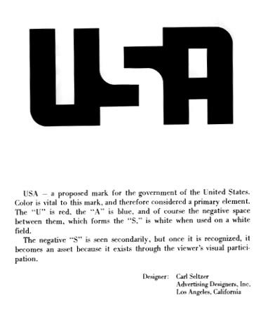
That USA logo looks like they were trying to summon the spirit of Paul Rand!

On Jul.13.2005 at 11:21 PM
John’s comment is:

I really like the new USA logo just for the cool little negative space trick. It also has a new touch of personality over the old one.

I'm also really wierded out by it, because, sometimes the negative space escapes me and I'm seeing those strange little danglers hanging off the letters that just don't look right.

I wonder how much more that "S" will disappear when the logo is alpha'd over live video?

On Jul.14.2005 at 01:53 AM
Ravenone’s comment is:

Maven's posts are always so visually interesting. He takes time not just with figuring out what to say (or maybe he's the last bit of wit in the world?) and with making it look interesting. I bow down before him!

-and onto the topic at hand...

Logo just reminds me of Legos. Will the chanel's programing snap together to form a giant plastic man-eating monster? ... only time will tell.

the !/Pax logo.. uhm. Ouch.

And I'm going to miss the old USA logo. The new one without the flag just seems to lack the flare, and seem a lot more anonymous than the old one. It becomes just initials, meaningless letters- it could be a law-firm or mutual fund instead of a tv channel...

:

On Jul.14.2005 at 02:03 AM
logokid’s comment is:

The new USA Network logo is reminiscent of this logo produced by Carl Seltzer in the 70s.

On Jul.14.2005 at 03:14 AM
DesignMaven’s comment is:

Marian and Ravenone

Just waking up. Checking the site before the kids get up. Looking at It's A Mad Mad Mad Mad World. Mickey Rooney, Phil Silvers and the Crew. I'm a Sucker for Mickey's Andy Hardy Movies. Referencing his earlier work.

Many thanks. Not totally Ground Breaking. I've always said I live somewhere between PAULA SCHER'S School of Visual Art Posters. To Good is not Good enough if you Dream of Being Great.

The Good one's Copy and the Great ones Steal.

I really don't think I fit in either category.

Fess up time. I stole them from someone on eBay. In the feedback section. Thought, they were kinda COOL. Since I never seen it done before.

I'd never seen them on this site. Though I'd dress it up. They're free for anyone to use. I don't own them.

Like, George Washington and the Cherry Tree. I cannot tell a LIE. At least I never take credit for someone else labor.

The real test will come if my Probation Officer BIG WILLI (bka) William Drenttel will let me get away with it.

Thanks Logokid, that's usually my JOB.

Welcome to Speak Up.

I see, I have some competition.

DM

On Jul.14.2005 at 04:44 AM
Von Glitschka’s comment is:

I find the 'negative' space on the 'S' in the usa logo somewhat perky.

That said it's on screen movement is well done.

On Jul.14.2005 at 01:49 PM
feelicks sockwl jr’s comment is:

Carl's is much better.

THx Logokid!

On Jul.14.2005 at 01:59 PM
Rob’s comment is:

What can I say that hasn't already been said. Of course, the 'I' immediately made me think of the leaning tower of Pisa. It's been a whacky day.

USA, the negative space trick is the only 'nice' aspect of an otherwise visually weak, wimpy logo. Carl's, with thanks to Logokid, was much better. And the USA 'old' hands above the new.

Oh, and the LOGO 'logo'. I don't get it. Seemed the old was a better concept to reflect the content.

Oh, then again, being a lower designer—is that valley speak for below the Mason-Dixon line— maybe I need to raise myself upon my perch of critique. In any case, I've seen better work from my students, which speaks volumes about the wasted efforts and $$ spent here.

On Jul.14.2005 at 04:15 PM
Armin’s comment is:

> Carl's is much better.

Yes, much better, especially if USA were a channel on Russian Cable TV and the tagline were Commies Welcome�.

Like tbs, usa went for the three letter logo (a la NBC, CBS, abc). I used to like the old USA Network logo, it was very stately. This one though, seems quirky enough to accommodate their hit show, Monk, and possibly fluctuate between a broader range of programming. Maybe the flag in the logo presented a certain expectation from viewers, something like "American Programming" that the network people found limiting — just speculating. Visually, it's pretty well resolved, the "s" creates some nice shapes at the top right and bottom left when it junctures with the other letters.

**

No comments on PAX.

**

The first LOGO logo was much better and I remember seeing that at one point. I really dislike the actual logo, specially the "L". The first logo, specially in its outline version, had a certain unity and can't we be all friends? feeling that worked very well. I can't see the chosen logo communicating effectively with its audience. A — if stereotipically at least — tasteful audience at that.

On Jul.14.2005 at 04:54 PM
feelicks sockwl jr’s comment is:

stately?

i find the older (CBS, NBC) logos stately? .

its a nice piece of type- granted- but saturating the catagory with 3-letter lookalikes doesnt warrant a back slap.

On Jul.15.2005 at 10:05 AM
James Cooney’s comment is:

Maybe I'm the only one here, but I like the new USA logo. I first saw it on the train every morning with their advertisements for the new season of Monk, and it fits perfectly with that. As soon as I saw it I thought "hmm, when did USA change their logo? looks good, i like the trainspotting esque campaign, even if it is nothing shockingly original".

I didn't realize that Monk was their marquee show now, but based on Armin's comments it makes sense. It (both the show, and the logo, at least in the print use I've seen) speaks of being mass-market (or even family) friendly without alienating other markets. Based on how popular the show is with my girlfriend's family, both children and adults, it doesn't seem like a bad or innacurate approach.

As to basing a network's identity on one show, well, that is something I'm not about to debate. And thats provided that was the intention. I also haven't seen it in motion on tv (the main application for a network), so perhaps I'm bringing a knife to a gunfight. Cheers.

On Jul.15.2005 at 01:05 PM
JD’s comment is:

Anyone seen the new Palm rebranding?

Check out the website:

http://www.palm.com

Holy shagged sheep! (The "Welcome to Palm" header.)

On Jul.15.2005 at 04:49 PM
Forrest’s comment is:

LOGO:: I'm thinking the old design works better (but, yes, could use work). I think the equal emphasis on the "L" and "G" is much more appropriate. I already found it semi-confusing that it wasn't "GOLO" (hahahaha...yeah!! It should definitely be "GOLO.") and emphasizing the "L" in the new one just makes it worse.

PAX:: ...yeah.

USA:: I think it's great that they're redesigning. Everytime I see the flag logo I think of MacGyver (which...could be a good thing (?)). Not sure this is the best solution, though. I seriously thought it was a new USA Today logo when I just glanced over it. I'm with Derrick and Marian: with those...um...appendages it might work better for LOGO...*ahem*... GOLO.

On Jul.17.2005 at 01:06 AM
Armin’s comment is:

Looks like CourtTV has also gone through a "remove-any-sense-of-identity" change. (Or is it just a web application? I saw the new logo on a couple of phone booth ads, I assume it's a new logo…)

On Jul.18.2005 at 04:00 PM
Mark ’s comment is:

Talking about recent new logo rebrandings the weather channel recently changed their logo.

It boxy and uneven looking IMHO the logo looks retarded compared to the previous logo

Heres the new logo

On Aug.18.2005 at 12:54 PM
Mark’s comment is:

Sorry This is the first time posting at this place Heres the new logo

On Aug.18.2005 at 12:58 PM
Mark’s comment is:

this is the new logo img src=http://image.weather.com/web/common/logos/twc_logo.gif>

On Aug.18.2005 at 01:03 PM
Mark ’s comment is:

The new logo

On Aug.18.2005 at 01:06 PM
Mark’s comment is:

The new Weather Channel logo

Now compare that logo to the old one

On Aug.18.2005 at 01:12 PM
Mark’s comment is:


Usa Network had changed through a lot of logos since it premered

and the new one is another change in its history

On Aug.18.2005 at 07:30 PM
Michael Surtees’s comment is:

This should be interesting: Karim Rashid on USA Network, MADE in the USA. Consider yourselves warned... http://www.usanetwork.com/series/madeintheusa/

On Aug.19.2005 at 10:40 AM
Mark’s comment is:

Oh brother, USA has jumped on the reality show bandwagon

On Aug.19.2005 at 06:28 PM
Mark’s comment is:

Interestingly my Pax Tv channel WHPX is STILL Pax!

On Aug.24.2005 at 12:53 PM
Mark’s comment is:

BET also changed their logo not too long ago

old:

New:

On Sep.06.2005 at 07:50 PM
David Farley’s comment is:

"feelicks sockwl jr’s comment is:

lower designers?

keep hate alive?

i thought we were

critiquing logos.

its nuthin personal

just business.

btw- youre a dumbass

:)

On Jul.13.2005 at 06:16 PM"

HA!! Oh my gawd - that was awesome.

On Sep.08.2005 at 09:46 PM
Mark’s comment is:

The flag in the now old USA logo made sense since its supposed to be the American flag and U.S.A. stands for United States of America.

unless the new logo is trying to make a new name?

Unified Station Association?

Untitled Stale Artists?

or...

Undercase Shall Assimilate

that means future logos shall have lowercase letters

but wait with all these new station IDs becoming more and more plain theres a more underlying meaning in U.S.A.

Its Uniqueness Shall have an Apocolypse

think about that.

more logos are getting to be almost the same.

On Sep.30.2005 at 08:45 AM
Max’s comment is:

Does anyone know who designed the original USA logo?
To be honest, I think the USA logos have been pretty bad since the beginning, but at least the new one is slightly playful.

On May.22.2007 at 04:20 PM