Speak UpA Former Division of UnderConsideration
The Archives, August 2002 – April 2009
advertise @ underconsideration
---Click here for full archive list or browse below
  
Pizza Flyers: The Height of Good Graphic Design?

Are pizza flyers well designed? The reason I ask is that someone recently said, in all seriousness, that the role of graphic design historians is to identify examples of good graphic design so that we can improve the quality of the pizza flyers we get through our doors. Of course, �pizza flyers’ is just a handy euphemism for the sort of everyday graphic design that permeates our lives, being so ubiquitous that it is largely invisible. Much of this design is undoubtedly �bad’ in terms of composition, typography and all-round clarity, but is it really �bad design’?

Bestchoice_oversize_200px.gif

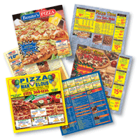
I put this question to my new first year students yesterday during a series of seminars designed to get them thinking (and re-thinking) about their preconceptions of their subject. Pizza flyers, it was agreed, are about as good examples of bad design as you could hope for.

But had any of them used one to order pizza? Almost all had, and several said they kept flyers and even had them taped on the fridge door. So are they badly designed? I asked again. It was like the scene from Monty Python and the Holy Grail where the peasants are trying to work out the tortured logic of what it means if a witch burns: �b-because… they’re made… of wood?’: It was clear from a lot of their faces that something was dawning, somewhat uncomfortably, on them. In this case the logic suggested that if a pizza flyer does its job then, no matter how awful it looks it must, by definition, be �well designed’.

I could see most people were struggling with this (and I imagine most readers of this are too — believe me, I feel your pain) but the struggle was not because they didn’t see the sense of it, but because it contradicts everything they have ever been taught or read about what makes good design good. When asked to describe good design the words �creativity’, �originality’, �vision’ and �passion’ came out — hardly the sort of things you’d associate with pizza flyers.

So why are pizza flyers so good, yet so bad? One student repeated a familiar argument: the reason pizza flyers look so bad is because they are put together by people who think that they are designers simply because they have a computer and an illegal copy of Photoshop. The old �everyone thinks they’re a designer’ argument.
Well I’m not sure I would agree with the generalisation because, while I don’t doubt that a lot of pizza flyers are put together by �amateurs’, a lot of them are designed by your actual real-life designers, some of them for a bit of extra cash but a lot of them as part of their stock-in-trade. No — the real reason pizza flyers look the way they do is because that’s what pizza flyers are expected to look like. It’s not the designers that are bad, but the visual language. Comparing a pizza flyer with some agency-originated design is like comparing the language you hear in a court to the stuff you hear on a building site — or college staff room. Pizza flyers are simply visual expletives: short, brutish and to the point.

But that doesn’t answer the earlier comment about a need to improve the quality of design. Just because that’s what pizza flyers are expected to look like doesn’t mean they should forever look like that, does it? I put the question to my students: if approached by a pizza company to design a leaflet to be pushed through thousands of doors in the area, would you produce something like all the others, or strive to be different? Most said they would try to be a little more creative and original, selling pizzas without selling out on their own visual tastes.

But would a �well designed’ pizza flyer work? Isn’t it probable that some modernist, sparsely filled masterpiece would send out the signal not that you can have a cheap pizza in minutes, but that you were being offered an expensive and minimalist piece of nouvelle cuisine?
The fact is, pizza flyers set up precisely the right expectations about the product and the service: cheap, cheerful and quick. The choice of visual language any graphic designer makes should be appropriate both to the message and to the intended audience. Differentiation is not an issue here because the pizza market is dependant on reliability and the belief that no matter how many different companies there are offering you pizza, you can be sure you’ll get the same quality product and service.

I would take issue with the idea that it is the role of the visually literate to impose their values on those they see as the visually illiterate. And I would question anyone who thinks that effective design, no matter how it looks, is not in some way good design. Design criticism, and design history, rarely enter TRW (the real world), preferring instead to inhabit a cosy province where everything looks lovely and no designer ever has to hear the dreaded words ‘that’s all very nice but could you make the type a bit bigger and all capitals?’ The fact that graphic designers have to make money and work for other people should no longer be our profession’s dirty little secret. And nor should the fact that graphic design is an essentially multi-lingual activity in which we should, must, be willing to use the same language as the people with whom we are communicating.

Ignoring the invisible visual communication around us, and the powerful effects it has, and looking down our noses at the 99% of designers who operate in that economy risks us producing a generation of designers who shun work they see as beneath them and insist on speaking a visual language only they understand. No wonder the vacuum is being filled with amateurs.

Maintained through our ADV @ UnderConsideration Program
ENTRY DETAILS
ARCHIVE ID 2462 FILED UNDER Discussion
PUBLISHED ON Nov.04.2005 BY Jonathan Baldwin
WITH COMMENTS
Comments
marian bantjes’s comment is:

This is a great post—it just needed some more imagery. But it leads me immediately to this:

But would a �well designed’ pizza flyer work? Isn’t it probable that some modernist, sparsely filled masterpiece

The fact that "modernist, sparsely filled" is our generally unified idea of what constitutes good design is a major, major problem in the design industry. The vast majority of students coming out of school are reproducing the "clean, simple aesthetic" as good design. The idea is, once you get it down, you can't go wrong ... and in the mind of most businesses, you can't.

But i don't see this as good design. It's just a clean, simple aesthetic, and it makes me crazy to see this aesthetic held up, over and over again, as what's good.

So in this sense, this "good" aesthetic for pizza flyers would not work. But the truth is there's a helluva lot more to good design than that. You can have your pizza and eat it too.

What does the client want? Big bold colours, big bold headlines, a bunch of menu items, prices, and pizza. It's a challenge I'd love to tackle, paid the right $$. It involves a combination of dynamic in-yer-face graphics with a lot of structure. It could be awesome, compelling to the average pizza-eater, and a wonder to the discerning eye. Would it win any design awards? Well ... it would depend on the name attached, for that.

My point is that good design is not blending everything through the "clean aesthetic" machine. It's doing something challenging, that works for the client, the audience and the inherent designer in all of us.

On Nov.04.2005 at 03:28 PM
Armin’s comment is:

More later... But one thing that immediately comes to mind is the work that Dan Ibarra, during his tenure at Planet Propaganda, did for Jimmy John's sandwiches. The coupons and black and white ads in dinky magazines they did were very visually astute (and literate!) while still pandering to the dude (or dudette) that just wants an f-in' sandwich. This is proof, I think, that pizza flyers can retain their sense of urgency, cheapness and comfort without it being amateurish.

And I doubt students keep pizza flyers for the design... I bet it's the 2 pizzas for $5. (Sorry, not sure how much a pizza costs in Sussex!).

Welcome, Jonathan.

On Nov.04.2005 at 04:13 PM
Drew Davies’s comment is:

Jonathan, thank you for saying what most dare not speak. Good design must be defined by appropriateness to audience and goals, and by its effectiveness, not by its adherence to Swiss design or the number of awards it wins. I'd say more, but I'd just be repeating what you've already eloquently stated. Well said.

On Nov.04.2005 at 04:16 PM
Mr.Frankie L’s comment is:

The "clean aesthetic" style, unfortunately

has been identified as Modernism.

Modernism ISN'T a style. It is a design

philosophy — its practitioners' work are not

required to look similar.

With that said, I do agree that people

can confuse visual style with good/bad design.

I would even dare suggest flyers for fast food

such as pizza, are a type of modern folk art..

On Nov.04.2005 at 04:17 PM
Jonathan Baldwin’s comment is:

Phew - I thought I was going to be flamed for this! Actually, I'm slightly disappointed... :-(

Must try harder. Mind you, it's still early days!

Marian: yes I did originally have more images but they weren't good quality. I was waiting for the weekly delivery of flyers through my door but it didn't come... I guessed I'd better just post away!

Armin: Thanks for inviting me to contribute! I actually meant that the students kept them for their usefulness not for their design values. I looked at that sentence for ages wondering if it made sense and it obviously didn't! Argh ;-)

Mr Frankie L: You're right, of course, but the term has become shorthand for a style - with the end result that it often contradicts the original definition. It doesn't help that people like me continue the abuse (it's oure laziness I admit), but in this case I think the point I was trying to make justified it...

On Nov.04.2005 at 04:27 PM
Jonathan Baldwin’s comment is:

Marian: 'you can have your pizza and eat it too' - very good. And how appropriately cheesy! :-)

I did consider doing my own 'redesign' of a pizza flyer for this post - maybe we should have a competition?!

On Nov.04.2005 at 04:33 PM
Mr.Frankie L’s comment is:

Jonathan,

I didn't mean to come off so rigid...

Good idea bout the contest!

The lst Annual Speakup Pizza Flyer Contest !

On Nov.04.2005 at 05:06 PM
Chris Rugen’s comment is:

A pizza flyer redesign exercise/contest would be great.

I disagree that the flyers are 'good design'. I think they're 'good enough'. They often do the bare minimum, stopping just short of being illegible. A clearly designed pizza flyer with personality that goes beyond "HEY LOOK, 12 COLORS AND LOTS OF GRADIENTS!" would probably work much better.

On Nov.04.2005 at 05:33 PM
Jose Nieto’s comment is:

That was a provocative post, Jonathan: it's good to jar people's expectations every once in a while. Where I think your argument falters, however, is in your simplified definition of the word "effective." You cannot brand something as effective is you do not first delineate its goals. What is the purpose of these pizza flyers? Informational? To increase orders from existing clients? To expand the client base? To distinguish itself from competitors? To enter into a crowded marketplace? Just because your college students order pizza doesn't mean that they flyer is effective: you need more information to reach that conclusion.

Armin's comment about Jimmy Johns is right on the mark--good design can distinguish a client from the competition without alienating its intended audience. Design is not about giving something a "clean, modernist look," but about defining a communication problem based on an assessment of goals, audience, and expectations, then delivering an appropriate solution on time and within budget. That holds true whether you're doing brand identities for Fortune 500 companies or a humble pizza flyer.

On Nov.04.2005 at 05:36 PM
Daniel’s comment is:

Jonathan Baldwin—what a perfect addition to the Speak Up list of contributors! Great topic. Is this your first post?

"...the struggle was not because they didn’t see the sense of it, but because it contradicts everything they have ever been taught or read about what makes good design good."

To question the appropriateness of a design as a means to asses it's success is such a simple concept/approch when you think of Airbus's new A380 (it's successful first flight took place yesterday).

Is it just a mater of context? I always felt like "good design" was something that works—work being defined as having brought about a desired result.

Welcome!

On Nov.04.2005 at 05:36 PM
Andrew Twigg’s comment is:

Great ideas here.

Earlier in my career I art directed a direct mail piece that I was far from proud of visually. But, the piece had a 13% return on the first mailing, and 16% on the second and third. This was considered phenomenal for direct mail, as a 2-3% return is generally considered successful for such a piece (at least it was at the time).

Prior to that experience, I had worked in-house with a marketing person who always wanted to violate the brand in the name of results. Her only concern was efficacy. This was mortifying to me, especially because (appropriate to our discussion) our brand was one of those modernistic brands with sparse design, small Futura type, and the other requisite grid structures-not-quite-international-style attributes. Of course, I was also concerned that consistent branding was part of effective design, that efficacy had to do with more than the success of one particular piece of marketing, that it had to do with the whole of the effort.

I think in the case of pizza flyers, this seemingly "tawdry" design probably doesn't really violate the brand. A modernist flyer would, for certain.

This is definitely a topic for design education. I've had to really open my mind as an educator to not let my preferences (or brainwashing) get in the way of perfectly valid student work that maybe doesn't look the way I've been told good design should look. It's especially true because I'm teaching in a school with students from all walks of life, all ages, all cultures. What do I know about culture in the barrio or the suburbs of Chicago?

I've often wondered what the ivory tower would have to say about this.

On Nov.04.2005 at 05:36 PM
Jonathan Baldwin’s comment is:

Jose: You're right of course, and my next post will make that point in relation to a recent critique of a British poster designer who produced a series of accident-prevention posters in the UK during World War II. The issue in that example was the critique said the posters were 'good' because they looked radically different to those that went before. I wanted to know if they had led to a drop in accidents.

However, I was taking a gamble with the pizza flyers that the intended effect was simply to make someone phone for a pizza.

It just shows that the sentences that get cut are actually the ones you get picked up on! Around about the part where I talk about 'differentiation' I had originally written something along the lines of 'a pizza flyer isn't intended to make someone suddenly want a pizza. They're there so that when the urge hits, there's a piece of paper that tells you who, what, how much and how'. But I thought it was already getting too long. You're right to point out the omission.

On Nov.04.2005 at 06:04 PM
Jonathan Baldwin’s comment is:

Chris: I know what you're saying but when I was a designer I learned (eventually) that there comes a point where you have to say 'this is good enough'. It took me a while to see that this is not a bad thing. Far from it.

Maybe I was lucky in that I was an in-house designer based in a marketing department, so I picked up a lot of the stuff about aims and objectives that designers who are brought in late in the process maybe don't get and therefore don't understand (through no fault of their own - if briefs had this information in them as a matter of course, we'd all be a lot happier I'm sure). Maybe this is something that could form a future post: how much do designers get told about the aims of the projects they work on?

But what you're saying came through in the student comments too: why can't something be effective and look good? Well that's a fair point, but it isn't my point here.

On Nov.04.2005 at 06:22 PM
Jose Nieto’s comment is:

They're there so that when the urge hits, there's a piece of paper that tells you who, what, how much and how'.

Fair enough, but my guess is that your students have more than one pizza flyers on their bulletin boards. Why do they choose one over the other? If they get one from a new restaurant, what would prompt them to give it a try?

You can even take it further than that: perhaps the objective is to increase the profit margin on pizza sales by getting out of the lowest-price pie game. Could a better-designed flyer, as part of a well conceived branding effort, get people to spend an extra dollar on a large pizza? I would say yes.

I should add that it's very encouraging to hear from graphic design teacher who is putting such a strong emphasis on meeting client objectives. Kudos!

On Nov.04.2005 at 06:34 PM
Jonathan Baldwin’s comment is:

Daniel: thanks for the kind words - yes, first post!

I always felt like "good design" was something that works—work being defined as having brought about a desired result.

It sounds obvious doesn't it? But you'd be surprised how many designers feel they're somehow letting the side down by not producing great art all the time. That's what I mean by the phrase 'dirty little secret'.

I never show my work to students because it can't live up to the models I know they see in the books on design - ironically, I've just written a book which the publishers have ensured adds to the problem - even though I know for a fact it was rather effective. (Plus there's nothing sexy about designing leaflets and catalogues for kitchens and bathrooms! In the early days of the web I contacted several web design agencies about them working with us but all of them turned us down as we weren't 'sexy' enough for them - I rightly predicted that they would all be out of business within a year or two).

On Nov.04.2005 at 06:34 PM
Jonathan Baldwin’s comment is:

Jose: yes you're right. I'd like the students to investigate things like that and in fact they will be when we look at retail design, appropriately enough in the last session before Christmas! It always proves an eye opener when I ask the simple question 'why is it you go to the supermarket just for some milk and come back with several heavy bags of groceries... and no milk?' They'd never thought it might be down to design rather than simple forgetfulness...

One of my third years is investigating this area for her final dissertation, in fact.

On Nov.04.2005 at 06:44 PM
Tom B’s comment is:

why can't something be effective and look good?

Too often, unfortunately, this is seen as an either-or problem. Too many marketing people (particularly those who deal with direct mail) seem all too keen to avoid good design.

I've come across this attitude time and again - that it is precisely the bad design that brings results.

It's seen almost as a trade secret, known only by the marketing people: "consumers are all brainless cretins - in order to be successful we must descend to their level"

But the problem is only made worse by the snobbery of many designers, who object to this type of job because it isn't 'sexy' enough. There's often no desire on our part to produce anything even half-decent for this type of work: "just churn it out, take the money and don't ever mention having done it."

Well I beg to differ

Response-driven design should be thoroughly encouraged, and applauded when successful (well done Andrew - 16%!). Direct Marketing's use of testing means that we can get a real appreciation of what works and what doesn't.

Too much design is lazy: comfortably slipping into an established visual style, with no real attempt to understand the requirements of the job, or even to understand our own design choices.

I believe that all designers should be encouraged to do these kinds of jobs. It can help us to figure out what design is actually for

On Nov.04.2005 at 08:20 PM
David E.’s comment is:

I don't agree at all with the idea that effective design is always good design. The responsibility of the designer is not to sell the client's pizzas, but to provide the best possible experience for the USER of the flyer, or anyone else who might happen to see it. That means that not only is the information easy to access, but that the form itself enriches our lives. That's what people mean when they refer to design as "problem-solving." Problem-solving doesn’t mean applying a certain look or style. It means creating something that works for everyone, in a visual language everyone will understand. Johnathan makes it sound like an either / or proposition.

I do agree 100% that designers should never be embarrassed about what projects they work on or who their clients are. And if a client insists on junk design, it's up to the designer to decide whether or not to take on the project. But believing in good design is not snobbery. Every client is entitled to good design, so long as they pay for it, and creating good design is our contribution to the world we live in.

On Nov.04.2005 at 09:05 PM
Tom B’s comment is:

But believing in good design is not snobbery

Certainly not. But believing design for certain types of clients is more worthy than that for other types definitely is snobbery.

Pizza flyers are a good example of a place where good design can really make a contribution - both to the client's business directly and also to the wider world of mass visual communication.

So to avoid these types of jobs in favour of slick corporate brochures and beautiful ad campaigns is really missing a trick - taking the lazy option.

On Nov.05.2005 at 04:54 AM
Armin’s comment is:

> ...but to provide the best possible experience for the USER of the flyer, or anyone else who might happen to see it. That means that not only is the information easy to access, but that the form itself enriches our lives.

Design is also about fulfilling expectations and I doubt anyone expects their lives to be richer after seeing a pizza flyer. I think as designers we can pick our battles as to where form and message most overcome expectations and pizza flyers ain't it. Unless, as Marian said, the price were right.

On Nov.05.2005 at 08:27 AM
Andrew Twigg’s comment is:

The responsibility of the designer is not to sell the client's pizzas, but to provide the best possible experience for the USER...

David, I think this is A definition of design, but I wonder what you mean by that? Does the "best possible experience" mean that the user, in this case, can quickly find the coupon that saves them the most money or get them the most pizza? To give the user what they want?

This makes a LOT of assumptions. Couldn't the "best possible experience" be that the user NOT buy pizza? Perhaps the user has bills to pay and should really be eating what's in their fridge instead of spending more money on food. Perhaps a user's cholesterol is so high and their veins and arteries are so clogged that this is the pizza that pushes them over the edge, leading to a heart attack and their demise? Extreme examples, I know, but the pizza flyer has nothing to do with the user other than making them a pawn in the pizza company's plot.

The problem is that the pizza company determines what the "best possible effect" of the flyer should be (i.e., we want to sell 2 million pizzas this month, so let's get each user to buy into our "regular price, 4 bucks, 4 bucks, 4 bucks" deal). This is about manipulating the user. The user isn't the user at all... maybe they're the "usee", the user is the pizza company.

I'd buy the "usability" argument a bit more if this were a website (a bit more, I say), but even then - as with most commercial projects - the finished piece has less to do with the customer than it does with the client. Creating a good user experience (or "best possible effect") isn't the "ends", it's just the "means".

I'm going to go out on a limb, but think for a moment about vernacular design and who its audience is supposed to be. And think about the kinds of things we see presented with vernacular design in our culture. The pizza flyer is an excellent example of this, and think about other fast food flyers. These flyers are doing their job, perhaps too well. We're an overweight country. We're in debt up to our eyeballs. The more educated don't eat at fast food restaurants with the same frequency as the less educated:

  • "In general both probability of consuming and expenditure increase with income and household size, but decrease with age and education."

    -"Determinants of Fast Food Consumption", Jasper Fanning, Thomas Marsh, Kyle Stiegert, Food System Research Group, University of Wisconsin-Madison, January 2005 (pdf)

  • Back to going out on a limb: The pizza flyer is a form of oppression for the uneducated. Uneducated = poor. So the wealthy corporation sells pizza to the poor and uneducated, further oppressing them, using them for their money, and disposing of them - perhaps literally - when they get fat and die.

    Sounds like the the "best possible experience" for the user.

    On Nov.05.2005 at 09:28 AM
    Michael B.’s comment is:

    Great article, Jonathan.

    To a certain degree, designed objects have to acknowledge the conventions of their genre in order to communicate. But audiences understand (and enjoy) different genres and conventions. Making a pizza flyer look like a Josef Muller-Brockmann poster wouldn't make much sense to a bunch of college kids, but why not make it look like a Radiohead cover?

    Of course, you could always namecheck El Lissitzky for your pizza client, but that's been done.

    On Nov.05.2005 at 09:50 AM
    Jonathan Baldwin’s comment is:

    Andrew: I quite agree with you. In fact, at a conference in London last weekend I asked the question:

    Is it the role of design historians to find the best examples of design in order to improve the quality of pizza flyers? Or is it to critique a society and profession that thinks it acceptable to use such a wasteful and questionable form of communication?

    The same issue was raised as well by Judith Williamson who was highly critical of the approach that sees design critique as improving aesthetic sensibilities before we improve the messages themselves.

    It was that which prompted my post here but I wanted to leave this particular angle for another time. However, it seems to have come up sooner than I anticipated!

    It was interesting when I raised the whole 'how would you design a pizza flyer' question with my students that they addressed their aesthetic concerns before their ethical ones. However, when I pointed this out to them most looked quite relieved and admitted this was their first concern, but thought they weren't allowed such revolutionary thoughts. (First years, remember - my third years wouldn't be so reticent!) Many admitted they were more likely to turn the job down not because they couldn't be 'creative' but because they didn't want to contribute to the waste of paper and nutritional problems that are apparent here at the moment.

    Michael: Thanks for the kind words.

    Yes, a pizza flyer could reference existing design as appropriate to the audience. I live very near arts student halls of residence but also on the border of Brighton's artsy quarter, so the vernacular near me is quite eclectic as you can imagine. Lots of flyers and posters for nightclubs with more information than you could ever hope to take in (and a worrying over-use of the apostrophe) plus lots of hand-printed home-produced community newsletters, mixed in with quite professional posters for local events thanks to the large number of designers living in the area.

    A clever pizza parlour would have different flyers for different neighbourhoods, but round these parts I don't think it would work!

    On Nov.05.2005 at 12:00 PM
    James’s comment is:

    If you took an 8.5 x 11 sheet of paper, left it all blank except for the coupons, it would do a better job or just as good a job as the flyers are doing now.

    All pizza flyers look the same, you could use one for every pizza company in the world replacing just the names on the flyer.

    I think a contest is in order, sounds fun to me.

    As for the clean look, I love that look, but it doesnt work for everything that is produced.

    On Nov.05.2005 at 05:54 PM
    David E.’s comment is:

    Does the "best possible experience" mean that the user, in this case, can quickly find the coupon that saves them the most money or get them the most pizza? To give the user what they want?

    Andrew, That is, of course, a big part of what I meant by “best possible experience,” but not all there is to it. I meant that it should be aesthetically pleasing as well. Wouldn't you rather stick something beautiful on your refrigerator? As Massimo Vignelli says, “Vulgarity is ignorance.”

    This makes a LOT of assumptions…

    Couldn't the "best possible experience" be that the user NOT buy pizza?…

    The pizza flyer is a form of oppression for the uneducated…

    Of course I was making the assumption that the client and the consumer weren’t at odds with one another. I like pizza. My wife and I just ordered one Friday night to go with the movie we rented. Personally, I don’t feel that pizza flyers oppress anyone. Everyone’s entitled to their opinion, of course, and if a designer did feel this way, I hope he/she would stand up for what they believe in and not take on the project of designing them.

    The problem is that the pizza company determines what the "best possible effect" of the flyer should be.

    I never used the words “best possible effect.” Naturally, the intention of the pizza business is to get more people to buy pizza. I said “best possible experience” — for the person using the flyer. Yes, as you pointed out, the word “experience” is often associated with web design, but anyone looking at anything is having some kind of experience. If we’re not making it a good one, than we’re not doing our jobs. While there are clients I would never work for (the Republican party, for one), my view is that if something is going to exist anyway, why shouldn't I be the one to design it and make it something good?

    My main point, though, was that the two extreme examples that Jonathan gives (blindly applying a sparse, modernist style on one hand, and the banal examples he posted on the other) are really two sides of the same coin. Neither one amounts to problem-solving. The problem, in this case, is how to create something that benefits the client and the consumer.

    On Nov.06.2005 at 04:42 PM
    Kenneth FitzGerald’s comment is:

    Design criticism, and design history, rarely enter TRW (the real world), preferring instead to inhabit a cosy province where everything looks lovely and no designer ever has to hear the dreaded words �that’s all very nice but could you make the type a bit bigger and all capitals?’

    Those damn critics and historians, again. Can't they get anything right? Forcing us to study Paula Scher or Stefan Sagmeister or Saul Bass when we want to look at—pizza flyers!

    This essay obviously hasn't read any design criticism since 1991 (when I started reading it) as challenging the formally-determined, one-size-fits-all Modernist conception of design has been topic #1. Where has Jonathan Baldwin been? At the risk of self-promotion, he might start here (written in 1997, published spring 1998) to start catching up on all he's missed. BTW, wasn't that annoying "vernacular" crap design theoretics went on and on about giving props to stuff like—pizza flyers?

    Something else he missed was an opportunity to ask Michael B. to square his advocacy of better dog food packaging (in the wake of the First Things First 2000 Manifesto) with this essay.

    I've often wondered what the ivory tower would have to say about this.

    I'd first refer you to my essay "Buzz Kill" so I don't have to repeat my regard for people who trot out this hoary cliche of academia. I know I'm hardly representative but every "ivory towerer" I'm acquainted with is far out in front of this issue. So far, in fact, that they gain the scorn of TRW designers— who prefer to gaze at the designstars and are the source of "...the idea that it is the role of the visually literate to impose their values on those they see as the visually illiterate." The damned critics, historians, and academics are trying but, as this essay (and various responses) shows, not too many are listening.

    On Nov.06.2005 at 05:06 PM
    Jonathan Baldwin’s comment is:

    Kenneth, I'm sorry but are you agreeing or disagreeing with me?

    On Nov.06.2005 at 05:38 PM
    thorri’s comment is:

    Kenneth, is there a possibility to get the Eye Magazine article to read?

    Sorry everybody, for not having more to say. I need to check Kenneth's required readings first :)

    On Nov.06.2005 at 06:47 PM
    Andrew Twigg’s comment is:

    David, sorry, you said experience, not effect. My apologies.

    The examples I gave, as I stated, were extreme, but I still stand behind my point. I think the next step in the progression of my statement is asking the question about who one's clients are. But that's not the point of this discussion. And I'm not going to try to convince you of my position. Take it for what it is.

    Kenneth - I've actually read your essay (though admittedly, it was some time ago when that issue of Emigre first came out). I certainly don't think criticism is without value, and I hardly think that most of the academic world of design is apart from "the real world".

    My question about the "ivory tower" had more to do with the reality that - as an example - Yale will (never?) be admitting the kind of students that I have in my classroom. I should make it clear that I'm not sour about that, I love my students and I love giving them an opportunity when others have remain closed to them.

    What I was wondering about is how an educational system which is only ever exposed to "highly qualified" students can account for the backgrounds, cultures, and aesthetic sensibilities of students it will never have. How do those aesthetics enter into the conversation? Perhaps I shouldn't have used the term "ivory tower", I should have said "upper crust of design education". This also wasn't meant as a slam, I'm genuinely curious about it because I teach in a completely different setting and have no idea what life is like on the other side. (Kenneth, if you are able/willing to provide, I'd like to hear your opinion on this.)

    On Nov.06.2005 at 08:06 PM
    Tom B’s comment is:

    It's interesting that the old 'theory vs practice' dichotomy has cropped up again.

    It seems wrong that we should try to blame academia for designers' narcissism - precisely what most critics strive to criticise.

    The term 'Ivory Tower' is used far too often, and used wrongly. We don't really mean to attack academia - only 'the establishment': the forces that attempt to protect the status quo.

    Designers are strange, paranoid creatures. Deep down, I suspect, we all think of ourselves as outsiders - fighting a solitary battle against ugliness and ignorance.

    When we talk about design, we use a lot of 'we's and 'us's (I'm doing it right now). But I suspect this is just politeness - what we really mean is 'you': all you other designers - the ones who aren't me.

    'The Ivory Tower' is no longer an academic 'otherness'; it has become a general otherness - applied to anyone and everyone.

    'I'm the only one who understands', we tell ourselves, 'everyone else is full of hot air'.

    But this is just narcissism again. If I'm the only person who understands the real world, then just how real can it possibly be?

    On Nov.06.2005 at 08:28 PM
    Gunnar Swanson’s comment is:

    Jonathan—

    A pedagogical question for you: My experience is that beginning graphic design students often have the impression that form is arbitrary and “good” and “bad” are purely subjective (read: arbitrary personal choice.) How does putting this question to new first year students get them thinking (and re-thinking) about their preconceptions of their subject? I’m not asking how effective it is in getting them to think. I’m wondering what effect it has on their attitudes toward their work. Does the discussion become a defensive shield, protecting their work from criticism? One can have rather catholic tastes, an open mind, and an interest in broader context and still run up against a willful insistence that nobody is in the position to judge craft, thinking, or any other aspect of quality.

    Do your students think that all pizza is the same or that sales volume is the only measure of quality?

    On Nov.07.2005 at 06:08 PM
    Jeremy Fuksa’s comment is:

    If anyone's interested, I've gone beyond a short comment or two and have expanded on this post with the following posts to my blog. Feel free to check them out and comment on them if you wish!

    B-because they're made of wood? (my response to this post)

    More on bad design (an expansion of this good vs. bad/theory vs. practice/narcissism vs.unpretentiousness debate)

    On Nov.07.2005 at 06:41 PM
    RandomBoy’s comment is:

    If I write an article and it is copied. The person who has copied me has committed plagiarism. If I produce a piece of design, I would be pissed off if it was copied. The person who copied it would be committing plagiarism.

    Yes there is a visual language that we associate with pizza flyers - but is not the essence of design to produce new language and create new visual references and new associations.

    One could argue that it is a bit lazy to assume that because something has worked in the past it is going to be the best for the future.

    Lets do something different. Lets challenge preconceptions. Bring on the flyer competition.

    Great post.

    Yours

    RB

    On Nov.07.2005 at 08:11 PM
    Jonathan Baldwin’s comment is:

    Random Boy (who for the sake of openness I should explain is a former student of mine!): I don't disagree with the idea that design should move forwards. But all the time?

    All language works on the basis of cliche in a sense - we understand certain words to mean certain things and the more redundant the message the easier it is to understand.

    In some areas, if understanding is poor, then the designer's job is to improve the language being used - this is the sort of design that lights a lot of people's candles and where I think we can do a lot of good. But in others - and this is the key point and why I used pizza flyers as the example = understanding is not poor, in fact it's very good, which suggests that in this area at least, designers (and I include myself in this) don't need to worry. But we do...

    Visual communication, I would argue, needs to be effective first, affective second. But... this debate is often characterised as an either/or argument which I don't quite understand. I wa planning to continue in this vein in my next article.

    On Nov.08.2005 at 03:46 AM
    Jonathan Baldwin’s comment is:

    Gunnar: that's an interesting question, and it requires a more longitudinal study I think. But initial impressions are that it's not so much about getting students to agree with me (they often don't - see RB's comments above!) but provoking them into seeing judgements of good design/bad design in a) more objective terms, as communication, such as 'does it have the intended effect', 'will this work with the intended audience' and so on - things that here in the UK graphic design education often ignores or regards as implicit; b) as a cultural effect - too often discussion of design on courses focuses on what we as designers think is good, but rarely considers what (and I'm uncomfortable with the term) less visually literate people think. The question moves the discussion of design from 'art and design' to 'cultural studies' and prepares the ground for discussion of among others Barthes, Baudrillard, Chomsky and Bourdieu.

    But like this article, the first session is only the first in an unfolding argument (which occasionally contradicts itself). Personally I think pizza flyers look awful and are a waste of paper, but the fact they are so effective demands that I get over my own personal tastes to analyse why and how they work. I don't for one minute think my students should be happy just producing pizza flyers, but I do think they should understand how to communicate to people other than themselves and their tutors.

    I'm now working with the first final year group I've seen through from the start, and I can say that the quality of their discussions of design have improved markedly and their appreciation for the different forms that 'good' design takes has broadened. (I'm sure there's a couple floating around here who will support or contradict me on that!)

    However, in case anyone was concerned, it hasn't reduced their ability to produce design that demands a high degree of visual literacy to understand either.

    There is a c) as well I think: they are more critical of the power of design to form tastes and attitudes and so would approach pizza flyers not as some form of great design but as a form of social mediator, critical not so much of the design but of the message. Mind you, they already were - but now they have the arguments to support their views.

    Seeing design as Communication, Culture and a site of Conflict is what the course initially set out to achieve and I think it's achieved those aims.

    There's a link to a paper I gave on the course recently on the front page of my web site if you want more information on techniques and philosophy.

    On Nov.08.2005 at 04:12 AM
    Jonathan Baldwin’s comment is:

    Gunnar, I didn't quite answer your questions!

    Does the discussion become a defensive shield, protecting their work from criticism? One can have rather catholic tastes, an open mind, and an interest in broader context and still run up against a willful insistence that nobody is in the position to judge craft, thinking, or any other aspect of quality.

    I think that they're certainly better able to defend their work from purely subjective criticism, or better able to evaluate criticism. But I wouldn't imagine that many of them would simply say their work cannot be criticised because it is 'craft'. Some would, but their goal appears to be to operate within a cultural or social economy where their work and reputation depend on a different set of criteria from those used in marketing, advertising, communication etc.

    Do your students think that all pizza is the same or that sales volume is the only measure of quality?

    Do you mean quality of design or quality of the pizza?

    Well this is where I expect them to pursue such questions through research rather than provide the answers, and my approach is one of 'three years' - I expect questions like this to be answered by the time they graduate, not by the time they leave the room! ;-)

    But I certainly introduce them to the difference between advertising that is intended to provoke and immediate response, and advertising that is intended to provoke a 'link' that is acted upon later - hence the fact that people saving flyers and taping them to the fridge is an important one for designers to understand. Pizza, as a product and as a service, often doesn't depend on the quality of the product because it is assumed to be the same wherever you go. It's cost and speed that often matters more and they are the differentiating factors in a crowded market place.

    That's what I'd say anyway, but I would expect students then to consider their own behaviour and that of others and, where possible, figure out how they would test that hypothesis.

    As I'm sure is true in the US, when asked most people will say they are not influenced by advertising (and bizarrely a lot of food and toy companies are using that excuse in the UK to avoid legislation aimed at banning junk food and toy ads during children's programmes!) But that's for two reasons, I would say: firstly because as I said before so much visual communication is ubiquitous that it becomes socialised - invisible and therefore 'natural'. We'd notice someone screaming a message in our face but we don't notice most advertising. Secondly, because the common misconception is that the purpose of advertising is to get us to stop what we're doing and go and buy something. In fact advertising sets up differentiating factors (the majority of advertising is for goods and services for which similar, virtually identical products are also available) so that at the time of purchase one of the many choices leaps forwards as the natural one. It's unconscious, therefore we don't realise we're doing it.

    So that's another reason it's important to study pizza flyers because rather than critiquing them from an aestehtic point of view we need to understand them from an effectiveness point of view. And that means figuring out what happens between someone receiving one and using one. Only then can we hope to improve the aesthetics as well.

    On Nov.08.2005 at 08:30 AM
    Tom Kerwin’s comment is:

    Jonathan Baldwin mentioned "a worrying over-use of the apostrophe" which we've all seen in countless examples (example's!) of commercially produced design.

    Having enjoyed this article I'm now wondering: is poor punctuation sometimes deliberate? Can it increase effectiveness within certain target markets? I know I'm generally put off by a misplaced apostrophe; are there people out there who feel the opposite?

    Still - even if that is the case, I don't want to see countless examples in every design degree show. I'm always left thinking, "if this is the culmination of a year's work and you're sending it to print, couldn't you at least have had it proof read once?"

    On Nov.08.2005 at 08:33 AM
    RandomBoy’s comment is:

    I agree that a visual style that works and communicates PIZZA will definitely continue to sell pizza.

    It is however a shame that in the wonderful world we live in - design is homogenized and repeated. In this debate about a style of design associated with pizza I have found contributions from the UK, USA and is it Iceland Thoori? Yet we all have the same cultural capital that gives us the same brash reference - �pizza’ - and as visual communicators or commentators all feel that the value lovin’ public all posses this un-flapable association that gawdy graphics = pizza.

    The history of pizza shows us a food worthy of queens. A food originating from Greece, a food which is more than our design gives it credit for.

    (*ahem, I am aware of the soap box I am building - but here goes...*)

    Surely pizza deserves more. As designers we owe it not to ourselves or our vanity about design - but to the food itself to become a bit more sensitive to its history. Should we not honour its past and re brand pizza in ways that are culturally significant to its own history and to the locale that we are �selling it’.

    I find it refreshing to visit countries where branding will often extend only as far as the shop front it covers. It is dynamic and exciting to see a billboard painted by hand reflecting the local traditions and sense of self. Where a pizza parlour may decorate the whole restaurant in locally found objects and pepper menus with exciting anecdotes and casual illustrations. Stuff about where I am, who the owner is, what I can eat and why I will enjoy myself.

    This is the stuff that makes me swoon. Is there no room to pay pizza the respect that some (it turns out me) think it deserves? Do we as designers not have an ethical duty of care to respect the pizza’s early Greecian origins?

    I know this is a case in point - and I would like to conclude my somewhat ramblin post:

    Obviously we have to be sensitive to what the audience understand and the associations that go with that. But do we not also have a duty to respect the product and research its history? Would we not be better serving our audiences by producing a piece of design which sits will in a local or with the ethos of our pizza place? Rather than adopting a template of �what a pizza flyer looks like’?

    Yours

    RB

    On Nov.08.2005 at 02:17 PM
    Halli’s comment is:

    Marian and Jonathan:

    The saying "you can't have your cake and eat it too" is too often used in the wrong way, and you are guilty of that. :)

    The saying means simply that the two choices you have are incompatible. You can either decide to have the cake or eat it. Just flip the saying and it makes sense: You can't eat your cake and have it too.

    Maybe this saying says all there is about designing pizza flyers? Unless the competition proves us wrong.

    On Nov.09.2005 at 02:22 AM
    Halli’s comment is:

    Jonathan:

    And so I won't forget: very nice article.

    On Nov.09.2005 at 02:27 AM
    thorri’s comment is:

    Yup, RandomBoy, it's Iceland. But still we all live in very similar cultures, so one shouldn't be too surprised at the homogenuity of the pizza-flyer.

    Nice soap box, by the way. Is it Brillo?

    I think what RandomBoy described is the possibilities of design for a pizza restaurant - not a fast food joint, as most pizza flyers originate from (at least here up north). So the self-proclaimed rules of making a pizza-flyer may be ruled by a certain type of a caterer (i.e. the fast food one).

    When I try to think about a pizza-flyer from a homely pizza maker as RandomBoy describes, I don't see -fast-, but -slow and careful, lovingly made perhaps. So maybe the pizza is just an innocent victim of the element of speed here?

    On Nov.09.2005 at 08:45 AM
    Jonathan Baldwin’s comment is:

    Hi Thorri: yep, that's sort of my point when I say that a 'well designed' pizza flyer will send out the wrong signals about the establishment. a pizza flyer as I think we're all imaging it is a quick visual signifier for fast, cheap, cheerful.

    It would do a pizza restaraunt no good to market itself in that way unless it was able to ensure its different clientele did not mix up the message.

    But of course this is what many companies do when they produce similar products but branded differently for different markets: Kraft own coffee brands Kenco, Maxwell House, Carte Noir and Cafe Hag - each aimed at different markets and with only slight overlap. Maxwell House uses a different visual language to that adopted by Carte Noir and that is what my article is trying to get at: different design for different purposes rather than one 'elite' design for everything.

    Incidentally, a Swedish student told me pizza flyers there weren't like ours. He described them as being predominantly white with images of peppers and tomatoes. (Red, white and green - mmm, what's the relevence of those colours?) Still quite amateurish (clip art etc) as he described it, but different enough from what we in the UK are used to to be interesting. I've asked him to bring examples back after Christmas.

    On Nov.09.2005 at 10:53 AM
    Gunnar Swanson’s comment is:

    Mr. Boy— a terminological quibble: you say “If I write an article and it is copied. The person who has copied me has committed plagiarism. If I produce a piece of design, I would be pissed off if it was copied. The person who copied it would be committing plagiarism.”

    Plagiarism is not the copying of others’ work; it is the taking of credit for others’ work. There are good arguments for doing new things but one can avoid plagiarism and be completely unoriginal.

    Jonathan— The question moves the discussion of design from 'art and design' to 'cultural studies' and prepares the ground for discussion of among others Barthes, Baudrillard, Chomsky and Bourdieu.

    I can’t help but wonder why. Why are graphic design students to be subjected to Baudrillard and Chomsky under the guise of it being about graphic design? So it has a little more to do with graphic design than it does about physics but with the little time we have with students, why should these particular classes be converted to cultural studies classes?

    A clarification: You commented that you “wouldn't imagine that many of them would simply say their work cannot be criticised because it is 'craft'” in response to my having written about “a willful insistence that nobody is in the position to judge craft, thinking, or any other aspect of quality.” I meant “craft” as an aspect of quality to be judged (as is thinking in that case), not as a subject matter (as in being a craft.)

    That is not unrelated to my question about the quality of pizza. Yes. I meant pizza, not pizza flyers. You begin to address my implicit comparison of food and graphic design when you said “Pizza, as a product and as a service, often doesn't depend on the quality of the product because it is assumed to be the same wherever you go. It's cost and speed that often matters more and they are the differentiating factors in a crowded market place.” (Remind me never to let you choose the restaurant.)

    If we apply this to graphic design we can say that price and speed are the main factors in many situations. So what? Does that mean that someone should attend a university to learn how to produce fast and cheap pizza flyers?

    I hope you know me well enough to not believe that I am advocating either anti-intellectualism or the ignoring of context and purpose of graphic design. It just seems like there are as many questionable assumptions buried in your teaching practices as there are in those you criticize.

    On Nov.09.2005 at 12:29 PM
    Jonathan Baldwin’s comment is:

    I can’t help but wonder why. Why are graphic design students to be subjected to Baudrillard and Chomsky under the guise of it being about graphic design? So it has a little more to do with graphic design than it does about physics but with the little time we have with students, why should these particular classes be converted to cultural studies classes?

    Well - why not? It's not a guise at all - it is graphic design! Graphic design has always been the subject of cultural studies, at least in European and British cultural studies.

    Graphic design is a cultural artefact, it mediates the view of the world that people receive, forms the 'mouthpiece' of everyone from government to, er, pizza shop, and exists both as an economic practice and as a social one. Therefore I think it is important to understand not just how to 'do' graphic design but how to 'be' a graphic designer, in the sense of a major contributor to people's experiences of the world. The theorists I mentioned help to explain how design operates.

    I didn't spot your comparison of pizza and graphic design - whoops!

    No I don't believe that people should attend university to learn how to design pizza flyers - far from it. But I do believe that anyone studying graphic design at degree level should understand how all types of graphic design work - and that includes pizza flyers (taking them, as I said at the start of the article, as a euphamism for all types of graphic design that surround us but tend to be ignored in critiques of design).

    I've replied to you privately about the latter part of your question. I'm happy to talk shop in regards to teaching but I'm conscious this is getting way off topic!

    For now, back to pizza flyers!

    On Nov.09.2005 at 01:42 PM
    Mark Notermann’s comment is:

    There is no �visual signifier’ except for the person seeking one. Ugly pizza flyers exist as a parallel construction to cheap pizzas. Fast and cheap.

    People save the flyers because they want to save money, not admire the designs. This is a commodity transaction, not a �dining experience’ more often than not. And it in no way validates the �effectiveness’ of the design.

    The people who design the flyers (the ones we are picking on here) have as much education in graphic design as the average pizza cook does in culinary arts. Screaming type, bold colors, and rainbow gradient text fills with drop shadows are the product of someone proud of a self-taught skill mastery.

    Jonathan— I like your premise, and the discussion is important, but I don’t think this is about good, bad, or effective design. It should be about the cost per pizza of the restaurant’s advertising or marketing budget, and how good design (which would cost more) can add value beyond those pennies per pie.

    Instead of the cultural aspects, we should look at the economic aspects. These are the ones most of the decision-making is based on. Very few pizza businesses consider their place in the cultural milieu, as much as they do their place as a leaseholder and employer.

    Design students would be better prepared to understand and be sensitive to the business realities of the restauranteur, than they would reading Chomsky.

    They have the rest of their life to read Chomsky.

    Better now to understand how to pay for the education.

    On Nov.09.2005 at 07:14 PM
    Kenneth FitzGerald’s comment is:

    Kenneth, I'm sorry but are you agreeing or disagreeing with me?

    I'm saying that an essay including a statement like this:

    Design criticism, and design history, rarely enter TRW (the real world), preferring instead to inhabit a cosy province where everything looks lovely and no designer ever has to hear the dreaded words �that’s all very nice but could you make the type a bit bigger and all capitals?’

    is one I dismiss out of hand (sorry, tossing "rarely" in doesn't make it any less silly.). It's comparable to basing an argument on claims like "designers are frustrated artists" or "designers are liberal Democrats" or saying that there is a distinctively "feminine" mode of designing. The wheel spinning I see going on above demonstrates that the premise of the essay is terminally flawed.

    On Nov.09.2005 at 11:26 PM
    Julie Oakley’s comment is:

    This post reminds me of my thoughts on the 'EasyJet' (low cost airline) corporate identity. The logo was orginally designed by an amateur - the owner of the company - using a sheet of Letraset. It's brilliant because it evokes the ethos of the company perfectly. When you compare it to the corporate identity for 'Go' the now defunct British Airways low cost airline you can see why one airline is still in existence and the other isn't.

    On Nov.10.2005 at 05:56 AM
    Kenneth FitzGerald’s comment is:

    Kenneth, is there a possibility to get the Eye Magazine article to read?

    What appeared in Eye was substantially rewritten by Max Bruisma so I don't have a copy of that specific article (though what was printed was consistent with my intent). A PDF of what I submitted is here.

    On Nov.10.2005 at 09:04 AM
    Steve Williams’s comment is:

    I found this particularly interesting as I recently designed a flyer for a local mortgage brokers and can definately relate to a lot of what Jonathan wrote in his article.

    I've linked the flyer and would welcome any constructive critism - I have an email form if you're feeling especially brutal!

    On Nov.10.2005 at 07:08 PM
    Dave Mohrman’s comment is:

    I think with something like your everyday mass mailed pizza fliers, graphic design is a secondary consideration to the content and intent of the piece. It's all about getting their product into your face. Content over style.

    So you may get a "Glam" shot of a slice of pizza (if you could call a greasy piece of pizza glamorous...) followed by presumably unbeatable offers and how to order or get to the restaurant.

    Let's face it, to the average pizza consumer, Pizza Hut is the same as Sabbaro is the same as Chucky Cheese is the same as, well - whatever. They just want something cheap and quick, and some art school, fancy-ass bauhaus design's got nuttin' to do wid it. In the consumer's mind the calculation is probably something like, "who's closest, quickest, cheapest?" Followed by a search for the flier and a coupon if they happen to be handy.

    We have a place here in Salem, Oregon called Lefty's that has fliers with clever design and copy with no images of pizza to be seen. The fliers happen to be quite nice graphically and typographically, with that "wicked, worn" look that's popular these days, but the emphasis in the ones I saw was again price.

    They also aren't a big franchise chain, just a local upscale pizza parlor so their marketing is different as well. Well designed, localized marketing to the bureaucrat lunch crowd and near by college dinner crowd, not Mr. and Mrs. Joe Average and family across the nation.

    On Nov.10.2005 at 07:46 PM
    Jason Tselentis’s comment is:

    You are what you eat; you are what you design.

    On Nov.10.2005 at 10:58 PM
    Jonathan Baldwin’s comment is:

    Mark: The people who design the flyers (the ones we are picking on here) have as much education in graphic design as the average pizza cook does in culinary arts. Screaming type, bold colors, and rainbow gradient text fills with drop shadows are the product of someone proud of a self-taught skill mastery.

    I don't agree at all. This is one of the points I tried to make in the article, that a lot of this type of design is produced by 'qualified' graphic designers and that judgements of those designers based on the design are false. The flyers aren't bad design, because they precisely fill the expectations of the reader. (It's no wonder clients and marketing departments keep designers at arms length when making decisions. The phrase 'bloody designers' is a common one. We say they don't understand design, they say we don't understand them).

    I wanted to highlight what I see as a tendency in critiques of graphic design to dismiss visually poor, but meaningfully rich, design that does its job. You just did exactly that.

    In terms of adding value to the service on offer, that's exactly what the sort of designs I'm talking about do - they magnify the message "order your pizza from us, it's cheap quick and tasty'. What more do you hope to achieve?

    Anyway, what's wrong with being self-taught? I am!

    Steve: your design proves the point. It is exactly the sort of stuff I spent years doing and I can imagine it being particularly effective for its intended audience (generally working class people in low-cost local authority owned housing).

    In the UK we have a 'Campaign for Plain English' which tries to get officialdom to ensure they don't use jargon and gobledeegook (or however you spell it) in communications aimed at ordinary people. Maybe there should be a 'campaign for plain design' to make sure designers don't overcomplicate things too!

    And having lit that particular touch paper, I'm going to stand well back... ;-)

    On Nov.11.2005 at 04:23 AM
    Mark Notermann’s comment is:

    produced by 'qualified' graphic designers

    OK— we need some idea of what qualified constitutes.

    The flyers aren't bad design, because they precisely fill the expectations of the reader

    I think that you have just described mediocrity. Good design is about exceeding the expectation of the reader and giving them a reason to look at and enjoy the flyer for its own sake. This benefits the reader, restaurant, and the designer.

    If this is a critique, let’s get a larger image up here that we can all see and be on the same page. This all becomes a matter of opinion and prejudice without a specific piece of work to address.

    On Nov.11.2005 at 05:59 AM
    Gunnar Swanson’s comment is:

    My comment about “questionable assumptions buried in My comment about “questionable assumptions buried in [Jonathan’s] teaching practices” may have come off as more of a personal confrontation and less the philosophical one than I intended. I hope those interested in the assumptions behind our teaching will join the http://www.underconsideration.com/speakup/archives/002469.html#002469" target="_blank"> what to teach/who should teach thread.

    Are any of those flyers low carb?

    On Nov.11.2005 at 05:40 PM
    Tobias Brauer’s comment is:

    I think it sends a bad message to your students to all but ignore the validity of aesthetics. Just because something functions, that does not make it good design. That makes it functioning design. And in the world of graphic design, merely functioning means mediocre or average. Just in the same way that something would only be considered average if it looked really cool but only communicated some of the information. Why would anyone choose to be average just because it works? This is not a good way to approach life and business.

    I’ve worked both in the real world and in education now, and as I look back at the stuff I did in the “real world”, I wish I had the conviction to try to find a better solution for design without as much compromise; and the courage to work more diligently in educating my clients as to what they should be getting from design. The great ones (who I’m sure you respect dearly) already do this.

    On Nov.14.2005 at 08:56 AM
    Shawn Lea’s comment is:

    Or it could be that if we need the information badly enough - we don't care what it looks like. If it was just an ad for a pizza company that looked that bad - not the specials, phone numbers, toppings, etc. - would it still be taped to our refrigerator? I suspect not.

    On Nov.14.2005 at 12:58 PM
    Rick’s comment is:

    At this stage the conversation is already over, I suppose. That's what I get for dropping out of the SU fray.

    But it's worth noting that Mark Silveira talks about this same idea in Ordinary Advertising.

    Why, he wonders, are all those new car :30s so categorically horrible? With very few exceptions (The occasional Mini and, duh, VW), new car ads are the residue left at the bottom of the broadcast advertising barrel.

    His point, and I think it's been well-made above, is that while we tune this crap out 95% of the time, we've learned to let those messages in on the rare occasion that we are in the market for a new car. The crappy :30s are shorthand.

    Jimmy John's is nice stuff. But when I want a sandwich, I've already learned what to look for. That goes a long way to getting my dollar, right or wrong.

    On Nov.14.2005 at 04:03 PM
    DC1974’s comment is:

    I risk giving away a business plan here, but since I've had it so long and never done anything with it, I'll go ahead. I've often that small business owners (like Pizza delivery!) would take more risks or liberties with the tried and true format if they could be shown how it would work. I've thought that an interesting way to start a small design business would be to do a little bit of spec work. Like that which many do in design school: take an established small business near were you work and redesign their logo and stationary, or some such. Why not take that take-out menu or pizza flyer home and give it a work out and present it back to the potential client. "This is what your business could be?" Instead of pitching them on a need they don't think that they have yet.

    On Nov.16.2005 at 10:47 AM
    marko savic’s comment is:

    While I haven't read the other comments, I'd just like to suggest my solution to when I came across this problem. I was 17 and working at a local Pizza store. New owner, new image, no budget. So I tried to make it as appealing as I could with one colour and no photography, an 8.5x5.5" ad. Business went up 200% after the flyer was released, mostly all business had the promo codes.

    Looking back, it's not the best designed piece, but it gets the job done in a new way. Plus, I was only paid $18. My goal was actually to make something you would enjoy keeping on your fridge. Well, here it is. It got me into college, and that's where I am now.

    On Nov.17.2005 at 06:08 AM
    Jonathan Baldwin’s comment is:

    Marko - I think that's a very effective piece and a good solution in that it would be cheaper for the client (being one colour) and looks different from usual flyers while still being, in terms of visual language, a pizza flyer! I like it.

    On Nov.17.2005 at 06:43 AM
    Christy Weese’s comment is:

    I recently ran into this situation mentioned in the article... After working in the field for three years, I returned to school to finish a design degree. My last class this summer was a practicum at a small studio in Calgary. The designer I was working with had married a former instructor of mine, from the first time I went to school.

    During my last two years of university, I did some freelancing, mostly for small equestrian clients - ads for breeding stallions, show prospects, and such. These ads can be very 'beautifully' designed, but they all have to follow a certain aesthetic and are generally dominated by photography.

    (Examples here, not mine but similar, some pretty, some not so pretty...)

    Both my former instructor and his wife were rather horrified that I would stoop to such a level. They were fairly polite about it, but it seemed they simply had to express their amazement. "Don't you ever get tired of doing horse ads ?" (Does it matter when they're my college source of income, and I'm quite happy with it for now, thanks) and the final confession, "I have to be honest, we really hate those ads you did."

    These are "immersed in the lifestyle" uber-designers. But I feel they really missed the forest for the trees. Barring major lifestyle changes, they would never be in a position to buy the products the ads were designed to sell. How could they expect the ads to appeal to them? If the ads did appeal to them, how could they appeal to the target market? Why were they so focused on 'design' at the expense of 'effective communication'? And how could they expect to be able to design for markets that they didn't personally fit into?

    Thanks for the chance to vent! Any comments?

    On Nov.17.2005 at 01:48 PM
    Mark Notermann’s comment is:

    well.....Money can’t buy taste.

    No, but seriously you seem a bit defensive about the work. And making comments about your teachers’ class and lifestyle doesn’t help your credibility.

    It was WORK. It paid bills, and you were learning. There should be no shame there. Look at the masters of design and you will find everyday work they did somewhere along the line. None of us are born with solid portfolios.

    Ask your teachers to give you an honest, detailed critique of some of your best horse pieces, and I bet you will find something to chew on.

    I think that this illustrates that whether we are talking pizza flyers or horse breeders, attention to typographic fundamentals and other details can really enhance a piece. Relying on gradients and text that shouts (even in a subdued palette) just ends up looking like clichéd desktop publishing. It does not differentiate, but delivers what is expected. There is nothing wrong with that, but I think graphic design offers the opportunity do do so much more, if a client is willing.

    On Nov.18.2005 at 03:24 AM
    Christy Weese’s comment is:

    Well... I did feel very defensive about it. Mostly because I felt they were attacking my lifestyle. I'm certainly not putting down their lifestyle; they deserve and worked hard for the success they got. But I can't immerse myseslf in design all day, every day. I need to get away from it, take a break, play in the dirt once in a while. I guess I felt that they thought I was less of a designer for it.

    I do try my darndest to stick to Robert Bringhurst typography. I know the work isn't stunning, or groundbreaking. It's not supposed to be and I am in no way ashamed to be doing it, because the clients are great people to deal with. But, "If the client is willing" is the key here - they always want photos, and sometimes they sure want a long column of centered text. I also thought about your last statement, "It does not differentiate, but delivers what is expected."

    Is there a place for that kind of work in design?

    On Nov.22.2005 at 01:02 AM
    Mark Notermann’s comment is:

    On Nov.22.2005 at 02:26 AM
    Nick Shinn’s comment is:

    This is a beautiful pizza flyer from the '90s that I've kept (in the "Fontesque samples" folder). I use it as one example of spot-colour printing (orange) to show students when I'm teaching them non-CMYK special colour techniques.

    It's craft-intensive: the studio licenses the trendy fonts (thanx), gives them the treatment, and manages to artfully get a ton of stuff on the same page all working together. Much as I enjoy minimalism, I find that complexity is ultimately more satisfying. Don't forget the anchovies.

    On Nov.23.2005 at 02:01 PM
    Ben Weeks’s comment is:

    I live in an apartment and throw out all direct mail, except those that seem to have been made with a care and respect for me.

    Michael's comment about making the flyer look like a radiohead album cover is brilliant.

    I have only kept one pizza hut flyer because they were launching chicken strips. It is better designed than it's competition in our area which still operates under a pre-branding era ethos. Personal relationships with buyers and community involvement are areas I'd suggest they focus on.

    I have spent money on cheap pizza in the past, but overall have spent much more on products of a higher quality-with good packaging and ingredients. For instance, orange juice, pomegranate juice, cheese.

    It's interesting to see the Tazo teas charging a premium due to design. The other packages seem more marketing driven. (Which would appeal to some i'm sure)

    Would people buy brocolli more if it's health benefits were promoted like a brand?

    On Dec.09.2005 at 06:38 PM
    copy this!’s comment is:

    If I write an article and it is copied I feel like people out there get what I'm talking about. The person who has copied me has committed plagiarism and I dont mind because something I've done inspired them somehow. If i produce a piece of design, I would be pissed off if no one noticed it or simply put it in thier shredder or used it to pick up dog crap. The person who copied it would be a new friend of mine, what a cool way to make a friend.

    is this it? we become police men of our work to the point that someone wanting to pass around good writing and design by eachother is a crime? dumb.

    On Dec.10.2005 at 12:44 PM
    james eden’s comment is:

    Yes, pizza flyers are well designed, though to elaborate on this we need to clarify the definition of "good design".

    Pizza flyers being one of those graphic species that exist in a very obscure field (letterbox advertising if you like, with the exception of those which come with the order): along with other oriental take-away flyers, charity shop leaflets, supermarket offers, and notes from the milkman. These all have different and very specific purposes and require a unique aesthetic to be rendered authentic or trustworthy. We need the modesty and accurate tone of voice in the charity shop leaflet, the hard sell from the supermarket and the personal handwriting of the milkman to reassure our expectations. In this context, the design has to be judged on its ability to familiarize the viewer immediately with the type of product or service they're getting, here; cheap, fast food. This requirement is catered for by the use of immediate colours and a trashy mish-mash of incomprehensible type and image. This is where the established visual language is central to the communication. Its not the case that an ugly design exemplifies a bad designer, its just that to gain the trust of the audience, we have to give them what they expect. And they expect a half baked excuse for a design because maybe it conveys the image of the local pizza shop making the best of a small budget and putting the money where its needed most: in providing a valuable service for the customer, because flashy design is for more expensive global products like Pizza-Hut, right?

    Beyond the more passive aspects, as in many forms of design and information, there are stages of interactivity. This interaction with the flyer, now a menu, is unique and only occurs under the circumstance that the viewer is hungry. I could argue that the lack of clarity and slight confusion on the page adds to the anticipation of the meal and the fun in choosing, which we wouldn't get in a "modern" layout of Univers 55, 10/12. And the only time this is seen again is when hunger strikes. This puts the flyer into an exclusive context which, in turn, develops a sense of relation and comfort.

    The good design manifests in the transparency of itself, revealing all the glitches in the process and the intentions of the flyer with absolutely no mysterious or conscious attempt at a subliminal message. All the layers of formal communication have been left out. Its obvious that this method is rooted in the ignorance or visual illiteracy of the amateur, but you suggest that the reason for the vacuum being filled with amateurs is that professionals turn their noses up at this sort of work. I think its more to do with the widespread availability of DTP software than anything else, as your student rightfully pointed out. But this stuff has been going on for years. Could you walk past a traditional English fish 'n' chip shop with immaculately painted signs and no ugly fluorescent, star shaped cards screaming "large cod & chips �2:50!" without feeling there's something wrong? OK, pizzas aren't the precious institution that old chip shops are but the language is still there. The cheapest most readily available materials provide the tools of communication, whether it be a cheap copy of Photoshop, fluorescent paper or a sandwich board.

    But would a "well designed" pizza flyer work? There may be only one way to successfully change the style: Since the materials and processes used are the cheapest and often quickest (for the layman), the next step could only be a very slow, evolutionary one. Moving with the cycle of tools and process that is ongoing. As one technology or idea is rubbished, (clip-art, crude photoshop effects, the visual tricks used on the library notice board.) it becomes part of the undergrowth in the public domain. We would need to offer new materials to the untrained designers rather than utilise our own. Its the inability to handle the nature and amount if information and graphic elements that is inherent in the naive piece of work. Also, I've noticed, the person taking on the responsibility of making a flyer at home wants to demonstrate all of their creative talents on one A4 sheet, where we have to choose appropriate answers. This is where our ability to be selective would possibly eradicate ideas that aren't appropriate, ideas that would find their way onto the flyer in the hands the designer that's learned a new visual trick.

    On Dec.16.2005 at 09:15 AM
    Mark Sibilia’s comment is:

    Third posting on Yahoo's first page search engines list of the Pizza Flyers is a company named My Pizza Promo which happends to be owned by my wife and I. A few short years ago we asked the same question and invested a small fortune in developing a tool for the pizza industry that is based on mouthwatering imagery and great designs. It offers different themes and promotions.
    Please check them out and contact us with your comments. www.mypizzapromo.com

    On Jun.13.2006 at 07:07 AM
    glyndon’s comment is:

    I THINK THERE IS MUCH MORE TO THIS THAN YOU SUGGEST.

    FOR EXAMPLE, A BARTHESIAN READING OF THIS WOULD BE MORE INTERESTING THAN A SUBJECTIVE ONE AS SEEN HERE.

    On Feb.23.2007 at 07:15 PM
    K. Stoepel’s comment is:

    check it out.
    http://www.homemadepizza.com/

    On Oct.02.2007 at 11:59 AM
    Ryan Ichiban’s comment is:

    They look the same because that's what pizza companies want. People don't choose their pizza based on the design quality of the flyer. You take all the coupons and see who has the best deal. Pizza companies usually have lots of deals going on, so they want lots of deals displayed. That usually lends itself to cluttered design. Everyone accepts it, so the pizza companies see nothing wrong with it. It's easy to do, it pays pretty well for what it is. Basically it's a template. So people do it cheap and don't care. Save your creativity for a forum where someone will appreciate it. Good luck trying to convince a pizza company to cut a few loud headlines or pizza deals.

    On Oct.02.2007 at 03:29 PM
    Mike’s comment is:

    This has been a very interesting post and there have been a lot of great things said. However, when its all said and done, pizza flyers are still bad design no matter how you slice it.

    On Oct.15.2007 at 12:55 PM
    Ayoush’s comment is:

    Jonathan

    As a graphic design student , I found this discussion to be very interesting that i wanted to include it as a case study on my thesis which talks about how to measure good graphic design.

    I was wondering about the students you asked in the seminars (u mentioned in the begining of the discussion), are they design students? what and where did they study? this would help a lot with the case study. Looking forward to ur feedback

    thanks

    On Feb.11.2008 at 09:49 AM
    Murphy’s comment is:

    That's hilarious! The first comment is a "That's nice, but..."

    This reminds me of a story my wife told me. Her cousin was helping their Grandpa build something by hammering a nail into a board. She was doing it very delicately, hitting the nail just so. As Grandpa watched her do this, he got increasingly frustrated, grabbed the hammer, knocked the nail in with one good *thwack* and that was that.

    The "fine" Designers you describe are like that cousin - delicate and annoying. This is Design, not Art.

    On Aug.19.2008 at 10:20 AM