Have more fun, get more action and go online in this edition of Recent Rebrandings.

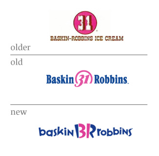
Baskin-Robbins
Internally labeled “The new FUN Baskin-Robbins Logo”
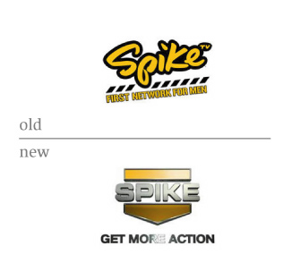
Spike TV
AOL


The BR logo is very scary. It looks like some new game at Chuck E. Cheese. Adults buy ice cream too, so I'm not sure I understand the reason to kidify the logo. At least Rudy must be enjoying this.
On Apr.07.2006 at 10:32 AMUgh...the Baskin Robbins is barely legible now. The only thing that should be commended is that they found a way to fit in the number 31. Except it now reads like "baskin BRrobins," whatever that is.
I'm really digging the new Spike TV logo. Makes me, a woman, feel manly just looking at it. "After watching this fine program on Spike TV, I'm going to go cut down a forest and club a baby seal."
On Apr.07.2006 at 10:44 AMI am actually drawn the the old school baskin robbins logo. funny how "trendy" and fresh it looks here in '06. the "fun" one does look a lot like a "chuck e cheese" game. ha.
Spike tv, thats a pretty bold move. and the washed out gradient looks pretty cheap. they probably should have just removed the tagline and gone with there old script logo. just leave it alone.
AOL seems like a pretty smart move considering most people say "aol". so, there is brand equity in that. and i'm all for keeping things simple. but, in an interesting twist. who really uses aol? my guess would be an older crowd just wanting to get on the "internet" and get "e-mail". so it may be a little less recognizable to the market they're trying to capture.
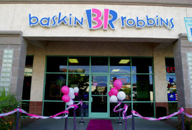
On Apr.07.2006 at 10:51 AMThe two-toned pink streamers and balloons outside the store are a nice touch, though my experience with streamers is that they tend to stretch out after a few hours, causing them to sag and lose their "twisted" form. They are a welcomed substitute to the played-out, obvious velvet ropes (and yet still serve their purpose as an element of crowd control). The pink carpet is very inviting and just reeks of a "VIP" experience - not to mention the clever twist on the classic "red" carpet.
The environment they've created is one that would be hard to walk past and not partake in - especially with summer approaching.
And they didn't ditch their old identity altogether, there's still a hint of it seen in the "open" sign hanging in the window - that swooshy thing in pink and blue.
On Apr.07.2006 at 11:49 AMI share Armin's thoughts regarding Baskin Robbins. It looks very young now, from the logo to the store interior. Of course, that may be what they wanted, to provide a little differentiation from the other ice cream store brands out there. But I think as an adult wanting a more sophisticated experience, I'd choose another store. I'm personally a big fan of Cold Stone Creamery. I think they balance the right amount of fun, cheekiness and maturity.
I like the 31/BR monogram. Do their stores still stock 31 flavors?
On Apr.07.2006 at 11:59 AMThat Baskin Robbins logo makes my eyes bleed.
I'm trying to form some better critique of it, but I truly can't stand looking at it.
The Spike re-branding also took a bit of a visual loss. Gone is the sense of men as being intelligent, witty, sometimes goofy, and more of an all around actual person... in it's place is a one-sided stab at arm-chair Rambos.
AOL... uhm... it's so soft and safe, there's nothing negative or overly positive to be said about it. An improvement over the old versions, though... IMHO.
On Apr.07.2006 at 12:02 PMBR — The intent behind the new logo is right IMO. Ice cream is very fun after all and the old logo was a little "square." I also have to commend them for having the balls to use Variex as I've always thought that font was almost unusable. My reaction, however, is that it just looks so messy. Mostly due to the "BR" in the middle. Does anyone say: "let's go to BR"? I've always said the full name and liked it. Perhaps if they had just stuck with the 31 in the middle I would like it more. Justin—great comment about the original logo looking trendy today...it's so true.
Spike — I liked their script logo. I guess the new one works as it looks like it should be on the side of the latest Ford pick-up. Don't get the gradient on the tag line in relation to the lighting on the logo.
AOL — Good idea.
On Apr.07.2006 at 12:03 PMArmin, Jon — I know what you mean re the BR logo looking kiddy, but to me that's alright. Ice cream is a guilty pleasure that is a good chance to be a kid again. And BR has some crazy flavours so I think the idea works. I really don't want my ice cream experience to transform into a Starbucks-like experience.
On Apr.07.2006 at 12:09 PMre: br/31, i have to hope it's a matter of reseaarch and positioning that makes it look like a gymboree...seems like an area where thay can stake their claim since coldstone has moved in and taken the more old-timey type feel that the original 31 flavors had. all that being said, even though it's clever, it already feels dated and just not very 'tight'...i'd like to know who was in charge of the rebranding...anyone?
On Apr.07.2006 at 12:27 PMhere is a pdf article off the baskin robbins site, i was hoping for more insight...a lot of buzz words and mention of a more sophisticated customer? hmm. Link
On Apr.07.2006 at 12:39 PMBaskin-Robbins is now an 80s Burtonized Nightmare Before Ice Cream, who's interior poses as some 50s stylized Mel's Diner. How dare they appeal to a younger and younger audience? Who do they think they are? Boo Berry? Count Chocula? It's a move driven by marketing and the bottom line, in order to get kids to nag their parents into the sundae line. I'm revolted.
On Apr.07.2006 at 12:59 PMThe BR/31 combination is a sort of clever idea that looks forced and awkward in execution -- like a student logo. The wacky type does have a kids' birthday party flavor to it, so much so that I'd probably avoid stopping in for a cone just to avoid the headache.
On Apr.07.2006 at 01:06 PMlooks like a place where you can expect there to to be dropped scoops on a sticky floor
On Apr.07.2006 at 01:13 PMAt least the logo matches the overly sweet, disgustingly terrible ice cream.
On Apr.07.2006 at 01:21 PM![]()
![]()
![]()
Can anybody tell me where the nearest Spike dealership is?
p.s. I couldn't find the Toyota Truck logo
as seen in the commercials; it is evoked when
viewing the new Spike.
On Apr.07.2006 at 01:53 PMWhen I used to get ice cream at a Baskin-Robbins, I could remember the classic, ice cream churn feel of something freshly made. Although it may not have been, it still gave me that feeling. Baskin-Robbins, as of late these days, definitely does not feel like that now. It's more of a get in and get out. I'm personally a fan of the classic OLDER look, but within these times, I could see this new logo working out, creating a more youthful appearance to make ice cream fun again. Because, dammit, ice cream should be fun.
Although, I do have to say...ditch the kitschy "31." I think it was an interesting way to solve for incorporating the number, but I also think it feels a little bit forced. How many flavors of ice cream are there really in a Baskins-Robbins store? 31? For real? I'll probably catch hell for it, but I say the logo can work without the 31. Or shit, keep the 31, but ditch the "BR" that it's hidden in.
I am really disappointed in the Spike logo redesign. There was a fun casualness of hanging with the dudes with the old one. I think we lose that in the new version. The slickness is alright because it reminds me of fast cars, but it is also TOO refined. We're dirty dudes. Gritty. Unexpected. I picture something more like that. How about using a monkey or a gorilla, because, honestly, that's what we get down to right? Our primal tv watching habits. Things that makes us grr-r-r-r and grr-r-r-owl about right?
AOL's new logo has been out for awhile now, I believe. A definite improvement since they've been born, and each reincarnation has been better than the previous. Kudos to the design team for simplifying the look. And for making it interactive and utilitarian as a logo mark itself. It says moving forward, it says America Online. It's cool.
On Apr.07.2006 at 01:57 PMgod damn, but that baskin robbins thing is an eyesore. there's something to be said for doing what's appropriate for the situation. but did nobody consider how many customers they might lose from their new status as visual pollution?
also note how badly the designer redrew the variex s. nice touch.
spike: you're butch. we get it.
aol: you're online. we get it.
On Apr.07.2006 at 02:27 PMSo.......the Spike logo has gone from looking like it belonged on a pair of women's jeans to, "Mary, butch is not your color." And "Get More Action" just sounds like they're hawking gay porn.
(Rebranding = cheap shots. What?)
Baskin Robbins' new thing just make them look like a toy store now, what with the "zany" type on random baseline. *barf*
On Apr.07.2006 at 02:28 PM(PK, stop doing that!)
Also, I kinda like the new AOL logo. Better than the goofy trying-too-hard-to-be-friendly type treatment previous, anyway.
On Apr.07.2006 at 02:31 PMIt's pretty obvious that the design community is not "pleased" with the redesign of Baskin Robbins' identity. And I agree.
Growing up, there was a Baskin Robbin's near my house, and as a child I referred to it as "31 Flavors." That's how important the number was to me. The sign outside was of the oldest logo/type, and it was carved deep in wood and painted. The impression was that this company had been around for a very long time (and I do believe it has) and it was nice knowing I was going to a well established shop.
The redesign is so incredibly new, that I feel absolutely no heritage to the company anymore. I don't know about you guys, but wouldn't you want people to know that your company has been around longer than everyone else's? It's a sort of bragging right, in a sense, and something the older logo did best.
On Apr.07.2006 at 03:08 PMIs the thin type supposed to make the ice cream seem less fattening???
On Apr.07.2006 at 03:35 PMThe heavier weight 'r' in robbins is unfortunate. Thought it might be a rough jpg, but for the shot of the signage.
On Apr.07.2006 at 03:50 PM"BR" is not "KFC" (or even DQ), but it's hip be letters
I guess I'm supposed to text: CU@BR
But the whole concept reeks of pandering to children. Except children don't have money and can't drive. McDonald's understands this and provides some incentive to the parent for visiting. Why not go with an updated 50's ice cream parlor? They've lost gourmet to Cold Stone and Marble Slab, go after family time. I'm sure that was presented and dismissed as not hip, but it could work.
Spike: "let no logo be un-3D"
(side note - how can I watch a channel that's telling me to "get more action" in front of my wife without being slightly embarrassed?)
AOL: you're just now realized what we've called you since day 1? See: KFC
On Apr.07.2006 at 04:11 PMBR — Interesting solution, but I think it is trying to accomplish too many things by including too many unique elements: the BR/31, the capital �N’s, and the hyperactive letters. The �BR’ looks like it is rendered in Chopstix. Was the old logo broken?
Spike — I found this on a Google search: ">http://www.super-seal.nl/images/logo%20super%20seal.jpg">
The lighting on “GET MORE ACTION” is too harsh. The highlight probably animates well.
AOL — The new logo looks like a natural transition. I would have preferred to see the triangle graphic re-rendered so that it wasn’t quite so puffy.
On Apr.07.2006 at 04:48 PMBaskin Robbins is sickening.
The thing that might make me go there is my 1992 childhood memory of the Oscar the Grouch sundaes (a cup with ice cream and green frosting with eyes and an orea lid). They're the ice cream shop that does stuff like that. But even for a kid, part of the joy in an ice cream shop wasn't that it was like Toys 'R Us but that they had a counter with knives and cutting boards behind it and people who listened to your order and treated you sincerely.
The formal language that this suggests is not hog wild type that pierces into space and blobs around. Instead, it's one of fanciful order. Sweet and cold. Warm pink. A filled circle and well-behaved type. Maybe hints of whimsy in the typeface.
B31R. A pink that recalls blow-molded plastic toys that have been sitting for years in a dollar store. Screaming and stupidly clever, the new identity looks like something out of a Brave New World orgy-porgy.
I'd have done it differently. But, yeah.
On Apr.07.2006 at 04:52 PMAlso, I have some thoughts about the new Spike TV. It's militaristic. It speaks at least one volume about how "manly" looks and feels in 2006. While the script was kinda nice on its own, my feeling is that its far off the mark in terms of a national conciousness of masculinity. So maybe as authored by not just the design team but by a nation, it's not what I hope for. Unfortunately, it seems to fit a little better.
Fratboys get action blind-drunk in a wet basement somewhere. Soldiers get action in the field. Bummer.
On Apr.07.2006 at 05:06 PMI really like the AOL change, and I think it's a smart move. In the last several years the majority of people have begun referring to Amercia Online as AOL. It's nice to see change shaped by the society that uses the product, instead of some huge marketing ploy to try and sell more product (i'm aware that may be part of the reason).
BTW:
The spike logo, make me laugh very hard. It's "soooo thug."
I have to much nostalgic sentiment attached to the BR logo to comment.
On Apr.07.2006 at 06:32 PMWith all the high-end ice cream that's been so popular lately I can see why Baskin Robins is
defining their niche this way, but the logo is just really bad. It looks like it was concieved by a bunch of businessmen sitting around in a board room discussing the core attributes of Baskin Robins (gee, you think one of them was "fun"?), as opposed to the Ben & Jerry's logo, which looks like it was created by a couple of old hippies who love ice cream. In other words, it doesn't ring true. If I wasn't already a big fan of their ice cream I'd be put off by it. I agree that it looks very Chucky Cheese...and implies the same low level of quality in the food. The old-timeyness of the older logo seems to imply quality to me.
The concept/execution of the "31/BR" is even worse. I've seen it a few times while driving past, but never saw the "31." I wondered why they'd gotten rid of it and why the BR letters in the middle were pink and blue. Even knowing it says "31," I have to look closely at it to see it. This may be a southern California thing, but growing up, everyone I knew referred to it as "31 Flavors." They still do, in fact. You'd think they'd want to play that up, not hide it.
By the way, I love Baskin Robins ice cream. The chocolate is really chocolatey. I hate Cold Stone. The chocolate there barely has any flavor. I wonder if they still have the clocks where every number is 31.
On Apr.07.2006 at 07:24 PMI confess, I kinda LIKE the Baskin-Robbins new logo - visualizing rotten tomatoes being thrown - and the reason why is because it breaks with its past. Nostalgia is overrated. The original was corny, the follow-up was mediocre. Sickening? Maybe so - call me crazy - but the unstructured baseline is the appealing part of this font. The BR/31 was obviously the highlight of some hallucinatory late night creative sessions.
It's fun to be critical about someone else's logo, but then it's also good to acknowledge a different point of view. I've heard that David Ogilvy had a piece of paper in his pocket at meeting that read: "They might be right." (Wonder if that's true.)
I didn't design this one, honest.
As for Spike. The original seems far cooler. The chrome car plate look is so very...ah... misplaced. but I imagine they had fun doing it. Only problem seems to be holding the gradation at smaller scale.
On Apr.07.2006 at 07:45 PMWell, after doing a little research I discovered that David E. was right about "fun" being a core attribute for the Baskin Robbins rebrand. Brand officer Ken Kimmel lists the core attributes as being "irresistible treats, smile, and fun".
Ken claims that "[his]competitors are pushing this mix-in experience, a higher-price theater experience." He criticizes companies like Cold Stone, Marble Slab and Starbucks for taking this approach. He says he wanted to get away from Baskin Robbins theatrics of the past; "31 flavors was a big idea 60 years ago".
I agree that it may be tough to compete with the experience Cold Stone and Marble Slab deliver. However, Baskin Robbins has a tremendous history and story to tell. They essentially brought the corner drugstore ice cream experience to the masses. They would have been well served to be true to themselves. It would have been much more exciting to see the experience of Baskin Robbins be rejuvenated, rather than the sugar-coated ADHD sticky fingers approach.
I loved the buzz words in the article including "innovate", "strategic heartbeat" and "synergistic".
On Apr.07.2006 at 08:50 PMMy jaw hit the floor as i scrolled down for the slow reveal of the Baskin Robbins logo, from older to old to ... omfg ... now that's a 13-car pile-up. It is one of the most brutally hideous things I've seen in a long time. A literal eye-sore. And thank you Steve Mock for mentioning the weighty "r"—it was one of the first things i noticed.
Alas, their second logo is on the verge of becoming trendy. Actually, what it needs is a nice fat , Bello-y script for an easy transition from old to new.
Embrace the fat.
Anyway, the Ford/Spike TV logo, with the downward pointing arrow to "Get More Action" ... hey boys, have it tattooed on your belly!
The connotations are delightfully exemplified by Mr Frankie L.'s logo column ... doesn't anyone else know "hummer" as another term for "blowjob"?
On Apr.07.2006 at 09:34 PMMost of the BR locations in Florida (assuming elsewhere, too) are merged with Dunkin Donuts as a one-stop shop for adding some extra padding to your svelte figure. I would imagine this rebranding adds a needed contrast to the interior of such mergers, because it gives the children an incentive in going to Dunkin Donuts with their parents. All the moms and dads go for the Dunkin Donuts coffee/donuts, and the kids get the colorful ice cream at BR. Not terrible in concept, but rather wack in execution. Thought I'd shed some light on this perspective of the rebranding, because it might in fact be the reason why it's so "kiddie".
On Apr.07.2006 at 11:01 PMYou changed my mind, Marian. I'm gonna hate myself in the morning.......
On Apr.07.2006 at 11:08 PMJust a passing note: funny how the branding threads gain the most comments, huh?
And when did identity become about likeability as much as communicating? It plays a small part in identity, but not as much as people would like to think. Let's be more critical other than "we get it" or "it's okay." I hate reading the same post 30 times about how bad the BR font looks. Get over it and move on with a critical view on the subject.
FYI, in Marks of Excellence by Per Mollerup, look at pages 90—91 and study the list to gain other topics to discuss within identity/branding.
On Apr.08.2006 at 02:55 AM...which seems to assume that every person here has a copy of that book at hand, and will go look at it right now. If you don't like the direction of the discussion, then um...how about actually bothering to cite (at least) one of those items, and maybe even acting upon it? You now have a prime opportunity to open the deeper critique you desire. Are your notes still being drafted, or are you just here to wag a finger?
Also: How do you define "small" as regards likeability's role in branding/ID? I wonder if I'm interpreting that term in an altogether different way than you seem to be. More than one person has specifically reference being put off by just the logo. That's small?
On Apr.08.2006 at 05:47 AMWell, I’m over all of the emotional disappointment I felt after discovering that the BR logo had changed. That was tough to see, I remember going to a BR for the first time, I was amazed. Who knew there coudl be 31 flavors, and I could taste them all!
I’ll admit I don’t like it as much as the older one. The old one has a simplicity about it that really appeals to me. The new one is complicated, and needs a lot of work (especially the type), but one has to admit it is clever the way the B and the R make the 31 (for the 31 flavors). So, in response to Feldhouse’s comment above (and I agree with Su by the way: roll the ball don’t talk about rolling the ball), I’ve asked myself “How could I communicate this better?”
As an introductory project, I often have my Design I students redesign print works. We redesign magazine spreads, phone book ads, flyers, and various other easily accessible print materials, but the catch is, in your redesign you can only use what already exists in the work. You can resize, rearrange, swap colors, and possibly delete, but you cannot add to it. So, I’ve approached the BR logo with this “how could I make it better” perspective.
The major problem I have with the BR is that it’s difficult to read the 31, especially inside the store when it is pink on top of pink circle. I’m amazed by how much of a difference it makes when I look at it. I’m certain what I’ve made could easily be improved upon as well, so I’d encourage you to take 5 short minutes, like I did, and see how you can improve it.

Can you imagine if a Baskin Robbins was next to a Build-A-Bear store... bouncing type for everyone!
On Apr.08.2006 at 11:21 AMThe Spike logo says to me: "It's all downhill from here". It clashes with the tagline - that shape isn't about action.
I think AOL made a smart move.
On Apr.08.2006 at 11:59 AMBR: I actually like the B31R bit...
AOL: "consumers in the U.S. and around the world"? Hey, AOL do already have a just AOL logo, which is totally different all over in Europe. The "old" version has applied (and the "new" one will?) for North America only.
![]()
couldn't the Baskin Robbins identity have been more round. Ice cream is fucking creamy, smooth and sweet, so whats with all the harsh corners, harsh colors and harshy harshness? and ow fuck! my eyes!.
They could have set the whole thing in Bello and called it a day. They would be a hell of a lot better off. Nostalgic and modern. Whoa!
On Apr.08.2006 at 02:52 PMBR - I think there is an ideal there but it fell short in execution.
Spike - I understand the move from the old to new and what the designers had to go through with the client. The old seems to be an influence of street type and the new is more macho military influence. Personally neither of the two is top shelf design but it might be what spike needs to communicate their new positioning.
AOL - a fair example of an evolution of a logo. and a good move to AOL from America Online. Remember when FedEx was called Federal Express.
On Apr.08.2006 at 09:29 PMBR: Train wreck or kids hyped up on all the sugar?
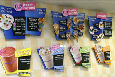
The carry-over of the logo into the in-store signage seems a bit more tragic. Seems a bit cluttered visually and the overblown cones and custard may not be quite appealing in real life on the wall.
If you are going to say Baskin Robbins, why do you also need to use the BR? I always said the name out loud went we went there as kids and I'm not sure of anyone that may have just used BR. Curious to see what research may have driven this decision. As for the pink 31, didn't catch it at first glance and while it's clever, I also feel it's overkill again. It's obvious they felt the number 31 was still an important part of their identity, so why get tricky with it? It's almost too cute and not in a good way.
Spike: The NASCAR Channel?? Have never watched it so I have little else to say. But that's the feeling I get from looking at the new versus the more sophisticated old version.
AOL: Nice move that probably should have been done a long time ago. And also a good way to separate themselves from the whole TIme-Warner mess.
On Apr.09.2006 at 01:06 PMWow, I didn't notice the 31 in the Baskin Robbins logo until it was mentioned in the comments. I had a small "When You Realise There's An Arrow In The FedEx Logo" moment. So that much about the new logo is great! I don't really have that much of a problem with the type either, on its own it reminds me of how "Calvin and Hobbes" was written in those comics. The logo as a whole just looks kind of gross to me, however. I'd expect all the ice cream inside to have disgusting artificial flavors like bubblegum and cotton candy or something. On the storefront, those colors combined with that type is just too saccharine. I didn't even like that kind of stuff when I was a kid - it just seems patronizing. The graphic equivalent of your aunt pinching your cheeks and saying "ooh, does my widdle baby want some ice cream?"
On Apr.09.2006 at 01:16 PMThanks for your words, Su. It seems as if you have solidified my point exactly. If you are going to speak about identity, you must be able to speak about it in a professional and educated manner. If you cared about identity in any fashion, you might have picked up a few books, including Marks of Excellence, or at least have browsed through it.
Obviously not everyone has this book but if you care about identity enough to post comments on this blog, you might want to do research on the subject. The first post where Baskin Robbins was mentioned in juncture with Dunkin Donuts was a much later post (thanks, Milan). Again, something that should come into play when discussing branding: what type of company is it? Who is the audience? etc.
I'm not here to wag a finger, nor have I ever been one to. I am trying to be proactive to get people to think before they post.
I'll post a few of the topics from Marks of Excellence but I will leave it to those who actually care about identity to find out the rest. Many should know these already, but just a refresher:
Visibility, Competition, Color, Tone of Voice, "Buy-Me", Holding Power.
These are just a few. None of these are particularly specific to any of the above mentioned marks, but they are at least more of a starting point to think about rather than just saying "I think this is crap."
My only thing about these new marks is the time in which they occur. It wasn't too long ago (3 years, if that, in 2003) that Spike TV came out with their script mark. It seems as if the trend is to change your look every few years. This worries me greatly as identity is supposed to solidify a visual representation to the public. With a constant change of looks every few years, the public starts to wonder when the next visual update will happen and then start expecting it. I don't think this is a healthy cycle at all and as people much more knowledgeable than me in this field have said, "identity is a dying art."
On Apr.09.2006 at 02:22 PMBR: Holy moley, that 'r' is the TOTALLY wrong weight. Awful, now I can't stop staring at it!!!
Also, I find that the 'fun, exciting, perky' look reminds me too much of Carvel.
![]()
They also use and excess of pink. I would have liked to see the pink toned down so that the blue takes center stage. The blue talks about cooling down after a sweltering summer day; the pink says sickly sweet and makes my teeth ache; combined inside at about 50%/50% of each I think of cotton candy, not ice cream.
It's not bad per say, I just think it's the easiest, and not quite the best, route to take.
On Apr.09.2006 at 03:25 PMoh my. I must join the throng in heartily denouncing the BR logo. Personally, I liked the one they had been using. The new one reminds me vaguely of the show Rugrats - I feel like I should be in a diaper. Personally, I'm a big fan of the Toscanini's logo (and their ice cream, for that matter - the grapefruit tequila sorbet is just short of heaven for me) - http://www.tosci.com/
As for Spike TV, I keep thinking about GI Joe when I look at that one. Suppose it fits.
I do like the AOL logo - it works pretty well.
On Apr.09.2006 at 05:15 PMBR — eventhough I hate it, I predict that it will work wonders to refreshen their image and brand. The old logo, while a classic, had a very weak retail presence to me. Let's see how their sales do.
Spike — I hated the last logo, and thought it was wussy. The new one looks like it would fit on a grill of a semi-truck. That's exactly the image of the network -- take it or leave it.
AOL — a better refinement, though I wonder how long the whole network will last. Sure, it still attracts the kiddies and old folks, but is the new brand speaking to new audiences, like us. I think not. So it's a failure in the long run, no matter how nice the refinements are.
On Apr.09.2006 at 05:40 PMhas the new travel channel logo been looked at? very strange…
![]()
and poor quark… at least they did the right thing (even if it was in the wrong way).
![]()
Along with The Travel Channel, another Discovery property, TLC recieved an upgrade also...
Old
![]()
New
![]()
That last pair deserves top-tier posting to get some more attention.
The new TLC looks like it'd work better in a Japanese auto-maker's light SUV brochure, or maybe on the dash. Besides the gradient/web button/bubble treatment, I don't so much mind it, but I wouldn't trust it to teach me anything. The old logo feels like it came out of This Old House or some other PBS program. It's trustworthy.
On Apr.10.2006 at 02:57 AMI think the sans-serif and the tan/red combo serves TLC much better than the serif and the stark red/white did. Anything serif like that reminds me of Flare magazine.
As far as the comments on the 'deeper meanding of brandings', imho, it seems the trend is to take a visual and work backwards to see what it looks like it stands for, rather than research what it stands for and decide if what it's supposed to stand for is appropriate. I think this is just because we're designers. I don't think it's bad, maybe just effective if you're discussing design but not effective if you're discussing marketing.
I appreciated Tan's comments, they seem to blend the best of both worlds.
On Apr.10.2006 at 12:03 PMSpike TV might work well it seems.. they seem to be pretty focused about this one & their positioning seems 'ok'. But like everyone else says, the logo.. seems like Marvel created another superhero or something like that. Sounds more like a person now.
Baskin Robbins, hate that logo. The older two are way much better.
cheers!
On Apr.10.2006 at 10:29 PMRe: BR
"Ice cream for kids" seems to me an entirely valid brand differentiation given the current retail ice cream environment, and I think this logo succeeds wonderfully in that sense. Is it a little abrasive to adult eyes? It sure is. Would a kid relate to the new letterforms better than the old ones, and love the visual punniness of the 31? Mine sure would.
Folks keep throwing out comaprisons to Chuck E. Cheese as some sort of dis, but CEC has succeeded brilliantly in being the pizza of choice for kids, much to the chagrin of sane grownups everywhere. If BR can do the same, well that's going to serve them pretty damn well.
On Apr.13.2006 at 11:59 AMThe AOL logo and Spike TV logo are fine IMO but the Baskin Robins logo is just asking to be made fun of.
first off they went from reading left-to-right Baskin 31 Robbins to Baskin BR/31 Robbins
second the font is a mishmash I can't recognize it, is it helevecta? Broadway? Tachoma? san sarif?
isn't mixing fonts in the same line of words unacceptable in graphic design?
third WRONG FONT the letters while readable certainly do not reflect a sense of "fun" some of the letters look too formal and clean-edged such as the "b"'s "a"'s and the "o"'s
forth excuse me for being picky but the "N"'s having sharped pointly edges isn't that a big no-no in graphic design?
fifth In the overall appearance the logo just looks like they haven't gone far enough it looks semi-restrained and they could of used a better font that would've fit better.
On Jul.23.2006 at 03:08 PMYou guys are the 48123 best, thanks so much for the help.
On Aug.04.2006 at 12:48 PMSpike looks like a delivery company now.
Ironically it reminds me of the UPS logo (the old one) ;)
On Dec.28.2006 at 04:09 PMI would think that Baskin Robbins would need to strengthen their adult market and not their youth market. In which case, it would have been nice to see them bring back the chocolate brown and pink colorway. The letterforms bother me. Why is that lowercase r bolder than the rest of the letterforms? Even my husband, who is not a designer, came home one day and said, "have you seen the new Baskin Robbins logo. It is horrendous."
On Jan.07.2007 at 11:32 PMI would think that Baskin Robbins would need to strengthen their adult market and not their youth market. In which case, it would have been nice to see them bring back the chocolate brown and pink colorway. The letterforms bother me. Why is that lowercase r bolder than the rest of the letterforms? Even my husband, who is not a designer, came home one day and said, "have you seen the new Baskin Robbins logo. It is horrendous."
On Jan.07.2007 at 11:32 PMI would think that Baskin Robbins would need to strengthen their adult market and not their youth market. In which case, it would have been nice to see them bring back the chocolate brown and pink colorway. The letterforms bother me. Why is that lowercase r bolder than the rest of the letterforms? Even my husband, who is not a designer, came home one day and said, "have you seen the new Baskin Robbins logo. It is horrendous."
On Jan.07.2007 at 11:33 PMI would think that Baskin Robbins would need to strengthen their adult market and not their youth market. In which case, it would have been nice to see them bring back the chocolate brown and pink colorway. The letterforms bother me. Why is that lowercase r bolder than the rest of the letterforms? Even my husband, who is not a designer, came home one day and said, "have you seen the new Baskin Robbins logo. It is horrendous."
On Jan.07.2007 at 11:34 PMXOMG!!! BASKIN ROBBINS oh this just pissed me off
ok so i went into BR and it had changed into like one of those old-fashioned ice cream parlours that was for kids with all the cute colors and big pics on the walls and a zillion toppings in a horseshoe shape and THE HORRIBLE LOGO. i mean, i like the |312 (that's my sad attempt at the B31R thing haha) i mean it's cute and all but they shouldn't have baskin BR robbins. i loved the middle one because i've lived with it all my life and loved it! XOMG!!! BASKIN ROBBINS oh this just pissed me off
ok so i went into BR and it had changed into like one of those old-fashioned ice cream parlours that was for kids with all the cute colors and big pics on the walls and a zillion toppings in a horseshoe shape and THE HORRIBLE LOGO. i mean, i like the |312 (that's my sad attempt at the B31R thing haha) i mean it's cute and all but they shouldn't have baskin BR robbins. i loved the middle one because i've lived with it all my life and loved it!
Pampers Logo:
The Pampers logos has been changed throughout the years, but from the 1960s to 2000, it was featured with a baby sleeping. Since 2000 the logo is now featured with a heart and 3 small lines above it.
We are living in a simplified age. In my opinion, the new Baskin-Robbins logo is one of the most juvenile I've seen in years.
The new Payless Shoe Source logo isn't much better looking.
The designers' intention was probably to create a youthful and energetic graphic representation of that company's ideals.
Burger King's new logo follows along those
lines as well. I like that logo. The bun halves are still there, that's nice.
I'll continue to like it, so long that it isn't worked any further into something more stupid.
The new BR and Payless logos are yet another example of the streamlining and dumbing down of this country's people to the intelligence of doorknobs.
Companies like the Hartford, with their buck, and the Prudential, which suffered a loss of recognizability with their over-simplified Rock of Gibraltar logo of 1984, and because of that, chose to have a more realistic version designed in 1988, if I'm not mistaken, are stalwarts of logo design.
On May.11.2007 at 02:59 PMThe Baskin Robbins logo works best when it is stacked. It's too puzzly to have the BR-31 icon in the middle. However, similar to the past circle-31s, the new BR-31 makes an excellent icon for the company all on its own.
I still like the retro logo, too. I see so many great vintage circus poster fonts these days, I almost wish they had gone in that direction.
On Jul.08.2008 at 03:08 PM
The BR/31 works well in spirit, but damn if some of those letterforms (S? K?) don't feel like they're borrowed from the Greek coffee cups. The capital Ns are also a strange choice.
On Apr.07.2006 at 10:09 AM